Overview of Canvas Peer Review for Group Work Evaluation

We have discussed peer review in Carmen/Canvas before both on this blog and in previous Flash Friday presentations.  If you would like to catch up on the most recent Flash Friday on Peer Review, click here.  This post will go over some details and instructions for using the Canvas Peer Review tool to allow your students to evaluate one another’s performance in group work.

Peer Review in Canvas was designed to allow students to review work submitted by peers, such as research papers and websites.  If you are interested in using Canvas for this type of peer review, check out this post on creating peer reviews and this post on viewing peer review comments.  Also note that there are other ways of getting peer review feedback, including Qualtrics surveys and having students use email.  Whatever method you decide on, the College of Nursing IT team can help you design and implement a peer review assignment.

Peer Reviews for Group Work

For a step-by-step guide to creating your own group work peer evaluation assignment, download this presentation: Using Canvas Peer Review for Group Peer Evaluations-1qlkjnb.

Hints and Tips

  • Peer reviews do not receive a grade—if you want to give a grade for how well a student peer reviewed another student, you have to create a separate (no submission) assignment in Canvas to allot grades.
    • Alternatively, the instructor can give a grade on the assignment being reviewed and call that the peer review grade—this does get confusing and will not work if you have two rubrics involved.
    • Grading completion of peer review vs. grading students’ work vs. grading students’ feedback can be confusing.  Feel free to consult IT about this!
  • Who can see the comments in a peer review?  Instructors and the student being reviewed can see all comments on their submission or performance. Peer reviewers can only see their own comments–the comments they made and the comments addressed directly to them.  Students cannot see comments made by students to other students. The “test student” in Canvas cannot complete peer reviews.
  • Saved by the Bell – Clicking the “bell” symbol next to a student’s name who has not yet completed a peer review sends an email to the student to complete the review along with a link to the review they need to complete. This is handy when students state they cannot find their peer review assignment. Peer reviews go directly to the person getting the review—instructors cannot read over or approve them beforehand
  • When “Saved by the Bell” doesn’t work—instructors can delete the assigned peer review and re-assign it. This will erase all record of the first peer review attempt.
  • When assigning peer reviews for evaluation of group members, there is no shortcut to have the group members evaluate each other— the instructor must manually add each student (this can be tedious).
  • Dates get wonky in peer reviews for performance rather than a submission (“due date” is really “start date”)— you will need to explain this to students so they understand that this will look like an overdue assignment. Also, changing the due dates or available dates after publishing the assignment may result in student difficulty in viewing and completing peer reviews.
  • There is no “self-review” option.  If you want your students reviewing their own work, you’ll have to do this separately or on a different platform.
    • Workaround: you could have students leave a comment on their own peer review submission page.
  • Students may be able to go back in and change rubric scores after the review period, but they cannot edit or delete comments.

If you would like help setting up a peer-to-peer evaluation of group work, please contact us at CON-IT@osu.edu

Get your Carmen Gradebook Ready for AU17 Final Grades

You’ll be submitting final grades for AU17 in just a few weeks. Are you ready? Now is the time to double-check your Carmen gradebook setup and prepare it so grade submission goes smoothly. The CON instructional design team presented a Flash Friday webinar on 11/17 on how the gradebook and assignment tools in Carmen are connected and how to organize one to rearrange the other. Find out how weighting grades, dropping grades, muting grades, and bonus assignments/points work in the gradebook in the recording of this webinar at http://carmenconnect.osu.edu/p9ndq89j1wb/

Additional resources

Resources for Carmen Courses

Are you working on your Carmen course content for the upcoming semester? The Office of Distance Education and eLearning has some useful templates and information you might be interested in.  Check these out!

Review an online course

This is an online form you can use for a self-evaluation of your online course or ask a peer to use to provide feedback for you.  It is more concise than the Quality Matters rubric and covers teaching practices of individual instructors. It can also be used as a general guideline for knowing what makes an online course and an online instructor “good.”

Log in to Carmen first in order to access the Canvas Commons resources below.

Student Resources at Ohio State

Provide information to your students about services related to academic success, tech help, community resources, and health.  This resource imports as a Content Page in your Carmen course and can be placed in Modules.

Student Online Readiness Module

Help your students understand what the expectations are in online learning.  Keep the parts of the module you like and delete the rest.

Template for a fully online course

This template is a good place to begin in Carmen with any online course development, and it also serves as a good model for revision or reorganization of existing fully online courses.  You’ll be asked to log in with your university credentials to view this template. If you want to see it in action in your own view of Carmen, create a master course, and import the template into it.

Looking for more Carmen templates?

Try going to Canvas Commons, uncheck the “Show Public Resources” button, and enter the terms OSU Carmen in the search field.  You’ll find templates from a basic homepage to a resource-heavy course.  Browse the available course models and see if one seems right for you.  Create as many master courses as you need to import the templates you are interested in.

Creating a Self-Grading Quiz on H5P

In a previous entry, you learned how to create a set of flashcards on H5P. Flashcards are an excellent study tool, but some students may simply memorize the cards themselves rather than actually learning the underlying concepts. For that reason, an excellent tool to reinforce the material on the flashcards is the self-grading quiz. Below is an example quiz based on this flashcard set:

To create an interactive quiz of your own, go to the H5P content creation screen and select “single choice set” from the drop down menu.

The first dialogue box will set the title for the entire quiz.

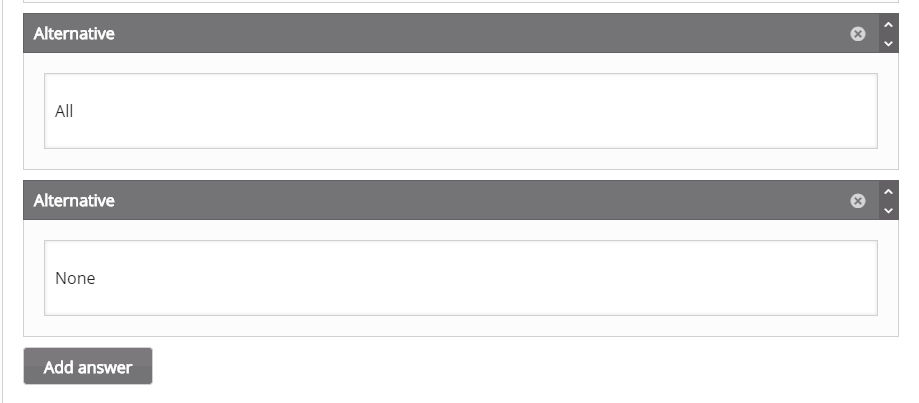
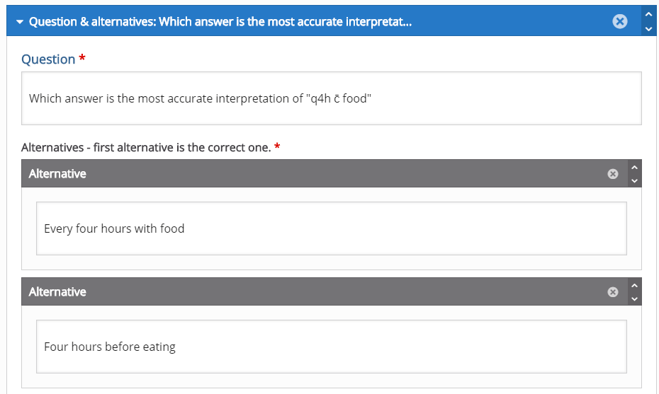
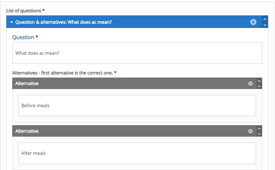
In these dialogue boxes, you will fill out the question and up to four possible answers. The form will default to two possible answers. You must click the grey “add answer” button to create new blank answer dialogue boxes. It is important to note that the first dialogue box is for the answer that you want the quiz to grade as correct. It is also important to note that the quiz will randomize the order of all four possible answers. This will be important later.

Question 5 is an important example because I chose to include an “all of the above” style answer. However, it is important to note that even though this answer is the last one on the form, it will not necessarily appear as the last question within that answer set (eg: it could appear answer 1, 2, 3, all of the above OR 1, all of the above, 3, 4 etc.). For this reason, you should choose a wording similar to “all answers are acceptable” and avoid answers that make reference to other answers in terms of their location within the answer set.

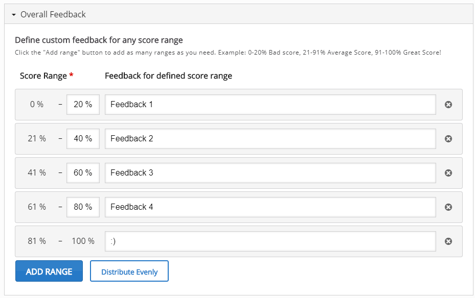
This image shows the grade ranges you can choose. This section starts relatively blank. To create the grade ranges for this quiz, I clicked the blue “add range button” until there was one grade range per question, then clicked the white “distribute evenly button.” However, If you choose to, you can manually adjust the grade ranges. The text boxes next to each grade range are the messages that will appear if a student receives a given score.

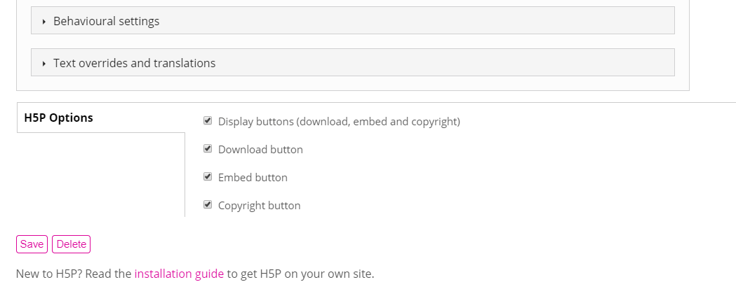
In these final steps you can further customize the behavior of the quiz and the messages and prompts that appear on the quiz. For this tutorial, these settings have been left as default, however I encourage you to play with these settings and contact CON IT for any additional assistance you may need. As with other content on H5P, you can edit the download, embed, and copyright buttons that will appear. Once you are happy with your quiz, click the pink save button. If you followed these directions, you should end up with a quiz identical to the one at the beginning of this blog post. Once you have completed your quiz, it can be embedded into Carmen or into your u.osu blog for use as a study tool. For help configuring your quiz, or assistance in implementing an H5P quiz in your classes or study groups, please contact CON IT for additional assistance.

Hiding the Nearpod Navigation Link in Carmen

Many of you may have noticed a new navigation link on the left side of your Carmen courses called “Nearpod.” For those who use Nearpod in their classrooms, this may be a great addition to your course. However, if your students don’t need the Nearpod navigation link, there is an easy way to hide it.

The Nearpod navigation link is currently showing by default on the left-sided navigation on all College of Nursing Carmen courses, but it can be hidden if it is not necessary for your course.


If you want to hide this navigation link, the first step is to click “Settings.”


Next, click the “Navigation” tab.


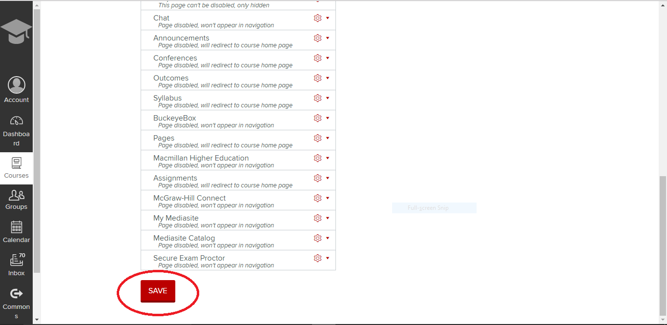
Here, you can see that there are two sections where navigation links can be sorted. The top section is for navigation links that you want to be viewed by students. The bottom section is for navigation links that you want to hide from students. Since Nearpod is in the top  section, it is currently able to be viewed from the student perspective.


Left click on the Nearpod box and drag it down to the lower set of navigation links. Notice the note in the Nearpod box now, “Page disabled, wont appear in navigation.” This verifies that students will no longer be able to see this navigation link.


Scroll to the bottom of the page and click “SAVE.”


The Nearpod navigation link is now hidden and will no longer show up on the left navigation menu.

You can hide any of the unused or distracting navigation links in your Carmen course using the method described above. If you have questions or need assistance with your navigation links in Carmen, contact the CON IT team.

Creating Flashcards on H5P

The previous blog entry showed how to make a basic accordion style review tool on H5P. This entry will teach you how to use H5P to create online flashcards. The online flashcard tool is a great way to present a large amount of study material, as long as the material requires only a brief explanation or rationale. The process is a bit more complex than the accordion style list, but the outcome is much more customizable. Below is an example flashcard set to study commonly used medical abbreviations. Most of these cards are simply text on both sides. Cards 3 and 4 give examples of how to use audio and image clues on a flashcard set.

To create a flashcard set, start at the H5P content screen (you will need to create a free account) and select “dialog cards” from the drop down menu.

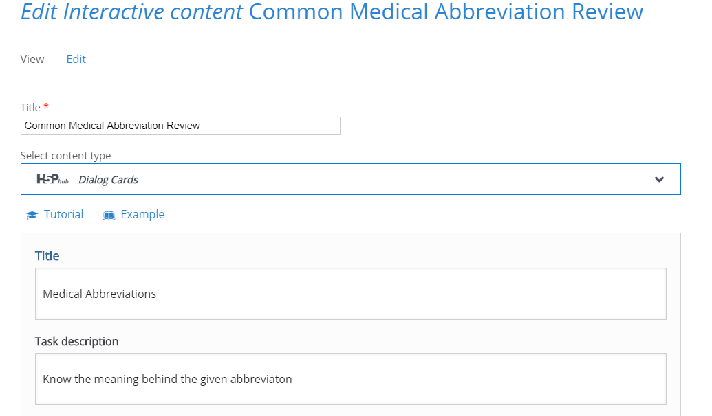
These first dialogue boxes will set the title for your project, the title that appears at the top of the card pile, and the general instructions for the card pile.

The first dialogue box for your card will determine what shows on the front of the card. The second dialogue box shows what will appear on the back of your card. Initially, you will only have one blank card. To add more cards, you must click the blue “add dialog” button on the left menu.

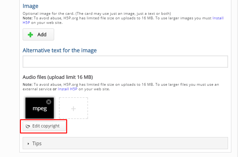
Card 3 is unique in that I added an audio clue to the card. To do this, scroll down until you see the section for “audio files” then click on the grey rectangle to upload your audio file. You can upload audio files with a URL or from uploading a saved MP3 from your computer. It’s also possible to record your own audio files to upload. It’s important to be aware of any copyrights your file may have, and to cite them properly. Citations will appear in the “Rights of Use” button on your flashcard set.

Card 4 is unique because it has a visual clue that appears on the card (images will appear on the front and back of the card). Images are uploaded just like audio files, except you will upload images under the “image” section. Just like audio files, be aware of the copyrights your image may have and cite them properly.

At the bottom of the page you will have the option to further edit actions and behaviors of the card deck. For this tutorial I left those options as default, but I encourage you to play with them and contact CON IT for any additional assistance you may need. You will also have the option of editing what buttons will appear on the final flash card deck. Once you are satisfied with your flashcard deck, click the pink “save” button. If you followed the directions posted here, you should end up with a deck identical to the one at the top of this blog post. For help configuring your deck, or assistance in implementing flashcards in your classes or study groups, please contact CON IT for additional assistance.


Multiple Choice vs. Multiple Answer

The “Quizzes” tool in Canvas is a easy way to allow students to take a quiz or survey online. Not only is this feature easy to use, it also comes with a large number of  features to customize a quiz to fit your exact needs. You can make it a quiz or a survey, a graded or a practice quiz, and even add a variety of question types such as matching and true/false.

With 12 different question types to choose from, there may be some confusion as to which question type does what. Two very similar sounding types are “Multiple Choice” and “Multiple Answer.” Although they sound the same, they produce very different types of questions. Below is a tutorial on how each of these question types work.

Multiple Choice vs. Multiple Answer tutorial

Go to the quizzes tab in Canvas and select “+ QUIZ.”


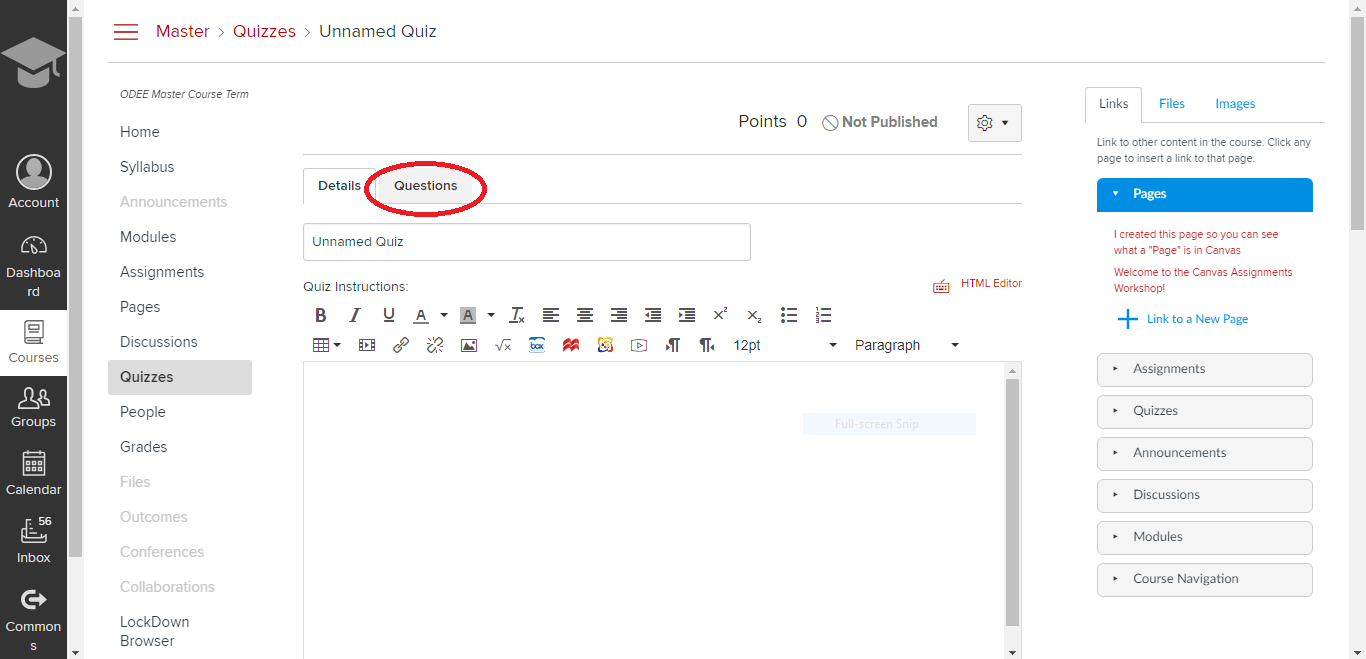
Select the “Questions” tab.


Select “+ NEW QUESTION.”


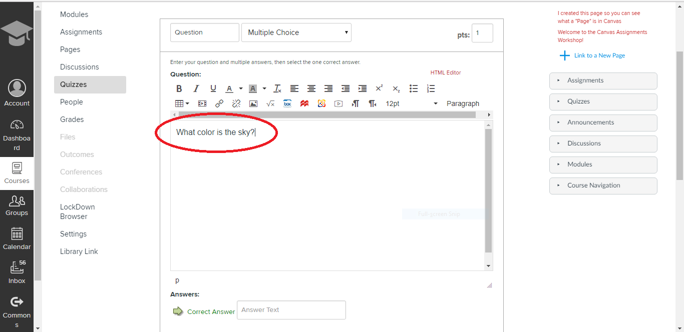
Here you can select which type of question you want. In this tutorial, we will select “Multiple Choice.”


Type your quiz question into the text box.


Type your possible answers into the texts boxes.


Select “UPDATE QUESTION.”


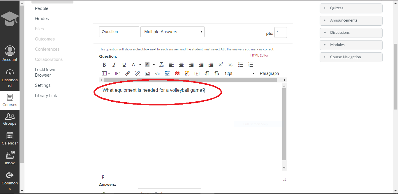
Select “+ NEW QUESTION” again. This time instead of selecting “Multiple Choice,” we are going to select “Multiple Answers.”


Note the warning above the text box. “This question will have a checkbox next to each answer and the student must select ALL the answers you mark as correct.”  Do not select this question type if you only have one correct answer in your question. For questions with only one correct answer, use “Multiple Choice.” For questions where you want the student to select more than one correct answer, use “Multiple Answer.”


Type your quiz question into the text box.


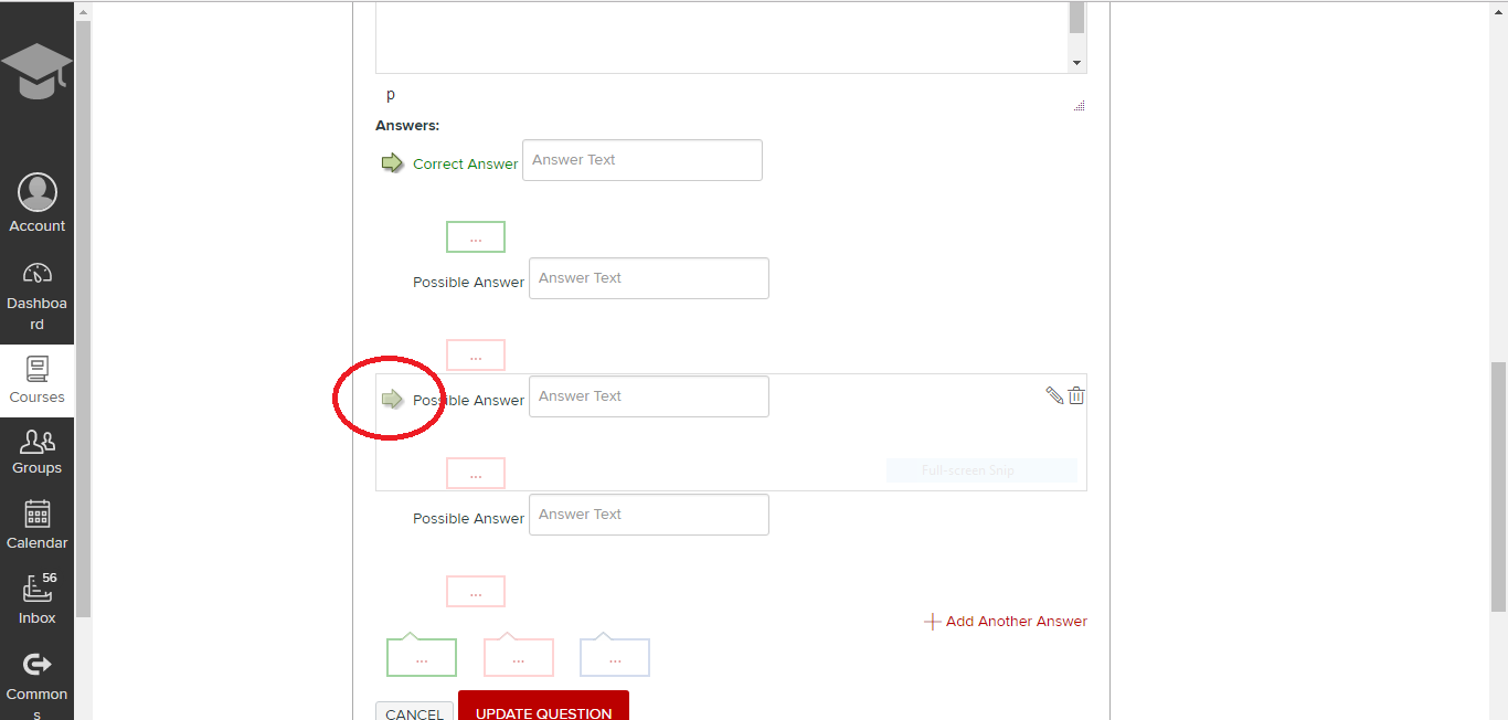
To turn a “Possible Answer” into a “Correct Answer,” click the arrow next to the answer. Notice if you were in a “Multiple Choice” question, the “Correct Answer” would simply move to that question row. You cannot have more than one correct answer in “Multiple Choice.”


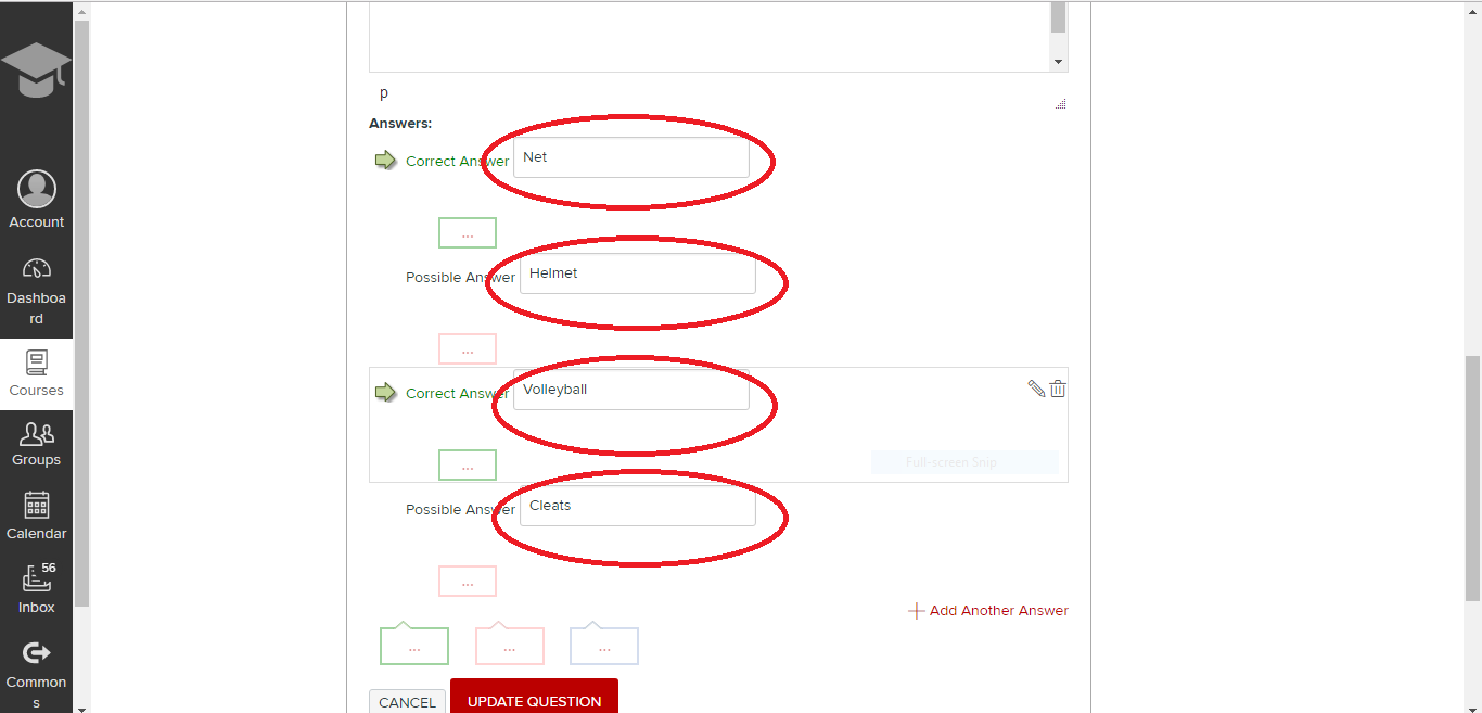
Type in your possible answers into the text boxes. Notice since a net and volleyball are both needed for a volleyball game, both answers are marked as correct.


Select “UPDATE QUESTION.”


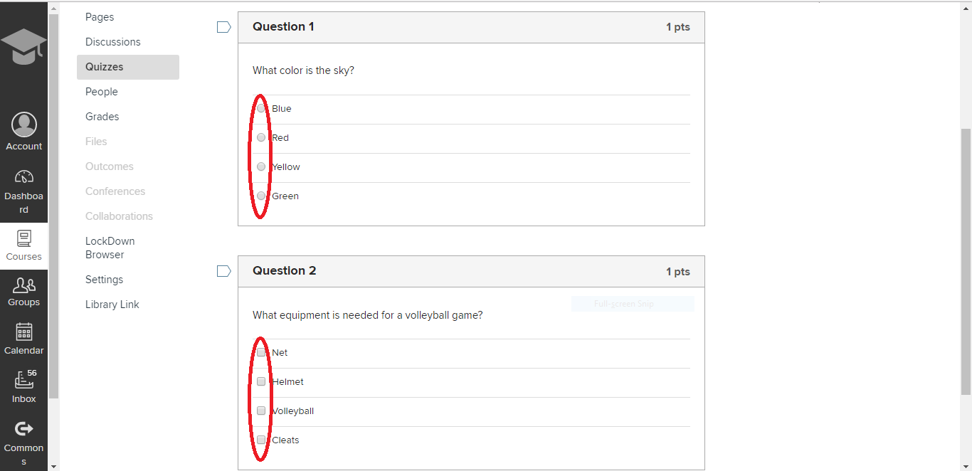
This is what the quiz questions will look like from the student perspective. Notice “Multiple Choice” questions have circles (also called radio buttons) next to the answers while “Multiple Answer” questions have squares (also called checkboxes).

If a student sees a question with squares (checkboxes) by the answers, they will assume more than one answer choice is possibly correct and can choose more than one answer. This circle and square convention holds true across quizzes and survey created in many different applications, including Qualtrics, SurveyMonkey, and the NCLEX.  This is why it is important to only use “Multiple Answer” questions on your quizzes if you want the student to believe that more than one answer may be correct.


Notice “Multiple Choice” questions will only allow the student to select one answer while “Multiple Answer” questions will allow the student to select several answers.

Embedding VoiceThread Videos into a Page/Post

This post will walk you through the steps to embed a video on a webpage.  The images here show how to embed a VoiceThread video into a u.osu.edu webpage, but the same basic instructions can be used to embed videos into your Carmen classroom pages as well.

After you have created a video in VoiceThread, click on the “menu” button to the top left and click “Share”

In the “Share” menu, click on “Embed”

Click to copy the embed code, and be sure to check the boxes if you want others to be able to view and/or comment on your video:

Now, after logging into u.osu.edu and going to the site you want to embed your video into, click on the title of the page or post where you want the video to go (or, create a new page or post)
In the “edit” screen, click “Add Media”

When the menu opens, click on “Insert Embed Code”

Now press “ctrl + v” or right click and click “paste” to paste the embed code into the box, and click “Insert Into Post”:

Now your video is embedded in the page. Be sure to “Update” or “Publish” your page to save your changes!


If you want to embed a video in a Carmen page, click on the “HTML editor” button and then paste the embed code into the page:

Add Recent Announcements to your Carmen (Canvas) Homepage

If you’ve ever thought that your students might not be getting all of your course communications by email or through Carmen (Canvas) announcements, try this clever idea (and best practice) from Hollie Moots.  Consistent class communication will improve, and questions directed to your email inbox will decrease.  Take 2.5 minutes to learn more from Hollie in her demonstration video (below).

Accessing older CarmenCanvas courses

If you are on the Carmen landing page and are trying to access older courses, here’s a simple trick to make them show up.

Click on the “Load More Courses” button on the right side under Filter.

Load More Courses

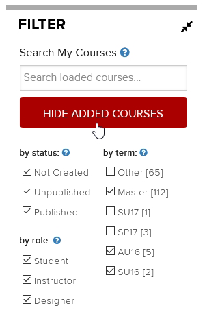
Now you’ll see more courses. In this example, the list now includes SU16 and AU16. The search feature will also find your older courses from those semesters.

Hide Added Courses
To go back to viewing more recent courses, click on the same button (which now says “Hide Added Courses”).