In order to begin this project I had to become familiar with the game of chess. I researched strategies, the general rules, why the the pieces are shaped the way they are, and how each individual piece moves.
Summary of research
I looked online for ideas on how to possibly construct some of my forms.
We got to a point during our research stage where we struggled to pair the Heaven vs. Hell theme with the chess piece roles, so we made it easier on ourselves and changed our narrative to fit cowboys vs. aliens.
Cowboy vs alien roles
I started working on the cowboy side and create a chart to organize my thoughts and design ideas.
Mars iterations
Iteration 1: I used a 2-inch circle as the center piece and went down a half an inch for the rest.
Iteration 2: I tried to do the same idea as my first iteration but changed the sizing
Cowboy Iterations
Iteration 1: I used different sized ovals to form the torso of the cowboy while leaving the top and bottom flat.
Iteration 2: I continued to focus on the torso but constructed it from the side view.
Iteration 3: I didn’t know how to connect the top and bottom of him so I used the full body silhouette and used only one slice joint
Cowboy hat iterations
Iteration 1: I used different sized circles to create the shape of a hat but it looked more like a cake.
Iteration 2: I then focused on the front view of a hat and scaled them down to make it 3D but the side wasn’t distinguishable.
Iteration 3: I looked at the shape of a hat from the side and front view but added the rim of the hat as a separate piece.
Horse iterations
Iteration 1: I used the horses silhouette as the middle layer and used the body shape on both sides.
Iteration 2: I added a tail and mane to the middle shape for more detail but I didn’t like how the front and top view looked.
Gun Iterations
Iteration 1: I wanted to make the revolver of the gun connected the front and back piece while also layering the back to make it extrude.
Iteration 2: I used the same idea but used one layer for each piece while adding detail to the front of the gun.
Cactus Iterations
Iteration 1: I wanted to intersect the two forms together to give it a 3D effect but it was too big.
Iteration 2: Our initial plan was to use wood so I cut the shape out using the laser cutter.
Iteration 3: I switched to using card-stock and cut this out to see if the size was good.
Concept Statement
My overall goal for this project was to redesign traditional game pieces in chess to fit the narrative of Cowboys vs Aliens, while still using the original rules, mechanics, and goals of the game. After researching and studying the history of chess, my partner and I worked together to pair the roles of the original game pieces with our theme. We specifically chose to use the clear board because the “battle” takes place on the moon. Each side is fighting to take back their home planet, Mars, the cowboys king, and earth, the aliens king. I focused on designing the cowboy side while keeping the original roles in mind. For my pawns I chose to use cacti because they are a defense mechanism. For my rooks I designed a pistol gun which protects the higher class pieces. Like the original knight in chess, I chose a horse which cowboys ride. For the bishop I chose a cowboy hat which protects cowboys from different elements and is a very important item to the queen and king. For the queen I have a cowboy because it controls a lot of the board and is the most important piece. For our materials, we used cardstock and layered the paper to create stability. My partner and I both focused on color and shape as our main design elements. To bring more emphasis to the opposing sides, I have my pieces as orange to give them a western feel and hers as green to fit alien colors. To harmonize each piece, we focused on the contours of each shape to create a 3D form using slip joints. Overall, each piece has its own story that comes together to create a narrative that relates to a traditional chess game.
Production
After many iterations of each piece, I finally finished designing each of the files and began constructing the final chess pieces.
To give each piece a stable base and an accurate height, I made 2 inch rectangles and adjusted the height depending on the piece.
King/Mars
File
Constructed
Final
Queen/Cowboy
File
Contructed
Final
Bishop/Cowboy hat
File
Constructed
Final
Knight/Horse
File
Constructed
Final
Rook/Pistol Gun
File
Constructed
Final
Pawn/Cactus
File
Constructed
Final
Final Chess Pieces
My favorite part about this project was getting to learn about how the game of chess works and its history, then taking that information to create and redesign a whole new narrative. Considering that I had never played chess before, I caught onto the rules and roles of the pieces pretty fast. I felt comfortable with my ideas and did a lot of research in order to start the iteration process. My initial plan was to use the laser cutter to cut my designs out of the balsa wood sheets I purchased. However, late in the iteration stage I hit an obstacle with the laser cutter due to its availability and had to switch to paper. I had to redesign all of my laser cutter files to work with the card-stock and had to figure out how to make the pieces sturdy. I used the Cricut to cut out my final pieces but the paper kept tearing and I faced additional challenges with the few resources available. I was able to come up with a plan and executed what I could in the time that I had. In the end I wasn’t happy with the sizing and craftsmanship of my work but felt that my concept could’ve been fine tuned if I had been able to redo everything in the proper proportions that I imagined.
I began this project by researching what a gift is and what it fully means. I then used that information to make a list of questions to ask my mentor to get to know her a little better.
Collected research
First simple list of questions I asked her.
Using her responses I began listing a few ideas that I could possibly do.
I made a new list of questions to expand on my ideas.
Once I had an idea of what I wanted to make for her, I created a Pinterest board for inspiration for the container and the gift itself.
Some photos from the Pinterest board.
Paula Scher is a designer that my mentor looks up to, so I made a list of quotes to choose from to incorporate in my gift.
#1: The best gift I ever received was getting the chance to go to Israel. It was special to me because I got to see first hand how my culture helped shape my family heritage. Both my grandparents and my parents have been, so getting the opportunity to go experience the places they went to was meaningful to me. It also taught me a lot about my culture, how different life is there, and so many other things. While being there I hiked the same mountain as my ancestors did, visited historical places, and even brought back gifts for those who made this trip possible for myself. I hope to go back one day and visit the same places with people I love. Overall it was a trip I will remember for a lifetime and places I will never forget that made it the best gift ever.
#2: The best gift I have ever received was a camera from my grandparents that I got as a graduation gift. It was special to me because I got the chance to go pick out the one I wanted with my grandpa. They wanted it to be perfect, so I did as much research as I could on cameras so we wouldn’t run into any problems. It was especially special to them because they knew it was something that I have wanted and it’s something that makes me happy. I love using it to capture moments, whether that’s when I am with my friends/family, traveling, or just walking around. I take the footage and make one big video to share with others and it puts a smile on my grandparents faces.
Exercise 2: Container
For this assignment we were told to design a container for an object of our choice. Georgia, my partner from assignment 2, and I came up with the idea to make the container a bath tub for the rubber duck. The bathtub was our very first thought because that is where the rubber ducks are usually found. When you open the shower curtain it reveals the duck as well as the quote “wash away your troubles with some bubbles.” This assignment helped me think about unique ways to package a gift.
Iterations
Once I chose the design quote I wanted to incorporate in my gift, I began categorizing my ideas for the container and gift itself.
Explanation of the quote I chose that also happened to be from her favorite designer.
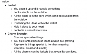
I knew I wanted the gift to be some sort of locket/bracelet because that is one of the favorite gifts she has received.
I then wrote out ideas that I took from her responses to help me figure out how I wanted to contain the lockets.
After collecting the information she told me, I decided I wanted to do some sort of time capsule/memory box. Inside the container would be envelopes that would hold charms based on the category which she would add to the charm bracelet when the time came.
In illustrator I drew a hydro flask and a camera which were the two containers that I was choosing from.
I then took the responses she gave me from the second list of questions and categorized them into sentences. Each one was in a section and started with “open when…”
I sketched out the ideas to organize my thoughts so I could start constructing.
She gave me her favorite color palette which I then paired with the category of the envelopes.
As I started trying to collect the materials that I needed for this project, I noticed I was moving away from the design quote I was incorporating. The gift itself was starting to get complicated and not logical.
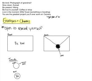
I narrowed the list down to 6 envelopes which would have a charm in each one. On the front would be a statement she said and the charm would be designed with something she likes.
After talking with some classmates and my TA they told me that I was still making it too complicated. I realized I had to follow the words of my quote so I chose to only do 3 envelopes. She told me she was into self development books, so I found a quote that related to a gift and paired it with things she told me.
Container Iterations
Iteration #1: My first idea was to have the envelopes be stored inside the camera like a filing cabinet. So I designed the top of the camera to come off like a lid and reveal the gift inside.
I designed the lens to move like an actual camera.
Iteration #2: I decided I wanted the camera to open like an actual camera and have the envelopes be like film. So to practice I used the template I found online and then cut out the monitor window.
Envelope Iterations
I researched different ways to make unique envelopes to store the pendants in and tested out different proportions.
I ended up doing the basic envelope style with proportions that would fit in and out of the camera container.
Since I had never used resin before I didn’t know what I was doing. I waited 48 hours and the resin never dried because I forgot to mix in the hardener with it.
I tested out the paint pen on the fabric to make sure I liked how it looked.
Concept Statement
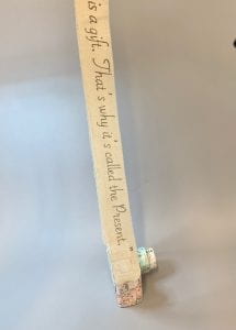
My overall goal for this assignment was to design a gift for Sarah Torchia, who is in visual communication design. The gift was intended to highlight an idea that I have come to understand as fundamental about design while also creating a gift based on the information she gave me. My inspiration for my gift came from the quote “keep it simple, make it smart” which are the words of my mentor’s favorite designer, Paula Scher. For one of the very first projects in fundamentals, I wrote in the process post how I learned when starting a design, it would be better to start simple and not make it so complicated. I realized through my projects that if I keep it simple from the beginning, it’s easier to perfect that and make changes through each iteration along the way. For the container, I chose to make it a camera because she was introduced to VC through a digital art class in high school and it’s something she loves to do. Sarah is very passionate about living life and embracing moments as well as self growth/sentimental objects. The best gift she ever received was a piece of jewelry from her grandma because it’s something she will always have to remember about her. I decided to use that information and combine it with a separate quote that says “Yesterday is history, Tomorrow is a mystery, today is a gift. That’s why it’s called the Present.” I paired the words “yesterday”, “present”, and “tomorrow” with words that she lives by/images from her social media which gave the gift a purpose, meaning, and an experience for my recipient. I was designing my gift and making it smart with the information she gave me and then throughout my iterations made it simpler. The gift as a whole is something that she can continue to add memories to and share with others in the future which is what design is all about.
Production
Materials Used
I used Matte board for the entire structure of the camera.
Thickness
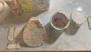
I bought map wrapping paper from world market to mod podge on the whole camera.
Map unrolled
Camera Base
step 1: I used this template I found online as an outline for the top and bottom piece.
Top and bottom pieces.
step 2: I made my own measurements for the body of the camera based on how tall I wanted it to be.
Step 3: I molded the rectangles to make the shape of the top and connected it with hot glue.
Step 4: I took the wrapping paper and mod podged it to the walls of the inside.
Step 5: I drew the outline on the outside of the camera, where I wanted to cut it
Step 6: Taking the bottom piece, I hot glued it to the rest of the camera.
Step 7: I mod podged the entire camera
top
bottom
Step 8: I finished mod podging the inside of the camera.
Step 9: I used the template to cut out the shape of the view finder to fit the camera.
Step 10: I covered it with my material.
Step 11: I cut out the details of the camera to add on top.
Step 12: I covered it with the material.
All pieces covered
Step 13: I attached the buttons and view finder to the camera with hot glue.
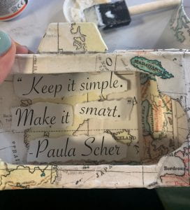
Design quote
Step 14: I separated the quote and glued it to the inside walls of the camera.
Step 15: I covered the monitor window with the material.
Other side.
Step 16: I took the hinge and hot glued it to the outside of the camera.
Step 17: I attached the other side to the inside part of the monitor window.
Step 18: To make it look cleaner, I covered the part of the hinge that was showing with the material.
Camera Lens
Step 1: I cut out two 1 1/2- inch circles and two 1-inch circles.
Reference
Step 2: Using my camera lens as a reference, I cut out a 1 1/2 inch wide barrel and a 1 1/4-inch wide barrel.
Step 3: I hot glued the barrels to the circles to make two different sized lens.
Step 4: I cut out a 1-inch circle out of the large lens to allow the smaller lens to fit inside.
Step 5: I took my material and wrapped the inside and outside of the lens.
Step 6: I decided to incorporate the logo I found on her design page and add it to the front part of the lens.
Attached
Step 7: I added arrows to indicate that you turn the lens which holds the chain bracelet inside.
Envelopes
Step 1: I bought the first three colors from her favorite color palette for the envelopes.
Step 2: I made a 4×2 inch rectangle that fits perfectly inside the camera.
Step 3: I folded each one to create a template.
Step 4: I took the three triangles and attached them to create the form of the envelope.
Step 5: Using the same font as the quote, I freehanded “yesterday” “present” and “tomorrow” with pencil on the front.
Step 6: I took the same paint pen and wrote over the pencil lines.
Step 7: I wrote the statements that I paired with the word on the inside flap of the envelopes.
Step 8: I took these wax sticks to seal the envelopes.
Step 9: Using a lighter I dropped the wax onto the envelope.
Step 10: Because I didn’t have a mold to create a design to press down on the wax I used a cap.
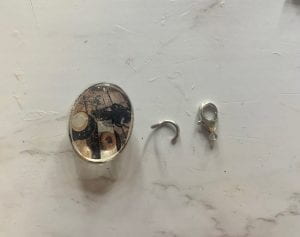
Lockets
For the pendants I took images from her social media and printed them out to put inside the resin.
Yesterday
Present
Tomorrow
Step 1: I mixed even amounts of resin and hardener together.
Step 2: I cut out the images to fit in the molds that I bought and poured the mixture before and after I placed the image inside.
Step 3: After 48 hours I popped the pendants out of the molds and filed them down.
Step 4: Using a push pin I poked a hole from the front to the back.
Step 5: I separated the jump ring so it would slide through the hole.
Step 6: I looped the jump ring through the pendant.
Step 7: I repeated the same steps for the other two and attached the clasp through the hook and closed it.
Neck Strap
Quote
Step 1: I cut the paper and put the fabric on top and traced it over with pencil.
Before marker
Step 2: I went over what I traced and filled it in with gold marker.
Step 3: I cut out two 2×1 inch loops and cut a slit for the strap to weave through.
Step 4: After measuring the strap to be even I hot glued the fabric to the back.
Front view and loops covered in the material.
Step 5: I then hot glued the loops on opposite end of the side of the camera.
Final Gift
Sarah and the gift
Overall this was one of my favorite projects this semester. When I first started, I was thinking too much about just a gift. When I connected with my mentor, and thought about how I like receiving thoughtful gifts, it became so much easier to create. I got a little lost in the moments and had fun making the experience special when she received my gift. But when I went back to her quote, it made me excited how everything connected. I asked for advice when starting this project and she told me to use a material that I am unfamiliar with. I wanted to get out of my comfort zone so I chose to use resin because its something that I have always wanted to try. Although I messed up the first time, which was my fault since I didn’t read the instructions, the final outcome was one that I was happy with.
In this exercise, I worked with my table to design a form that communicates fluidity, dynamism, and power which has safety as its priority.
We took the ideas from the left and the right sketches and combined them to create the middle design.
What the design elements represent.
Iterations
In order to start the construction process, we developed a more detailed outline.
My partner and I worked together to make a narrative framework to help with our design intention.
Based on that narrative, I began sketching out my own composition on procreate.
Sweatshirt Iterations
My initial plan was to make a sweatshirt using this template.
Using this fabric as a prototype, I pinned the pieces to a sweatshirt.
After the whole process of pinning it, I realized it would be easier to just sew my fabric onto a sweatshirt rather than going off a template.
Back side
Glasses Iterations
I cut through the glasses to make it into two pieces.
To cover the edge of the glasses, I used these holographic bags.
Rather than gluing them down, I tried to blow dry the material to warp onto the glasses.
The blow dryer cause the material to fade and did not stick.
Mask Iterations
I cut this fabric to just use the holographic strips.
My initial plan was to use a disposable mask but I didn’t like how it fit.
Concept Statement
My overall goal for this project is to design and construct a volumetric form that communicates a thematic narrative based on a pandemic of my choice. I collaboratively worked with my partner to create a framework and a design intention to begin our process. Our concept is based on a pandemic from the year 4191, which is the reverse order of when tear gas was first used in 1914 during World War 1. It is called Lacrima Larva, which stands for “tear mask” in latin. We both created our own composition that protects the world from tear gas that is being released through sewers and vents by the government. However, my partner’s design is a mask that is mandated by the government which secretly tracks you, while mine is made to protect and hide from government surveillance. Although we have the same concept, our compositions are very contrasting when they are side by side. My composition is made of three parts; a mask that protects you from inhaling tear gas, safety goggles that magnetize together to protect your eyes, and a hoodie that hides the rest of your face, all covered with holographic material. I chose to use holographic materials because it interferes with light and reflects back at you. However, I used a variety of different holographic materials to emphasize the sense of touch for each piece. With the use of color and shape, I created a harmonious, three-dimensional form that protects you from tear gas and the government.
Production
Sweatshirt Construction
I took an old sweatshirt and cropped it to use as a base.
I then took this holographic bag to sew onto the sweatshirt.
Beginning with the front, I sewed the material on with white thread.
Once I finished with the front and the back, I sewed the hood using two different pieces.
I cut off the top part of the bag and sewed it onto the end of the sweatshirt.
Then I laced the string back through so it can tie around your arms.
Glasses Construction
I used sandpaper to smooth the edges that were cut.
Once they were smooth, I was able to super glue the magnets to both ends so they would attach evenly.
In order to clean up the edges, I took the same material as the mask and aligned it to wrap around.
Both pieces finished
Mask Construction
Base of the mask
I used the holographic strips and I sewed them all along the mask.
After sewed on.
To clean up the edges, I used the extra fabric from the hoodie and aligned it along the edge.
To have the glasses dangle, I use the string from a disposable mask.
I used those strings and tied them around the mask and the glasses.
Overall, I really enjoyed how open-ended and creative this project was from the start. Now that we have been in a pandemic for a couple of years, it’s been interesting to see how our protections evolved. I used my own experiences and applied some of those ideas to begin my design process. However, once I got to the brainstorming stage, I got caught up in my ideas and had to sacrifice some of my craft. But in the end, it was fun to come up with my own concept and create a three-dimensional form for a pandemic that no one will ever experience.
To begin this project, my partner and I researched genres of music that we found interesting.
We looked at the instrumental soundtrack from the TV show, Euphoria. After listening to a few, we both chose different 5 second portions from the song, “Still Don’t Know My Name.”
Individually, we both listed feelings that we get from listening to the song, as well as elements and principles we would want to use to illustrate that feeling.
I researched a few words to develop a better idea for my design intention.
>Exercises/Activities
In this exercise, I explored how to make different types of paper mechanisms. I researched videos that were focused on pop up books and others that were more focused on pull tabs.
My overall goal for this project is to use stop-motion animation and paper construction elements to emphasize the principle movement. After my partner and I collaboratively chose a song, we chose different five second portions that both correlate with the idea of disruption. Since the project is meant to be abstract, I am using different shapes and colors to communicate a crowded yet powerful composition. My main objective is to visually illustrate this narrative by using the principles; scale, repetition, and balance along with the element of contrast. I split the song into sections to communicate the feeling I get from each part. The beginning of the song feels packed and crammed which is why I chose to make the squares and triangles pointy as they move inward, leaving no space. The circle gets larger as it absorbs more shapes as well as turns into a darker shade of purple. Once the beat drops, the circle continues to get larger, representing that it’s gaining more power, however, the edges of the shapes burst out and are now rounded making the composition feel whole.
Production
Illustrator
Before filming my final stop-motion video, I continued to use illustrator as a guide for each frame. I decided to manipulate the shapes, making them pointy in the first half and then rounded after the beat drop.
Recording
Using the app, Stop Motion, I was able to film my whole video in a few simple steps. The app put all the frames together and had a guide on the screen to show you where you left off.
Value scale for my composition.
Using the cricut, I cut out my squares and triangles and placed them in different bowls based on their size.
Value and scale of the circles.
The guide on the app would show the frames that were recorded before to help with aligning.
All pieces used in video.
In the studio, I used a phone mount and a ring light to record my final video.
In app I went through each frame and adjusted the lighting.
I clicked on each frame and adjusted the brightness and contrast to match with the rest of the frames.
After
Before Editing
After Editing
Final Stop-Motion Video
This project introduced me to a new type of media that can be used to communicate a narrative. At the beginning of this project, I was having a hard time taking the feeling I get from my song and illustrating it in an abstract form. This project was very much based on a concept. I found that there was a lack of communication between my partner and I which made our compositions in-cohesive. This made developing my concept harder and very late in my process. I designed a lot of iterations that were focused more on the beat of the song rather than the emotion. It was a way of thinking that I wasn’t used to but once I broke the song up into sections, I created a animation that illustrated a crowded composition to a powerful one.
This exercise taught me how to hide images within a form by using positive and negative spaces. I began by making a list of things that I like which helped me explore further into the shape. Using my middle initial, R, I created a scenery of the beach which is a place I love to be at.
After exploring all of my options, I chose to do nostalgic points within St. Louis as my main scenery areas.
In Notability, I jotted down notes and did a ruff sketch of one idea that came to mind.
Taking that sketch, I used Procreate to make a better outline of the points I wanted to incorporate.
In illustrator, I explored different ways to communicate the city of St. Louis while still using the same elements.
I chose 5 different spots that were meaningful to me as well as spots that I thought would communicate St. Louis the best.
St. Louis is well known for a frozen custard stand called Ted Drewes. I thought it was unique to put the layers in the ice cream cup to look like ice cream.
In 2019 our hockey team, The Blues, won the Stanley cup. I took the elements and placed them inside the cup as a different way to illustrate St. Louis.
I chose to go with the Ted Drewes ice cream cup as my main element and began changing the arrangement of layers.
To make the composition look more like ice cream, I added a spoon in the farthermost layer.
I felt like it didn’t communicate a spoon very well so I added two and flipped it over so you could see the bottom.
I didn’t like how it looked with two, so removed one and adjusted it.
I changed my value scale to have black as the background to make the layers stand out more.
Concept Statement
My goal for this project was to communicate space by layering components to create a sense of depth. I wanted each image to have a background, middle ground, and foreground so I could experiment with different perspectives. By researching images based on a specific theme in mind, I was able to narrow down my ideas. My intention was to compose a space that I connected to and that I can visualize the best. This would allow me to give meaning behind the placement of the elements in my composition. Using points throughout St.Louis that are nostalgic created a variety of elements to explore. Having the layers overlap one another and selecting a certain value scale, helped bring emphasis to the little details. These little details are outlines that are significant to what area I am communicating within St. Louis. From the start of the project, it was important to me that each layer would stand out on its own, which I did by having each one lower than the one behind it. I was able to bring the whole composition together by placing the Ted Drewes ice cream cone on top of the layers, while also having the layers look like ice cream.
Production
Page selections
I selected 7 different shades of grey from my card-stock for each layer of my composition.
The maximum size we could use for this assignment was 10×10, so I took my 12×12 card stock and measured it out to be 10×10.
10×10 inch cardstock
Setting up vector files
Once I had my final vector file ready, I created the outline version to transfer over to the cricut.
When transferred over, I re-colored the layers to help visualize which layer to cut first.
The blade of the cricut didn’t fully cut through the card stock for some of the layers so I had to take my exacto knife and carefully cut it out by hand.
The Arch
On this layer the spoon was fully cut out except the inside parts of the Ferris wheel were not.
Union Station
The Budweiser layer was the one I expected to be the hardest to cut out from the start.
Because the letters are so thin and small the blade didn’t cut the words as a whole.
However, I saved the pieces that broke off and was able to glue it back on once I put all the layers together. Rather than having two cardinals above the words, I chose to make one the dot of the “i”.
I glued each layer one by one starting with the arch.
In this part I was able to glue back parts of the “r” and “e” that broke off of Budweiser.
For the final layer I had to make sure it was aligned to match up with the Ted Drewes detail behind it.
Finally, I tucked the thumb behind all the layers as well as a part of the middle finger. I felt like this made it feel more like it was being held.
Final Layering
Overall, I really enjoyed the freedom we had throughout this whole assignment. Starting from exercise 1 we were told to design a composition that communicated something about ourself which is something that I always have fun with. So I took that idea into my final composition by designing a space that I know the best and feel comfortable in. I was also introduced to the cricut which is a new tool that I adapted to fast and hope to use in future assignments. Although in the beginning I struggled with visualizing how the layers would be cut out physically, I was able to visualize it better once I looked at each layer by itself. The part that I wish I focused on the most was my construction but in the end, I am really happy with how my final composition came together.
In this exercise I explored unique ways to make a mini sketchbook. As a table group, we answered the question “What Are Your Favorites?” to practice mind mapping. I like things to be organized, so I designed it to be sections to put each category in. When you lift each tab it extends out, allowing more room to write in.
Front cover
First page
Pages opened
Iterations
Before I began testing, I drew out what I wanted each part of my sketchbook to look like.
I knew I wanted each section to be color coordinate so I wrote out what could go in each section.
I used string to define the page sections.
Front Cover Iterations
From the start of my research, I knew I wanted my cover to be black and white and to have color coming through the cut outs.
I used procreate to visualize what I wanted my front cover to look like.
I moved the title to the center to take up more room as well as aligned holes around the page to later thread string through.
Using material I found as a tester, I later learned that the holes around the edge were too close together.
Page Iterations
My initial idea was to use different values of color for each of the sections. However, I realized that it would be too difficult to bind them all together so I narrowed it down to 4 different colors.
Initial Idea
Simplified version
Connecting the the theme of the cover of my sketchbook, I wanted each colored section to have a cut out with a different shape. Although I didn’t have time to do alternating shapes, I was still able to cut out the star for each section.
Star
Heart
Moon
Production
Final Construction
Using the laser cutter, I cut out the title and used string to sew through the holes that were cut out.
Because the letters were cut out, I saved the pieces that make the letters a whole and glued them onto the next page.
Cover Binding
I measured out .25 mm marks to later connect the front, middle, and back cover.
Using a push pin, I poked holes on the marks.
I then took a needle to thread the three pieces together and made 1-inch marks going up for the binding of the pages.
Page Binding
On the inside of the pages, I made 3-1 inch marks on the top and bottom of the page.
Using the same colored thread as the cover, I wove the pages together the same way for each colored section.
Each colored section has a certain material bind to the Bristol.
Tracing paper
Grid paper
Black card-stock for white crayon or chalk
Dry erase board
Colored Sections
I transferred the star I traced onto black card stock as a stencil for the rest of the pages.
Once outlined I took a ruler and cut it out with the exacto knife.
Using masking tape, I connect the two pieces of colored paper together.
Element of surprise
Using the grid paper, I drew each letter for the stitching.
Final outcome
Final Sketchbook
I really had fun with this project because I was able to create a sketchbook that I personally would use. By thinking through the materials I liked and keeping the sections simple with the use of color, the sketchbook began to reflect my personality and was functional at the same time. Once I created the the format, I also enjoyed adding details that were interactive and added an element of surprise. I was challenged with timing on using the laser cutter for some elements of the scrapbook but I was able to trouble shoot and still cut out straight shapes. I created the cover first and once I used it and saw what it could do, I had additional ideas to enhance my book.
The exercise for this assignment was to find a text that represented our personality and transform it into a 3D isometric illustration.
I wanted to use a font that would be easy to use but had some personality.
I uploaded a grid to photoshop that helped me create the isometric effect.
I imported the type into illustrator to create the extruding effect using the pen tool. I used the values of complimentary colors pink and green because I like bright and fun colors.
Iterations
I chose the word heepy because I had the most ideas that could illustrate the words hug and sleepy. Using the techniques from exercise one, I began sketching out different ways to communicate my new word.
Idea 1
Idea 2
Idea 3
Once I did the sketches, I created a font that felt soft and rounded to better support my word.
Step 1: I used a grid to create my font.
Step 2: Using step 1 as a reference, I converted the same grid in an isometric view.
Step 3: I extruded the text.
Manipulating the text
I used the H to represent two people hugging.
The hug looked a bit awkward, so I added detail to the eyes and simplified the hands.
The eyes were frightening so I researched cartoon eyes.
I applied my ideas to the rest of the letters based on my sketches.
I focused a lot of my attention on each individual letter, trying to add personality while still communicating the meaning of the word.
Manipulating the background
I had an idea that I thought would work but then when I started creating it my illustrating skills needed improvement and was something that I would like to explore in the future. It was taking too much focus away from my main objective and I was getting frustrated.
Iteration 1
Iteration 2
Iteration 3
Production
Final construction detail
After researching, I chose to simplify it and create a bedroom in isometric while also including hands as the hug element.
I took the “z’s” and tried to create some visual movement to the laytout.
I deleted the stars from a previous iteration but wanted to incorporate them into my final design.
Final Poster
I really enjoyed the process of coming up with my own word. It was fun to get creative with the brainstorming and coming up with ways to visually bring the word to life. After going through this whole process I learned that planning and sketching out all my ideas before working in illustrator is an important step in the design process. I was excited to animate my words and spent a lot of my effort on that, however if I had planned the room out more in the beginning stages, I would’ve had added more details than I have now. I focused a lot of time on trying to illustrate little details like the hands and definitely need to learn how to draw body parts. In the future I would like to improve on the way I process my ideas before I start working on the final product.
I began this project by collecting 20 images (10 man-made/10 human-made) and analyzed each form by using my line drawing techniques and digital skills.
I was having a hard time communicating visual rhythm in my composition so I did research for inspiration.
Rhythm in design is using a repetition of patterns and evenly spaced/angles lines. Having variety between the spacing of lines will create a flowing rhythm as well as suggest a movement for the eye to follow.
Analogous: color schemes are color combinations made up of those that are next to each other on the color wheel. These create a visually pleasing and calming design.
Split Complimentary: compromised of two colors that are opposite one another on the color wheel as well as immediately next to them. These create a good contrast and balance between different colors.
I used rhythm as my compositional principle by combining my umbrella and ocean wave abstractions. By using the basic shape of the forms, I was able to construct them together to enhance movement.
I began repeating the forms by flipping them vertically and horizontally because I felt the waves together were visually appealing.
After our small group discussion, I revised my design by adding value to both the wave and umbrella which made the movement in my pattern enhanced.
Iterations
Mandala and Grey Scale Iterations
To start my final mandala composition, I experimented with the radial, grid, and mirror tool to create different templates in illustrator.
Template #1
Template #2
Template #3
Template #4 and the one I selected to test my abstractions.
Once I chose my final template, I began combining my natural and synthetic abstractions that would create visual rhythm.
Using the lock as my focal point, I started arranging my elements using repetition to create flow.
To create interest, I added lines that were abstracted from the ferris wheel. After looking at it, I found them to be distracting.
As a solution, I added color to see if that would help make my abstractions pop out.
After many variations with the background to bring more unity to my composition, I felt the design as a whole was too static.
The more I manipulated the design, I was drifting away from my main principle being rhythm. While using the same ideas from my first mandala draft, I was able to create a more rhythmic design by doing additional research and experimenting with visual rhythm.
To start my new design I used the wave pattern I created in exercise one. Once I shaped them in a circle I liked the shapes that were formed.
Continuing the idea from my original draft, I used the four leaf clover to create depth. I did this by manipulating the size and value of the abstraction.
I focused on repetition as my element of rhythm by repeating the waves and clovers in the center to show more movement.
Once I had completed the main structure of my design, I experimented with line weight and grey scale value.
Color Iterations
Using my grey scale value, I experimented with different translations by using related color application. Since my values of grey are very similar, I chose to use an analogous color scheme for my first color iteration.
I used blue because it represented the color of ocean waves.
Although these shades are appealing, I felt it was too bland for my application.
These shades of blue translated with too much grey and didn’t feel it would be visually impactful.
I chose to use a split complimentary color scheme for my second color iteration because it created more contrast in my design while also creating a sense of harmony.
I liked the balance of the blues and purples with the pop of orange.
This palette has too much green and didn’t like how the colors worked together
Although i liked these colors, they did not work well with my design.
Production
I was happy with how my final mandala design evolved but I changed some minor details to make it feel complete.
I added butterflies flying around the outside of my mandala to add visual interest.
To make the design feel complete, I shaded in the triangles to create additional movement.
The different values in the trangles wasn’t necessary so I decided to keep them consistent.
After the group discussions I received positive feedback that helped revise my final piece. I used illustrator to soften the hard edges where the triangles and the waves met. Below is the grey scale example of where I show a close up. I went back in and darkened the center of the waves to give it more depth as well as lightened up the center.
Final Design
Each composition creates a different feeling when placed side by side. This project taught me a lot about the process of getting to the best solution for my goals. That sometimes that a design that I like may look good but doesn’t always meet the initial goal. The more I experiment in these projects, I am learning to continually remind myself of the objectives for the assignment.
I’ve enjoyed learning new tools and techniques in illustrator that have made the design process easier. Although I’ve used illustrator in the past for basic ideas, I never knew all the shortcuts I could use to manipulate my designs.
We began this assignment by reading chapters from the book Slow Looking: The Art and Practice of Learning Through Observation by Shari Tishman.
We practiced the different types that we read about by observing spots throughout Hayes Hall.
We observed different styled maps and their differences.
I chose my final destination as the overlook of Mirror Lake.
I used the slow looking techniques as I walked to my destination.
I began to research the area to get a better understanding of it as a whole.
I used the information that I gathered to create a brochure for others to interpret.
Using magazines and other materials, I explored different ways to communicate the exploration.
>Exercises/Activities
Exercise 1: Written Directions
Specific Directions: Start at the entrance of Hayes Hall and walk directly straight on the path that leads to the first red circle. From there, turn right and stop at the center of the oval to look around at all of the buildings. Next you are going to want to continue forward and observe the William Oxley Thompson Statue that is in front of the Thompson Library. When facing the library, turn around so you are looking at the path that you just came from and walk straight until you reach the third path on your right. Now you will want to keep walking on that path until you see the path split on the right that goes between the Mendenhall Laboratory (on the left) and the Orton Geological Museum Building (on the right). Take that path and it will lead you to South Oval Dr. and you will want to walk on the left of the building which will lead you to Hagerty Drive. Across that road should be two sidewalks that you can take, choose the one on the right side and that will lead you to the center of the south oval that has a tree in the center. With the Museum behind you, take the path on the right and walk directly straight and you will now approach the Browning Amphitheater that has many features to admire. After you get a good like, continue to your right down the few steps and in front of you will be Mirror Lake. Take a right and go around the lake which will finally lead you to the destination, lake stone grotto. From here you can see the Amphitheater on the right, Pomerene Hall right ahead, Campbell Hall on your right, and so many amazing features of the lake.
Creative Description:I wander across the paved path in front of Hayes hall, with the crisp morning air surrounding me. Ahead is a web that connects the different thoughts of each student. To my right is the path left empty, escaping the chaos. I make my way towards the center of the oval that is filled with life and happiness. The sun begins to shine brighter reflecting off of the William Oxley Thompson Statue that I will soon begin approaching. I begin feeling lifted by the leaves falling and the smell of fall around the corner. I turn back towards the center of the oval as the cool wind blows my hair. Each building provides its own purpose, as I focus on one, the Orton Geological Museum Building. Behind it is a tree which leaves me with curiosity. Around this tree is darkened by the shade and seems left untouched. I see a glowing entrance to my right which is provided with life. I approach the Browning Amphitheater where students are working and it feels like more of a reality. Down the stairs is a path that leads me to my destination that allows me to take in all of my thoughts without the worries of others. Lake stone grotto overlooks views that allow you to use your imagination.
Exercise 2: Pictures
Starting Point – Hayes Hall
Point 1 – Center Oval
Point 2 – William Oxley Thompson Statue
Point 3 – Tree in South Oval
Point 4 – Browning Amphitheater
Final Destination – Overlook of Mirror Lake
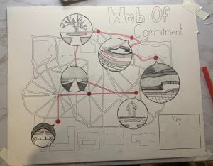
My overall idea for my journey was to point out parts that I visited when I decided to commit to OSU.
Starting Point: Hayes Hall was the first academic building that I wanted to see because of the Foundations Program.
Point 1: The Oval is where I got to see a lot of the student life as everyone crossed my path.
Point 2: On my way to see the library I stopped at The William Oxley Thompson Statue.
Point 3: Students had a stand by this tree in the south oval about Buckeyethon which was something I was really involved with in high school.
Point 4: I found the Browning Amphitheater very peaceful and unique.
Final Destination: The overlook of Mirror Lake is the spot that my mom made me take a photo in front of and is when I decided to commit to OSU.
Iterations
I began experimenting digitally and inserted the general area of my map from google into procreate using the guided grid.
To create the outline, I traced over the lines and buildings as I began incorporating my ideas.
Using the grid, I translated my digital version onto tracing paper.
Once on tracing paper I used the light table to put the final outline on bristol.
Production
By referencing the images that I took, I began to draw the magnified points in the bubbles.
I chose the color red to show my path because of ohio state and it symbolizes celebration.
I continued the color red within each bubble to communicate that journey.
The bubbles are where I utilized line weight, value, and texture (non-visual sense) to make them stand out.
I added the last few details and filled in the circles to make it bold.
Final Map
Throughout this project I was able to gain a better understanding of what it means to communicate through design. Learning different techniques through slow looking allowed me to interpret those senses within my map. I had to get out of my comfort zone and dig deeper when asked the meaning behind certain points. But by doing this, I have become more confident with communicating designs and expressing a variety of ideas.
To begin transitioning from a 2D composition to a 3D composition we had to find the right template.
We explored with materials and craft in order to build the “perfect” cube.
Once we viewed the 3D cube from different perspectives, we created an orthographic and isometric drawing digitally.
Exercise 2: The Letter “F”
We began exploring a more complex form which required a range of measurements.
After tracing and cutting out on bristol we crafted together a new 3D form.
This composition included more orthographic techniques and application.
Iterations
For this project I chose to explore the shape found in the negative space form my assignment 2 composition.
Highlighted part of negative space shape.
I created an isometric and orthographic view of this 2D shape.
This led me to creating my shape into a 3D template.
After cutting and scoring, I experimented by looking at which tabs should be included or not.
Once I made my final decisions, I crafted my 3D form together
After creating a 3D form of my shape, I began exploring different solutions in order to create a more complex form.
Iteration #1
For my first form I wanted to use triangles to create different points coming together on the back.
Back
Side
Iteration #2
Continuing with the idea of using triangles, I wanted my shape to look like it was leaning back but have nothing behind it but the base.
Back
Side
Iteration #3
I liked the idea of using triangles and having that empty space, so I experimented by combining my two other forms to create this one.
Back
Side
Production
I chose to further my exploration by constructing form #3 as my final 3D model.
I unfolded my form to create the measurements for my template.
While keeping the plan view of my shape the same, I changed measurements in order to make it more symmetrical.
After assembling my first template, I realized certain angles were off which caused the measurements to be incorrect.
After making many iterations of my template (view PDF here), I finally perfected the angles and measurements to create my final 3D form.
Final template including where to cut and score.
Final measurements of each shape and spacing.
Once I completed my final template and 3D form, I chose to further my exploration by adding negative space into my form.
Once my original template was cut out, I traced squares and triangles on the parts where negative space would be within my form.
After cutting it out I created ideas of where I would want tunnels and where I would want windows.
I cut out shapes and glued them together based on the measurements before building my final form.
Final Forms
When comparing these two forms above, it is very obvious what is the same and what is different. The form on the left is closed and contained not having much freedom. But the image on the right has holes and gaps that creates triangles and squares, which has more of a visual experience.
This project taught me that when starting a design, it would be better to start simple and not so complicated. As I built upon my design I faced many challenges in the construction. If I had started with a simpler form and mastered that, it would have been easier to make changes through each iteration.