2110
Iterations- Increase
Iterations- Bold
Iterations- Tension
Project 2: Research
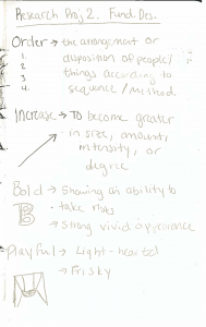
- Order: The arrangement or disposition of people or things according to sequence or method
- I used order in a sense that created more organized designs
- Bold: Showing the ability to take risks/ A strong vivid appearance
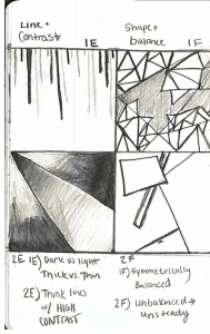
- Dark against light helped motivate my “bold” designs
- High contrast
- Dark against light helped motivate my “bold” designs
- Playful: Light-hearted/ frisky
- I wanted looser form and less cohesive structure.
- I think of tumbling little kids knocking over toys.
- Increase: To become greater in size, amount, or degree
- I attempted to suggest upward movement
- I felt my most successful “increase” designs emphasized size and rhythm
- Congested: Immense crowd to the point that movement is hindered
- I thought a lot about congestion in my nose and throat, causing many of these designs to be very busy and clustered with lines
- Tension: The state of being stretched/ mental or emotional strain
- I used unbalanced compositions to attempt to stress my viewer into experiencing tension (that is as much tension 4 squares can provoke)
Elements and Principles of Design
Designer Bio


Final bio link- https://u.osu.edu/kimball.103/about/


