
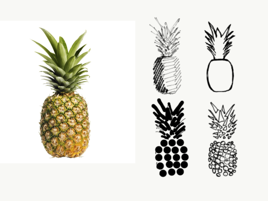
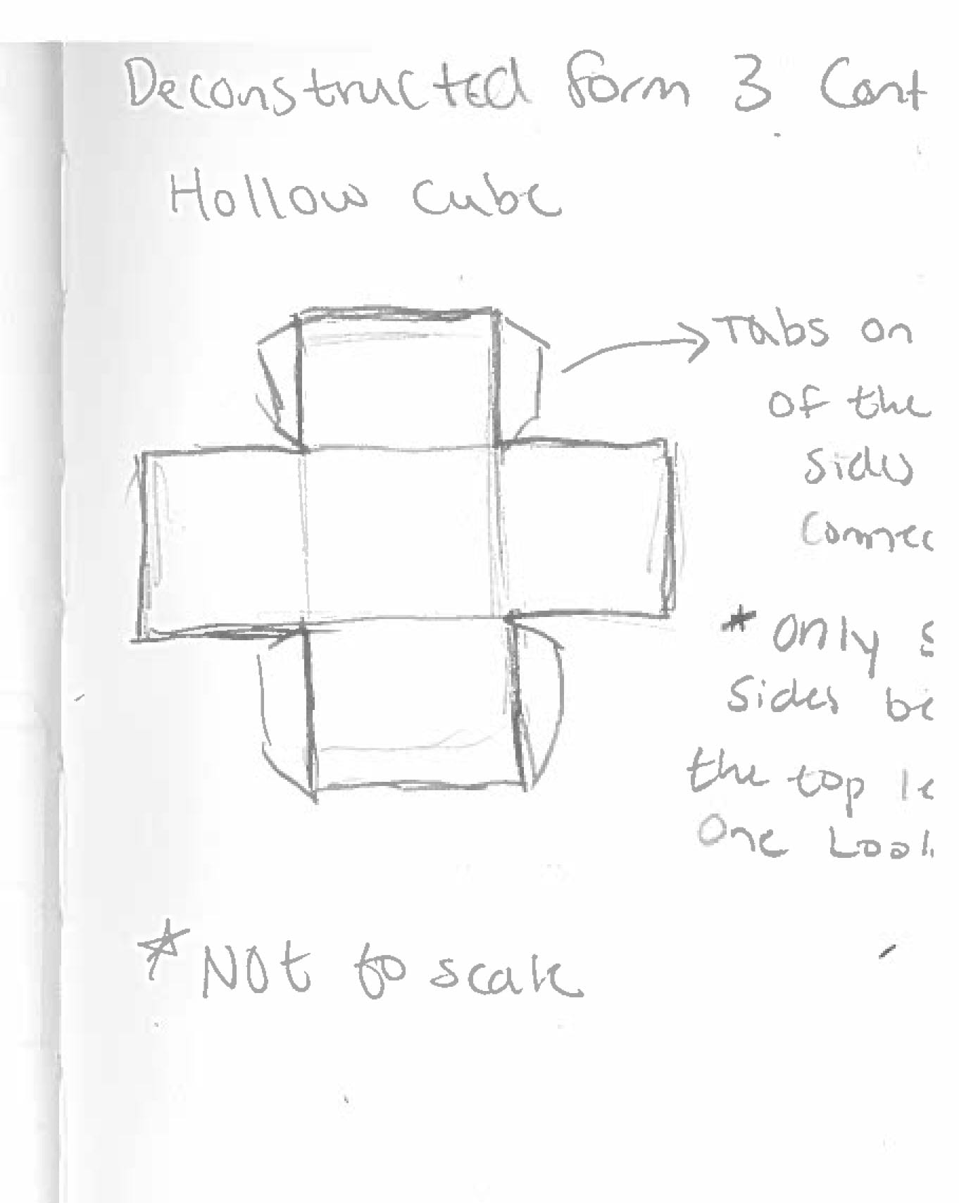
Possible Reconstructed Objects
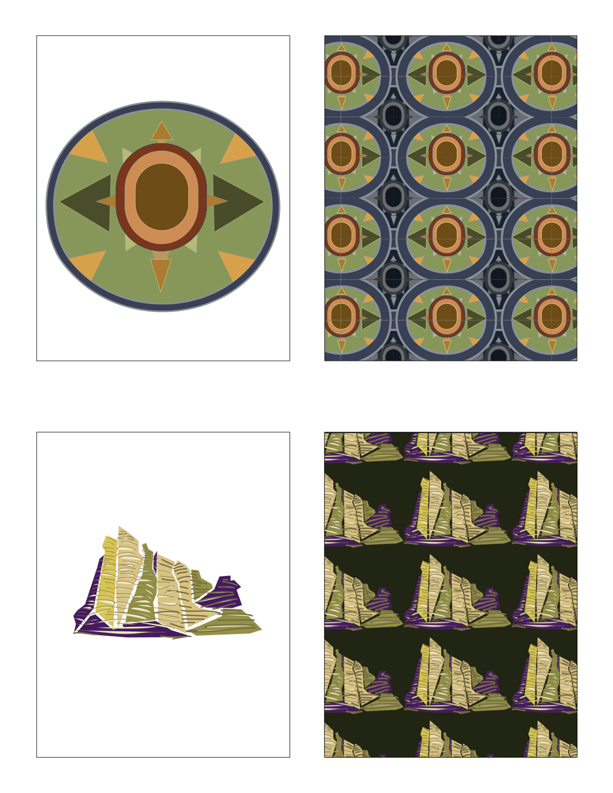


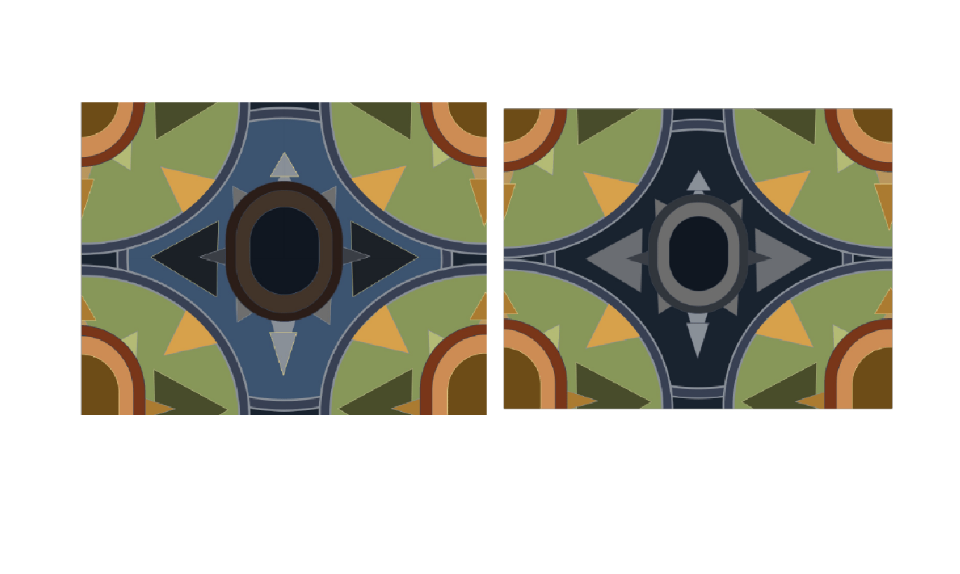


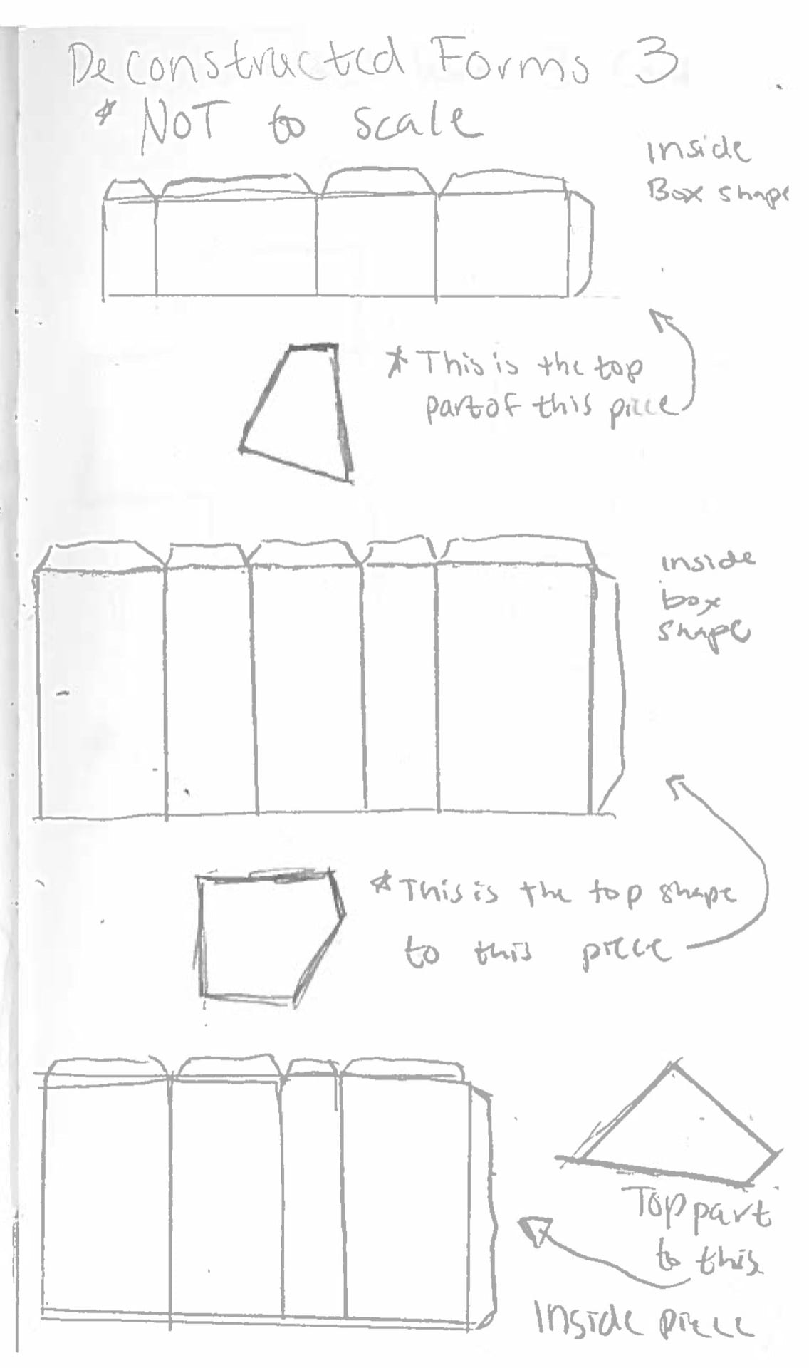
When initially creating my 12 ideations for the elevations, I focused on designs that would result in 3 different final forms. I chose order design as I felt pillars are a strong stable element that projects stability.When experimenting with different iterations I found that I could used a variation of heights to create the overlapping squares. I made the center the highest as the cross-shaped pillar is crucial in creating the top view’s image as my 2D design. My second design I chose was my tension. Implied lines and negative space were used in creating the diagonal movement in the piece. In addition, I relied on completely closed figures as well as gapping figures (the gate-like structure surrounding the majority of the form) to mirror my original design. This was done because the forms that were left open created a thinner outline for the bird’s eye view. Lastly, I planned on following my congested design for my third figure; however, the individual pieces proved to scale very small when confined to a 3×3 space. Furthermore, it felt like the dramatic height changes were too similar to my tension design, so I decided to recreated my bold design in elevated form. My bold design was my favorite to make, as it feels very successful having it a simple box from all angles (besides the top). I liked playing with the idea of internal and external forms. This design forced me to think about using internal space and elevations within a frame.
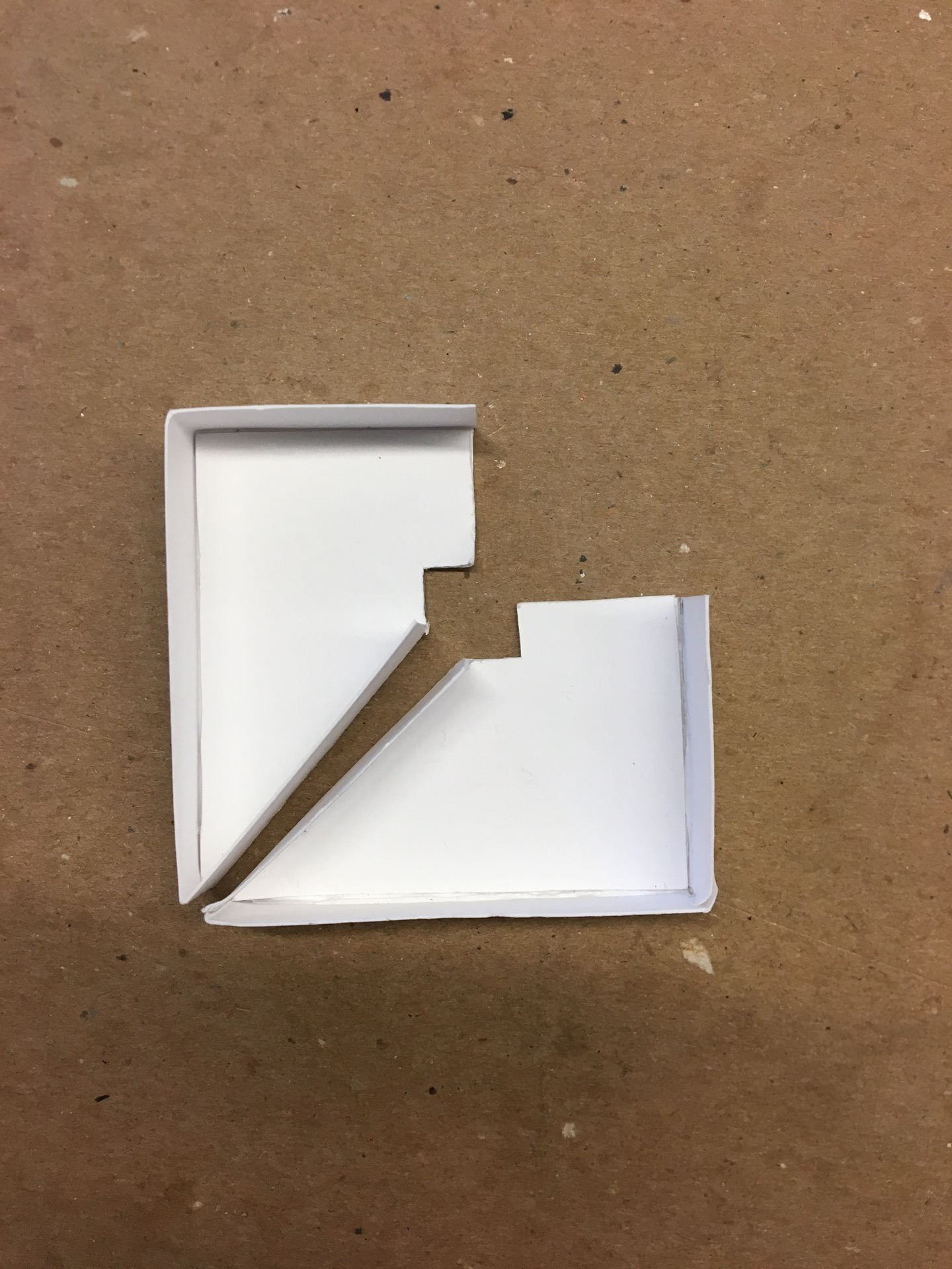
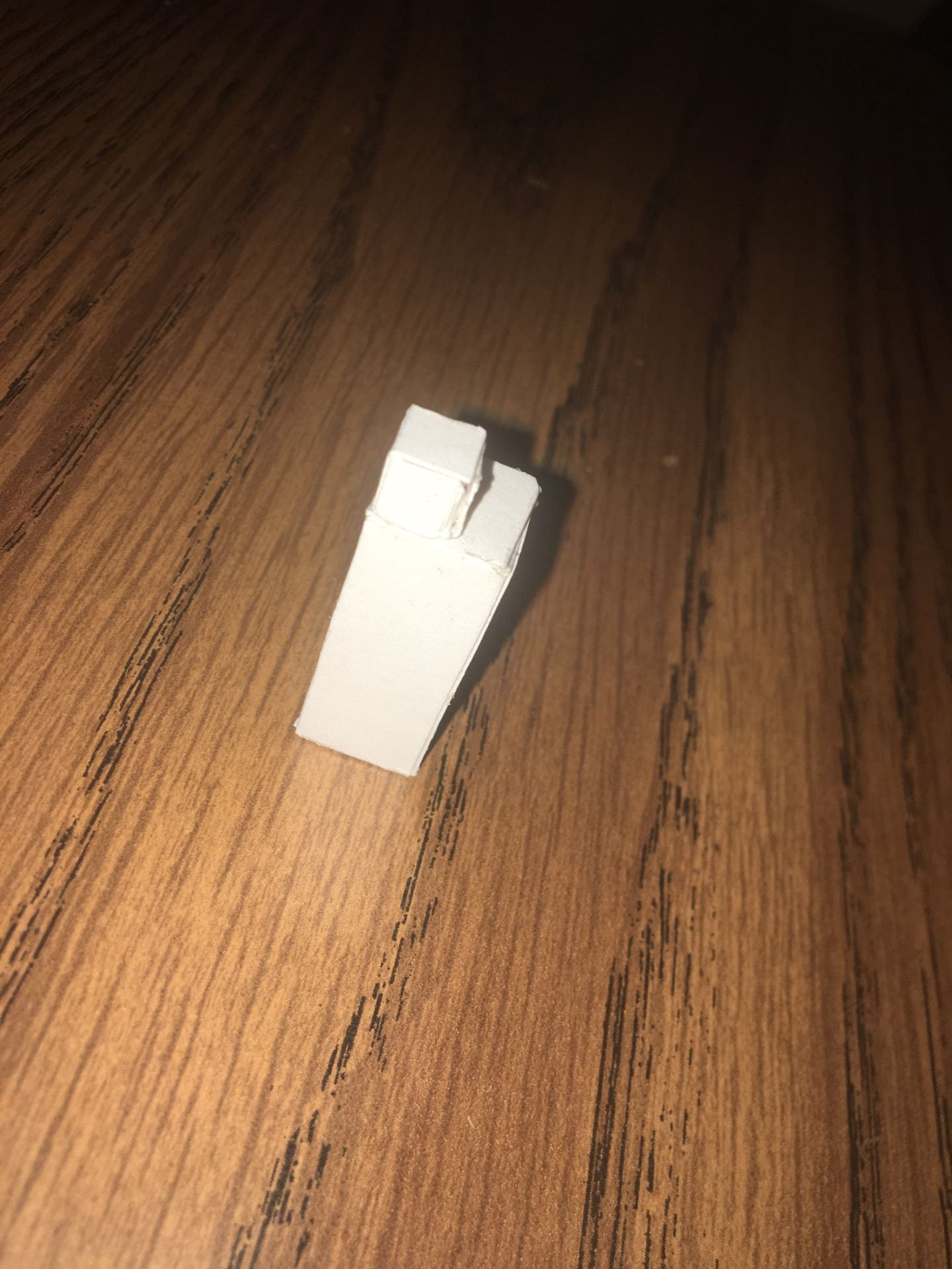
My original models were very poor quality. A major issue I had with this project was glue. I kept getting glue on the outside of my pieces. Finally, I discovered the best way to join parts is to allow the glue to dry for a longer time before pressing the tabs together, that way it is firmer and less likely to move out of place. In addition, my original drafts required a lot of trial and error. I found that practicing 2-3 times led to a cleaner final project. My construction process was: 1)Draw the parts (usually a column shape and a base that it folds around) 2) Add tabs accordingly (always trying to have the least amount of glueing possible) 3) Cutting out parts 4) Glueing 5) Combining the parts together. I would do each process individually per a design. This helped especially for going from my order to my tension. I had to make at least 10 of the L-shaped columns before I could get it right, so when I got to that part for my tension design it was much easier. Following the reviews in class, I decided to remove the bottoms of some of my pieces as they did not sit flat. This was a recommendation of my peer and it helped reduce the number of cracks in my pieces. In addition, I had to redo my bold design as it got stepped on; nevertheless, this forced me to redo it another time, letting my experience with Bristol paper improve the overall result. All in all, the heights of my projects show variation yet, they do not stray from the 3″x 3″ base very much, which personally helps generate a cohesive aspect. I kept the base board small as my projects are a little smaller, and it allows them to fill the space. Each of my design seem a bit random from most angles, but it aids my decision in making the top view the focus.
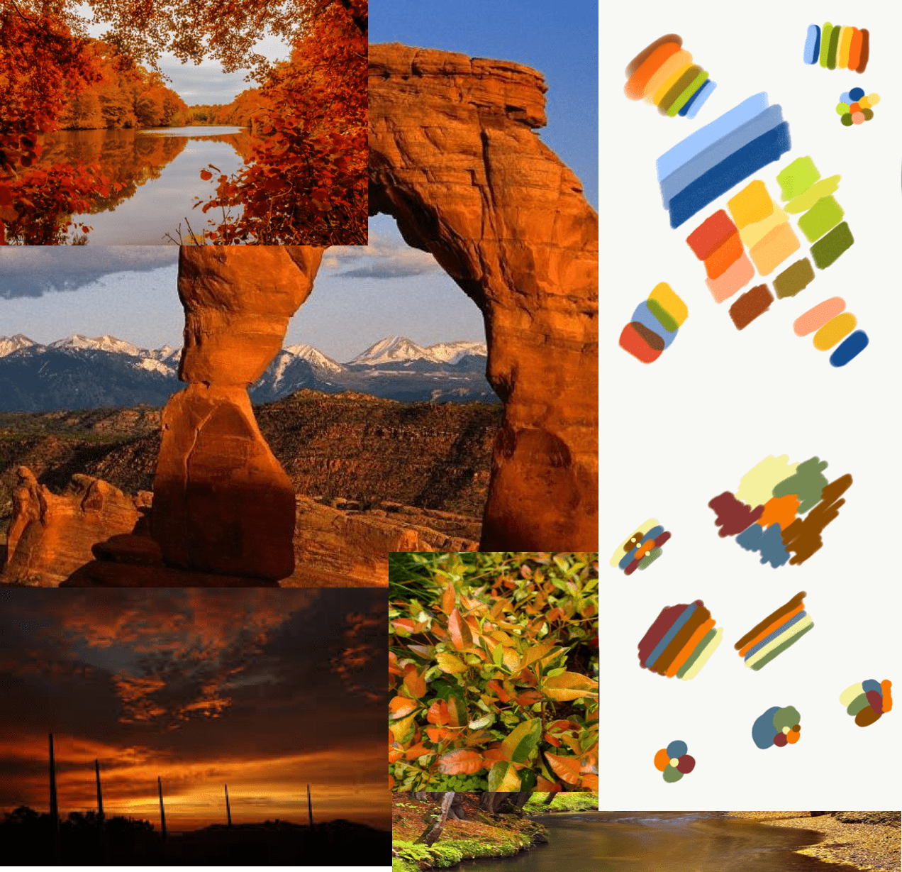
To begin creating my journey reimagined in the context of a new planet, I returned to each location from my original excursion. I wanted to find obscure perspectives at each place, while conveying a sense of curiosity and uncertainty about a particular object or landscape. I noted the physical characteristics of each spot, fixating on ones that would seem unusual to an alien. I also maneuvered my point of view to understand the emotions my scenes would provoke. Lastly, to conclude the research aspect, I thought about the various combinations of the element/principles and compositional tools I could apply to each sketch. with every sketch, I attempted a new compositional tool such as canting, framing, or worms view.

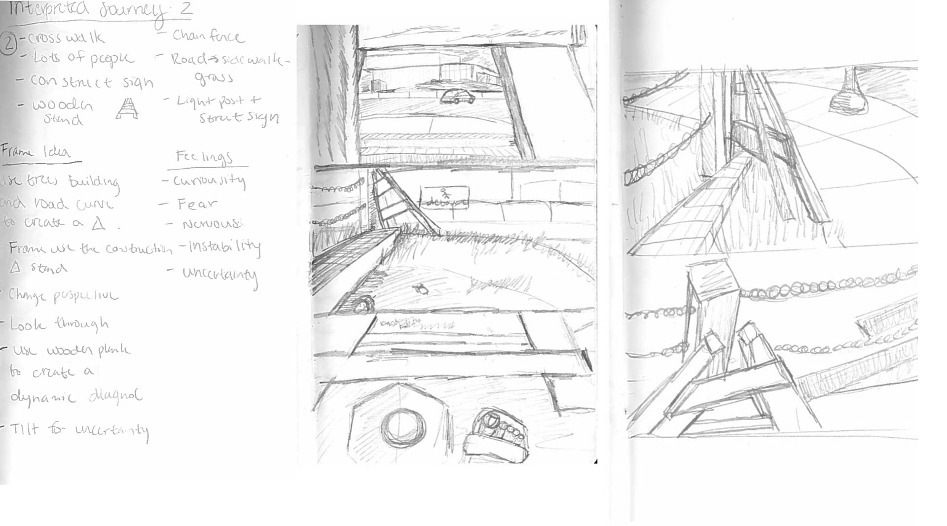
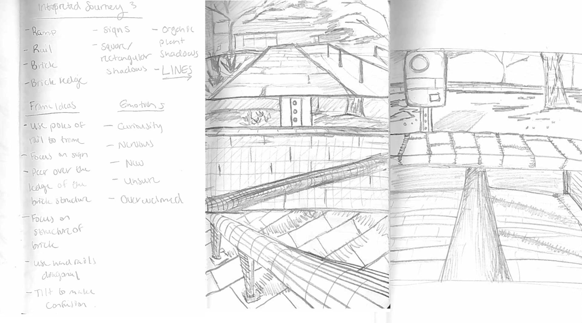


In my final work, my individual frames demonstrate a focus on compositional tools to project sentiments of curiosity, uncertainty, and observation. I use the tire as my object of intrigue as the concentric circles and unique texture make it an odd object. I used the close up view to give the wheel emphasis, while providing a sense of depth to my background. My second scene uses the frame within a frame composition. Texture also was a major influence in my work as the two wooden structures were very similar, yet possessed slight differences. In addition, the feeling on uncertainty is conveyed effectively by the narrow view of the street. Personally, I felt a little creepy and unsure myself as I peered through the small gap into the open space on John and Anne Glenn Avenue. My third situation had me focus on the extreme angle. The metal railing was an affective contrast between the other textures; however, the height was a little overdramatized. I added the hand after the critique because it helps direct the viewer to focus on the feeling and texture of the rail. Sensory input would be a major component to discovering a new planet. I continued adding myself in my next drawing, but this was to emphasize the aerial view of the cup. In this frame, the cup is an out of place object in the outside context, so I used light circular lines to focalize it. Furthermore, I attempted to use the natural direction of the step to create the golden triangle composition. My final destination was in the Architecture building, where the ceiling is composed of various lights. The clean symmetry of the spotlights fascinated me, as did there abstract angling.


