Masked Up Process

Research


Concept Statement Draft

Concept Statement 1.0

https://docs.google.com/document/d/12yOiD1t7fZGriTNiYWq5bI0LekyUve2E1JslWV2FZdw/edit 

Concept Statement 2.0

https://notability.com/n/mHXY8j8080AvkuNJGwt2T

Netflix Show: Squid Games

https://www.netflix.com/title/81040344?source=35

https://www.etsy.com/listing/986146961/werewolf-mask-3d-paper-craft-wolf-model?gpla=1&gao=1&


Exercises


Note Feb 17, 2022

Beginning sketches and construction ideas


First trial sketches of visualizing the lion mask.

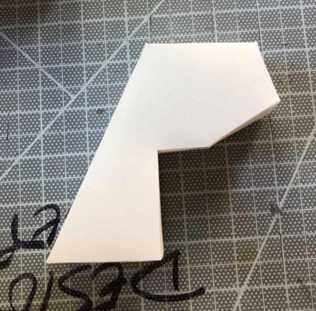
Construction and transformation of the 2D sketches to a partial 3D mask. We folding inward and taped the parts were tabs were needed.


First experiment of reconstructing the face

Second full mask experiment made of paper

Final full mask made of card stock and Bristol paper.

Gold Spray paint finish


Iterations


Did Do…

  • Included mane
  • Chose lion mask
  • Chose apocalypse narrative
  • Followed inspiration from Squid Games
  • Bedazzled gold mask with gemstones and such
  • Geometrical shape/ sharp edges
  • Made a full head wearable mask

Didn’t Do…

  • Panther mask
  • Brown Ant Mask
  • Glitter Accents
  • Silver and Gold
  • Sliding compactable ant mask
  • Wealth hierarchy narrative


Process


In the exercise/ brainstorming period and as soon as the project was introduced, I recognized it as the same project that my friend from DAAP was working on. As soon as they finished their mask project, we began ours. Their rules were slightly different, like they had a shorter time period and the materials were far more strict and it wasn’t a partnered project. It was more about construction than meaning. My friends final project was a huge rhino mask made of Bristol paper. He chose a rhino because they had to do studies of countries and his was Africa. I took a part of his idea and ran it through my brain to find similarities and to me, it reminded me of Squid Games because of the geometrical design.

Me and my partner, Sharon, then began watching Squid Games for research purposes and we found a lot of connections and hidden reasonings behind their masks. We were really intrigued by the sliding mechanism of the ant/ worker masks but we knew it wasn’t attainable in our time frame and moved on.

We began with the lion mask, trying to figure out the cuts and folds of this seamless design. It was really difficult at first, just because I couldn’t wrap my brain around the possibility or the physics of the material. Each fold was bending the wrong way and things overlapped too much. We were close to giving up when I took closer inspection at some other geometric face mask designs.

I noticed their layouts and how they managed to get past our struggles. It finally clicked of how they did it. The layout looked nothing like the finished project so that is what confused us. I recognized these layouts from first semester and our shape project from Design Fundmentals.

I used the skills I learned from this project to think of this shape in a flat sense, working from the inside out and examining each plane. I took inspiration from this earlier project, my personal skills of origami, and others geometrical paper masks.

Images like this helped me when I became blocked. When I was a kid, I got into origami and that skill also helped me in creating the spikes of the mane.

I went home and worked on the project during a weekend, had all the pieces printed out from a printer instead of cutting them out from the Cricket or the laser cutter, and hand cut each piece and folded using the x-acto method Deb taught us first semester.

At first, I did it in plain printer paper to see if it would come other to the right form. Once it did and I figured out each tab and fold, I printed it out again in card-stock. I used multiple colors because I didn’t want to use up all of one color in my card-stock pack. I picked a few pages out of each color and thats why it looks like that. It came out looking really cool because of this and Im glad my mistake worked out.


We had the plan to spray paint it gold the whole time to symbolize the wealth of material. I think it looked really good, especially mature and secretive. This was heightened with the addition of gemstones.


We were also offered to use some of the classrooms gold leaf. Our TA saw our idea and our plan and she thought it would be a good addition. It fit excellently.

The ant mask also came out looking really good, perfectly fitting the theme we set for each of them. The ant mask isn’t a full wrap mask, so I had the idea of tasking a bunch of disposable masks and braiding them together to form a back strap. We worked together to make it look tarnished as well, to fit with the dirty, homemade look of the ant mask. The bandaid and duct tape add to this effect tremendously.

Masked Up

Layers Process


Research


(A1 Exercise)

Many many different versions of the A1 Exercise. Playing with font and placement and deciding between 2 different ideas. The numbers to the side were for voting purposes.


(For Final Project)


Re-reading my mom old copies of the Calvin and Hobbes collection until I found the strip I wanted.


https://cartoons.osu.edu/

Took a tour to the cartoon museum and found inspiration in the original Calvin and Hobbes panels.


– Idea Board : https://notability.com/n/1brCRYJj8EGuKhmHGoQVn2


– Calvin and Hobbes Exploration and Layout Plan:  https://notability.com/n/gJx7dA2OC29pHolXwPYKB


Exercises

A1 Exercise (figure/ ground)

I explored negative space and variation in design for this exercise. It helped me with shape and conveying movement in 2D in preparation for the final. I got to see what the negative space looked like if it became positive and helped me visualize how important outlines are.


Iterations


Did Do:

  • Calvin and Hobbes idea
  • 2 panel comic strip
  • 5-25 pages
  • Foam layer separations
  • Painted foam to match greyscale color
  • Greyscale dark-to-light/back-to-front
  • Big title cover page
  • Landscape page layout
  • Kept the B.W. watermark and style
  • Replicated an original comic

Didn’t Do…

  • Apple Valley Lake Idea
  • Layers between each page
  • Laser cut pages
  •  3 panel comic


Process


After I drew out and labeled each layer in Illustrator, I took them to the Innovation Studio where they got cut and etched. This process was a bit of extra work because the Glow Forge worked different than the laser cutter. I had to separate each of my layers into an individual file with the etches and silhouettes and fills all in their own groups.

Before they were cut however, I had to chose a greyscale color to match with each layer. I started from the back, in black and grew lighter towards the front, where the top layer is white.

Once they were cut, I lined them all up to make sure they were equal in size.

After that, I started on cutting the foam layers to add the depth of this project.

During the process, I realized I didn’t want foam layers between every single layer because the spacing would have been too big. Also, some of the supports for the characters would have been visible. Calvin and Hobbes have to be raised to appear like they are sitting on top of the grass, so they have a piece of paper connecting them to the border and I didn’t want that to be seen by my viewers so I pushed the grass to be right up on them, effectively hiding the supports.

After I had all my foam layers glued to each page but not fully assembled and stacked, I noticed that one you put them all together, the white edges of the foam stood out. This was taking attention away from my scene when all I wanted them to do was to give an illusion of depth. This eyesore prevented that illusion and it was very distracting. So, to fix this, I painted the inside of each piece of foam to match the color page they were glued onto. This made the illusion alive again and made the depth flow.

Lastly, once each layer was stacked and glued and painted, all that was left was the border, to hide the ugly layers and proof of depth. All I did for that was covered the sides in black card stock, to match the black layer and provide contrast between the white front page and black siding.


Only lasting problem was that there was some slight warping, as Taylor clarified in his critic review. The divider between the two panels is too thin and I didn’t think of how it wouldn’t be able to support the weight of the scene. It’s too skinny to add support to so Ill have to think of another way to fix it but it’s only noticeable from the side view.

Other than that, my project came out exactly how I planned and expected.


Layers


Sketchbook Process

Research


https://notability.com/n/2a9_hqR~p0rfmZCp5UWai_

-Annotated article of 10 different binding methods

  • Pros and cons of each method
  • Personal opinion of look and function
  • Check if it meets the essentials


https://notability.com/n/172EddMrp~rvAwAgppVV69

-Hand-drawn blueprints

  • Throughly labeled parts with suggested material
  • Where to find each suggested material in a recycling aspect
  • Nonpermanent ideas and loose concepts
  • Laid out possible essential that would be needed for each idea
  • Open ended question with pros and cons
  • Potential future problems and solutions

-(Second Page)

  • Professional and neat blueprint of kerf method
  • Exact measurements in multiple different units
  • Decided length and width


Exercises


Tiny Sketchbooks with Binding

I first planned to sew my pages, but after three attempts at perfection, I decided the sewing method wasn’t for me.


Iterations


Did Do:

– Double Spiral Bound Method

– Kerf Cut Cover

– Swirl Cover Design

– Wooden Material

– Mixed Media Pages

– Modern Vibe


Didn’t Do

– Double Bound Cover

– Basic Hardback Cover

– Hidden Box

– Inside Pencil Pouch

– Carved Pockets in Cover

-Threaded Binding


Process


In the beginning, I was set on my double cover plan, with the hardback outside and spiral notebook inside. Other ideas intrigued me, but I knew this one was best.

My idea path soon changed after I found inspiration inside Joann’s.

This is a bamboo book cover, made from one single sheet of material. I thought this would be an amazing challenge and that it would really set my work apart from everyone else’s. I was set on completing it.

I chose my cover material, cherry plywood, also from Joanns. I wanted to get started immediatly.

The background sheet shows my chosen material, with my inspiration positioned in front of it.

I had to throughly analyze these cuts that made the wood flexible. I noticed it was one way, the wood could only bend inward based on the angle of the cut. I measured and researched accordingly but this method was rare to be seen on book covers so I had to rely on myself for most of the research.

I cut many test covers first before working on any interior.

My first was made of paper, the second was a thin cardboard, and the third was a thicker cardstock. I also tested the beginning of my design on the last test. None of my tests prepared me for the thickness of my plywood however.

When I finally went to cut my plywood for my final, the sizing got messed up even after my extensive tests and I ruined my entire sheet of plywood.

First, it printed way too small, and I immediatly stopped when I found out.

The next print was far too big though, and it couldn’t tell until I removed it from the machine. The cuts also weren’t deep enough, I learned. The cardstock test version is the correct size, in comparison to the two mess ups.

This was very frustrating for me, because I wasted an entire sheet of valuable material from a problem I couldn’t even fix and had no control over.

I ended up buying another piece of the same plywood, because I was glued to my vision and I refused to use another material because there just wasnt anything else like it.

I did millions of test cuts on the first ‘mess-up’ sheet of wood, to be perfectly confident that my cuts would be correct this time. I tested the depth of the cuts and if they would cut through, I tested sizing over and over again, and I made sure the wood was stable after each cut.

It was gorgeous. My final piece cut perfectly and I even had time to etch my design into the front page. The laser cutter room was packed for all the days I tried to do tests. I chose not to etch the back cover because many people were waiting on me and it was a long process. I also think that wood really is just so beautiful and I wanted to show that off too.

My etches and cuts were something to be proud of.

I got the inspiration for the cover design from one of my earlier projects in Visual Principles from first semester.

This rug is where my inspiration rose from. It looks similar to a topography map, so I used a topography map from google to base my sketchbook cover design off of.

This was my template for the cover and it came out great, it gave me the texture aspect I was looking for. Now it was time for the interior.

I deconstructed an old planner to get the double bound spiral model I wanted. Added bonus, it was gold. I like how it gives a modern look.

The pages are combined of graph paper, sketchbook paper, watercolor paper, mixed media paper, tan recycled paper, brown cardstock, and black cardstock. I really liked the contrast and variety of mediums. I got this idea from another old sketchbook I have.

I cut the pages by copying the measurements and sizing of the old pages in the planner, where I got the spiral from.

I then constructed all of it together, with the last page being a durable, decorative page to glue onto the back cover to keep the spiral in place.

My surprise element was that each page separating the different colors had a built in divider. I got this idea from my old planner, which also had a page like this.

The white page is from my old planner and the brown page is from my new sketchbook.

The end result was magnificent. Everyone was really impressed by my work, and I was really proud to have made it.

Sketchbook

Patterning Abstractions Process

Research

Part 1: I searched the web for 10 images of natural and man-made patterns each.

Part 2: I searched the web for multiple different versions of mandala grids until I found one I was satisfied with.

Excercise

20 Abstraction Forms

I tried to choose unique pictures that would look cool in an abstract form and pictures that I found visually appealing. I was heavily attracted to symmetry and rotational movement because I knew it would give depth to my 2D drawing.


Combine Abstractions

Single

This was my first time trying to make a combined abstraction, so it looks really rough, as I was still figured out what to do and getting used to this new style. I tried to add depth into it as the staircases go up, but it didn’t really work out the way I wanted and the images still look separate instead of combined and the whole thing overall is flat and boring.

5 abstractions

These are the 5 combined abstractions I created completed with value. I noticed afterward when, in comparison to my classmates, my pieces were still too realistic. They weren’t abstract enough to qualify as proper abstractions. If I had more time, I may have listened to the feedback I got and redone my abstractions, or even chose new images that would blend better. I, however, enjoyed the level of detail I put into my work and I wanted to leave them the way they were for specific reasons.

9×9 board

This excercise helped me see my abstraction from a different angle than how I originally saw it in creation. This also helped me visualize how others would see each abstraction if it was placed in a radial, with every perspective and angle shown. At this point, I also got the chance to see if my images eluded to anything else, like how the tree looks like a tree both upside down and right side up. I also found out that circle shapes are hard to manipulate to show movement so I tried to show harmony and symmetry instead. In m of these, I tried to display movement, like tumbling or spinning. The skull shows movement through tumbling, the butterfly shows flying in a circle around the center, rotation and movement, and the tree just shows being spun. For the staircase, I tried to make it look like it was rolling, but it was such an uneven surface of sticking out shapes that it didn’t work out the way I hoped but it still shows some form of moving. The last one, the coin, shows rotation. A perfect circle is hard to show movement but the cutouts really helped in showing some movement.

Final Composition

For the gray composition, you can see the movement that I tried to convey and the ration motion revolving around the “tree of life”. My intention was to show the tree as the center, with two orbs glowing above and below the tree and its roots. These two orbs represent life and death. They could be seen as a living soul and a dead soul. The life orb is at the bottom, towards the middle of the rotations, where life begins. The dying soul is outside the circle, showing its been through the rotations and has died. I wanted to show how everything ends where it begins. This is why the rotation begins going out from the tree(birth) and circling around(life) and then going back into the tree head first (death). As you move outward from the center of the circles, you experience life. The first abstraction represent money and wealth, something I was taught to appreciate from a very young age. I was raised with money in mind to everything, being aware of how it is spent or saved. It has been a traditional gift in my family to give old coins to my brother ever since he was born. That is why it is at the beginning. The next is symbolizing growth, with the staircase element as growing/ moving up. This could allude to puberty, graduating schools, or just physically growing. The next one, the butterfly symbolizes a transformation or a metamorphosis through life. It could also be a mental transformation. I chose this to be right before death because its usually towards the middle or end of life that a metamorphosis would occur. Death is the outermost layer, the end of life. All of these symbols are spinning around the tree, starting and end in the roots, like dirt. All life begins and ends with dirt. The white circle in the middle was added to emphasis what direction the images were spinning in and as the end is wisped away, that shows the end of the life cycle. The white circle can also represent yourself, as you are the center of your life. I showed heavy amounts of symmetry and also some asymmetry with the spinning, not being a mirrored image.

In the next one, I used an analogous color palette and I tried to get the widest color palette I could by playing with the values and I chose a neutral base because I didn’t want the attention to be drawn away from the bright colors of the abstractions. Each color was chosen for a very specific purpose to signify different things. The skeleton on the outermost layer represents death and I chose to make it bright green because death is surprising and unexpected. The shadows are red to show that death is evil because it steals lives at a moments notice and to represent blood. Death is scary and usually unwanted but it is still part of the circle of life.  The colors on the butterfly are incredibly symbolic. Purple and teal together represent suicide awareness, another reason it comes before death. This is personal to me and my life and I knew a butterfly would be a perfect way to show this idea. The white spots in the wings show a light in your life, even surrounded by suicide and death, there is always a silver lining, something good to look forward to. The spiral stairs represents growth in childhood. The colors are light and fun, representing kids toys. To me, the color gradient of gold and teal relates to God, even though I’m not very religious anymore, I was as a kid. The salmon/ pink color in the dots in the middle of the spiral show the lighthearted side of things. The innermost layer, the divided circle, represents money or coins. I chose to fill it with red and gold because the shape and those colors reminded me of Chinese currency and their coin system. As I stated before, the white circle represents you and it never changes color to show that you are the same no matter what life you live. The souls are changed into color however. The dark purple represents the scary abyss of dying and the wonder of what happens after. It could be seen as a portal to the next life or next dimension, whatever you want to believe. The light green and yellow of the living soul obviously with green representing life, and the yellow as hope and positivity. This piece is incredibly personal to and every decison was thouroughly thought out.

For the purple piece, I used a monochromatic palette because I didn’t want to draw any attention away from the first grey board and its meaning. This board also holds meaning in the color but I know I put a lot more thought into the placement of colors in the other board. Purple is still an important color because to me, it represents growth. Green is life, yellow is happiness, blue is a constant calm, and purple is growth. This board is much calmer than the other two, as purple is also balancing color. The first board looks plain and dull to me, but it makes you focus more on the forms and their design principles which is an essential part to understanding the piece as a whole. I want the meaning and form of the shapes to mean more than the colors.

Iterations

These were my combinations of my first abstraction and I relied too much on the snowflake outline and too little of the staircase elements so the piece really flopped. In hindsight, I couldve only chosen one picture that had movement instead of two because they really clashed with each other.

This is my rough draft of my first abstraction and I really just fell in love with the butterfly shape and I knew I had to add the spots. The only trouble I had was figuring out how to show depth in the upward view of the building. I eventually found a way to merge the two but I still feel Ike the butterfly element is a bit too overpowering and they’re not equally balanced between butterfly and building. The butterfly symbol also means a lot to me because my best friend got a butterfly tattoo and there are many different ways you could interpret the symbol of a butterfly. To me, a butterfly shows a transformation or a big change and building are tall and overwhelming so in my head, those two went together.

I am really fond of this abstraction, it may be my favorite because it took the longest and it was the one I changed the most due to feedback and advice. Deb really helped to steer me in the right direction from the very beginning to start it off as more abstract. I get very focused with the individual parts of each item, instead of finding a way to merge them, my process was to kind of to overlap them and see what fits where. This was obviously flawed and I’m glad Deb realized it before me. I really like how it turned out and how its symmetrical but the roots are coiled around different parts instead of being mirrored to the other side. To make it more abstract, and to try and include more spider parts in the piece, I sharpened the ends of the roots in the middle to look like fangs and the outer ones kind of look like legs. I knew from the beginning that this was going to be a main attraction to my piece because of how many ways you could interpret it and all the ways it can be transformed to look like something else.

This piece was made from spiderweb and a human skull. I really like how the spiraling of the spiderweb adds depth to the whole face, almost rounding it out and from how the spacing of the spirals increases, it gives an illusion of the face being caved into the nose hole. I thought of starting the web in an eye socket but I still wanted it to look symmetrical so I started the middle in the middle of the face. I also like the angle that the skull is positioned at. This angle is universal and no matter what way you put it, flipped or upside down, it still looks normal, with nothing off or uneven. I chose to pair a spiderweb and a skull because they both kind of fit into the same category of Halloween and spooky things so I assumed they would look good together as an abstraction.

This was made of a spiraling staircase and a flower. This is one where I had to think a bit more, because as you can see, it is much more definable abstract than the others. The flower had odd shapes of shading in the petals and that’s where the rectangular shapes come from. I made then rectangular to make it look like the staircase steps, spiraling upwards. The spiral circles in the middle is the middle of the flower, only changed in perfect circles instead of pollen and I added the spiral effect to that as well. This piece shows movement and I think I displayed it relatively well compared to the others.

This piece was made of a waffle and a starfish. This is another one of the more abstract pieces and I also like how the is turned out. The main design principle is symmetry but it also has excellent harmony shown through the gradients. I would say that this was the best example of abstraction out of all 5 of my pieces. It was the last one I made so of course it had to be the best one. The shape reminded me of a coin, but not an American coin. The triangular shapes reminded me of the Chinese coins where it has a rectangle in the middle and from there I noticed that red and gold were both a part of my color palette and red and gold are both colors that refer to currency. The colors also were inspired by the original colors of the 2 images. The starfish I chose was a coral/red color and waffles are always a shade of tan, or golden brown.


This was my first attempted mandala. Rahul gave me some help when I was lost about how to begin and said that mandalas sometimes tell a story. That’s when I made the connection and realized that all my abstractions have relationships to each other. From there I created the idea of telling the story of life. There are four different path emerging from the middle and each path illustrates a path you could take in life. The right one shows a religious life, and passing onto heaven or an afterlife. All four paths start with a tree, for birth. The right one then goes on into a butterfly, showing a transformation within yourself where you would find your God, within whichever religion. The next thing is a coin, referring to donation. You must be selfless with in this life, like giving to others. Finally, you can continue up the staircase to heaven, etc. The left path shows a life of freedom, making money, saving money, basically the whole path is just money. In the end you die happily and free, flying away like a beautiful butterfly. The bottom path shows a selfish life, ending in a sad lonely death. This also holds only money but its more about hoarding it and only caring about yourself and your wealth, like Scrooge McDuck. The skull shows this horrible sad ending to a life. The top path is almost the opposite. The spiral symbol shows growth, or someone else helping you through your hardships, and still making money, shown by the coin. The skull still represents death but if I were to take this piece as my final, I would color the two skulls differently, showing a happy death and a sad death. The ending is always death, only shown through differnt things. The butterfly and coin diagonals were just to illustrate every other part of life, the filler parts.

This was my next attempt, I spent a decent amount of time on this as well. The paths are still there but now there is more meaning and depth. The top path is the religious path. I realized that I could take apart my abstraction and I stole the circle spiral part from the middle of the staircase abstraction and presented that as a symbol for finding enlightenment or just finding religion inside yourself. That symbol leads to the ending, the whole staircase abstraction surround a pure soul, clean of sin. The left path shows greed through money, the whole path is only the coin. This path is okay, but still not pure, which is why the ending soul is slightly darkened. The same goes for the other right side path. This one shows a life that was saved. My intention was a life of depression that got turned around and saved but you could also take it any way you wanted. It begins with skulls, showing either a death in early childhood, a traumatic expierience, or suicidal thoughts. Right after that, we see the growth symbol, showing that someone helped you to change. After that, its blank because I never fully finished the last two paths. The butterflies here symbolize a second chance, freedom from an old life, where you might have felt trapped. This is also showed by the soul, it starts dark but then lightens. A caterpillar may feel trapped in its old body, and physically trapped inside its chrysalis, but once it emerges, its free from that trapped lifestyle. The bottom path was the worst, ending in a bad death but I never came up with a good life story for that path.

This was another attempt where I filled in too much space with small things and I realized it had far too much detail. The outside ring was supposed to be a pattern of life. Beginning with a butterfly, then a staircase to show growth, then death. It was a short pattern and that’s another reason I abandoned this attempt. The middle is a living soul, showing the beginning of a life, then birth, the actual beginning of the life cycle. I didn’t really like this template as much because it didn’t have definitive paths and only one focal point in the middle. The only reason I tried this is because everyone else’s work had spiral patterns and mine didn’t. I had a lot of fun playing with the radial tool over and over again, but in the end I realized this style wasn’t for me and I knew I could come up with a more clear way to show my story.


This was the last template I tried but I didn’t get very far before I realized it wasnt going to show my story the way I wanted so I gave up and moved on to the next template. It was an immediate decision and at this point I almost gave up completely because I was struggling so much to find a way to show my story. I had my goal, but no way to get there.

Once I almost had given up, I realized it wasn’t the projects fault, it was the template. I was struggling because all the templates weren’t fitting with my vision. So, I ditched the template all together and made my own shape, no template. This was a risk to take, because we were supposed to follow a given template but at this stage, I was already behind on time and I had to catch up fast, so once I found something I was finally happy with, I ran with it.

This has my template shape and my first trial of a color palette. I realized the colors were all too bright and distracting from one another. I wanted them to blend almost, so I dulled the colors down to get the palette you see in my final.


Conclusion

This project proved to be extremely difficult to me for more than one reason. At the time, there were very many contradicting things going on in my head in regards to all of my classes. In Visual Principles, we were working on the word mashup where you are expected to add a good amount of detail, and in my Photo class, I was working on another abstraction project but in retailtion to photography. I understand abstract photography but not design. Design has been a very hard concept for me to grasp and understand throughout this whole semester as one moment I think I’m doing it right and once I look around I realize Ive done it completely wrong and I’m 5 steps behind everyone else. My vision was clear throughout the whole project, the struggle was trying to find a way to present it. This mandala piece means a lot to me and I only hope that others can understand the story the same way I do.

Mandala

Mashup Process

Research

Font Exercise

For this exercise, I was told to choose 5 different fonts that represent me or ones that I relate to. I hate the idea of being basic and having my works lo ok exactly like the rest of the class. I knew I had an advantage with an outside app and I picked out the craziest fonts I could find that still related to me.


Name/ Initial Exercise

After the font exercise, we were left to discuss with the table and choose one font that was our favorite. I have very many different aspects of myself that I see reflected in all 5 of these fonts so I actually combined pieces from each of the choices to construct my name. After that, we had to send the name into Illustrator and extrude it in an isometric grid.


30 Mashup Words

.

For this we had to combine 30 words made up of nouns and verbs/adj in our own way. Then, from that list, we chose our favorite word and made up a definition for it.

Final Mashup Deliverable

The final objective was to extrude your word in an isometric grid and in your font and illustrate the definition in the way you manipulate the word and its surroundings. I mixed in other textures because I wanted it to have some essence of realism.


Iterations and Production

I chose these fonts because I saw myself reflected into all of them and I was fixed on being different than everyone else. I tried out my name on each of the fonts but I wasnt really liking any of them.

Since I didn’t like my name in any of the fonts but I still liked each font individually, I combined my favorite letter from each of the fonts to form my name. I didn’t do my initials because it wouldn’t show off my fonts as well. The upside down A represents the crazy part and the normal upper case B’s show a normal, presentable side. Then backwards 3 matches with the randomness of the A and the y is normal but a bigger sized lowercase size than the B’s. It’s normal but still stands out from the rest of the letters.

I chose the word Bcharkmas because it sounded the weirdest but you could still guess what works make it up. The definition was a mix of of the definition of bark and Christmas, using both version of the word bark. I chose 2 definition instead of 1 because I couldn’t decide which one I liked better and most dictionaries include more than 1 definition.

This project took very long as I was working in an iPad and many features are not supported as they are on a laptop, but unfortunately I was out of luck with my laptop breaking down only a few weeks ago. This causes a lot of wasted time as there is no extrusion tool in iPad so I had to manually draw each line connecting the front and the back and filling in each empty space with different values of the same color. Another part that was difficult to get through was the limitation of only 4 colors. I realized we could only use 4 colors about halfway through the project and I became very discouraged because I had already picked out many appealing colors to match my theme. My creativity was lessened by this realization but I still carried on.

This was my new color palette after I saw the restrictions and I chose primary colors so that I could potentially mix them in the gradient tool to create any color in the rainbow and be less limited. I dint end up doing that because soon after working with these new colors, I realized they fit my theme already, with a few alterations on opacity and darkness. I thought my piece would look very boring, repeating the same colors but I was wrong as it looks bright and full of color.

My favorite letter is the middle A because it took the longest to get perfect and its the center of the piece and all attention is brought to it first. I also enjoy looking at the layers of pine needs, they look very aesthetic and it came together very nicely. Furthermore, it’s one of the key aspects to show the definition. Taylor first gave me the recommendation of enlarging it, to emphasis the amount of detail I put into it and to set it apart from the rest of the letters, adding importance to it. Taylor also gave me a suggestion that I really liked, where he told me to maybe make the rest of the letters as little presents underneath the tree. I took his advice but only make a couple of the letter look like presents, because I wanted to show more elements of Christmas as well. The hole for the A shows an under layer of the tree, showing the bark. This was a last minute edition as I realized I gave myself more work than everyone else and I needed to include both definitions. For the star, I added a gradient circle underneath the shape itself where the inner color was yellow and the outer color was completely transparent so it would blend better and I love the glow effect it gives.

The idea to add fallen snow on top of the letters was one of my best and I spent a lot of time to make it look good and shade it correctly for each letter. I like the winter effect it gave and some people said it reminded them of club penguin, which I found funny and I’m happy to hear that my style looks similar to theirs. This however, contradicted with Taylors idea to make all the little letters look like presents because I could have a bow and snow both on top of a letter, it would be too crowded.

This was to show the second definition of Bcharkmas, the sacred Christmas dog. I wanted it to fit the cutesy theme I had going so I didnt show an audible bark and I tried to add as many dog-ish elements as I could with it still being minimalistic and still being able to understand what letter it was. In hindsight, I should’ve given more thought to my definitions and better ways to show them but I was so focused on the Christmas theme, I just got caught up with everything else.

This was one of the last elements I added and the idea came to me the day before the final because I was making cookies with my friends and I forgot that cookies were part of christmas. I was initially going to add a snow layer on top of it but this idea came to me at the perfect time. It looks especially good next to the tree, just like cookies for Santa.


These are the textured pieces that I added to make the piece feel more real and not all cartoon. They were all made in an outside app that ive used for many many years and this app could offer things that Illustrator could never imagine. The glitter bows are self explanatory as christmas bows are shiny and sparkly. I added them on the B and M because they draw attention and the B should definitely have attention brought to it because it is the beginning letter and I thought it was being a bit overshadowed by the A tree. The M just deserved a topper to complete the ribbon look and I used silver and gold because of the classic christmas song “silver and gold”. The carpet is a bit of a longer explanation. For my family, we do Christmas on the floor, like opening gifts in our carpeted living room and so every Christmas for me holds the memory and feel of our shag carpet. The carpet color also matches the one I have at home so this addition was very personal to me and I felt it was necessary to include the textured appearance instead of hand drawing it.


All and all, for the amount of effort I put into this project, it came out looking amazing. Although, I know if I was working on a laptop, I could’ve done so much more but I’ve learned to work with what I have. I chose to draw my own font instead of following the previous exercise because I like doing everything myself and I like how its original and no one else could’ve copied my font. My piece is incredibly detailed from all the time and work I put into it and I did this because I was very sick and tired of our abstraction project from Design Foundations 2110 so I added as much detail as possible to balance out the anger I held from abstraction. This project was very fun to draw and I enjoyed myself throughout the whole process. Drawing things like this is calming to me and it doesn’t cause me stress because its very similar to what I used to do in high school when I was bored or trying to keep myself awake by focusing my attention on drawing or doodling. This also helped me solidify my own style and what that looks like.

Concept Statement

I knew I wanted to really show Christmas spirit but then I went a little overboard. My initial dream was to make some of the letters brown with the texture of bark on the side but I ended up not doing that after I heard Taylors recommendation and followed that instead. After that, I followed the idea of Christmas and all the things that make up Christmas. I wanted bright colors to show how vibrate and exciting this time of year is and also added a comfortable, homey feel with the shag carpet. I still managed to add some hints of the definition that fit in with christmas elements and I knew I wanted it to all be the same theme and it did. It came out much better than I imagined when I started and I’m glad I made all these decisions along the way.

Mashup

Space and Time Walk Process

Research

https://www.google.com/maps/place/The+Oval/@39.9993666,-83.0135217,545m/data=!3m1!1e3!4m5!3m4!1s0x88388ebe583f917b:0xd267c072f6a429bb!8m2!3d39.9994979!4d-83.012709!5m2!1e3!1e4

Google Maps University Area


Exercises/ Activities

Writing

Our directions to get to the destination including sensory details


Pictures

Pictures of our journey from Hayes to the destination


Final map

Iterations and Production

We started with a scavenger hunt leading to the map room at Thompson Library. I enjoyed this exercise because I like scavenger hunts and it was fun to follow the clues without any visual hints. When I and my group finally found the map room, we took pictures of what looked interesting to us, and here is where I got my idea started for what I wanted my map to look like. I liked the old maps with pictures of dragons and such, filled with color. I knew my map wouldn’t be this big, but I still liked the idea. After that, I found some county maps, and my vision got refined down to a smaller scale. In another book about the history of New York, I read about the revolution in the Hamilton period and as they were describing the order of events, they had a small little map of the peninsula with paths leading over and around it to show where each army and battle was located. I noticed small details, like the simple tree symbols and condensed squares to represent small towns. I liked these small symbols and I knew that I wanted something like that map in New York.


The next exercise we did was instructional drawing. We made specific steps and symbols to help the drawer reconstruct Sponge-bobs house. these instructions were so specific, as they included inch measurements and angles of lines. I didn’t want my directions to follow the specificity of this exercise so I dumbed down my instruction to strictly sensory words, nothing like “take 3 steps back” because that is unnecessary to me. This instructional drawing exercise was enjoyable too. When we traded with other groups we got good feedback on how we should be more specific with the placement and location of the symbols. I liked how we were being tested to do things without seeing them, only words.


The texture exercise was one of my favorites because I liked drawing small things with high detail so they look as realistic as possible. This helped me visually see the difference and the change from complete black shadow to pure white and better understand values. This kind of helped me with experimenting with different textures like if I wanted to add shadows in my map or texture to the grass. I decided not to do any of that but this was still fun.


After all that, I finally began the process of making my map. I chose my location and how wide I was making the boundaries and from that point, I knew this was going to be a long process for me. My area was very large and it would be really hard to just look at it then try to recreate it directly on the paper with no grid or anything. I’ve always been good at digitized recreations so I thought that would be a good place to start. For my area, I chose to focus on the oval and north oval and cut it off around Neil Ave, W 12th Ave, College Road S, and Annie and John Glenn Ave. These cutoff roads created a nice rectangular shape for my map and it was pleasing to my eye.


This was the process of recreating the map digitally before transferring onto the paper.  My original plan was to copy this part of the map that I wanted, including all the detail of each building and the shape of each tree, not simplifying anything. From there I was going to find a way to scale it up to the size of my 17 x 14 paper and use the light table to trace it from there. Doing this, I avoided the possibility of mistake or misplacement of any buildings or alteration to my map. My title, key, and directions were all last-minute thoughts to the map.

Once I finished my final digital map, I chose some banners and borders to try and set a theme for my paper. I switched the middle of each oval into a compass because, in my directions, I refer to the oval as a compass because of all the paths that emerge from one point, the point of the compass. I liked the idea of a subtle compass theme, maybe old tarnished nautical vibes. From that, I looked for an old ripped paper template, the kind you would find a treasure map on, and I wanted my key to be on that.


Since I was still working digitally, I shaped and scaled this paper until it was in the size and location I wanted it to be and copied a similar version overtop that would soon be on the final paper. My title was just written on a simple banner because I didn’t want to overcomplicate things. I also played around with some fonts until I found some that matched my nautical theme. I didn’t finish the entire map digitally, I left some blank space for my directions and to figure that out on paper. I had a small thought for the directions and I liked the idea of rope to match the theme so you can see how I manipulated that to fit in the final.


I did have some trouble trying to scale the map from digital to paper because I didn’t know the original scale of the digital board and I couldn’t compare it to the 17×14. I had to move my project to Illustrator from Sketchbook because Sketchbook doesn’t do measurements. I learned from Illustrator the size of my board and I scaled it from there and I just had to divide the board into sections that equal the size of a piece of printer paper. I ended up with 3 papers, horizontally and vertically and I transferred that to a printer nearby and once I had the pages, I matched them up to make sure they were perfect. There was a slight alteration where the bottom block of the map was too long and didn’t match up with the top of the map. I don’t know how this happened but I just cut a sliver out from the middle and forced it to match up again. I also give myself room to overlap each page to get the most accurate tracing. For the actual tracing, I used a 0.3 point pen for the buildings and 0.5 for the trees.

Transferring digital map onto 17×14 Bristol paper

I was met with frustration when I discovered we could only use one color because I really like bright colors and combining them to create a tone or mood. I didn’t accept this to I decided to challenge this restriction by making a proposal. If I chose one color, like beige, and darkened it using only the white and black slider, nothing else changed, I would make brown. If I did the same thing but lightened it, I would make a light cream color. So, technically, I still used the same color to make two new colors. I brought my proposition to Taylor and basically annoyed him into submission where he allowed me to use these alterations of one color. I was very excited about my success and I went to work right away because I had so many more opportunities to experiment.


My original plan was to use colored pencils in brown scale but I didn’t have those so I used watercolors instead. This was actually better because they weren’t super opaque and you could still see the outlines of the trees underneath the color. I did overlap in some places so I did have to redraw some lines but nothing unexpected. In the end, I’m really glad I chose beige as my color because I am obsessed with brown and it matched my theme close enough, especially when coloring the key paper, which worked much better than I expected. I also didn’t want to be basic and choose green because I knew everyone else was choosing either green for the grass or red for the trail. My piece definitely stands out, just as I intended. In the end, I love what I did and I’m glad I put so much time into this because it was definitely worth it. If I had more time to improve, I may have been more precise when painting, making sure to stay inside the outlines to avoid having to fix it later. I maybe would have used a different color of paper but I wasn’t 100% on my brown color theme until about halfway through, and after that came the nautical theme. I maybe could’ve soaked my Bristol paper in some coffee water to tint it beige, making it look older, and I could’ve burnt and torn some edges to make it look like a pirates map like some other people did. Still, I love my final.


Space and Time Walk

2D to 3D Process


Exercises/ Activities

Perfect Cube

We were told to find a cube template online and construct a perfect cube using the tools and trips Deb gave us on constructing 3D shapes with Bristol Paper.


Trapezoid

We were given a trapezoid template and we had to copy the measurements exactly and make a perfect trapezoid. This was a more complicated shape than the cube.


A2 Shapes

Extrusions of new shapes, all found in A2


Combination 3D Shape (1 + 2)

We had to combine our first shapes to form a new shape, I combined my first and second shape because the bottom and the side conveniently had to same measurements.


Alteration(s) of final shape

I chose partially the negative space option and also combining that with the pattern option, where you change the outward appearance. The mix of the two is the one with the twine strung throughout the shape.


Drawings

'

Isometric and Axonometric view of cube.


Isometric and Orthographic view of 3D trapezoid shape.

Templates

Cube Template.

All three shape templates with measurements.

Final shape digital labeled template.


Step by Step:

Step 1: Carefully cut out template only on the solid lines and lightly run your knife over the dashed lines to make it foldable

Step 2: Bend away from your light cut on each of the dashed lines to make each side

Step 3: Fold A and B towards each other

Step 4: Glue g2 to C and g1 to A, use another paper to evenly spread a thin layer of glue

Step 5: Glue f2 under G and f1 to B

Step 6: Glue h1 to F and carefully glue h2 to the side of I, careful because this is one of the smallest tabs due to the convex shape

Step 7: Glue I1 to A, bending E inwards

Step 8: Glue e1 to B

Step 9: Make sure there is no gap between E and I because there is no tab there to connect the two

Step 10: Put glue on c1 first and then a1 and a2

Step 11: Attach all three tabs to their connecting planes at the same time

Step 12: Complete your 3D shape.


Iterations

When we made the first cube, my edges were overlapped and there was glue all over the sides, it was very messy. It was my first time with a 3D Template so there were bound to be mistakes. My second attempt was much cleaner, I took my time cutting it out and carefully gluing it and folding each edge perfectly and it turned out much better. My third attempt was the same as the second just doubled in scale. Overall I learned better techniques to gluing and folding carefully and with precision, which helped me when constructing the other templates.

For the trapezoid, my first attempt was made out of scrap paper, so it was very flimsy and delicate to touch. The edges were very hard to fold and the glue made the paper super wrinkly and thinner than it already was. First attempt was lacking in material but it helped me visualize where the appropriate tabs go. Second attempt was much better, I made it in Bristol paper so it was much sturdier and that was my final form.

For my first shape I chose from A2, it started off as a curved shape, but then Deb warned me how difficult curves were and that we should save those for a later date. I then picked my chosen shape, the triangle looking one. I extruded it in Adobe Illustrate and visualized my template and went from there. I had to do multiple templates because I didn’t know where each of the sides should go and where the tabs should go. As you can see in the first attempt, I struggled with getting correct measurements and the tip ended up being too short for their tab to fit underneath. So, I adjusted and corrected. My second template was a little better, still just experimenting with different ways to construct my shape. I mixed the two templates together to make a shape that worked the best with the least amount of complications, and that was my final template. For the final piece, I doubled the measurements to make it more accurate and it turned out very clean and easy to construct.

For my second shape, I chose something simple so I could constrict it faster and also have time for the third shape. I extruded it in my mind and since i already had experience from shape 1, I knew what to do so I didn’t have to experiment with the templates as much. I attempted my first template and most sides matched up, I had to do some slight alterations and I also upscaled the template and it worked. I’ve learned that once you double the measurements, your shape gets much better because small shapes are harder to work with. I like this shape because it looks like a cube but it’s just slightly more complex and difficult to work with. The top is slanted up and the side is sloped down and those unequal measurements were a bit tricky to work with.

For my third shape, I chose something more complex, to challenge myself. I think it turned out well for how complex it was to formulate in my mind. The shape resembles a W and the part in the middle where the downward slopes intersect was hard to connect with tabs because of how it folds and how small the angle is. I figured it out after a few attempts on paper and then I decided on my template and cut out my final form in its smaller shape. I didn’t upscale this one, like I did the other shapes, because I didn’t think I needed it. Deb only suggested to double the measurements if our smaller version were a bit sloppy, but since I already had experience making two shapes before this one, I felt pretty confident in making the smaller shape.

The final was a bit confusing for me because I at first didn’t understand the parameters of the assignment and then Rahul kindly explained it to me and I finally got it. I chose to combine my first two shapes and skipped over the third one because I couldn’t formula a way to combine the awkward shape of a W to the other blocky, more uniform geometric shapes. The first and second shape were extruded to the same width so it was easy to come up with combinations. I rotated shape 2 a couple times until it matched up with the front side of shape 1 in a way I liked. I thought this new shape looked like a person with a big head and I liked that so I chose that combination. I made a good couple of templates for this final piece, and I learned that it was easier to attach your extruded side to the longest portion of your shape and knowing this made the experiment process a lot faster because I had one variable locked. When it came to the end part where we had to label the template, I was met with a lot of frustration between digital and paper templates. My paper template measurements didn’t match up with the digital versions in length and degrees. I was so lost in what to do because I didn’t want to contradict myself between paper and digital so I just tried a bunch of things until one of them accidentally worked and I was able to match my different templates. I later learned that the problem was with the measuring system used in Illustrator and how it wasn’t measuring the full length of the line when it was angled in any way. That setback caused a lot of distress and took an extra 2 hours out of my work process. But overall, through the difficulties, I completed each part of this project to the best of my ability and I’m proud of the work I have made, I think its really clean.

For my iterations, I quickly made more templates. I purposely rushed the creation process because I wanted to challenge the perfection aspect of this project. If you look close, you can see overlapped edges, incorrect right angles, uneven folds and planes that aren’t identical that don’t line up straight. These “mistakes” would be easily noticeable if the shapes were bare but I knew that if I had enough of something else to distract the viewer, those imperfections would be immediately looked over.

For Alt 1, I had this idea in mind for a while because it employs the idea of negative shape but I didn’t just want to cut holes or shapes into my project, I wanted it to be more natural, and fire is found in nature. The burn holes are strategically placed on the shape, I wanted them to be random but also not intentional. I probably should’ve done a test first with burning Bristol paper because that is when I met all of my problems in action of this idea. I though that just by holding a torched lighter near the paper would automatically make the shape I wanted, but I didn’t account for how thick Bristol was. It immediately caught on fire and when the area was big enough, I blew our the flame but the embers remained lit. The edges around the hole were still burning without a flame and it was slowly eating the paper around it. I tried blowing it out but that also made it worse. So, I stuffed a wet paper towel in the hole and that helped a bit. I kept the paper towel in the first hole as I began on the next one. My next hole was in the bottom, where there was a very obvious mistake in the construction process, so I just decided to burn away all my mistakes. I knew that the embers would do enough work if I at least got the hole started so I cut a jagged shape out and lit that part on fire, watching and waiting until it was big enough then stuffing that hole too. From here I noticed that the entire shape itself was smoking even though there was no active flame or ember. I took out the wet paper towels and wet them again and continued with the last hole. Once the last one was done and all openings were stuffed, the shape was still smoking and I didn’t know why or how to proceed so I shoved the entire shape into a cup of water, completely submerging it for maybe 10 minutes. Halfway through I realized that paper deteriorates in water and though I would have to find a way to redo the entire thing. But, again, Bristol paper is incredibly thick and the shape dried off and it was absolutely fine. I never found out why it was smoking but I learned to maybe not burn Bristol paper again.

The idea for alt 2 came to me while I was waiting for alt 1 to stop smoking. It was creepy, it sounded interesting, and it looked fun. This is the one that took the most time because I didn’t actually have a needle, I just stabbed single holes into the shape with a pencil, gluing tabs and folding edges as I went. I planned out each hole and after it was made and after the twine was strung through it, I planned for where the next hole would go. I wanted the outside to look cool, with some cross overs and parts that wrapped around an edge, but I also didn’t want the inside to look boring so I strung it all around from top to bottom with overlaps inside and outside. It was difficult to thread the twine with my hands because when I closed one flap, I was also cutting off the amount of space I had to work with my hands. It got to the point where all of them were closed with the top and bottom open, just how I wanted but I still had more to thread so I took a pair of tweezers and tried to find a way to snake my way through the maze of strings to my next hole. It was difficult but definitely worth it for the end result. It looks exactly like how I envisioned it in my head.

For my third alteration, I decided to make it easy on myself and just manipulate the outside. This one was another great example of distraction from the mistakes because this was the one that was the sloppiest in creation and construction. If you look at it head on, you can see there is an obvious slant from one side to the other but its completely unnoticed because of all the different words in different angles. I did a project like this a while ago for myself, where I constructed a mans figure out of the word meatball, and that was fun and entertaining to me so I wanted to do it again. I also knew it would provide some visual contrast in both the black and white and the texture contrast in comparison to my other two alterations. The words written on here are not random, some are poems, some are songs with a strong meaning, and some are thing my friends have said to me. All of these things have a big of a sad tone which is different that the overall creepy theme I was going for and I think that’s interesting to have all these small details you might overlook mean so much when you know the real meaning behind them. I like how this one turned out because its also a part of me and who I am put into my shape.


Production + Process Images

Extrusion of shapes in Illustrator.

First attempt at shape 1 template and outcome. This outcome didn’t work because I underestimated some angles and the length of the front protruding face.


Second attempt at shape 1 with a new template.

Third and final attempt at shape, replica of second attempt with the same template.

All 3 attempts and outcomes of shape 1


Template and outcomes of shape 2 (later upscaled)


Shape 3, first and final rendition. I simply took my cutout shape and traced it twice and connected the two tracing with however long I wanted the shape to expand.


All three extrusion shapes with different combinations.


Decided outcome of shape 1 and 2

Practicing template(s) and where the flaps and tabs go.

Final template and final shape.


Repeating final shape and template x3 preparing for alterations

First alteration (Alt 1) burned holes

Making of alt 2, needle and twine

Alt 3, covered in my handwriting text

All shapes next to each other combined into a pattern


2D to 3D


Perspective Studio Space Process

Research

https://notability.com/n/esWp2sHC5ruDnSpqnyKB4

Research of dimensions and designs of furniture


Exercises


Planes, Curves, Layering Exercise

This exercise was designed to teach us about perspective and introductions the concept of 2D and 3D objects in space. This was one of the earliest exercises and it was used to transition us into being comfortable experimenting with uncomfortable objects that bend, curve, and fold onto itself. I really liked this exercise because there weren’t a lot of limitations to it and I could draw whatever I wanted like banners and title headers. I also played around with stairs because he suggested it and doing that helped me in the future when I added stairs into my room. Taylor also gave me feedback on my shadows and direction. This showed me basic structures that would add up to more complex compositions, like spheres and curved objects.


Two Point Perspective Exercise

For this exercise, we practiced drawing perspective from a horizon line. We were instructed to draw multiple shapes, squares, cylinders, and wedges. Practicing this helped show me how shapes can look so different based on their perspective in relation to the horizon line, showing with side would be shown: the top, the side, or the bottom. This was helpful to remember in the final when I was looking over my sketch for one of the last times, to make sure all my objects followed the rules of perspective to the horizon line. If one line was slightly off, or showed the wrong side, it was noticeable and I could fix it. This especially helped in the corners of my room. Most of the guidelines from the original grid lines helped me form my outline shape but this practice helped me understand what each side would look like and how much of it would be shown to the viewer. Taylor also gave me feedback and complimented how neat all my shapes looked, which started my quest for perfection on this final project.


Triangulation Practice

Taylor told us to construct our own 8×8 grid, complete with a vanishing point and horizon line. We only drew two sides on the room because this wasn’t a complicated exercise. The floor grid helped me visualize space and volume and the wall grid helped me visualize depth and height. This exercise greatly helped me in my process to the final because if I knew my dimensions of the grid, (1’ unit squares) and I knew the measurements of my objects (he told us to label dimensions in our mood boards) then I could build my room proportional to a real human being. During our critiquing process, I noticed how some people just guessed on the height and length of some objects and once you took a closer look, they looked odd : too short or too wide. As for me, I was very thorough when finding and measuring my dimensions of my furniture in accordance to the dimensions of my room. I wanted it to look as realistic as possible and I think I accomplished this very well. Another thing I received good feedback on was my visualization of space, more specifically my posters on the wall and how I made them retreat back into the room. You can see that the top and bottom line of the poster don’t match up, not making a perfect rectangle. If it was a perfect rectangle, it wouldn’t be properly retreating into the depth of the room and would’ve overall ruined the perfect perspective. Doing this really showed the true angle of the wall and proved the viewers perspective as where it is.


Iterations


Grid Making

My first attempt at making a grid didn’t go very smoothly because I messed up my horizon line, shifting the perspective every so slightly so that the walls didn’t match up with the ceiling in the end and I had to start over again. Taylor gave me some helpful feedback when he took me aside to teach me step by step how to make a perfect grid. He recommended placing two central vanishing points on the horizon line instead of one, making the room even more precise by ensuring the floor tiles were all straight and even. Doing this made my floor perfectly aligned and straight, therefore perfecting my walls and ceiling as well.

This was my second grid attempt, the one Taylor helped me make and it turned out beautifully. I chose not to use it because I hadn’t hit the 200 sq ft maximum dimensions and I knew I could add more space to my room.

This was my third and final attempt at making a grid. It turned out perfectly, after two test runs, I knew what I wanted and I constructed it. I made my room 15×11 and lowered my horizon line to include a ceiling because I really felt inspired to add a chandelier. I also chose to use a smaller size paper compared to my second attempt which was very large, it barely fit in the locker and I didn’t want to carry a large piece of paper like that, unprotected, back and forth from my dorm to the studio. Because I downsized, I also forfeited the opportunity to have wide vanishing points. I wanted wider vanishing points so my room could appear to have more depth. Thomas helped me out here, suggesting that I could tape paper to the sides to extend my horizon line, making it possible for the far vanishing points. He suggested this kind of as a last resort, not expecting me to take his advice and he was pleased to see that I took his advice and that it turned out nicely. Taylor and Thomas’s advice really helped me out in this part of the project, because the beginning is always the most important part and I wanted my base/ beginning to be perfect, as the remainder of the project would follow.


Mood Board

Our first exercise at the beginning of this assignment was to create a mood board to set up a theme for our space and to visualize the different types of furniture that could be put into room as well as their dimensions. As I picked out pictures for my mood board, I relied a lot on Pinterest in the beginning to visualize a completed room and what aspects I thought looked best when paired with different kinds furniture. I got distracted by colors often because I love when different color palettes intersect perfectly and we all know that Pinterest is the god of color aesthetics. However, in this project, we didn’t get the privilege of adding colors, so the final will be strictly black and white. From Pinterest, I picked out multiple couches, a staircase referral, and some interesting chair designs that I was hesitant to try out. I also found a lot of small decorations that I wanted to add, like hanging plants and little trinkets to place on the desk or by the window just to fill up some space. I wanted my studio space to look real, like there was someone actively using it, instead of just an empty room. Out of all my ideas that I put into my mood board I only chose to bring a handful of them to life. I really liked how the palm tree leaves looked in the setting of my modern room but the sketching process was difficult due to all the detail in the shape of the leaves. The couch was also hard because it wasn’t a defined shape, it was combined of cushions, which is not one of my strong suits. The perspective was tricky to obtain, as it had to grow smaller as it receding to show the true length of the couch. I went through many erasers getting it perfect.


Drawing Process

When I first began adding all my items into the room, I ran into some problems pretty quickly. I underestimated how small the room actually was and it the beginning, I was really excited to try and construct a balcony on the back wall of the room. I wanted the balcony to be placed high to the ceiling so that the desk would fit underneath it but I saw that my ceiling wasn’t tall enough and if I was to go through with this idea, it would look crammed, awkward and disproportionate to a human body. I was so attracted to the idea of adding a balcony because I knew it was different and possibly risky, but it would make my work stand out. I also followed this idea with the chandelier. I knew some of my classmates chose not to add a ceiling view, so, if I added a ceiling with a chandelier, I could further my creative thinking and make my piece stand out from the crowd. I eventually ditched the balcony idea but kept the doorway that was supposed to lead up to it. I didn’t add many clues as to what the doorway led to, which I think adds mystery. Later, I soon fell in love with another idea, one I liked even better than the balcony loft: A window perch. This idea was tricky to construct because there weren’t many reference photos of an indoor window perch that fit my vision well enough. I also got a bit confused about the architectural elements of constructing an addition like this. It technically protrudes from the room, therefore making its own vanishing point, and I had to do some extra thinking in order for it to look acceptable. As you can see from the picture, I could never get the lines to look right, something always looked off. As for the rest of the room, minimal planning was required. The coffee table turned out to be glass because I thought I had too many solid colored things in the room already, I also chose not to round any corners because I had yet to draw corners in this room and I needed at least a little diversity, to step out of my comfort zone. Another minor setback was determining how to distinguish mirrors from glass. Taylor told me that to symbolism glass, I should add a couple diagonal lines, which I’ve done throughout my life and the effect is as expected, everyone recognized it as glass. But, I have only drawn a handful of mirrors in my life and usually I show they are mirrors by reflecting something else in the room. Due to the position of the mirrors on the left wall, there was nothing nearby or in that angle that the mirrors could logically project. So, I looked online and found that mirrors usually have multiple diagonal lines extruding from corners to show depth, if they are not already reflecting something. This marks the first time I have combined mirrors and windows in the same room.

Lastly, to add more life into my room, I added a lot of plants. I tried to disperse them around the room evenly instead of just one corner and I think the final product matched my intention nicely. The rug was a last minute addition to fill empty space and I think the design is unique and contrasting to the rest of the room.


Tracing process

The tracing process was difficult for me because I put off my work until that last day, which is not ideal, especially for me, but I struggle with motivation very often so if I’m pressured by a near deadline, it should be enough for me to get my work done quickly. I realize that speed is not the goal aspect of this project or any other project but sometimes, it works. I wanted to experiment with line weight more than I did, but I think I did an acceptable job of portraying distance and proximity using different thicknesses of my lines. I had some struggles with these pens because of how they smear. I haven’t drawn with ink in quite some time and I had completely forgotten how cautious you must be when moving your hand or sleeve. Due to this setback, there are places in my piece that look sloppy with drag lines and random smear marks and dots spread across the page. I would’ve enjoyed my piece to look clean and precise, alas, I have already finished and I can’t go back now. Another thing about switching from pencil to marker is line weight. With a light sketchy, flicking motion, you can create the thinnest of lines either used to for outlines or very small details. This was hard to recreate with Micron pens and I even worried about it before I started tracing. I do own the .005 Marker by Micron but it still was too small. My solution to this was to draw incredible lightly across the paper, feathering just the tip of the pen across the very top of the paper to get those super thin lines. You can see this in the hanging plant array in the back corner of the room. It can also be seen with the items sitting on the desk. Because everything was in the back of the room, the line weight had to be even more exaggerated to show distance from the viewpoint. There are many mistakes to my final composition but I still love how my final piece turned out and I think the black outline of everything makes it look more professional and real.


Digital Version

With mirror additions and extra designs.

Structure

Shape Grammar Process

Research

None


Exercises/ Activities


A2 Exercise

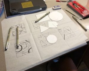
For this exercise, we used our square templates and traced circles, triangles, and squares of various sizes to show different design principles. I liked this exercise because I got to play around with line weight and empty space and I really bent the rules to make it how I wanted it to look. I played with the lines mostly by dotting them or not finished the whole shape, creating a straight line.


Point Line Plane Exercise

The goal for this exercise was to convey specific design principles using only a point, line, and plane. The constrictions were that 2 of your shapes had to be static and the other 2 dynamic, and each shape had to be convex, using protrusions instead of intrusions to construct the shape. Half of each composition had to be curvilinear and the other half geometric. We had 4 8x8in squares in white card stock and our point, line, and plane was cut out of black card stock to promote contrast.


Iterations


The process  of making the 3×3 square template was very meticulous.


The process of A2 exercise was a challenge because I used circles when we supposed to only use pointed geometrical shapes for tracing. I also had trouble visualizing the hidden shapes.


.


My first attempt at shape, line, plane compositions was a bit of a flop. I didn’t understand the directions and used the wrong type of shapes, and they looked very boring and blob-like.


My second attempt was much better, where I replaced the worst 2 compositions with better ones that followed the criteria.


My first idea for final project looks good at first but it was too complicated to continue with.


My final project idea was amazing in my eyes, I like how abstracted it is while still giving off strong elements and principle.


Production


One of the most important starting pieces for this project was the 6 panel tracing paper.  Deb specified that if the lines were even 1 cm off then we would get points off. I had trouble with the precise measurements but with practice, I got it down. It took a couple of tries and erased and an explanation as to why it was so important until I understood completely. If this version wasn’t perfect, then all the tracing would be imperfect too.


With the first assignment, A2, I really enjoyed how much freedom I had in arranging my shapes and the different kinds of outlines I could use. My thought was that I got bored with the usual process, like drawing solid lines, so I spiced it up a bit and made it my own work.

I began with the dotted lines, then tried playing with the line weight and even the negative space combined with line weight. When I first started changing things, I was afraid that I would get scolded for breaking instructions but I learned that here, there are no incorrect answers or actions. I had a lot of fun trying out new outlines and designs between the shapes.

I think it turned out well and Deb agree because she complimented me the next day. I learned from this that its ok to be bored sometimes, beneficial even, because it allows you to think outside the box and experiment. If I had to do this again, I might have made my shapes in different sizes so I would have more range and scale to play with, as my shapes were similar in size.


With the second part of the A2 assignment, filling in spaces to make new shapes, I struggled a bit. The objective was to find new shapes inside our other shapes, through the overlaps and edges. My trouble with this was that Deb wanted us to start with geometric shapes, all corners and not curves, but since I worked with circles in almost every piece, it was hard to find straight shapes. Maybe next time I will do pieces with only one shape instead of all three all the time.


For the shape line plane exercises, I didn’t give the initial project much thought and just threw together my original 4 compositions.  I didn’t fully understand the instructions, so I didn’t realize that the two curvilinear shapes and the two geometric shapes had to be the same. I corrected this mistake later because first attempts are never the best.  For the given principles, I went with the obvious choice: movement for the dynamic pieces, and harmony for the static pieces.

The second take gave me an opportunity to redo 2 of my compositions. Deb gave me some good feedback and told me to explore more with the line and how it didn’t necessarily  have to be straight in the curvilinear pieces. I took it one step further and starting thinking about the point in this respect too. From that, I created my dripping piece by stretching and bending the line and point in one joint fluid motion. For my second replacement piece, I just made it more obviously a dynamic piece and changed the scale of my shape. I wanted to convey the action of sliding so I positioned my shape at an angle on the page and placed the line underneath it, as a ground line. I wanted to show that gravity was in effect and the shape was in a state of movement as it slide down the line. For the dot, I just placed it above the shape, almost making it look like a person. I accepted the final piece but it wasn’t as attractive to me as the other composition.


For the actual final piece, I started with this crazy shape. Right after it was made, I realized that it was way too complicated and they wasn’t really a strong design principle that connected to it.

For my second attempt, I decided to start with a design principle and brainstorm from there, which I found to be much easier. I decided on harmony/ symmetry and built a compositions using all 3 shapes. I wanted my piece to be symmetrical because symmetry looks very smooth to me and calming. Earlier in this project I was digitally playing with my shapes, trying to create new shapes(as you can see in my first attempt of the final) and I accidentally made a raindrop. Its not a new shape but I really liked it and wanted to use it in this final composition.  I paired that underneath my main square in the center of the paper, again promoting symmetry. When I compared my piece to my classmates pieces, mine looks very different and plain when seen next to big, bubbly, extravagant shapes. But, I followed my plan and my vision to what I planned for my piece to be.


Shape grammar