By Alexandra Warner

Students head to and from class on Oct. 23, 2013 at the Fisher College of Business, located on Ohio State’s Columbus campus. Fisher College of Business was recently ranked 36th in the nation.
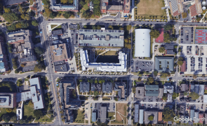
Fisher College of Business at The Ohio State University was founded on March 7, 1916 and is located on 2100 Neil Ave, Columbus, OH 43210. The Fisher College of Business (aka Fisher) is a complex consisting of five academic buildings; these buildings include Mason Hall, Pfahl Hall, Fisher Hall, Gerlach Hall, and Schoenbaum Hall. The complex also consists of the Blackwell Inn and Conference Center. The completion of what is now known as the Fisher College of Business Complex was completed in two phases; Phase I consisted of Fisher Hall and Gerlach Hall and Phase II consisted of Mason Hall, Pfahl Hall, and Schoenbaum Hall (“Our”). Connecting these buildings are numerous outdoor, intersecting, walking paths and an underground tunnel system. The walking paths are open to the elements; however, with that said, the presence of a first floor stoa extends along the courtyard. These stoas are covered and accessible through the walking paths, but the stoas are dark most of the day; the sun hits each section of the stoa, partially lighting up the interior for a limited amount of time. During the day, most of the stoas are dark. The Fisher Complex can be entered through entry ways (between each building) are passing through one of the five buildings. The official entryway for the Fisher Complex (Bert L. & Iris S. Wolstein Gateway) is between Mason Hall and Schoenbaum Hall.

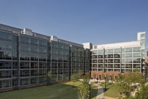
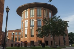
Exterior view of Mason Hall on the Fisher College of Business campus.
Mason Hall is located on 250 W Woodruff Ave, Columbus, OH 43210 and began construction on August 22, 1997 during phase II. This building was dedicated and completed in the autumn of 1999. Mason Hall is named after Raymond E. Mason, who graduated from and played football for The Ohio State University. The architects for Mason hall were Karlsberger Company, Cooper Robertson & Partners, and Kallman McKinnel & Wood. Mason Hall contains the office of Information Technology Services, computer labs accessible to students, indoor and outdoor patio space (includes seating), and a café (“Mason”). Mason Hall is easiest to distinguish between the five buildings due to its corner cylinder that extrudes into the courtyard. Contained in the lower level of the cylinder space is the popular Rohr Café and patio space. The exterior patio space borders the courtyard connecting the academic buildings. Compared to the other rectangular buildings, the addition of the cylinder to Mason Hall presents a “post-card image” of the Fisher College of Business.
Pfahl Hall is located on 280 W Woodruff Ave., Columbus, OH 43210 and is named after John K. Pfahl, who was a finance professor and the “chair of the finance department at Fisher College.” Pfahl hall was completed during phase II and approved in 1996; the architects on the project are Karlsberger Company, Cooper Robertson & Partners, and Kallman McKinnel & Wood (“Pfahl”). Pfahl is a brick, rectangular prism with a datum of windows. When imagining business, this building resembles the other three business buildings. Pfahl Hall contains executive education programs, a conference center and a restaurant.
Fisher Hall is located on 2100 Neil Ave, Columbus, OH, 43210 and was designed by Karlsberger Company, Cooper Robertson & Partners, and Kallman McKinnel & Wood. Fisher was included in Phase I and completed on August 3, 1998. Fisher Hall, much like the Fisher College of Business is names after Max M. Fisher who was an Ohio State graduate and became a successful businessman and donated 20 million dollars to the Fisher College of Business. Within Fisher Hall, there are faculty and administrative offices, along with “research and business partnership centers” (“Fisher”). Much like Pfahl and Mason, the façade of Fisher Hall is brick with a repetition of windows. Much like Pfahl Hall, Fisher Hall resembles a similar block shape; however, it stands much taller at ten stories (plus a basement).
Gerlach Hall is located on 2108 Neil Ave, Columbus, OH 43210 and was designed by Karlsberger Company, Cooper Robertson & Partners, and Kallman McKinnel & Wood. Gerlach Hall was completed as a part of Phase I on August 3, 1998 and is named after a well-known businessman (and former OSU Foundation Board Chair) John B. Gerlach. This building houses the graduate programs at the Fisher Complex, the Office of Career Management, and the Batten Investment Laboratory (“Gerlach”). Gerlach is like Pfahl with the datum of windows and repetitious, brick façade.


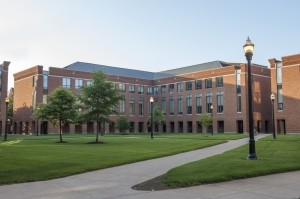
Exterior view of Schoenbaum Hall.
Schoenbaum Hall is located on 210 W Woodruff Ave, Columbus, OH 43210 and includes the undergraduate business programs and the Berry Auditorium. This building is named after Alex and Betty Schoenbaum due to their numerous contributions to Ohio State University and was completed during Phase II on August 20, 1999. Schoenbaum Hall resembles the other buildings in this complex (designed by Karlsberger Company, Cooper Robertson & Partners, and Kallman McKinnel & Wood) in that it has the brick and windows with a stoa surrounding the courtyard (“Schoenbaum”).
The overall architectural style for the Fisher College of Business is utilitarian. Utilitarian architecture is a minimalistic style used primarily for function and efficiency rather than a piece of artwork. The characteristics of utilitarian included large windows, high ceilings, and inexpensive materials. The large windows and high ceilings provide natural light, reducing the need for artificial light; this is ultimately more efficient by reducing electrical cost (“The Utilitarian”).
The idea of a stoa originates from Greek architecture. The stoa, but definition, is a free standing, covered walkway supported by columns. Each building of Fisher College contains a stoa at the ground level. This provides shade and coverage from the elements for individuals walking to and from destinations (“Stoa”).


Bibliography
Herrick, John H. “Fisher Hall, Max M.” Knowledge Bank. The Ohio State University, n.d. Web. 17 Nov. 2016. <http://kb.osu.edu/dspace/handle/1811/24267>.
Herrick, John H. “Gerlach Graduate Programs Building, J. B.” Knowledge Bank. The Ohio State University, n.d. Web. 17 Nov. 2016. <http://kb.osu.edu/dspace/handle/1811/24389>.
Herrick, John H. “Mason Hall, Raymond E.” Knowledge Bank. The Ohio State University, n.d. Web. 17 Nov. 2016. <https://kb.osu.edu/dspace/handle/1811/38579>.
“Our Campus.” Fisher College of Business. N.p., 21 July 2016. Web. 17 Nov. 2016. <https://fisher.osu.edu/about-fisher/our-campus>.
“Pfahl Executive Education Building.” Knowlton School Digital Library. N.p., n.d. Web. 17 Nov. 2016. <https://ksamedia.osu.edu/work/64451>.
“Schoenbaum Undergraduate Program Building.” Knowlton School Digital Library. N.p., n.d. Web. 17 Nov. 2016. <https://ksamedia.osu.edu/work/64449>.
“Stoa.” Encyclopedia Britannica Online. Encyclopedia Britannica, n.d. Web. 22 Nov. 2016. <https://www.britannica.com/technology/stoa>.
“The Utilitarian Architectural Style.” Architecture. N.p., n.d. Web. 22 Nov. 2016. <http://academics.smcvt.edu/winooskimills/millshistory/architecture%20and%20engineering/Intro%20architecture%20.htm>
