Posts

Test of changing the role of a span in a menu

This is a test of changing the role of a span to fix an accessiblity issue.

Creating link text intended for screen reader users that is hidden visually

TOC

In some cases, developers may want to create links that are only intended for screen reader users, that are hidden visually. There are two ways to create visually hidden links:

  • The aria-label method
  • The clip method

One case where you might want to have visually hidden links is the case of social media icons. For example, visually you might want to show a Facebook logo for the link, but screen reader users you would spell out the word ‘Facebook’ in the link. So, it would appear as a Facebook logo button, but have an accessible name of ‘Facebook’.

The aria-label method

Aria-label is the attribute that can change the accessible name of a link. In this method, a CSS class is placed in the <a> tag to visually show the Facebook icon, like class=”fb”. Then the aria-label attribute is used in the <a> tag to provide an accessible name. Without aria-label in it, it would be an empty link.  
Aria-label code example:

  <a href="https://www.facebook.com/stateuniversity"  class="fb" aria-label="State University Facebook  page"></a>
  

The clip method

In the clip method, the text that’s desired to be visually hidden is wrapped in a <span> and given a CSS class, like: class=”visually hidden”. Then in that CSS class definition, the text is thrown off-screen, so it’s not seen visually, but remains available for screen reader users. It’s called the clip method because it uses the clip CSS property to redefine the visible portion of the link element and totally clip it from being seen.
Clip method code example:

  <a href="https://www.facebook.com/stateuniversity"  class="facebook_icon">
<span class="visually-hidden">State University Facebook page</span>
</a>

Some CSS for the code example:

  <style> …
.visually-hidden {
border: 0;    clip: rect(0 0 0 0);
height: 1px;    margin: -1px;
overflow: hidden;    padding: 0;
position: absolute;   width: 1px;
}
</style>

Updated clip method CSS

The MDN docs say that the clip CSS property is now deprecated. Here is the CSS updated to use the clip-path method:

  <style> …
.visually-hidden {
border: 0;    clip-path: rect(0 0 0 0);
height: 1px;    margin: -1px;
overflow: hidden;    padding: 0;
position: absolute;   width: 1px;
}
</style>

The clip-path property can also clip with different shapes, other than a rectangle, like: circle, ellipse, and polygon.


Resources about creating visually hidden links:

Using role=”presentation” on HTML tables for special cases

HTML table example with role=”presentation” on it

In this example, screen readers should not treat the data table as a table because role=”presentation” removes those table semantics. For this technique to work the role=”presentation” has to be in the table element itself, not on a wrapper div. Upon testing, NVDA and Narrator comply and treat it as normal text without saying anything about the table rows or cells. Layout tables are a case where you might use role=”presentation” to make the table not look like a true data table to screen readers.


Railroads in Columbus Union Station table example
Railroad name Years in operation Succesor company
New York Central 1853-1968 Penn Central
Pennsylvania Railroad 1846-1968 Penn Central
Penn Central 1968-1971 (company existed until 1976) Conrail / Amtrak
Norfolk & Western 1838-1982 Chessie System / CSX
Baltimore & Ohio 1830-1972 (name still used until 1987) Norfolk Southern
Chesapeake & Ohio 1869-1972 Chessie System / CSX

For comparision here’s the same table example but with role=”presentation” removed:


Railroads in Columbus Union Station table example
Railroad name Years in operation Succesor company
New York Central 1853-1968 Penn Central
Pennsylvania Railroad 1846-1968 Penn Central
Penn Central 1968-1971 (company existed until 1976) Conrail / Amtrak
Norfolk & Western 1838-1982 Chessie System / CSX
Baltimore & Ohio 1830-1972 (name still used until 1987) Norfolk Southern
Chesapeake & Ohio 1869-1972 Chessie System / CSX

Mapping InDesign Paragraph Styles to Heading Tags

To setup heading styles in InDesign you’ll need to define Paragraph Styles in your InDesign document. Penn State has a good article about this. You basically create styles for the heading levels you want to use in your document, such as H1, H2, and H3. You can also setup a regular paragraph style for the <P> tag.

To open the Paragraph Styles panel in InDesign:

  • Go to the Window menu.
  • Choose Styles > Paragraph Styles.

To create a new paragraph style from existing text:

  • Select the text.
  • Choose ‘New Paragraph style’ from the hamburger menu in the ‘Paragraph Styles’ panel.

The font & size attributes of the text you selected become the basis of the new paragraph style.

To check which tag a style is mapped to:

  • Select the style in the ‘Paragraph Styles’ panel.
  • Go to in the ‘Paragraph Styles’ panel hamburger menu and choose ‘Style Options’.
  • Click on the ‘Export tagging’ area. Under ‘PDF’ you will be able to see which style your paragraph style is mapped to. If you want to map it to a Heading Level 1, then choose H1 from the list of tags. If there are not a lot of tags in the list you may need to load your standard paragraph styles from another document and use the ‘Map styles to tags’ function under the Structure area.

To see the tags structure of an InDesign document:

  • Go to the View menu.
  • Go to Structure > Show Structure.

To map your newly created heading paragraph styles to tags in the structure:

  • Go to the hamburger menu in the Structure panel.
  • Choose the ‘Map styles to tags’ option.

If you have a premade set of paragraph styles you want to reuse in the document, you can load them via the ‘Load’ button in the ‘Map styles to tags’ option. This could save time in setting up tags & styles. Some designers keep a separate .indd InDesign file with all their commonly used styles in it to load.

The document structure appears as in a panel on the left side of your screen.

How to create accessible data tables in InDesign

TOC

There are a couple things to check to be able to export accessible data tables from InDesign:

  1. Make sure your table has a header row at the top. You can check if it has a header row in the Table Setup options.
  2. Ensure that you export your document as a ‘tagged PDF’.

Also, keep in mind that InDesign can only markup basic tables with column header cells in a top header row. If you need to do a more complex table that also includes row header cells on the left side, you’ll need to add the row header cell markup in Adobe Acrobat Pro.

To create a data table in InDesign:

  • Click in a text where you want the table to go.
  • Select Table > Create Table.

This brings up a dialog that asks how many rows and columns you want in the table. The important part for accessibility is that it asks you to designate one or more header rows. A typical basic table has one header row.

Inserting a table into an InDesign text box.

Be sure to include a header row when insterting a data table into your PDF document.

How to select a table in InDesign and adjust options?

  • Click in the table that you want to adjust.
  • Go to the Table menu in InDesign.
  • Choose Table Options > Table Setup.

A dialog box of table settings comes up where you can adjust settings like the number of rows and you’ll also have the ability to add a header row if your table doesn’t already have one.

Selecting a table and adjusting setup options

Selecting a table and adjusting setup options

How to add a row to a table in InDesign?

  • Click in the row where you want the new row to go above or below.
  • Go to the Table menu in InDesign.
  • Choose Insert > Row.
  • Choose if you want the new row to go above or below the current row and hit ‘Ok’.

The new row appears above or below the current row you were in.

Inserting a row in an InDesign table.

Inserting a row in a data table

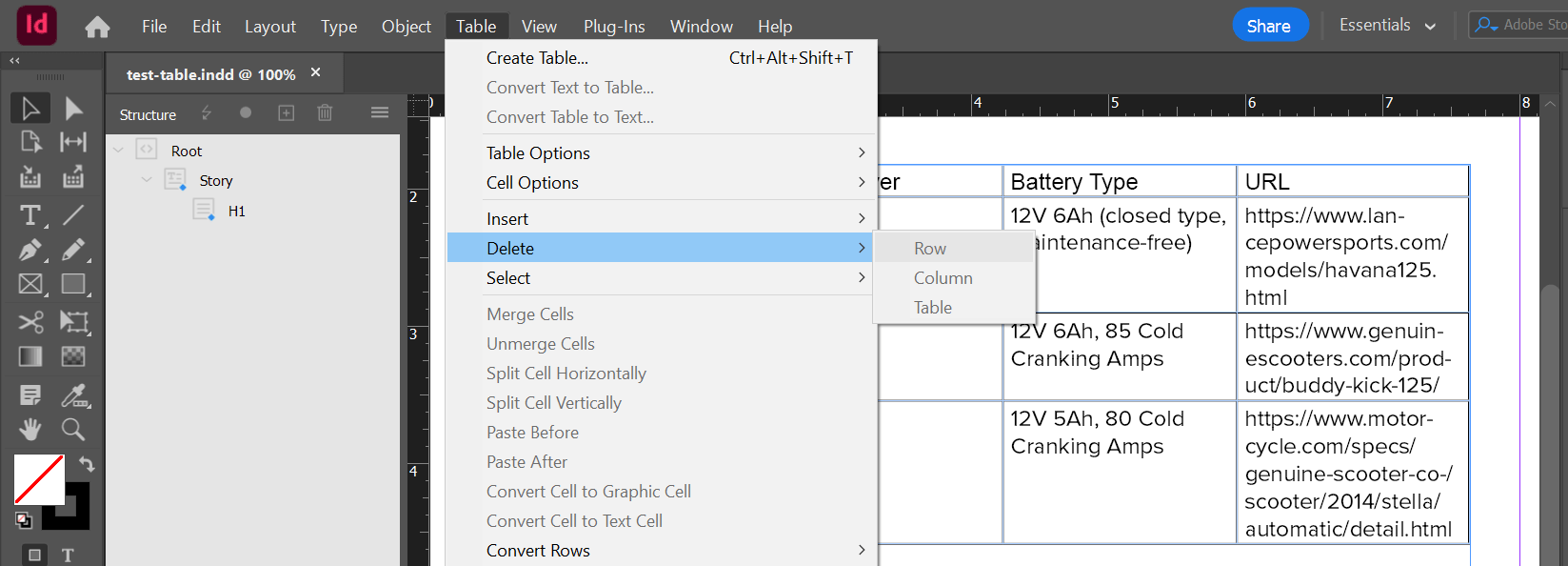
How to delete a row in a table in InDesign?

  • Click in the row that you want to delete.
  • Go to the Table menu in InDesign.
  • Choose Delete > Row.

The current row is deleted.

How to delete a row in a table

How to delete a row in a table

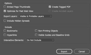
To export your PDF document with accessibility features:

  • Go to File > Export and choose PDF format.
  • Hit Save and in the options that come up make sure ‘Tagged PDF’ is checked. This will ensure the tag structure for accessibility is included in the document.
  • Click Export and your tagged PDF is saved ready to review in Acrobat.
Make sure 'Tagged PDF' is checked when exporting.

Be sure sure ‘Tagged PDF’ is checked in the options when exporting your PDF document.

What’s the result in Acrobat tags of including a header row in a data table?

If you want to check that the header row exported made it into your PDF successfully you can:

  • Open the document in Adobe Acrobat Pro and find the table in the Tags panel.
  • Then open the <TR> rows of the table and verify that the first row uses true <TH> header cells instead of regular <TD> header cells.
When you look at the exported table tags in Acrobat, the first row will have true <TH> header cells instead of regular <TD> header cells. Normal rows below it will use regular <TD> header cells.

When you look at the exported table tags in Acrobat, the first row will have true <TH> header cells instead of regular <TD> header cells. Normal rows below it will use regular <TD> header cells.

Running the accessibility checker in Adobe Acrobat will also tell you if there’s a problem with your data tables.

To run an accessibility test in Acrobat Pro:

  • Find ‘Prepare for accessibility’ under ‘All Tools’
  • Click ‘Accessibility Check’, accept the default settings, and click ‘Start Checking’.

The test runs and the results pop up. Any table issues can be found under the Tables section.

How to delete a row in a table

Running the accessibility checker in Adobe Acrobat.

Resources about InDesign and accessibility


Videos about InDesign and accessibility


Other data tables in InDesign resources and tutorials:


More information about InDesign and accessibility:


The trouble with table-based layouts

HTML tables aren’t a good choice to use to create columns or layouts in a webpage because they aren’t as responsive to small screens and can cause confusion to screen reader users. Back in the late 1990s a lot of designers used tables for visual layout, but this was later found to be a bad practice because fixed-width table-based layouts didn’t adaptive well to different-sized screens. This layout practice used the HTML <table> element for a use that it wasn’t semantically intended. HTML tables were designed for data grids, from the perspective of semantic structure, so it is better to use them only for that purpose.

How developers can ensure layout tables don’t cause problems for assistive technology

Web developers should take steps to ensure layout tables don’t cause problems for screen reader users. If an HTML table must be used for a layout, the developer should add the role=”presentation” attribute to the <table> element so it’s not confused with a data table. Role=”presentation” tells the screen reader to ignore the semantic table markup and treat it as normal text. The web developer also should not include any of the header markup for data tables in a purely visual layout table. These data table header markup tags to avoid are:

  • The <caption> element
  • The <summary> attribute
  • The <th> element
  • The scope attribute (that goes in a <th> tag)
  • The headers attribute (that goes in a <td> table cell tag)

If data table markup tags are used in a purely visual layout table, screen reader users might expect the table to represent tabular data leading to confusion or a poor user experience. So, if a purely visual layout table must be used the developer should ensure that ARIA is used to make it look like normal text to screen readers. Any purely decorative images used in the table so be marked with null alt text (alt=” “) or hidden from readers with aria-hidden=”true”. Back in the late 1990s, web designers used to use tools like Macromedia Fireworks to slice up webpage visual mockups into layout tables and many time these tables would include a bunch of purely decorative images.

An easy way to avoid the troubles with layout tables is to avoid using them at all. For the modern web CSS (cascading style sheets) is a more robust way to design visual layouts. Once web developers realized web sites would be viewed on devices of many different screen sizes, they began using CSS to create columns, float content, and adapt to different viewport widths. The latest Web Accessibility Guidelines (WCAG 2.1) say that websites should be responsive and including layout tables would likely work against that. According to WCAG guidelines, tables should reflow to fill most of the width of the viewport, without causing any horizontal viewport overflow. On smaller screens it becomes more difficult avoid horizontal scrolling (horizontal overflow).  The WCAG SC that is related to tables and horizontal viewport overflow is 1.4.10 Reflow. This success criterion requires that content can be presented without loss of information or functionality, and without requiring scrolling in two dimensions for vertical scrolling content at a width of 320 CSS pixels.

How content authors can avoid using tables for layout

As a content author, might craft your blog posts in MS Word documents and you might desire to create a visually interesting layouts using tables in Word. But doing so will introduce some of the same accessibility problems as with using HTML tables for layout in a webpage.  It’s best to paste your content into WordPress blog posts as plain text without MS Word formatting so the conversion to HTML will be more semantically correct, free from accessibility problems. Pasting a table-based visual layout from a Word doc should be avoided because it can introduce accessibility problems into a blog post and lead to poor user experiences for both visual and screen reader users.  Tables aren’t really a valid layout technique in Word documents. They are meant for tabular date (data grids). When publicly shared on the web at public universities, Word docs (and PDFs) are expected to follow WCAG guidelines. So, it’s best to follow accessibility best practices even in our Word documents.

WordPress blog sites may or may not include a table tool in the rich text editor for posts. If your WordPress blog does include a table tool, be sure to use it responsibly. Avoid using the table tool for layout tables unless you have the HTML expertise to markup the table so it doesn’t cause problems for assistive technology. If your blog includes a table tool, it’s best to stick to using it just for data tables. You can ask your department’s web developer to check your data table for accessible markup. It’s possible for rich text editors to create simple accessible data tables but when you get into more complex data tables you’ll have to go to the code view to insert the correct accessible markup. Some more advance table markup that might not be in your rich text editor’s table tool may include:

  • Ability to add the scope attribute (that goes in a <th> tag)
  • Ability to add the headers attribute (that goes in a <td> table cell tag)

Once you get into creating more complex data tables you should probably work with your department’s web developer to make them accessible.  For accessible presentation in websites, sometimes it’s better to split a complex table into two or more simple tables. This makes the data tables easier to understand to screen reader users a more adaptable to different screen sizes (more responsive).

Opening a link in a new window or tab

I tend to like opening links to external websites in a new window with target=_blank. Below is an example of the code I use to make a link like that more accessible. WCAG guidelines say we should warn a screen reader user when a link is going to open in a new window, so I do that with an aria-label attribute in the a tag. Using an aria-label attribute is a way to override the standard accessible name of the link and provide more context for screen reader users.

Example of a link with an aria-label attribute in the a tag


Videos can be hosted in MediaSite

Videos can be hosted in MediaSite

Actually, the best practice for links that open in a new window is to provide both visual and verbal indication. For sighted users an external link icon appended at the end of the link could be used. See this article about opening links in new windows article from the University of California Berkeley for more information about best practices. WCAG guidelines only recommend opening links in new windows in a few special situations.

Social Media Accessibility

TOC

Social media accessibility is the practice of ensuring content is consumable by our entire community. WCAG 2.1 guidelines also apply to social media content and platforms. The Web Content Accessibility Guidelines (WCAG) are a set of globally adopted technical standards on web accessibility developed by the World Wide Web Consortium (W3C). WCAG is technological agnostic so it can apply to any digital content or apps. I’ve added links to related WCAG guidelines at points in this article.
Many people in our audience live with disabilities (temporary or permanent). People with vision, hearing, cognition, or mobility disabilities often use assistive technology to access digital content in their preferred format. Making social content accessible means ensuring it works with assistive technologies like:

  • Screen readers or magnifiers 
  • Closed captioning 
  • Voice command software

Text Content

Writing social media content that is easy to read and understand will be more accessible for everyone, including non-native English speakers and people with cognitive disabilities. Some additional writing tips include:

  • Don’t rely on the image or graphic to relay essential information (dates, times, location…etc.)—include essential information in the copy of your post.  WCAG SC 1.1.1: Non-text Content (Level A), the success criterion about alt text, is related.
  • Write using clear prose in short sentences and paragraphs. WCAG SC 3.1: Readable is related to this point. SC 3.1.5: Reading Level (Level AAA) is also related.
  • Try reading content out loud to make sure it is clear.
  • Keep an active voice with uncomplicated words.
  • Avoid jargon and be sure to spell out acronyms on the first reference, especially since these can be confusing when read separately without context or explanation.
  • DO NOT use non-native or display fonts. Use standard fonts Arial, Helvetica, Times Romans, and others that are natively installed on Mac, PC, and mobile devices. Some non-native fonts will be unreadable by a screen reader.

Here’s a list of cognitive disability related WCAG guidelines.

Hashtags

Hashtags can be a great tool to connect with a larger audience but make sure they don’t add mystery to the message you are trying to convey. Some additional hashtag tips include:

  • Be strategic and concise with hashtags you create yourself.
  • Since you can’t use spaces in hashtags, use “CamelCase” by capitalizing the first letter of each word to add additional clarity (e.g., #OhioState, #FranklinCounty, #CuyahogaCounty)
  • Use branded hashtags to join the conversation with other organizations and partners (e.g., #Huntington, #Cocacola, #FairhillPartners, #GenerationsUnited, and etc.).
  • Minimize the number of hashtags to three or fewer and only use them when necessary or part of a campaign.

— Graphics and Charts in Social Media

Any important information that contained in a graphic should be easily readable and conveyed in the alt text or post copy (e.g., a graphic with event details). Some additional tips include:

These techniques will allow your social media graphics and charts to be consumable by people with low vision, colorblindness, and blindness. These inclusive techniques help share you charts with a broader audience.

For graphics and charts posted in the Facebook and Instagram platforms, you may need to add your descriptive alternative text in the post copy after your main text. Not all social platforms have the same capabilities for adding alt text as in CMS (content management systems). and LMS (learning management systems).

Here’s some information about using alt in Facebook posts.

— Social Media Video Content

Closed captions are the main way to make spoken content in videos consumable to people with hearing disabilities. The WCAG guidelines related to captions for video is SC 1.2.2 Prerecorded video (Level A) and SC 1.2.4: Captions (Live) (Level AA). Including captions with your social media videos will also help those without a disability because research shows that 69% of consumers view video content with the sound off at times. Here are some options for including captions in your social videos:

Closed Captions files

An .SRT file is a common file type for closed captions. This file can be uploaded on many social media sites alongside your video and will play when the video plays with toggle on/off capabilities. The benefit of a separate .SRT file is that you can edit and control exactly what is being displayed (which is particularly important for accuracy with proper nouns). You can obtain closed caption .SRT files from paid services like Otter.ai or download from YouTube auto generated captions. Otter.ai and YouTube Studio have tools that can help you edit your caption text for accuracy.
.SRT files can be added to videos on Facebook, LinkedIn, Twitter, YouTube, and Vimeo. It is best practice to upload the file at the same time as posting your video as not all platforms allow you to go back and make edits.

Auto Closed Captions

Auto-captioning is available on several popular social media platforms. These transcriptions are generated automatically by machine learning technology. Proper nouns and accents can affect their accuracy and the generated captions should be double-checked and edited, if possible.
Facebook, YouTube, Instagram, LinkedIn and TikTok have auto-captioning capabilities. On Facebook, YouTube and TikTok you can edit the auto-captions once they are generated. YouTube Studio also allows you to download a .SRT file of your captions that could be uploaded to another platform.
Here is some information about how to add auto-captions for these popular platforms: 

— Resources

Here’s an Ohio State Social Media Accessibility Guide from University Marketing.
There’s a good Tips for more accessible social media video in one of the LinkedIn Learning courses.
Creating an Accessible Facebook Post article with accessibility tips.

Using the Meta for Business Planner for entering social media posts and stories

In the Meta for Business Suite – Updated on 2/10/23

How to schedule a post in the Meta Business Suite

  • Login at: https://business.facebook.com/ and click on the calendar icon to go to the Planner.
  • Click on the down arrow next to the Create button and choose ‘Create post’ (or Create story’).
  • Enter your post text, add your photo, and click the down arrow next to ‘Publish’.
  • Choose ‘Schedule Post” and enter the date and time you want the post to be published.
  • Double check your story settings and click ‘Schedule Post”. The story appear under the date when you scheduled it.

How to schedule a story in the Meta Business Suite

  • Login at: https://business.facebook.com/ and click on the calendar icon to go to the Planner.
  • Click on the down arrow next to the Create button and choose ‘Create story’.
  • Enter your story photos/media and click the down arrow next to ‘Publish’. You can have up to 10 media items.
  • Choose ‘Schedule Story” and enter the date and time you want the story to be published.
  • Double check your story settings and click ‘Schedule Story”. The story appear under the date when you scheduled it.

Social Media Posting Resources

Screen readers and languages test page

The following paragraphs are marked up with different languages in the lang attribute. These can be used for testing the accent of a screen reader. The two letter language code in the lang attribute should match the language the text was written in.

If a language isn’t specified, the screen reader will read the page in the user’s default language. That may result in a bad accent that’s difficult to understand. To specify a language for the page, add the ‘lang’ attribute to the HTML tag. For example: html lang=en.

Si aucune langue n’est spécifiée, le lecteur d’écran lira la page dans la langue par défaut de l’utilisateur. Cela peut entraîner un mauvais accent difficile à comprendre. Pour spécifier une langue pour la page, ajoutez l’attribut ‘lang’ à la balise HTML. Par exemple : html lang=fr.

Marked up as French lang=”fr” a language isn’t specified, the screen reader will read the page in the user’s default language. That may result in a bad accent that’s difficult to understand. To specify a language for the page, add the ‘lang’ attribute to the HTML tag. For example: html lang=fr.

Wenn keine Sprache angegeben ist, liest der Bildschirmleser die Seite in der Standardsprache des Benutzers vor. Das kann zu einem schlechten Akzent führen, der schwer zu verstehen ist. Um eine Sprache für die Seite anzugeben, fügen Sie dem HTML-Tag das Attribut „lang“ hinzu. Beispiel: html lang=de.

Marked up as German lang=”de”: If a language isn’t specified, the screen reader will read the page in the user’s default language. That may result in a bad accent that’s difficult to understand. To specify a language for the page, add the ‘lang’ attribute to the HTML tag. For example: html lang=de.

>यदि कोई भाषा निर्दिष्ट नहीं है, तो स्क्रीन रीडर पृष्ठ को उपयोगकर्ता की डिफ़ॉल्ट भाषा में पढ़ेगा। इसका परिणाम खराब लहजे में हो सकता है जिसे समझना मुश्किल है। पृष्ठ के लिए एक भाषा निर्दिष्ट करने के लिए, HTML टैग में ‘लैंग’ विशेषता जोड़ें। उदाहरण के लिए: html lang=hi.

Resources

ISO 2 Letter Language Codes reference

Google Translate

ISO 639.2 Codes for the Representation of Names of Languages