Santiago’s Sacred Places— Religiously Similar, Yet So Different

I found the difference between the two religiously-significant buildings, Santiago Metropolitan Cathedral and the Benedictine Monastery, very interesting due to the fact that their styles and messages have such a stark contrast to each other. While they are relatively close in location, each in Santiago, they do not connect in any sense. The Santiago Metropolitan Cathedral boasts a large, grand facade in the bustling Plaza de Armas. The cathedral, which was rebuilt many times due to earthquakes, finally settled on a Neoclassical style. The three naves are huge and the crypt was slightly bigger and more well-lit than I was expecting it to be. The crypt did a nice job slowing down the distractions and overwhelming qualities of the large and highly-ornamented interior of the church. The simple and plain materials allowed all of the focus to draw on the hierarchy of the crypt— Jesus. The Cathedral, overall seemed to restrict the natural light, allowing it to come in from the stained glass windows and an oculus. It is such a large space that it makes you forget where you are. The multiple chapels provide various sacred areas along with the crypt.

The largest nave in the Cathedral leading to the main alter.

The simpler and calmer crypt within the Santiago Metropolitan Cathedral.

The exterior of the Santiago Metropolitan Cathedral, with its context being located in Plaza de Armas.

This newer, simpler, more-modern Benedictine Monastery has a very different first impression than the Cathedral. The location, for one thing, provides a clue on what the intended effect of the building is. The Monastery is tucked away in the foothills of the Andes Mountains. It gives an amazing view of the surrounding mountains and towns below. It is not trying to fight for attention, as opposed to the Santiago Metropolitan Cathedral, which is competing with three other pieces of architecture around Plaza de Armas. The simple white exterior was beautiful against the blue sky, making any colors pop even more. The Monastery, while situated to admire the amazing view, does not have any windows to directly highlight the beauty. Instead, windows are tucked into the sides of the walls, at different angles, so they cannot be seen unless you’re looking for them. However, the building incorporates natural light in many ways: above and behind the alter, above the entrance, and behind the statue of Mary and Jesus. I found this use of light incredible since we went to the Monastery in the morning, which highlighted all the amazing features of the Monastery. The inside also was not ornamented like the Cathedral, which allowed you to focus on the statues, crosses, beautiful wood benches, and the glowing yellow light coming from within the chapel.

The exterior of the Monastery, along with a sketch I did, capturing the mountains in the distance.

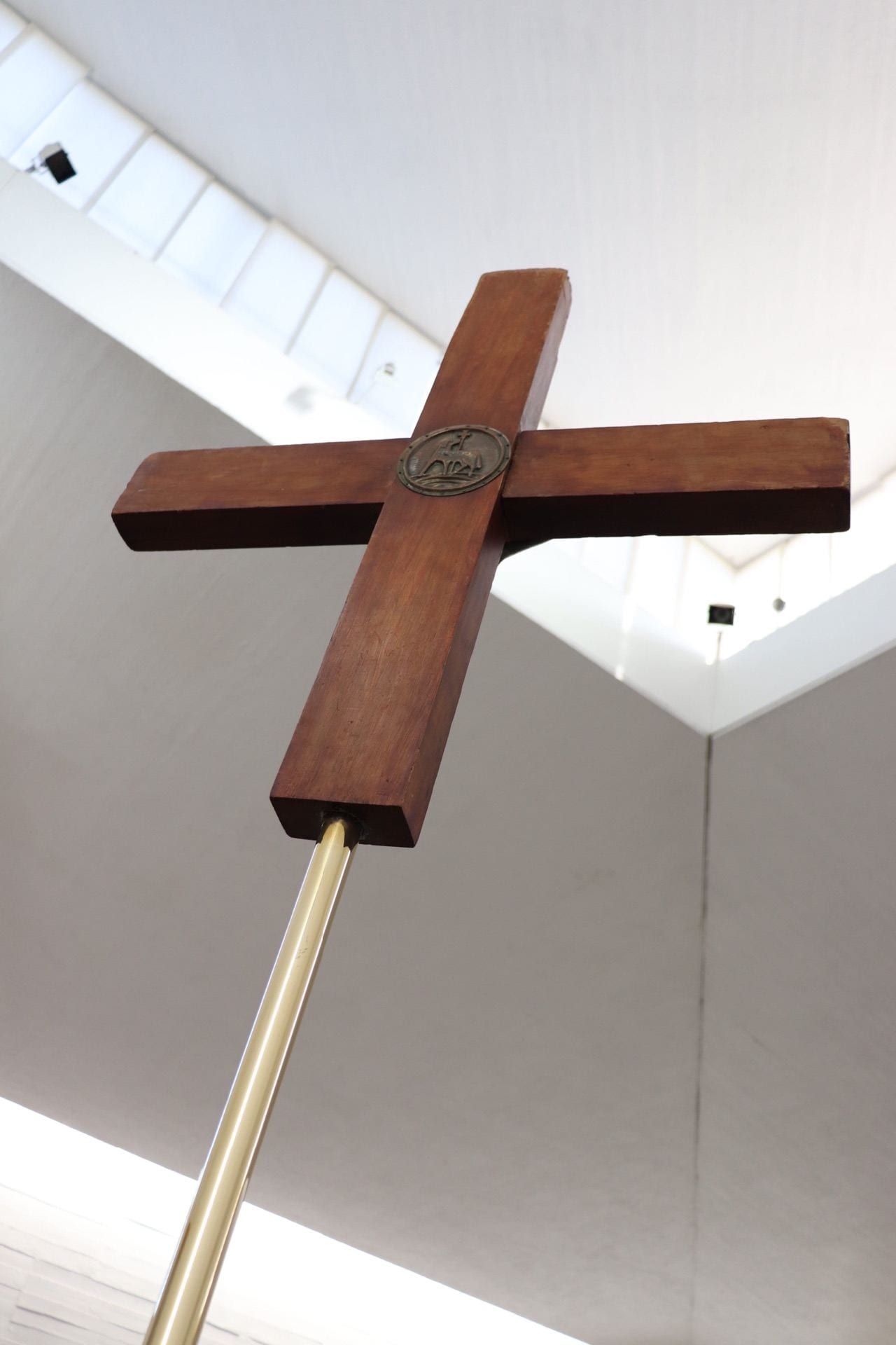
The natural light streaming in above the alter at the Monastery.

Another example of the natural light highlighting a statue of significance— Mary and baby Jesus.

The glowing yellow light from within the chapel, shown from the main space of the congregation.

Personally, I found the slowed down pace and simple beauty of the Monastery more appealing because it allowed you to let go of any distractions or stress. The location and being able to see many mountains was quite amazing. The morning light also was a beautiful quality in and out of the space, shining over the white interior and exterior, showing the Monastery’s amazing qualities.

Mid Century Monastery

The Benedictine Monastery caught my attention in many ways. The first thought that came to mind was how small it looked from the outside. The exterior of the building is white to embrace the style of modern architecture of the time it was being constructed. It is of similarity to the style of The New York Five (architects, Peter Eisenman, Michael Graves, Charles Gwathmey, John Hejduk and Richard Meier). From the west facade, the entrance presented itself as a structure with no change in elevation, but it was completely opposite when  I walked up closer and was able to see over the edge of the hill. Looking up from a lower elevation, the monastery  consist of some unique and similar to La Tourette by Le Corbusier. They both serve the same purpose and belong of two different culture that uses different types of system to build it both structurally and aesthetically.

 The interior space of the monastery further breaks away from traditional cathedrals and monastery design by creating a ramp. The ramp also hides the centralized space of worship from plain sight to make people take a journey through the space. The whole interior is bright and white to reinforce the idea of holiness and allow people to feel connected to god. Many traditional ideas has been broken, but the alter is still facing east to allow the light to shine in as sunrise ego create a unique light effect that illuminated the cross to show god’s presence. 

My interpretation is that people feel like they are being lied to when they arrived from the west facade when they thought the elevator is simple and what you see is all there is to the building. This represents sinning. Then people enter the building, see the wooden sculpture of Mother Mary holding baby Jesus and progress down the ramp. This represents confession and journey to asking for forgiveness. Then people will progress down into the service space and see a natural light illuminating the holy cross from the east facade. This stage represents forgiveness because light represents purity. 

Heavenly Mixed Media

B- Sketch Post

For this sketch, I tried to get a little adventurous. I really wanted to capture the light because it was so intensely shining behind and above it (and in my eyes), but   I didn’t know how to capture it with pen without filling the entire page in ink. Solution? Break out the pencil. I did some minor shading with my pen for the very dark parts, as well as a few hints of pen strokes to indicate the orientation of the exterior material. I then went in with the side of my pencil to add some degree of shading to almost the entire building, given that it was technically all in shade. Lastly, I attempted to illustrate the halo-effect of the sun behind it by shading the most on the corners and least in the middle (kind of a vignette effect). Overall, I think using both pen and pencil led me to create a more effective sketch, and I think I’ll definitely do it again in the future.

My sketch of the Benedictine Monastery

Defining Light Through Shade

     The Benedictine Monastery was a breathtaking surprise to me. Light radiated throughout with an almost spiritual presence that appealed to me unlike many other churches I have visited. It was a welcomed and striking contrast to the darkness and extravagant, rich architecture in the Metropolitan Cathedral in Plaza de Armas. I was compelled to try the shading only sketching technique to capture the quality of light that so greatly defines this beautiful space. Only shading was initially a challenge because the first thing that jumped out at me were the strong lines defining the edges of the walls and ceilings planes. Also while I love shading sketches, I think shading can be difficult to master because it can cause a lot of ambiguity such as determining whether it is meant to show depth, light, texture, materiality, or tone. I tried very hard to use shading to distinguish the light flooding in from the gaps between the ceiling and wall planes while also showing the linear emphasis of the thin slats of wood wall paneling versus the smoother floor and ceiling textures. I think it is interesting that the qualities of airy light can still be accurately captured by such dark graphite sketches when in reality the monastery was one of the most white-washed, naturally lit, bright worship spaces I have been in. I learned a lot about shading as I kept trying to change up my technique in these sketches and tried out a blending stump for the first time!

Shading sketch of the altar space at Benedictine Monastery

Shading sketch of the space opposite the altar in the back of the Benedictine Monastery featuring the statue of Mary holding baby Jesus.

illuminating the cubes

It was so peaceful starting day three out at the Benedictine Monastery. I thought it was really beautiful how light was encorporated throughout the entire building. When we first walked up, the monastery was framed by rays of light due to the perfect placement of the sun as shown below.

Ring of light around the monastery

When we entered the building, I thought it was interesting that the beams of light coming in reinforced the corners. For example, in the picture I have shown below you can really see how the three beams of light draw your eye to the corner where they all meet.

Light on the inside of the monastery

This occurred in several other locations throughout the monastery as well. This may have been done to remind people of how it’s based off of cubes, or to draw one’s eye to the altar. I found the light that occurred both inside and outside beautiful so I decided to sketch the light in two different ways: one of the interior using graphite and one of the exterior using color.

Sketch of the monastery

I decided to add color for the exterior because the vibrant landscape brought such a contrast to the all white monastery. I decided to use the color yellow to show where the light was hitting in the moment I was sketching.