It’s a little more than 24 hours since we have returned to Columbus, Ohio. The flight home was very relaxing and the meals on the plane were so much better than what we had on the way to Santiago. The flight felt shorter and I was able to fall asleep for a majority of the flight home. Looking back to our entire trip and the itinerary, I have noticed we did so much within a short period and it was such an amazing experience.
First of all, going to Chile is a once in a lifetime opportunity. Without going on this study abroad, I would not have known where to start my research. After this trip, I can definitely say that I can definitely plan my trip when I decide to go back in the future, and let’s hope that I know some Spanish before I decide to visit again!
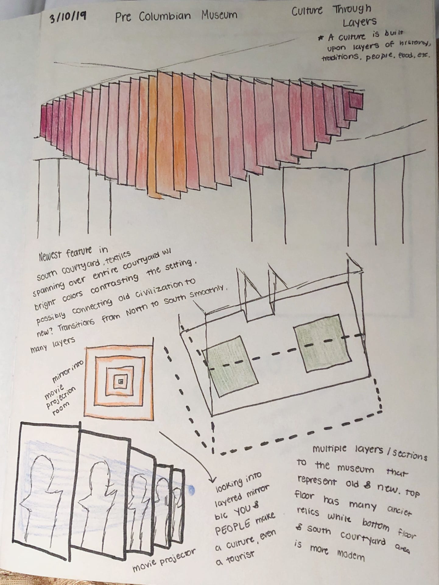
Secondly, I learn so much about Chilean contemporary architecture and landscape architecture by visiting important buildings in and out of Santiago. I enjoy seeing the colorful facades of various buildings throughout the duration of the trip. It definitely adds beauty and a unique style to the architecture. It is also very cool to see how city planing and landscape architecture can come together and create so many unique and amazing public spaces and pedestrian walkways around the city. The pedestrian walkways are often shaded and allow people to take a journey through it and end up in a much larger public space. It definitely felt much cooler in the pedestrian walkway compared to being in a place like plaza de Armas. I wish that we can have more public spaces for people to use in Columbus, and I think we are moving toward that direction in recent years.
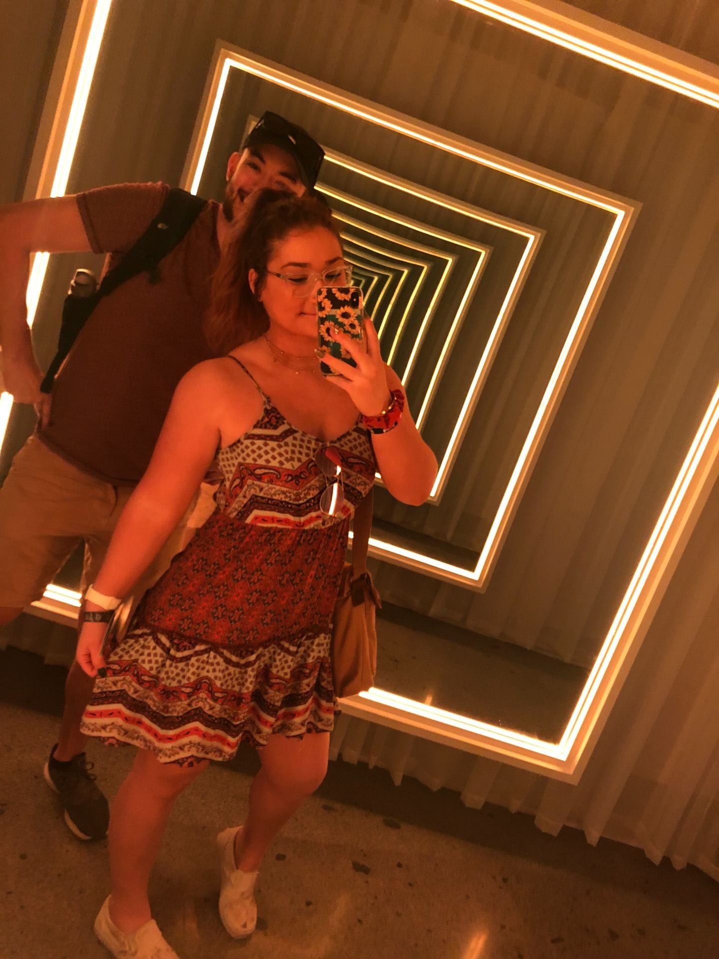
Lastly, I am so grateful to have the opportunity to get to know everyone on this trip. I have notice I did not know anyone and was afraid to talk to a lot of people before the trip, but now it is a completely different story. A week of intensive learning, walking, sketching, complaining and chilling has definitely brought us all close together and I would not have it in any other way. I have learned so much from everyone and learned a lot more about Chilean culture since we have returned.


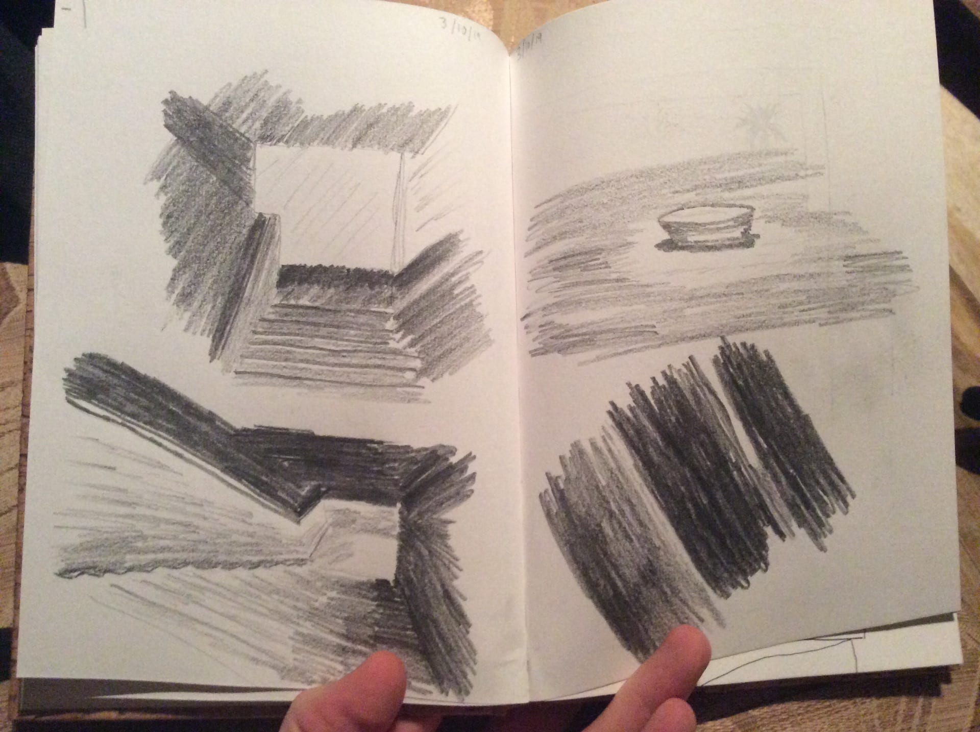
 Stair
Stair