Santiago: An Experience Like No Other

I was amazed by the beauty of Santiago as soon as we stepped out of the airport. Day by day, I only grew to love it more. We learned a lot in class leading up to the trip, but there were so many aspects that could only truly be learned through experiencing it.

The openness, for instance, was very surprising. Everywhere in the city felt like a single open area. Sidewalks, streets, plazas, and parks all felt like one. Locals, tourists, and even dogs all shared the same space while using it in their own way. I have tried to explain this to people since I have come back home, but found it difficult to describe. Perhaps this is simply something that needs to be felt and experienced.

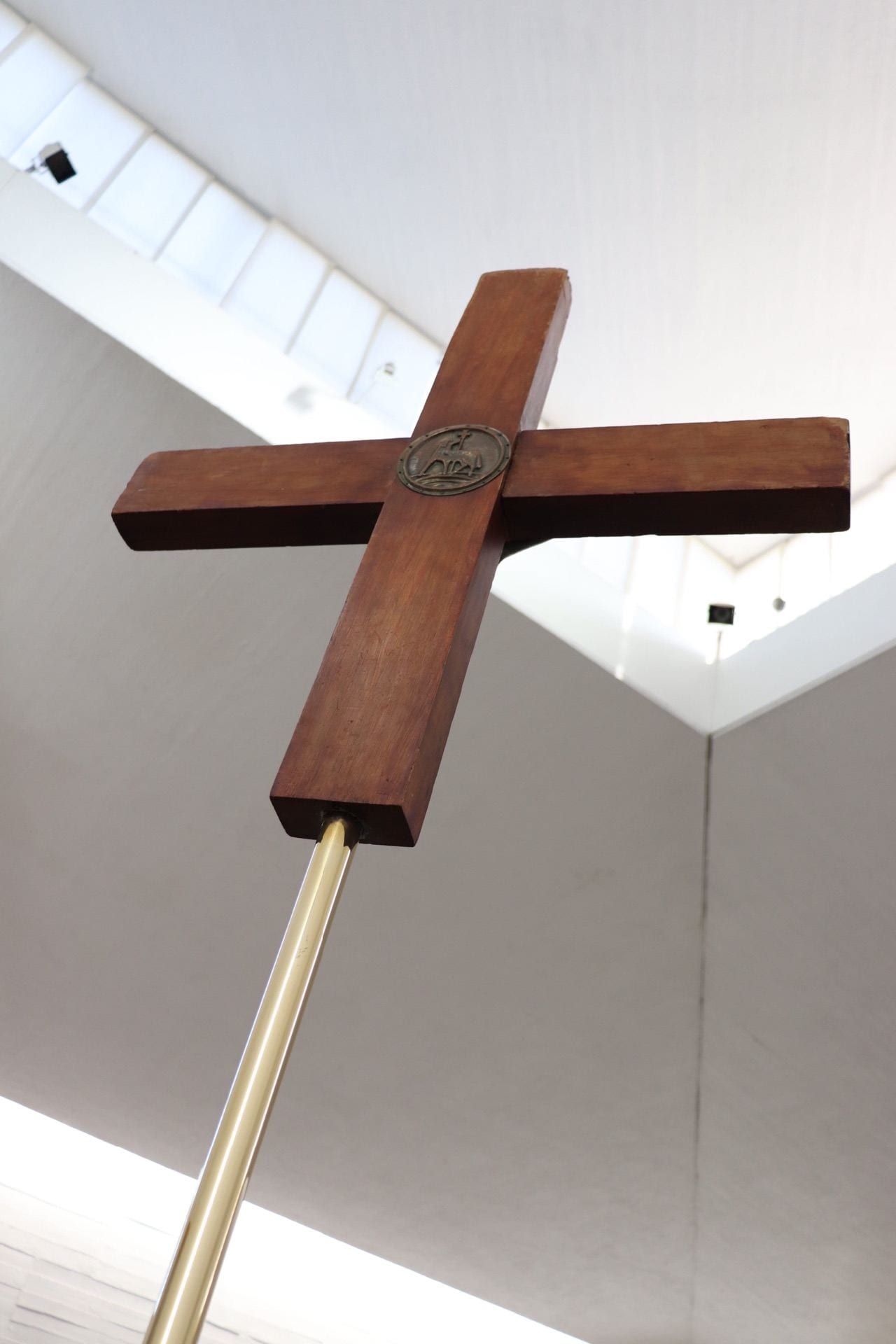
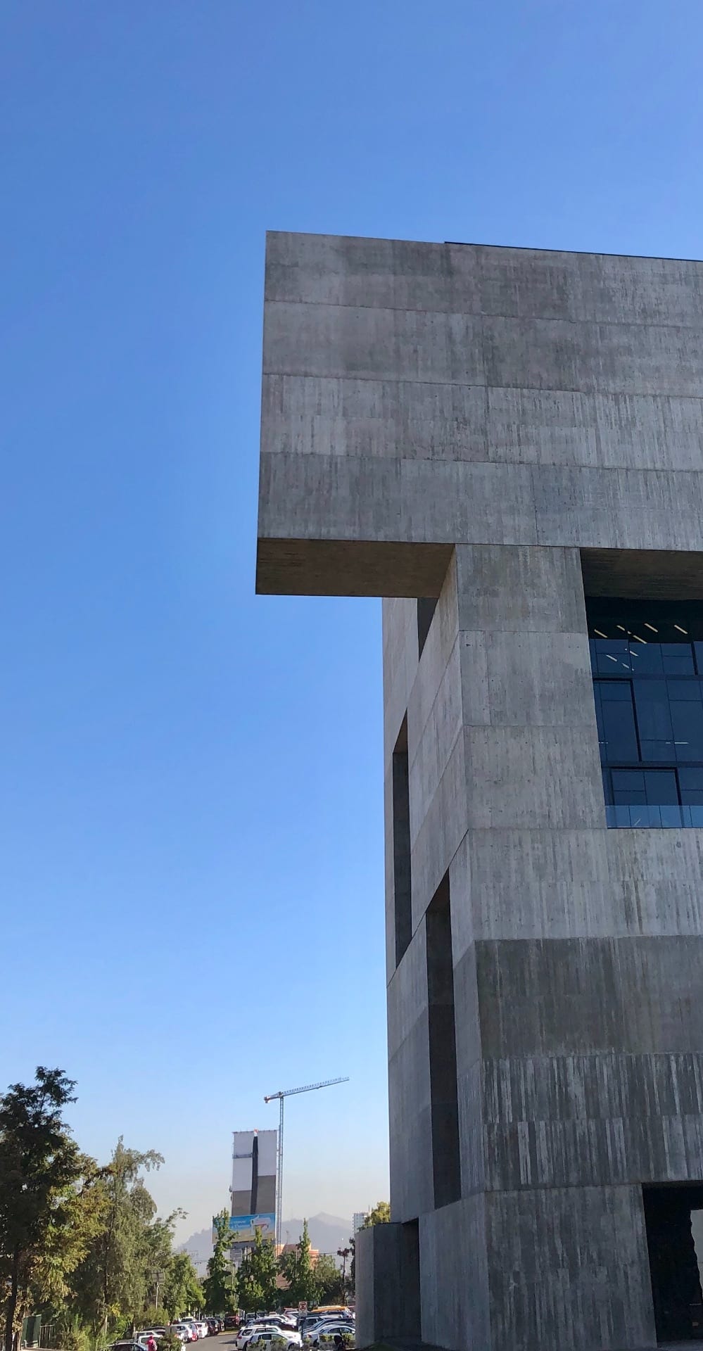
There was a similar situation with the architecture. We discussed and read plenty ahead of time, but nothing compares to seeing the buildings in person. A picture of a handrail in a museum does not do it justice compared to touching it in person and walking down the stairs. Images of the Innovation Center do not convey the monumentality of the space and the views that it provides.

We also spent a decent amount of class time talking about Chilean drinks and food, but no number of videos could convey the delicious taste of jugo de frutilla or the many flavors of helado on the streets.

Simply walking through Santiago or the hills of Valparaiso was probably my favorite part. Looking around gave me the opportunity to appreciate the country and its beautiful art and nature. We were lucky to have a tour guide as great as Alejandro with us because we had so much access to better understand the culture and people around us.

Now that I am back in Columbus and can reflect on the trip as a whole, I have nothing but fond memories. The trip may be over, but the memories of the beautifully vibrant city will surely last forever.

Back to Reality

My experience in Chile was everything I had hoped and more. I can say I definitely received the culture immersion that I had desired and included everything from language to food. This was especially apparent when I walked into a restaurant for lunch the first day and nobody there spoke any English. I will say, the Chilean people were very patient with us “Gringos” and our broken Spanish. Also, I noticed a large part of Chilean cuisine was either very meat or fish heavy, this was fine by me as I am relatively open-minded when it comes to food.

The one thing that really stuck out to me about Santiago and Valparaiso was their proper use of all the land available to them. Santiago was the most expansive city I have ever seen, I don’t think I was able to see all the way to the end of it even at the top of the Costanera Tower. And in Valparaiso, with the steep landscape, they were able to build up to use all the space they could in a very dense landscape.

Even with all this dense urban environment, the idea of a natural landscape was never lost on the Chilean people. This is an idea that I think needs to make its way to America more, it seemed like everywhere I was in Santiago, I was only a short walk from the nearest park. There were numerous parks all throughout the city, some with wide open areas, and some with much more condensed space. The important thing was that there was a space for everyone’s wants and needs in these parks.

First time in Chile but not my last…

The Santiago trip exceeded my expectations immensely. As my first study abroad trip, I’ve never expected to have such a entertaining time in Chile yet still be a teaching experience. I not only gained an understanding of the Chilean culture, but I also gained insight on architecture from a different continent. I understood the difference and between Chile and Ohio in terms of architecture and I’d admit that Chile is way beyond Ohio in design. Chile has been undertaking these urban ideas that have a SOCIAL PURPOSE and creating a meaningful architecture, which the landscape and climate having a huge role.

The landscapes of Chile incorporated throughout all of Santiago creates an interesting architectural promenade. Every street, every walk you took, you were surrounded by trees that bordered the road or trees/plants and created spaces for outdoor seating areas or provided shade. The heat during the day that hardly reaches 80 degrees with a constant breeze throughout the valley that keeps you cool. I’d say over all the countries I’ve traveled I’ve never experienced such an ideal weather.

One of my goals for this trip was to come back in one piece, since this was my first time traveling on the air without family members. I think I learned a lot about myself.  To be more responsible with my items. How to take care of myself independently, in terms of money. I also learned that maybe Ohio isn’t where I want to study for Graduate school… I was really impressed by the programs offered for architecture, more specifically Universidad Adolfo Ibáñez, and they how they don’t label architecture as it is, but into multiple categories of design, philosophy, engineering, etc.

Santiago reminded me of a cleaner New York…. I won’t forget the guy who was selling ice cream on those hot days, screaming “HELADOHELADOHELADO!”. I definitely won’t forget the food, which were mostly meat based, really heavy to digest and was always too much to take in, but never regretful. The people of Chile were patient even with our language barriers, they always tried to understand or communicate even if it was through hand motions.  It felt more like New York when we took the metro bus and artists were performing on the bus. But what Chile has that New York doesn’t is green spaces; hills, trees, multiple parks, mountains in the distance and a whole body of ocean along the country.

I don’t think I can pinpoint a favorite project we visited or restaurant we ate, but I know I had special memories that I hold for ever place. I won’t forget this spring break trip!

¡Adiós Chile!

Building new friendships & Experiencing a new culture

It’s a little more than 24 hours since we have returned to Columbus, Ohio. The flight home was very relaxing and the meals on the plane were so much better than what we had on the way to Santiago. The flight felt shorter and I was able to fall asleep for a majority of the flight home. Looking back to our entire trip and the itinerary, I have noticed we did so much within a short period and it was such an amazing experience. 

First of all, going to Chile is a once in a lifetime opportunity. Without going on this study abroad, I would not have known where to start my research. After this trip, I can definitely say that I can definitely plan my trip when I decide to go back in the future, and let’s hope that I know some Spanish before I decide to visit again! 

Secondly, I learn so much about Chilean contemporary architecture and landscape architecture by visiting important buildings in and out of Santiago. I enjoy seeing the colorful facades of various buildings throughout the duration of the trip. It definitely adds beauty and a unique style to the architecture. It is also very cool to see how city planing and landscape architecture can come together and create so many unique and amazing public spaces and pedestrian walkways around the city. The pedestrian walkways are often shaded and allow people to take a journey through it and end up in a much larger public space. It definitely felt much cooler in the pedestrian walkway compared to being in a place like plaza de Armas. I wish that we can have more public spaces for people to use in Columbus, and I think we are moving toward that direction in recent years. 

Lastly, I am so grateful to have the opportunity to get to know everyone on this trip. I have notice I did not know anyone and was afraid to talk to a lot of people before the trip, but now it is a completely different story. A week of intensive learning, walking, sketching, complaining and chilling has definitely brought us all close together and I would not have it in any other way. I have learned so much from everyone and learned a lot more about Chilean culture since we have returned. 

Thoughts on Santiago

The time I spent in Santiago was a very valuable and unforgettable experience. On this trip, I was exposed to so many different types of architecture and learned so much about the culture and history of Chile. The visit to the Museum of Memory was an especially eye-opening experience for me and really helped me to better understand the history of this area and the pain that was caused by the coup. Doing things like riding the metro and walking through pedestrian streets and Plaza de Armas also helped me to gain a better understanding of daily life in Chile.

One of the most interesting things for me on this trip was seeing how much the Chilean lifestyle differed from that of America. The laid-back style of service and small size of restaurants and stores contrasts the fast-paced, big-business culture of America. It was also interesting to me that most people, while not overly-friendly, were not outwardly rude or annoyed and no one seemed to be in a rush, like we often see in America. Even though most of us spoke another language, most people we interacted with were friendly and patient with us, and didn’t become easily frustrated or annoyed.

Overall, I am really going to miss Santiago and all of its special characteristics, like the dogs wandering around everywhere and the delicious foods, like empanadas and huesillo. I’ve gained so much from this trip, including a greater knowledge of architecture, culture and the Spanish language, and I’m glad that my first trip to South America was this one.

Returning from Santiago, Chile

When I return home from Santiago, Chile, the first thing I thought was that I am very grateful that I had this opportunity. I learned a lot about architecture, landscape, and about myself.
The experience of seeing the project we learned in a lecture on the site and taking time to sketch on the site was very special. Especially design details that correspond to the climate and locations (such as sun shading strategies etc), I could understand clearly by being at the exact site.

One of the most interesting things about the city of Santiago was how it interacts with water, pedestrians, and landscape.
The water was used in many different ways in everywhere through the city. different forms of water vary from fountains and ponds in parks, steam fan in a metro station, and water walls and falling water art in a mall. It was clear that the water element was utilized to cool down from the hot weather. In contrast, when we went to Valparaiso, water elements were less used in the city due to colder weather.

The driveway and pedestrians street are very close in Santiago. First, I was feeling it is close to Tokyo, Japan. However, as I see more places, I felt that the separation between driveway and walkways is more ambiguity than Japanese street. Not only the walkways on right next to driveways but also many parks, restaurants’ seating areas, benches, tennis courts, markets, and even kids parks were located on the right next to driveways, sometimes next to highways. Usually, vegetations, section level, lower objects (ex. semi-sphere stones at Plaza de Armas) and/or material shift separates the two zones. They are very ambiguity separations and I sometimes felt it may not safe. However, I also thought it is very interesting how density the city is and pedestrians space are more dominant in the city, trying to maximize the pedestrian’s spaces.

This was the first time to sketch on site. First, I struggle to find a good spot to draw and how to express my findings of the building. As I sketch more and more, I could find what I am most interested about the project, and how to sketch them better and faster. I feel I can analyze buildings better now and I actually enjoy sketching. I will definitely continue to bring a sketchbook when I travel.

I learned many skills to analysis. I am very happy I could travel with my classmates and all members could return safely.
I appreciate the instructors for planning this travel and provided various opportunities for us to learn. Thank you!

Tourism, Parks, and Public Spaces: reflecting on Santiago

For such a large and layered city, Santiago is not that touristic. Compared to some of the large European cities I have been to, it felt like the city catered much less to tourism- and more specifically American tourism. For example: only a small amount of the signs are in English, just two lines of the metro make announcements in English, and many people did not seem to change their behavior to make us feel more comfortable.  Why then make a distinction about American tourists? After all tourists in general can be inconsiderate and annoying- to be fair to people from the US, we are not the exception. What, in my opinion, distinguishes American tourists from the rest of the world is their expectations. We don’t need to speak another language, they should speak English. We don’t need to know other cultures customs, they should accommodate ours. It is refreshing to see a city that doesn’t feel like is catering to all of our expectations.

Despite how Santiago is now, talking with Alejandro he seems think that tourism is an increasing industry in the country. And often times increasing tourism is a good economically for a country. I also think that it would be problematic to say that Americans shouldn’t go to an area for fear they would taint it. Often I think that it is unfortunately the case that the tourists will come and the question becomes how can they be responsibly integrated into the city. An answer to the question that may not immediately be the most obvious, but one that I would argue is the most encompassing is creating and maintaining healthy public spaces in the city. These may be pedestrians streets, plazas, or parks but often they all work together to allow a healthy interaction between people occur.

Why is it important for tourists and the public to interact? It may seem like a trivial question, however list off some major tourist cities and often the two don’t mix. Cities sometime have an active interest in keeping their citizens away from tourists. In Santiago I often felt closer to the citizens of the city and I believe it is unequivocally because the public spaces are well designed and allow for this mutual exchange to occur.  Pedestrian streets and bike lanes reach to not just areas with hotels but areas where people live and draw them towards plazas and parks. Seating is designed to accommodate different sized groups and different uses. The spaces feel safe and maintained- and thus they are cared for by both tourists and the public. I think a perfect example of this is plaza de armas. It is remarkable that the space is both so populated by tourists but also immigrants and citizens of Santiago. The plantings and design make it interesting, maintenance keeps it cared for, authorities keep it safe, and walking streets get people there on foot. All these things must work in harmony to make the public space work and perhaps most importantly- allow the citizens and tourist to coexist.


artists de la calle

As the end of our trip now rears its ugly head, I look back on my Santiago experience and think of some of the major differences between what I’ve seen and experienced here versus back in Colombus. The large amount of plant life penetrating the cities here, the language barrier, the weird trash pick-up baskets, and (what stuck out most to me) the amount of street art here. It seems that everywhere you turn there is some moral, tag, or scribble; and no surface is safe. It’s on buildings, street signs, the road, benches, and literally all of the bus windows. The people here are creative and it shows through the marks they’ve made on their environment. Over the week I’ve seen lots of reoccurring tags in different locations through the city. Whoever did each of them has that innate desire to leave something personalized and recognizable for others to see. Even though it may not connected to their name what matters to them is knowing they have this entity out there that everyone can see that is inherently theirs. Art is all about creating and making something outside of yourself that evokes something in other people who see it. What better gallery than a cityscape that millions of people live and work in? Back home grafetti is certainly more frowned upon back home. But I’m a person that thinks that any art opposed to no art is usually good art. I think it adds interest and depth to santigo. It makes the large city feel more personal and connected. It helped me to recognize the cultural perspectives of the people here through their own handiwork on their city. Continue reading

Chair Compare (Blog 3 B)

In the airport a set of interesting chairs caught my eye. They reminded me of the Knowlton chairs and the assignment we had done before the trip. I analyzed these chairs in a similar manner so I could compare with the Swan Chair. Both if these chairs have complex curves which helped make them more pleasing, and the curves helped make them more ergonomically better. But they did this in different ways. The Swan Chair used symmetry and had a void in between the seat and back to add interest. Then the airport chairs used asymmetry and have a large bulbous shape for complexity. This also helped give the chair a heavy and more permanent presence. I think these could both work in the Knowlton Library, but I don’t think the Swan Chair could go in the airport. The Swan Chair lacks the heavy presence to go in the airport. It would look out of place and fail to be a focal point. But personally I like the design of the Swan Chair better and I think it is better suited to be a seat to relax in.

Swan Chair Side Elevation

Swan Chair Section

Airport Chair Image

Airport Chair Diagrams

Plaza de Armas; Creating Sketches and the Importance of Spaces.

Diagram of trees in Plaza de Armas.

Diagram of benches in Plaza de Armas.

Sketch of the aerial plan of Plaza de Armas.

When you are immersed in Plaza de Armasa, it is difficult to understand a layout of  the space. I found it very difficult to put what I was seeing onto paper. That is why I chose to take this sketch on in various steps. By breaking it down I was able to further understand the design of the plaza’s vegetation. As noted in class, the major organization in the plaza is a 8×5 grid of palm trees. But to further emphasize the importance of the plaza, there is a change of elevation coming from the streets up to the center of the plaza where most of the shade is. The fountain in the middle of the plaza also is the main focal point in the plaza, but there also is a gazebo on the x-axis coming from the fountain that is important as well, as it a unique presence in the plaza that provides a unique space for activity. Overall, the plaza provides many spaces for everything from street performances, to relaxing in the shade and is very successful at it.


European Feel in a South American City

One of the first and strongest observations I got from Valparaíso was its resemblance to small European towns. Last year, my sister studied abroad in a small French town a few hours outside of Paris, and my parents and I got the chance to visit her in the summer. I had been to France earlier in 2015, starting in Paris and working our way down and around for close to a month. Long story short, I’ve had a lot of exposure to small village architecture. Quaint facades, narrow cobblestone roads, worn-down materials, the whole Shabang.

What I found interesting, then, was that I was taken right back to my time in France while walking around the streets of Valparaíso, despite being on an entirely different continent. Of course, there were some major differences, namely the brightly colored buildings, the graffiti, and the sheer size of Valparaíso (although when walking its streets, it’s easy to forget you’re in such a large city). However, I found the similarities to greatly outweigh the differences. While you’re in both places, the age of the towns and the amount of history that surpassed in it is clear. Extremely quaint, culture-rich, old architecture, and very cute. The walls and streets are heavily worn, most the buildings themselves are originals, and if they were in fact renovated, usually only the interiors were updated to keep the its exterior charm.

One thing I was not expecting in Valparaiso was its buildings to be so worn down. At first I took this as a lack of effort by its residents to keep it up, but later I decided that although very inhabited throughout the years, this old-timey feel was what gave the city much of its charm.

Overall, I was blown away by Valpariso. I didn’t think I’d find a place so European looking in South America, but this turned out to be an incredible surprise. I feel lucky to have been able to travel to two places that are so different but still find incredible similarities, and I’m excited to be able to compare Chile to the places I travel to in the future.

View of street in Valparaíso

View of street in a small French town

French building art

Valparaíso building art

Quick sketch of street in Valparaíso

Light and it’s effect on shopping

As advertisers and entrepreneurs may already know, the ambience of a space can have a very direct influence on how people act and feel in that space. I think this principle was shown very clearly when we visited the two markets today. Both were technically open air markets, as they had ceilings that were not closed and minimal amounts of walls. Despite this similarity, the two markets were different in very distinct ways and I would argue these differences arise as a result of their qualities of light. Within the main Vega market the roof is formed  by slanted corrugated panels that open up, shown in the diagram below.

Diagram showing directionality of light at Vega

While some light is let in, because of the orientation of the building this light is limited and the market feels quite dark.

Looking up inside the Vega market

I do think that it contributes to it having a subterranean feeling. This is quite different in the first market we visited. The ceiling and light were treated in a very different manner.

Outside view of panels

Inverted pyramids with permeable faces allowed a diffused amount of light to enter the market, giving the space a more full, welcoming quality. The pyramids are instrumental in this, allowing light to pass no matter the time of day, as opposed to the strict directionality of the roof of the Vega market. The eating places were located on the second floor and while it may simply be correlation and not causation, I noticed many more people eating on this floor.

Elevation of pyramidal panels

what type of roof you plan to have may not always be number one concern on designers lists. However, as the case with many things, attention to detail can make a huge difference in how a space feels.

Structured for Success

Geometric patterned mosaics and truss support system at GAM

Close up view of Museum of Memory and Human Rights facade with visible structural beams.

View of Museum of Memory and Human Rights’ bar building facade with structural system clearly visible.

My quick diagram sketches of the basic truss support system and other geometric relationships at GAM

     Despite not having taken a structure course yet, I was able to gain a new understanding and appreciation for analyzing structure. I wanted to diagram and learn how structure can efficiently serve its important functional role but also greatly facilitate design themes. For instance at Gabriela Mistral Cultural Center, I noticed a design theme of geometrical patterns organized in relation to the ceiling’s steel truss structural support. The use of a truss system, in which the diagonal components allow for more space to be carved out of large structural mass, make the structure at GAM not feel overbearing and still let the mosaic pattern be the focal point. It also appeared as if the triangular shapes formed by the structural beams influenced the triangular mosaic pieces within them to form a cohesive geometric design. Also, the large circular stone seating bench I was sitting on mimicked the circular glass pattern directly above it on the ceiling and the linear block patterned flooring with metal accents related in geometry and materiality to the linear support beams directly above.
     The benefits of truss structural system were also important at the Museum of Memory and Human Rights. The structure was mainly located towards the edges of the bar building which allowed for continuity of open, spacious circulation and exhibit rooms throughout the interior. Since the beams at the museum were spaced more irregular and are clearly visible from the exterior facades, they also serve as an eye catching graphic design focal point.

A City Where Buildings And Exterior Space Are One

A park sketch showing circulation through the park along with leisure areas, and buildings in the background.

An image of the plaza space in front of the PreColombian Art Museum, showing the way circulation through Santiago can occur through landscaped plazas rather than just sidewalks.

An image taken of a walk space in the Universidad Cathólica de Chile, once again showing the integration of seating, circulation, shading, and landscape.

On our first day in Santiago, I was immediately struck by the openness of the city. As I walked to get lunch, all of the stores along the way had their doors open to the street. Escalators to the mall were accessible straight from the sidewalk. The separation between indoors and outdoors was often minimal to none.

The openness of the city is difficult to describe. The word that seems to best explain it is permeability. Many of the malls in the city, for instance, do not act as one heavy volume on a city block. They are permeable in the way than the lower level has paths to cross through the block, with shops all around.

Even parks behave in an entirely new way. They don’t act as an isolated destination the way I have seen many parks in Ohio. Rather, they serve as both recreational areas and as circulation paths through the city.

The impact of all this is the creation of a blended, unified city. Locals and tourists, children and the elderly, and even dogs and humans all live as one.

Implementing this into cities like Columbus would completely transform the place, and certainly in a positive way. Take the Oval on campus, for example. It is by far one of Ohio State’s most popular spaces, and serves the dual purpose of play and circulation. Perhaps Columbus is not quite so literally possible since the climate of Ohio is nowhere near as favorable in Santiago. Still, creating spaces that are permeable as opposed to heavy volumes has the potential to create a more usable city.

Copper Wall Openings

Centro Cultural Gabriela Mistral’s copper surface was very interesting to me. The first sketch is showing my analysis of the panels which is being used to create the surface. I observed two types of panels. One from least to middle-level opening. The other one is from middle-level opening to a max level of openings. The surface is created by the combination of these two types of the panels by cutting in a different size, flipping upside down and gathering/scattering the same level openings.
For the wall, more north side and the top has more openings to let light into the building. Less opening panels are used on the bottom of the wall more for the privacy. The second sketch and the third diagram is showing the organization of opening levels.

it was great to learn how the simple panels can create a variety of surface expression as well as the shading system.

2 Panel types idea diagram


West side wall: higher it goes, it has bigger and more frequent openings. lower wall has less and smaller openings.


organization of opening diagram: more openings on top for light and less opening on bottom for privacy. Also north side has many openings for light.

East side wall image

west side wall image

America, Land of Who?

The United States of America or just America, that’s how I and most others refer to these 50 states. Whenever I travel abroad, I refer to myself as an American. I know my customs and traditions to be American. I remember the first time that I was introduced to the concept of “America” meaning more than just the United States of America. It was in one of my introductory Spanish classes at OSU. My professor asked us who was more American, us or someone from Panamá, perhaps. After all, Panamá is located in Central America. Ofcourse I was already aware of the existence of both Central and South America but we, the USA were the Americans, right? It was during that Spanish class that I began to challenge that idea. I was indirectly reminded of this when visiting La Moneda Cultural Center. On the glass walls, the phrase “America, Tierra de Quienes”  was painted. This translates to “America, Land of Who?”. As I was pondering on this, I began to think of the ethnic and cultural background of the people that make up “America”. Let’s think about Latin America in particular since we are in Chile. In 2019, it’s a melting pot like the United States but we know that much of the cultural make up comes from Spainards, enslaved Africans, and Indigenous peoples native to this land. I saw this cultural make up represented in the artwork all over Valparaíso which we visited on day 5. Some of the people depicted on the murals were, in my opinion very clearly of African descent and others indigenous. This experience in Chile has truly brought this concept to life for me and I will continue to learn about and expand on this idea of America being more than the United States of America.The United States of America or just America, that’s how I and most others refer to these 50 states. Whenever I travel abroad, I refer to myself as an American. I know my customs and traditions to be American. I remember the first time that I was introduced to the concept of “America” meaning more than just the United States of America. It was in one of my introductory Spanish classes at OSU. My professor asked us who was more American, us or someone from Panamá, perhaps. After all, Panamá is located in Central America. Ofcourse I was already aware of the existence of both Central and South America but we, the USA were the Americans, right? It was during that Spanish class that I began to challenge that idea. I was indirectly reminded of this when visiting La Moneda Cultural Center. On the glass walls, the phrase “America, Tierra de Quienes”  was painted. This translates to “America, Land of Who?”. As I was pondering on this, I began to think of the ethnic and cultural background of the people that make up “America”. Let’s think about Latin America in particular since we are in Chile. In 2019, it’s a melting pot like the United States but we know that much of the cultural make up comes from Spainards, enslaved Africans, and Indigenous peoples native to this land. I saw this cultural make up represented in the artwork all over Valparaíso which we visited on day 5. Some of the people depicted on the murals were, in my opinion very clearly of African descent and others indigenous. This experience in Chile has truly brought this concept to life for me and I will continue to learn about and expand on this idea of America being more than the United States of America.

America, Land of Who at La Moneda Cultural Center

One of many colorful murals in Valparaíso

Mural in Valparaíso

Nonsuccessful Qualities of a Successful Place

We have visited many public spaces throughout this trip. Some are extremely large and control the interaction that happens within them. For instance, Plaza de Armas is made up of both wooden benches and concrete seats. The wooden benches are nailed into the ground making them unmovable. Similarly, the concrete seating is around the trees and is also immobile. One of the most important qualities about a public open space is the way in which it allows for interaction. As William Whyte has pointed out, a successful characteristic is for a space to allow movement and freedom of choice through movable chairs. This will make the users more comfortable. However, Plaza de Armas clearly did not have this quality, yet was still a successful place full of people. On the other hand, the open space within GAM had plenty of moveable options and the freedom of choice in interaction. For instance, the picnic benches were able to move and allowed users to face one another or separate ways. Similarly, the concrete benches, while not moveable, are close enough to allow a larger group to interact together, or for strangers to turn away from each other. It was extremely interesting to me that while Plaza de Armas seemed to be missing a key quality of a successful place, it was far more packed than the GAM plaza that I have analyzed above.

Working it Out

On Monday after a nice lunch at Mestizo we all got to take a lovely stroll through Parque Bicentenario or Bicentennial Park. The landscape of this Park was mostly flat unlike the infant park that we visited on day 1. While walking through Park Bicentenario, I was able to experience the beauty and serenity of it all. The flamingos were a nice added touch that I am not used to seeing in parks. One element that caught my eye was the workout equipment situated about one fourth of the way through the park. At first glance, it looked like more toys for the children to play on but upon closer inspection, there was a sign that read “15 years and up”. There was a machine that appeared to be an elliptical and leg lift bars among other equipment. This was very interesting to me because this Park was clearly a space for all ages to enjoy. The exercise equipment was not far from a jungle gym area that was neant for children. I thought that the inclusiveness of the  design was very practical. Adults can bring their children to the park and have activities for themselves other than sitting on a bench.

Exercise equipment at Parque Bicentenario

Flamingos

    View of Torre Costanera from Parque Bicentenario

Mid Century Monastery

The Benedictine Monastery caught my attention in many ways. The first thought that came to mind was how small it looked from the outside. The exterior of the building is white to embrace the style of modern architecture of the time it was being constructed. It is of similarity to the style of The New York Five (architects, Peter Eisenman, Michael Graves, Charles Gwathmey, John Hejduk and Richard Meier). From the west facade, the entrance presented itself as a structure with no change in elevation, but it was completely opposite when  I walked up closer and was able to see over the edge of the hill. Looking up from a lower elevation, the monastery  consist of some unique and similar to La Tourette by Le Corbusier. They both serve the same purpose and belong of two different culture that uses different types of system to build it both structurally and aesthetically.

 The interior space of the monastery further breaks away from traditional cathedrals and monastery design by creating a ramp. The ramp also hides the centralized space of worship from plain sight to make people take a journey through the space. The whole interior is bright and white to reinforce the idea of holiness and allow people to feel connected to god. Many traditional ideas has been broken, but the alter is still facing east to allow the light to shine in as sunrise ego create a unique light effect that illuminated the cross to show god’s presence. 

My interpretation is that people feel like they are being lied to when they arrived from the west facade when they thought the elevator is simple and what you see is all there is to the building. This represents sinning. Then people enter the building, see the wooden sculpture of Mother Mary holding baby Jesus and progress down the ramp. This represents confession and journey to asking for forgiveness. Then people will progress down into the service space and see a natural light illuminating the holy cross from the east facade. This stage represents forgiveness because light represents purity. 

Sculptural Installations at San Joaquin

At the UC Campus San Joaquin, one particular design aspect truly captured my attention. In front of the innovation center, there was a sculptural piece, comprised of several concrete orbs. The spheres consisted of various sizes, with a diverse range in height and diameter. The installation was interesting. At first glance, I assumed it was just a sculpture garden. Located in front of the innovation center, I assumed, like most museums, they were displaying some sculpture or art piece that compliments the architecture of the building, and also hints at the main entrance to visitors and building occupants. However, after further observation, these concrete pieces are not only sculptural and can be used for a social gathering space. 

The innovation center shows how the floors are obscured and obstracted, but also shows how the concrete becomes somewhat sculptural. The series of wooden form work indentation on the concrete becomes a sculpture in and of itself.

From my observations of Chile so far, similar pieces like these concrete orbs are found throughout parks, campuses, and exterior spaces. With the beautiful Chilean climate region, it encourages users to explore exterior spaces more, versus in colder climates, these exterior spaces are not as mindfully designed. Even the planters on campus have a gentle lip to them, to encourage students and visitors to sit outside, enjoy the weather, and engage in discussions with their counterparts. 

Sketch analysis of the concrete spheres outside of the innovation center. Shows the various sizes of this sculptural piece.

At the innovation art center, there were several sets of these balls clustered together. This not only allows for users to move toward the shade with the moving sun. But also, it shows strength in numbers, and has a heavier, more dominate presence versus if there was just one cluster of them. Furthermore, the shape of them strongly contrasts with the linearity of the innovation center. This juxtaposition strongly identifies and diagrams exterior space and interior space.

An exterior shot of the innovation center, on campus. The jut out beaks the box and barrier of the defined building.

Critiquing Public Parks and their Draw to Locals

My idea of public parks is that they are areas where people can gather and relax or play sports and games. I wanted to analyze the Infant Park and Bicentenario Park and their effectiveness in creating spaces welcome for activity as well as relaxation and overall usefulness.

Overall, I believe that the Infant Park is more successful in creating a welcoming environment that is welcoming to small children and adults alike. The water spheres were a neat area that kids can both run around in as well as sit down and relax. I even saw a local girl sitting on top of one of the spheres as chaos ensued around her. There is also seating nearby so the adults can closely supervise their kids. Even when walking through I stuck my hand in the water and enjoyed the mist this area was creating on a hot day. The wooden houses are a great example of where kids can go to relax. They are relatively private in the way that the slats have a very thin opening in between them. They are also small enough so that only kids can comfortably occupy them. This acts as almost a sanctuary for the kids from their parents. Finally, the slides in the park are easily enjoyable for people of all ages. Most of the people in our class tried out a slide as well as a parent who was there with their kid. The best part of this playground was that although there are some age restrictions, there were still areas that older kids and parents could enjoy as well.

Park Bicentenario, although a very nice space, was less successful in creating a space that was enjoyable for everyone. There was a lot of occupiable space, but it was mostly flat and difficult to let your imagination run, unlike in the Infant Park. The playground sets in Bicentenario are also very similar to American playgrounds where everything is pretty much scripted. This also conflicts with letting kids imaginations create activities in a space. I also believe the fact that is right next to a street but isn’t completely enclosed is a deterrent to parents to let their kids run around in this park. The Infant Park doesn’t have that problem as it is completely enclosed.

Overall, both parks are enjoyable spaces. I think the Infant Park was more active than Park Bicentenario due to the fact that it is more catered to kids. But I also believe the space is organizes better and more conducive to activity due to how it was designed. The designers knew that not only would kids be coming, the parents would be coming as well and they did a very good job including the parents in the design of the park . Park Bicentenario was less busy because it was very open with little shade. In a hot climate like this, shade is necessary for people to visit a park during the summer. Both parks are successful, I just believe that more can be done to help make Park Bicentenario even more successful.

Water Spheres at Infant Park

Small Wooden Houses at Infant Park

Water Landscape in Park Bicentenario

Highway Immediately next to Park Bicentenario

Small Playground Set in Park Bicentenario

A Park Designed For Children

Of all the places that we have visited so far I found the Parque de la Infancia to be the most interesting. As we walked along the paths I found myself comparing it to traditional parks that I have seen in America. Parque de la Infancia is a very processional park that climbs vertically up the cerro and takes up a large amount of space. This differs from the flat landscape and open layout that is normally seen in American parks. Parque de la Infancia is also designed specifically toward children and makes sure that it has engaging attractions along the whole stretch of the park. This is also different from American parks because they are usually geared more toward general recreation, with smaller designated children’s play areas. I feel as though the design for Parque de la Infancia is very successful in its context. It works with the challenging landscape of the cerro, while still creating a safe area for children to play, by including things like the enclosed jungle jim pathway that protects children from the dangers of the busy street. It also engages people of all ages, by turning traditional children’s play areas into aesthetically pleasing attractions. Visiting this park was a very thought-provoking experience and I really enjoyed my time here.

Enclosed jungle jim bordering street

Tree houses above water sphere area

Water spheres attraction

Sketch map of Parque de la Infancia

The Perfect Plaza

Analysis of Plaza de Armas and surrounding buildings

Today we visited Plaza de Armas, which was a unique landscape unlike any I had ever seen before. I included my diagram of the plaza in this post, and I found it very interesting to analyze the space and the very clear system with which it was designed and constructed. In its simplest form, Plaza de Armas is a datum of trees, however when we got the chance to walk around the plaza, I noticed that there were several other datums overlapping the datum of trees, such as benches and planters. I also found it interesting that the density of trees increased as you move southward into the park. As a class we concluded that this was to allow sunlight in from the north, but I also thought that it could have been designed in this way to allow a clear view of the cathedral, which is located at the northwest corner of the plaza. In my diagram I also drew each of the 4 facades next to their corresponding cardinal direction. I thought that this was an interesting way to view the facades because in the real world they can never be viewed all at once next to each other because of the tall trees blocking the view. When the facades are viewed next to each other I noticed several differences and similarities among them. The north and west facades are much more ornate and formal than the east and south facades, which read more as a datum of windows and don’t have any towers protruding upwards. I really enjoyed analyzing Plaza de Armas and this exercise made me realize the conscious design decisions that were made in the construction of this plaza.

Afternoon Serenade

To my surprise, a huge highlight of the day was visiting the Pre-Columbian Art Musuem. Learning about it in class, I knew the art was going to be interesting and the architecture looked impressive, but actually experiencing the space first hand was enjoyable beyond what I had ever imagined. At one point, I sat on the pebbles in the open courtyard, enjoying the sun, the colorful art, and the violin music of a musician that had just started playing. It felt like a scene from a movie: serene beyond belief. I just sat there, taking it all in, and it was a moment I’ll never forget.

Art installation in the courtyard of the Pre-Columbian Museum

Lovely bike in the corner of the courtyard.


For my sketch, I wanted to feature the courtyard, but from a new perspective than looking up at the art installation. Instead, I had a delightful view of both the courtyard and the surrounding buildings from the second floor, so I got a little bit of everything in my sketch.

My sketch overlooking the courtyard in the Pre-Columbian Museum

Lastly, I found the bottom floor of the museum was extremely interesting. The sharp contrast between the very sunlit ground floor and the very dimly lit bottom floor was very dramatic, and I believe only made the actual art installations more appealing. The way the art was lit really drew you into it, which I thought was not only beautiful, but a pretty impressive design.

A few Knowlton students sketching the art.


The Brown Line (Blog 1 B)

On our way back to the hotel from the Plaza de Armas we decided to take the new brown brown line. I wanted to compare it with the red line a bit. The brown metro was at least 7 stories underground and in a much more open and larger than the red. The brown had a a sleeker and more modern design. The red line used wall art to make the space interesting and used a yellow line painted on the ground to mark a safe place to stand waiting for the metro. Then the newer brown like used the curved walls and exposed structural features to create an interesting space and had automatic glass gates for safety.


Puente Cal y Canto Metro Station (One-Point Sketch) 

Discovering Chilé’s Vibrance

      If there is one word to encompass my perspective of Chile so far it would be vibrant. I have especially enjoyed the vibrance found in the natural landscapes, the artwork displayed at the PreColumbian Art Musuem, and even the exuberant people at the Plaza de Armas. My sense of appreciation for the natural landscape of Chile started when I first opened the window on the plane as we soared above the breathtaking mountaintops and clouds. Then at the top of Cerro San Cristobal I gained a new perspective of the Andes mountains that enclose Santiago and their colossal scale and impact they must have had on shaping the city from an urban planning lense. The vegetation and landscape surrounding the statue of the Virgin Mary was a touching reminder of the beauty of God’s creation and the innate vibrance it brings to our lives.

      The exhibit “La Fiesta de Las Imagenes en Los Andes” at the PreColumbian museum is now one of my favorite art exhibits I have ever visited. I appreciated that it brought vibrance to the museum by being interactive, eye catching, colorful, insightful, full of illusions, modern and historical. I tried to capture the themes and concepts of layering, perspective, illusion, color, and movement found repeatedly throughout the exhibit in media such as the illuminated double mirrors, the hanging colorful art display in the courtyard, the maze of decorated ropes, and the layered video projectors.

A collage of diagrams showing the repeating themes of color, layering, and perspective at the art exhibit.

Amazing view from top of Cerro San Cristobal!

Beautiful weather and vibrant landscape and surrounding the focal point Virgin Mary Statue at the top of Cerro San Cristobal.

Repetition + Reflection

My favorite part of the day was viewing and sketching at the PreColumbian Art Museum. Something that I noticed and found very interesting was that there was a common theme of repetition in the exhibits. When I first walked into the courtyard there was the large hanging ombré display. It was a repetition of squares gradually going from light pink to purple and then back to light pink. When looking below the exhibit I noticed it’s reflection in the glass on the ground which reinforced the idea of repetition.

Reflection of hanging display

Moving along into another exhibit, we came across an infinity mirror. It was cool to play around with how the light changes when you look into the mirror from different angles; it fades from yellow to green in the position I took my picture from. This repetition of the mirror was a lot like the hanging display from earlier.

Infinity mirror

The last place I visited in the museum was the basement. This was my favorite part because the dim lights and quiet made it very calm to sketch in. I noticed that there was also repetition here because all of the chemamulles statues looked similar, all of the various vases where together in long rows, and the case filled with the quipu had many repetitive patterns. Below I have a sketch of the repetitive pattern of the quipu, some of my favorite bowls/vases, and the chemamulle statues.

Sketch of the Minera Escondida exhibit