Thoughts on Santiago

The time I spent in Santiago was a very valuable and unforgettable experience. On this trip, I was exposed to so many different types of architecture and learned so much about the culture and history of Chile. The visit to the Museum of Memory was an especially eye-opening experience for me and really helped me to better understand the history of this area and the pain that was caused by the coup. Doing things like riding the metro and walking through pedestrian streets and Plaza de Armas also helped me to gain a better understanding of daily life in Chile.

One of the most interesting things for me on this trip was seeing how much the Chilean lifestyle differed from that of America. The laid-back style of service and small size of restaurants and stores contrasts the fast-paced, big-business culture of America. It was also interesting to me that most people, while not overly-friendly, were not outwardly rude or annoyed and no one seemed to be in a rush, like we often see in America. Even though most of us spoke another language, most people we interacted with were friendly and patient with us, and didn’t become easily frustrated or annoyed.

Overall, I am really going to miss Santiago and all of its special characteristics, like the dogs wandering around everywhere and the delicious foods, like empanadas and huesillo. I’ve gained so much from this trip, including a greater knowledge of architecture, culture and the Spanish language, and I’m glad that my first trip to South America was this one.
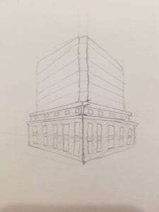
Leave that building alone…

The Hapag Lloyd building in Valparaiso inspired me for this post, if you don’t remember it, I’ve included a quick sketch that may remind you of this distinct port authority office right near the coast. The glaring part of this building is the contrast between the international style of the top half in contrast to the neoclassical facade of the bottom half. Since Valparaiso is a UNESCO site, the facades of these old buildings could not be changed, so when the Hapag Lloyd company took over, they kept the old facade but built upwards, in a completely different style. The windows of the old facade now have the same blue glass windows that the top half does, making it look like someone stuffed a big glass tube into the old building, and it is full to the brim. This particular building, which is not very successful in its renovation attempts, made me wonder what other buildings that have been renovated in contemporary times did correctly. The Precolombian museum was a renovated old building, but it is much more successful in that way. Is it simply because it doesn’t have a boring glass cube sticking out of the top? Perhaps, but it comes down to decorum– is it an effective/appropriate use of the local history to make a building like the Hapag Lloyd HQ? Here the answer is no. The blue glass windows on the lower half of the building make it seem like the central glass structure reaches all the way to the ground and the stone facades are simply slapped on to the sides. There is no continuity between the two halves of this building, and it takes an interesting concept/potential and completely fails at executing it, unlike the renovations of the Precolombian museum, or so many other projects that have revived classical/neoclassical buildings in a contemporary way.

Hapag Lloyd Building

Day Opener: Eye Opener

My Day Opener as is shows the range of projects we visited starting from La Moneda ending it with the Furnicular.

My last blog in the country is about my first sketch of this trip. I think Day 1 was the busiest day yet the most diverse in terms of the projects we saw. From historical buildings to different transportations to parks, the first day of Chile gave a me a sense of the kind of architecture the city of Santiago focuses on. Chile’s architecture ranges from a traditional colonial aesthetic to contemporary modern architecture as it deals with the variety of landscapes that make up the South American country. I now end this trip finding their focus of sustainability and their use of green space. The green spaces filled the city and the mountains in the view reminded me each day how I was in a whole new place.


Structured for Success

Geometric patterned mosaics and truss support system at GAM

Close up view of Museum of Memory and Human Rights facade with visible structural beams.

View of Museum of Memory and Human Rights’ bar building facade with structural system clearly visible.

My quick diagram sketches of the basic truss support system and other geometric relationships at GAM

     Despite not having taken a structure course yet, I was able to gain a new understanding and appreciation for analyzing structure. I wanted to diagram and learn how structure can efficiently serve its important functional role but also greatly facilitate design themes. For instance at Gabriela Mistral Cultural Center, I noticed a design theme of geometrical patterns organized in relation to the ceiling’s steel truss structural support. The use of a truss system, in which the diagonal components allow for more space to be carved out of large structural mass, make the structure at GAM not feel overbearing and still let the mosaic pattern be the focal point. It also appeared as if the triangular shapes formed by the structural beams influenced the triangular mosaic pieces within them to form a cohesive geometric design. Also, the large circular stone seating bench I was sitting on mimicked the circular glass pattern directly above it on the ceiling and the linear block patterned flooring with metal accents related in geometry and materiality to the linear support beams directly above.
     The benefits of truss structural system were also important at the Museum of Memory and Human Rights. The structure was mainly located towards the edges of the bar building which allowed for continuity of open, spacious circulation and exhibit rooms throughout the interior. Since the beams at the museum were spaced more irregular and are clearly visible from the exterior facades, they also serve as an eye catching graphic design focal point.

Night at Pre-Columbian Musuem

The dark stairs contrasts the shining light of the windows and the glass door.

My interest in the Pre-Columbian Museum was the design of the stairs, more specifically its context to the rest of the space. I feel as if the represent what the Knowlton stairs represent which are these obaque objects that make a way through an open space. We get to see that through Knowlton, but in the Pre-Columbian Museum it still makes a presence of these black walls that either takes you up to another dark space or a more brighter space. This concept is also shown as one would progress through a space filled with light into the night.

The panoramic image is what is being sketched above, as you can see the differences on each side in terms of lighting and a hint of the artwork on the second window from the left.

A closer look at what is seen through the window, a gradient of pink and purple.

So this transition is seen through plan and section, but what I noticed about where I was sketching was the placement of the art. In between the pitch black, heavy ramp and the light coming from glass of the windows and door was the colorful sheets of pink and purple that were floating, which was framed by one of the window.

The sculptural black stairs that wrapped with the black rails seen as a sculpture that constrasts from the well-lit room.

As I was sketching this scene, people were passing by and I observed their movement as they first enter the museum. I then understood the ramp as more of a calling into another space. Since the entry into this museum is a well-lit, double height, white walls, door to the outside courtyard that is first seen in front of you, then you turn to the left and then suddenly it’s this dark, black, huge stairs that, for me personally, seen as a part of the museum like a sculpture. Most of the time the person would double look as if they are unsure about what would happen next as they begin to move foreword into the “night”.

Nunca Mas

A site that I was looking forward to visiting on this trip was the Museum of Memory. I had done a lot of research on this topic in AP Spanish in high school and the subject weighed heavily on me. While visiting the museum, I couldn’t help but notice there were parallels between it and our 9/11 memorial in New York City.

First of all, they both use enormous scale gallery walls that can be seen from almost any part of the museum. The Museum of Memory has the enormous wall filled with many picture frames of victims of the attacks and the 9/11 memorial in New York has varying shades of blue tiles to represent what color most people described the color of the sky was on 9/11/01.

New York City 9/11 memorial tile wall

My sketch of the wall of picture frames in the Museum of Memory

I think that this large scale is used to make a great impact on whoever is entering the museum and to make them realize just how many lives each specific event has effected.

Another similarity between the two museums is the use of water. I think that the water in both museums represent the absence of those who were taken from their loved ones on these days.

Museum of Memory

Reflecting pools at 9/11 memorial in NYC


The Truth Behind the Lies

I was anticipating my visit to the museum of memory. I had always learned about the attacks that happened in Chile but I wanted to get my hands on the hard evidence. I wanted to know what actually happened with US intervention in Chile. Specifically , I wanted to see the classified documents first handedly on the order made by the CIA and other government agencies under the presidency of Richard Nixon. To my surprise there was little to about nothing displayed on US involvement in the attacks. ( pictured are the only two CIA documents displayed). Analytically interpreting the document it clearly portrays the CIA’s point of view on the attacks. Moreover, it shows how little they think of Chileans and their government. This is clearly shown as the document repeatedly refers to the left wing as terrorits. The language that is utilized is incredibly offensive but foreshadows the support that the CIA and US government in general will have on the attacks against the working class of Chile. I decided I wanted to learn more! I soon noticed a basement floor where students from universities can come and do research. I decided to stay for an hour and do research. They had nimerous artifacts and classified documents in their database. It all made sense after doing my research. I learned about the United States illegal activities in Chile and how they overrided Chilean power based on a supposed “ drug transaction”. However, after analyzing the situation I soon came to realize that the United States abused their power to gain access to the military’s channels to know information about what was going on. Apart from that there are various documents, books, and testimonies from war generals who recollect their transactions with members from the US like the CIA. Also, i discovered that the United States president had a certain perspective on Chile and got involved in Chilean attacks by providing ammunition and financial support. The United States took part in this horrific event that still affects people do this day. It makes me wonder about the sad reality of the situation. When will the United States stop it’s involvement and when is enough enough ? Where do we draw a line on human decency?

CIA documents on the attack in Chile

( US INVOLVEMENT IN CHILEAN ATTACKS HELD IN THE MUSEUM) 

Accessibility at the Gabriela Mistral and the Museum of Memory

Something I noticed today was the efforts to make the areas accessible to people who are visually impaired. The first thing that caught my eye was a handrail at Gabriela Mistral that had braille lettering along it to coincide with lettering in the glass behind it. Something that interested me about this was the fact that the lettering had faded and chipped off but the braille remained intact so that in order to read the lettering one would need to know braille. They also had a map that indicated the spaces buy indenting them into the metal surface along with a braille description.

The 3D map at Gabriela Mistral Cultural Center.

The handrail with braille to match the text on the glass at Gabriela Mistral.

    I also feel like the museum of memory did a good job of integrating things that allowed people with impaired vision to access and understand the exhibits. For example there was a drawing that a child did for their parent who was imprisoned and underneath there was a 3D version with braille and important elements raised up. There was also a map of the locations of key places involving the imprisonment that was raised and indented with braille captions. The map was able to be followed by one’s finger with the key spaces being raised and numbered in braille. The floor also had strips of a different material that one could follow around the museum to experience it that way. Then on the second floor there was a ledge with captions in braille leading to the voting ballot which was completely reconfigured in braille underneath the actual ballot.

My interpretation of how the Museum of Memory made some elements of their exhibits more accessible to the visually impaired.

    Last semester I attended a Buamer series lecture about art restoration and how to make history more accessible and seeing these elements in the museum reminded me of that. I think that accessibility in historically or culturally significant spaces is something that is incredibly important. Learning about art and history can help enrich an individual’s experience and making spaces more accessible allows a wider range of people to indulge in these things. I also found that the tactile elements helped enrich my own experience as someone who is fortunate enough to have vision. Being able to actually touch the outlines of a drawing and experience it in a more tangible, hands-on, way helped make the experience more real to me. I also think that this was an especially important element at the Museum of Memory and Human Rights because it is a space that is rembering people who have been through a traumatic experience while also placing emphasis on the fight for justice. Not excluding individuals who have disabilities from this experience helps support the idea that it is a space for all people to pay tribute to the atrocities that occurred. Overall, I appreciated the efforts both of these spaces made to create an inclusive experience.