Santiago: An Experience Like No Other

I was amazed by the beauty of Santiago as soon as we stepped out of the airport. Day by day, I only grew to love it more. We learned a lot in class leading up to the trip, but there were so many aspects that could only truly be learned through experiencing it.

The openness, for instance, was very surprising. Everywhere in the city felt like a single open area. Sidewalks, streets, plazas, and parks all felt like one. Locals, tourists, and even dogs all shared the same space while using it in their own way. I have tried to explain this to people since I have come back home, but found it difficult to describe. Perhaps this is simply something that needs to be felt and experienced.

There was a similar situation with the architecture. We discussed and read plenty ahead of time, but nothing compares to seeing the buildings in person. A picture of a handrail in a museum does not do it justice compared to touching it in person and walking down the stairs. Images of the Innovation Center do not convey the monumentality of the space and the views that it provides.

We also spent a decent amount of class time talking about Chilean drinks and food, but no number of videos could convey the delicious taste of jugo de frutilla or the many flavors of helado on the streets.

Simply walking through Santiago or the hills of Valparaiso was probably my favorite part. Looking around gave me the opportunity to appreciate the country and its beautiful art and nature. We were lucky to have a tour guide as great as Alejandro with us because we had so much access to better understand the culture and people around us.

Now that I am back in Columbus and can reflect on the trip as a whole, I have nothing but fond memories. The trip may be over, but the memories of the beautifully vibrant city will surely last forever.

First time in Chile but not my last…

The Santiago trip exceeded my expectations immensely. As my first study abroad trip, I’ve never expected to have such a entertaining time in Chile yet still be a teaching experience. I not only gained an understanding of the Chilean culture, but I also gained insight on architecture from a different continent. I understood the difference and between Chile and Ohio in terms of architecture and I’d admit that Chile is way beyond Ohio in design. Chile has been undertaking these urban ideas that have a SOCIAL PURPOSE and creating a meaningful architecture, which the landscape and climate having a huge role.

The landscapes of Chile incorporated throughout all of Santiago creates an interesting architectural promenade. Every street, every walk you took, you were surrounded by trees that bordered the road or trees/plants and created spaces for outdoor seating areas or provided shade. The heat during the day that hardly reaches 80 degrees with a constant breeze throughout the valley that keeps you cool. I’d say over all the countries I’ve traveled I’ve never experienced such an ideal weather.

One of my goals for this trip was to come back in one piece, since this was my first time traveling on the air without family members. I think I learned a lot about myself.  To be more responsible with my items. How to take care of myself independently, in terms of money. I also learned that maybe Ohio isn’t where I want to study for Graduate school… I was really impressed by the programs offered for architecture, more specifically Universidad Adolfo Ibáñez, and they how they don’t label architecture as it is, but into multiple categories of design, philosophy, engineering, etc.

Santiago reminded me of a cleaner New York…. I won’t forget the guy who was selling ice cream on those hot days, screaming “HELADOHELADOHELADO!”. I definitely won’t forget the food, which were mostly meat based, really heavy to digest and was always too much to take in, but never regretful. The people of Chile were patient even with our language barriers, they always tried to understand or communicate even if it was through hand motions.  It felt more like New York when we took the metro bus and artists were performing on the bus. But what Chile has that New York doesn’t is green spaces; hills, trees, multiple parks, mountains in the distance and a whole body of ocean along the country.

I don’t think I can pinpoint a favorite project we visited or restaurant we ate, but I know I had special memories that I hold for ever place. I won’t forget this spring break trip!

¡Adiós Chile!

Light and Perception of Space

Blue glass at church

Light at monastery

Light above statue at Pre-Colombian Art Museum

    Some of my favorite buildings that we saw on this trip were the monastery, the church, the pre Colombian art museum. A common theme in these buildings was the play of light. Each one of these buildings created three completely different atmospheres using unique techniques. 

    The Pre-Colombian Art Museum is a dark space due to the black painted walls. In the basement, the architect light the space with artificial lights. He was very particular in choosing the color, type and intensity of light. On the handrail he used a continuous light to take people down to the basement. Above the statues he used artificial light that was reflected on wood to soften the harsh light. These materials and lights allowed for a dark and heavy space.

   The Benedictine monastery is the complete opposite experience of the Pre-Colombian Art Museum. The monastery is made of a series of planes that are pulled apart to allow for light to come through. In some instances, like in the side walls, 4’ of the bottom wall is pulled in creating a slip for light to get in. The entire space is white with sublime light washing over the interior of the building and showing Gods’ presence. 

   Lastly, the church at the university used a combination of natural and artificial lights. They used artificial light on the floating roof and angled slits on the wall to bring in natural light. Additionally they used colored glass to transform the natural light into a intense blue light. This church also had a sublime effect but it was created more by the color than the puncture of light through the space. 

Contrast, continuity and cracks : a study of details


Little details can make a project. I think that this simple fact is true for both designers and the general public who may not be familiar with principles of design. That is to say, I think people have an inherent appreciation for some of the fleeting moments in life; nostalgia is a powerful force. In my opinion, little details can create these tiny moments of joy. 

Water plants at Parque Bicentenario

Many projects -landscape and architecture-we have visited have details that hold up under scrutiny. Starting with parque bicentenario, I was especially struck by a view in the lake. Large, dark stone lined the bottom of the lake and from it emerged a light, thin plant. It may be a variety of allium, but I can’t find the species. Contrast can be a detail in and of itself and I think that it is working for parque bicentario to both provide a striking appearance but also create a unique experience for people using the park.

Water runnel at plaza outside La Chascona

Outside Pablo Neruda’s Santiago home  I was struck by a different type of detail. This was less an aesthetic quality of design but a more functional one as well. Instead of simply having a reflecting pool, the water in the plaza outside the house is in motion; down from the reflecting pool and out between the stones that make up the seating of the plaza. This both adds beauty to a simple space but also cools down the air and stones- an important thing for an area with strong sun and limited shade. 

Gutter at San Joaquin chapel

While details can be contrasting, they may also blend into the overall style of a project. The gutters at the San Joaquin campus do just that. Looking at them one might miss the fact they are even gutters. Their form and material makeup fits with the building, allowing them to blend in. Discovering what they are is exciting though, and proves that even everyday things deserve to be examined in detail.

I have many more details I could talk about, but I hope these select few begin to show what can be done with detail and the different ways it can be used.

San Joaquim vs. Ohio State

Something I was curious about before this trip was how a Chilean university compared to an American one. After visiting San Joaquim, I was shocked at how different it was from Ohio State. There was a large variety of buildings, differing in scale, shape, color and materiality. This is a direct contrast from the many similar buildings on Ohio State’s campus that follow the brick standard. Both campuses are similar in that they have prominent central features that dictate the organization of the site. The main quad at San Joaquim is a wide, paved path that serves as a linear axis for all the buildings to line up along. Ohio State differs in that the central feature is the Oval, a large landscape that divides the campus into two parts: North and South. In terms of actual campus size and layout, San Joaquim’s campus is much smaller that that of Ohio State and splits up into multiple parts, with the architecture school being located in an entirely different location than the main campus. Ohio State differs in that it is one continuous campus but can also relate to the organization of the main campus of San Joaquim in the density of academic buildings seen on their campus and also on North campus.

Innovation Center at San Joaquim

Torres Siamesas at San Joaquim

Building with interesting window features at San Joaquim

Round copper museum on San Joaquim’s campus

Diagram comparing organization of San Joaquim and Ohio State

Materiality & Structures in Chilean Infrastructures

Chilean architecture often shows or mimic the materiality. Throughout the duration of the trip, I have learned that many buildings in Chile embraces  materiality and expose structures and mechanical works. Many buildings around here are made of strengthen concrete in order for it to withstand earthquakes. The concrete is then left exposed to show the infrastructure of the building. This occurs in many types of infrastructure ranging from metro stations, museum, monasteries and museum and school. They were all build in different eras but still represent the same idea.

First are metro stations. Some were built more than 20 years ago and some were built this past year.a majority of them are located underground, but there are exceptions. Underground infrastructures are made of concrete. The concrete are often smashed like brutalist concrete with a large structural beam supporting the weight above and mechanical wiring exposed. The stations above ground are often made of copper or metal. The different pieces are then bolted together to create the infrastructure. All the bolts and metal are left exposed like the stations underground. 

Underground Station Structures

Underground Station Material Patterns


Above Ground Station Materiality


Underground Station Structural Joint

Second are local monasteries and museums in Santiago. The Precolombino Museum and the monastery are both made of concrete and glass. The glass shows the lightness of the structure and the concrete shows the roughness of it. The way concrete is pour in Chile often leaves a unique pattern that looks like wood on the surface of the concrete. Sometime Chilean architecture uses one material to mimic another. In this case it is wood, because there are more than 100 difference species of trees. This technique allows the concrete to keep up its materiality and let it mimic wood. 

Monastery Material Pattern


Third are educational institution. Many schools  we visited uses the same materials. University Adolfo Ibanez is made entirely of concrete. However, it breaks away form the traditional style of Chilean concrete pouring. Instead of a rough pattern, it embraced a smooth concrete surface and still embrace the idea of exposing the material. The school also brings back the importance of wood to Chilean culture by utilizing it in the architecture. 


Educational Insitution Materiality Differentiation

Universidad Adolfo Ibanez: Contrast, Trick, Purpose, and Community

The Universidad Adolfo Ibanez is a private design school with an interest in systems engineering. The physical school has been rewarded for its complex design.

View of Rectilinear Exterior Volumes

At first, I thought the interior curvilinear forms (Ramps and rooms) were possibly a response to the curvilinear nature of the mountains meeting the sky and the landscape. Then, the more rectilinear exterior forms would stand in contrast to the site and the interior. Additionally, the white exterior continues to stand in contrast to the blue sky and brown earth, while the off white and light brown interior relates to the earth of the exterior. Therefore, the site, exterior, and interior react equally with one another, and dictate the design. 

View of Weaving Ramps

After taking a closer look, I realized the organization and form as a reaction to the exterior was unlikely. This is because the apertures in the main corridors are rectilinear and random; Very rarely are they related to the human, room, or hallway scale. Additionally, any stairs are designed to appear as they are floating in the middle and grounded at top and bottom by differing stair thickness and tread length. Lastly, the ramps are not understood alone but as a weaving of ramps, which is disorienting through circulation. Therefore, I concluded that the relationship between interior, exterior, and site was not the only design solution, but that the school is designed to trick and confuse the eye and disorient the user. 

View of Floating Library Stairs

In relation to Lo Contador, and the comment made my a professor there, what is the purpose of having a confusing building. At first, I thought there is no purpose. But, Knowlton is a confusing building to outsiders but not to us. Most likely, Adolfo Ibanez is confusing to us but not the students and faculty. Similar to Knowlton, this most likely increases the sense of community of the building and in the school.

San Joaquin v. La Contador

One example of the different approaches to site specific design is that both campuses have a very different attitude toward main circulation. At the Campus La Contador the passage mostly occurred through the interstitial space between buildings. As the site is small a lot of the buildings must be accommodated by squeezing them in tightly next to one another. This means there is no central axis or point that guides the circulation. San Joaquin Campus definitely has a central axis which you are meant to use to branch off into different paved ground. The buildings generally line up with this main axis so it is very much a key driver of the design. 

Another example of the difference in attitude is how the landscape is created. San Joaquin definitely makes use of its vast sight and spreads out as many kinds of vegetation as possible. It also makes use of large planters that become furniture or objects on the site to encourage interaction with the landscape. On the other hand, Campus Lo Contador had the restriction of the small site to work with. They deal with this small site by gathering their many types of vegetation into one courtyard. The courtyard at Lo Contador does not have as much of an idea of interaction in place. Most of the vegetation feels as if is on display and non approachable by people. 

Overall I had a great time learning the differences between the two campuses today. It also gave me a lot inspiration for my new studio project, which is a mixed-use building like UC Innovation Center. Also, seeing the campuses gave me a lot of ideas on how to improve our own campuses. 

San Joaquin’s large site allows for bigger formal opportunities

Proximity of buildings at Lo Contador make courtyard spaces like this important for bringing in light

Courtyard at UC Innovation center is also used to bring in light at a larger scale

Government and Collective Efficacy

View from the top where a little café is located. Showcasing the cerro on one side and the city on the other.

Today on our last stop of the day we visited UC lo Contador Campus ( school of architecture). The Chilean guide and professor at the school was absolutely amazing apart from letting us into all the amazing spaces on campus. Specifically, I was incredibly impressed with his comment about collective efficacy in Chile. He mentioned how Chile had been facing natural disasters -mainly earthquakes- for the past 10-15 years and that this was incredibly hard on the government. Moreover, that a continuous flow of natural disasters put a huge strain on the government. This caused a huge financial strain on the government which led the governments funds to dry up. This strain existed because of the continuous renovations thay needed to be done on the buildings and projects affected by natural disasters like earthquakes. Normally, this would be a huge issue and questions about government’s level of leadership would be in question. However, it was poetically mentioned that this caused a blessing for the community. This created what we know as collective efficacy. The community came together to unifórmalo spear head the problem head on. As a collective effort they rounded up funds and support from architects as well as a few supportive politicians to raise money and ideas on how to combat this issue. This shows how Chilean people are so much different than the United States where our culture is very individualistic. Here we see the strong bonds created in social circles but also the importance of community and how that relationship is incredibly important in times like these. However, what I enjoyed the absolute most was the fact that this bind still continues to grow. That as a community in times of new the Chilean community comes together to combat issues regardless if it affects them on an individual level or not.

Stop and see that Metro Stop!

I would like to discuss something that we all saw, and occupied, today at the PUC campus: the metro stop. I’ve included pictures, but there are a few of these large, raised tunnel structures along the green line that we took to get to PUC. As soon as I saw these, I was reminded of a very similar metro stop, specifically the L stop on Mies’ IIT campus in Chicago, IL. The stop on PUCs campus has a lot of framework on the end of it currently; however, the others (visible from the top of the Innovation Center) did not have these so try to ignore that, focusing more on the actual structure. The PUC stop has lots of visible ventilation, and less prominent ridges on the exterior. The IIT one has no visible ventilation (cold Chicago Winters) and large ridges on the sides (reference to Mies’ tendency to use external structural beams, or even add unnecessary ones?). Additionally, if we look at how they effect the surroundings, while the PUC one feels very alone and additive, the IIT one effects the building it crosses over, ‘bending’ it to allow it to pass. Unlike IIT, the PUC campus is a collection of works by many

PUC campus – green line metro stop

L stop IIT campus 

Sculptural Installations at San Joaquin

At the UC Campus San Joaquin, one particular design aspect truly captured my attention. In front of the innovation center, there was a sculptural piece, comprised of several concrete orbs. The spheres consisted of various sizes, with a diverse range in height and diameter. The installation was interesting. At first glance, I assumed it was just a sculpture garden. Located in front of the innovation center, I assumed, like most museums, they were displaying some sculpture or art piece that compliments the architecture of the building, and also hints at the main entrance to visitors and building occupants. However, after further observation, these concrete pieces are not only sculptural and can be used for a social gathering space. 

The innovation center shows how the floors are obscured and obstracted, but also shows how the concrete becomes somewhat sculptural. The series of wooden form work indentation on the concrete becomes a sculpture in and of itself.

From my observations of Chile so far, similar pieces like these concrete orbs are found throughout parks, campuses, and exterior spaces. With the beautiful Chilean climate region, it encourages users to explore exterior spaces more, versus in colder climates, these exterior spaces are not as mindfully designed. Even the planters on campus have a gentle lip to them, to encourage students and visitors to sit outside, enjoy the weather, and engage in discussions with their counterparts. 

Sketch analysis of the concrete spheres outside of the innovation center. Shows the various sizes of this sculptural piece.

At the innovation art center, there were several sets of these balls clustered together. This not only allows for users to move toward the shade with the moving sun. But also, it shows strength in numbers, and has a heavier, more dominate presence versus if there was just one cluster of them. Furthermore, the shape of them strongly contrasts with the linearity of the innovation center. This juxtaposition strongly identifies and diagrams exterior space and interior space.

An exterior shot of the innovation center, on campus. The jut out beaks the box and barrier of the defined building.

Contrasting Elements

Today, we saw many buildings. The first thing that I realized about them is the contrasts within each of them. I believe that these contrasts are used to emphasize the thoughtful materials and designs. In the Torres Simenas, the eye catching contrast is that of the glass shell with the wood that wraps around its bottom. However, as you go inside there are several more subtle, yet clearly well thought differences amongst the glass, differing wood types, and metal railings. This gives the building a look that is sleek and modern, but also rough and imperfect. In the chapel, the curvature in the roof contrasts the straight lines of the wooden posts laying below it. The perfectly symmetrical posts lie behind the roof which takes an asymmetrical form through its curvature. More over, such contrast throughout both buildings also work to emphasize light vs dark features. The light  creeping in from above the chapel becomes more eye-catching as it follows the exact curve of the roofed opposed to if the roof were closed and flat. Similarly, the metal rods in between the inner and outer shell and on the outside of the glass of the Torres Simenas create beautiful shade within the glass, brightly lit building.

The shade created between the glass and concrete shells.

A place where all of the materials meet.

The curving roof against the wooden panels.

Transparency Inside/Under the Thickness

I was very excited to visit one of the Pritzker winning building today. It is Alejandro Aravena’s the Innovation Center at his graduated university

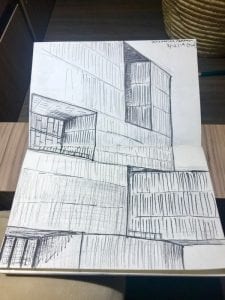
The dynamic openings are very deep and high (three story hight) which control the light and separate spaces inside. The contriver blocks were creating shadow and adding powerful gesture for the project. The simple shape and move, but the project stand out from surroundings due to its large scale. While the entire project’s scale is very large, the façade treatment/molding patterns match to human scale. The color changes slightly on the bottom. About 1/3 of bottom façade are darker than the above facade which adds visual volume and dense on the bottom.

Unlike the heavy and sublime feelings on the exterior, the interior spaces are very open and transparent. When you ride the elevator, you can see all of the floors and even the parking garage in the underground. A large part of its structures are exposed and an excessive amount of glasses are used. The light through the skylight and the punctured openings reflect those glasses. It makes the datum wood framings look like floating. The view from the openings is fantastic. I could see the view from the elevator. It was hard to believe that we were in the thick volume building when you see how transparent to the outside from the inside.

My sketch trying to show the volume of the balconies and the cantilever.

Inside: central void space looking up. Excessive lighting and reflection makes wood frames look floating

The Campus lo Contador was very surprising. I was not very prepared for this visit but it ended up a very great experience. I liked how they used the underground level and the ground level. I usually avoid using an underground level on my project because of the lighting issue. This project taught me how effective it can be to utilize the underground level, how to lets light in, and how to connect to the ground level.

Campus lo Contador: Section Sketch