Tourism, Parks, and Public Spaces: reflecting on Santiago

For such a large and layered city, Santiago is not that touristic. Compared to some of the large European cities I have been to, it felt like the city catered much less to tourism- and more specifically American tourism. For example: only a small amount of the signs are in English, just two lines of the metro make announcements in English, and many people did not seem to change their behavior to make us feel more comfortable.  Why then make a distinction about American tourists? After all tourists in general can be inconsiderate and annoying- to be fair to people from the US, we are not the exception. What, in my opinion, distinguishes American tourists from the rest of the world is their expectations. We don’t need to speak another language, they should speak English. We don’t need to know other cultures customs, they should accommodate ours. It is refreshing to see a city that doesn’t feel like is catering to all of our expectations.

Despite how Santiago is now, talking with Alejandro he seems think that tourism is an increasing industry in the country. And often times increasing tourism is a good economically for a country. I also think that it would be problematic to say that Americans shouldn’t go to an area for fear they would taint it. Often I think that it is unfortunately the case that the tourists will come and the question becomes how can they be responsibly integrated into the city. An answer to the question that may not immediately be the most obvious, but one that I would argue is the most encompassing is creating and maintaining healthy public spaces in the city. These may be pedestrians streets, plazas, or parks but often they all work together to allow a healthy interaction between people occur.

Why is it important for tourists and the public to interact? It may seem like a trivial question, however list off some major tourist cities and often the two don’t mix. Cities sometime have an active interest in keeping their citizens away from tourists. In Santiago I often felt closer to the citizens of the city and I believe it is unequivocally because the public spaces are well designed and allow for this mutual exchange to occur.  Pedestrian streets and bike lanes reach to not just areas with hotels but areas where people live and draw them towards plazas and parks. Seating is designed to accommodate different sized groups and different uses. The spaces feel safe and maintained- and thus they are cared for by both tourists and the public. I think a perfect example of this is plaza de armas. It is remarkable that the space is both so populated by tourists but also immigrants and citizens of Santiago. The plantings and design make it interesting, maintenance keeps it cared for, authorities keep it safe, and walking streets get people there on foot. All these things must work in harmony to make the public space work and perhaps most importantly- allow the citizens and tourist to coexist.


Light and it’s effect on shopping

As advertisers and entrepreneurs may already know, the ambience of a space can have a very direct influence on how people act and feel in that space. I think this principle was shown very clearly when we visited the two markets today. Both were technically open air markets, as they had ceilings that were not closed and minimal amounts of walls. Despite this similarity, the two markets were different in very distinct ways and I would argue these differences arise as a result of their qualities of light. Within the main Vega market the roof is formed  by slanted corrugated panels that open up, shown in the diagram below.

Diagram showing directionality of light at Vega

While some light is let in, because of the orientation of the building this light is limited and the market feels quite dark.

Looking up inside the Vega market

I do think that it contributes to it having a subterranean feeling. This is quite different in the first market we visited. The ceiling and light were treated in a very different manner.

Outside view of panels

Inverted pyramids with permeable faces allowed a diffused amount of light to enter the market, giving the space a more full, welcoming quality. The pyramids are instrumental in this, allowing light to pass no matter the time of day, as opposed to the strict directionality of the roof of the Vega market. The eating places were located on the second floor and while it may simply be correlation and not causation, I noticed many more people eating on this floor.

Elevation of pyramidal panels

what type of roof you plan to have may not always be number one concern on designers lists. However, as the case with many things, attention to detail can make a huge difference in how a space feels.

Contrast, continuity and cracks : a study of details


Little details can make a project. I think that this simple fact is true for both designers and the general public who may not be familiar with principles of design. That is to say, I think people have an inherent appreciation for some of the fleeting moments in life; nostalgia is a powerful force. In my opinion, little details can create these tiny moments of joy. 

Water plants at Parque Bicentenario

Many projects -landscape and architecture-we have visited have details that hold up under scrutiny. Starting with parque bicentenario, I was especially struck by a view in the lake. Large, dark stone lined the bottom of the lake and from it emerged a light, thin plant. It may be a variety of allium, but I can’t find the species. Contrast can be a detail in and of itself and I think that it is working for parque bicentario to both provide a striking appearance but also create a unique experience for people using the park.

Water runnel at plaza outside La Chascona

Outside Pablo Neruda’s Santiago home  I was struck by a different type of detail. This was less an aesthetic quality of design but a more functional one as well. Instead of simply having a reflecting pool, the water in the plaza outside the house is in motion; down from the reflecting pool and out between the stones that make up the seating of the plaza. This both adds beauty to a simple space but also cools down the air and stones- an important thing for an area with strong sun and limited shade. 

Gutter at San Joaquin chapel

While details can be contrasting, they may also blend into the overall style of a project. The gutters at the San Joaquin campus do just that. Looking at them one might miss the fact they are even gutters. Their form and material makeup fits with the building, allowing them to blend in. Discovering what they are is exciting though, and proves that even everyday things deserve to be examined in detail.

I have many more details I could talk about, but I hope these select few begin to show what can be done with detail and the different ways it can be used.

Light at the precolombian museum

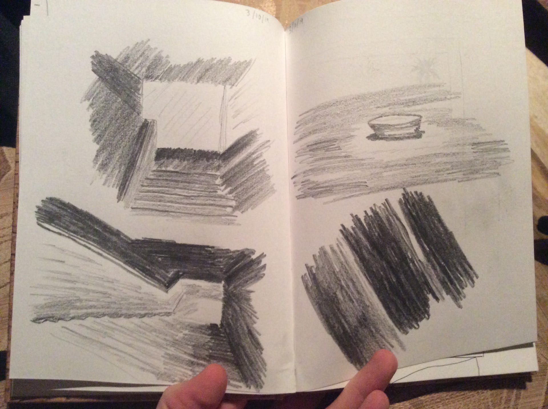
Selected views of the stairs. From left to right: 2nd flight looking up, chair at bottom of stairs, 3rd flight looking down, under 2nd flight

At the precolumbian museum’s bottom story, what struck me most was the light-or for that matter the lack thereof. To be in a stair or stairwell is usually a fairly well-lit experience and many stairs are lit up by bright fluorescent lightbulbs. This is almost the opposite for these stairs. In each sketch I was trying to shown the stark black and light gray shades present in the different views of the stairs. Even one of the chairs close to the bottom of the stairs is illuminated and controlled in a similar fashion; it sits in its own tiny pool of light. To me, the least successful sketch is the fourth, and frankly I think it was just a very hard view to pull off. The deep black shapes abstract any sense that you are looking at the bottom of a stairway.

Colin’s pre-departure post

Having prepared so much for this trip, I don’t really think it feels like it’s happening. I often feel like this before big trips, but I think this one feels especially odd because I haven’t traveled with a group since Sophomore year of high school. Also, these last couple days have been crazy; trying to spend time with people before I leave, do all the school work I need to do (including prepare for a review I’ll be missing), and prepare for the trip at the same time has been a lot. In the end, though, it’s a push that has been challenging in a good way, and I’m excited to relax now.

I think first and foremost, I’m excited for the free time we have. I really appreciate the mix of presecribed activities and open time incorporated in this trip. To me, it gives both the opportunity to see the sights-and maybe learn something about from someone who knows- but also explore on our own. This exploration is really important to travel and is also a time I’m really excited to take some photos. I like taking street photos, and being in a large group can sometimes alter the dynamic of that.

Oh yeah, and the food and architecture doesn’t hurt as well. The benedictine monastery is the architecture project I am most excited about, and parque Bicentenario is the landscape project I am most interested in. Pictures (usually) don’t do these places justice and its the atmosphere that adds so much.