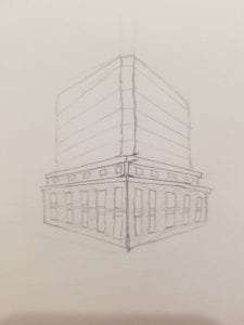
The Hapag Lloyd building in Valparaiso inspired me for this post, if you don’t remember it, I’ve included a quick sketch that may remind you of this distinct port authority office right near the coast. The glaring part of this building is the contrast between the international style of the top half in contrast to the neoclassical facade of the bottom half. Since Valparaiso is a UNESCO site, the facades of these old buildings could not be changed, so when the Hapag Lloyd company took over, they kept the old facade but built upwards, in a completely different style. The windows of the old facade now have the same blue glass windows that the top half does, making it look like someone stuffed a big glass tube into the old building, and it is full to the brim. This particular building, which is not very successful in its renovation attempts, made me wonder what other buildings that have been renovated in contemporary times did correctly. The Precolombian museum was a renovated old building, but it is much more successful in that way. Is it simply because it doesn’t have a boring glass cube sticking out of the top? Perhaps, but it comes down to decorum– is it an effective/appropriate use of the local history to make a building like the Hapag Lloyd HQ? Here the answer is no. The blue glass windows on the lower half of the building make it seem like the central glass structure reaches all the way to the ground and the stone facades are simply slapped on to the sides. There is no continuity between the two halves of this building, and it takes an interesting concept/potential and completely fails at executing it, unlike the renovations of the Precolombian museum, or so many other projects that have revived classical/neoclassical buildings in a contemporary way.
