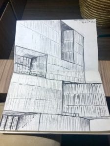
I was very excited to visit one of the Pritzker winning building today. It is Alejandro Aravena’s the Innovation Center at his graduated university
The dynamic openings are very deep and high (three story hight) which control the light and separate spaces inside. The contriver blocks were creating shadow and adding powerful gesture for the project. The simple shape and move, but the project stand out from surroundings due to its large scale. While the entire project’s scale is very large, the façade treatment/molding patterns match to human scale. The color changes slightly on the bottom. About 1/3 of bottom façade are darker than the above facade which adds visual volume and dense on the bottom.
Unlike the heavy and sublime feelings on the exterior, the interior spaces are very open and transparent. When you ride the elevator, you can see all of the floors and even the parking garage in the underground. A large part of its structures are exposed and an excessive amount of glasses are used. The light through the skylight and the punctured openings reflect those glasses. It makes the datum wood framings look like floating. The view from the openings is fantastic. I could see the view from the elevator. It was hard to believe that we were in the thick volume building when you see how transparent to the outside from the inside.

Inside: central void space looking up. Excessive lighting and reflection makes wood frames look floating
The Campus lo Contador was very surprising. I was not very prepared for this visit but it ended up a very great experience. I liked how they used the underground level and the ground level. I usually avoid using an underground level on my project because of the lighting issue. This project taught me how effective it can be to utilize the underground level, how to lets light in, and how to connect to the ground level.

