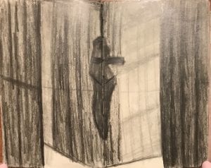
The Benedictine Monastery was a breathtaking surprise to me. Light radiated throughout with an almost spiritual presence that appealed to me unlike many other churches I have visited. It was a welcomed and striking contrast to the darkness and extravagant, rich architecture in the Metropolitan Cathedral in Plaza de Armas. I was compelled to try the shading only sketching technique to capture the quality of light that so greatly defines this beautiful space. Only shading was initially a challenge because the first thing that jumped out at me were the strong lines defining the edges of the walls and ceilings planes. Also while I love shading sketches, I think shading can be difficult to master because it can cause a lot of ambiguity such as determining whether it is meant to show depth, light, texture, materiality, or tone. I tried very hard to use shading to distinguish the light flooding in from the gaps between the ceiling and wall planes while also showing the linear emphasis of the thin slats of wood wall paneling versus the smoother floor and ceiling textures. I think it is interesting that the qualities of airy light can still be accurately captured by such dark graphite sketches when in reality the monastery was one of the most white-washed, naturally lit, bright worship spaces I have been in. I learned a lot about shading as I kept trying to change up my technique in these sketches and tried out a blending stump for the first time!
One thought on “Defining Light Through Shade”
Leave a Reply
You must be logged in to post a comment.


Something I thought was interesting was your comparison between the Metropolitan Cathedral in Plaza de Armas and the Benedictine Monastery. The Cathedral was very dark, yet had visible windows. Then the Monastery was extremely bright and had no visible windows from the inside. They both contradict the thought more/bigger windows means more light. The Monastery shows that good design and strategic placement of windows can go a long way. The only thing is that I did not take good documentation of the building around the Cathedral. It is in an urban areas and may have been dark due to the surrounding buildings and their shadows. What helped give the Monastery better lighting was the fact that is was up on a hill and didn’t have large imposing buildings around it. It would have been better if we were at these places at the same time of day with similar weather conditions to get a more accurate and correct comparison.