We’re in the process of expanding our communication methods and want to hear from you! Use the one-question survey below to let us know how you would prefer to get Ed Tech related updates and information. Your feedback strengthens the Ed Tech unit, and makes it work better for you. Please provide your answer by September 18th. Thank you in advance for your help!
E-newsletters
Even Easier-to-Use CFAES and Extension Branded Images!
We have great news and not-so-great news this morning. Yesterday, we shared the link to a Buckeye Box folder that housed easy-to-use branded images. The not-so-great news: we’ve deleted this Buckeye Box folder. The great news? = the reason why! What we didn’t realize, was that this resource already exists! CFAES Communications now offers branded college and University background images, art, in addition to logos in .jpg and .png formats.

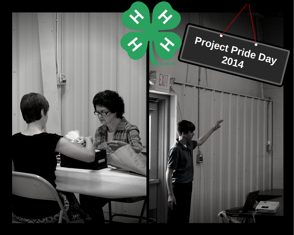
This 4-H Background image is one of many image resources available on the CFAES Communications site.
We apologize for the confusion. As we had mentioned in the previous post, if you have trouble using an image in it’s current format, do not see a desired image available, or just have a general branding question, please contact Jamie or Danae and we will help or contact the appropriate parties within the college.
Quickly Create Modern Looking Graphics for Anything with Canva
Allergic to Photoshop but still want pretty looking images to share on a blog or social media page? Canva is a cool (and very new) web tool that lets you easily and quickly create images that you can save and/or share online. The best news of all? It’s free to sign up and Canva has thousands of images and graphics that you can use for free. The real kicker is that the extra cool photo that you might want to use will only $1. That’s right, if it’s not free, it’s only going to cost you a buck. Good news for those of us in Extension.
Getting Started
You’ll need to sign up for a free account to use Canva. Then, you get to choose a template based upon what you will use the image/graphic for – which I think is a great feature that makes Canva super easy to use.

By selecting what you’ll be using your image for, Canva will automatically select the best formatting and size.
After you choose a design to get started, you’ll come to what looks like a “dashboard of sorts”. Honestly, if you take just a few minutes browsing the tools on the left side of the screen, you can get acquainted with Canva’s features rather quickly.
Here are a few images I created in Canva to show everyone the possibilities of how those of us in Extension could use it:
All of the above images and graphics could be shared on social media sites. You can also create PowerPoint presentations, posters, and marketing materials within Canva.
How to Brand Your Images and Grahics
As for proper branding protocol when it comes to using Canva, you probably noticed that all of the above images use our scarlet color – one of the University’s primary branding colors. Anything that is created within Canva should include at least ONE of the primary branding colors, shown below. Scarlet is the preferred primary color, since it is the most recognizable color associated with OSU.
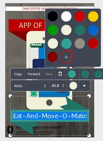
What do the numbers below the colors mean? This is where we’ll do a little walk-through in Canva to show you how to change color using the HEX color code (last line of text under each color above). We’ll use one of the graphics I included above as an example. When I first clicked on the template to edit it, the original color of the ribbon was teal. I needed to change this to a branded color. First, click anywhere on the color in your graphic or text that you need to change. Then, click on the “+” sign to open up the color wheel (circled in red below).
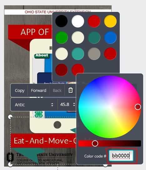
This will pull up a color wheel, with an option box to enter an exact color code. This is where the HEX color code is entered. The color code for our branded scarlet color is bb0000 (entered in the box circled in red).
This changes the color of the ribbon. To change text or any other graphic, simply go through the same process. Other logos such as the block “O” or our Extension strip at the top do not have to be included if you utilize any of the primary branding colors, as well as a branded font. In Canva, we’ll need to use Helvetica as the only font… which limits creativity I know. But it is required to be brand compliant.
Want more info about Canva? The site features a great support blog that gives advice on how to create different layouts, work with color in your graphics, how to create infographics, and much more.
Still have questions or want advice on how to create something specific? Leave a comment and we’ll help!
~Jamie
Ed Tech in Action with the Live Healthy, Live Well Team
A couple of weeks ago, I was invited to attend a Live Healthy, Live Well program team meeting. This FCS group has done a wonderful job of including technology and social
media into their program – and it’s now an OSUE Signature Program. Live Healthy, Live Well is a nutrition challenge during which participants receive e-mail newsletters, and follow the program’s blog and Facebook page. Both the blog and Facebook page are updated regularly, even outside of the program’s challenge dates, which helps to drive more potential participants to the program’s information.
During this meeting I shared and discussed the following resources with the team:
- A list of what they’re doing well already.
- An easy-to-understand guide from Social Media Examiner on how to use the new Facebook Insights to track and record data and impact.
- The CDC’s official guide to writing for Social Media.
- Useful recent posts from this blog.
- Tips for blogging (be visual, always include a photo, be brief with not more than 3 or 4 paragraphs, spread the work among multiple authors).
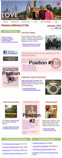
Of course, Live Healthy, Live Well digital newsletters won’t be sharing the same information as the OSU football Facebook page. So we chatted about how we could transform the e-newsletters become a bit more visual and not as information-dense while still getting needed info to participants. The key here can be links, links, and more links – all complimented by a very visual template. This also will drive more traffic to their blog and Facebook page, which is a goal they’ve decided needs to be part of their overall social media strategy. E-newsletters are beginning to look more and more like a page in a magazine as the appeal of seeing information in visual form and in short snippets crosses over from Facebook (see other examples below).
As a result of the meeting, the Live Healthy, Live Well team is considering experimenting with paid promotions on their Facebook page to reach more potential program participants. I’ll also be working closely with them to communicate how they can best show and report their impact via the technological components of the program (in RiV in particular) – which is an issue we’ve been struggling with in Extension for years. This will be a major focus of our next Ed Tech meeting this Wednesday and we hope to have this information posted and ready for the organization in December – just in time for all the RiV procrastinators out there! (I can say this because I’m one of them.)
In the meantime, please consider inviting an Ed Tech (or more than one…) to an upcoming project or program team meeting to help your group think through some of the issues, concerns, ideas, and aspirations of technology use in Extension. We are here to help. I feel that in just the past few short months, we’ve already gained a lot of ground.
~Jamie


