Posts

Opening a link in a new window or tab

I tend to like opening links to external websites in a new window with target=_blank. Below is an example of the code I use to make a link like that more accessible. WCAG guidelines say we should warn a screen reader user when a link is going to open in a new window, so I do that with an aria-label attribute in the a tag. Using an aria-label attribute is a way to override the standard accessible name of the link and provide more context for screen reader users.

Example of a link with an aria-label attribute in the a tag


Videos can be hosted in MediaSite

Videos can be hosted in MediaSite

Actually, the best practice for links that open in a new window is to provide both visual and verbal indication. For sighted users an external link icon appended at the end of the link could be used. See this article about opening links in new windows article from the University of California Berkeley for more information about best practices. WCAG guidelines only recommend opening links in new windows in a few special situations.

Social Media Accessibility

TOC

Social media accessibility is the practice of ensuring content is consumable by our entire community. WCAG 2.1 guidelines also apply to social media content and platforms. The Web Content Accessibility Guidelines (WCAG) are a set of globally adopted technical standards on web accessibility developed by the World Wide Web Consortium (W3C). WCAG is technological agnostic so it can apply to any digital content or apps. I’ve added links to related WCAG guidelines at points in this article.
Many people in our audience live with disabilities (temporary or permanent). People with vision, hearing, cognition, or mobility disabilities often use assistive technology to access digital content in their preferred format. Making social content accessible means ensuring it works with assistive technologies like:

  • Screen readers or magnifiers 
  • Closed captioning 
  • Voice command software

Text Content

Writing social media content that is easy to read and understand will be more accessible for everyone, including non-native English speakers and people with cognitive disabilities. Some additional writing tips include:

  • Don’t rely on the image or graphic to relay essential information (dates, times, location…etc.)—include essential information in the copy of your post.  WCAG SC 1.1.1: Non-text Content (Level A), the success criterion about alt text, is related.
  • Write using clear prose in short sentences and paragraphs. WCAG SC 3.1: Readable is related to this point. SC 3.1.5: Reading Level (Level AAA) is also related.
  • Try reading content out loud to make sure it is clear.
  • Keep an active voice with uncomplicated words.
  • Avoid jargon and be sure to spell out acronyms on the first reference, especially since these can be confusing when read separately without context or explanation.
  • DO NOT use non-native or display fonts. Use standard fonts Arial, Helvetica, Times Romans, and others that are natively installed on Mac, PC, and mobile devices. Some non-native fonts will be unreadable by a screen reader.

Here’s a list of cognitive disability related WCAG guidelines.

Hashtags

Hashtags can be a great tool to connect with a larger audience but make sure they don’t add mystery to the message you are trying to convey. Some additional hashtag tips include:

  • Be strategic and concise with hashtags you create yourself.
  • Since you can’t use spaces in hashtags, use “CamelCase” by capitalizing the first letter of each word to add additional clarity (e.g., #OhioState, #FranklinCounty, #CuyahogaCounty)
  • Use branded hashtags to join the conversation with other organizations and partners (e.g., #Huntington, #Cocacola, #FairhillPartners, #GenerationsUnited, and etc.).
  • Minimize the number of hashtags to three or fewer and only use them when necessary or part of a campaign.

— Graphics and Charts in Social Media

Any important information that contained in a graphic should be easily readable and conveyed in the alt text or post copy (e.g., a graphic with event details). Some additional tips include:

These techniques will allow your social media graphics and charts to be consumable by people with low vision, colorblindness, and blindness. These inclusive techniques help share you charts with a broader audience.

For graphics and charts posted in the Facebook and Instagram platforms, you may need to add your descriptive alternative text in the post copy after your main text. Not all social platforms have the same capabilities for adding alt text as in CMS (content management systems). and LMS (learning management systems).

Here’s some information about using alt in Facebook posts.

— Social Media Video Content

Closed captions are the main way to make spoken content in videos consumable to people with hearing disabilities. The WCAG guidelines related to captions for video is SC 1.2.2 Prerecorded video (Level A) and SC 1.2.4: Captions (Live) (Level AA). Including captions with your social media videos will also help those without a disability because research shows that 69% of consumers view video content with the sound off at times. Here are some options for including captions in your social videos:

Closed Captions files

An .SRT file is a common file type for closed captions. This file can be uploaded on many social media sites alongside your video and will play when the video plays with toggle on/off capabilities. The benefit of a separate .SRT file is that you can edit and control exactly what is being displayed (which is particularly important for accuracy with proper nouns). You can obtain closed caption .SRT files from paid services like Otter.ai or download from YouTube auto generated captions. Otter.ai and YouTube Studio have tools that can help you edit your caption text for accuracy.
.SRT files can be added to videos on Facebook, LinkedIn, Twitter, YouTube, and Vimeo. It is best practice to upload the file at the same time as posting your video as not all platforms allow you to go back and make edits.

Auto Closed Captions

Auto-captioning is available on several popular social media platforms. These transcriptions are generated automatically by machine learning technology. Proper nouns and accents can affect their accuracy and the generated captions should be double-checked and edited, if possible.
Facebook, YouTube, Instagram, LinkedIn and TikTok have auto-captioning capabilities. On Facebook, YouTube and TikTok you can edit the auto-captions once they are generated. YouTube Studio also allows you to download a .SRT file of your captions that could be uploaded to another platform.
Here is some information about how to add auto-captions for these popular platforms: 

— Resources

Here’s an Ohio State Social Media Accessibility Guide from University Marketing.
There’s a good Tips for more accessible social media video in one of the LinkedIn Learning courses.
Creating an Accessible Facebook Post article with accessibility tips.

Using the Meta for Business Planner for entering social media posts and stories

In the Meta for Business Suite – Updated on 2/10/23

How to schedule a post in the Meta Business Suite

  • Login at: https://business.facebook.com/ and click on the calendar icon to go to the Planner.
  • Click on the down arrow next to the Create button and choose ‘Create post’ (or Create story’).
  • Enter your post text, add your photo, and click the down arrow next to ‘Publish’.
  • Choose ‘Schedule Post” and enter the date and time you want the post to be published.
  • Double check your story settings and click ‘Schedule Post”. The story appear under the date when you scheduled it.

How to schedule a story in the Meta Business Suite

  • Login at: https://business.facebook.com/ and click on the calendar icon to go to the Planner.
  • Click on the down arrow next to the Create button and choose ‘Create story’.
  • Enter your story photos/media and click the down arrow next to ‘Publish’. You can have up to 10 media items.
  • Choose ‘Schedule Story” and enter the date and time you want the story to be published.
  • Double check your story settings and click ‘Schedule Story”. The story appear under the date when you scheduled it.

Social Media Posting Resources

Screen readers and languages test page

The following paragraphs are marked up with different languages in the lang attribute. These can be used for testing the accent of a screen reader. The two letter language code in the lang attribute should match the language the text was written in.

If a language isn’t specified, the screen reader will read the page in the user’s default language. That may result in a bad accent that’s difficult to understand. To specify a language for the page, add the ‘lang’ attribute to the HTML tag. For example: html lang=en.

Si aucune langue n’est spécifiée, le lecteur d’écran lira la page dans la langue par défaut de l’utilisateur. Cela peut entraîner un mauvais accent difficile à comprendre. Pour spécifier une langue pour la page, ajoutez l’attribut ‘lang’ à la balise HTML. Par exemple : html lang=fr.

Marked up as French lang=”fr” a language isn’t specified, the screen reader will read the page in the user’s default language. That may result in a bad accent that’s difficult to understand. To specify a language for the page, add the ‘lang’ attribute to the HTML tag. For example: html lang=fr.

Wenn keine Sprache angegeben ist, liest der Bildschirmleser die Seite in der Standardsprache des Benutzers vor. Das kann zu einem schlechten Akzent führen, der schwer zu verstehen ist. Um eine Sprache für die Seite anzugeben, fügen Sie dem HTML-Tag das Attribut „lang“ hinzu. Beispiel: html lang=de.

Marked up as German lang=”de”: If a language isn’t specified, the screen reader will read the page in the user’s default language. That may result in a bad accent that’s difficult to understand. To specify a language for the page, add the ‘lang’ attribute to the HTML tag. For example: html lang=de.

>यदि कोई भाषा निर्दिष्ट नहीं है, तो स्क्रीन रीडर पृष्ठ को उपयोगकर्ता की डिफ़ॉल्ट भाषा में पढ़ेगा। इसका परिणाम खराब लहजे में हो सकता है जिसे समझना मुश्किल है। पृष्ठ के लिए एक भाषा निर्दिष्ट करने के लिए, HTML टैग में ‘लैंग’ विशेषता जोड़ें। उदाहरण के लिए: html lang=hi.

Resources

ISO 2 Letter Language Codes reference

Google Translate

ISO 639.2 Codes for the Representation of Names of Languages

Complex images and alt text descriptions

Complex images like charts & graphs must be briefly described using basic alt text and must have a more complete long description elsewhere in the page. The long description should be available to both sighted and screen-reader users and be programmatically associated with the image.

The figure / figcaption method:

One of the limitations of basic alt text is that it’s meant to be brief, no more than around 150 characters. So you shouldn’t try to use an alt attribute in an image for the long description. Instead, a good way to add a programmatically associated long description is the use the figure / figcaption method. In this method the figure tag wraps the whole image and long description code. Then the figcaption tag is used to wrap the long description text. This can be normal HTML text that’s available to both sighted and screen reader users. Inspect the code of this preformatted example to see how the figcaption tag is used house a long description.

Pie chart showing factors affecting credit scores. See table next to this image for the data.

Factors in Your Credit Score

Payment History (35%) 35%
Outstanding Debt (30%) 30%
Credit History (15%) 15%
Pursuit of New Credit (10%) 10%
Types of Credit in Use (10%) 10%

The aria-describedby method:

You can also use the aria-describedby attribute added to an image to point to the id of a long description. For example, you could point to the id of a div wrapping a long description like:

    Pie chart showing factors affecting credit scores. See table next to this image for the data.


Factors in Your Credit Score

Payment History (35%) 35%
Outstanding Debt (30%) 30%
Credit History (15%) 15%
Pursuit of New Credit (10%) 10%
Types of Credit in Use (10%) 10%

Inspect the code of this preformatted example to see how aria-describedby works. In this example, the table within the wrapper div describes the segments of the pie chart. It wouldn’t be possible to descibe all those segments in basic alt text.

The web accessibility guideline SC related complex images is 1.1.1 Non-text Content (Level A). The W3C WAI has a tutorial with more information about handling complex images. Most universities are striving to meet WCAG level AA conformance. Of the three levels of WCAG conformance, level A is the most important to achieve and level AAA is nice to have but not mandatory. So level AA is a middle ground that most universities and government agencies strive to achieve. Ohio State’s information about minimum web accessibility standards can be found in the Digital Accessibility Center’s website.

Comparing screen readers: VoiceOver and NVDA

VoiceOver for Mac and NVDA for Windows are two popular screen readers helping users with visual disabliites navigate websites. They share some similarities and have some differences. VoiceOver’s rotor and NVDA’s Insert+F7 function fullfill a similar purpose.

The basics:

To launch VoiceOver, click Command+F7. To a launch NVDA, click Control+Alt+N.

In VoiceOver you use VO + Right Arrow to read the next item while in NVDA you use the Down Arrow.
In VoiceOver you use VO + Left Arrow to read the previous item but not in NVDA.

The rotor:

The rotor in MacOS VoiceOver is similar to NVDA’s Insert+F7 function in that it allows the user view and to jump to headings, landmarks, or other HTML elements. To popup the rotor in MacOS VoiceOver presss VO + U. ‘VO’ is the VoiceOver keys (Control & Option) that are pressed in conjunction with a VoiceOver command (like U which launches the rotor). Use the Left and Right arrows to select page elements like: Links, Headings, Tables, Frames, Images, Form Controls, Landmarks, Visited Links, and Non-Visited Links. Once a page element type is selected, the Up and Down arrows can be used to select a particular element from the list and Enter can be used to activate it. The Escape key exits the rotor.

An example of the rotor in MacOS Voiceover poping up a list of headings.

An example of the rotor in MacOS Voiceover poping up a list of headings.


Configuring the rotor

You can choose which element types are viewable in the rotor by opening the VoiceOver Utility with VO + F8, then going to ‘Web’ > ‘Web Rotor’. VoiceOver for iOS devices also has a similar rotor that can be configured.


Features similar to the rotor in other screen readers:

Popping up a list of all links in other screen readers is similar to what the rotor does in MacOS VoiceOver. Insert+F7 in NVDA can pop up a list of all links.

To list all links in MS Narrator, hit Caps Lock + F7 or Insert + F7. See Deque System’s information about MS Narrator for info about keyboard shortcuts.

To list all links in JAWS for Windows, hit Insert + F7. See Deque System’s information about JAWS for info about keyboard shortcuts.

ARIA Menu or Menu bar interaction pattern recomendations

Many websites use Menu or Menu bars for their global navigation to pages in the site. For maximium accessbility it’s best for these menu bars to follow ARIA APG guidelines. In ARIA APG’s recommended menu interaction pattern, because menubar and menu elements are composite widgets as described in Keyboard Navigation Inside Components, Tab and Shift + Tab don’t move focus among the items in the menu. Instead arrow keys are used to move through the menu items and the Enter key is used to follow a link. The right arrow goes to the next item and the left arrow moves focus to previous item. See ARIA APG’s recommended menu interaction pattern for more details about how the arrow keys should behave. Using ARIA APG guidelines as a standard way of building menus will help establish a web convenion that users can learn and apply to a lot of website. Using a standard interaction pattern convension for menus will save users time in not having to learn a different interaction pattern.

ARIA menu and interation pattern resources

What’s new in WCAG 2.1?

The Web Content Accessibility Guidelines (WCAG) are a set of globally adopted technical standards on web accessibility developed by the World Wide Web Consortium (W3C). The guidelines represent a shared, international standard developed by many different stakeholders including: education, industry, disability organizations, government, and accessibility research organizations. The guidelines strive to make websites, apps, electronic documents, and other digital assets accessible to people with a broad range of disabilities, including sensory, intellectual, learning, and physical disabilities.

WCAG covers a breath of success criteria that, when followed by website designers, developers, and content authors, can remove many of the barriers that people with disabilities face when navigating a website or other digital applications. Find out more about WCAG in this article – WCAG 101: Understanding the Web Content Accessibility Guidelines.

What are the new accessibility guidelines in WCAG 2.1?

WCAG 2.1 became a W3C Recommendation in June 2018. There are 17 new SC (success criteria) guidelines in WCAG 2.1:

  1. 1.4 Reflow (AA) – responsive design principals are important to accessibility.
  2. 1.4.11 Non-text Contrast (AA) – requires the icons, UI, and graphics should have good color contrast.
  3. 1.4.12 Text Spacing (AA) – the Text Spacing bookmarklet can help test.
  4. 1.4.13 Content on Hover or Focus (AA) – don’t show unexpected content on hover.
  5. 2.1.4 Character Key Shortcuts (A) – don’t interfere with screen reader shortcuts.
  6. 2.5.1 Pointer Gestures (A) – complex gestures also need a single pointer equivalent.
  7. 2.5.2 Pointer Cancellation (A) – down events must not be used to complete a function.
  8. 2.5.3 Label in Name (A) – visible labels should match the accessible name.
  9. 2.5.4 Motion Actuation (A) – don’t make shaking the phone the only way to complete an action.
  10. 4.1.3 Status Message (AA) – alert the user, but don’t interrupt them.
  11. 1.3.6 Identify Purpose (AAA) – HTML content should provide context, purpose and meaning.
  12. 2.2.6 Timeouts (AAA) – you must store the user’s data for 20 hours.
  13. 2.3.3 Animation from interactions – motion animation trigged by interaction can be disabled. Use media query: prefers reduced motion.
  14. 2.5.5 Target Size (AAA) – touch target size must be 44 x 44px.
  15. 2.5.6 Concurrent Input Mechanisms (AAA) – websites should allow users to switch between input modalities.

Here’s a Good video covering all things new in WCAG 2.1 (53:58).

What are the main WCAG principals of accessibility?

The top four principals of WCAG are: perceivable, operable, understandable, and robust. All new guidelines introduced fall under one of these broad categories. WCAG 2.2 is scheduled to be completed in early 2023 and will include 12+ new guidelines.

  1. Perceivable – people must be able to find your content.
  2. Operable – people must be able to use your website.
  3. Understandable – people must be able to understand your website.
  4. Robust – your website must work with different assistive technology.

See Understanding the Four Principles of Accessibility for more info.

Setting up a heading structure in InDesign for accessibility

TOC

Something that’s different in InDesign from Word is that in MS Word you already have predefined Heading level styles in the Home ribbon whereas in InDesign you have to set up your own ‘Paragraph Styles’ and map them to a Heading structure. You can follow the directions found in this workflow for creating accessible PDFs from InDesign article to setup a template InDesign document with a structure. Here’s an example template exported to PDF. For an InDesign template for graphic designers, it might be good to have Paragraph Styles predefined and maybe have an XML document structure predefined based on text frames they most commonly use. Penn State also has some good information about accessibility and InDesign in this article: Accessibility at Penn State | InDesign Accessibility (psu.edu).

What you setup in the InDesign Structure panel becomes what you see in the Tags panel in Acrobat. The tags in PDF are very similar to HTML with a few odd differences. For example there’s a general <L> tag for all lists instead of <ul> and <ol> (unordered lists and ordered lists) tags. InDesign can also export to ePub format which is more like regular HTML.

Set the tab order in InDesign:

The structure created in the InDesign Articles panel is exported to the PDF file, but it is not automatically set as the order followed when tabbing through interactive elements like hyperlinks and form fields.

  • If the tab order fails in Acrobat, you can right-click on the issue and choose ‘Fix’. This sets the tab order to match the document structure that you set up in InDesign.
  • You can view and adjust the reading order in the Order panel (looks like a Z icon in the left panels).
  • If the panels aren’t there you can open them by going to: View > Show/Hide > Navigation Panes > Page Thumbnails
view and adjust the tab order in the tab order panel

To get to the Tab Order Panel in Acrobat, click the Z icon in the left panels.


How to Export to PDF:

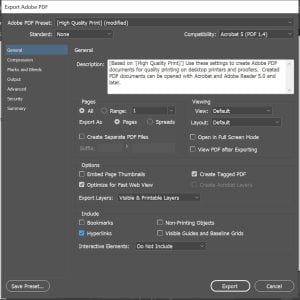
In InDesign, when you are ready to export to an accessible PDF, go to: File > Export > PDF

  • Choose Adobe PDF (Interactive) if your document contains forms, buttons, audio, or video or Adobe PDF (Print) format if it doesn’t.
  • Check the Tagged PDF box to ensure you document structure and tags are exported.
  • Then save the document and open it in Acrobat Pro to check for any accessibility issues.
Export to PDF settings - create tagged PDF

In the export PDF settings in InDesign, check the Tagged PDF box to ensure you document structure and tags are exported in the PDF output.


Three things to do in Acrobat after you export your InDesign document to PDF:

  • Assign a document language
  • Set PDF tab order to ‘use document structure’
  • Run the accessibility checker
  • View and adjust the order in the Tab Order Panel
view and adjust the tab order in the tab order panel

Screen of the Tab Order Panel in Acrobat where you can adjust the PDF document tab order.


Find out more in the workflow for creating accessible PDFs from InDesign article.


Resources about InDesign and accessibility

HTML 5 Landmarks and equivalent ARIA Landmark Roles

WAI-ARIA roles provide more semantic meaning to content making webpages more accessbile. ARIA landmark roles provide a way to turn bare <divs> into HTML 5 landmarks. This can be useful in systems where the <divs> can’t be turned into real HTML 5 landmarks for whatever reason.

Comparison of HTML 5 Landmarks and equivalent ARIA Landmark Roles
HTML 5 Landmark Equivalent ARIA Landmark Roles more information
<main> <div role="main"> info about the ARIA main role
<nav> <div role="navigation"> info about the ARIA navigation role
<header> <div role="banner"> info about the ARIA banner role
<footer> <div role="contentinfo"> info about the ARIA content info role
<section> <div role="region" aria-label="Example"> info about the ARIA region role
<aside> <div role="complementary"> info about the ARIA complementary role
<form> <div role="form" aria-label="Contact information"> info about the ARIA form role

Find about more about ARIA (Accessible Rich Internet Applications markup) in the Custom JavaScript/ARIA Widgets Buckeye Learn course.