Space and Time Walk
Design 2130 Visualizations AU21
Jorie Capper
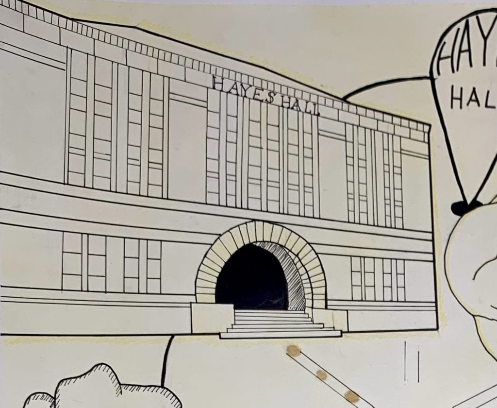
In this project, I communicate a path of my choice, starting from Hayes Hall, through observing and effectively conveying which landmarks I passed, and what I experienced on my walk. My goal is to not only demonstrate my ability to recreate what I saw, but also represent what I felt. Using hierarchy, emphasis, and creative expression I created a map that is both easy to understand and evokes a sensorial response from the viewer.
Research
Slow Looking
I read a chapter from the book Slow Looking, which discussed the importance of taking a step back and really taking time to see what you’re looking at. The author provided different categories with which to implement slow looking, including focusing on only color, or only sounds, narrowing your focus to hone in on the small details of one category before moving onto the next. I used these techniques while walking my path from Hayes Hall to Mirror Lake, observing all that I could.
- Sounds from my walk
- Plane overhead
- People talking
- Lawn mower roaring
- Fountain splashing
- Leaves rustling
- Sights from my walk
- Hammocks in the trees
- People sitting on the lawn of the Oval
- Bikers whizzing past
- Water rippling
- Lots of different types of trees
- Smells from my walk
- Leaves
- Flowers
- Food coming from Mirror Lake Eatery
- Feelings from my walk
- Sun warming my skin
- Wind blowing my hair
On my walk, I took many photos of landmarks significant to me to refer to throughout the project.


Exercises
Haiku
I returned to Mirror Lake for a short period of time to sketch my view of the lake. I also wrote a haiku, to convey what my other senses were experiencing, aside from sight.
“Warm sun, rippling lake // Fresh smell of flowers smothers // Water crashing down”

The entire class compiled their sketches and poems onto a large map layout of the Oval, creating a group collage representing each of our chosen destinations.

Collage
By creating a collage of the photos that I captured on my slow looking walk, I am able to better convey my experience. I show the general path by arranging the photos in a fashion that fill the space, but waterfall down from start to end point in the order in which I came across each scene. Encouraged to provide more contrast and layering, I added to my collage with newly introduced techniques, such as transferring an image with tape from one surface to another.

Depth Sketches
Methods of shading such as stippling and crosshatching are used to show greater depth, but it is important to be aware of how each method interacts with different textures of paper. I practiced using shading to create realistic shadows cast from a single light source, and how light interacts with the shape on which it is cast. In order to convey depth, I followed the contour of the shapes with shading.

Shape studies, focusing on how to identify and relay shapes, is very useful both digitally and analogous, and I employed this practice to more accurately draw the whole form of a deciduous tree.

Production
Iterations
Taking placement inspiration from my collage, I began iterating on the most effective way to portray my path from Hayes Hall to Mirror Lake. To bring attention to the landmarks I noticed along the way, and the starting point and destination, I used scale to emphasize the importance of those points, as well as perspective to display hierarchy; my start and destination points are in perspective while everything else lays flat, whether that is from a top view or a side view.

To lessen the visual noise of my map I used stencils to replicate patches of trees and bushes, adding texture without so much variation that it drew from the main points of the map.
Once I had my vision down on paper, I used Sketchbook to digitally trace the more detailed parts of my map for accuracy, such as Hayes Hall and the Oval paths, resulting in a digital draft of my final.

I printed out my digital map and used the light table to trace it onto a piece of Bristol paper that I had gone over with a light wash of yellow paint. The warm yellow tones cast across my whole map represent the warmth of the sun that I had felt on the walk. Varying line weights further emphasize the most important subjects of my map, such as Hayes Hall, my legend, and the pinpoints marking landmarks. Additionally, simple hatching gives depth to my trees and buildings without distracting from the path.
As well as showing the warmth of the sunlight, I included an olfactory sense into my map as well. When I walk to Mirror Lake, it’s usually to do homework and grab a vanilla milkshake, so I painted my path in dots of vanilla extract so the viewer could have further insight to why I chose this path, as well as enjoy the sweet smell of vanilla when using my map.
Final


From this project, I explored thinking in different ways about how to execute my ideas and how to use size and line weight to convey hierarchy. In the future, I will further explore detailing, stenciling, and shading, and how each of those strategies can help me communicate more effectively.