Posts

Gifting Design: Process

Concept Statement

For this project, I had Brooke Koch as my mentor. When I met with her, she placed a heavy focus on sentimental gifts and the emotional connections she has with them. Only having known her for a short period of time, I thought the best way to incorporate this feeling of sentimentality and nostalgia was through her progress as a designer. I chose the quote, “Innovation is often the ability to reach into the past and bring back what is good, what is beautiful, what is useful, what is lasting” by Dorothy May Kinnicutt because it fit well with the idea of look through her design history. I demonstrated her journey from her first year of college as an engineer major to her experience as a second year interior design student through different patterns and abstractions. I kept the shape of the form similar to that of the Hayes Hall arch to emphasize the impact this design program has had on her. For the color, Brooke said she wanted to learn more about color theory, so I implemented a split complementary color palette into my design. The panels are removable so she can add more as she develops in her discipline. Overall, the purpose of this piece is to highlight Brooke’s past and future path as a designer.

Research

I met with my mentor Brooke to get to know her a little better.

I looked up designers Charles and Ray Eames and I took inspiration from these images:

Eames Chair

I loved the simplicity and the soft edges of the chair, which I sought to incorporate into my design.

Ray Eames Pattern

This pattern, while it is structured, has a sort of randomness about it, which intrigued me.

Exercises

Exercise 1

I made a container for my compass. The packaging looks like a directional compass as a play on words and to give the viewer a hint as to what is inside.

Iterations

I then decided I wanted to make a display for the charm bracelet her grandma got her.

View full iterations at Package and Gift Iterations

I then realized that I wanted to incorporate more of her as a designer into the gift.

She said her favorite style was minimalism, so I wanted to keep the outside packaging simple, while the actual gift challenges that idea.

Refined iterations:

Prototypes

Here are a few from prototypes I made with chipboard and paper.

Production

Materials Used:

Paper

-printer

-card-stock

-water color

-chip board

Glue

-spray adhesive

-tacky glue

Paint

-acrylic

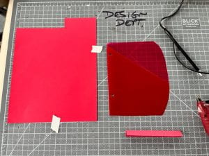
I began making abstractions from the rooms 224 and 225, since that it where Brook spends and will spend most of her time in Hayes and turned them into a pattern. I took abstractions from the chairs, tables lights, pipes, racks, windows, and the room numbers.

Abstractions
Pattern iteration 1
Pattern iteration 2

I then started making my files in illustrator in order to cut them on the Cricut. The abstractions for the first panel are mathematic symbols from her first year of engineering, and the second panel serves as the transition from that to where she is now.

I cut one of the abstractions from each panel to encourage Lauren to keep opening them. I then started to paint them with acrylic paint. I liked the way the brush strokes looked because it added some much needed depth/texture. I thought the color palette enhanced the idea of color theory while keeping it minimalistic on the outside.


I added highlights in blue, yellow, and white, which are split complementary to the pink/red.

Panel 2
Detail of panel 3
Detail of panel 4

After that, I used a combination of tacky glue and spray adhesive to hold the paper together. I then added the definition of history according to dictionary.com to give a hint as to what the gift was. I included her quote on the inside of the back panel and her initials on the outside (cut on Cricut).

Final Images

Here is a video of Brooke that shows the interactive removal of the packaging and the revealing of the inside.

Brooke with gift

Overall, this project was a great way for me to design for a specific person in mind. I had to incorporate not only my interests, but also Brooke’s. I would have loved to use different materials, but I needed a flexible material to form the shape of the piece, so paper seemed to be the best option. One problem I ran into was my paper being warped by the paint, but I was able to fix most of that by placing a heavy book on top of it.

View Final Portfolio Project at Gifting Design


Checkmate: Process

Concept Statement

For the “Checkmate” project, my partner and I chose the concept of the chess pieces to reflect the true beauty or ugliness hidden behind one’s facade. We left the front side of the chess pieces their standard shapes and kept them unpainted. This reflects that judging someone’s character based off their appearance is very deceiving. My side of the chess board emphasizes the good hidden within a person. They are painted in warm tones to make them strong and inviting, and the forms themselves are left unbroken. Contrast is heavily used between the front of the pieces and the back to reiterate that stark contrast within a person. Contrast is also used between my pieces and my partner’s pieces because hers display the ugliness within a person.

Narrative Story

In order to create a clear concept, we started out by formulating a story:

Once upon a time, there were two kingdoms ruled by two brothers. On the surface, the brothers looked merely identical. They moved, talked, and even acted to the public like mirrors. However, under the surface, the brothers could not have been more different. Where one was a man of high integrity and honor, the other was one of deceit and destruction. The first brother, with his kindness and wisdom brought great success to his kingdom. But, no matter how hard the second brother tried to hide his true self, his wickedness eventually led to the demise of his own. Now the brothers, still identical on the outside, are stuck with their fates, because looks are fleeting, but character is forever.

Research

In order to get a better understanding of the project, I looked up some of the rules and made some notes. From those rules, I brainstormed some possible ideas to accommodate them.

Chess Rules

My partner, Raneem, and I had a broad range of ideas for our concept. We loved the opportunity to use contrast, so we incorporated that into our ideas.

In terms of material research, we tested out both chipboard and paper. Due to the limited time at the laser cutter, we found that watercolor paper was a durable option.

I looked at a few examples in class for ideas on how to start assembly.

Slice-form examples

Exercises

We practiced the general assembly of slice-forms by making test pieces.

Iterations

Our first idea was to create pieces that reflected important aspects of each of our lives. I took those object/ideas and turned them into abstractions for potential piece shapes.

I Started to turn those abstractions into possible forms:

Basic chess forms

Link to reference photo

Chess Piece Reference

Another concept we thought of was the contrast within a person (appearance vs. personality). We thought of a few ways to represent that. I started by making a list of opposites that could potentially portray that concept.

We thought about using contrasting symbols like moths and butterflies or simply using pristine vs. destroyed pieces.

Production

I started by putting my pieces into Illustrator to make some test cuts.

Rook version 1
King
Knight
Queen
Rook

We tried chip board, then ultimately decided that watercolor paper would be the best option due to scheduling issues with the laser cutter.

Chipboard pieces

I then cut out the Illustrator file on the Cricut.

I used a series of slices of .02 inches to connect the circular pieces to the main forms.

Pawn Pieces
Finished Pawns

For the knight, I had to hand-cut a few of the pieces because it was an organic shape unlike the other pieces.

Side piece
Base connector

I then painted the back of each piece with warm-colored acrylic paint in contrast to my partner’s cool-toned pieces. The warm colors emphasize their integrity and strength.

Painted rook

Individual Piece Selections

Pawn: flag

Rook: Castle Tower

Knight: Horse

Bishop: Sword

Queen: Crown

King: Throne

My partner and I thought that keeping similar forms to the original would emphasize our theme more because it shows the sharp contrast in looks between the front and the back of the pieces.

Final Images

My side of pieces
Full chess set


View individual pieces at Individual Chess Pieces

Overall, this project was a great way to learn more about 3D forms. It was a challenge at first to learn how to assemble the forms, but I really enjoyed the process. However, I think my pieces could have benefited by leaving the front form completely flat to emphasize the theme of superficiality.

View final portfolio project at Checkmate

Dynamic Pages: Process

Concept Statement

This dynamic triptych was inspired by the musical elements of the lo-fi song, “Morning Moon,” by Kanisa, Wishes and Dreams. (Time 1:15-1:26). The composition is divided into three different parts representing the careful layering of instruments (piano, electronic strings, and saxophone) that unite to give the listener/viewer a sensation of peace and relaxation. The panel displayed here individually has an overall simplicity, because it represents the raw breakdown of the piano. The piano is represented through circular mechanisms to show its consistency throughout the piece. The circles increase in size as the mechanism is being pulled, which shows the escalation of the actual notes being played through rhythm and repetition. The pull-tab mechanism also utilizes elements like a leading line to guide the viewers eyes to the rest of the composition. The cohesive color palette of the panel and the entire composition consists of two cool-toned colors contrasting with one warm, which creates an overall harmony within the piece as well as its overall curve-linear shape. It also emphasizes the idea that all of the instrumental parts unite to create a complete sense of relaxation.

Research

This project was really exciting to me because I have a strong background in music. I was also placed in the group of three, which gave us a great opportunity to capitalize on the importance of individual instruments. For our research, we each looked up different styles of music we were interested in.

Links to the songs i found:

Fine Coffee Jazz

Jump Up-7” edit

When we got to class to share our ideas, we found that Tawny’s song she found called “Morning Moon,” was our best option. There were three clearly defined parts of the song, piano, electronic strings, and saxophone.

We also made a mind map to collect all of our thoughts to clarify them.


In class, we drew how we visualized a song. I often associated staccato, moving notes with a wave/escalating image, which late influenced my project.

Music to Visuals

We were really inspired by how abstract putting music to paper could be. It allowed us to express how we interpret sound in a much more physical way. Every time there were moving notes, I pictured forms in a flowing sequence, which is what I ended up focusing on in my final.

When we were formulating our concept, we used the same technique to visualize our chosen song.

“Morning Moon” visualized

Exercises

Exercise 1

For this project, researching paper mechanisms was one of the most important steps to complete it. I looked up video and picture tutorials to generate more ideas for my panel.

I found a few interesting pop-up tutorials to test out for my project. View tutorials at

Automatic Pull Strips

Simple Pop Up Card


This mechanism pops/folds up whenever the paper is opened.

I also tried a much simpler mechanism, which was a simple pop-up. I wanted to become more familiar with the basics before I started something more complicated.

Iterations

For the mechanism I planned on using, I created many different iterations of it. They were all inspired by the tutorial Waterfall Card Tutorial

I started by making the first one straight like the tutorial, but I began to experiment with what it could look like if it were curved. I tried a few different versions of that because it was difficult to get the scoring in the correct increments.


Iterations for overall composition

Production

I began my construction process by cutting out circles of multiple sizes with the Cricut. I used cardstock for this as well as the rest of my compositions.


I then hand-cut a strip of paper and scored it in even increments. After doing that, I attached the circles onto it in increasing size order.

Front View

I then created A pull tab to connect the strip to. I attached then attached the mechanism to a base. I kept the base shape very curve-linear to fit with the idea of relaxation.

Mechanism on base

I realized at this point that I would need a way to keep the pull tab steadier, so I added a slit into the base, so the strip would have a guided path.

Pull-tab with slit

On the end of the pull tab, I cut out a shape similar to those on my partners’ work. I then filed the edges of it and the base of the composition.

Cut-out shape with file

I wanted to add more stability, so I cut slits to create a channel for the tab to follow.

Added slits

I created a loop to go underneath the slits and connect to the top of the tab. This allowed the tab to move straight without wobbling.

Loop

I did not like the way the small, purple loop looked, so I made thicker loop and replaced it to give it a much cleaner appearance.

Final Images

Beginning position
End position
Side-View

I used the app “Gif-Maker: turn videos to gifs” to make a gif of my section. You can view it by clicking on the image below.


Starting position
Ending Position

To put our project into stop motion, I used the app “Stop-Motion.” I also added a short clip of our song to play behind the composition.

Reflection

Overall, I felt that this project gave me much needed experience working in a group setting. Being a group of three had its challenges, but we were able to come together and create a successful composition.

View final portfolio project at Dynamic Pages

Mask Up: Process

Narrative

There once was a time, not so long ago, that Man had to take on a new battle. The Covid-19 pandemic shook Man to its core. There was a heightened sense of confinement due to a newly isolated lifestyle. Alone and fearful, there seemed to be no way out. The most hopeless days turned into hopeless nights, and the darkest months turned into the darkest years. But, out of the ashes arose a small, yet mighty glimmer of hope. Nature, in all her beauty, stood strong. Where Man felt stuck, Nature began to thrive. Vibrant greenery and odorous flowers sprung up everywhere. A new relationship began to develop, not within Man itself, but between Man and Nature. In Man’s imprisonment, Nature reached out her hand to release it from its binds. She offered it an escape from its constraining way of life. Where there once lied two separate entities, now lies one unbreakable bond. While man still faces many challenges, Nature has planted a new seed of hope within it.

Research

When starting my mask, I had to research what material would work best.  My original thought was to use cardstock and Bristol.

Paper tests

I liked the rigidness of these tests, but the paper would not give me the tight fit I was looking for.

I then began to experiment with fabric, and while I was in my dorm room, I saw some extra storage bins I had. They were covered in a rough, gray fabric, which I thought would work really well with my concept.

Storage bin

I was looking for a template to get inspiration from, and I found this one on Etsy. Unfortunately the link is no longer available, but the shop name is “Stassklass”

Template for mask
Fabric test
Running Stitch with string test
Sewn mask
Mask with mouth opening

Iterations

In class, Megan and I created potential forms for our concept of Man and Nature. We traded forms every ten minutes and added our own elements on to them. Here are the results:

I used Sketchbook and Illustrator to draw other iterations of my mask.

“Man Mask” iteration

View Full iterations pdf at Mask Iterations

Exercise 1

I listened to the podcast “Masking for a Friend” to learn more about the use of masks, and get a better foundation for my mask.

Production

I began my process by creating a template based on the one mentioned in the “Research” section.

Paper template

I cut out two pieces of the fabric from the template. I used a “running stitch” to connect the two pieces of fabric. I used embroidery string to sew almost all of my mask.

Stitching

I ended up disconnecting the neck and face parts because I found it looked better so sew them separately. In order to give my mask more support, I sewed in a wire into the neck part and the outer lining.

Connecting stitches and wire
Outside of mask

I felt the outside of the mask looked too bare, so I laced a leather string through the  stitches.

Leather String addition

I created a template for a lining on the inside to give it more support. I thought of doing it in green, but ended up using gray to emphasize the feeling of confinement.

Final inside lining

On the outside of my mask, I added green fabric to the back, which tied it more into Megan’s.

For my “lock” mechanism I thought about using strings to tie it closed. However, that didn’t provide nearly enough support, so I decided to use the same wire I had sewn into the mask to make the clasp. With the lock, I also wanted it to tie into the idea that Nature sets Man free, so I used the same leaves as Megan’s mask. I punched holes into the leaves so my wires could connect and secure the back of the mask together. To put the leaves on my mask, I used hot glue.

The clasp was the last major part on my mask. I then secured some of the raw edges on the inside with hot glue to give it a cleaner appearance. I also added black string to the front of the mask in an “x” pattern to make the mask look even more suffocating.

The interaction between our masks was her unclipping my mask then taking a flower off of hers and handing it to me.

Masks together
Unlocking my mask

Final Images

Side
Front
Back

Overall, this project was a great way to build my teamwork skills within my class. Along with working with another person, I was also able to develop my skills in other areas as well (sewing, hand-cutting, prototyping, etc.).

View final portfolio project at Mask-Up

Deep Space: Process

Research

Exercises

Exercise 1

For exercise one, we had to use one of our initials and use the negative space to form a picture (Gestalt Principles).

Gestalt PowerPoint used in class Gestalt Principles

I began researching different fonts that could work for my composition.

I tried Zapfino, Courier New, Copperplate and American Typewriter.

I also had to decide what I wanted to fit into the negative space of the “R.” I made a list about some of the most prominent parts of my life/things that I enjoy.

List of Ideas with ideations

Exercise Ideations

I decided on American Typewriter because I felt the square shape and relaxed look would pair well with the coffee theme

In Illustrator, I continued with the idea of the coffee cup and manipulated the font to better fit the outline of the mug. This meant that I had increase the width of the whole letter.

Illustrator File

I used the laser cutter to get the “R” into a physical form.

Laser-cut Form

To get an idea of what “deep space” was, my group and I created a list of words that made us think of depth.

Word List

I used a mind-map to visualize what deep space actually means. I thought of more physical ways like mountains, caves, but also more metaphorical like the process or deeper meaning of something.

When I was choosing the concept of my project, I was quarantined. Being unable to go to class and be around others left me feeling very isolated from the outside world. Therefore, the concept of “isolation” became very real to me and inspired my project.

Later research I did was on the two figures in my composition. I do not have much experience drawing people, so I needed a guide.

View guide photos/ research at Figures & Hands

After the project was complete, we practiced more with color theory and hue/saturation.

Composition with color

Concept Statement

In 2021, more people are familiar with the meaning of isolation than ever before and are seemingly disconnected from the outside world. In this project, through layers of card stock and the use of contrast and scale, isolation is portrayed in a more tangible, visible way to connect to the world’s current state. Two figures are placed at a great distance from each other. They are noticeably a stark white in comparison with the landscape separating them to highlight their connection and desire to be together. The contrasting sizes between the figures and the outstretched hand emphasize the vast distance and isolation between them and creates a deep sense of longing. The inside of the house is left noticeably bare to show that the large figure is completely alone in addition to being disconnected from the other. Through the layers of the cave, waves, and the house, the hope of contact is out of reach.

Iterations

During class, I created a few iterations that I felt represented that strong feeling of loneliness/isolation. I used aspects of nature like trees and mountains along with forms of people. I was drawn to the use of scale and contrast, so I continued to build off of those principles moving forward.


View more iterations at Project Iterations

Production

I began changing the settings in my illustrator file to make the layers suitable for the laser cutter and Cricut.

Illustrator Vector File

When I used the Cricut for the first time, I realized that for my project, the Cricut would be the most effective in that I had a few small cuts, and there was no risk of burning my paper.

I cut out waves using the Cricut and began to experiment with how I wanted to put my whole layers together. I tried the accordion method.

Cricut-cut waves

For my cave, I planned on using the Cricut, but due to limited available time, I decided to cut them by hand. I then used a nail file to smooth the edges.

Hand-Cut Cave

My figures were cut with Cricut as well, and I made sure to that the difference in scale was drastic.

Cricut-cut figures

After I cut-out smaller pieces, I used the Cricut again to cut my back piece. I cut out stars and a moon so the composition was lit on the inside.

Back Panel

I tried another way of layering my pieces with cardboard, which made the layers closer together and offered more stability. This is the method I ultimately decided to move forward with.

Cave cut-outs and small figure


Cardboard layering

I drew a rough sketch to create a game plan for how I was going to finish the assembly.

For the front of the composition, I made a couple versions of a wall with windows with the Cricut. I went with the second one because there was less obstruction, and I added tabs. I was not original going to include a house, but it added a much needed layer to enhance the feeling of isolation

I then hand cut a front piece to attach my large figure to and used tacky glue to connect them.

Figure with front piece/walls

I then attached the waves, cave, and the back panel to the front of the house with glue.

Attached composition

After I had the inside complete, I began to work on the outside. I cut everything on the outside (roof, walls, side pieces) by hand.

Glueing the roof
Composition glued together

I wanted to clean up the edges like I did with the front panel, so I made a lining for each side of the front.

Lining

I wanted to make the sides and back cohesive to the inside, so I cut out more mountains to glue on them.

Final Outcome

Front view

See previous pictures for back and side view

Overall, this project was a great way to become familiar with new tools like the Cricut and laser cutter and also improve my hand skills. Due to the long period of time we had to work on it, I was able to develop my concept even further and explore new ideas. In the future, I would love to be even more ambitious with both my concept and craft.

View Project Portfolio Page at Deep Space

Sketchbook: Process

Research

In the beginning of my research, I learned more about mind-mapping to generate ideas more efficiently.

I class, we practiced using the prompt of “Which Season is the best?”

We took an approach based on overall “feel” of the season, which led us to choose summer.

I also took up embroidery and learned new techniques so I could incorporate that into my sketchbook as well.

Embroidery Tutorial

Embroidered “O” with flowers

Aside from the internet and outside research, I asked myself what I wanted for my sketchbook. My criteria was:

1. Access to online research

2.  Small/Portable size

3. Informational pages

4. Organized

Exercises

1. Mini Sketchbook

I experimented with how the sketchbook opens. I made it so it can be opened like a normal book, then flipped up and expanded to have more space. Inside of the sketchbook, I practiced more mind-mapping with the concept of “How to live your  best life.” I found that the answer is balance.

Iterations

Then I started in Illustrator on the size and design of my book. I made mine on the smaller side to keep it easy to travel with. The dimensions are around 6.4in x 8 in. The line weight is .072.

I wanted my cover to be something I enjoy looking at. We were asked in class to think about something that we really love. I thought about it, and even though it’s simple, riding my back is one of my favorite activities to do. I reworked my design to figure out a way to incorporate that image into it.

I kept the rounded edge because it gave the book a sleek finish. I also wanted to add something with a deeper meaning to my cover, so I added the Roman Numerals to my favorite Bible verse, Mathew 11:28. My faith is something very important to me, which makes my sketchbook even more personal.

Production

The first challenge of the sketchbook was figuring out the materials I wanted to use. I thought about chip-board or leather, but I wanted to use something I already had to create less waste. I took apart and old binder to get the cardboard underneath.

Binder with cardboard

I used the laser cutter to engrave my Illustrator design into my cover

Finished Cover

I began by looking at my lists of what I wanted in my sketchbook. One of the requirements was access to online notes, so as my “surprise element,” I made my own QR codes to download and put into my book. I used a printer and cut them out.

QR Codes

Order from right to left: Adobe Color, my portfolio, a linear perspective PowerPoint

The website I used:

QR Codes

The pages, I used the Cricut machine to cut out most of my pages. The materials I used were: gray cardstock (color-testing), sketchbook paper (notes and ideations), grid paper and tracing paper (precise drawing).

Vector page template

To save time, I moved to the laser cutter to finish the cutting process. I am much more familiar with the Cricut, so a few of my pages were slightly burned around the holes as I was adjusting the settings.

Laser-cut page

For a much needed storage element, I used old, unused tab dividers to hold and cut/sewed them to hold paper. I original was going to line the bottom with paper, but thread was a sturdier option and looked better aesthetically.

Construction of folder
Stitching
Pocket in book
Grid paper

When I came time to bind my book, I faced a few road bumps. I originally wanted to use spiral binding, but the measurements of my holes were slightly off, so I decided to use thread. If I were to do something differently, it would be to make the holes bigger, so the spiral could have worked because I wanted my book to lay flat.

I tried this first method of binding with thread, but found that it made the book difficult to close and the overall appearance was not as clean as I was wanting.

I thought about using Coptic, but I had so many holes on the side of my book, that it was not my best option in terms of efficiency.

I ended up following this video tutorial:

Binding Tutorial

Binding Detail

On my cover, I used a “French Knot” technique along with cutting the petals off of a fake flower to make the flowers in the basket.

Fake Flower
Cut flower petals
Flowers in basket

Final Product

Front


Back

I began a few note pages in my book to refresh my memories on important topics.

I used felt-tip markers to add some extra color.

Overall, this project pushed me way out of my comfort zone. Craft is very important to me and is something I am continuing to improve on, so the binding issues took up much of my time. From those issues however, I had to use design thinking to work out another solution, which was a great learning opportunity. In the future, I would love to experiment with new materials and push the boundaries even further.

View final portfolio project at Sketchbook

Mash Up: Process

Research

With this project, I had to familiarize myself with new softwares. I had never worked with Illustrator on the desktop so I had to watch a tutorial on the extrude and bevel tools.

Links for tutorial:

Illustrator Tutorial

I began combining words to create potential possibilities for my project.

I narrowed down my options to “Wintold,” (winter and cold) “Cozmas,” (cozy and Christmas) and “Snabin.” (snowy and cabin) I decided on “Snabin” because of how easily it rolls off the tongue and the many design possibilities.

Exercises

Exercise 1

We practiced using different softwares to create our initials in isometric. I used illustrator on my iPad to create mine.

I tried three different color options. In order to change the color, I had to redraw every piece of the letter using the pen tool and fill it in.

Iterations

Sprints

We did “sprints” to create ideas for our project. I put possible words into isometric and created possible post card designs for the word “Snabin.”

Other Iterations

I created one iteration for “Cozmas” then shifted my focus to “Snabin.” I tried both literal and poetic approaches. I included my post card iterations as well as a couple other ones I made in Sketchbook.


Production

I started in Adobe Illustrator for the desktop to easily put my word into isometric. I placed an isometric grid underneath the words for more accuracy.

I took a picture of the word and imported it to Sketchbook on my IPad. I began retracing and filling in the letters to create a clean look.

Filled in Letters

I kept the hues relatively dark to create an inviting and cozy feeling.

I began to add small details to all of the letters in Sketchbook. I used the technical pen for all of the solid colors and lines. For the pine needles, I used the feathery shape. In the window of the “A,” I used the glow airbrush tool. On the “S,” I used the rough charcoal tool to create a knit effect.

View all Letter Details at Snabin Details

After I added the details, I began to construct the snow globe.

The snow presented a challenge because I had to find the correct way to position it in isometric.

I added the base at an angle to make it seem like the globe was being shook.

For all of the shadows, I used the airbrush tool. I wanted the lighting to be dramatic, so I added a large shadow behind the globe and behind each letter.

For the snow, I used the speckled texture tool to create the individual flakes.

I used the Courier New font for my definition because it gave the poster a vintage and cozy look. It reads, “The coziest cabin retreat in the snowiest of winters.”

I then went back to add a plaque to the base of the globe. I wanted to add the plaque so “The Snabin” seemed like a real place people vacationed to.

Final Result

Overall, this project was a great way for me to work with new softwares and further my knowledge of isometric. In the future, I would love to experiment with a more complex font or different angle of the letters. I am looking forward to improving my digital skills in the upcoming semester.

View final portfolio project at Mash Up

Patterning and Abstractions: Process

Research

I found examples of natural and man-made patterns and created some abstractions. I found that many of them had similar movements and shapes.

Natural Abstractions
Man-Made Abstractions

See full citations list at Abstractions Citations

I also looked up the history of mandalas to get a better understanding of their significance. Below are the links to the websites I found:

Website 1

Website 2

I found that they are of great spiritual importance in Buddhism, and represent a joyful/peaceful world. Knowing the background of the mandala gave this project so much more importance.

Exercises

A4 Exercise 1

I used an abstraction from a peppermint candy and a grapefruit for my pattern. I used varying sizes and changed the orientation, which created a sense of rhythm within the pattern. I chose these specific abstractions because of their underlying movement.

Peppermint Candy
Grapefruit
Pattern

Production

I began by creating many iterations and ideas of mandalas. I was focusing on the principle of directional movement with rhythm as my secondary principle.

Iterations

Mandala Abstraction Organization/Grid Design

I experimented with different mandala grids to put my abstractions into. I found a few online as my guides. I also tried different abstractions from a fan, cartoon sun, volleyball, rock, tree, peppermint candy, and grapefruit. View full mandala iterations pdf at Mandala Iterations

View Mandala Grid Inspiration at Mandala Grids


I reviewed one of my mandalas and evaluated it based on different categories. It was very useful in that it determined what was working well and what needed to change.

In depth mandala review

Color Experimentation

I tested out many different color harmonies using Adobe Color. I tried analogous harmonies, but found I was most drawn to monochromatic and split complementary palettes because the hues seemed to flow into each other and amplified the directional movement.

Color Harmonies

We uploaded our mandalas to Miro to receive feedback.

Color Harmonies with Peer Review

After reading my peer reviews, I began to experiment with the white space by adding a background color and an inner circle.

Analogous
Analogous
Monochromatic

Final Mandalas

In addition to the changes I had already made, I decided to experiment with the direction of my arrows and add another inner circle (shape of peppermint candy). I chose these color harmonies because they added depth and a sense of movement withtheir contrast and gradients. On the split-complementary mandala, I added a gradient to emphasize the rotational movement. I did end up keeping the same abstractions though (tree, fan, cartoon sun, grapefruit, and peppermint candy).

Grayscale Mandala
Monochromatic Mandala
Split Complementary Mandala

If I were to do anything differently to my mandala, I would add more detailed abstractions and experiment with more complex grids. Overall, this project was a great opportunity to learn more about a different culture and design techniques. I have a much greater and appreciation for color theory as well.

View final portfolio project at Patterning and Abstractions

Space and Time Walk: Process

Research

In class we looked at different styles of maps to expand our ideas of what a map could be.

View full map research at Map Research

As a class we went out and took pictures to work on our composition.

We also created a collage to get some inspiration for our final project. My theme for my map is the meshing of nature and man, so for my collage I decided to use strong contrast between the lush green and stark concrete.

I used jagged cutouts from magazines to represent the industrial part of campus.

I added 3D elements with softer edges to represent the natural part of campus.

Exercises

1. Written Descriptions

2. Visual Descriptions

Hayes Hall
Wexner Center of the Arts

View full pdf of visual descriptions at Compositions

Iterations

I did all of my planning on Sketchbook to get a clear idea of how I  wanted to layout my map. I experimented with words and how I wanted to portray the sounds I heard on my path.

Production

I began with the iterations on my iPad, forming new ideas digitally. I then transferred those ideas to paper.

I did a rough sketch of Hayes and started on the outlines of my buildings. I added 3D lettering to the buildings that followed my path.

I added more trees and details to my map including more dimension to my words.

I began to add color to my map using green felt pens. wanted to make my path stand out with contrast, so I used a different shade of green than the rest.

As a whole, this project was a very great learning experience. I learned that slow looking is an important skill to have, and using all of my senses will be crucial as a designer. I also enjoyed the amount of freedom we had to make our maps completely unique. In the future I want to push the boundaries more with my design and not be afraid to take risks.

View final portfolio project at Space and Time Walk

2D to 3D Translation: Process

Research

I began my research by revisiting my shape from the Point, Line, Plane, assignment to find a shape for my 3D Translation.

Point, Line, Plane Shape

I decided on this cross shape to begin my process because it was simple but still contained many interesting components.

Negative shape I chose

Exercises

The first exercise we did was creating a perfect cube. I found a template online to follow, and I used glue to put it together.

Cube Template

The first exercise we did was creating an orthographic and an isometric drawing of the letter “F.” I realized how much simpler using these drawings can make the actual construction part.

Orthographic and Isometric Drawing

After I completed my drawings, I constructed the “F” with my Bristol. I used tape to hold the form together for efficiency instead of glue.

3D “F”

Iterations

I made my cross shape into a 3D form.

3D cross


View Full PDF of iterations at 3D Iterations

For our final exercise, I began by creating a few variations for my final shape. I wanted a shape that added a lot of dimension without becoming overwhelming and distracting. I ended up combing two of my variations to create my shape.

Production

I began by creating templates for my 3D shape. After I made a hand drawn template, I finalized it on Illustrator.


Final Template


I then constructed it, and after I was complete, I made some notes for measurements and parts to fix.

After making some of the minor adjustments, I decided to scale the whole shape up by 1.5” to make construction easier.


I used that template to construct my 3D shape.

Final Shape

Then with my test shape, I experimented with negative space to add more dimension and interest to my shape.

I liked the negative space concept, but I did not like the tunnel because it seemed too open. I ended up using windows instead of tunnels to incorporate negative space.

Template for negative space

In my shape, I added square pyramids inside of the windows. I had 2 2.5” pyramids and one 1.5” pyramid.

Pyramid Template
One Pyramid in shape
Over-Head view of pyramids

Final Production

In this project, I learned the importance of exploration. There is no real failure with exploration because it is simply trying new things that excite you. I also learned the importance of craft, which I want to improve in the future. Overall, this project got me thinking outside of the box and made me eager to design more.

Comparison

3D form
3D form with negative space

Both of my figures still contain the same cross plane. For my second figure, I decided to go with negative space as windows because I wanted to evoke a sense of surprise. The pyramids are a kind of hidden treasure in the form. There is an excitement that comes when one looks into the shape because the added dimensions are unexpected.

Overall, this project pushed me to develop my form building. Despite errors with craft, I was able to develop my skills an extremely beneficial way.

View final portfolio project at 2D to 3D Translation