Week 3 Project

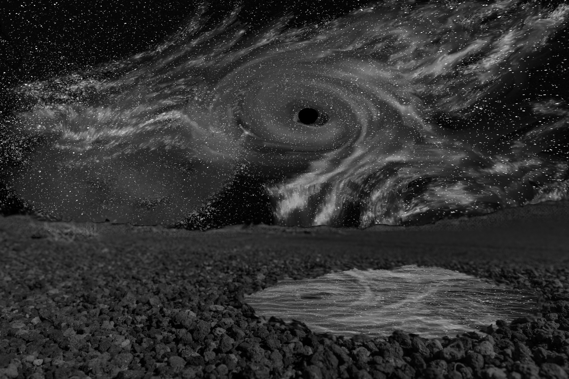
In this image I feel like I am pretty disconnected from the space that I occupy. Part of this is unavoidable because the tiny world image is somewhat unnatural in nature. My goal in this image was to try to make the tiny world seem as seamless as possible, then I just added myself on top of it.

I like the contrast that the image of myself has in the tiny world picture. In the tiny world its dark, cloudy, and cold, whereas I’m in shorts and a T-shirt. I find the contrast to be very interesting and it adds a much nicer effect to the final piece than I initially thought it would. I only wish I could make myself seem a little closer brightness wise.


Week 6 Project

Elements: These are the specific objects and properties that make up a work of art.

Line: The use of straight lines.

Shape: The perimeter of a flat piece.

Color: The objects physical color.

Value: An objects relative brightness or darkness when compared to the rest of the image.

Form: The shape of a 3D object.

Texture: The pattern on a surface.

Space: The openness/emptiness of a displayed area.

Principles: These are concepts that are taken into account when creating a work of art.

Balance: A sense of equality portrayed in a work of art.

Contrast: Differences that are highlighted by the relation of two things.

Emphasis: Emphasizing the importance of something in the piece.

Movement: How your eye tends to move through a piece of art.

Pattern: A motif that a piece of art displays.

Proportion: An emphasis on the scale of objects that are related to each other in the piece.

Alignment (Repetition): An assortment of objects that together form a straight line.

Unity: The arrangement of visual elements in such a way that the image has a distinct balance.

Enterprise Extra Credit

I ended up doing a lot to original Image. I added a blue hue to the city, cloud cover, darkened the moon, replaced the space background with an image I made earlier, and darkened the enterprise slightly.

Week 7 Project

For this project I used a picture I took of a lightsaber. I decided this would be the best because it is a good representation of one of my favorite things, Star Wars. I think what Andy Warhol was trying to say with his art also applies to this piece. Star Wars is something that anybody from any part of society can enjoy.

I would say this piece follows Warhol’s tradition. Once you get the process down, repeating this process for others objects wouldn’t be too challenging. PS has been an amazing tool for me to realize some of my artistic ideals. I am really bad at drawing and painting and pretty much any other way to bring an idea into real life. However, I am good with computers so being able to use a computer to create Star Wars art is super awesome and something I wish I got into sooner.

Dream Journal

As evident by some of my other work I have done in this class, I am a huge Star Wars fan. Unsurprisingly a lot of my dreams have a futuristic motif. In this dream specifically there were large spaceships overhead. The setting of the image was also very important to the plot of the dream. I was with my cousins at their house in Tampa, Florida. I have spent a lot of my time at my cousins house and I always remember it fondly. The house has been in the family for around 50 years and it has always been the center place of my extended family on my Dad’s side. It sits right on the water in Tampa bay with an old red dock extending in the water. Whenever I go back home to visit I always visit my cousins house and sit on the dock to watch the sunset go down in front of me.

This image was the center of the dream as I remember it. I was at my cousins house watching the sunset, when I saw a large spaceship appear in the sky heading towards another planet I could see in the sky. After this the dream gets a lot more confusing to follow. I end up being put in charge, along with my two cousins, to pilot the ship to the lava covered planet in the distance. Upon arriving we receive information that self replicating droids have infested the molten planet and intended to take over earth and the rest of the galaxy. In order to stop them we had to go down to the planet to stop the central computer. We ended up having to swim through lakes of lava to get to the underground facility which housed the computer. After using a lightsaber I found we took out some droids and destroyed the main computer. This is as much as I can remember of the dream.

Making the Image:

I started with this background that I found on pexels. The dock reminded me so much of my cousins dock that I knew it would be perfect.

Next I wanted to add a molten planet and a spaceship to my image. Since I could not find anything like this on pexels I had to improvise a little. To create the planet I found a picture of the sun I thought would work and removed the excess of the picture using the magic eraser. Next I just added it into a separate layer. I experimented with blend modes and found that the lighten mode was perfect for what I was going for. The space ship was a little more tricky to create. I first took a picture I found of an aircraft carrier and began erasing until it looked a little bit more space craft. I wanted a really dark metallic appearance to the spaceship so I used the multiply blend mode.

I thought the image looked a little crowded at this point and I wanted to draw more attention to the spaceship and the way it draws the eye towards the planet. I found the best way to do this was to remove the small ship that was in the original background image. This was done using the patch healing tool. At first it left some weird lighting on the water but I corrected this using a mixture of the spot healing brush, and paintbrush with eyedropper tool. 

The final piece I wanted to add was myself watching as the ship passed overhead. I achieved this by finding a silhouette image of a man from behind, removing the unwanted background and adding it in. I scaled it down so the man looked proportional at the end of the dock.

PS Challenge Extra Credit

To compare the original image is above and the image with altered hair and eye color are on the bottom.

The first thing I did for this challenge was to change the eye color. Originally I believed it would be an extremely complicated process to make a change to eye color without making it look really fake. I actually discovered how to do this on accident. In one of the later assignments where we need to add makeup to the lady in the image, I slipped and accidentally added color on the eyes when I was trying to add eye shadow. I was surprised at how how natural it looked and began to experiment with different colors and processes. Eventually I found the process that I found produced the most natural looking eyes. First I add a new layer and paint over the cornea with the color of choice. Next I simply change the overlay to screen and adjust the opacity so it looks natural.

To change the hair color I added a Hue/Saturation adjustment layer to the picture. Next I added a blacked out layer mask to hide the effects of the adjustment. Next all I had to do was paint white over the layer mask where I wanted the altered color to show up in the picture. I used a small soft white brush over the edges of the hair to ensure that the result looked natural. I found out how to do this by googling it. I thought it was fairly straightforward. At first I had a hard time figuring out how to enable a layer mask, but with help from the professor I figured it out.

Overall I felt that doing these edits on my own was not too difficult. These are relatively simple edits so I believe we did not need to take time out of class to do them. I mostly remember things through practicing them so I feel that I would have retained the information just as well as if we demoed it in class.


Week 2 Assignments

Tuesday

For this image I took an image I previously made, the space background, and added it into the image of the Lava Field. In order to make the background seem more like it belonged I took out the patch of grass in the lava field image and added a puddle of water. Inside the puddle I made a reflection of the sky to bring everything together.

Here are 3 different versions of this image with different alterations added in:

This image was desaturated. The effect it had makes the image look almost like the northern lights.

For this image I shifted it to grey scale and made adjustments so that the nebulas in the sky would really pop. I think they have an interesting shape when the color is taken out.

For this last image I posterized the sky and its reflection on the water.


Thursday

For this image the first step I took was to remove the tattoos on her arm and around her neck. This was done in another layer, as was learned in the Destructive vs. Non-Destructive edits tutorial. The tools used were the content-aware move tool, patch tool, and spot healing brush. There were some complications using the spot healing brush. I believe these were mostly due to my inexperience in photoshop. I tried to use the spot heal brush as a fix all when it came to patches of skin that looked disconnected in color or shade. This caused a few areas with strange shading that are noticeable on the shoulder and arm. I know now that there are better tools to use to prevent these problems from arising.

The next step I took was removing the freckles on the face. I found that the spot healing tool was excellent at removing these blemishes. I made sure to use a very small brush and began removing all the freckles one by one. I believe I did a much better job at removing the freckles than I did the tattoos.

The last step was replacing the background of the image to an inside space. To do this I first removed the background in the original image. This was done by using a combination of the magic wand tool, and the eraser tool. The magic wand helped to remove some of the background but I found it wasn’t very good at removing the background very close to the subject. This is where the eraser tool came in handy. Using a small soft brush I was able to remove the final bits of background. Then all I had to do was find a good image of an indoor background. I chose one with no foreground because of how close up the image of the subject is.

Overall I think the final image came out very well. The only problems I have with it are the aforementioned problems on the neck and arms from removing the tattoos and the apparent disconnect between the subject and the background. I’m excited to learn new techniques so that in the future I will not make the same mistakes.

Blend Tools

In this post I will be comparing and describing the different blend modes available in Adobe Photoshop. The different blend modes are ways that you can combine two different layers together. There are 3 parts to a blend, the blend layer (top layer), the background layer, and the result of the blend.

Background Layer:

Blend Layer:

Normal: The normal blend family contains two modes neither of which has any particularly special effects. They are only affected by opacity

  • Normal: The most simple look of the blend modes, also the default mode. Blend layer pixels cover background layer. Can be changed with opacity slider however. 


  • Dissolve: Blend layer covers background image. Pattern of blend layer removed depending on opacity value.

Darken: This family characteristically darkens the result. White in the blend layer will not show up in the result.

  • Darken: Chooses which color will be on top based on which is darker.

  • Multiply: Multiplies the luminosity of the base and the blend color. Produces a darker color.

  • Color Burn: Gives a darker color than Multiply, similar to using the burn tool.

  • Linear Burn: Reduces brightness of base color depending on the blend color.

  • Darker Color: Each pixel is determined by choosing the darkest color of the Blend layer and Background layer.

Lighten: The opposite of the Darken Family.

  • Lighten: Color of result is chosen from darkest of either base or blend color.

  • Screen: Result image is brighter than either of the original images.

  • Color Dodge: Gives a brighter result than Screen

  • Linear Dodge: Even lighter results than Color Dodge or Screen

  • Lighter Color: Keeps the brighter color for the result.

Contrast: A mix between the Lighten and Darken Families.

  • Overlay: A combination of Multiply and Screen

  • Soft Light: Softer version of Overlay.

  • Hard Light: More intense version of Overlay.

  • Vivid Light: A more intense version of Overlay and Soft Light.

  • Linear Light:  Uses Linear Dodge on lighter pixels and Linear Burn on darker pixels in the image.

  • Pin Light: Performs Darken and Lighten blend modes at the same time.

  • Hard Mix: Resulting image can only be black, white or a primary color. Very intense.


Inversion: Resulting layer is based on differences between background and blend layer.

  • Difference: Resulting blend is difference between the two layers.

  • Exclusion: Similar to Difference. Grays produce Grays.

  • Subtract: Darkens pixels by subtracting brightness from base layer by the blend layer.

  • Divide: Opposite effect of Subtract

Component: Uses different components of colors to create blends.

  • Hue: Hue of blend is made the hue of the Result.

  • Saturation: Saturation of blend is made the Saturation of the Result.

  • Color: Color of blend is made the Color of the Result.

  • Luminosity: Luminosity of blend is made the Luminosity of the Result.