Census Data: A Personal Note on Some Challenges and Successes

The census data we use today is a symbol of American democracy. The U.S. Constitution states that “the actual enumeration shall be made … within every subsequent term of ten years, in such manner as they shall by Law direct” (Article 1, Section 2). After this historical point, the census has a brand new meaning beyond the mere means for the royalty or state to make their economic or political gains. Today, U.S. census data are commonly used for mapping and many other purposes. It is literally the textbook example of spatial data and applications in GIS and cartography education. Indeed, the U.S. census has empowered individuals and organizations around the world. A few simple clicks on an interactive map shown below, for example, will reveal some stunning pattern of spatial dynamics across America, even at a county level.

Map to explore census data of U.S. Counties

An interactive map to explore census data of U.S. counties.

However, as useful and powerful as the census data are, shortcomings and challenges are also noticeable. Let’s start from a spatial perspective and ask ourselves this question: are census data safe? The following map comes from the dark side of using census data. It was made by Nazi Germany circa 1940, before the U.S. formally entered the Second World War. This map details the first and second generation of middle and western Europe immigrants in the United States, based on the publicly available data from the 1930 U.S. Census. It also has a label at the top left corner that reads “For official use only!” Its cartographic achievement aside, this map was used by the Nazi propaganda machine to strategically spend their war money to persuade the public opinion in the U.S. to avoid being involved in the war raging in Europe. Many believed such a campaign was successful to some extent. It is safe to say that, ever since then, the use of the census data and maps in today’s affairs, from political campaigns to social media disinformation to foreign meddling of our elections, is everything but the lack of imagination.

“20th Century Through Maps” Courtesy of British Library (permission pending)

The arguably darkest moment of the U.S. census also came in the Second World War, when the census information used by the U.S. government directly led to the internment of Japanese Americans after the Pearl Harbor attack. So is it really provocative to ask will the census data, mapped or not, put us in danger? Will history repeat itself in the 21st century? Will another ethnic group become the victims? While the 2020 census eventually did not include citizenship questions, it should not be the time to celebrate. Instead, we should ask will such questions ever come back, and in what form? These issues may be beyond the scope of the census, but the census has been the vehicle that carries these issues.

Also from the spatial perspective, it is well known that census geographies are designed in a hierarchical fashion where the blocks are the smallest spatial units and from there we can aggregate to units such as block groups, tracts, and counties. Census tracts have been considered to be the relatively stable units for statistical analysis because by design they aim to have an ideal population of 4,000. But why should space be delineated in such a fixed and perhaps artificial way? What if we can re-arrange the blocks and come up with different kind of units that are compatible with the official tracts? This is a notoriously difficult task because there are an astronomical amount of ways to recombine the blocks. But if we test some algorithms on a manageable number of units, we can see how the world can be different. The two figures below show the result of such an exercise. It is clear that we can actually achieve a better set of spatial units where the population is more evenly distributed and more centered around the ideal size. Also, the new aggregated units show no significant spatial auto-correlation, which makes them more suitable for statistical analysis.

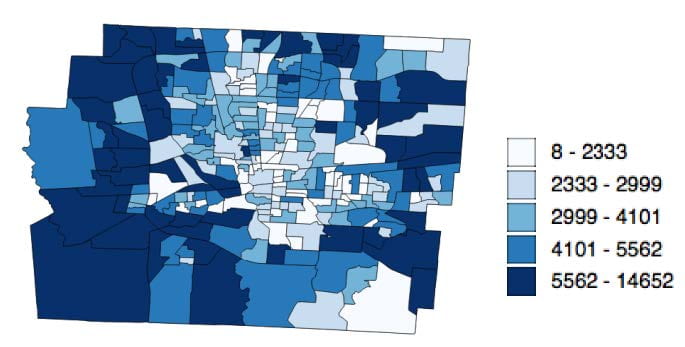
Visual representation of Population of the 284 census tracts in Franklin County, Ohio.

Population of the 284 census tracts in Franklin County, Ohio.

Visual representation of Population of the 284 new units that are aggregated using the 887 census block groups in Franklin County, Ohio.

Population of the 284 new units that are aggregated using the 887 census block groups in Franklin County, Ohio.

Issues related to spatial units are not new and have been around in statistics and geography for at least more than a half century. Computational advances have made it possible to explore new and different approaches to spatial organization. The question is: how can we embrace such a new way of thinking about these statistical units? Should we even go down this rabbit hole where things will become constantly changing.

We can certainly read the history of the use of census data through different lenses. But, however we read it, we will find both bright and dark sides that are full of conflicts, betrayal, conspiracy, struggle, and promises. The world envies the richness of the census data available in the United States that dates back to the beginning days. From this perspective, I personally do see more promises than anything else, as the new century should be the time for us, the research community as well as the general public, to re-imagine what the census data could be.


Ningchuan Xiao, Professor

Department of Geography

The Ohio State University

Exploring the Spatio-Temporal Dynamics of Socio-Economic Dimensions of the COVID-19 Pandemic: An Interactive Dashboard Approach

 The COVID-19 pandemic has presented a myriad of challenges to the world. While many of the challenges are related to the medical aspects of the disease and how it spreads, for communities to survive and thrive in this public health crisis, it is also extremely important to understand the socio-economic dimensions of the pandemic. Specifically, the spatio-temporal dynamics of the implications and consequences of COVID-19 are related to a multitude of social, demographic, and economic factors. Exploring these factors, especially their spatio-temporal trends and how they are related to the infection cases, will help reveal the key determinants that can be used to understand the spread of the disease. As a response to this need, a COVID-19 dashboard[1] herein presents a highly-interactive, map-oriented visualization platform to explore the coronavirus outbreak from its underlying socio-economic contexts. The dashboard enables its users through visual exploration and comparisons to recognize the extent of coronavirus spread and its association with socio-economic characteristics of the communities at various geographic scales.

A glance at the plots of the dashboard, one can identify that top-ranked states exhibit two different trends. States like New York, New Jersey, Illinois, and Massachusetts are showing a flattening curve, leading the overall trendline of coronavirus confirmed cases in the United States to a flatter direction (Figure 1 top row). However, coronavirus is still spreading at an alarming rate in many states, including California, Florida, Texas, Arizona (Figure 1 bottom row). It will be interesting to see how modified stay-at-home orders and early reopening of business activities (California – May 8 [3], Florida – May 18 [4], Texas – May 1 [4], Arizona– May 8 [3]) will affect the continuing upward trend of COVID-19 in these states.

Figure 1: Top-ranked states for coronavirus cases, as of June 28, 2020.

Along with the spatio-temporal dimensions of COVID-19 spread, the dashboard can also be used to reveal that the nature of COVID-19 outbreak is associated with the socio-demographic and economic profile of each state. The following findings can be summarized by further exploring the dashboard.

  • Population. While states or counties with large populations tend to have more cases, the dashboard indicates that the rate of coronavirus spread, however, is indifferent to the population size. As shown in Figure 2, many counties in California, Texas, and Florida (marked in red) have a greater population size with a lower confirmed case and death rates than the counties in New York and New Jersey (marked in yellow).

    Figure 2: Plot showing the relationship between the rate of coronavirus cases (per 1000 people) and other socio-economic indicators in the counties of New Jersey, New York, California, Florida, and Texas. Note that multiple colors are made available by modifying the source code of the dashboard.


  • Age. Although the virus is dangerous for any age group, counties with high percentages of adult population reflect a high coronavirus confirmed rate. The geographic spread of the disease does not show a noticeable correlation with the geography of other age groups. As hinted by this observation, researchers can further explore whether the chances of being affected by

    Figure 3: Plot showing correlation between coronavirus confirmed rate and percentage of non-white population in the counties of Georgia, New Jersey, New York, and Maryland

    coronavirus depends more on peoples’ daily activity pattern and level of exposure to the outside environment than their physical age.

  • Race and Poverty Rate. It is evident that counties with both racial and economic disadvantages are more affected by COVID-19 than other well-off counties. For example, states with high percentages of non-white people (such as New York – 33.9, California – 35.9, New Jersey – 30.1, Maryland – 41.1, Mississippi – 40.2, Georgia – 39, and Louisiana – 36.1, numbers in percent) also have high numbers of confirmed cases. Besides, counties within these states indicate a positive relationship between the percentages of non-white people, and the coronavirus confirmed case rate (examples are illustrated in Figure 3).

The findings from racial profiling also complement the results related to the economic statuses of each state. The coronavirus confirmed case rate tends to be high in the states where a high percentage of households are living below the national poverty threshold (e.g., Mississippi – 15.9, Louisiana – 14.6, and Alabama – 13, numbers in percent, marked in shades of red in Figure 4). On the contrary, New Mexico -15.3, Kentucky – 13.5, and West Virginia – 13 (marked in shades of green in Figure 4), that also have a high poverty rate, show insignificant/negative relationship with confirmed case rate. The difference between the former states and later states lies in the racial distribution. The later states have a lower percentage of non-white populations (New Mexico -22.9, Kentucky – 10.8, and West Virginia – 5.2) than the former states (Mississippi – 40.2, Louisiana – 36.1, and Alabama – 30.1). This observation can further be exemplified by the stark contrast between Mississippi and West Virginia (marked respectively in dark red and dark green in Figure 4) in terms of confirmed case rate, white and non-white population, and poverty level. This finding pronounces the long-prevailed racial and economic disparity of the country, which have been overlooked by the government leaders and policymakers for years[6] and have exacerbated the COVID-19 situation for non-white communities than others.

Figure 4: Plot showing the relationship between the rate of coronavirus spread and other socio-economic indicators in the counties of Louisiana, Mississippi, Alabama, New Mexico, Kentucky, and West Virginia

  • Occupation. The relationship between coronavirus confirmed case rate and job categories mostly depends on their possibility for remote working. The spatial distribution of jobs that can be supported with work-from-home opportunities such as education, public administration, and other services present no significant relationship with the spatial distribution of coronavirus spread (Figure 5).

    Figure 5: Plot showing correlation between rate of confirmed coronavirus cases and percentages of jobs in education (left), public administration (center) and other services (right) in the counties of the United States

  • The work-from-home opportunity for employees working in information, finance, and professional sectors depends on the subcategory of businesses and the type of services provided by them. However, the percentages of population working in these job sectors indeed show a positive correlation with the coronavirus confirmed case rate. This finding can be attributed to the fact that states with high confirmed case rate contain a high percentage of the population working in information (New York, California, Colorado, New Jersey), finance (New Jersey, New York, Connecticut), and professional sectors (California, Virginia, Colorado, New Jersey, Florida) (Figure 6).

    Figure 6: Plot showing correlation between coronavirus confirmed rate and percentages of jobs in finance (left), information (center), and professional services (right) in the counties of the United States

  • The remaining business sectors, such as agriculture, construction, manufacturing, recreation, wholesale, and retail, indicate no impact on the spatial distribution of coronavirus spread. These business sectors certainly need direct physical presence of workers and consumers, but their business activities were either shut down or operating at a limited scale during the lockdown period of the COVID-19 crisis. These sectors are mentioned in the initial reopening phase for most of the states starting between early-May to late-May [2,3,4,5]. The impact of these job sectors on the rate of coronavirus spread can better be explained when these sectors will be fully operational.

Along with the outlined observations, the dashboard facilitates exploring the spatial relationship between coronavirus cases and their associated socio-economic indicators for any county or state of the nation. By contextualizing the public health crisis, the dashboard can be used as an exploratory tool for the decision-makers, practitioners, and the general public to monitor their local COVID-19 situation. The dashboard can also help researchers to examine patterns of COVID-19 cases, which will prompt interesting research questions and hypotheses for further investigation.


Armita Kar (PhD Student, Geography), Luyu Liu (PhD Student, Geography), Yue Lin (PhD Student, Geography), Ningchuan Xiao (Professor, Geography)

Department of Geography

The Ohio State University


References

  1. https://gis.osu.edu/COVID19-Dashboard/
  2. Treisman, R. (2020, May 28). Midwest: Coronavirus-Related Restrictions By State. NPR. Retrieved from: https://www.npr.org/2020/05/01/847413697/midwest-coronavirus-related-restrictions-by-state
  3. Treisman, R. (2020, May 28). West: Coronavirus-Related Restrictions By State. NPR. Retrieved from: https://www.npr.org/2020/05/01/847416108/west-coronavirus-related-restrictions-by-state
  4. Treisman, R. (2020, May 28). South: Coronavirus-Related Restrictions By State. NPR. Retrieved from: https://www.npr.org/2020/05/01/847415273/south-coronavirus-related-restrictions-by-state
  5. Treisman, R. (2020, May 29). Northeast: Coronavirus-Related Restrictions By State. NPR. Retrieved from: https://www.npr.org/2020/05/01/847331283/northeast-coronavirus-related-restrictions-by-state
  6. Long, H. & Dam, A. V. (2020, June 4). The black-white economic divide is as wide as it was in 1968. Retrieved from: https://www.washingtonpost.com/business/2020/06/04/economic-divide-black-households/