Blog #7: Disaster Planning (Team C Squared)

Overview

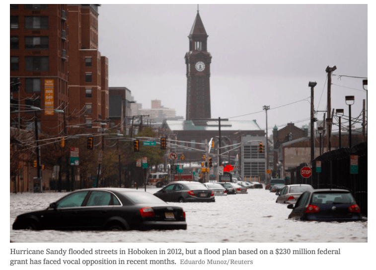
Hurricane Sandy was named during the hurricane season of 2012. It started to form in the central Caribbean and made its way up the East Coast, eventually reaching landfall in New Jersey. (Picture #1) It had winds that reached 80 mph. The storm flooded streets and caused immense damage destroying homes, businesses, power lines and landmarks around the city. (Picture #2) The storm continued east leaving 15 states without electricity. Many people were killed or severely hurt from the strength of the storm.

Picture #1

Picture #2


Communication

At first, the articles described more material impacts, such as those affecting power and transportation systems. The loss of electricity was a major focus of many of the articles with variations of additional focus on other issues like housing, hospital issues, and fires. Immediately following the hurricane, these problems were quickly mentioned without a large amount supporting information. As time passed after the hurricane, articles became longer and featured more in-depth information, with a shift in focus from material loss to human loss. The articles that were written later also focus on the much larger consequences such as economic impact and mental health problems. The progression of material covered went from quick information (immediately after the hurricane) to more in-depth analysis and description about all of the damages (longer span of time since the hurricane). Stories about people’s situations also began to make an appearance in the later articles more than those in the first few days after the storm. The tone definitely changes over time as it seems at first more urgent about the damages, and over time, reporting is less frequent and less pressing about the hurricane. Accuracy also improved, as estimates of damage became more accurate as time passed. Overall, human and material impacts were covered in all the articles, with early articles focusing on immediate concerns and latter articles focusing on larger scale issues.


Names and Dates of Articles Used for CommunicationSection

  • Sandy’s Aftermath: 33 dead, millions without power (10/30/2012)
  • Hurricane Sandy: The Aftermath (11/01/2012)
  • Hurricane Sandy: High Winds and Flooding Hit US East Coast (10/29/2012)
  • Hurricane Sandy: October 29 as it happened (10/29/2012)
  • Sandy’s Impact: State by State (10/31/2012)
  • In New York City, a rising death toll from Sandy (11/01/2012)
  • Superstorm Sandy: Facts About the Frankenstorm (11/27/2012)
  • The Night Hurricane Sandy Hit New York City (10/29/2013)
  • Hurricane Sandy’s Impact (10/29/2013)
  • Hurricane Sandy, five years later: ‘No one was ready for what happened after’ (10/27/2017)
  • Hurricane Sandy Facts, Damage and Economic Impact (09/22/2018)
  • Superstorm Sandy Struck 6 years Ago Today; What’s Changed? (10/29/2018)

Vulnerability

            There were a variety of factors, some man-made and some natural, that contributed to the intense degree of devastation seen along the East Coast following the hurricane. One of the biggest causes for such large-scale devastation was the location of the cities themselves. Areas such as Hoboken, New Jersey and Lower Manhattan lie at or below sea-level, meaning that the areas are “notoriously susceptible to flooding even after just a heavy downpour.” (McGeehan n.pag) (Picture #3) These communities lacked both the hard engineering solutions (levees, surge barriers, etc.) and the natural barriers (living shorelines, wetlands) needed to weaken the strength of the storm. The lack of such infrastructure meant that these low-lying areas were hit by the storm at full force, resulting in over $72.1 billion in damages. (Miller 2) Another problem that contributed specifically to New York’s material devastation was the flooding of the subway system by large amounts of saltwater. “Salt can eat at the motors, metal fasteners, and electronic parts, some many decades old, that keep the system running.” (Mann n.pag) Hurricane Sandy managed to flood all 10 of the subway tunnels located in lower Manhattan, resulting in widespread damage to subway infrastructure – some of which has been in service for over 100 years. (Picture #4) The age of such equipment proved to be a source of vulnerability, because when flooded equipment refused to restore function, engineers could not simply order parts to repair them, as they were no longer available. (Mann n.pag) Such weaknesses in New York City’s transportation network had massive consequences, as the 4.3 million people that depend on the subway every day were rendered immobile for over a week, hurting the area’s economy.

Picture #3

Picture #4


Future Improvements

Major coastal communities must strive to improve engineering on a number of fronts in order to avoid both surface-level and underground infrastructure damage. One way in which cities can mitigate underground flooding damage is by developing and implementing grating and entry flood-prevention techniques. Sealable aluminum covers for street grating and inflatable, sealable barricades for subway entrances can help mitigate underground flooding and infrastructural damage. Cities can alleviate ground-level damage by constructing coastal defenses such as levees, sea walls, and natural wetlands. (Miller n.pag) (Picture #5) Another key aspect to reducing an area’s vulnerability to natural disaster is the implantation of evacuation warnings/procedures. A major issue in Hurricane Sandy was a delayed evacuation command and many people ignoring the evacuation. Taking evacuations seriously and responding accordingly is an important measure in short-term and long-term safety. Most importantly, individuals need to develop emergency response protocols and emergency kits. Although located directly on the coast, near or at sea level, many people failed to have emergency planning before Hurricane Sandy. Evacuation and contingency planning and emergency kits can expedite responses during emergencies, backup plans in case of failure, and mitigate some of the stress and panic of emergency situations.

Picture #5


Implementation

            There are a number of significant barriers that prevent East coast communities from implementing new strategies to prevent future hurricane/storm damage. The largest of these barriers comes from an unexpected source; the citizens that would benefit from such improvements. Such opposition is seen in places like Hoboken, where NIMBY-like movements occur as residents protest the construction of a sea wall that would prevent flooding in the city but also ruin the beautiful view of Manhattan. (McGeehan n.pag) Even when projects are supported by residents, other barriers persist. One such hindrance is the magnitude/complexity of the projects needed to “flood-proof” the coastline, many of which are the first of their kind. (Picture #6) The implementation and construction of these improvements takes large amounts of time and money, leaving communities vulnerable until construction has been completed. (Jorgensen n.pag) In order to minimize these barriers, communities must attain commitment from citizens and long-term funding to support major projects through their completion. Without such improvements, the East coast will continue to be susceptible to hurricanes and thus significant economic damage.


Picture #6

 Sources


Blog #6: Affordable Housing Site Visit (Team C-Squared)

Site-Researched: 1535 West 3rd Avenue, Columbus, Ohio 43212

Site Characteristics

The property we visited is known as the “CHN University District” affordable housing complex, which is owned by CHN University District LLC, a company that acquires and rehabilitates housing units. It is funded privately (LLC), with funding being directed by the Fifth By Northwest Commission. This neighborhood organization acts as a intermediary between the Northern Grandview Heights community and various groups, such as residents, developers, property owners, and elected officials. The single-building site, built in 1926, houses two multi-family units and thus serves low-income families residing in the area. The land-use classification of the property is 680, meaning that any charitable structure can be built on the premises as long as it is not a hospital. The square-footage of the building itself is 2,880 square feet, while the total assessed value of the property is $315,000.

Building Aesthetics

Upon visiting the site, one is pleasantly-surprised to find that the affordable housing property fits in with the surrounding architecture. This is due to the fact that all of the buildings in the surrounding area were constructed in 1920’s, meaning that they all follow a similar architectural design.  The low-density apartment building is surrounded by others just like it, creating a street view which pleases the eye. The facade of the structure, complete with greek-style pillars and brick finishing, creates a simple yet attractive look (Picture #1).

Picture #1

Building Maintenance

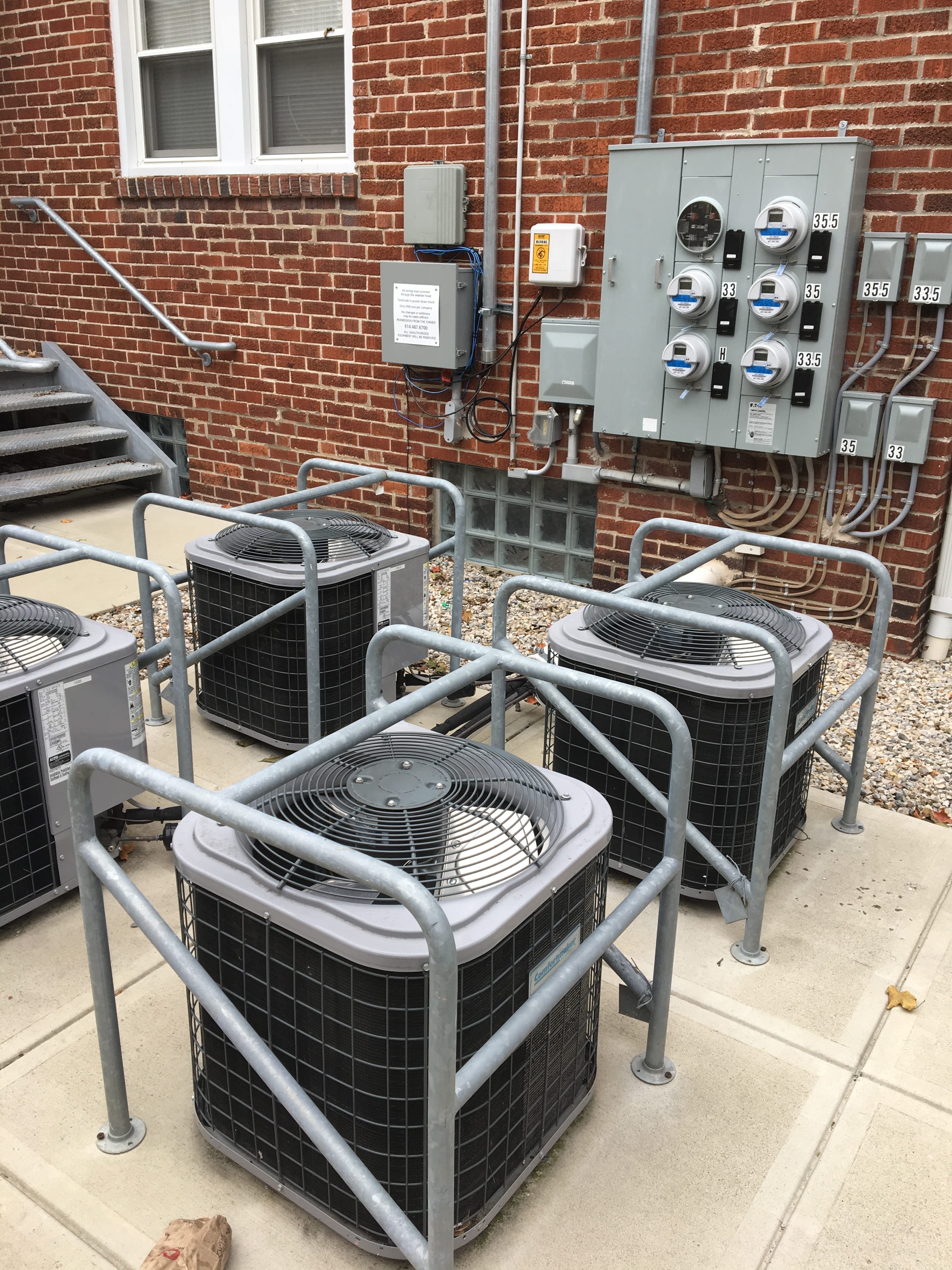
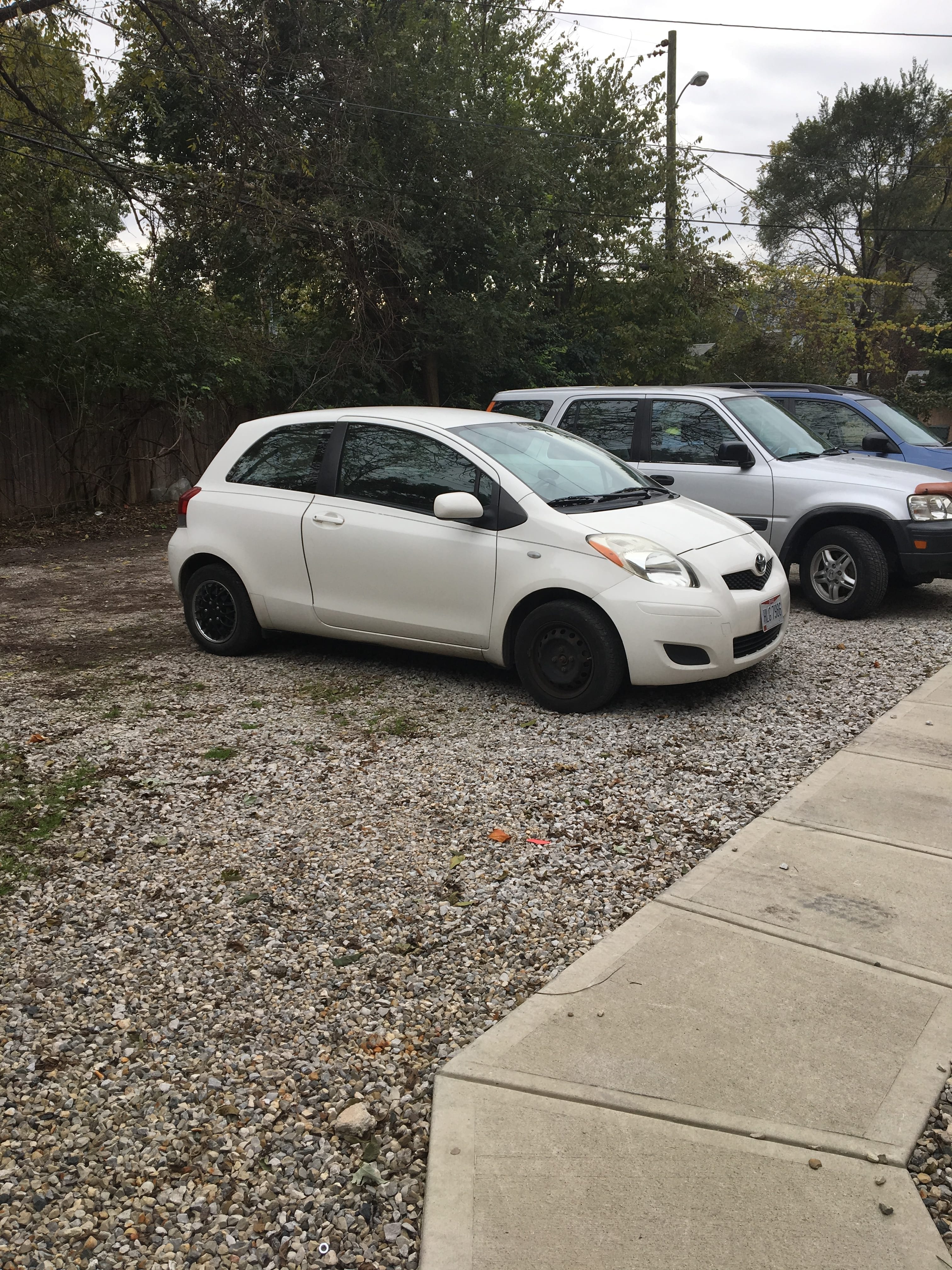
The property is incredibly well-maintained, especially compared to some of the apartments around it. Landscaping work (including mulching) has been done to the front yard, creating a clean/crisp look. (Picture #1) The property features several trees which provide a nice amount of shade for the surrounding area. The front yard also includes a dual-level porch complete with door lighting, providing residents with a safe environment at night. Walking to the back of the building, one quickly notices the organization of the air-conditioning units and electrical box due to its symmetrical nature which is pleasing to the eye. (Picture #2) Because the apartment is comprised of only 6 units, the parking lot is made of gravel (suitable for low-density buildings). The gravel is freshly laid in an organized manner away from the back alley that connects the parking lot to 3rdAvenue, which runs past the front of the building. (Picture #3) Trash cans are kept behind the property and contain all of the residents’ waste; as no loose garbage can be found on the premises. (Picture #4) Surveying the perimeter of the building, one cannot find a single example of deterioration, whether it be from graffiti, wear-down of structural components, or chipping paint. Such observations make it clear that the property is incredibly well-maintained and that the residents likely take pride in the building in which they live.

Picture #2

Picture #3

Picture #4

Nearby Businesses

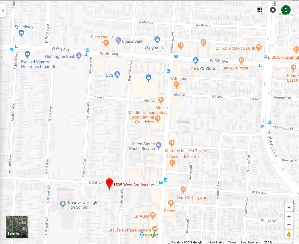
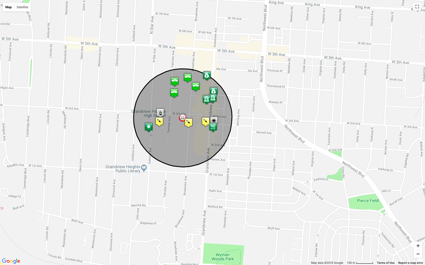
One of the greatest aspects about the CHN University District property is its proximity to a wide range of major businesses, public resources, and religious services. Using Google Maps, one can identify a wide variety of destinations located extremely close to the apartment. (Picture #5) This is largely due to the fact that it lies a block away from both Grandview Avenue (to the East) and 5th Avenue (to the North). These two streets are zoned for commercial use, providing nearby residents with a multitude of restaurants, banking options, and shopping destinations. Two pharmacies (CVS and Walgreens) are located within walking distance, while the nearest grocery store (Kroger) is a mere 1.1 miles away. Public resources nearby include a United States Post Office, Grandview Heights Public Library, Grandview Heights High School, Trinity Elementary School and Larry Larson Middle School. In regards to religious services, the property lies near both Grandview Christian Assembly and Saint Christopher Catholic Church. Based on this information, one can see that the CHN University District property lies in a location ripe with opportunity and resources.

Picture #5

Transit Options

Due to the fact that it is located a block away from two major commerce hubs (Grandview Avenue and 5th Avenue) the CHN University District property is well connected to the COTA Bus Service. (stops denoted by blue icons in Picture #5) 4 stops (2 each way) along Grandview Avenue provide residents with both North and South service on the #31 Bus Route, which originates in Grandview Heights and heads North. Major connections on this route include High Street (access to The Ohio State University and Old North), the City of Westerville, and Easton Shopping Center. One block North of the apartment runs 5th Avenue, which connects residents to the #5 Bus Route. This line runs East/West until reaching High Street, at which point it proceeds to head North/South through Downtown, then East/West again all the way to Reynoldsburg. This route provides CHN University District residents with an efficient way to get to the Arena District, the Downtown core, and the Eastern reaches of Columbus. Considering both the #31 and #5 bus routes run every 30 minutes and both connect to High Street, residents can commute to most of Columbus’ major destinations without a car in an efficient manner.

Crime Rates In the Nearby Area

For crime analytics at each of the following distances, (500ft, 1,000ft, 0.25 miles, and 0.5 miles) consult the following pictures.

Crime Analytics – 500ft

Crime Analytics – 1,000ft

Crime Analytics – 0.25 miles

Crime Analytics – 0.5 miles

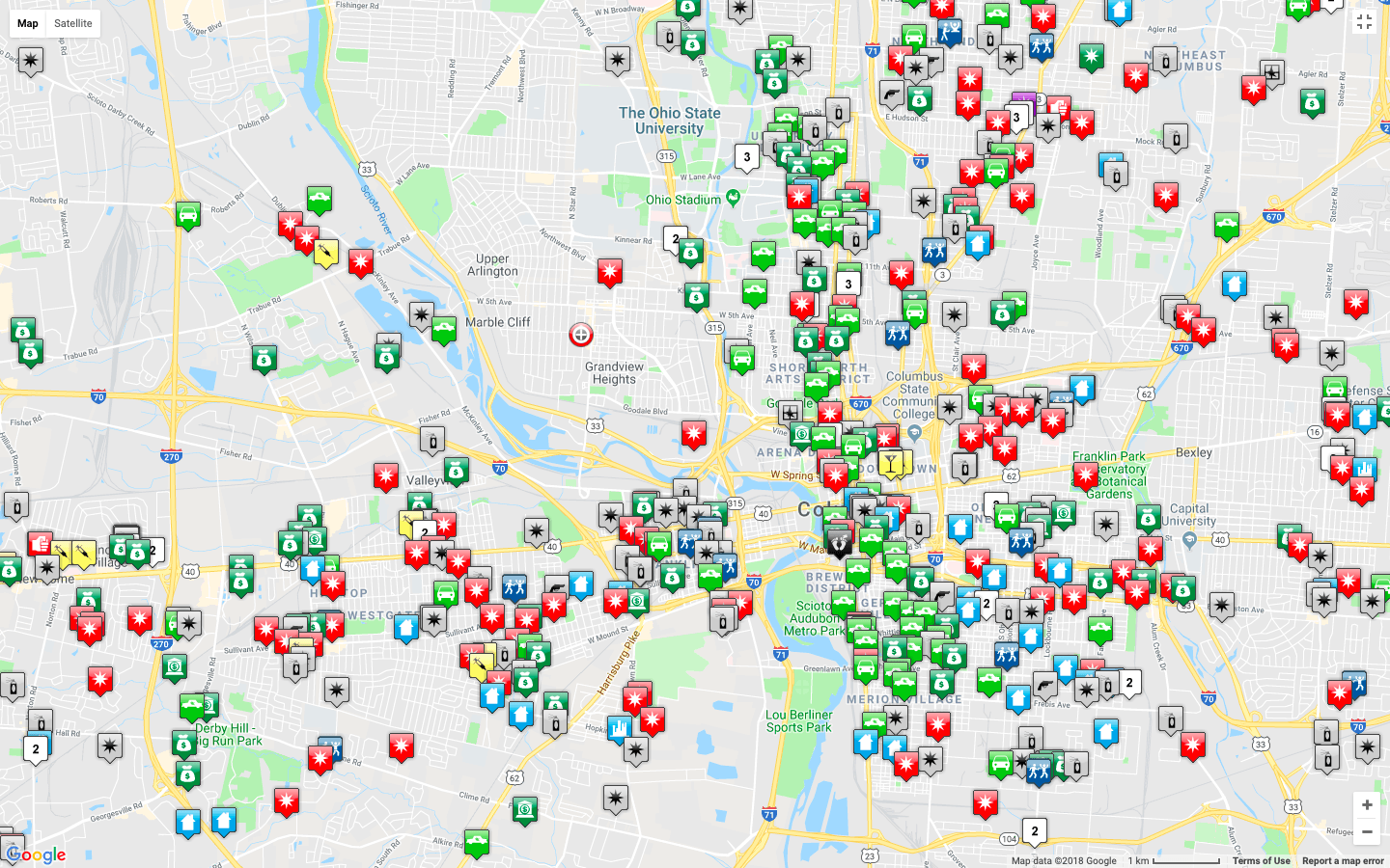
When the buffer was set to a 0.5 mile radius, the density of crime in the surrounding area was observed. (Picture #6) Thankfully for the residents of the CHN University District property, a vast majority of the crimes occurred two blocks away, targeting the businesses on 5th Avenue. However, there were multiple burglary-by-vehicle reports on Broadview and Fairview Avenue, less than a block away from the apartment. When the radius-observed was changed to 0.25 miles, the hottest density of crime shifted slightly closer to the aforementioned property, lying in the region where the burglaries occurred. However, no matter what buffers were applied to the calculations, the CHN University District remained within a “cool” crime zone; denoting the idea that it is located in a relatively safe area. In regards to type of crime-committed, there were three that stood out in the surrounding area; burglary from motor vehicle, theft, and drug violations. Although the incidence of such crimes is troubling, it is clear that the apartment rests in a fairly safe neighborhood when it is compared to some of the surrounding communities. (Picture #7)

Picture #6

Picture #7

Property Values and Education

Property Values were collected for the following distances (500ft, 1,000ft, and 0.25 miles) and are given below:

  • 500ft property value (1327 Broadview Avenue, Grandview, Ohio 43212; south of CHN University District): $310,062 – Rent Zestimate® = $1,700 per month
  • 1,00o ft property value (1241 Broadview Avenue, Grandview, Ohio 43212; south of CHN University District): $396,269 -Rent Zestimate®: $1,900 per month
  • 0.25 mile property value (1251 West 1st Avenue, Grandview, Ohio 43212; southwest of CHN University District): $651,241 -Rent Zestimate®: $4,097 per month

As seen above, property values tend to increase as one moves South, away from 3rd Avenue. This is likely due to a combination of factors, none of which are related to affordable housing. Moving south, one can see that the area becomes entirely residential (no commercial intrusion). This, along with the fact that a large majority of the crime in the community is centered north of 3rd Avenue, results in heightened property values as one heads south.

Schools in the area (South of CHN University District) include the following, all of which received a 6/10 from GreatScores:

  • Cranbrook Elementary School
  • Centennial High School
  • Ridgeview Middle School


Sources 

  1. https://www.franklincountyauditor.com/
  2. https://www.columbus.gov/bzs/online-services/Online-Zoning-Map/
  3. http://property.franklincountyauditor.com/_web/Datalets/Datalet.aspx?mode=&UseSearch=no&jur=025&taxyr=2018&pin=010M062%20%20%20%20%2012100
  4. https://www.cota.com/wp-content/themes/gotravel-child/PDF/lines/31.pdf
  5. https://www.cota.com/trip-planner/
  6. https://communitycrimemap.com
  7. https://www.google.com/maps/place/1535+W+3rd+Ave,+Columbus,+OH+43212/@39.9849908,-83.0489321,17z/data=!3m1!4b1!4m5!3m4!1s0x88388e4e2a212267:0x2900f6a9f8ebb0c4!8m2!3d39.9849867!4d-83.0467434?hl=en&authuser=0
  8. https://en.wikipedia.org/wiki/Fifth_by_Northwest

Blog #5: Comprehensive Planning (Team C-Squared)

*Note: All picture examples are located at the end of the post


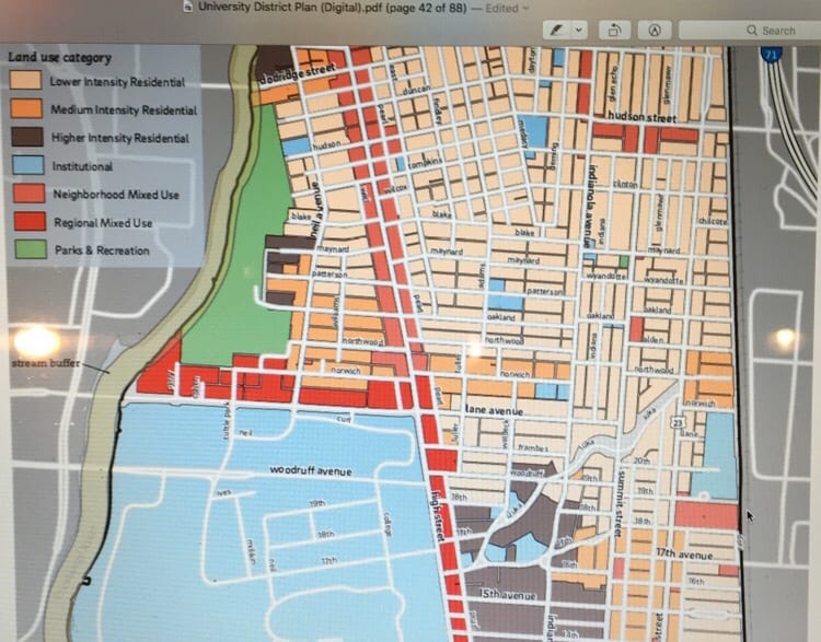
The goals and objectives of planning in the University District are focused on recommendations for the development around the university and a gradual lessening of development intensity as the area transitions to a mostly single-family area. The plan provides proposals to revitalize several High Street locations. It also describes the percent usage of the area; residential and institutional uses combined make up 87 percent of the area, commercial, industrial, mixed use and office is about 6 percent of land uses, with the majority located in the High Street corridor. Parks and open space comprise of approximately 4 percent of the planning area. The rest of the area includes utilities, railroads, and undeveloped land uses.


The land goals and objectives are appropriate, but over-allocate high-density development near campus. Mixed-use buildings of 45-72 feet tall are in the plan all along High Street, and in the bordering areas of the University District. This encourages buildings of this height to extend further along High Street and further East into Victorian and Italian Village. This takes away from the residential and historical aesthetic of these districts. The permissibility of high-rises to spread away from High Street and into this district can further be seen by the already expansion outward of these high-rise mixed-use apartment buildings. The University District plan encourages the vertical expansion of the surrounding area, which would disrupt the integrity of the landscape and create an increasingly urban environment along Ohio State’s campus. Because of this fact, such expansion must be confined to particular areas near High Street and Lane Avenue – places where the high-rise buildings create an attractive, modern look. The University District Plan states that all attempts must be made to preserve historical buildings, meaning that as long as residential demand does not exceed supply, a vast majority of the existing homes East of High Street will remain.


The University District has done an incredible job recently in regards to creating new developments that are consistent with the land-use goals and objectives for the area (Picture #1). Whether it is the maintenance of residential sectors or the redevelopment of an area, the City of Columbus has done well at keeping things up to code. There are both subtle and obvious examples of such efforts. When it comes to less-noticeable examples, one can simply observe the housing patterns on the East side of High Street. While high density apartments begin to rise along the main corridor, medium (Picture #2) and low-density (Picture #3 ) housing remain on the feeder roads in accordance with the zoning standards (both in regards to plot size and building height). Larger-scale developments have been made in recent years in the “regional mixed use” sector of High Street located on South Campus. These developments – including the Gateway District, Eddie George’s Grill, and Barnes & Noble – follow the city’s recommendation for “larger scale commercial use” and for a focus on walkability. A third example of recent development is the revamping of Cazuela’s Mexican Grill, located in one of the “neighborhood mixed-use” areas of High Street. In accord with the University District Plan, the restaurant chose to preserve/utilize pre-existing residential buildings as opposed to constructing a more commercialized structure (Picture #4). Such examples of compliance extend far beyond High Street and can be seen in various locations throughout the University District. Whether it is the new apartments on Lane Avenue that follow the” 15-foot landscaped setback” requirement (Picture #5) or the addition of 4thStreet Bar and Grill which follows variance laws set for residential areas (Picture #6), it is easy to see the strong impact that the plan has had on the area.

There have been two issues our group has identified in past adventures along High Street. One of those issues has been the insertion of many apartment complexes, and the other is the low amount of public art. Within the plan, the area along High Street has been designated as mixed-use which means that both commercial and residential uses can be implemented, but in our opinion, the plan does not fully address the issue of the numerous apartment complexes. There are height restrictions and subsequent parking restrictions included, but there doesn’t seem to be any limit to the number of apartments that are allowed to be put in. Additionally, there is only one page (Page 75) in the entire plan which addresses public art. The page outlines the guidelines by which such artwork must be approved, but no further details are given. Public art is a very open topic with many possibilities, which makes a lack of further information somewhat understandable. Although more work must be done, some art does exist. Such pieces include the “Sohud 2.0” and “Ohio Exterminating Company” building murals.


Overall, the City of Columbus has done a fantastic job in regards to implementing a plan that has helped the University District grow to be more modern while still maintaining its historical character. Much of this growth has come through the mediated redevelopment of High Street, which has been transformed from a place of single-story shops to a bustling network of multi-story commercial prowess. While High Street has been improved, other areas of concern remain underdeveloped. One of the most pressing areas of need is the parks and recreation sector within the University District. While campus itself and the area surrounding the Olentangy River are overflowing with green space and recreation opportunities (Picture #7), the surrounding residential areas continue to suffer from lack of such enrichment. In fact, there is not a single park on the East Side of High Street between Arcadia Road and 9thAvenue (nearly 30 blocks). There are only three major parks in the entire district (Weinland, Luka, and Tuttle) and only two have playground equipment. The City of Columbus currently requires that a park must be located within 1.5 miles of all residents, but does not specify the quality of facilities that must be required. Such specifications, along with greater funding, should be put in place to increase the overall park scene on the East side of High Street.


Photo #1


Photo #2


Photo #3


Photo #4


Photo #5


Photo #6


Photo #7


Blog #4: Arts and Urban Revitalization (Team C-Squared)

The area between Woodruff and Lane is relatively plain in terms of design. For example, The Ohio State Inn is an entirely beige building with no extra decoration, and other buildings like Donato’s pose no artistic element with entirely plain walls that could easily support public art. Additionally, there is no indication that you are approaching the university. Granted, there are dorms and other academic buildings along the road that would indicate to observant travelers that they are in the university district, but there is no true gateway to introduce the area.

As one travels along High Street, one of the most easily identifiable aspects of the drive is the black archways with gold writing that introduce the different neighborhoods/districts like the Short North and Old North. One of these archways can be seen right outside the Buffalo Wild Wings on High Street, yet it does not announce the arrival of the University District. Due to this fact, we believe that it would be a good idea to add multiple archways along the stretch of High Street between Lane Avenue and Woodruff Avenue (Photo #1). Currently, these structures are all essentially the same, with just the neighborhood names differentiating them. Following our concept drawing (Photo #2), the ones in the University District will be enhanced with additional features such as lights underneath and Block-O’s on the side-posts. The addition of such features will enhance the commute through the University District and infuse life into an otherwise dull portion of High Street.

Photo #1

Photo #2

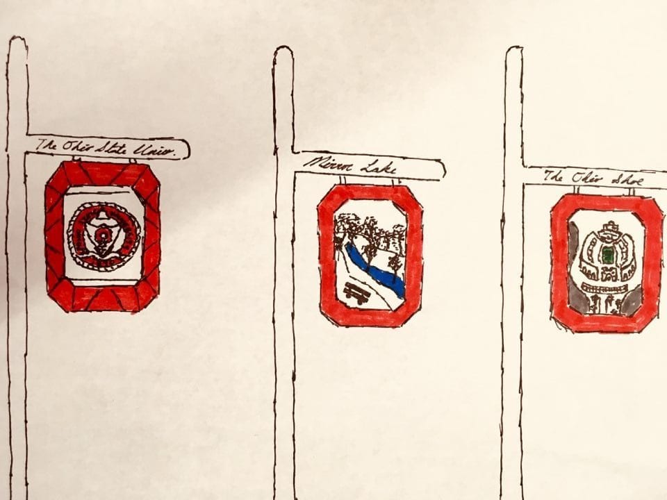
Streetlamps are a necessary aspect to have along the roads whether they are wanted or not. However, the posts lining High Street are quite bland and lack personality (Photo #3). In order to give the University District a stronger sense of place, we devised a plan to add banners to the lampposts. Implementing this plan would be relatively easy, as the lampposts already have fixtures in place to hang murals (Photo #3). On such banners would hang various pieces of art representing iconic locations throughout campus (Photo #4). Such images would exemplify campus pride and give the area an increased sense of place. Implementing a Block O border around the murals would create a clean/cohesive look, while the designs in the center would make them all individual.

Photo #3

Photo #4

Without funding, all of these concepts cannot be put into action. Thankfully, the ideas presented are simple and would likely not cost vary much money to implement. In regards to the archway, as it is a commonality along High Street, it may be possible to convince the City of Columbus to support a furthering of the theme. The banners would likely have to receive funding from the Ohio State due to the fact that they would likely be seen as an advertisement for the university. Even if this happens, funding for such projects already exists in the form of private donors and student due. In order to allocate this money, a pitch must be made to either the university or to private donors (alumni) that such a project is affordable and necessary for the betterment of the campus environment. By convincing these entities to follow through, High Street could receive a major face-lift that will greatly improve its overall appearance and add a greater sense of personality to the University.

Blog #3: Field Assessments (Team C Squared)

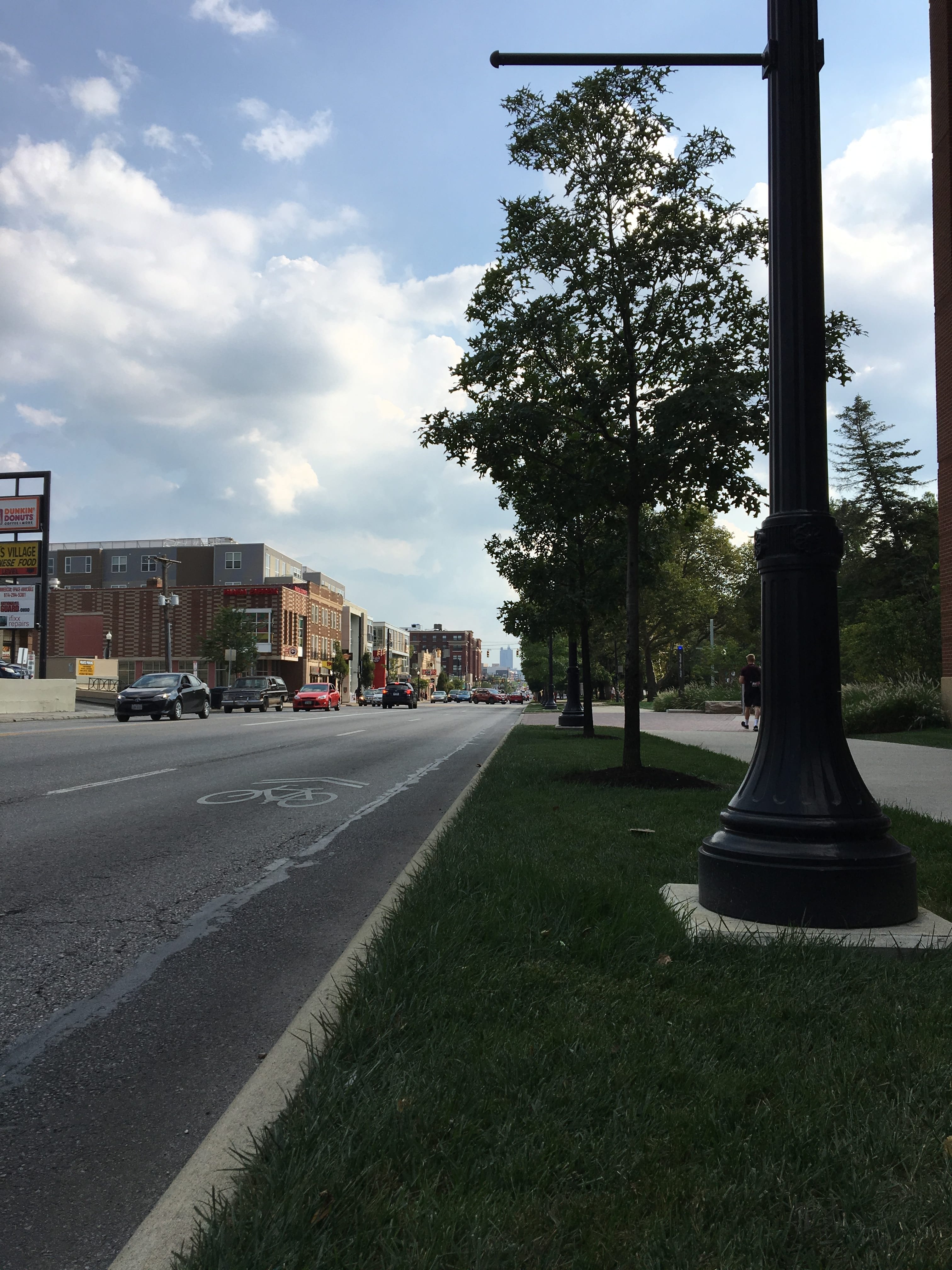
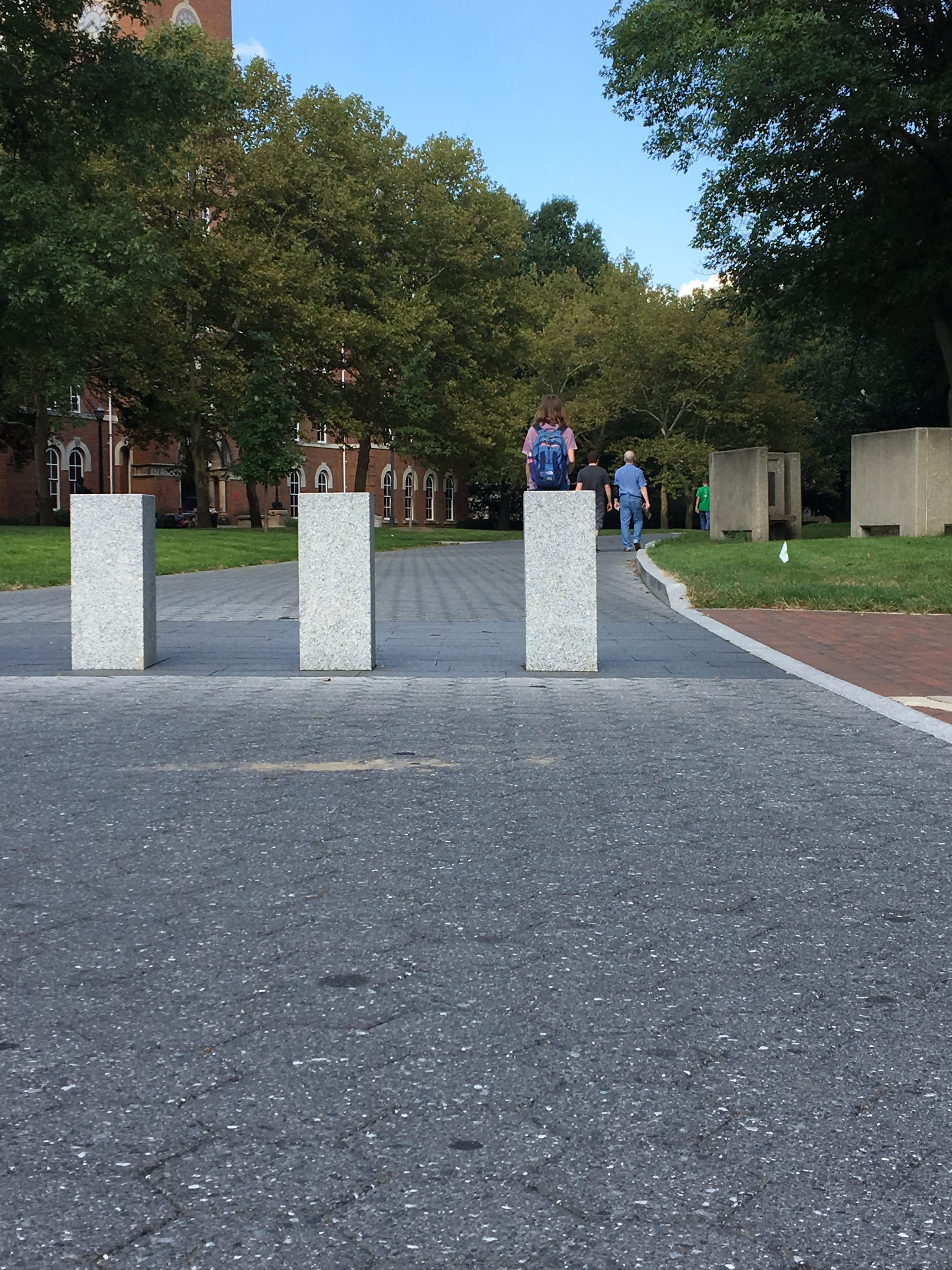
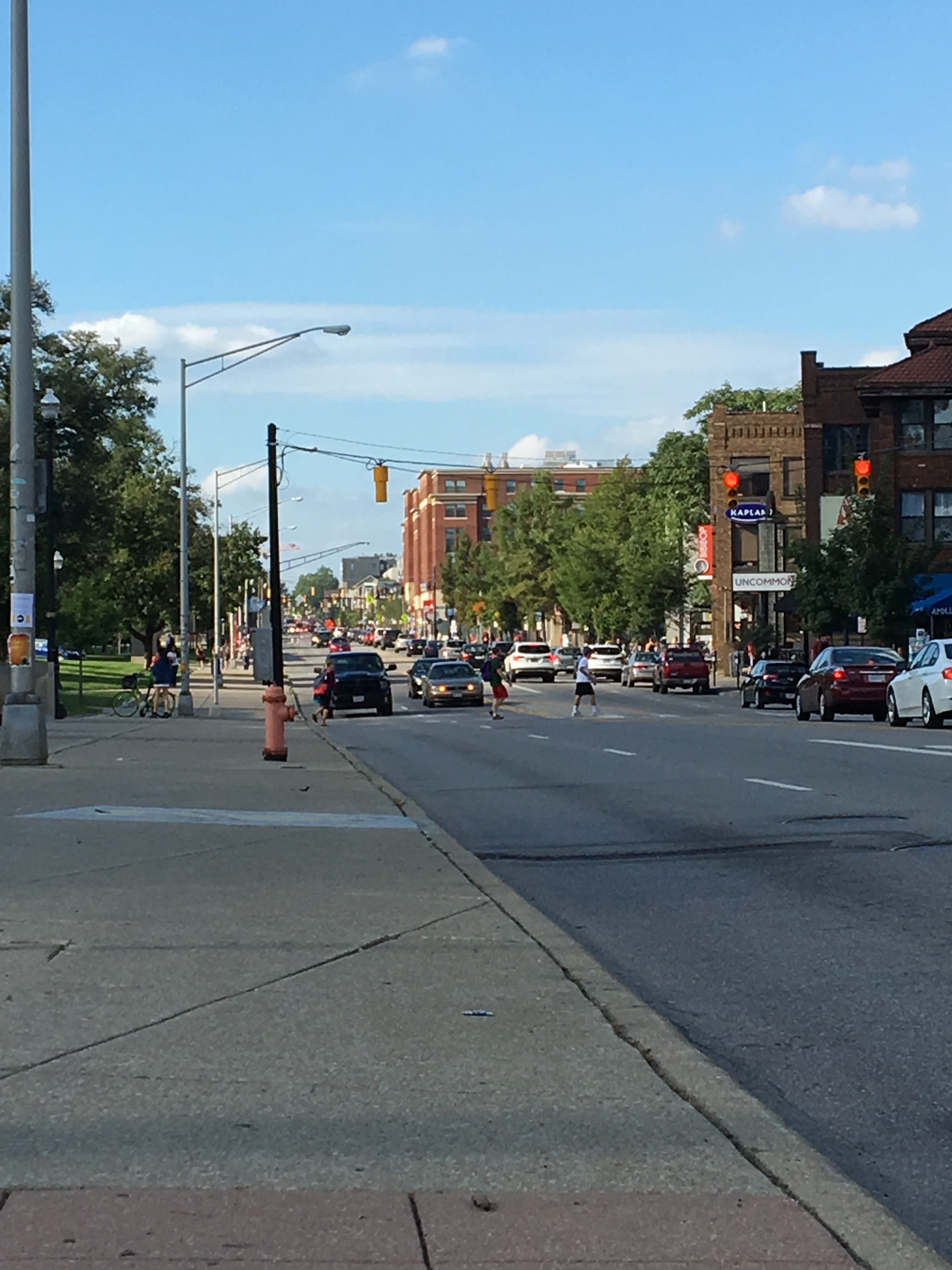
The Ohio State University has done a great job designing its campus to accommodate all modes of transportation while still enforcing its “pedestrians first” identity. This can be seen in regards to the various street widths utilized throughout campus. On the perimeter of the campus, roads tend to be wider while also having higher speed limits. This is especially true for Lane Avenue and for High Street, which uses its width to allow for street-side parking (picture #5 – seen later in post). Roads that run through the inside of campus are much more narrow, controlling both the speed and volume of traffic moving through campus. Various other tactics are used to slow/stop traffic, including barriers near Thompson Library (picture #1) and the utilization of one-way streets on south campus.

Picture #1

Street safety is another important aspect of a pedestrian-oriented campus, and the University has done a great job at implementing various systems to improve the ease-of-walking. One of the most notable aspects is the prevalence of cross-walks (picture #2),  which are painted onto roads throughout campus and are accompanied by crossing signals (traffic lights) for more heavily-traveled roads. The large amount of such pathways makes it easy for students to reach their destination in both a safe and timely manner. Another great street-safety feature can be seen on Cannon Drive, which features a series of pedestrian bridges (picture #3) that span the aforementioned road, along with the Olentangy River and Olentangy River Road, allowing students to cross between East and West campus without traversing traffic.

Picture #2

Picture #3

The setback of properties are what makes the university so beautiful, as they are all designed to serve a certain purpose. Academic halls, libraries, and dormitories are typically spaced-out by green spaces and walkways, which gives the campus a more natural look. This is especially true of the buildings on Neil Avenue, as Thompson Library and the buildings surrounding it are all separated by Mirror Lake (picture #4). This natural look fosters a sentiment of learning and serenity, which serves in stark contrast to the feelings invoked when one reaches High Street (picture #5). Setbacks on this portion of campus are much closer to the street, creating a “commercial-strip” of restaurants and shops. This setback design creates an identity for the area, drawing in students looking for a break from dining hall fare.

Picture 4

Picture #5

The University has also done a great job with building use, doing its best to cluster Academic Halls that house classes for particular majors whilst spacing out dining halls and libraries. The design is quite intuitive, as all of the buildings flow together both in appearance and function. A great example of this is the Ohio State Medical Center, which has its own campus yet still remains very close to the rest of the university operations. This allows medical students to easily access their classes without interrupting the beauty/feel of other areas on campus. All of the medical center is connected, which creates both ease-of-access and an aesthetic structure (picture #6).

Picture #6

One of the pressing concerns of any pedestrian-oriented campus is how to alleviate the area of cars, a problem the University solves quite well with the prevalence of parking. The design of such parking is quite intuitive, as both garages and lots are spaced strategically throughout campus to provide faculty and students with a place to park that is near their desired destination. The best aspect of the parking operations on campus is the lack of lots, which can typically only be seen on the edges of campus (picture #7). The rest of parking is accommodated vertically through the use of garages, which cuts down on the overall space being consumed by cars. The parking layout functions quite well and will only need to be changed if a much-higher demand presents itself, in which case more parking garages would be the best solution. By building “up” and instead of “out,” the University preserves the aesthetic appeal of campus by reducing the number of cars on the road and the space taken up by lots.

Picture #7

Blog #2: Interpreting the City – Images, Elements, and Emotions (Team C-Squared)

Buckeye Doughnuts evokes a sense of happiness amongst many students on Ohio State’s campus. There is nothing quite like a tasty treat and a warm cup of coffee either before or after an Ohio State football victory. This store simply brings the community together, brining joy to all who enter.


The Wexner Center for the Arts is an awe-inspiring building. Its unique design brings a sense of character to campus, personifying the creativity possessed by the University’s students.


Evolved Tattoos evoked a sense of fear amongst the members of our team. Hidden away in the depths of High Street’s growing infrastructure, this business lurks underground.


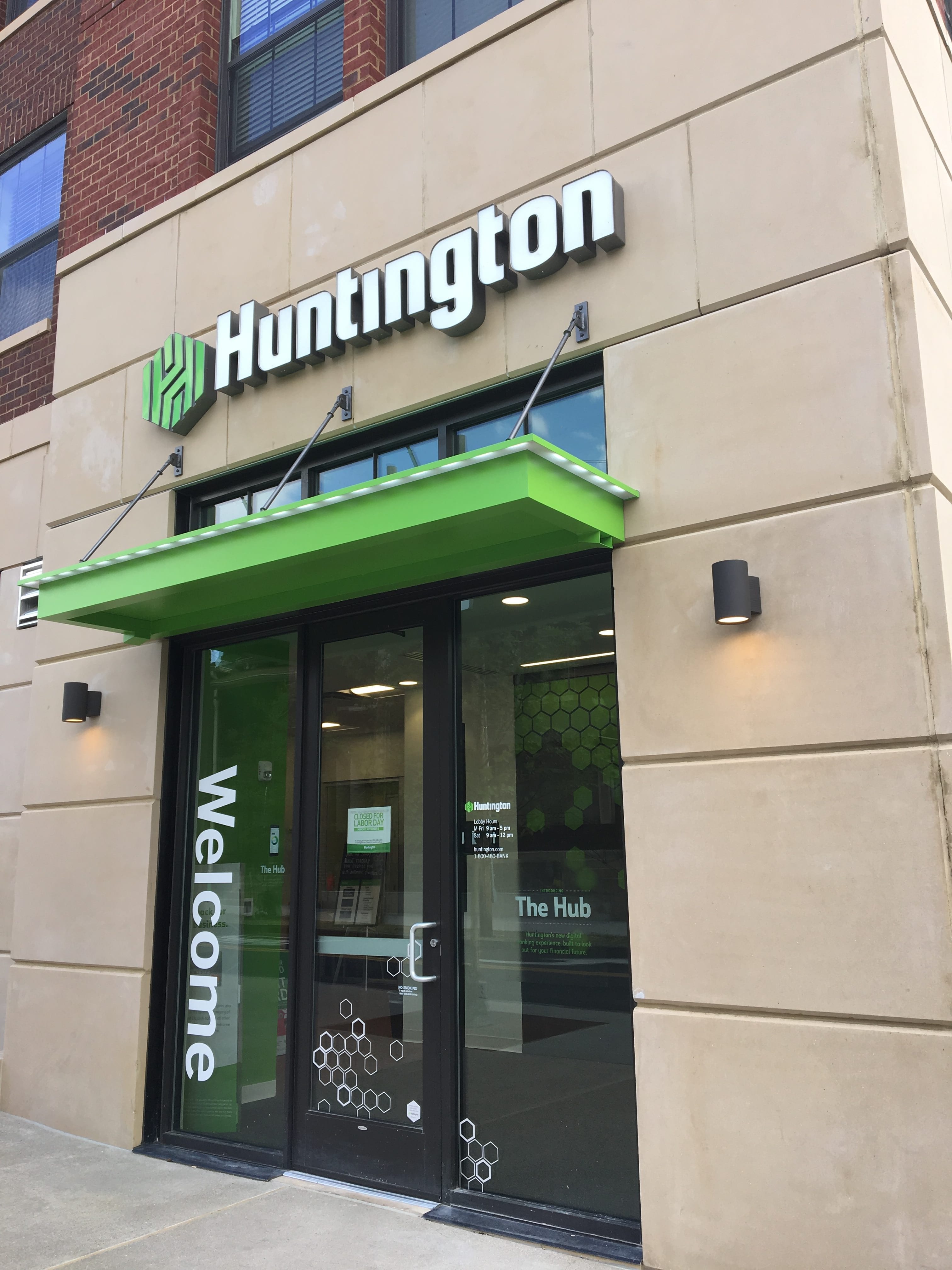
Passing by the Huntington Bank often evokes feelings of sadness amongst the students here on campus. it reminds them of the exorbitant amount of money they have spent and of their never-ending quest to avoid college debt.


Nothing evokes a sense of disgust quite like the never-ending construction here on campus. Obstructing both the campus’ beauty and daily routine, this menace always finds a way to throw a wrench into a student’s plans.