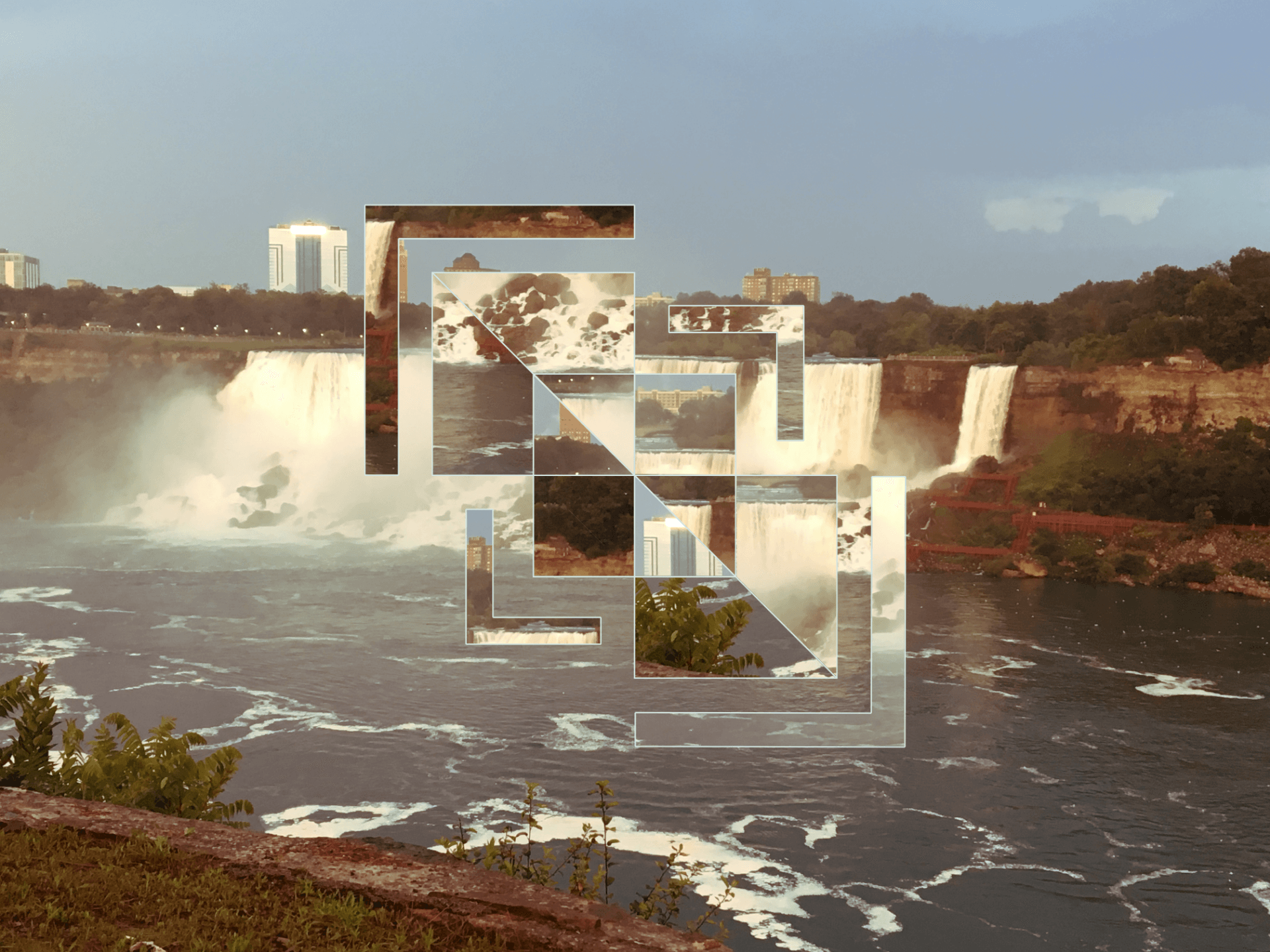
Blending Modes
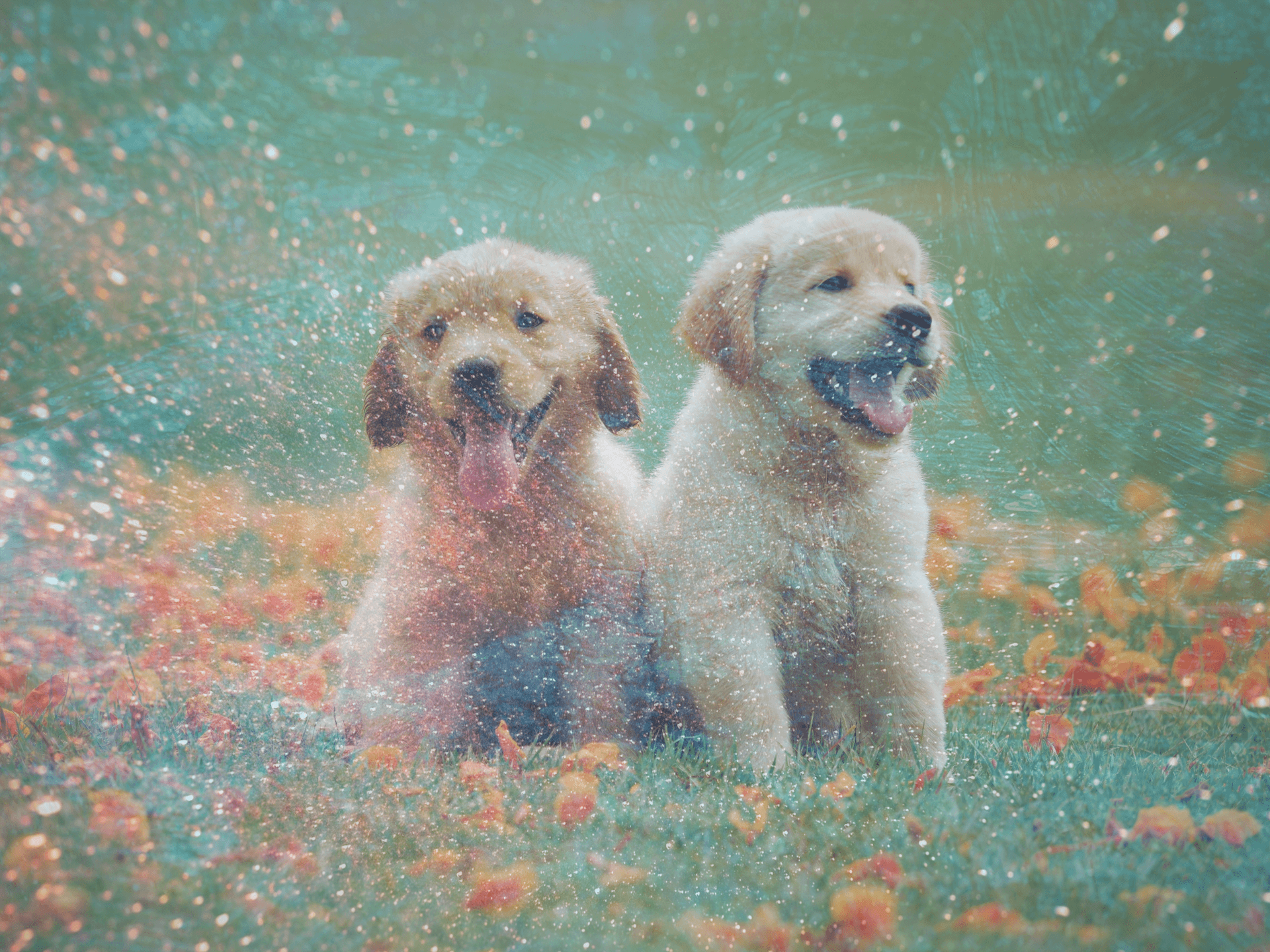
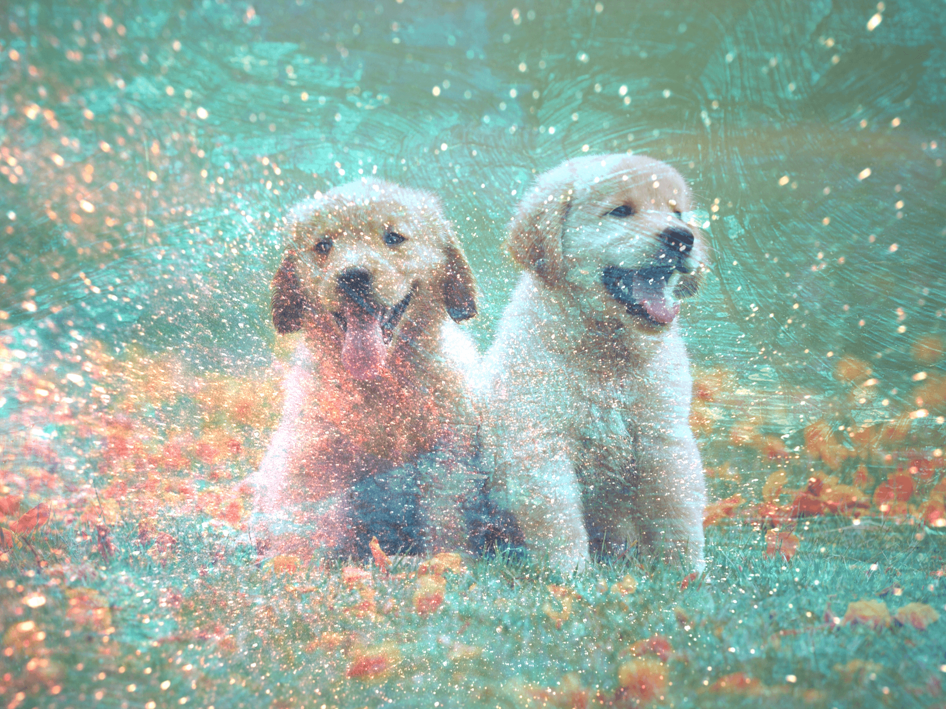
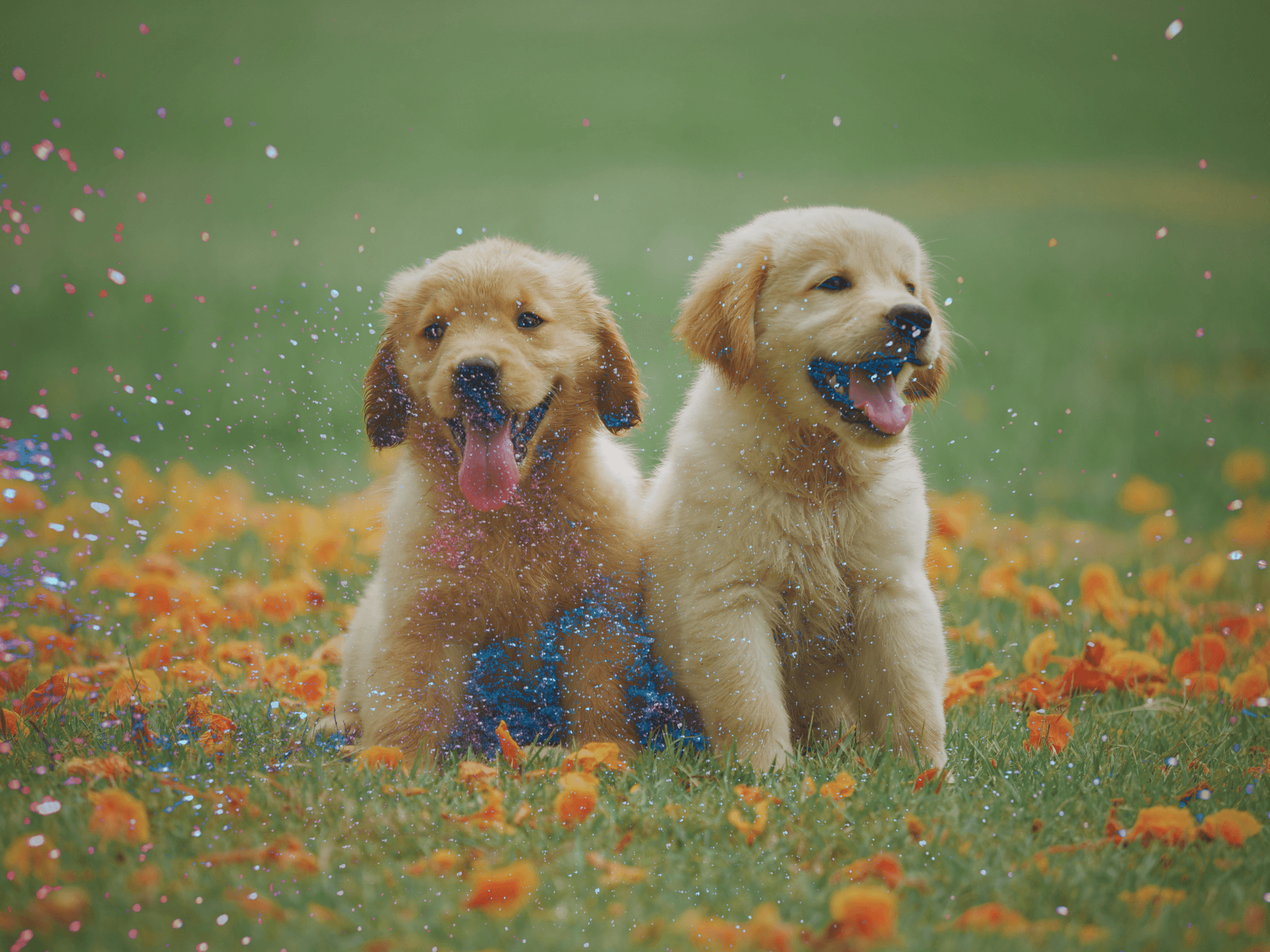
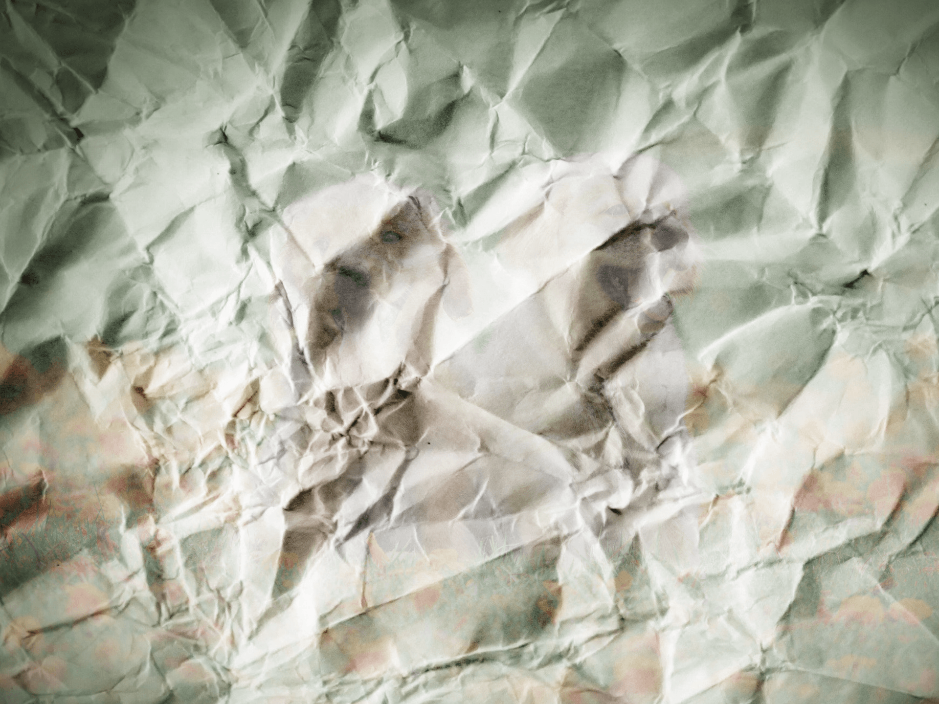
Blend Layer

Base Layer

Normal Blend Modes
Normal
This blend mode, is the default mode. Nothing is applied to the blend layer from the base layer.
Dissolve

In the dissolve blend mode, pixels of the base layer are shown in the blend layer. To show more pixels from the base layer, the opacity of the blend layer must be reduced.
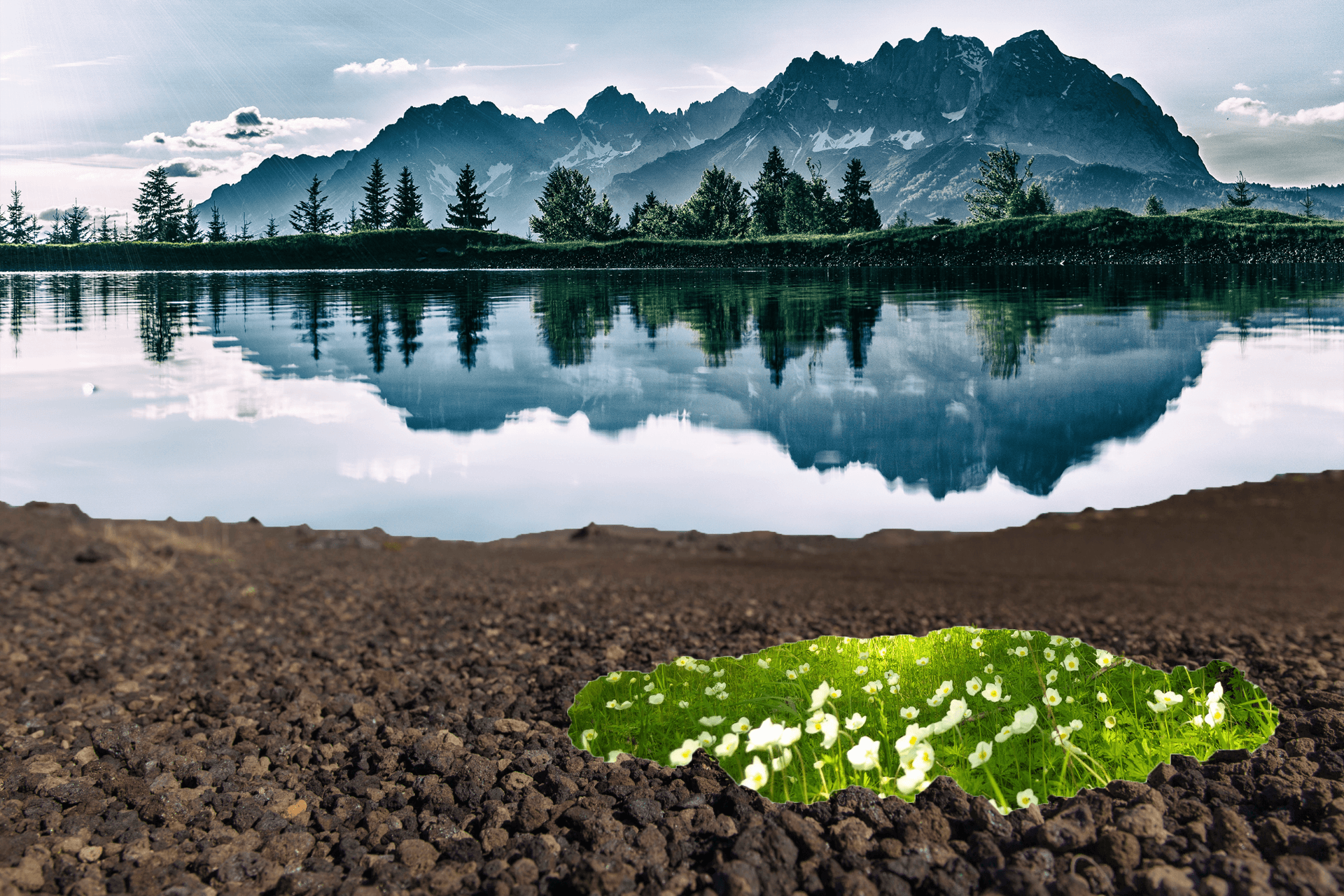
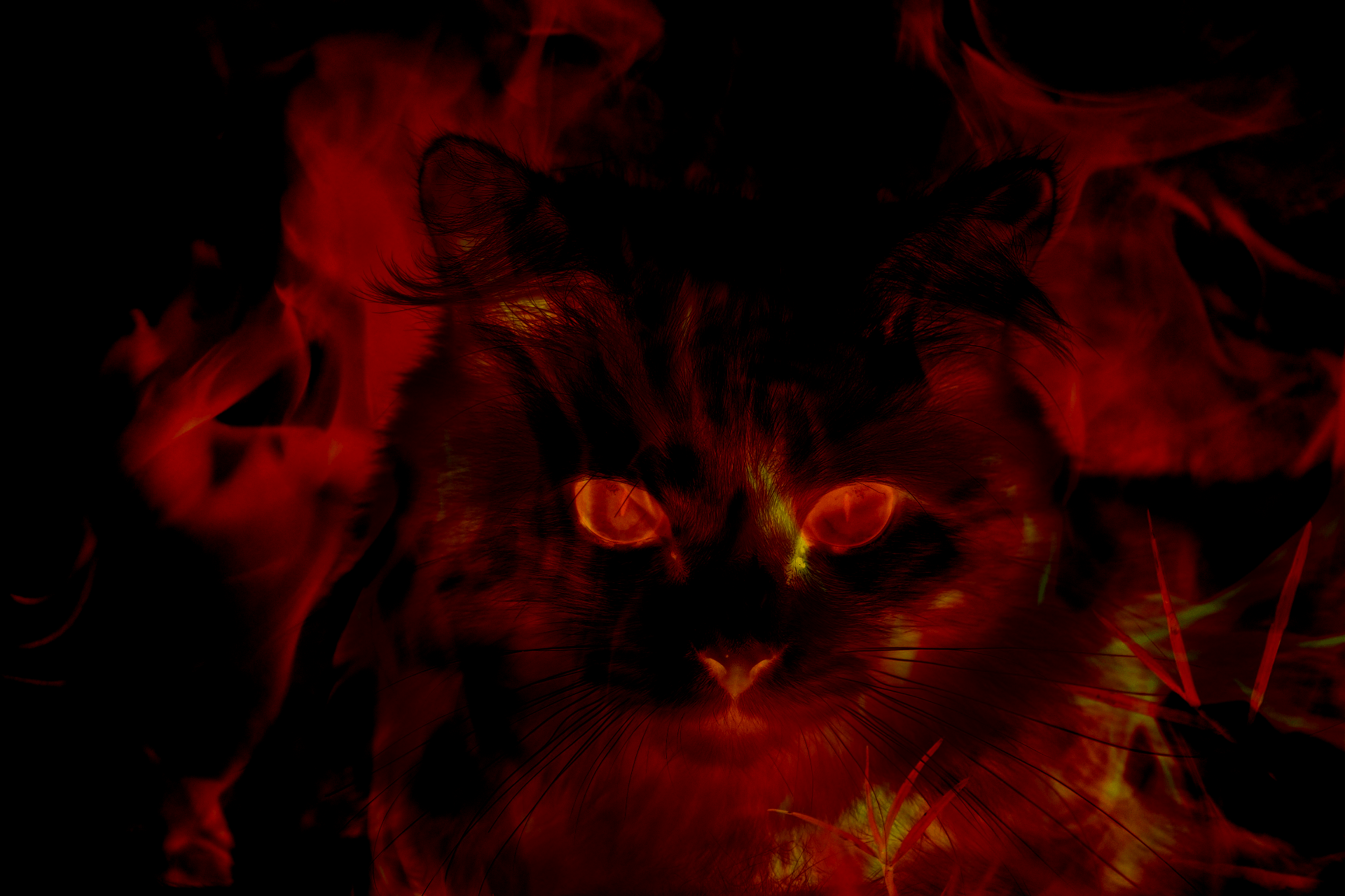
Darken Blend Modes
Darken

The darken blend mode, compares the color of both layers and keeps the darker one of the two.
Multiply

The luminosity of the base color is increased by the color of the blend layer. Overall it darkens the image.
Color Burn

The color burn blend mode is darker than multiply. This blend mode increases the contrast between the two layers. The highlights are reduced and the mid tones are saturated.
Linear Burn

The linear burn blend mode decreases the brightness of the base layer.
Darker Color

The color of each layer isn’t blended here, only the darker of the two layers is kept here.
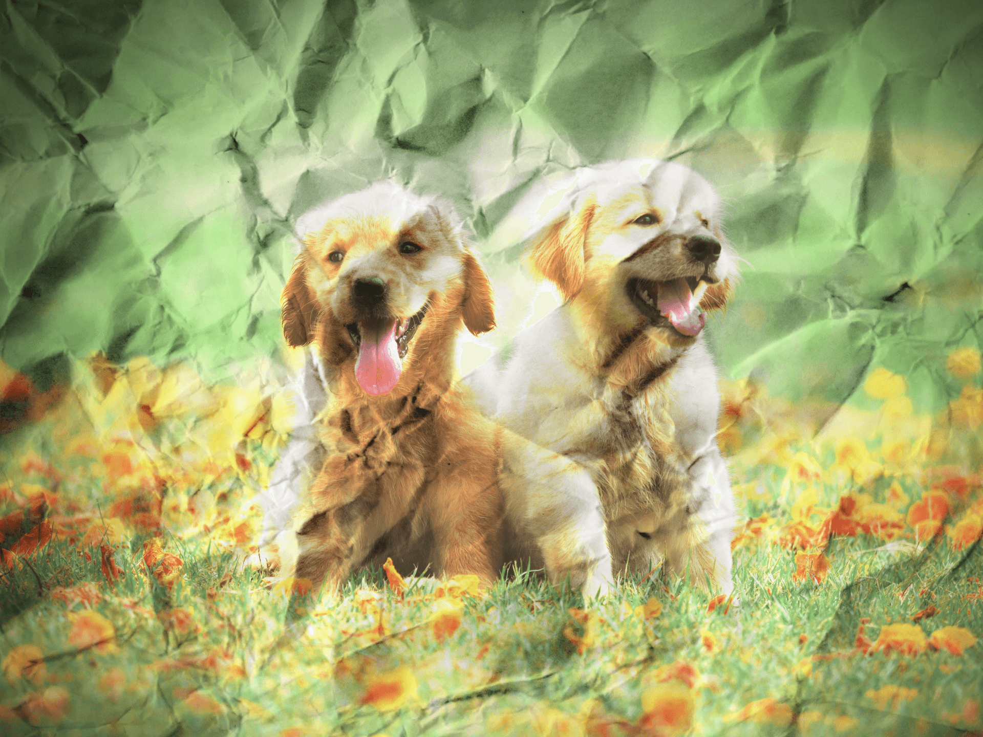
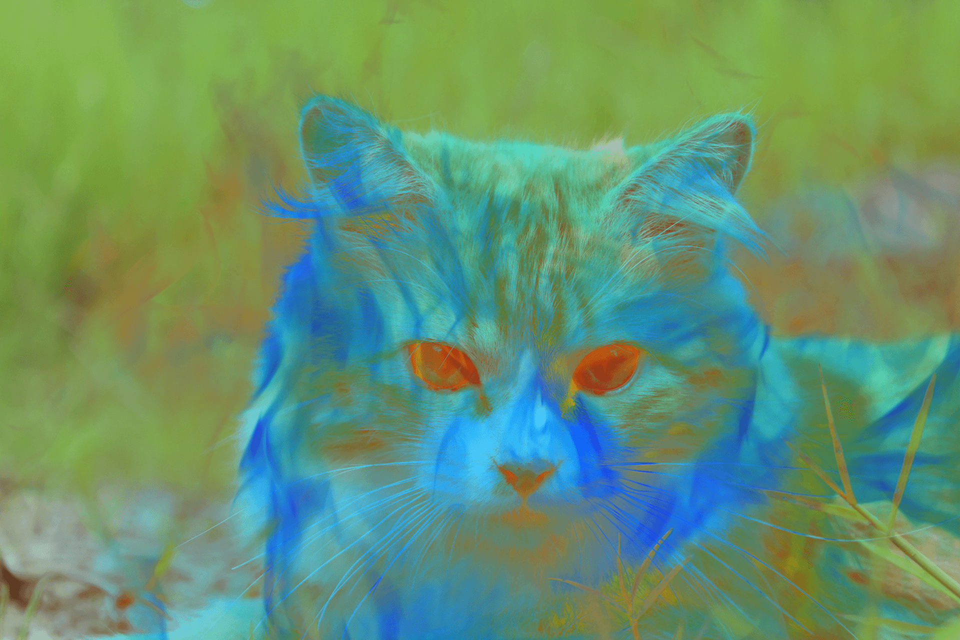
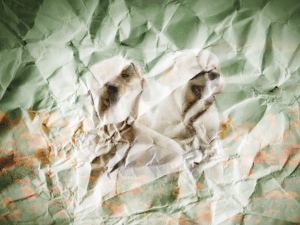
Blend Layer

Base Layer

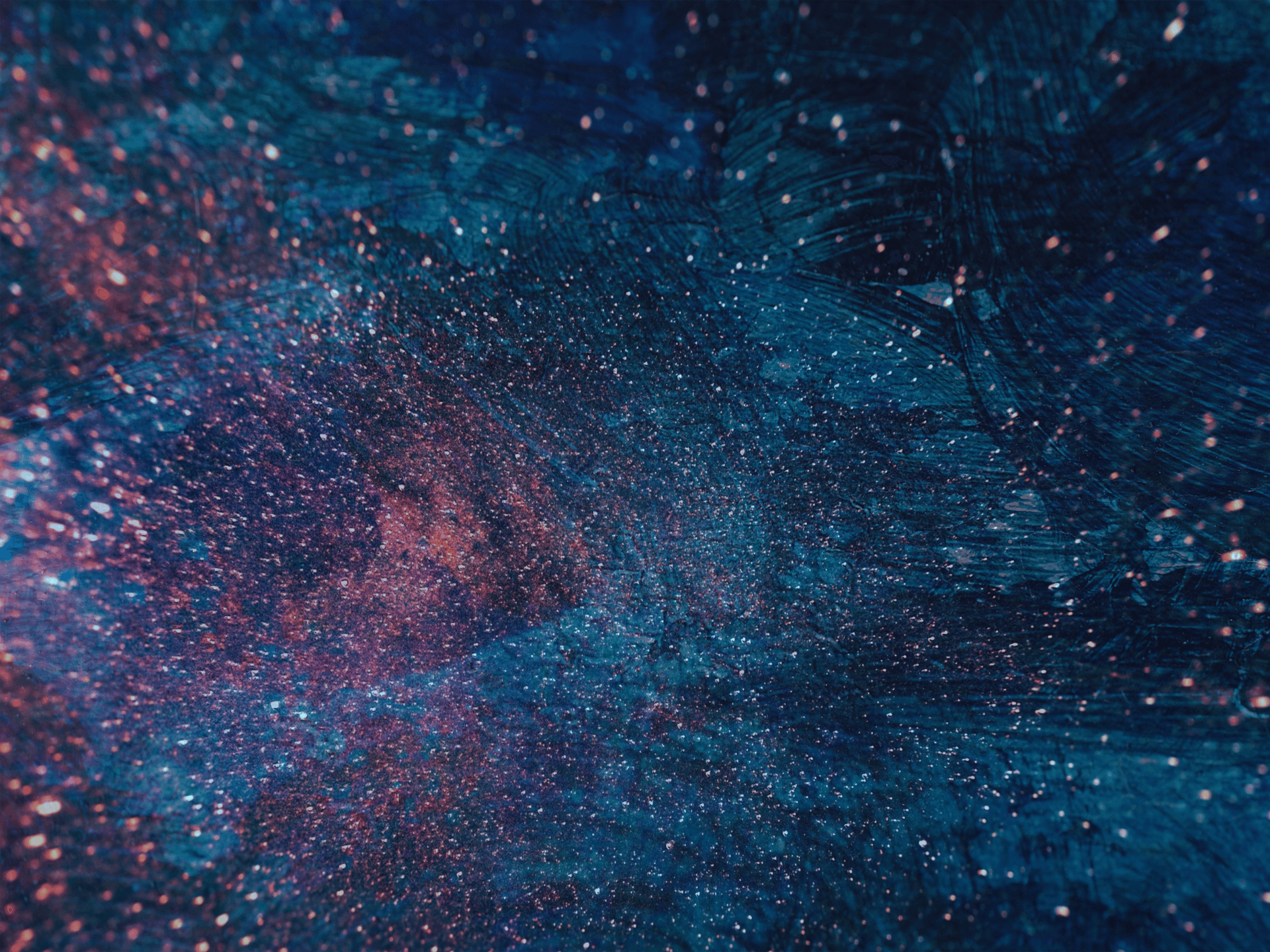
Lighten Blend Modes
Lighten

This blend mode compares the color of each layer. Then keeps the lighter of the two and blends it.
Screen

The black parts of each layer is ignored, and the overall image is lightened. This blend mode is the opposite of multiply. The lighter part of the base layer is added to the blend layer.
Color Dodge

This blend mode decreases the contrast between the two layers. This is the opposite of color burn.
Linear Dodge (Add)

This blend mode is similar to Screen and Color Dodge but produces a lighter color. The base color is lightened.
Lighten Color

The lighter colors of the two layers are kept, with out any blending of the two layers together.
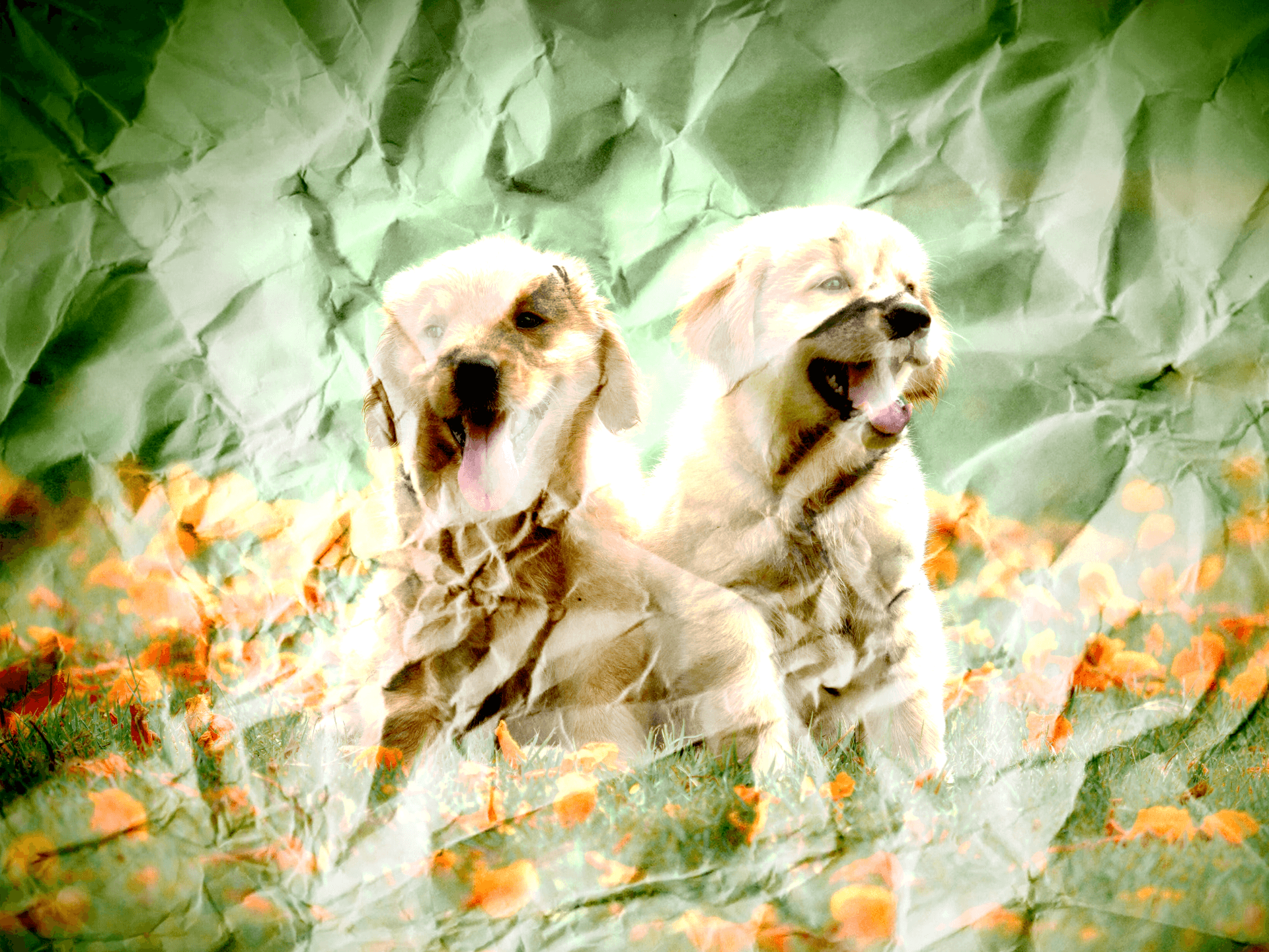
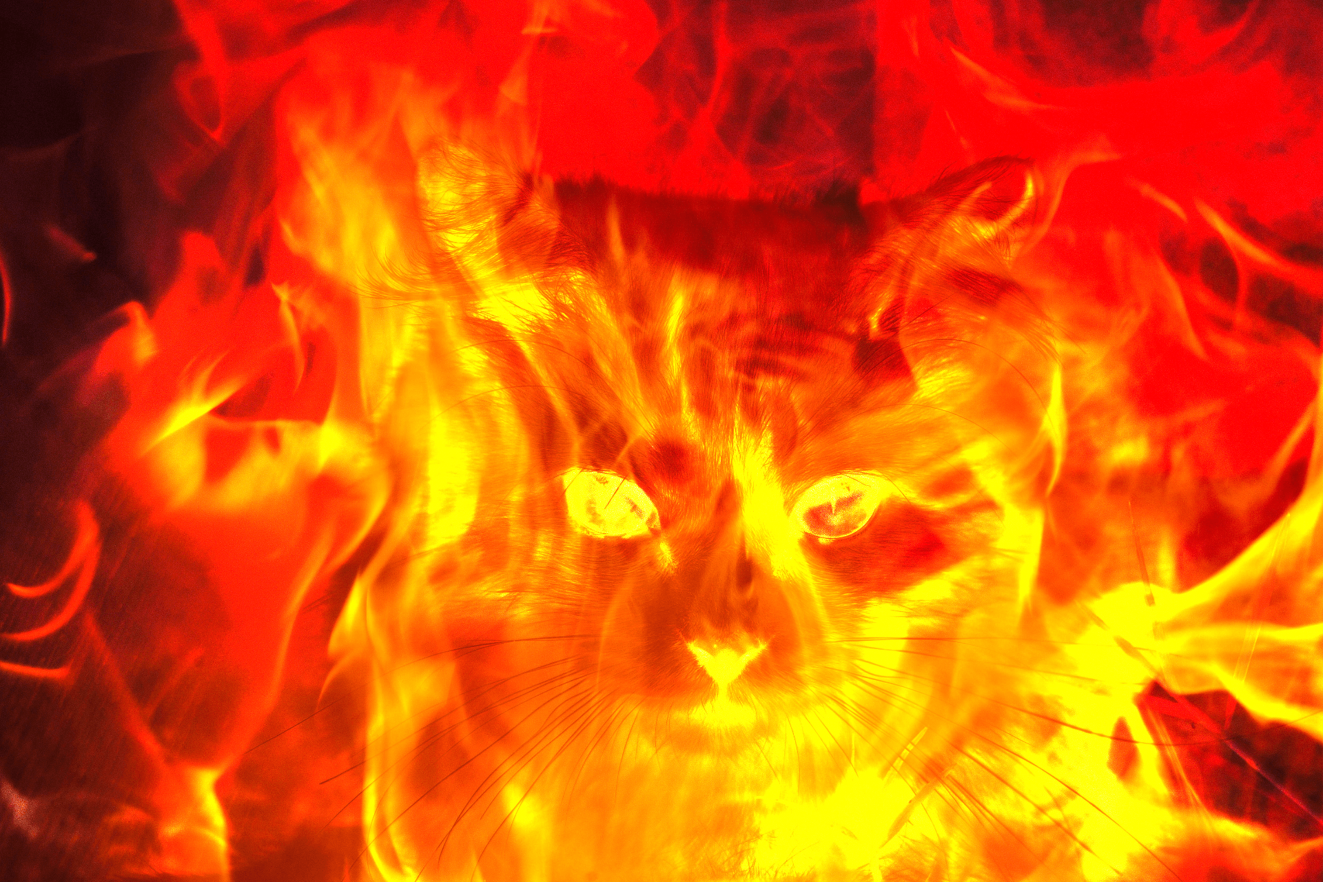
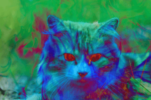
Blend Layer
Base Layer

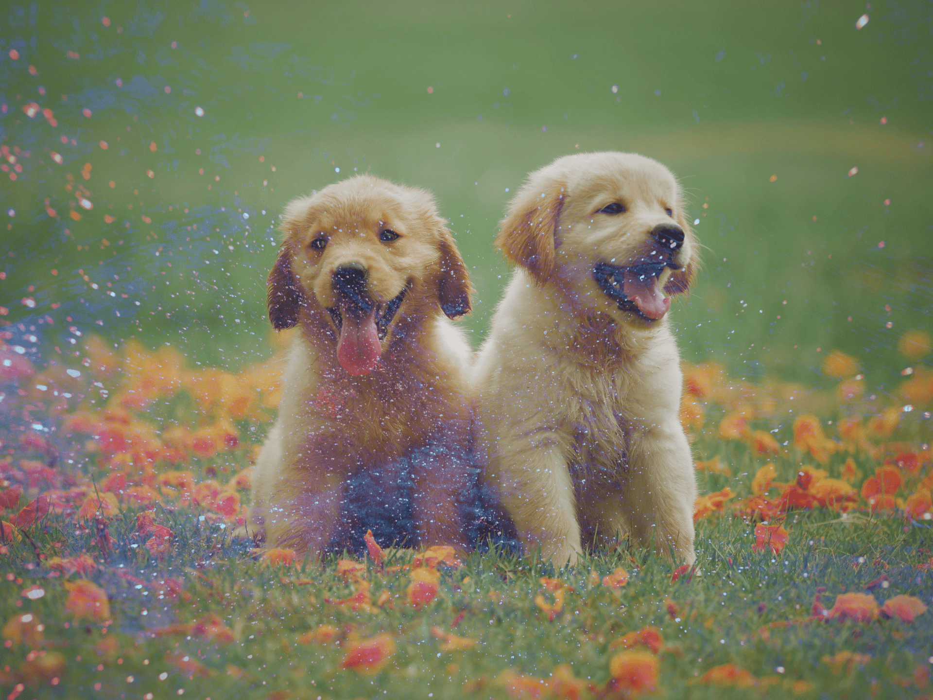
Contrast Blending Modes
Overlay
The overlay blend mode depends on the colors are darker or lighter. If the colors in the blend layer are darker than the base. The blend layer will be darker. And if its lighter it will become lighter.
Soft Light

This blend mode will either darker and lighten depending on the luminance value.
Hard Light

If the blend is darker than if multiplies, if its lighter than it screens.
Vivid Light

Anything darker than 50% gray is darkened, and anything lighter than 50% gray is Lighten. This uses color dodge and color burn.
Linear Light

Linear Light uses a combination of the Linear Dodge Blending on lighter parts and a Linear Burn on darker parts.
Pin Light

Where the colors are 50% gray on the blend later the base layer will be shown. Other than that the blend layer will show.
Hard Mix

Only the colors red, green, blue, cyan, yellow, magenta, white, or black is shown. The image loses lots of details and there are no gradients.
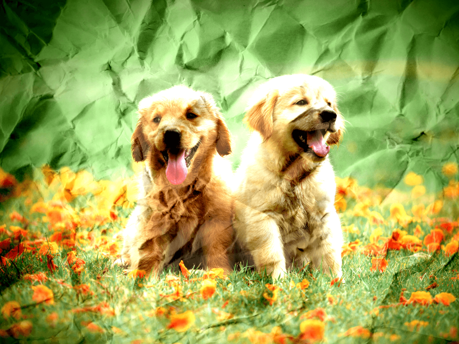
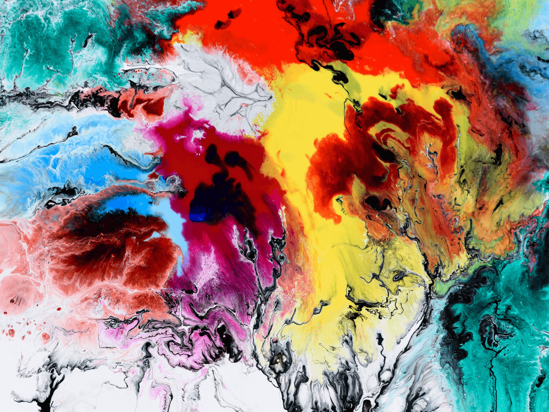
Blend Layer
Base Layer

Contrast Blend Modes
Difference
The base colors are inverted. And the lighter colors are subtracted from the darker colors.
Exclusion

Similar to the difference blend layer, but has less saturation.
Subtract

This subtracts the blend color from the base color. Overall darkens the image.
Divide

Does the opposite of subtract. It divides the blend color from the base color, and lightens the image.
Blend Layer
Base Layer

Color Blending Modes
Hue

Preserves the luminosity and saturation of the base layer, while applying the hue of the blend layer.
Saturation

Preserves the luminosity and hue of the base layer while applying the saturation of the blend layer.
Color

Preserves the luminosity of the base layer while applying the hue and saturation of the blend layer.
Luminosity

Preserves the hue and saturation of the base layer while applying the luminosity of the blend layer.