Research
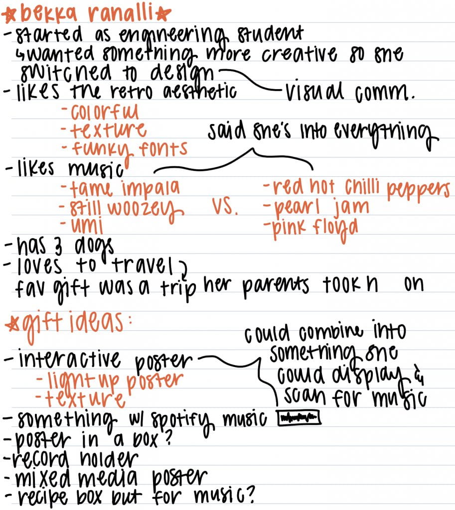
For this assignment, I conducted research on several things. Since the concept of this project was centered around creating a gift for our mentors, the first thing I did was try and learn information about mine. I did this by first reaching out to Bekka, my mentor, and asking her a series of questions. Through this, I was able to gain a better understanding of her hobbies, favorite style of design, and what the best give she ever received was. I took notes on all of this, as well as possible gift ideas. That can be seen below.
 After sitting with my gift list for a few days, I decided to move forward with the idea of an interactive music poster series. The next step I took towards creating this was to specifically research Bekka’s favorite genre of music as well as the style of design she liked. I did this by looking through her Spotify account and reaching out to my dad for song suggestions because they have similar tastes. Beyond this, I also looked at the Instagram accounts of several graphic designers she told me she liked in order to gain inspiration for what my posters could look like. Below is a collage of these things.
Once I felt like I had enough information on the style of music and design she favors, I moved on to researching color psychology. Color psychology is the study of how different hues represent and induce certain feelings within humans. This idea is relatable to music since different genres and specific songs can make someone happy, sad, relaxed, excited, etc. Thus, I thought it would be an interesting inclusion within my posters and something that could subtly suggest how listening to one of my playlists could make an individual feel. Below are the notes I took on color psychology from the website https://www.colorpsychology.org 
- Exercise #1

- Exercise #2

Concept Statement
Gifts occupy an important place in our social life; they build relationships, visually depict our feelings, and give us an excuse to celebrate. The definition of what a gift is varies from person to person but they’re typically a store-bought, handmade, or intangible item. For this assignment, I decided to create a gift that was a combination of the last two things on that list. Upon meeting my mentor, Bekka, I gathered information on the style of design she liked and what her hobbies beyond her major were. She consistently expressed her fondness for music, specifically stating that she loved band posters and that her dream job would be designing marketing materials for a traveling music festival. With this in mind, the first step towards designing Bekka’s gift revolved around creating six different playlists on Spotify. Ranging in moods and genres, the playlist titles were as follows; “Morning Coffee”, “Rainy Day”, “Forever Summer”, “I Am Where My Feet Are”, “Cleaning The Kitchen”, and “Abby’s Top Picks”. Once I finalized these playlists, I created six different posters on Illustrator to go along with them. When creating them, I kept in mind the retro design aesthetic she likes, along with the idea of color phycology. Beyond this, I added an interactive layer to the posters by adding the unique Spotify code for each playlist within them. This idea for this inclusion was inspired by my design quote. Written by Frank Chimero, it reads “People ignore designs that ignore people”. Simply put, this quote summarizes the idea that interactive factors contribute to the success of a design. Thus, it greatly influenced me to not only include the Spotify playlist codes within their respective posters but to also build a flippable stand Bekka could use to display them once they were printed out.
Iterations
Before I started making my posters, I tested out different ways I could display them. I wanted something that looked like decor but could also be functional, so the first idea that came to my head was a flippable paper stand. I made two possible prototypes for this, shown below. Taking into consideration the usual orientation for music posters, I decided that I wanted mine to be portrait rather than landscape. With this in mind, I now moved on to figuring out what size I wanted them to be. I made three different test sheets; 9×6, 8×10, and 8.5×11. Here is what they looked like.

I liked all three of these options but felt as if the 8×10 would be a perfect size. From here, I started creating my actual posters. This came with a lot of experimenting and watching how-to-videos of certain tools within Illustrator. Before I was able to finalize the ones of my gift, I failed many times and produced numerous posters that didn’t quite meet the standard I was looking for. Here is what they looked like.

Production
#1

Before I could truly get into creating the playlist posters, I had to create the playlists themselves. I did this on Spotify, adding around 30-40 songs per playlist. Each playlist is inspired by a different emotion/situation and they include songs that associated with that.
#2
Once the playlists were finalized, I began designing the posters. The first one I created was for the “Morning Coffee” playlist. This playlist includes very relaxed, happy songs that would be perfect to listen to in the morning. Using colors that reflected these feelings (yellow, pink, taupe), I started this poster by creating a circle gradient in the middle of the page. After this, I added the text first around the gradient and then around the three of the four edges. I placed the Spotify code along the bottom edge so it’d be away from everything and easy to scan. The last step was adding a crumpled paper texture on top that I found on Google.
#3

The next poster I created was for the “Cleaning The Kitchen” playlist. I described this playlist as something Bekka could play while she was cleaning or doing any boring task because all of the songs within it are exciting and dance-inducing. Thus, I decided to have a dancing character be the focus of this poster. I started by drawing it on Sketchbook and then transferring it to Illustrator. From there, I duplicated, resized, and recolored the dancing figure before placing it on top of repetitive text. The colors chosen (purple, red, orange) represent the high energy, happy feelings the songs employ. Regardless, I then added the remaining text and Spotify code around the top and bottom. The last step, again, was to add texture. This specific one came from Illustrator and was called “burlap”.
#4

The next playlist poster I created was for my top picks. I thought including this playlist would be a great way for Bekka to get to know me and see firsthand what music I like to listen to. The songs within it vary in genre and mood so the colors I chose to put on the poster reflected my favorite ones. I started by spelling out my name and distorting the letters. From there, I added the remaining text and Spotify code. Lastly, I put a canvas texture from Illustrator on top.
#5

The fourth poster I made was for the “I Am Where My Feet Are” playlist. The phrase “I Am Where My Feet Are” stems from the idea of being present in the moment and focusing on the task at hand. Thus, this playlist is full of “no skip songs” so Bekka could theoretically just press play and not have to worry about checking her phone to change a song. The songs within it are very relaxed and nature-inspired, so the colors chosen (blue, black, white) are representative of that. I started by taking a picture of my feet outside and then adding a warped, wavy text above them. From there, I added the remaining text and Spotify code. As for the texture, I added a film grain one as well as one that mimicked a piece of plastic.
#6

The next poster I made was for the “Rainy Days” playlist. The songs within it imitate the feelings we get on days that are gloomy, dark, or just overall not good. Thus, the colors chosen (dark blue, dark purple, black) do as well. I started this poster by writing the word days in the middle with a warped effect. From there, I added the word rainy, the Spotifty code, and the remaining text. The last step was to add texture, this one being a combination of film grain and folded paper.
#7

The last poster I created was for the “Forever Summer” playlist. The songs within it are light-hearted, nature-inspired, and joyful. The chosen colors (green, champagne) represent more of the nature side of things. Regardless, I started this poster by creating a curved line background. I cropped it, added negative space, and put the text within that. I lastly added a brick texture on top.
#8

Once the posters were finalized, I printed them out and built my display for them. As I mentioned previously, this display is a flippable stand that doubles as decor and something useful. I started building this by creating another prototype with paper, my mom was so gracious as to hold it up for me with a wooden fork so I could document it. After that, I cut two pieces of wood into an 8.5×11 rectangle. I was originally going to put their ends together as I did with the paper but I couldn’t get the angle right so I ended up cutting one piece of wood in half and gluing it to the middle back of the other. From there, I added a few nails so it would be more sturdy and spray-painted it black. To ensure there wouldn’t be any roughness or chance for splinters, the last step was to sand it.
#9

With the display being finished, the last step of this project was to hole punch the posters, hang them within the clips, and of course, give the whole thing to Bekka! On the left, is two pictures of the “Cleaning The Kitchen” and “Rainy Days” playlist posters once they were hung, and on the right is a picture of Bekka after she received the gift. Overall, I liked this project. Creating the posters was very fun and giving them to Bekka was very rewarding, as she told me she thought they were so cool and that she loved the interactive scan feature. Below is a Youtube video of what that looks like!
Link to Portfolio Project
Now that you know how it came to be made, here’s a link to my Gifting Design page. Enjoy!