Posts

Checkmate: Process

Research

For this assignment, I conducted research on many things. Since the concept was centered around chess, that was the first thing I looked into. I understood the basic idea behind the game but had never played it before. Thus, my research included reading articles and taking notes about how the pieces work together and function individually, as well as playing several online chess games to get a feel for the application of those ideas. Below are notes that I took as well as a screenshot of a chess game I played.

Once I had a better understanding of the rules behind chess and how to play it, I began to research how I was going to construct my own pieces. Since we were required to create slice forms, I watched videos and looked at numerous pictures of them so I could form an understanding of how they were made and how complex I could possibly make mine. Below is a video I watched and a few pictures of slice forms I kept note of.

  • Exercise #1
This is an exercise we did in class in preparation for this project. After researching slice forms and how to create them, we were tasked with this exploratory exercise to try things out. We were given a list of a few basic forms; a sphere, toy car, and a cube are a few examples. After creating those things, I deviated from the list and made some random forms such as a cat, Christmas tree, and leaf. Above is a picture of several of my practice slice forms. As can be seen, I had my fair share of mistakes like cutting my slots very inaccurately. Regardless, this exercise was extremely helpful in figuring out the basics of slice forms firsthand and being able to try things out with no consequence if they didn’t work.

Concept Statement

By accident or design, the large majority of games possess a narrative structure. Chess, the oldest skills game in the world, has a strong sense of rivalry woven into the narrative it depicts between its two players. Expressed through the traditional names of its pieces, its elementary series of rules, and its visual presentation, this has allowed chess to become one of the most popular games across the world. For our collaborative project, my partner and I decided to rewrite its rivalry-based narrative into something that college football fans are sure to be familiar with; Ohio State versus Michigan. While it was a tough decision, I chose to design the sixteen-piece set that was inspired by the state up north. My pawns are foam fingers, representative of the many loyal fans who so willingly support their teams regardless of the game’s outcome. My bishops are megaphones, representative of the cheerleaders who rally and motivate their team. My rooks are two block M’s, representative of the university itself. My knights are football helmets, representative of the football players who move quickly and jump over obstacles to protect their title. My queen is a wolverine, representative of Michigan’s mascot who is overly supportive and pops up when it’s least expected. Lastly, my king is a big house, representative of the university stadium and the overall title everyone involved is trying to protect. We created our respective files using Illustrator and worked simultaneously to cut them out using a laser cutter. Through all of this, we wanted to visually depict a rivalry that as students is very important to us in a way that could connect to people of all ages who simply enjoy playing the game of chess.

Iterations

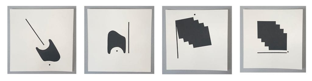
Once I had an understanding of how chess worked and how to create the game pieces using the slice-form method, my partner and I started thinking of what rivalry we wanted to rewrite its narrative into. This thought process initially started with a list of contrasting things. Below is my list.

After looking through both of our lists, we decided to move forward with the idea of Ohio State versus Michigan. As students, this excited us because we knew the rivalry aspect between the two schools would be relatable and allow us to create really interesting pieces. Although I’m a die-hard Buckeye fan, I decided to design the Michigan chess pieces. The first step in doing so was to practice creating slice forms as I did within the exercise except this time they were centered more toward our theme. Below are those practice slice forms, labeled.

Production

#1

After creating the different paper iterations of our pieces, the next step was to create our finalized list of what positions those pieces were actually going to represent. While there are many layers to the OSU versus Michigan rivalry, we leaned more into the football side of things. Thus, our pieces represent many important sport-related things like the fans, players, cheerleaders, mascots, and stadiums.

#2

After figuring out what my pieces were going to be, I designed their slice forms using Illustrator.

#3

Once my files were complete, I used the laser cutter to cut them out on thin birch wood. Thankfully, my partner and I got this done early on so we never had to wait in any lines or deal with scheduling issues.

#3

Now that I had my pieces cut out, I started assembling them. I began with my king; The Big House. This piece is representative of Michigan’s stadium since it’s named The Big House. We wanted the kings to be the stadiums because whenever OSU and Michigan fight to win the rivalry title, it’s within those places. Furthermore, we wanted these pieces to stand out so we made them gold and silver rather than blue/yellow or scarlet/grey.

#4

After assembling the king, I moved on to the queen; the Wolverine. This piece represents Michigan’s mascot, an overly supportive character who often runs around and appears when it’s least expected.

#5

The next piece I put together was the rook; the block M. This symbol is iconic when it comes to Michigan as a university and although it’s a static object, the tradition and fan base it represents spreads far and wide similar to the way a rook moves.

#6

After the rook, I assembled the pawn; a foam finger. This piece represents the many loyal fans Michigan has. These fans travel in large packs and support the university no matter what the outcome of the game is which is similar to the pawn’s relationship with the king.

#7

Next, I assembled the bishop; a megaphone This piece represents the cheerleaders who similar to the Wolverine, moves very fast and support their team no matter what.

#8

The last piece I put together was the knight; a football helmet. This piece represents the football players. We chose them as our knights because physically, they can jump over obstacles and move around things in a fast manner. This is similar to the way knights move in an L shape quickly in several directions.

#9

After they were put together, I went through with some yellow paint and touched up some of the pieces. While the laser cutter worked wonderfully, my partner and I found that pieces that were painted a lighter color like red or yellow tended to burn more around the edges than blue or black pieces. This wasn’t a necessary step but it greatly helped to make the pieces look more professional and put together.

#10

Once the paint dried, I was all finished! To the left is a picture of all the pieces on my desk directly after I completed them while on the right, they can be seen placed on a chessboard with my partner’s pieces. Overall, I’m extremely proud of this project. Our pieces came out way better than I expected and I really enjoy how our narrative relates to that of the original one.

Link to Portfolio Project

Now that you know how it came to be made, here’s a link to my Checkmate page. Enjoy!

https://u.osu.edu/fricke-60/portfolio/checkmate/

Gifting Design: Process

Research

For this assignment, I conducted research on several things. Since the concept of this project was centered around creating a gift for our mentors, the first thing I did was try and learn information about mine. I did this by first reaching out to Bekka, my mentor, and asking her a series of questions. Through this, I was able to gain a better understanding of her hobbies, favorite style of design, and what the best give she ever received was. I took notes on all of this, as well as possible gift ideas. That can be seen below.

 After sitting with my gift list for a few days, I decided to move forward with the idea of an interactive music poster series. The next step I took towards creating this was to specifically research Bekka’s favorite genre of music as well as the style of design she liked. I did this by looking through her Spotify account and reaching out to my dad for song suggestions because they have similar tastes. Beyond this, I also looked at the Instagram accounts of several graphic designers she told me she liked in order to gain inspiration for what my posters could look like. Below is a collage of these things.

Once I felt like I had enough information on the style of music and design she favors, I moved on to researching color psychology. Color psychology is the study of how different hues represent and induce certain feelings within humans. This idea is relatable to music since different genres and specific songs can make someone happy, sad, relaxed, excited, etc. Thus, I thought it would be an interesting inclusion within my posters and something that could subtly suggest how listening to one of my playlists could make an individual feel. Below are the notes I took on color psychology from the website https://www.colorpsychology.org 

  • Exercise #1
This is an exercise we did in class in preparation for this project. The prompt behind the exercise was to think about a time when you received a gift that was special to you and why. For me, this was a necklace my grandma gave me when I graduated high school. Thinking back on this gift was really helpful in the beginning stages of this project because it reminded me of the many layers of a gift and how they often go beyond just the surface level.
  • Exercise #2
This was another exercise we did in class in preparation for this project. The prompt was to find a random object and create a container for it. For my object, I chose a purple spikey ball. I loved its exterior appearance and wanted to preserve that so I decided to create a bowl-like container. I used paper mache to create the bowl and added a mouth on the outside as though to make the purple spikey ball look like hair. Overall, I loved this exercise. I thought it was extremely fun and a great way to start thinking of the various ways I could possibly conceal my gift once it was finished.

Concept Statement

Gifts occupy an important place in our social life; they build relationships, visually depict our feelings, and give us an excuse to celebrate. The definition of what a gift is varies from person to person but they’re typically a store-bought, handmade, or intangible item. For this assignment, I decided to create a gift that was a combination of the last two things on that list. Upon meeting my mentor, Bekka, I gathered information on the style of design she liked and what her hobbies beyond her major were. She consistently expressed her fondness for music, specifically stating that she loved band posters and that her dream job would be designing marketing materials for a traveling music festival. With this in mind, the first step towards designing Bekka’s gift revolved around creating six different playlists on Spotify. Ranging in moods and genres, the playlist titles were as follows; “Morning Coffee”, “Rainy Day”, “Forever Summer”, “I Am Where My Feet Are”, “Cleaning The Kitchen”, and “Abby’s Top Picks”. Once I finalized these playlists, I created six different posters on Illustrator to go along with them. When creating them, I kept in mind the retro design aesthetic she likes, along with the idea of color phycology. Beyond this, I added an interactive layer to the posters by adding the unique Spotify code for each playlist within them. This idea for this inclusion was inspired by my design quote. Written by Frank Chimero, it reads “People ignore designs that ignore people”. Simply put, this quote summarizes the idea that interactive factors contribute to the success of a design. Thus, it greatly influenced me to not only include the Spotify playlist codes within their respective posters but to also build a flippable stand Bekka could use to display them once they were printed out.

Iterations

Before I started making my posters, I tested out different ways I could display them. I wanted something that looked like decor but could also be functional, so the first idea that came to my head was a flippable paper stand. I made two possible prototypes for this, shown below.Taking into consideration the usual orientation for music posters, I decided that I wanted mine to be portrait rather than landscape. With this in mind, I now moved on to figuring out what size I wanted them to be. I made three different test sheets; 9×6, 8×10, and 8.5×11. Here is what they looked like.

I liked all three of these options but felt as if the 8×10 would be a perfect size. From here, I started creating my actual posters. This came with a lot of experimenting and watching how-to-videos of certain tools within Illustrator. Before I was able to finalize the ones of my gift, I failed many times and produced numerous posters that didn’t quite meet the standard I was looking for. Here is what they looked like.

Production

#1

Before I could truly get into creating the playlist posters, I had to create the playlists themselves. I did this on Spotify, adding around 30-40 songs per playlist. Each playlist is inspired by a different emotion/situation and they include songs that associated with that.

#2

Once the playlists were finalized, I began designing the posters. The first one I created was for the “Morning Coffee” playlist. This playlist includes very relaxed, happy songs that would be perfect to listen to in the morning. Using colors that reflected these feelings (yellow, pink, taupe), I started this poster by creating a circle gradient in the middle of the page. After this, I added the text first around the gradient and then around the three of the four edges. I placed the Spotify code along the bottom edge so it’d be away from everything and easy to scan. The last step was adding a crumpled paper texture on top that I found on Google.

#3

The next poster I created was for the “Cleaning The Kitchen” playlist. I described this playlist as something Bekka could play while she was cleaning or doing any boring task because all of the songs within it are exciting and dance-inducing. Thus, I decided to have a dancing character be the focus of this poster. I started by drawing it on Sketchbook and then transferring it to Illustrator. From there, I duplicated, resized, and recolored the dancing figure before placing it on top of repetitive text. The colors chosen (purple, red, orange) represent the high energy, happy feelings the songs employ. Regardless, I then added the remaining text and Spotify code around the top and bottom. The last step, again, was to add texture. This specific one came from Illustrator and was called “burlap”.

#4

The next playlist poster I created was for my top picks. I thought including this playlist would be a great way for Bekka to get to know me and see firsthand what music I like to listen to. The songs within it vary in genre and mood so the colors I chose to put on the poster reflected my favorite ones. I started by spelling out my name and distorting the letters. From there, I added the remaining text and Spotify code. Lastly, I put a canvas texture from Illustrator on top.

#5

The fourth poster I made was for the “I Am Where My Feet Are” playlist. The phrase “I Am Where My Feet Are” stems from the idea of being present in the moment and focusing on the task at hand. Thus, this playlist is full of “no skip songs” so Bekka could theoretically just press play and not have to worry about checking her phone to change a song. The songs within it are very relaxed and nature-inspired, so the colors chosen (blue, black, white) are representative of that. I started by taking a picture of my feet outside and then adding a warped, wavy text above them. From there, I added the remaining text and Spotify code. As for the texture, I added a film grain one as well as one that mimicked a piece of plastic.

#6

The next poster I made was for the “Rainy Days” playlist. The songs within it imitate the feelings we get on days that are gloomy, dark, or just overall not good. Thus, the colors chosen (dark blue, dark purple, black) do as well. I started this poster by writing the word days in the middle with a warped effect. From there, I added the word rainy, the Spotifty code, and the remaining text. The last step was to add texture, this one being a combination of film grain and folded paper.

#7

The last poster I created was for the “Forever Summer” playlist. The songs within it are light-hearted, nature-inspired, and joyful. The chosen colors (green, champagne) represent more of the nature side of things. Regardless, I started this poster by creating a curved line background. I cropped it, added negative space, and put the text within that. I lastly added a brick texture on top.

#8

Once the posters were finalized, I printed them out and built my display for them. As I mentioned previously, this display is a flippable stand that doubles as decor and something useful. I started building this by creating another prototype with paper, my mom was so gracious as to hold it up for me with a wooden fork so I could document it. After that, I cut two pieces of wood into an 8.5×11 rectangle. I was originally going to put their ends together as I did with the paper but I couldn’t get the angle right so I ended up cutting one piece of wood in half and gluing it to the middle back of the other. From there, I added a few nails so it would be more sturdy and spray-painted it black. To ensure there wouldn’t be any roughness or chance for splinters, the last step was to sand it.

#9

With the display being finished, the last step of this project was to hole punch the posters, hang them within the clips, and of course, give the whole thing to Bekka! On the left, is two pictures of the “Cleaning The Kitchen” and “Rainy Days” playlist posters once they were hung, and on the right is a picture of Bekka after she received the gift. Overall, I liked this project. Creating the posters was very fun and giving them to Bekka was very rewarding, as she told me she thought they were so cool and that she loved the interactive scan feature. Below is a Youtube video of what that looks like!

Link to Portfolio Project

Now that you know how it came to be made, here’s a link to my Gifting Design page. Enjoy!

https://u.osu.edu/fricke-60/portfolio/gifting-design/

Dynamic Pages: Process

Research

For this assignment, I conducted research on several things. Since the concept was centered on instrumental music, that was the first thing I researched. Looking into this genre of music was an entirely new experience for me; I had only ever heard a few instrumental songs in my life and so I was very surprised by what I found. To keep track of my thoughts, I made a huge mind map of songs I liked, instruments I wanted to incorporate, and many other things. Below is that mind map.

After consulting with my partner, we ended up going with a song she found. Titled, “Joyride” by DCS Lefty, it encapsulated every quality I wanted. Once we had this finalized, I started to research different types of paper mechanisms to get a feel for what ours could possibly look like. Conveniently, we went to an exhibit as a class where we had the privilege of seeing OSU’s collection of paper mechanism books. Below are a few of my favorite ones I saw.

Once I had these saved for inspiration, I moved on to researching stop motion animation. I started with looking up the basics of stop motion and watching several how-to videos. From here, I researched videos that were set to instrumental songs so I could get a better idea of what ours could look like. Below are the links to a few videos I especially liked.

  • Exercise #1
This is an exercise we did in preparation for this project. It was completely exploratory and meant to help us try out different paper mechanisms. The first one I tried involved string and paper. I glued two hearts back to back with a string put in the middle. When it was dry, the heart could be flicked or touched and it would spin back and forth. The other one I made was more complicated; it involved a tab that when pulled, would expose and pop a smiley face onto the surface.

Concept Statement

In mainstream American culture, music is a huge part of people’s lives. Whether it’s being played on the radio, in a classroom, on a phone, or through the speakers of the device you’re reading this on, music is a limitless medium of expression that can convey every known mood, feeling, or emotion. It can help the development of sensitivity, creativity, and an ability to analyze vocal or instrumental sounds. The latter of that list is exactly what we did for this assignment. After picking the song, Joy Ride by DCS Lefty and Roadetrix, my partner and I created a ten-second stop motion video that analyzed the instrumental layers within the song. We divided the section in half; I took the first five-second section and my partner took the last five-second section. Through this analysis, we assigned each instrument a shape. Doing this revealed that when introduced one at a time and continuously added on top, all of the instruments create an extremely harmonious effect. Beyond this, we constructed the stop motion using only bright colors such as blue, pink, yellow, and green. We choose this color scheme so feelings of happiness, warmth, and peace would be demonstrated. Through all of this, we attempted to take our viewers and listeners on a “mental vacation” where nothing else mattered but what was on the screen. Music has the amazing ability to do this by itself but our carefully crafted visuals help to further push this idea along.

Iterations

Although we had originally planned to create duel paper mechanisms, after researching the idea of doing a stop motion my partner and I decided to go in that direction instead. I’ve never worked with stop motion before so I made a test video with my AirPods to learn the basics. It was a short, one-second clip but surprisingly, it still had quite a few frames in it. Below is that video.

After creating this, we moved on to planning our actual stop motion. I had a few ideas so I tested them out before jumping in fully. I did this in a sort of backward way; I created the files digitally on my Ipad, took pictures of them on my phone, and then put them into a stop motion app to see if they worked or not. Here is a compilation of those tests.


Production

#1

The first step towards creating our final stop motion was to create a thumbnail view of what the frames would look like. Compared to filming the actual video, this part was definitely the hardest. Trying to stay completely abstract while still depicting shapes and emotions was something we struggled with but watching videos such as those I listed above was very helpful.

#2

After doing these quick thumbnails sketches, the next step was to make individual frames. We decided to do this digitally so that we could use the cricut afterward to cut the pieces out consistently and with precision. The total number of our individual frames was way more than I could include in this post so above are screenshots of what a few sections looked like.

#3

Once we had all the files completed, we used the circut to cut everything out. This was really helpful in ensuring that everything was the correct size and had clean edges. Here are what some of the cut-out pieces looked like.

#4

After this, it was time to start filming the video! I didn’t have time to be in the studio so I had to film in my dorm room. This is what my setup looked like; I used an old sketchbook as my backdrop, my roommate’s desk light for lighting, and a rectangular container to hold my phone steady. It was a little crazy but it worked.

#5

The first section I filmed was the opening. It was meant to draw viewers into the main drum scene by having two window-like panels open to reveal it.

#6

After the opening, I made the drum circle section. I used several colored dots to imitate the sounds of the drum by having them pop up across the screen.

#7

Once the middle section was complete, I moved on to the ending of my section. I filmed this section by isolating one of the dots and having it flow downwards into a wave-like blob. Said blob then spread across the screen to fill it with one color. This full-color screen acted as a good transition section so that’s why we decided to end my section here and start my partner’s.

#8

Thanks to my high-class setup, my next step was to crop the video. The app I was using to film didn’t have this option so I just looked up “video cropper” on google and uploaded my video.

#9

Once it was cropped, I added the music to see how it would line up. The middle section lined up perfectly but the start and end were a little slow. To fix this, I uploaded the newly cropped video back into my stop motion app and speed up the frames per second on those parts only. This was very difficult to do but it solved the problem. After this, my stop motion section was finally done! I expected my section to look a lot more complex than it did due to the many hours I spent on it. I can’t complain that much, however, because it matches up with the music very well and I’m proud of that.

Link to Portfolio Project

Now that you know how it came to be made, here’s a link to my Dynamic Pages page. Enjoy!

https://u.osu.edu/fricke-60/portfolio/dynamic-pages/

Mask-Up: Process

Research

For this assignment, I conducted research on several things. Since the concept was centered around masks, I first researched the origins of masks and what different types of them have looked like over the years. This produced very interesting results, those of which led me to narrow my research to strictly mascarade or high fashion style masks. After realizing this was the direction I wanted to go in, I made a mind map to keep track of my thoughts and create a place where I could put my inspiration pictures. Here are both my mind map and inspiration board.

From here, I started researching how these types of masks are constructed. The mass-produced ones all seemed to be created using materials like plastic or fabric. Considering I didn’t have access to these materials as easily as I do paper or newspaper, I researched how I could make a mask using those things instead. This resulted in the idea of paper mache. I had never made anything out of paper mache prior to this project so I made sure to watch several videos and read a couple of articles before I tried anything myself. Below is a link to one of the videos I watched.

Concept Statement

Ever since the break out of the Covid-19 virus, facial masks have become an essential accessory. While some masks are stylish, the large majority of them focus more on function rather than fashion appeal. Hopeful that the pandemic will end in the near future, the goal of this project was to create a mask that does the opposite. My partner and I wanted to display the idea that masks can be something we wear by choice to enhance our outfits and appearance rather than something we have to wear for our safety. Unlike our current masks that are often blue or black and made out of protective material, my mask is colorful and shifted upwards to cover the top have of the face instead. Inspired slightly by high fashion design and the mascarade style, it shows a mainly red-based color scheme. The top portion was created using paper mache; the bottom layer is made out of plain white paper while the top, more visible layer is made out of red paper cut out from fashion magazines. Modge podge was used to adhere everything. Beyond this, my mask is outlined with silver beads and decorated with hanging chains of various lengths. Upon each chain are beads that were created similar to the eyepiece with fashion magazine pieces. The use of chains and paper adds visual interest, constraint, and cohesiveness. This production was meant to show that soon masks could be a fully artistic accessory. We hope to inspire viewers and give them a preview of what the future of masks could possibly look like.

Iterations

After choosing to move forward with the idea of using paper mache to make a stylish, high fashion-inspired mask, I started to sketch out possible iterations for what my final product could look like. I really wanted to showcase texture, color, and shape so my initial iterations included a variety of those things. Here are a few of my favorite ones I made.

Out of all these sketches, I was most drawn to the one on the top right. It demonstrated the color and style characteristics I had originally imagined and I liked the idea of cutting the mask and using beads with string to “stitch” it back together. So from here, I practiced making an iteration with modge podge and paper to get an idea of how it would work. Here is the process of making it.

Production

#1

Just as I did with my first draft, I used the manikin heads in the design studio as a mold for my mask. This part in the process was very tedious because I had to cut small strips of paper, dip them in modge podge, and then mold them around the manikin’s face.

#2

When the paper mache dried, I took it off and started to cut it into the shape I wanted it to be.

#3

Once the base was complete, I started to contemplate how I wanted to add color. I knew I wanted red to be the focus but I was torn between painting it and paper macheing another layer of colored paper on top. As can be seen above, I went with the second choice. I ended up cutting out red rectangles from a fashion magazine I had in my dorm and paper macheing it on top of the first layer.

#4

After the red layer was complete, I had a change of heart on how I wanted to further decorate the rest of the mask. Originally I had planned to cut the mask diagonally and “stitch” it back together with paper and plastic beads. I thought this was very interesting but my mom led me in a different direction. She came down the weekend before to celebrate my birthday and brought a bag of random art supplies from my house with her. Inside the bag was a metal chain link spool and immediately after I saw it, I knew I had to include it somehow. So, I decided to combine it with my first idea by having the chain link act as the base for the beads but instead of being stitched, it would be strung from the sides of the mask. I created the beads by cutting pieces of the same fashion magazine I used for the red base, rolling them around the chain, and gluing the end. Above is the end result of the four I made.

#5

Next, I attached the four chains to each other and then to the sides of the mask. Along with that, I also glued two pieces of ribbon to the inside of the mask as a means to attach it to whoever’s face was wearing it.

#6

From here, I used tacky glue to attach silver beads to the perimeter of the mask and eye holes. I wasn’t planning on doing this but after seeing the shine of the metal chain link interact with the matte paper mache, I felt like adding something shiny on the edges would create a sense of harmony. Additionally, I added another chain link with beads on it to the top part of the mask. This, similar to the silver beads, had the purpose of making the mask more cohesive.

#7

After this, my mask was complete! I took some fun pictures with my roommate for my final submission and I was so happy with the way it turned out.

Link to Portfolio Project

Now that you know how it came to be made, here’s a link to my Mask-Up page. Enjoy!

https://u.osu.edu/fricke-60/portfolio/mask-up/


Layers: Process

Research

For this assignment, I conducted research on two things. Due to the large amount of freedom we had with the subject matter, I first researched things or places that had deep space with them. I had no idea where to start so to help guide my progress and what I was looking up, I created a mind map to keep track of my favorite ideas. Below is said mind map.

As you can see, there is a wide range of ideas here. After some careful thought, I decided to move forward with the idea of a tv scene. I was very unsure of where to go with this so I made some quick sketches to see what I could think of off the top of my head. Here are those sketches.

Out of these sketches, the one with the optical illusion intrigued me the most. I remember looking at paper optical illusions in class when we first got introduced to the project and so I imagined it’d be really cool to incorporate one into a tv screen. When thinking about optical illusions and tv screens, the idea of children being hypnotized by what they see on tv came to my mind. I thought this was a very interesting and relatable idea since everyone watches tv so I went full ahead with it.

  • Exercise #1:

This is an exercise we did in preparation for this project. The goal of the exercise was to create a design that incorporated an image into the negative space of our first initial. The image was supposed to mean something to you or reveal something about your personality. So, I decided to create a letter A that incorporated a sailboat into the negative space. The sailboat represents the idea of travel, which is something I love doing with my family and really want to do a lot in my future. Creating this design was super fun and something that helped me to experiment with negative space, which ended up something I heavily used in my final composition.

Concept Statement

As they grow and develop, children can be easily influenced by what they hear and see on tv. While some programs like Blues Clues and Sesame Street are educational, the large majority of what children are exposed to contains material that can “hypnotize” or induce unhealthy behavior within them. This negative relationship is a topic that has been thoroughly discussed within published articles and academic journals. However, it’s not represented equally as much in a visual sense through the use of advertisements and posters. Thus, my goal for this assignment is to produce an 8 inch by 4.75 inches layered paper composition that does just that; examine the harmful and hypnotic relationship children have with television. I will create the design on Illustrator, focusing on the different layers and how I can depict a sense of deep space within them. Once that is completed, I will cut the design out on a monochromatic range of black and white card stock paper using a Cricut. From there, the composition will be near complete, with the last step being to appropriately layer and affix them to one another. After it’s finalized, my project will hopefully spread awareness about the harmful effects of too much television consumption at a young age and illustrate what children could look like if things don’t change. It should ignite feelings of unrest and a want for said change.

Iterations

After choosing to move forward with the idea of a tv screen and how watching tv can hypnotize children, I started to sketch out possible iterations for my final. I really wanted to showcase the relationship between children and the physical aspect of the tv, so a lot of my initial sketches just had those two things in them. Here are a few of them.

Out of all of these ideas, I was the most drawn to the far left. I thought it most accurately showed the relationship between children and tv and used negative space to do so. From here, I practiced making two of my iterations on paper to get an idea of how it would work mechanically. I decided to create the one I just mentioned as well as the one to the right of the middle. Below are their paper iterations.

Production

#1

Wanting to make the glasses the focus of the composition, I decided to crop my design so they’d be more in the center than they were before. After I did this, I started to think about how I wanted to cut out the different layers. In my original paper version, I just cut out the two spirals within the glasses. This wasn’t an option for my final, however, so I decided to change the spirals to be rectangles that I could make different colors and simply stack on one another to achieve the same effect.

#2

After I had my final online version complete, I then cut out the different layers using one of our cricuts.

#3

Once the pieces were cut out, I started the process of attaching them to one another. The first piece I did was the inside of the glasses. I used little pieces of foam to stick them to each other and achieve a 3D effect.

#4

After I completed the eyes, this is what the glasses looked like.

#5

Now that the glasses were complete, I moved on to taping the glasses to the black layer. The sections that were taped are circled in red so they’re more easily recognizable.

#6

After that, I used the pieces of foam again to stick the light grey layer onto the back to finish my composition.

#7

After we finished the paper final, we created a color version. Using a square color theme, I created this version with blue, yellow, and purple. I wanted the hypnotic effect to translate into color so I researched different hypnotic color schemes and picked one I thought would look the best. It turned out exactly how I wanted and I’m very happy with it.

Link to Portfolio Project

Now that you know how it came to be made, here’s a link to my Layers page. Enjoy!

https://u.osu.edu/fricke-60/portfolio/layers/


Sketchbook: Process

Research

For this project, I conducted research on two main things. Initially, I looked up different ways of binding sketchbooks. I had a few ideas in my head prior to this research but considering I had never created a sketchbook prior to this, it was important that I saw what professional and other handmade ones looked like. So, below are a few of the drawings I made and pictures I looked at for inspiration.

After deciding what binding style I liked, I then moved on to researching what I wanted my cover to be. Without any research, I knew that I wanted something that was colorful and would catch a viewer’s eye when they walked past it. Keeping this in mind, I simply looked up different sketchbooks and whatever I saw one I liked, I saved it. After doing this for thirty minutes, I had a large number of pictures. Here are a few of my favorite ones.

  • Exercise #1:
This is an exercise we did in class in preparation for this project. It was completely exploratory and meant to help us experiment with different types of folding methods. The method I chose was one we did in class. It was very basic but at the same time, very helpful in allowing me to see the relationship between paper and how you can fold it into a sketchbook. In addition to folding it, we also got to experiment with what different types of drawings or sketches could go into it. We were prompted with several different questions and we were tasked with choosing one and depicting it however we wanted to within our mini sketchbooks. I chose the question “What are your favorite things?” and to visually answer it, I made a mind map. Above is a picture of the page with my favorites mind map along with a picture of the cover of my sketchbook.

Iterations

After creating the mini sketchbook and looking at the pictures I liked, I decided to move forward with the idea of using a vinyl record as my cover. Different than the inspiration sketchbook, however, I wanted to preserve the curved edge of the record so I experimented with two different styles; one where I simply cut one side straight and one where I cut two sides to make a sort of corner. Here are what they looked like.

After looking at them and asking peers for their input, I realized I liked the one with just one side cut better. This type of cut would allow me to easily attach any sort of binding to the straight edge while still being able to maintain the original and recognizable shape of the record. Once I had this figured out, I moved on to testing different page sizes. Because the record is an abnormal shape for a sketchbook, I knew a traditional 8.5 by 11 page wouldn’t work. Thus, I started cutting out different-sized circles instead to get a feel for what they could look like as sketchbook pages. I liked the consistent aspect of the circle and thought it would create a harmonious aspect throughout the entire sketchbook. Below are a few different circle pages I cut out, noting the differences between material and size.

From here, I decided to go with the biggest size circle possible. A pet peeve of mine within sketchbooks is running out of room when I’m drawing so I thought having them be as big as possible would help to avoid this. Once I had this decided, I made many different iterations of the front circle design and back cover collage. I played around with color, font, and layouts while still aiming for a cohesive and harmonious look. This is what those different iterations looked like.

Production

#1

In order to make the front cover, I first measured the record and made a digital version of it in Illustrator. Using a spiral I had from an old sketchbook, I figured out I would need 38 circles so I added those to the digital version. Using a Cricut, I cut out the record shape on bristol. Cutting the holes directly into the record wasn’t an option purely out of accessibility and safety concerns so this piece of bristol was meant to act as the surface to which the record could be glued. Once the bristol was cut, I then cut the record. Using a hairdryer as a heating tool, I heated the record and cut the straight edge once it was warm. Next, I glued the center circle design onto the record and then the record onto the bristol.

#2

After the front cover was done, I moved to the back cover. I used the same process as the front cover but instead of using a record, I used squares from old record sleeves made into a collage. The inspiration for this greatly came from a record wall I have in my room at home.

#3

Once the back and front cover were completed, I moved on to the pages. I wanted variety in their color and size so I cut normal drawing paper, bristol, colored card stock, and a laminated piece of paper that could act as a whiteboard. I made the colored card stock smaller so those pieces could act as dividers or a place to take notes.

#4

After the pages were all cut, I put everything together and threaded the binding within them. Overall, I loved this project. I ran into some hurdles here and there but in the end, it was so rewarding and allowed me to produce something I’m very excited to use in my day-to-day life!

Link to Portfolio Project

Now that you know how it came to be made, here’s a link to my Sketchbook page. Enjoy!

https://u.osu.edu/fricke-60/portfolio/sketchbook/

MashUp: Process

Research

For this project, I conducted research on three main things. Initially, I looked up a bunch of different 3D words and how they were arranged within a composition. When creating posters previously, I had never worked with anything other than 2D, flat letters so I wanted to see what different versions of 3d lettering could possible look like. Below were a few compositions I found that I liked.

After looking at these and thinking about possible drafts for my chosen word (hungrip), I started to look at different claw clips shapes. Since my word was a combination of “hungry” and “clip”, I thought it would be interesting to illustrate its definition by having it be constructed within the shape of a claw clip. I did the usual google search but also examined the ones that were in my personal collection. I tried to imagine what it would look like if my word were configured in the shape of the claw clips I saw and kept note of which ones I thought would be the most successful. These were those ones.

Once I got an idea for the shape I was going to try to duplicate, I looked for further inspiration from WordWorld. WordWorld is a cartoon show that helps children solve problems by building words. All of the characters and objects in the show are made out of words, specifically whatever word they are. When I first began constructing my word, I was utterly confused about where to start. I was given advice to start with the literal shape of the claw clip but I never fully understood how to go from that to a word until I looked at these characters. Here is an example of what they look like.

  • Exercise #1:
This is an exercise we did in class in preparation for this project. It was completely exploratory and meant to help us experiment with different 3D fonts and colors. The goal was to choose a font that we felt represented some aspect or quality of our personality and then in an isometric grid, write our name or initials in that font. I first tested out my first initial, A. I had little experience making 3D letters in isometric and wanted to start out simple. Once I got the hang of it and figured out what the color shading should look like, I moved on to my whole name, Abby. I had extra time so I added strings to the letters and made them appear as if they were hanging. Doing this exercise was extremely helpful and allowed me to have some practice with 3d lettering before making my final.

Iterations

Before I could create my final MashUp poster, I brainstormed a lot of different word mash-ups to ensure I would pick the best one. I did this by creating seemingly numerous word combinations and picking my favorite from them. Here is that list.

Once I chose my word from this list (hungrip), I began brainstorming different ways I could demonstrate its meaning within my poster. I came up with two overall ideas, both of which were very different. The first, which I was leaning more towards, involved having my word be in the shape of a claw clip. I planned on having it also be placed in someone’s hair. The second idea I had was to have the word simply spelled out but with human features like an arm and a mouth. A bowl of “spaghetti hair” would then be placed in front of the word and the arms/mouth would be eating that hair. I made two quick sketches of what they would both look like and here was the outcome.

Production

#1

Going with the claw clip idea, I began by creating a very simple 3D figure of one. I outlined the shape in Illustrator and used a tool to make it 3d.

#2

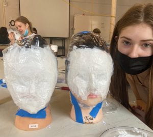
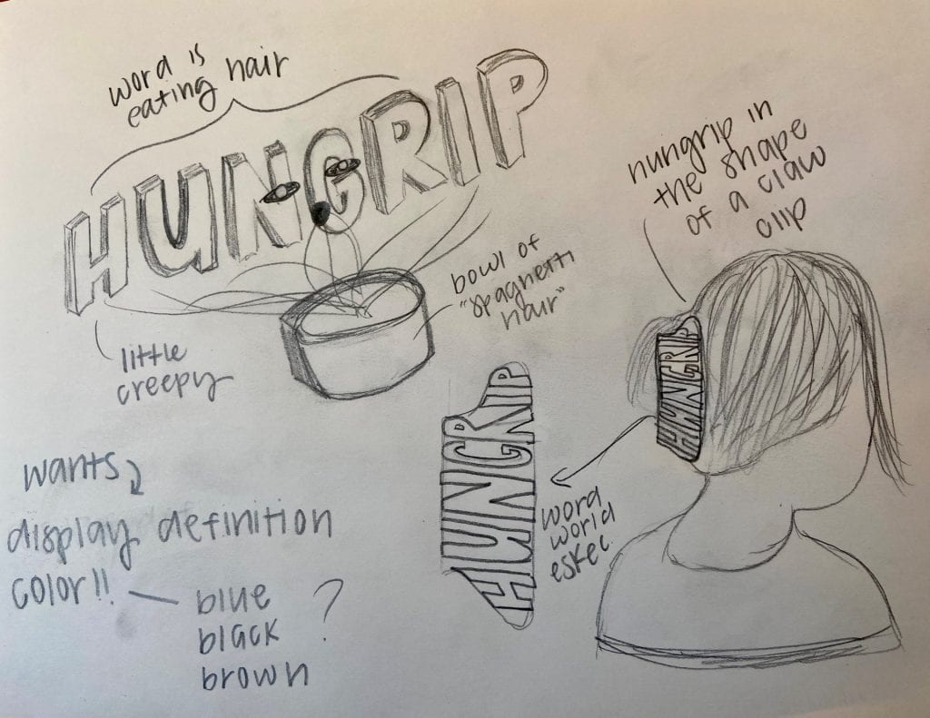
After that, I outlined my word on the shape to see where I needed to carve out my letters. My choice in the font was inspired by Word World, with its main purpose being to fit the shape of the claw clip rather than display a certain style.

#3

Once I did that, I was ready to actually create the word. I changed the color to blue because I felt it showed depth and perspective more accurately than pink due to its range of darker hues.

#4

From there, I added the clip to a silhouette of someone with their hair in it. I did this part in Sketchbook rather than Illustrator because I found it easier to manipulate all the different pieces and parts.

#5

I was originally going to leave my poster at that, but I felt as those the meaning of my word wasn’t displayed quite as much as I wanted. So, I looked back at my two drafts and pulled inspiration from the “spaghetti hair”. I liked how it visually showed how my word was literally a hungry clip and so I added arms and a mouth on this version and made it appear as if it was eating the hair again. I also made the poster more scaled in so the word and its actions were clearer to see.

#6

Similarly, I fully planned on finalizing my poster as the previous rendition. However, after a critique in class, I thought of an idea to further depict the meaning of my word; transitioning my poster into a product recall ad. My word is essentially a “claw clip gone bad” and that’s why I liked the idea of making my poster a recall ad since those are all about products that have gone bad. I looked up several different versions of one and then based mine on that. Overall, I think it turned out very interesting and although it is a bit wordy, it achieves what I wanted it to.

Link to Portfolio Project

Now that you know how it came to be made, here’s a link to my MashUp page. Enjoy!

https://u.osu.edu/fricke-60/portfolio/mash-up/

Mandala: Process

Research

For this project, I conducted research on three main things. Initially, I read a bunch of articles about mandalas and looked at several pictures of them. Prior to this project, I knew what they were and had seen them in presentations in other art classes. Now knowing I was going to be creating one myself, I viewed them in a different light. I paid attention to what specific qualities I saw that I liked, such as the incorporation of background color, scale, and repetition of certain elements. Here are three examples of mandalas I liked.

After getting an idea of what style of mandala I liked, I did research to figure out what possible abstractions could be included within mine. This was guided research, as we were prompted in class to find ten images of natural and mechanic objects and create different abstraction drawings from those images. We placed those abstractions in grids once they were finalized. Below are mine.

After creating these grids, I did some final research on color themes since that was an important quality within mandalas. I first used the Adobe Color website and was able to find a lot of unique and aesthetically pleasing combinations. I had planned to use this website the whole time but after a routine facetime call with my dad, he suggested another website where he had found some other premade color themes. The website was called, “wheelofnames.com”. As an eighth-grade teacher, my dad said he used this website for some activities in class and often had a lot of fun customizing the colors within the wheel. While an untraditional way of obtaining color information, I actually used the themes within this website a lot as inspiration for my final mandalas. Here are a few I especially liked.

  • Exercise #1:
This is an exercise we did in class in preparation for this project. The goal was to select two abstractions from our grids, one natural and one man-made. For my design, I chose to combine a spider web and a Ferris wheel. I saw a lot of resemblance between the two, as a Ferris wheel looks almost like a more structured spider web with all of the lines being connected via circles and spreading out evenly from the center. Once I combined them, I changed the values to a greyscale. After this, I repeated them within the 9″x9″ grid and rotated them when necessary so they would line up and create visually interesting shapes within the negative space. Doing this exercise was really helpful and gave me a lot of ideas on what abstractions I should include within my mandala and how I might want to construct it thereafter.

Iterations

Before jumping into the creation of my final mandala, I did a lot of brainstorming and experimenting with different grids. I initially designed very simple mandala grids because this process was very new to me and I thought starting with simple shapes like circles and lines would help me learn the basics. Here are a few of the ones I made.

Once I had a basic understanding of how to create one, I created a few more and experimented with different values and line weights. Here are those ones.

After this, I knew I was ready to start making different versions for my final mandala. Here, I used my actual abstractions and experimented with value again. I chose directional movement and rhythm as my principles and thus, tried to demonstrate those within my mandalas. Below are the ones that I made. Out of the four of them, I was most drawn to the one that resembled a wreath, as it included a lot of variety in shape and had a natural counter-clockwise movement within it.

Production

#1

Initially, I started creating the middle section. I combined two of my abstractions, the green spiral flower, and spider web. I used value to demonstrate movement and depth.

#2

From there, I expanded the mandala and started adding the first sections of the wreath. When I originally had the idea of making the outer part look like the wreath from my abstractions, I was just going to copy its sections completely. I then had the realization that I could incorporate some of my other abstractions into the wreath among a few of the initial parts and decided to do that instead.

#3

The first non-traditional wreath abstraction I added after this were buckeye leaves. I tried to choose the abstractions that were the most nature-like and would look realistic if they were placed within a wreath.

#4

After that, I added my final two abstractions; leaves and pinecones. Here, I experimented with different values and line weights in order to further show my principles and add texture.

#5

Once I finished this first draft, I adjusted the greyscale I had originally used and made some minor adjustments to line weight.

#6

After I had my greyscale mandala finished, I applied different color schemes to it. Since wreaths are seen as a seasonal decoration piece, I modeled my colored mandalas after several holidays. I pulled inspiration from the website my dad suggested but finalized the actual color scheme on Abode Colors.

#7

Along with my greyscale version, I chose the Thanksgiving and Christmas wreath mandalas as my final ones. I felt as though they demonstrated my chosen qualities the best and were the most aesthetically pleasing.

Link to Portfolio Project

Now that you know how it came to be made, here’s a link to my mandala page. Enjoy!

https://u.osu.edu/fricke-60/portfolio/mandala/

2D to 3D: Process

Research

For this assignment, I conducted research on different types of 3D shapes such as cubes, cylinders, and pyramids. Wanting to gain a better understanding of their inner structure and how they come into fruition, I looked at a lot of diagrams similar to the one below. Seeing diagrams like these gave me a better understanding of how 3D shapes are constructed and some are more difficult than others.

  • Exercise #1a:
This is an exercise we did in class in order to start understanding the construction of 3D shapes, cubes specifically. We started by drawing a cube template on a piece of 14×17 bristol and then, using our crafting knife and tacky glue, put them together. This was a really fun way to prepare for our project, as it provided good experience without being overly difficult.
  • Exercise #1b:
This is another exercise we did in class. Instead of finding a template from the internet, we were now tasked with creating our own based off a shape of our choosing. Wanting to experiment with squares, I chose a shape that was simply four squares aligned and slanted in a row. For the sake of time and efficiency, once I figured out the template I taped the sides together instead of gluing them.
  • Exercise #2:
This was our third and final exercise. Introducing us to the world of orthographic drawings, the task of this exercise was to create a digital version of our 3D shape. This was a really cool way to see what our shapes would look like without actually having to create a template and cut them out.

Iterations

From that given shape, we then had to figure out different ways we could manipulate it. The goal was to create it into something new while still maintaining the same plane view as the original one. Below are a few options I created, ranging from a table-like structure with two legs to a figure that appears as if it walked out of the movie Star Wars

I was most drawn to the shape all the way to the right so I moved forward with it and started to create a template that would allow myself and other people to construct it in the future. I initially struggled with this but found quick success after cutting out all the shapes I knew I needed and taping them together until I got the right configuration. This miss-match tape template is shown below. I marked with a highlighter the places I needed to put tabs and then wrote whatever notes I had either on the edges or backside. Doing this method really helped me to see quickly what worked and what didn’t.

Production

#1:

After creating the makeshift paper template, I first started by making a more accurate and updated version of it online (equipped with a key and directions since it does look confusing). I made this on Illustrator.

#2:

Once I finished making the online copy, I then made a paper version of it.

#3:

Since I knew I’d be making two different versions of my shape, I wanted to keep the base of it very consistent. In order to do this, I used a light table to trace that template onto several pieces of Bristol so I could be reassured that they’d be the same. I made a few modifications to the tabs, as well.

#4:

From there, I cut out and constructed my first rendition of my shape. This process was long and tedious but resulted in something that I think looked really cool.

#5

After that, we were given the final task of embellishing our shape with one of four options; modularity, negative space, comparison, and surfaces/illusions. I chose the last option, which meant we had to draw on the surfaces of the shape in order to create the illusion that it was moving and/or 3D. Since my shape had been constructed through many squares and cubes, I wanted to continue that theme within my embellishment. Thus, I drew smaller cubes all over my shape and produce an interesting, inner 3D effect. This took equally as long as constructing the shape but nonetheless, I was proud of how it turned out.

Link to Portfolio Project

Now that you know how it came to be made, here’s a link to my portfolio page where you can see my 3D to 2D assignment. Enjoy!

https://u.osu.edu/fricke-60/portfolio/2d-to-3d/


Space and Time Walk: Process

Research

For this assignment, I conducted a vast amount of research. I first dove into the world of maps after looking at and having a discussion about various ones in class. I researched various types of maps and how certain aspects of them (population, trees, people, etc.) were represented. From here, I specifically looked at maps with trees because the location I chose to be the endpoint of my map is surrounded by a lot of them. Shown below are a few of the ones that drew my interest.

  • Exercise #1:

Specific Directions To My Location:

To arrive at the “forest sidewalk”, start outside the front entrance of Hayes Hall.  Walk down the path of the Oval that is directly in front of you. Once you reach the brick circle where all the paths meet, take a right and walk until you reach the next brick circle. From there, walk down the path that is to the left of the light pole. Keep walking until you reach the road and then, cross the street to the other sidewalk. Walk on this sidewalk until you reach the downwards path to the left that leads to Mirror Lake. Once you get to Mirror Lake, turn left and walk around the lake by Mirror Lake Eatery. Continue walking straight on the sidewalk towards Thompson Library. Walk until you are past the library and on the side of the road where Townshend Hall is. Keep on this path and once you reach the intersection, take a left. After this, keep walking on the sidewalk until you’re by the end of the Rpac/North end of the stadium. Take a right and walk alongside the Stadium. Once you reach the next intersection, take a right. After doing so, you’ll see two different options for a sidewalk. Choose the one closer to the building on your right. You’ve arrived!

Creative Description:

I begin my walking journey outside of Hayes Hall, taking a second to notice the sun shining on my face and the vast number of students hurrying to class. As I start down the path directly in front of me, my vision is continuously changing between sun and shade due to the trees on either side. Once I make it to the brick circle in the middle, I have to make my directional decisions quickly as though not to run into any other people. Deciding to go right, I head towards Thompson Library. Breathing in the smell of freshly cut grass and looking around to see the yellow and red leaves slowly fall from their branches, I make a quick stop once I reach the next brick circle. Here, I take a slight left and begin walking, thankful the shade is more permanent because of the many trees surrounding me. Accompanied by a sporadic group of squirrels, I take a right once I make it to the sidewalk. Taking a slow stride walk towards Mirror Lake, I take the long way around until I reach the pavilion. Leaving the near vicinity of the lake with no near shade in sight, the air seems to get a little hotter and heavier as I get towards Thompson. Merely escaping a crash with a bicycler, I walk towards the next intersection. I notice it’s quieter on this part of campus and the sounds of nature seem to thrive. Once I reach the intersection, I take a left and walk down to where the Rpac and North end of the Stadium meet. Seeing athletes and gym-goers, I walk along the side of the stadium and make sure to take out my AirPods and pay close attention to what sound is being produced inside. If you’re lucky, you’ll hear the enchanting sounds of The Ohio State Band practicing for their next events. Once I walk away from the stadium, these sounds are quickly replaced by the revving of engines and conversations of people walking by. Approaching the next intersection, I take a right and see two potential paths. Choosing the right one, I realize I’ve arrived.

Above is an exercise we did in class to prepare for our final projects. It was meant to help us gain a better sensory understanding of our paths by allowing us to write two descriptions for it. The first one was a straightforward, word-for-word, description of how to get there. The second one was a more creative and poetic description, where we had to play into our emotions and other senses besides our sight. Doing this greatly helped with incorporating a non-visual sense into our maps, as that was one of the requirements.

  • Exercise #2:
This is another exercise we did in class to begin looking at the visual side of our maps. We were tasked with photographing our “stops” and displaying them in a way that could resemble our map. I was very indecisive when I started this assignment, hence there’s an insane amount of “stops” within this document. However, having this many allowed me to examine my path and figure out which 5-10 would be the most important. It was also fun to start playing around with different possible map layouts.

Iterations

To make the final version of my map exactly how I wanted it, I did a lot of experimenting with different orientations and layouts. The first layout I created was during a collage activity we did in class. Although simple and slightly messy, this collage was a good starting point for this project. I liked the look of word paths and stops demonstrated by their textures rather than their names.

After sitting with this version for a while, I came up with several ways it could be improved. When looking at the pictures I had taken, I quickly found that I was drawn to the image of my final destination and wanted to incorporate that into my map. Thus, I changed the shape of my map to be a recreation of that image, with specific trees throughout the “forest” representing my several stops. One of the main qualities I liked about my original map was the stops being depicted as their textures or something I felt showed what they were without explicitly saying it. So, I incorporated that within this new version and made a quick sketch of what that could look like.

I liked this version a lot and felt as if the representations of the different stops were very unique. Before I dove into drawing the whole thing, I practiced drawing different types of trees. Below are a few ones I drew, experimenting with technique, texture, and overall, look. I was most drawn to the tree to the left, so that’s what most of mine are based on.

Production

#1

First, I started by creating the outline for my path. I added a simple base layer of trees, alternating between four different styles. To create a sense of depth, I decreased their size as they got farther toward the top of the page.

#2

After I completed this, I drew my path as it appears on the aerial view of google maps. Instead of drawing this path as a line, I drew it as footsteps to replicate the idea of someone walking along the path. Then, I placed my stops along this path, represented by little leaves. I originally had them drawn as circles but after some thought, realized leaves were more visually interesting and would help the theme of nature come across more. I also added lines branching out to the trees that I wanted to change and make represent those stops.

#3

From here, I added my title and changed all the trees to be representative of their specific stops. I went in a clockwise direction, starting at the bottom with the arch tree and ending with the car tree.

#4

Then, I added my legend and filled it in with the appropriate information. This concluded the online version of my map and now, it was time to do a light table transfer and get it on paper.

#5

Due to a lack of time, I did this untraditionally by taping a copy of my map onto a window in my dorm room and then placing a piece of bristol on top of it. I traced an outline of everything I could and then took it off the window to retrace in black marker.

#6

I ran into some difficulties here, which caused me to make some minor changes. For instance, the pre-written legend text appeared too small to be able to trace so I had to instead freehand it. Similarly, I also struggled with the shapes of the top trees being too small so I had to increase their size. Once I fixed these issues, I added descriptive words to the insides of all of my “stop trees” to appeal to another sense beyond sight within my map. Overall, I extremely enjoyed this project because it allowed me to not only explore campus and search for the perfect destination but also to improve my drawing skills.

Link to Portfolio Project

Now that you know how it came to be made, here’s a link to my portfolio page where you can see my Space and Time Walk Map. Enjoy!

https://u.osu.edu/fricke-60/portfolio/space-and-time-walk/


Structure: Process

Research

For this assignment, I conducted research on what architectural features and specific furniture/objects I’d want in my dream studio space. After scrolling through Pinterest, I was able to put together the mood board shown below. Within this board, I tried to gather everything I’d want in my dream studio space. With the circle chairs, skylight and plants, I was trying to capture a bright, bohemian, and nature-esque space. Wanting to add some fun and playful features, I looked into options like a day bed and funky shaped mirror. In conjunction with all of this, I knew I also needed a few practical items, and thus, I researched items like the fridge and tablespaces.

  • Exercise #1:
This is an exercise we did in class to begin drawing shapes that could be similar to those within our final. To start the exercise, we chose a random object and made a quick drawing of it. Next, we traced that drawing onto bristle paper and cut it out so that we’d have a stencil. A single tracing of that stencil is shown on the left above. Then, we had to take that stencil and trace multiple iterations of it. After getting the base layer of the tracing done, I went back and experimented with line weight. This exercise was very helpful in teaching me about blind drawings and how different line weight can impact the overall composition of an image.
  • Exercise #2:
This is another exercise we did in preparation for this project. Here, we chose a scene near our classroom and drew it. We had the choice of drawing it digitally or physically, I chose digitally because it’s easier to manipulate and change elements without having a surplus of eraser marks. I decided to draw a scene that included a lot of nature as well as interestingly structured buildings. I experimented more with line weight here and how it can mimic the illusion of a shadow. Line weight also helped when drawing the more organic objects, such as the plants, as it added depth and a sense of texture. This exercise was great practice for my final project, as they share a lot of the same line, shape, and dimensional properties.
  • Exercise #3:
This is the final exercise we did before starting the design of our spaces. In essence, we experimented with one-point and two-point perspective grids. The process of making these was initially really challenging for me but with practice, it became a lot easier. With these specific girds, too, we were able to make the dimensions whatever we wanted and this was extremely helpful when it came to constructing our actual grid space for our projects.

Iterations

In order to make my studio look spatially accurate, I did a lot of experimenting with different 2oo square foot layouts. This was one of the biggest challenges for me because the dimensions of the space and where I placed the vantage point greatly impacted how and where I could draw the objects I wanted within it. I made countless one-point perspective girds with different measurements, below are three of them. The first drawing I did was all the way to the left, I experimented with creating a space without a ceiling. I thought this would give me more floor space but it just cut off the room and made it look really small. Taking this into consideration, I made the middle drawing. I placed the vantage point closer to the left in order to create a more interesting composition. I liked this but felt it could be improved, so I made some adjustments and produced the drawing on the right. I moved the vantage point more towards the middle but then made the wall space more rectangle than square. I really liked this layout so I made my final one very similar to it.

Production

#1

First, I started digitally with the basic perspective version of my space. I chose to begin drawing digitally rather than physically because I felt as if it would make it easier for me to manipulate aspects within my space and be able to quickly erase or remove them if they didn’t turn out how I wanted them to. Regardless, this is meant to be a 17×12 square foot space and it’s nearly identical to the third perspective grid I showed within the ideations section.

#2

From there, I started adding structural features. Wanting to create a sense of depth, I made my studio space elevated on a platform with steps and storage below. After that, I added hard wood flooring to act as a consistent base layer to my space and then some outlining trim to the edges of my ceiling.

#3

After adding those details, I started adding the simple furniture and architectural objects within my space. I started with the table and following the grid lines, I constructed it to be very long and directly against the wall. Then, I added the day bed and a funky shaped rug. I was originally going to do a big, rectangle rug but after seeing how just my table and couch had very sharp edges, I made it more organically shaped to create a sense of contrast. It was also easier to draw in my opinion, as you can’t really tell if it’s perfectly straight or curved in any manner. Lastly, I added a pair of glass sliding doors.

#4

From there, I added more objects such as a mini-fridge, spinning desk chair, fan, and a tv. The spinning chair was a fun addition, I’m not a fan of traditional desk chairs because they’re often uncomfortable and boring looking. I also liked that including one gave me another opportunity to include an organic shape within my space to help soften its overall appearance.

#5

Lastly, I added wall decor, plants, and details to the ceiling, sliding glass doors, and mini-fridge. I got the inspiration for my wall decor on Pinterest and added the roman numeral number six because six is my lucky number. I added a city skyline into the sliding glass doors to help with depth and hopefully, manifest where my studio will be located in the future. After that, I added plants and cans into the mini-fridge so there’d be a better sense of depth and show more detail in certain areas. Lastly, I added in my cat, Marley. For background, Marley (or bean as we typically call him), is my chubby, nine-year-old cat. He’s pure white with only a little triangle of grey on his head and instead of sleeping in cat beds, he loves to sleep in baskets. He’s an essential part of my life back home, so I figured he should be an essential part of my dream studio space, too.

#6

After getting the digital version of my space done, it was time to transfer it to bristol. I did this by printing out the digital copy and using a lightbox to trace it onto paper. This was a challenge in itself, as the majority of the printers we have access to don’t print larger than 8.5×11 and the paper we had to submit our drawing on was 14×17. In order to fix this issue, I transferred my drawing into a 14×17 document on Illustrator and then separated it into four sections using an 8.5×11 box to mimic the size of the paper I was printing on. When I printed it out, the four papers were heavily overlapping towards the middle but that never became an issue.

#7


After piecing it together, I put my drawing on a light box and placed my final sheet of bristol paper on top. I used several pieces of tap to temporarily adhere my project to the table, as any slight shifts could’ve made my alignment wrong and forced me to restart. From there, I did one layer of tracing in pencil and then, another final layer in marker. The one you see above is my final layer in marker. In total, these two versions took me over five hours to complete. I think it was extremely worth it, however. I really liked this outcome and even though it doesn’t look exactly like my digital copy, seeing it come into fruition after weeks of work was super rewarding.

Link to Portfolio Project

Now that you know how it came to be made, here’s a link to my portfolio page where you can see my Structure assignment. Enjoy!

https://u.osu.edu/fricke-60/portfolio/structure/

Shape Grammar: Process

Research

For this assignment, I conducted research on what the various principles of design are and how I could possibly incorporate them into my composition to reflect a certain feeling or idea. Through the listening of lectures, reading of articles, and class discussions, I found that I most resonated with emphasis, repetition, and movement. When examining these principles and how they related to my numerous practice compositions, I found that the feeling of loneliness was abstractly represented.

  • Exercise #1:
This is an exercise we did in class in preparation for this project. The goal was to use two out of the three basic shapes (circle, triangle, and square) and create two different sets of compositions. One set was supposed to consist of a geometric polygon shape, a line, and a point, and the other was supposed to consist of a curvilinear shape, a line, and a point. With each shape set, we also had to create a dynamic and a static version. Doing this exercise really helped me experiment with different geometric and curvilinear shapes and how they could be configured to demonstrate static or dynamic qualities. Furthermore, analyzing the feelings or ideas my compositions reflected helped me in selecting the feeling my final composition would then reflect.

Iterations

The final version of my Shape Grammar project was produced through a lot of brainstorming and experimenting with different configurations. Beginning with the exercise composition, below are a few of the shape configurations I made while trying to figure out which one I wanted to make the main component.

Here, I made a wide variety of geometric and curvilinear shapes. Doing these quick sketches helped me experiment with different combinations of circles, squares, and triangles in order to figure out what qualities within them I did and didn’t like. I took these ideas into my final composition and was able to produce many different versions. Below are a few of them.

Creating all these compositions allowed me to play around with positive and negative space. Out of all four designs, I was especially drawn to the one all the way to the left and so, I decided to move forward with it as the first draft of my final.

Production

#1

A previously said, I was really drawn to the composition above. I thought it demonstrated a strong use of emphasis, as one of the triangles was titled a different way than the rest of them. Through some class discussions and one-on-one conversations, however, I realized my use of negative space was incorrect and needed to be improved.

#2

To fix this problem, I started by simplifying things. I went back to square one (literally) and removed all of the triangles from the composition. This helped me to clearly see the positive and negative shapes being made and figure out what step to take next.

#3

This next step ended up being a change in the layout to resemble more of a checkered board pattern. I felt as if this composition showcased a better use of negative and positive space and would allow for a more interesting way to show emphasis.

#4

I experimented with many ways of showing emphasis but ended up liking this version the most. Tilting the one square not only puts emphasis on that specific area but also make an interesting shape within the negative space.

#5

From there, I realized I still needed to showcase the feeling of loneliness. I experimented with the placement of this circle, trying to put it somewhere it looked all by itself and away from the rest of the shapes.

#6

Although I liked the prior version, I still felt my representation of loneliness could be improved. I did this by adding two more circles near the original one and then another circle near the top left. This made it so one circle was clearly separated and not a part of the other group of circles, thus making it appear lonely. Once I had that finalized, I constructed it by hand using black and white colored bristol. All together, this assignment was fun but challenging for me. I struggled with managing the project requirements, having an appropriate use of positive and negative space, and demonstrating a feeling and design principle within all of that. I learned a lot throughout the process, however, and that makes it worth it.

Link to Portfolio Project

Now that you know how it came to be made, here’s a link to my portfolio page where you can see my Shape Grammar assignment. Enjoy!

https://u.osu.edu/fricke-60/portfolio/shape-grammar/


About Me: Process

Research 

For this assignment, I conducted research to figure out what type of information should be included in the biography part of my “About Me” page. Through readings of articles and biographies that other people had written, I found the most common information included was an individual’s name, profession/college major, skills, accomplishments, and future goals. I didn’t want to overload my biography section with all of this information so per the requirements, I spread it out over the other sections of my page.

    • Exercise #1:
This is an exercise we did in class in preparation for this project. The goal was to select four photographic images of designed “things” and rank them into categories; a good design you like, a bad design you don’t like, a good design you don’t like, and a bad design you do like. Doing this exercise really helped me experiment with layouts and text styles before moving on to this project. It especially helped me write the “What is Design” section, as it provided me with background information about what the qualities of good and bad design are and how that then transfers into what my definition of design is.

Iterations

In order to produce the most successful and aesthetically pleasing version of my “About Me” page, I brainstormed many different layouts to possibly display my information. For the sake of time, I quickly sketched these layouts before tackling the idea within my actual website. Below are pictures of three different configurations. Although my website isn’t exactly like any of them, doing these iterations really helped me to play around with different layouts and combine the best aspects of each one into what is now my “About Me” page.

Production 

(note; screenshots made the proportions look a little inaccurate)

#1

Initially, I typed out all the required information and displayed it within a very simple layout. When attempting to create the layouts I had previously sketched, I wasn’t able to manipulate the pictures and text as easily as I originally thought. Thus, I started with the basics and focused more-so on creating contrast between the different sections by separating them with lines and alternating header colors.

#2

After looking at that version, I knew some revisions were necessary. I started with the biggest problem I saw; the pictures. I wasn’t happy with the way they were formatted, as the spacing at the top and bottom made them look awkward, unbalanced, and distracting. To fix this, I rounded the edges of every photo and attached them to one another so spacing would never be an issue again. After this, I put them all back into the website and centered them, moving the text down accordingly. Because of this change, I also had to adjust the noteworthy section because bullet points have the inability to be centered.

#3

From there, I changed the header color to match the blue in the top picture and asked my professor what additional changes I should make. She first suggested that I remove my “Past Work” section because information like that would eventually go into a different place. She further suggested that I edit my text sections in order to create more flow and structure within them. You’ll notice that the “What am I most excited for?” section is blank, as we mutually agreed it should be entirely rewritten with a more clear focus on what specifically about design excites me.

#4

After taking her suggestions into consideration, I was able to produce the final version of my “About Me” page. Pulling inspiration from the first layout I created, I rearranged the biography section and placed it next to my picture. I also changed the shape of my picture to be a circle because it created a better sense of visual interest and harmony with the text next to it. From there, I uncentered the text and rewrote the large majority of it to make it sound better. Lastly, I placed lines similarly as I did in the original layout and was able to achieve a more balanced and structured look. Overall, I was very happy with the way this page ended up looking. It’s a lot more aesthetically pleasing than I thought was possible and although some of the features were difficult to manipulate, I actually had fun making it.

Link to Portfolio Project

Now that you know how it came to be made, here’s a link to my first project; my “About Me” page. Enjoy!

https://u.osu.edu/fricke-60/about/