Research
For this project, I conducted research on three main things. Initially, I looked up a bunch of different 3D words and how they were arranged within a composition. When creating posters previously, I had never worked with anything other than 2D, flat letters so I wanted to see what different versions of 3d lettering could possible look like. Below were a few compositions I found that I liked.

After looking at these and thinking about possible drafts for my chosen word (hungrip), I started to look at different claw clips shapes. Since my word was a combination of “hungry” and “clip”, I thought it would be interesting to illustrate its definition by having it be constructed within the shape of a claw clip. I did the usual google search but also examined the ones that were in my personal collection. I tried to imagine what it would look like if my word were configured in the shape of the claw clips I saw and kept note of which ones I thought would be the most successful. These were those ones.

Once I got an idea for the shape I was going to try to duplicate, I looked for further inspiration from WordWorld. WordWorld is a cartoon show that helps children solve problems by building words. All of the characters and objects in the show are made out of words, specifically whatever word they are. When I first began constructing my word, I was utterly confused about where to start. I was given advice to start with the literal shape of the claw clip but I never fully understood how to go from that to a word until I looked at these characters. Here is an example of what they look like.

- Exercise #1:

Iterations
Before I could create my final MashUp poster, I brainstormed a lot of different word mash-ups to ensure I would pick the best one. I did this by creating seemingly numerous word combinations and picking my favorite from them. Here is that list.

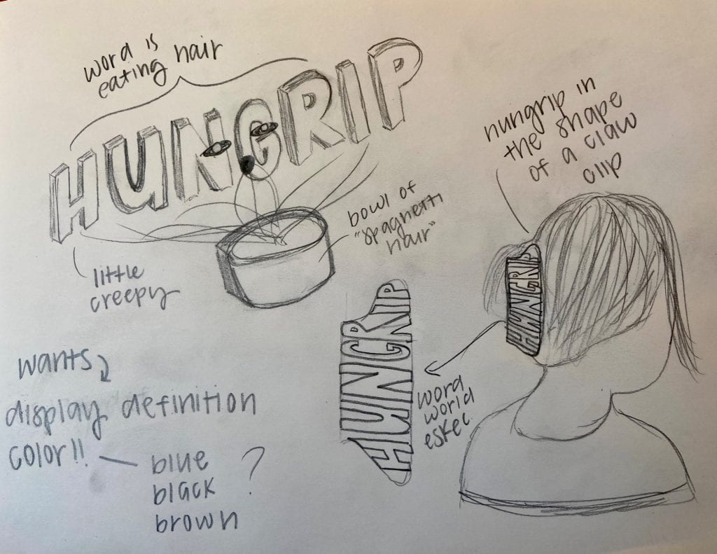
Once I chose my word from this list (hungrip), I began brainstorming different ways I could demonstrate its meaning within my poster. I came up with two overall ideas, both of which were very different. The first, which I was leaning more towards, involved having my word be in the shape of a claw clip. I planned on having it also be placed in someone’s hair. The second idea I had was to have the word simply spelled out but with human features like an arm and a mouth. A bowl of “spaghetti hair” would then be placed in front of the word and the arms/mouth would be eating that hair. I made two quick sketches of what they would both look like and here was the outcome.

Production
#1

Going with the claw clip idea, I began by creating a very simple 3D figure of one. I outlined the shape in Illustrator and used a tool to make it 3d.
#2
 After that, I outlined my word on the shape to see where I needed to carve out my letters. My choice in the font was inspired by Word World, with its main purpose being to fit the shape of the claw clip rather than display a certain style.
#3

Once I did that, I was ready to actually create the word. I changed the color to blue because I felt it showed depth and perspective more accurately than pink due to its range of darker hues.
#4

From there, I added the clip to a silhouette of someone with their hair in it. I did this part in Sketchbook rather than Illustrator because I found it easier to manipulate all the different pieces and parts.
#5

I was originally going to leave my poster at that, but I felt as those the meaning of my word wasn’t displayed quite as much as I wanted. So, I looked back at my two drafts and pulled inspiration from the “spaghetti hair”. I liked how it visually showed how my word was literally a hungry clip and so I added arms and a mouth on this version and made it appear as if it was eating the hair again. I also made the poster more scaled in so the word and its actions were clearer to see.
#6

Similarly, I fully planned on finalizing my poster as the previous rendition. However, after a critique in class, I thought of an idea to further depict the meaning of my word; transitioning my poster into a product recall ad. My word is essentially a “claw clip gone bad” and that’s why I liked the idea of making my poster a recall ad since those are all about products that have gone bad. I looked up several different versions of one and then based mine on that. Overall, I think it turned out very interesting and although it is a bit wordy, it achieves what I wanted it to.
Link to Portfolio Project
Now that you know how it came to be made, here’s a link to my MashUp page. Enjoy!