Explore Nation Activity 4: Analyzing Local Neighborhood Food Environments

Weinland Park’s food environment is deceiving; although it looks like there are several places to access food, the neighborhood is actually a food swamp and, an area where unhealthy and fast foods are more readily available than healthy grocery foods. While there is a Kroger grocery store located in the south west section of the neighborhood (near the Short North district), the northeast section only has Sam’s East Village Market and a couple other small convenience stores where unhealthy foods are readily available, creating a food insecure neighborhood. In order to get anything healthy, residents must travel to Kroger or the 4th Street Farms community garden.

Weinland Park’s current status as a livable neighborhood and community must be taken into account when looking at overall food accessibility. Sidewalks are narrow and overgrown with plants, a lack of crosswalks makes it difficult to cross the highway-like N 4th and Summit Streets where vehicles drive at very high speeds, and street lamps only illuminate one side of the road at night. These factors make it challenging to walk to the grocery store, causing food to be less accessible to neighborhood residents. The time and distance to walk to Kroger also makes it difficult. For example, if a resident lived near the intersection of E 11th and N Grant, the walk to Kroger would be almost a mile, or around 17 minutes of walking for an able-bodied adult. We also must consider other elements such as brutal winters, carrying a load of groceries back home, and taking along children, which could be considered dangerous with the amount of traffic. Kroger is also a bit more expensive than other grocery stores, while Weinland Park is statistically a lower income neighborhood with low health and high crime.

Despite the challenges residents face when trying to access a grocery store, the neighborhood has decent walkability rankings. WalkScore rated its walkability, transit, and biking with scores of 84, 55, and 67, respectively. While this is a good foundation for Weinland Park, there are some aspects that could improve the scores significantly. From a planning perspective, more street lighting, crosswalks, and perhaps an ordinance that ensures street plants are cut back could all help to make the walk to the grocery store an easier and safer one. Local government can take control by planning more farmers’ markets and petitioning for more public transit throughout the neighborhood to help improve the transit score of the area as well. In terms of private food businesses, encouraging the start up of a local bodega could create a positive  addition to the neighborhood and provide another source of healthy food options.

Street lacks crosswalks, creating dangerous conditions for pedestrians.

Street lacks crosswalks, creating dangerous conditions for pedestrians.

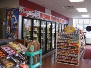
Sam’s East Village Market

Sam’s East Village Market

Overgrown plants make sidewalks more narrow.

Overgrown plants make sidewalks more narrow.

The Diamond Developers: Re-Submission Planning Local Development

The design that we chose for the new residential, commercial and office complex going in the lot bordered by Long Street, Gay Street and High Street captures several of the adjectives that the group feels is Columbus. Columbus is a city that is growing, and slowly getting its population back as it becomes more 

Green- The group felt that above all, the new complex needs to capture the environmentally friendly, green city that Columbus has become. Parks spot the city, giving families and pet owners an escape from the concrete, without leaving city limits. For that reason, there are plant walls with flowers that will last through all Ohio weather, a courtyard in the middle, and gardens on different step-backs. Not only does it play to the many parks throughout the city, but it provides a nice escape for the office workers and the residents. 

Pride– People in the city of Columbus are proud to be from Columbus, and love to see things that represent their city and state. Being Ohio’s state flower, the group plans to incorporate the red flowers in the flower walls and gardens. The Columbus Park of Roses is a huge attraction for everything from a casual walk to a wedding. In addition to the state flower, roses will be featured in the rooftop gardens.  

Renewal- Columbus is getting younger, and additions such as the Short North and the Arena District help attract and keep the younger residents. With younger people and a growing skyline, the city is being renewed and revived. To help symbolize this new age for an older city, the design includes a growing concept- large open windows for the stores and restaurants. It allows outdoor seating while still being indoors, and is a growing concept that is becoming popular. It adds youth to the building and the city. 

History- Columbus is old, and a lot of the original buildings remind the citizens of the older styles that used to cover the city. The brick, the Corinthian column style border along the tops of the buildings, the decorative window frames and the faux  balconies are seen all around the city. The group wanted to preserve that style, making sure the building fits in with those across the street and around the city. The entire complex will be brick, with the railings surrounding the various gardens imitating those that make up the fake balconies. It’s a way to welcome people into the city with a new building that has a comfortable, old-time feel.

Welcoming– Although it is a big city, the people living there would make one think otherwise. Being in the Midwest, Columbus residents are very welcoming to anyone and everyone. People are kind, they are open, they accept all people. This complex is at the entrance to downtown Columbus, so the group felt that while it will be several stories high, the building shouldn’t be overwhelming to those driving in. This prompted the idea to have the corners of the complex square be a few stories shorter, building up while adding step-backs. The residential area will be the farthest back from the street to give a sense of privacy to those living there.

Diversity- Columbus is a historically diverse city, with its now popular Italian and German Villages that bring light to the cultures of other countries. These neighborhoods, among the several other that differ in style, inspired the group to make each building and side of the complex a little different, whether it be the height or building material. Having each building in the complex be the same height is too boring for a city that has so many components going into it. 

The two block lot bound by High Street, Gay Street and Long Street should be taken advantage of, providing ample living and working space. The group designed each building in the complex to be at least eight stories high, with the pool on the roof. This way, more apartments or offices can be put in and the space isn’t wasted.

The group feels that with this design, the essence of Columbus was captured and implemented. It takes the best qualities of the city and emphasizes them, so that whether you’ve lived in the city your whole life or if you’re just visiting, you’ll look at Parkside on High and think, “Columbus.”


side view1

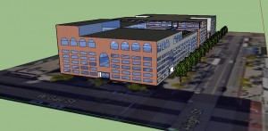
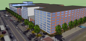
At the ground level the building will be brick to represent the history and authenticity of Columbus. As it rises, the stepbacks will change into a complimentary tan color to match surrounding buildings and break up the different portions of Parkside on High. Each stepback will have a green area for residents or office workers to enjoy. The green expresses Columbus’s environmentally friendly reform and will help break apart the stories in a memorable and symbolic way. On the corner of Long and High the complex’s height will be between 6-8 stories to make it seem more welcoming. Instead of just throwing 14 stories in one’s face at the entrance to downtown, seeing lower stories at first will make the building less overwhelming.


side view

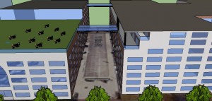
This view, from the perspective of Gay St. shows the opening of this complex. The courtyard that forms a divide in the building allows for people in Columbus to walk and sit and eat and lounge. Columbus is a friendly city and allows people to slow down and talk to one another. The flowers planted here will be carnations, Ohio’s state flower, to show the pride Columbus has for itself and the state. The different levels of the building gives this complex variety and allows for it to stand out and not just be looked over.


top view

This is a top view of Parkside on High. This perspective shows how the courtyard will cut into the building, leaving it as a U shape. Gay St. has more restaurants, cafes, and stores so the opening will allow for people to sit in a gardenesque space and escape city life. The two pools on the roof, rather than on the 3rd floor allow for more stories to be used for office and residential.

IMG_4887 [401675]

The logo that the group came up with for Parkside on High features the Columbus skyline in black, with our building design in white.

New Kids on the Block – Assignment 3: Planning “Local” Development

Much effort was made to create a site plan and design that reflected the city of Columbus, Ohio.  The proposal being submitted to Capital Crossroads Special Improvement District took may aspects into consideration for the purposed mixed-use development at the corner of High Street and Gay Street.  A survey was done of local history and the following themes were selected as inspiration for the final design:

  • Aviation
  • Rivers/Water/Erie Canal
  • “Arch City”
  • Limestone
  • Steel
  • Diversified Economy
  • Education
  • Arts
  • Government

A balance was sought to incorporate as many of these historical themes as possible, into the ascetics of the development.  the final product was something literally bridging the gap between a structure, at Long and High Street, reminiscent of Victorian architecture already present throughout Columbus, and a modern approach to Art Deco, at Gay and High Street.  Primarily, this was achieved in through the incorporation of:  arches, steel footbridges, glazed brick/tile, limestone cornice/columns, glass, patios/balconies, and lanterns.

The following was prepared as a study of these elements.

Design Elements

Elm Court | Mixed-Use Development, Columbus, OH

Hish Street Frontage
Elm Court | High Street Perspective

Ultimately, our group sought to preserve Elm Street as a pedestrian thoroughfare.  This would preserve the historic brick pavement as well as the integrity of the current street grid, while creating the opportunity for the “Elm Entertainment District,” consisting of twelve restaurants, bars, theaters, venues, and storefronts with outdoor seating.  In this and other ways, this design sought to utilize and incorporate outdoor space as much as possible.  Rooftop patios and gardens at varying levels, as well as a number of balconies on Gay, High, Elm, and Long Streets would be incorporated to provide unique views.

12020125_10206052488164262_695871036_o

Elm Court | Elm Entertainment District Aerial

The Elm Court development would include and indoor arcade to sever as a permanent, indoor home, for the Pearl Market as well as a general grocery.  The site would offer additional amenities including an indoor parking structure accessible off of Wall Street, near Gay Street.  commercial space on the first three-floors of both buildings, off Gay, High, and Long Streets.  Additionally, the upper floors would consist of market rate and affordable residential units, as well as a boutique hotel.

12019188_10206052503204638_516858985_o

Elm Court | Long & High Street Perspective

12011692_10206052904974682_2142983357_o

Elm Court | Gay & High Street Perspective

Special detail would be left to incorporating symbolic representation of each historical theme identified, into the the steel work on railings, staircases, balconies, lanterns, and footbridges.  From aviation to government, these same themes would be reflected throughout both structures through reliefs, motifs, sculptures, mosaics, and murals that would depict scenes of events that capture the significant, unique, and diverse heritage of Columbus, Ohio.

Designing/Planning a Local Concept by Urban Avengers

While Columbus, Ohio has long been admired for its sense of community, distinct outer suburbs and downtown districts, we are particularly proud to unveil “On the Bricks” which is literally in the heart of downtown at High and Gay Streets.  High Street is currently and largely known for the Short North District which showcases block after block of fine eateries, popular pub houses and renowned art galleries and retail shops.  On the Bricks is just a few blocks away from the Short North and will focus largely on unique retail shops like those found in Chicago, New York City and other popular USA cities.


4535

On the Bricks is inspired by the cobblestone streets of downtown Columbus and aspires to preserve the original, short brick cobblestone path that currently exists dividing the lots on High Street between Gay and Long Streets, the site of this new multi-living structure.

 22


Columbus is well known for their historic cobblestone streets still in place today, and the design concept presented by Urban Avengers captures and honors that important part of local history and design.

Sketch 1

Bricks 1

Our design of a beautiful and unique, primarily brick 6-story structure housing some of the most hip and successful Urbanites in the country will maintain or, at the very least, incorporate the original bricks already in place on the Gay and High property.  Urban Avengers’ vision includes the current “bricks” being the central focus of a covered ground-level courtyard.

sketch 2

The concept of local design in Columbus, Ohio is as versatile as the city itself.  Columbus is the nucleus of several suburban neighborhoods that, while independent, still associate themselves with being from Columbus.  The city of Columbus has a reputation for diversity, friendliness, safety, cleanliness, and creating entrepreneurs.  Columbus is a hot spot where highly successful businesses have been born such as:

The Limited Brands (think Victoria’s Secret)         Wendy’s Restaurants

Jeni’s Ice Cream                                                            Cameron Mitchell Restaurants

Worthingon Industries                                                 Donato’s Pizza

White Castle Hamburgers                                            Max & Erma’s Restaurants

The citizens of Columbus have a great love for nature as is evident in the numerous metro parks throughout the city, and a rapidly growing trend of neighborhood community gardens to implement healthier food access to all generations and income levels.  Columbus has very distinct and diverse neighborhoods (such as Italian Village, the Short North District, German Village, Olde Towne East, Victorian Village, Franklinton, Bexley, Minerva Park, etc.) and is continually moving towards revitalization and improvements of these areas and more.

On the Bricks is a creation that combines all of these qualities of Columbus city-living, greenspace, urban shops and eateries and incorporates them into one legendary, mini-city location in the heart of downtown for a perfect balance of life, health, work and play.

47

The courtyard will feature beautiful hanging garden plants to capture our local agricultural essence and staying in spirit with the rooftop residential community garden and green space, giving the residents a communal feel of ownership and personalization.  We envision the first floor courtyard also featuring a breathtaking fountain and local artistic talents with sprawling seating for visitors and residents to leisurely enjoy this covered outdoor setting.  Each residence will include a private balcony for residents to enjoy the outdoors and scenic view of downtown Columbus.

sketch 3On the BricksOn the BricksOn the BricksOn the Bricks

Due to its soaring employment opportunities and successful creation of numerous entrepreneurs, Columbus is drawing national and international professionals to work, live and play here.  Columbus is a magnet for new talent as showcased by just being voted the “2015 Intelligent Community of the Year” by the Intelligent Community Forum, based on our relentless embrace and pursuit of new ideas.  As professionals from all over the world land in Columbus, they will want to live, eat and play in the heart of the excitement that Columbus brings to life and that means living in the heart of downtown!  Living in downtown Columbus has also become a bucket list item for many Columbus natives.  The central location and convenient access to all freeways makes it a hot home spot no matter where your office environment may be located.  Use of bicycling and public transportation in Columbus is on the rise and with the recent addition of the FREE “C-bus” throughout the downtown, Columbus is highly comparative to other large USA cities in this regard.

On the Bricks

On the Bricks brings to life the desire of many Columbus natives who crave the excitement and energy that accompanies shopping in the downtown atmosphere.  The mix of retail storefronts at On the Bricks will showcase both vintage favorites as well as new blends of shopping flavors.  As Columbus continues to soar as an urban stand-out known for our ever-growing variety of exquisite eateries and popular taverns and nightclubs, On the Bricks will feature an iconic rooftop bar which will be the new favorite spot to hit any night of the week.  On our proposed rendering “On the Bricks” is let out from the building overlapping the upper third floor and the rooftop green space so the name greets everyone and people know exactly what you mean when you say I live “On the Bricks!


The Diamond Developers Activity 3: Designing/Planning “Local” Development

The design that we chose for the new residential, commercial and office complex going in the lot bordered by Long Street, Gay Street and High Street captures several of the adjectives that the group feels is Columbus. Columbus is a city that is growing, and slowly becoming known simply for being Columbus.

The group felt that above all, the new complex needs to capture the environmentally friendly, green city that Columbus has become. For that reason, there are plant walls with flowers that will last through all Ohio weather, a courtyard in the middle, and gardens on different step-backs. Additionally, the carnation will be planted, representing the pride that Columbus has for itself, its state, and the people that live here.

The city is being renewed, while keeping with its authenticity and history. For that reason, the group wanted to include some of the older styles with brick and the decorative lining along the top of the buildings. However, included is also some newer concepts, such as large front windows to allow an openness of the retail stores to those passing by on the street.

Although it is a big city, the people living there would make one think otherwise. Being in the midwest, Columbus residents are very welcoming to anyone and everyone. This complex is at the entrance to downtown Columbus, so the group felt that while it will be several stories high, the building shouldn’t be overwhelming to those driving in. This prompted the idea to have the corners of the complex square be a few stories shorter, building up while adding step-backs. The residential area will be the farthest back from the street to give a sense of privacy to those living there.

Columbus is a historically diverse city, with its now popular Italian and German Villages that bring light to the cultures of other countries. These neighborhoods, among the several other that differ in style, inspired the group to make each building and side of the complex a little different, whether it be the height or building material.

The two block lot bound by High Street, Gay Street and Long Street should be taken advantage of, providing ample living and working space. The group designed each building in the complex to be at least eight stories high, with the pool on the roof. This way, more apartments or offices can be put in and the space isn’t wasted.

The group feels that with this design, the essence of Columbus was captured and implemented. It takes the best qualities of the city and emphasizes them, so that whether you’ve lived in the city your whole life or if you’re just visiting, you’ll look at Parkside on High and think, “Columbus.”


side view1

At the ground level the building will be brick to represent the history and authenticity of Columbus. As it rises, the stepbacks will change into a complimentary tan color to match surrounding buildings and break up the different portions of Parkside on High. Each stepback will have a green area for residents or office workers to enjoy. The green expresses Columbus’s environmentally friendly reform and will help break apart the stories in a memorable and symbolic way. On the corner of Long and High the complex’s height will be between 6-8 stories to make it seem more welcoming. Instead of just throwing 14 stories in one’s face at the entrance to downtown, seeing lower stories at first will make the building less overwhelming.


side view

This view, from the perspective of Gay St. shows the opening of this complex. The courtyard that forms a divide in the building allows for people in Columbus to walk and sit and eat and lounge. Columbus is a friendly city and allows people to slow down and talk to one another. The flowers planted here will be carnations, Ohio’s state flower, to show the pride Columbus has for itself and the state. The different levels of the building gives this complex variety and allows for it to stand out and not just be looked over.


top view

This is a top view of Parkside on High. This perspective shows how the courtyard will cut into the building, leaving it as a U shape. Gay St. has more restaurants, cafes, and stores so the opening will allow for people to sit in a gardenesque space and escape city life. The two pools on the roof, rather than on the 3rd floor allow for more stories to be used for office and residential.

logo

The logo that the group came up with for Parkside on High

5 Beers 1 Coke: Assignment 3: Planning “Local” Development

The Capitol Arch Apartments building downtown is home to a complex program that includes residential, office, and retail front spaces, pulling from the local context and history of Columbus. From the massing to the material choices, the building distinguishes itself from other buildings around it, while abstracting what it is to be a part of Columbus and using that information to generate a building form-work.

20150914_213319_HDR

The strong history of Columbus flows like the raging Scioto River. Traditional districts like the German and Italian Villages are reflected in the peaking roofs and simple use of brick material. A courtyard weaves, in reflection of Columbus’ rivers, a way through the center of the building creating green space. A walking path decorated by local artisans incorporates the rejuvenated art scene from places like Franklinton Park and a post-modern abstraction of the Columbus’s infamous arch adorns the pedestrian entrance. Columbus is a big city with a small town feel and the sprawling building layout makes the apartments a retreat from the hyper urbanity of the downtown. However, while Columbus is proud of its history and traditions, it has always been and continues to be a forward looking city.


20150914_213326_HDR

The early industrial side of Columbus has been replaced in recent years with jobs in the technology and consulting fields. Columbus has year after year been considered among the top cities in the country for those in the technology, and the abstract nature of both the form and carbon fiber make Capitol Arch Apartments a building that, like Columbus, is at the forefront of design sensibilities, while making a mark in the city. The scale of heavy brutalism as seen in parts of the city’s skyline is seen in the sprawl of the building and points on the building which are over-scaled, such as the pitching of the roofs.

20150914_213330_HDR

Columbus as a city and the nature of the program are diverse and Capitol Arch Apartments attempts to consolidate these differences into a cohesive whole.

LOGO


The Chair of Pierre Activity 3: Designing/Planning “Local” Development

GreenPlex 

Our sign is made of Limestone with the lettering and designs chiseled in. The designs represent GreenPlex's core values which are to be clean, sustainable, and to honor Ohio's history.

Our sign is made of Limestone with the lettering and designs chiseled in. The designs represent GreenPlex’s core values which are to be clean, sustainable, and to honor Ohio’s history.

Columbus has been spearheading its downtown urban development with a theme of preserving the historic buildings that are in existence and merging the surrounding buildings with progressive green innovations. The town has enormous pride in itself and the new development around High, Gay, and Long Street are reflective of this due to the quality of thought that has gone into the area. We believe that the buildings should display Columbus’s desire for a more sustainable and green model of design of buildings by having efficient passive and active HVAC systems, using sustainable and long lasting building materials, and having a green space and solar panels on the roof. Our GreenPlex multi – use building will attempt to cover all three of these desires in a pleasing way that fits in the existing area and also encourages similar development in the future.

The arches on the front façade of the building facing east serve two purposes. First is for the aesthetic property of Columbus being the ‘City of Arches’. We like keeping this theme going along because it makes Columbus stand out from other cities and even if it is not anything astounding, it is still something Columbus can call its own. The arched windows are also grouped in three to represent Long, Gay, And High Street. The second purpose is that the windows will be set back in the arches at a scientifically determined depth so that it provides optimal shading from the sun at the peak hours of the late morning in the summer reducing the energy needed to cool the building, while also allowing some light in for the winter to help heat the windows.

The materials we are planning to use are brick, limestone, and energy efficient glass. The brick ties the building to the road that will be going underneath the building and connecting the access roads to the parking garage. It is symbolic of how this building will try to tie the existing area into the new building. The use of limestone in the arches and columns will show how this building will be built to last a long time and exemplify the solidarity of the structure. The two large columns bordering the side extremes of the front façade will be symbolic of supporting the green space on the terrace and the solar panels on the roof that will reduce the carbon footprint of the building over a long time. The main goal of GreenPlex is to create a long lasting structure the will tie into the existing area while creating the least amount of disturbance on the environment as possible.


Front View: High Street

IMG_5372

The front side of GreenPlex will face High Street. With multiple stories used for retail, the bottom portion of the building will be made with brick along with glass doors and windows. The upper half of the retail section will be used for apartments also being made out of brick. We have created tall pillars made out of limestone to separate the retail sections. The center of the first floor will have a tunnel entrance to the underground parking area.

North Side: Long Street

IMG_5376

South Side: Gay Street

IMG_9983

The north and south view facing Long and Gay Street will give the tenants’ and the people of Columbus additional access to enter our GreenPlex. We wanted to reassure the tenants that no matter how busy the retail stores became, they should not have any issues entering their apartments; also creating a better flow for the retail stores and eliminating a clutter of people entering and exiting the stores. We really focused on creating a symmetrical perspective for each side of the building. We strategically placed our variety of windows all around so all the occupants could gaze at downtown Columbus at any given time.

Top View

IMG_5403

For the rooftop of Greenplex, we first and foremost wanted to make sure we could supply our apartments and retail stores with renewable and clean energy. To achieve this, we covered the roofs of the apartments with solar panels, and decided upon this so they can be on the highest point of our complex to capture the most direct sunlight. For the balcony experience, we wanted to try and capture a sense of community for our tenants, and did so by creating a community garden, as well as an individual garden square per apartment, and a greenhouse to access year-round. As well as the gardens, we have created a washing station for the tenants to have easy access to wash their fresh food without having to worry about making a mess in their own kitchen. Lastly for recreation, we made an outdoor kitchen space, infinity pool to overlook scenic downtown Columbus, as well as a park for kids and families to enjoy.

Explore Nation A3: Designing/Planning “Local” Development

Columbus Local can be described through aspects such as

Arches

Elegant, distinguished, prominent, classic, notable, significant


Rivers

Flowing, converging, meandering, beautiful, peaceful, serene


Brick and Mortar

Stable, unwavering, steady, secure, sturdy, firm


Art

Artistic, creative, innovative, imaginative, expressive, alluring


“Old Meets New”

Refined, historic, converging, mixed, contemporary, evolving, traditional


Community

Accepting, positive, diverse, united, complex, spirited


Government

Strong, unwavering, structured, important, powerful, symbolic


Little Big City

Comfortable, sizable, reassuring, intriguing, inviting, opportunistic


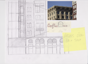
doc2Design aspects from Columbus preexisting buildings are prevalent in the sketch ups that we were able to do. Specifically, arches in the former “Arch City” are important to making Columbus have its own personal sense of style again. Columbus feels generic and doesn’t need to if it is able to utilize existing features and incorporate them into original design – you won’t need “New York Style” living advertisements, you’ll want “Downtown Columbus Style” living.


doc1

Incorporating these designs into the Edwards Development Company’s building, as we have called it “The Confluence,” is simple. If trying to stick closer to the design, only simple alterations have to be made, such as adding arches over windows or adding a more aesthetically-matching ridge that most historical buildings in Columbus have. The sign would be a great contrast, Imageutilizing copper letters and a giant glass “e,” showing off the arch design in a modern, elegant style. The “e” would be able to light up with LED lighting theoretically and change colors.

The Confluence’s northern half, near doc3the intersection of Long and High, appears to be built in a more luxury, traditional building style that reflects the buildings over the I-670 cap, according to the sketch. We chose sandstone and dark brick as building materials because of the Scan_20150914Ohio sandstone quarries, particularly the one in Amherst, and the dark brick which reflects many of the buildings in Columbus that have dark brick, whilst providing a clean, modern contrast. The “x” between the arched retail fronts signifies where the lights, based on the arches from the Short and Old Norths would go. The lettering on this half of the building would be a more sleek, elegant design that reflects and is in tune with the

14southern half of the building, but would provide that formal and luxury living aesthetic. Trees in front of the buildings would be replaced with the native red buckeye tree, an Ohio favorite that blooms beautiful flowers and matches the theme of “red” that people think of when thinking of Ohio. To continue the theme of arches, the red buckeye tree’s leaves naturally curve, making a succession of them appear as arches down the street.


In conclusion, the city of Columbus was founded at the confluence of the Olentangy and Scioto Rivers; similarly, the plot between Gay St. and Long St. sits at the confluence of downtown and the rest of the city. Due to this very important aspect, we decided to name the new apartment complex The Confluence. This name not only sounds interesting and compelling, but it also symbolizes many different features of the city itself. As has been said before, Columbus has many notable characteristics, one which has a heavy emphasis on arches. Anyone can see that the arches throughout the city are a very prominent feature; therefore, we designed the windows, storefronts, signs, and landscape to include this classic, elegant, and well-known structure, bringing the city back to its original nickname “The Arch City.” This aesthetic design allows for an original, less generic feel to Columbus.

Additionally, Columbus is filled with a mixture of old and new buildings. We decided to include the convergence of traditional and modern architectural elements in the design, allowing us to incorporate minimalist details alongside more traditional features. We have both modern and traditional materials in our design of the apartment complex. Some traditional materials used, including limestone and sandstone, are found in Ohio, along with our use of the Red Buckeye Tree. These intricate details give the apartments more of a unified and local design.

Art is also a major part of Columbus’s identity, so we’d also like to point out that the location of The Confluence would allow its residents easy access to a variety of cultural and artistic events, such as the Ohio and Palace Theatres, the Short North, and the night market located on Gay Street. This converges the artistic and practical parts of Columbus, putting more of the city’s creative features in the spotlight.


5 Beers & A Coke “How to Think Like a Planner | City DNA”

2207-209 Neil Avenue


The residences at 2207-209 Neil Avenue are unique and suit for only a certain type of tenants. This house is situated in a good location relative to campus, making it a very close walk to buildings on north campus as well as High Street. However, the only people I could imagine living here are college students because of the many disadvantages that come with this lot. First my team assessed the probable right of way width and came up with the idea that the line probably went from the edge of the street to halfway up into the residents yard. That being said, we measured this length to be 13 feet. The sidewalk took up half of this length with it being 6 feet wide. My team and I then surveyed the lot land and assessed many of the lots measurements. The lot dimensions were 30 feet by 100 feet while we estimated the house took up close to 90% of the lot. If this were the case we would estimate the house to be 2700 square feet. The building took up so much of the lot coverage that it left little to no space for setbacks. We measured the front setback to be 12 feet leaving a very sparse grassy area in front of the house. The side set back measured to be much less at only 56 inches. This very narrow distance between houses affects both neighbors quality of life with a lack of privacy and noise separation. Luckily the majority, if not all the tenants on this street are college students, so they understand what entails with a lot like this. One of the biggest appealing factors to a lot like this is the cost. What comes with living here is subsidized greatly by the cheap costs the occupants pay each month. One of the biggest things that stuck out to me as a disadvantage to living here was the parking, and the surrounding land use on Neil Avenue. Residents park their vehicles behind their house which is beneficial to get cars off the streets, however the parking lot that they use is backed up to alley ways and shared between the surrounding buildings behind the residence. One of the unique aspects to living in 2207-209 is the surrounding commercial land use. This residence marks the transition between commercial buildings to residential buildings. To the left of the property is a bar, while to the right begins the residential neighborhood. While, behind the property is a very tall apartment building separated by a worn down parking lot and many dumpsters. In conclusion, the area of land that is situated on 2207-209 seemed to be originally intended for commercial use only, however the demand for more residential buildings off campus began to grow making 2207-209 the dividing building between these two uses. Although this house would be easy on the average college student to afford, it comes with harsh factors that would have a big impact on quality of life.


Norwich Avenue


As my team and I walked along Norwich Avenue, the street proved to be the typical off campus residential neighborhood. This neighborhood planner’s goal was to utilize as much space as possible on this street, while this may mean the residents quality of life would be affected. When looking at the safety of this street it was apparent there needed to be more streetlights to provide for better lighting for those walking along the street at night. My team and I estimated the distance between lights to be around 150 feet apart. The only utilities my team and I noticed were the above ground power lines and phone lines running in between the streetlights. We noticed no utilities on the ground outside of houses because of the lack of space and negative effect this would have on the residents living there. As my team stood on the east side of Norwich looking west, we noticed the character of the neighborhood improved with wider setbacks between houses and the street, while houses on that side were also provided driveways to get cars off the street. Moving from east to west, the character proved to be more relaxed rather than crowded and overwhelming.


Norwich Avenue Street Width and Sidewalks


The width of Norwich Avenue proves to be problematic for the residents living on that street. We measured the street to be only 28 feet wide, but the main problem comes with the fact that people park on both sides of the street, only allowing cars to travel in a one way direction. If the street were wider and accommodated for parking on both sides, people would be able to drive both directions without a problem. Making the street wider would also improve the character and give it a more relaxed, spread out feeling that would be more attractive for people to live. Residents have no other choice to park on the street because of the lack of driveways, however this dramatically affects traffic as well as provides a higher chance of crime and theft because of cars being on the street. When assessing Norwich, my team and I also measured the width of sidewalks to be a mere 4 feet wide. This very skinny sidewalk doesn’t allow for people to walk comfortably side by side and also contributes to the very cramped residential area on Norwich.


Setbacks on Norwich


The front and side setbacks on Norwich measured to be dramatically less than the setbacks on Norwood. While we measured and assessed a particular house (pictured below) on the corner or Williams and Norwich to have front and side set backs of 10 feet each, houses across the street had side setbacks of only a few feet (picture 2 below) making it difficult for someone to even walk in between the two houses.


128-134W Norwich Av 128-134W

The building situated on the corner of Williams and Norwich is different from the houses across the street. With a larger residential building that appears to be condos or apartments, the character and flow of the neighborhood is disrupted and fails to be uniform. This gives a sense of confusion and lack of planning that affects the rest of the street.

Williams Street and Unnamed Alley

It seems a bit strange because the lot is organized in a way that blocks in half the cars. The lot could be easily reconfigured to prevent this ad many residents do this on their own because the parking lot was not heavily populated. Having such a high density and constricting parking lot is unnecessary because of the large amount of street parking available.


Northwood Ave and Williams Street

The wall acts to keep pedestrians off of the private property, giving the residents of the apartment complex more privacy from the street. It also hides the parking lot from immediate view, giving a little more security to the car owners and adding to the buildings curb appeal.


Northwood Ave Measurements

Width of Northwood Ave: 30’

South sidewalk: 5’

North sidewalk: 6’

The north sidewalk is more pleasant to walk on because there’s more space and a hill separating the sidewalk from the house. The one way streets are good for a residential neighborhood like this because it creates more parking for the residents and while it can be confusing at first the majority of the traffic in that area will be people who live nearby so they would be very familiar with the area.


Average Front Setback on Northwood

The front setback is about 25 ft. while the side setback is about 5-10 ft. It looked to be a nice neighborhood, the sidewalks were not very well cared for and the houses were not decorated or unique but it was very clean and quiet during the day.


2244 Neil Ave

While it might seem out of place to have a small business office among the nearby houses, the building fits in nicely with the surrounding area. It’s about the same height and size of the nearby buildings and made of brick similarly to many of the houses in that neighborhood.

The current owner told us a brief history of the house so that we know it was originally a grocery store with apartments upstairs.  Today it is a realtor’s office. The building could easily be made into a convenience store or an auto body shop pretty easily with space for tenants upstairs if it fell under new ownership. Its official zoning designation is likely low-density mixed use.


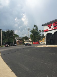
Tommy’s Pizza

We thought the paving of the ground all the way to the sidewalk was a bad move because it wastes space, is hot in the summer, and is pretty desolate to be around. There’s no parking in the front of the building and you cannot pull into the parking lot from Lane Ave so that there’s no reason for it to be paved for car accessibility. The building is also set back from the street about 20 ft. and since there is no sidewalk to lead customers to the entrance the paving isolates the building instead of appealing to people walking on Lane. The dark pavement also is hot and uncomfortable in the summer and adds to rainwater runoff making it environmentally wasteful. A better option would to tear out the pavement, add a sidewalk, a bioswale or buffer vegetation and possibly a small patio.


Tommy's Pizza Parking Lot

Tommy’s Pizza Parking Lot

Tommy's Pizza Parking Lot

Tommy’s Pizza Parking Lot

2244 Neil Ave, former grocery store

2244 Neil Ave, former grocery store

Unnamed Alley parking disaster

Unnamed Alley parking disaster

One of the houses we measured front and side setbacks 10ft x 10 ft

One of the houses we measured front and side setbacks 10ft x 10 ft

Norwich Ave street parking and slow traffic

Norwich Ave street parking and slow traffic

distance between 2 houses on norwich ave

distance between 2 houses on norwich ave