Columbus Local can be described through aspects such as
Arches
Elegant, distinguished, prominent, classic, notable, significant
Rivers
Flowing, converging, meandering, beautiful, peaceful, serene
Brick and Mortar
Stable, unwavering, steady, secure, sturdy, firm
Art
Artistic, creative, innovative, imaginative, expressive, alluring
“Old Meets New”
Refined, historic, converging, mixed, contemporary, evolving, traditional
Community
Accepting, positive, diverse, united, complex, spirited
Government
Strong, unwavering, structured, important, powerful, symbolic
Little Big City
Comfortable, sizable, reassuring, intriguing, inviting, opportunistic
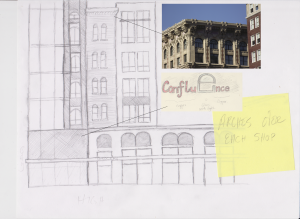
 Design aspects from Columbus preexisting buildings are prevalent in the sketch ups that we were able to do. Specifically, arches in the former “Arch City” are important to making Columbus have its own personal sense of style again. Columbus feels generic and doesn’t need to if it is able to utilize existing features and incorporate them into original design – you won’t need “New York Style” living advertisements, you’ll want “Downtown Columbus Style” living.

Incorporating these designs into the Edwards Development Company’s building, as we have called it “The Confluence,” is simple. If trying to stick closer to the design, only simple alterations have to be made, such as adding arches over windows or adding a more aesthetically-matching ridge that most historical buildings in Columbus have. The sign would be a great contrast,  utilizing copper letters and a giant glass “e,” showing off the arch design in a modern, elegant style. The “e” would be able to light up with LED lighting theoretically and change colors.
The Confluence’s northern half, near  the intersection of Long and High, appears to be built in a more luxury, traditional building style that reflects the buildings over the I-670 cap, according to the sketch. We chose sandstone and dark brick as building materials because of the
  Ohio sandstone quarries, particularly the one in Amherst, and the dark brick which reflects many of the buildings in Columbus that have dark brick, whilst providing a clean, modern contrast. The “x” between the arched retail fronts signifies where the lights, based on the arches from the Short and Old Norths would go. The lettering on this half of the building would be a more sleek, elegant design that reflects and is in tune with the
 southern half of the building, but would provide that formal and luxury living aesthetic. Trees in front of the buildings would be replaced with the native red buckeye tree, an Ohio favorite that blooms beautiful flowers and matches the theme of “red” that people think of when thinking of Ohio. To continue the theme of arches, the red buckeye tree’s leaves naturally curve, making a succession of them appear as arches down the street.
In conclusion, the city of Columbus was founded at the confluence of the Olentangy and Scioto Rivers; similarly, the plot between Gay St. and Long St. sits at the confluence of downtown and the rest of the city. Due to this very important aspect, we decided to name the new apartment complex The Confluence. This name not only sounds interesting and compelling, but it also symbolizes many different features of the city itself. As has been said before, Columbus has many notable characteristics, one which has a heavy emphasis on arches. Anyone can see that the arches throughout the city are a very prominent feature; therefore, we designed the windows, storefronts, signs, and landscape to include this classic, elegant, and well-known structure, bringing the city back to its original nickname “The Arch City.” This aesthetic design allows for an original, less generic feel to Columbus.
Additionally, Columbus is filled with a mixture of old and new buildings. We decided to include the convergence of traditional and modern architectural elements in the design, allowing us to incorporate minimalist details alongside more traditional features. We have both modern and traditional materials in our design of the apartment complex. Some traditional materials used, including limestone and sandstone, are found in Ohio, along with our use of the Red Buckeye Tree. These intricate details give the apartments more of a unified and local design.
Art is also a major part of Columbus’s identity, so we’d also like to point out that the location of The Confluence would allow its residents easy access to a variety of cultural and artistic events, such as the Ohio and Palace Theatres, the Short North, and the night market located on Gay Street. This converges the artistic and practical parts of Columbus, putting more of the city’s creative features in the spotlight.


 Design aspects from Columbus preexisting buildings are prevalent in the sketch ups that we were able to do. Specifically, arches in the former “Arch City” are important to making Columbus have its own personal sense of style again. Columbus feels generic and doesn’t need to if it is able to utilize existing features and incorporate them into original design – you won’t need “New York Style” living advertisements, you’ll want “Downtown Columbus Style” living.
 utilizing copper letters and a giant glass “e,” showing off the arch design in a modern, elegant style. The “e” would be able to light up with LED lighting theoretically and change colors.
 the intersection of Long and High, appears to be built in a more luxury, traditional building style that reflects the buildings over the I-670 cap, according to the sketch. We chose sandstone and dark brick as building materials because of the
  Ohio sandstone quarries, particularly the one in Amherst, and the dark brick which reflects many of the buildings in Columbus that have dark brick, whilst providing a clean, modern contrast. The “x” between the arched retail fronts signifies where the lights, based on the arches from the Short and Old Norths would go. The lettering on this half of the building would be a more sleek, elegant design that reflects and is in tune with the
 southern half of the building, but would provide that formal and luxury living aesthetic. Trees in front of the buildings would be replaced with the native red buckeye tree, an Ohio favorite that blooms beautiful flowers and matches the theme of “red” that people think of when thinking of Ohio. To continue the theme of arches, the red buckeye tree’s leaves naturally curve, making a succession of them appear as arches down the street.