1. Research
I read Sketching as Design Thinking and watched the TED talk show called Doodler’s Unite for as research for this project. After that, I started to think about what sketchbook personal meant to me and which things I would like to put in it. I decided to include observational sketch, structure study and design ideations in my sketchbook based on personal interest.
Exercise 1: Mini Sketchbook
Based on the mini sketchbook tutorial, I made a mini sketchbook that has 8 sides with single sheet of paper. Each page has a connection part which holds everything together, but it also wastes some pages. After making the example mini sketchbook, I started to experiment making a new mini sketchbook using one sheet of paper and tried to solve the problem from previous sketchbook.


Example mini sketchbook Further exploration
2. Iteration
Brainstorm: What kind of sketchbook do I want?
- Understanding of sketchbook
In my opinion, the purpose of sketchbook is daily sketching and expressing ideas. Since I used many sketchbooks and notebooks, the most important trait for me is functionality: easy to use and durability. I also want to keep the sketchbook simple, so that I won’t be stressed when I actually start to sketch on it.
- Define problems
Considering the circumstance when I was using sketchbook and something that would bother me during using it, I found that the covers of the sketchbook had fold marks after I carried it around in my bag and daily using, which really annoys me. Moreover, I noticed some notebooks couldn’t lay flat which makes hard to do works.
The path seems to be becoming clear; finding solutions and making sketchbook more desirable to use will be my main goal, as aesthetically pleasing comes after it.
As my sketchbook composed of four major parts: front cover, back cover, pages and binding, I started to iterate and solve each part one by one.
Pages
I started with pages, because it’s the most important part what could affect other components. I intended to set the page as a horizontal rectangle, so my hands won’t be affected by binding area easily when I am using it. Since the material, drawing paper, I have for the pages is 17*14 inch, I thought it would be great if I can cut down four identical pages from one drawing paper not only there will be zero waste, but also the size of page is perfect to carry around and easy to use.

Front Cover
When I see others artwork, I also have a great desire to express my ideas visually freely through sketching, draw beautiful things and push my boundaries more. However, understanding structure and observation are the keystones. So, practicing line work and studying structure through observation and imitations will be the main purpose of this sketchbook while also experimenting different media. With these intentions in mind, I started to design the cover. As we know, everything is constructed by simple geometric shapes, the same is true for the contents inside the sketchbook. I think the concept would match with the whole theme. And then, I had the first ideation below.

It looks good actually, but I thought it was a little serious. I want to bring more fun into it. As stackings and combinations of basic shapes make up object, aren’t they just add up? As a result, I brought the plus sign and equal sign into the composition which made the final cover design. The question mark implies content behind the cover, sketchbook itself.
I tried many different fonts of question mark. The final one has 3-D effect and pops up from the 2-D surface whereas the other parts of composition are flat. Instead of a monotonous composition, it gives viewers a relative visual focus, because I tended to lead viewers to focus and get curious on the content behind the cover.
It seems like the composition has the power let me open the sketchbook and start to sketch on it, because who knows what will be created? Everything is possible!

Back Cover
The back needs to have information including name, class and year. I don’t want them just sitting there, so I started to play around it and tried “type on path” feature. I came up with two iterations.
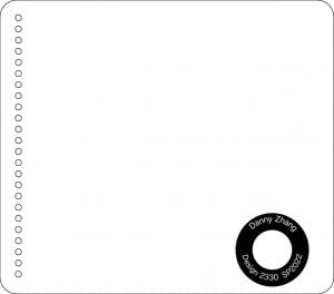

However, they don’t really match with the front cover. And then, I looked for inspiration on adobe stock by searching pixel icon, because the question mark is in pixel style. The UFO icon caught my eyes and I thought it would be cool if letters sucked away by UFO.

Surprise Element
After heard the surprise element, book flip animation pops up in my mind. Since I want to keep the sketchbook simple, small book flip animation would be a great fun element to include while not being worried about breaking harmony and overtrying.
So, I ended up choosing the gif from the internet as shown below.

simple and fun
Since I knew the animation is composed of multiple individual frames and how it works, I used a website that could break gif into individual frames. (Check pdf attached below for individual frames)
After that, I put each picture into illustrator and turned them into path. My first idea was to print on sketchbook pages, but I failed due to technological issue and suitability. So, I was trying to achieve it by another way which is making individual stamps by using laser cut. I bought 1*1 inch wood block as material for stamp. Since it would be a raster job, I need to do some adjustment to the path: reverse black and white, so that the machine will raster the black part and path will pop up to serve as stamp. Last but not least, mirror each image. When I use laser cut, it didn’t align perfectly, so there is always a slight edge was uncut on the surface, but they were all removed by hands.


3. Production
I measure the radius of the spiral bindings and distance between each circle, so that the distance between the edge of page and holes are not too big or small and distance between each hole are appropriate. After cutting out all the pages, I tried to bind them and worked really well. However, the cover was hard to open, because the curved edged cover had to be a little bit larger than the pages in order to cover the whole page. As a result, I compromised to give up the curved edge cover and made same size cover. The covers will still be durable since it is hard cardboard.
At the same time, I tested multiple times for raster power and found the appropriate setting.


Final Sketchbook


