Before this project, I never played chess before. So, I did some basic research on rules and played a couple games to better understand each role.
I also did some research on structure and slice form in order to get understanding of working principles.
An example model from Pinterest
2. Iteration
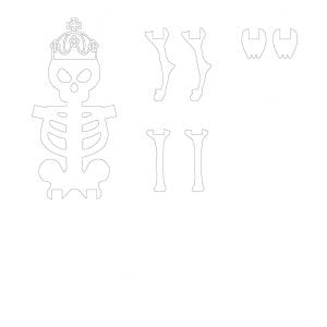
Me and my partner was kind of struggling at reaching a unified theme. We brainstormed couples of ideas such as: pirate, culture difference, totem pole vs. Roman column, etc. However, we both agree on death vs life at the end. I chose skeleton as basic form for my chess pieces.
Before making chess, I thought through about what makes a chess set successful. There are few key points I came up with. All pieces should not only harmonize as a whole, but also has variety between them. Scale could help illustrate the hierarchy. Each should communicate their role well. Instead of spending a lot of time explain each piece, I think they should be ready to play. Player should not be confused.
Having these ideas in mind, I decided to create a basic original form and other pieces will gradually evolve from it. So, they will both have same traits, but also communicate their role well.
I gathered references from internet.
Test could always help building forms. I made a couple prototypes.
After making prototypes, I made modifications including size, compositional change and connecting ways.
And then, the rest of part was much easier since they have similar body type. To make each piece distinguishable, I added different visual elements and modifies sizes to communicate their characteristics.
KnightKingRookQueenBishopPawn
3. Concept Statement
The Checkmate is a group project that remakes chess pieces under a common theme. The mechanism and rule stay the same, while each piece has different form than traditional chess set. Our overall theme is life creatures versus immortal army. They represent two opposite sides: life and death. From the beginning to the end of life, life and death are always happening. Life and death are contradictory existences that composed of resistance. Until death, we are silently doing resistance, and the essence of all resistance, which is life itself. I think there is only one way to treat death and life: without compromise. Always keep the spirit of resistance, this is perhaps the only way to make life less banal and less tend to be meaningless. I chose skeleton as simple original form for my side. Rest of pieces are variations from the origins by applying contrast and scale. Different scale depicts the relative importance of the figure in the whole set. Each piece has their own characteristics so that they could visually communicate their role and function. The chess set shows unity as a whole and variety as individual at the same time.
4. Production
Laser cut is most frustrating part; when I cut a file, there is always some parts are not cut through. So, I have to make multiples changes and cut them.
Before iterating, I had a conversation with my mentor to gather some basic information by asking some questions.
Some key terms about the gift: coffee, Lucien Kroll, minimalist, nature, functional.
Quote
I just simply searched “design quote” on Google and tried to find the most resonate one.
“Bad design shouts at you. Good Design is the silent seller.”
-Shane Meendering
Exercise 1 Best Gift
The best gift I received was a watch given from my father for birthday. There are few reasons. First, I didn’t expect the gift. And then, I like the watch! From perspective, the key points of a successful gift are surprise, connections, between the donor and recipient, and the gift is human centered around the recipient.
Exercise 2 Packaging Design
Before making the gift itself, I spent some time on packaging, because the packaging is part of the gift and essential. The packaging could create different effects such as surprise, implication, etc.
The object I choose is glue. I was mainly focus on how to show the power and stickiness of glue. I used black stock paper as the whole package and white paper stock as visual illustration to have black and white contrast.
2. Iteration
My gift is focus on things around coffee from the beginning. I was thinking how to improve or change the user experience of coffee making. I watched many videos about making coffee using coffee capsules, trying to find some problems during the process. There are few options such as coffee mug and coffee capsules holder. The first idea was coffee capsules holder and I sketched out some ideas.
However, there is not much space I can expand since this is a ready-made product and it is not connected to the quote. The coffee capsules holder is the product for pre-used coffee capsules. What about some possibilities of used coffee capsules? I could make some decoration from it or a plant pot. The coffee capsules are the perfect size for some microgreens at home for decoration. And she also likes nature. The plant will be the connections between me and her. It would be a great decoration for her home.
The single plant pot is so boring, so I want to make multiple plant pot holder and combine them as a whole. When I making a test holder, the way that how they connected brought me inspiration. The package could also be connected by crossing the gaps between them.
The next step was to somehow recombine the package into a new plant pot holder. I tested few cubes.
I also used Bristol to test the holder and package and tried to figure out how to make them as a whole. Language can’t really explain how it work out, but making and testing brought me solutions.
3. Concept Statement
This is a project that I design a gift for the mentor. The recipient is a senior interior design student, Aurora. She likes coffee, baking, and playing video games. About design, she likes green, minimalist, and got some inspirations from Lucien Kroll recently. Her ideal home is a loft or apartment in a city with balcony and nature. After I know she is a big coffee person, I was mainly brainstorming around it. I thought about the whole process of making coffee, even things before and after this. There is not much space I can touch on and expand on it, but the key part is the coffee capsule. This is the part that exists from the beginning to the end. The first idea was a coffee capsule holder. However, it’s too specific and not creative from my perspective. Then, I stepped back, reviewed the information and looked for more inspirations around coffee capsule. I brainstormed some ideas about what can I do with the used coffee capsule. Finally, the final idea came out: making coffee capsule as a plant pot. Based on quote I chose, I want the package become part of the gift and could be deconstructed and reorganized into coffee capsule, plant pot, holder. The change of coffee capsule into plant pot is also part of the deconstruction. There are many examples of deconstruction in interior design. I hope she could get some inspirations from recombing each pieces and have fun with growing plant.
Line, unity and scale are intended used in this project. Different scales of pieces combine as a whole and form lines and geometric shapes which bring aesthetics. The material is 1/8-inch-thick wood board. Everything is cut by laser cut.
4. Production
After did the measurements and some modifications, I started to make the template.
Thankful to multiple measurements, I don’t need to do any modifications after the first laser cut, but I need to adjust the laser cut setting in order to completely cut through. I was so rushed to do the laser cut, so I don’t have time to take photos. Since the gaps are precise, the connection is pretty smooth.
The research for this project is basically paper mechanism and videos that could visualize the music. Me and my partner Mark shared some music we like and decided the final theme music is Determination. Determination – YouTube
I found that lines could illustrate the movement of the music really well which helps my later works.
Exercise
Mechanism Exercise
I made a simple paper mechanism during class. It’s a sliding mechanism and has popup effect.
I also experimented two paper mechanisms based on YouTube videos
To better understand how to visualize sounds abstractly, I used basic shapes and lines to demonstrate the beats, tones and changes in the music during in-class exercise.
2. Iteration
Me and my partner were more focus on the changes of melody and the mood. As I searched many mechanisms, nothing really fitted the music, because the music I chose has significant changes throughout the whole thing which is the beauty of it, and I want to present it out.
So, I continued search up different mechanism and found out the Bauhaus Optical Illusion 4 on Cut / Fold Templates for paper mechanisms (cutfoldtemplates.com) could create a whole composition and demonstrate the changes. And then, I did a several tests as shown below.
As I had more understanding of the mechanism, I started to create the composition which also gradually formed in my head while I was doing tests.
I tried to use different size, height and angle line shape to illustrate the movement and changes.
3. Concept Statement
The Dynamic Pages communicate the mood and movements of music through a kinetic paper mechanism. I consider the chosen music as a whole to present by focusing on the line, form and pattern. The only mechanism I chose is Bauhaus Optical Illusion, 180° form. The lines are abstract generalization of the music. The composition is intentionally applied by design principles: balance, movement, rhythm, contrast and unity. Lines with different size, height, angles embody the philosophical worldview of contradiction and unity. The dynamic composition creates rhythm when the same visual element, lines, is repeated continuously. The arrangement lines with regular changes by different ratio or equal ratio processing to produce music-like melody. Rhythmic composition has a positive vitality and has the energy to strengthen the whole mood. The template is cut out by laser cut while material is Bristol.
4. Production
I choose to only use white for the whole composition, because I want to more focus on the dynamic movement while color might be distracted. I made a template on illustrator and did the laser cut.
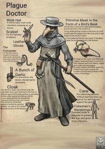
When the project was introduced, I searched up some pandemics in the history and how people react to it during that time. The first mask came to my mind was plague doctors’ mask. Their costume perfectly shows how they interpret the pandemic and interact with others based on little understanding of virus.
The circumstance was similar as today, but technologies become better, and people have more accessibility to medical protection. As we are living during pandemic era, mask gradually have different meaning to people than before. People who only have epidemic disease or deadly disease would wear mask, but now everyone wears mask to protect themselves and others. Since we wear mask every day, it becomes as necessary as clothing which share same traits.
So mask have two main function: protection and expression of ourselves.
From protection perspective, we got inspiration from nature world: animals. Every animal has their own way to protect themselves. Some are more aggressive, having a horn to fight and scare away others. Some protect themselves in a more protective way. Mother nature itself has gifted animals such as hedgehogs and porcupines with spikes so that they could scare off any creature that wishes to harm them. This mechanism also applies to human as well. We decided communication with ourselves and others through mask and how we protect ourselves as the main goal.
Mind map
Exercise
After we have more understanding of mask, me and my partner built a mask roughly and express the ideas by making and have a taste of it. I was trying to build an armor texture to show the protective attitude to others, meanwhile protect my own body.
2. Iteration
I made many quick iterations on sketchbook.
I was more interested in making armor texture on mask which has protective trait and also could warn others at the same time. So I started to experiment how to create texture by using paper. The origami method is searched from the internet.
It created the armor texture successfully, but there are not many possibilities with it, even I tried different sizes and angles. It certainly shows the protection for the wearer, but the message that keeps others away is not strong enough. So, I started to try different folding technique and explore more possibilities with arrangement of units since armor also consist of many individual units.
I made a composition composed by triangle base pyramids. However, the composition doesn’t cover the surface without having gaps between units. And then, one day, I noticed the texture of manhole cover on the ground and got inspiration from it.
The rhombus shaped pyramid has protective trait texture and not being too aggressive. I arranged the different skewed units repeatedly, so the spike is gradually pointing downward, creating a great balance.
3. Concept Statement
During the initial outbreak of the Coronavirus in March of 2020, people started realizing the changing reality of their day-to-day lives. Because of the pandemic, we have to wear masks when we go out for safety, so masks became very important accessories. The mask becomes part of our daily outfit, just like clothes. It can express our personality as well. The chosen mask is an expression of attitude and personality and communicates with others nonverbally.
Two college students, Mark and Danny, both design foundation students, are in the same social circle. One day, one of their friends was throwing a party at his house. Having never been to this friend’s house, both Mark and Danny were worried about the party being too crowded. Additionally, both have family members they interact with regularly who have compromised immune systems, leaving them more at risk for coronavirus complications. Having discussed the possible consequences, both Mark and Danny decided to go to the party, but they had a plan on how to promote social distancing, at least in their direct vicinity.
Both students planned on wearing masks to the party, but the mask each chose varied. Danny was aloof and decided to wear a mask that resembled armor to show that he was very attentive to the personal space and didn’t want random people to disrupt it easily. This passive approach does not frighten familiar people into staying away. Rather, like armor from the medieval period, the mask protects its user from harmful bacteria and unidentified people, while promoting a curious nature from peers.
Mark had a slightly different attitude toward the party, hoping to see his friends, but not wanting to be around a lot of people. He decided to wear a mask that resembled a combination of a wild mythical beast, incorporating horns and animal-like characteristics, and a warrior, having armor-like textures that appear weathered. The stand-off nature of the mask encourages people to back away from the individual wearing it, unaware of how the individual will respond to crowding. This outward approach promotes a sense of isolation, and more protection from the crowd.
4. Production
Due to experience of making template for 3-d model last year, it took a lot of time and measurement. I was trying to find a way that could make the process more efficiently. I found out there is a software that could convert 3-D model into template instantly. I learned and used Blender to create 3-D model by watching YouTube tutorial videos. I also use blender to experiment composition while it has a more intuitive feeling.
The mask is also created by blender.
Paper template:
Porotype:
The template was scored out by Circut.
The final mask is all using white Bristol.
I was trying use a chain composed of multiple units as the band, but it didn’t really work out. It’s hard to put on and doesn’t stay still.
Instead, I used bands from medical mask.
The final design challenge is that the outer side of the mask feels a little empty. I tried different composition on it by placing the paper units on the surface and see what feels like. However, there is no composition harmonize with the front sides. It would break the harmony of the whole mask, so I decided to leave it blank.
For this project, I searched many examples products that communicate deep space with layers and tried to find some common traits they have. Scale, perspective and overlap are some of important elements that could help me reach the sense of space and depth. After that, I started a mind map and explored every possibility. I found out storytelling resonates the most with me, so I use it as the base for developing design concept.
Exercise
After learning the gestalt principles, there was an exercise came after it: use negative space in my initial to hold an image that communicates something about me. The exercise also let me get familiar with laser cut which is beneficial for later works. I sketched out some possible ideas and chose letter “J” as the final letter. Since the negative space of “J” is an open space, it is hard just hold an image in it. So, I explored many fonts and tried to find one that has more potential. I like nature and animal, so I put different animals in negative space and deepen the design of letter “J”.
After I did the mind map, I quickly sketched some ideas and possible composition that could help illustrate deep space.
Since my main goal is communicating deep space through narrative and storytelling. I ask myself: what kind of story that everyone is familiar? The Little Red Riding Hood popped up in my mind which is perfect media that could communicate with everyone. However, I don’t really want to make one that is identical to the original one. As I explored more about deep space, it could be any space, not necessarily physical space. With these two ideas in mind, I was thinking about twist the story and leave imagination space to viewers. To achieve the goal, I challenge the personality of little red riding hood; instead of being a vulnerable girl, I let her carry a gun and sword. The set up the story continue develop as I create the composition. I was intended to create adapted story from a new perspective and leave imagination space for the audience. As a result, I set the scene before everything happened: little red riding hood is walking in the forest, meanwhile, the wolf is following her.
When I started to develop the composition, I chose contrast and scale to help illustrate the story and space. I also looked up for some references that could help me build the composition on Pinterest. I arranged different scales of trees to create guideline; and the overlap of objects create 3-D effect.
First compositionDeveloping composition
As I was about to finish up the composition, I applied value to it to strengthen the sense of depth and create observation position from the back as a bystander. I make the girl and house black purposely to show the visual focus and importance.
3. Concept Statement
Layers Project communicates deep space and depth through storytelling, inspired by fairy tale, Little Red Riding Hood. However, it’s different from the story that we used to know, challenging and questioning the things that we already knew or existed, because I want to break down stereotypes. The story is told from another perspective with same character. The scene is set up specifically before everything happens. It not only presents the deep space physically in visual composition, but also communicates imagination space with viewers. Through narrative and storytelling, I tend to expand story with more possibilities by applying alternative traits on certain characters and leave space to audiences to imagine or interpret what would happen next. Contrast and scale are applied to help set the mood and illustrate the storytelling. Black foreground and lighter gray middleground and background let viewer to observe everything as a bystander from an unobtrusive position. Contrast of different values highlight the importance of character or object. Perspective and guideline formed by different scales of objects create 3-D effect and depth. Material for this project is gray-scale cardstock, Bristol and glue. Dark tones cardstock creates the sense of mysterious for the story.
4. Production
After I finished my composition, I separated them into different layers and laser cut them to do a prototype. It turned out really successful.
I used cardboard and glue to connect each layer and have distance between them. I used the same way on the final project, but I also put carboard on the side instead of just corners. So, it won’t be floppy.
At the end, I made a template for the frame of the box.
I read Sketching as Design Thinking and watched the TED talk show called Doodler’s Unite for as research for this project. After that, I started to think about what sketchbook personal meant to me and which things I would like to put in it. I decided to include observational sketch, structure study and design ideations in my sketchbook based on personal interest.
Exercise 1: Mini Sketchbook
Based on the mini sketchbook tutorial, I made a mini sketchbook that has 8 sides with single sheet of paper. Each page has a connection part which holds everything together, but it also wastes some pages. After making the example mini sketchbook, I started to experiment making a new mini sketchbook using one sheet of paper and tried to solve the problem from previous sketchbook.
Example mini sketchbook Further exploration
2. Iteration
Brainstorm: What kind of sketchbook do I want?
Understanding of sketchbook
In my opinion, the purpose of sketchbook is daily sketching and expressing ideas. Since I used many sketchbooks and notebooks, the most important trait for me is functionality: easy to use and durability. I also want to keep the sketchbook simple, so that I won’t be stressed when I actually start to sketch on it.
Define problems
Considering the circumstance when I was using sketchbook and something that would bother me during using it, I found that the covers of the sketchbook had fold marks after I carried it around in my bag and daily using, which really annoys me. Moreover, I noticed some notebooks couldn’t lay flat which makes hard to do works.
The path seems to be becoming clear; finding solutions and making sketchbook more desirable to use will be my main goal, as aesthetically pleasing comes after it.
As my sketchbook composed of four major parts: front cover, back cover, pages and binding, I started to iterate and solve each part one by one.
Pages
I started with pages, because it’s the most important part what could affect other components. I intended to set the page as a horizontal rectangle, so my hands won’t be affected by binding area easily when I am using it. Since the material, drawing paper, I have for the pages is 17*14 inch, I thought it would be great if I can cut down four identical pages from one drawing paper not only there will be zero waste, but also the size of page is perfect to carry around and easy to use.
Front Cover
When I see others artwork, I also have a great desire to express my ideas visually freely through sketching, draw beautiful things and push my boundaries more. However, understanding structure and observation are the keystones. So, practicing line work and studying structure through observation and imitations will be the main purpose of this sketchbook while also experimenting different media. With these intentions in mind, I started to design the cover. As we know, everything is constructed by simple geometric shapes, the same is true for the contents inside the sketchbook. I think the concept would match with the whole theme. And then, I had the first ideation below.
It looks good actually, but I thought it was a little serious. I want to bring more fun into it. As stackings and combinations of basic shapes make up object, aren’t they just add up? As a result, I brought the plus sign and equal sign into the composition which made the final cover design. The question mark implies content behind the cover, sketchbook itself.
I tried many different fonts of question mark. The final one has 3-D effect and pops up from the 2-D surface whereas the other parts of composition are flat. Instead of a monotonous composition, it gives viewers a relative visual focus, because I tended to lead viewers to focus and get curious on the content behind the cover.
It seems like the composition has the power let me open the sketchbook and start to sketch on it, because who knows what will be created? Everything is possible!
Back Cover
The back needs to have information including name, class and year. I don’t want them just sitting there, so I started to play around it and tried “type on path” feature. I came up with two iterations.
However, they don’t really match with the front cover. And then, I looked for inspiration on adobe stock by searching pixel icon, because the question mark is in pixel style. The UFO icon caught my eyes and I thought it would be cool if letters sucked away by UFO.
Surprise Element
After heard the surprise element, book flip animation pops up in my mind. Since I want to keep the sketchbook simple, small book flip animation would be a great fun element to include while not being worried about breaking harmony and overtrying.
So, I ended up choosing the gif from the internet as shown below.
simple and fun
Since I knew the animation is composed of multiple individual frames and how it works, I used a website that could break gif into individual frames. (Check pdf attached below for individual frames)
After that, I put each picture into illustrator and turned them into path. My first idea was to print on sketchbook pages, but I failed due to technological issue and suitability. So, I was trying to achieve it by another way which is making individual stamps by using laser cut. I bought 1*1 inch wood block as material for stamp. Since it would be a raster job, I need to do some adjustment to the path: reverse black and white, so that the machine will raster the black part and path will pop up to serve as stamp. Last but not least, mirror each image. When I use laser cut, it didn’t align perfectly, so there is always a slight edge was uncut on the surface, but they were all removed by hands.
Inked Wooden Stamp
3. Production
I measure the radius of the spiral bindings and distance between each circle, so that the distance between the edge of page and holes are not too big or small and distance between each hole are appropriate. After cutting out all the pages, I tried to bind them and worked really well. However, the cover was hard to open, because the curved edged cover had to be a little bit larger than the pages in order to cover the whole page. As a result, I compromised to give up the curved edge cover and made same size cover. The covers will still be durable since it is hard cardboard.
At the same time, I tested multiple times for raster power and found the appropriate setting.
Final pageFinal front coverFinal back cover
Final Sketchbook
Front coverBook openBack coverBook flip animationBinding close-up
For this project, I didn’t do deep research. Instead, I listened the Mashup podcast and got some insights about mashup. After understanding some basics of mashup, I used random word generators online and wrote down some words that interested me and tried to find possible combinations. Fortunately, I got three possible mashup words that can use for final poster.
Exercise 1
For this exercise, I used photoshop and illustrator to create isometric illustration of my initials and got familiar with software. I tried different colors and experiment values.
Other Exercises
hand sketch exercise
Letter Mood game
I used spin wheel to get random letter or number and an adjective in order to combine them and visually communicate. This game let me have a taste of visualization of mashup word.
Joy V
2. Iteration
After having mashup words, I quickly wrote some possible ideas down and sketched it out.
Later, I decided use word “Dazzmond” for my final mashup word. The first was making every letter as shiny diamond, but that was too much. So, I started to play around different compositions and see what possibilities could come out from it. And then, I found out I could use shadow to illustrate the characteristic of dazzling diamond. So, for the next step, I made isometric form and added value and shadow to it. For the color selection, I decided to use just black and white instead of other colors, because I wanted composition stay unified and harmonious. Otherwise, the whole poster will be a chaos and won’t show the characteristics of the mashup word.
After about finishing the isometric form, I started to experiment the value and light from light and tried to make the composition balance.
3. Production
Adding details was my second last step: giving diamond more texture and modifying shadows.
Finally, adding definition of the word in dictionary format. I found if I simply put flat words on the poster, it might destroy the harmony. So, I was thinking about how to make definition and other parts as a whole. How about making text twisted and put it on the plane? And then, I quickly did multiples iterations.
At the start of this project, I searched up for few examples of mandalas.
For the color theory research, I read through the ppt and pdf and listened the presentation from another instructor.
Activity 1
The first activity is to create abstractions from nature and artificial objects. I didn’t really work out the Sketchbook: images become blur as zoomed them and sketches are also blur. \
Exercise 1: Pattern
I used abstractions from CPU and annual rings of tree trunk to create pattern. I chose them, because they all have line alignments. However, the pattern didn’t really work out as I tried to use harmony as design principle.
2. Iterations
Before creating mandala pattern, a guiding grid should be created. However, I was not sure about how to create a grid, so I used basic line and shapes to experiment.
I chose grid below as the start for my mandala.
I started to put abstractions in and used radial tool to see what will look like, but I had trouble with connecting different parts together and create structure. As the iterations kept going, I removed circle lines and arranged abstractions in angles to imply flow line.
The mandala pattern became had more movements, but the connections between different parts are still off. I continue to experiment with combining abstractions into new shapes and tried to make every abstraction relate to each other.
Final Mandala
Adding Value
When applying values, I was thinking about making the big combined abstractions as visual focus. So, I added more values to it. I also use different values at outer layer to create step-by -step effect in order to strengthen the movement.
Color
I started to play around the colors and applied them into mandala. I simply applied colors instead of using colors at different values at first. After taking advice from group discussion, I applied stronger value to show the focus and contrast.
For the final mandala, I decided to choose complementary and analogous as color harmony.
3. Production
Overall, I was struggling with making connections between abstractions. I learned color theory, knowing how to use colors and making the whole composition harmony. I think there could be more improvements on the structure and experimenting new shapes.
I read the book Slow Looking. In order to practice concepts in the book, I went out during the class and observed interesting things at Oval by taking pictures. This activity helps me to find interesting points while preparing for the final map.
After learned composition principle after class, I took pictures of the small flower in different perspective and practice composition. I also took pictures at Oval by using composition principles.
To better express and present feeling of the journey on the map, I test out the path and wrote the journey in standard and creative way.
Standard Direction
Starting from Hayes hall facing to the oval, turn left 70m, and then turn right. Walk across the oval, keeping walking forward. After across the street once and see the buss station, turn left and walk across the street. Ascend the stairs and turn right, keeping walking until you see the parterre and turn left and enter the door. As you enter the door, walk 10 meters and Brutus is on your right.
Creative Description
While waking on the oval, a gentle breeze pass by; sunlight falls on the ground through the leaves. Bus creates noises to make fun of UM. People heading to building while wearing clothe with OSU label on it. Brutus statue is chilling on the bench inside the Union building and welcome people pass by.
Exercise 2
Journey Photos
After practicing the composition, I took picture during the journey. Most of them were not used in the final project. However, I found few interesting points on the journey.
2. Iteration
Since I want to create a 3D map, I used google map as reference and trace the contour of the building and tried different angles.
3. Production
I used grid in Illustrator as reference and put tracing paper on the drawing pad which also has grid on it. And then transform the drawing on iPad to tracing paper. After that, I use light table to trace on the Bristol.
To start the project, I picked the bounded shape from previous project’s composition. I chose the corner one instead of the hexagon in the middle. (Part of the reason is that hexagon is too troublesome to draw)
Exercise
Perfect Cube
During class, I used template to built the basic form, cube, to get a sense of how 2D turn into 3D form. It seems easy, but it is hard to get a perfect cube: the alignment, pencil marks, excess glue.
Skyline Construction and Isometric Drawing
After finished the cube, I experimented more complex form with provided template. It was still hard to get perfect while doing the sketch and the order of connection of each part.
2. Iteration
First, I built the form and created the template by using chosen shape as base. I used it as prototype and sketched few possible from meanwhile keep the plain view the same. I was thinking how about cutting some parts of the form and what will look like.
Moreover, I tried to make them into 3D forms.
Model 1
model 2
Model 3
First 2 model was originated from the sketch by simply cutting part of the form. Th last was built from the chosen shape as base and randomly put on pieces and explore what form could come out.
3. Production
I chose model 1 as prototype and made some modifications: lower height and longer cut out part. The process was smooth while having the model reference. I teared of the tape and expand the form to visualize the template. I did one try out before doing the final one. However, the form is successfully made. There are still some problems: the taps on the upper part cannot connect the part it supposed to be.
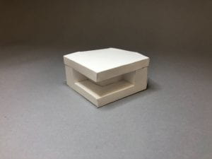
Final Form
Although the form is made, there are still some problems such as the taps on the upper part cannot connect the part it supposed to be. The total length of upper part and lower part is longer the target length due to the paper thickness. There must be better template option if doing more experimenting.
Option 3: Comparison
For the second part of the project, I chose to a variation of the form. Stead of cutting the part in the middle front, how about cutting out space around the form? With this in mind, I started to sketch out the idea.
And then, I started to build the form by using small pieces. I tried out multiple times in order to get one paper template. During the process, I made some changes from initial idea to get higher feasibility.
Final Form
Overall, I think the comparison is successful, but it stills have defect including hollow and alignment . Some places turn out well while some places are still off. Making the template was really challenging and took a lot of time. Overall project lets me realize the design process: start at a point, keep developing, keep trying until it works.


 Thankful to multiple measurements, I don’t need to do any modifications after the first laser cut, but I need to adjust the laser cut setting in order to completely cut through. I was so rushed to do the laser cut, so I don’t have time to take photos. Since the gaps are precise, the connection is pretty smooth.


 Paper template: