Imagined Journey

Ideation

To reimagine the Journey, we had to come up with a short and reimagined experience. Below is an attached picture of mine

My concept for this project focuses on the final treasure, the RPAC jacuzzi, and begins to play with the idea of what strangers mean to others. Jacuzzis are a weird and uncomfortable public spaces and coming to OSU and being forced to interact and meet people seems to be represented by that well. I included Haikus from anonymous people about their feelings on strangers to capture a chaotic mind state. The final project is an abstracted version of that same jacuzzi with a hand reaching out towards the viewer.

View my ideation process here: Scan Dec 12, 2019


Process

For my process post, I recorded a vlog because I felt like it better documented my process and that you can view here: https://youtu.be/fOlV_uasnt8

In front of the jacuzzi I included a display of haikus that other people wrote about strangers pictured below. It is titled “Warmest Regards,”

Towards the end, it started to leak so I went to the store before hand and got paper wrap, ziploc bags, and condoms to try and water-proof it. None of those worked though! So I used a trash bag and a lot of duct tape. I also added tension by putting a rubber band around it and used towels to control the leaking.


Final

Below are images of the final. A video of the final is also included in the process vlog.

Here is a short video of the final


Sensory Abstraction

Research

My initial ideas and their pros/cons:

  • Candle
    • pros: heat, smell, and scent (a lot of senses for abstracting), this could have a fun and attractive color scheme.
    • cons: seems too easy to abstract and I would like a challenge to push myself, might be too vague, just doesn’t feel right.
  • All senses (an experience like just taking in and paying attention to every sense in a calm environment) (another idea was to strip down one sense like smell to that unbiased state and abstract it through other senses like the literary device synesthesia)
    • pros: could be a good challenge because I wanted to make it applicable to every experience that ever happens just by taking out all bias and emotion and just creating something that resonated with everything.
    • cons: senses are inherently processed with emotion and for that reason, it is hard to find that unbiased viewpoint, too vague, every experience isn’t one specific experience
  • Song (This one I was just confused on the project and though we could tie in auditory aspects and just was thinking about using a song to abstract a different experience instead)
  • THINGS I HATE (this is where my final idea came from)
    • pros: I have a lot of passionate hate for things like tapping and chewing and just repeated rhythmic annoyances in general, I feel physical hatred for them and it is a large sensory experience
    • cons: could be too niche and specific to my own self

Click to see my mind maps of these ideas here: Mind Maps

  • MY FINAL IDEA: Hypersensitivity experience to those who have ADHD (I have ADHD and I know the effects of being hypersensitive to sounds when it is unknown to others. I decided that this wasn’t too niche because it is a normal thing to be annoyed by loud eating and other sounds (in other extreme cases it can be called misophonia).

Click to see my mind map for my final idea here: Hypersensitivities and Elements&Principles


Furthering my Eating Research

Below is a jpg of images I gathered that sparked anger and disgust in me.

Iterations/Ideations/Draft

Below I had planned to include a calm-before-the-storm feeling, anger, disgust, and sadness, but I decide afterwards that I just wanted to have those two main components of anger and disgust. Including all four was my way to tell a timeline, but I decided to just stick with a pinpoint moment.

iterations (2)-2

Below is the progression of my concepts in order from

1. The timeline idea with CBTS, anger, disgust, sadness

2. Continuation of the timeline idea

3. Timeline that centers around anger and then spreads to disgust, sadness, and then the calmness (which differs from the calmness beginning the timeline)

4.The first version of my final

5. A more developed version

6. A different take on the color scheme with just anger and disgust

7. The last iteration before my final

Concept Iterations

I printed #7 as my draft and brought balls of air dry clay to put onto the green blobs to paint green for my 3D element.


Final! 🙂

During my draft critique I realized that I didn’t want to add 3D elements that were popping out at you because the whole experience is based around silently suffering and hiding your anger. To accomplish this, I made the green blobs more bold so they were interesting without a 3D elements and I darkened the background for larger contrast. My 3D element was a subtle piece of fabric to add texture and roughness to the spiky objects below. The low contrast on the bottom was intentional to create confusion and frustration. Again, I wanted a subtle 3D element to show the frustration of hiding the annoyance.


Pattern and Scale

Iterations and Development

Above are the patterns with color from the last project. We were assigned the task to redesign them to look either like depth or like volume. I explored possible designs for both designs as shown below.


Below are my iterations. I picked those in the third image because I felt as if they best convey the meanings of the words (depth on right, volume on left),


Construction and Finalization

This project was made to challenge our craft, but it was also made to challenge our abstract thinking. A lot of the time was spent between students trying to define the difference of depth and volume. This project I worked on being okay with letting go of bigger ideas to get it down within the time frame while still making a product that I’m proud of.

Below is depth

Below is Volume


Abstracted Metamorphosis

Research and Abstraction

For my three forms I picked a toad, armadillo, and a lily flower. I wanted to choose natural forms that had a unique geometric feel to them, like the toad and armadillo. I selected a lily because they have been on my mind lately and felt like it was needed. You can view my original breakdown of these forms here: forms


Reconstruction

I made 15 iterations for each of the three forms. This helped me to think of ideas because I put all of my ideas on the page even if I thought they were bad. Below is the process of the reconstruction of the lily flower. This reconstruction was the biggest challenge for me and required the most drawing from imagination rather than drawing from another image. Below are the beginning reconstructions of all three forms, and then a more in depth reconstruction process for the lily.


The Armadillo Amphitheater

This theater I had in mind to belong to some sort of summer camp held somewhere in Arizona. The stage is perfect for end of camp talent shows or inviting the locals to a small acoustic set. I wanted the theater to feel small and homey for those who would visit.


Bed Side Hero

This rough and tough action star is the purfect protector against the monsters under your child’s bed and is especially good at scaring off the boogey man in their closet. This dynamic character is equipped with movable action joints, a soft plush body, and detachable armor. Sensational for fighting all things that go bump in the night, the Bed Side Hero really is no scaredy cat.


Full Music Immersion experience chair

The FMI chair is great for any child, teenager, or adult that has been on the hunt for that perfect place to listen to their new master playlist. Not only does this chair form perfect to each persons unique body, but it submerges you in the music experience of a lifetime. Find yourself humbled while you are swallowed in a cocoon of immersive sound.


Final

This project definitely challenged my ability to draw from imagination. Creating ideas based off of these abstracted forms did however seem really encouraging and exciting from an industrial design viewpoint. Talking with others in critique was actually one of my favorite parts of this project because everyone seemed so eager and excited to be creating these things purely from imagination!

Color and Pattern

Introduction to Color

Our first introduction to color was a RadioLab podcast over color and how it affects us. Following we had questions about how colors affected us and how they affect the way we see the world around them. Following the podcast we had to make a color collage of the words “soft” and “energy”. This portion of the project made me look at color from a new perspective. I struggled when I would begin to put things on the collage that I was favoring for texture rather than color. I did end up using textured objects, but only after I originally picked them for their color.

On the left is “soft” and on the right is “energy”


Introduction to Pattern

Taking natural forms, we trace the components, directional lines, values, and proportions, to begin observing organic and natural versions of pattern.

Above are the rough sketches I did to showcase these patterns. I wanted to pick objects from nature that had a cozy energy around them, or objects I favor. From this table, I initially chose the directional manatee photo and the baby platypus’ foot. Eventually I switched from the directional manatee to the proportional cauliflower because I felt the cauliflower had a more dynamic and asymmetric layout which achieved the feeling of “kooky and bubbly” which was intentional.

This was the very beginning stages of the directional manatee


Color Iterations

I knew I wanted one design to be bright and bold and the other I wanted to have more muted natural colors. For my iterations of both, I planned on giving the paw bright colors and the cauliflower muted colors. Although I later changed this mindset, you can view some of my original color schemes here: Color iterations

I decided agains those color schemes of the paw because I felt as if the static design felt better with a more muted color scheme. I ended up choosing the orange, blue, green color scheme for the cauliflower to keep the sense of “kooky and bubbly”.


This is my final symmetrical design. In the draft critique I had a white background and a yellow or green one was recommended. I feel like the yellowish/ ivory background makes the colors work together to form a harmonious balance.
This is my final design for an asymmetrical pattern. In the draft critique I had a white background and a yellow one was recommended. I felt that the comment was right to add a background, but yellow washed out the brighter colors and I wanted to stick with a color that kept the vibrancy.


Taking into account what I had learned from lessons and from classroom critiques, I was able to develop a final product which will be inserted below.

Interpreted Journey

Developing the Point of View

Originally I planned on doing the journey through the point of view of being chased; I decided to do the alien view because I felt it would be a different challenge.

See my iterations and notes here: interpreted journey iterations (there are three sets of being chased, one of flying, one of alien, and they all are read horizontally left to right)

Weening off the idea of being chased, I didn’t want to insert a lot of people because I wanted to focus on the landscape aspect. This is why my final doesn’t have the alien in the jacuzzi or him riding a bird scooter.

I used canted angles to signal confusion of the alien. I also made University Hall from a high perspective on with the bird sketches, but I decided to put a low angle of University Hall to make it seem overwhelming for the alien.


Choosing one Path

I was most excited for my alien path because I felt confident in portraying his confusion. My critique group did help me realize that my initial ideas were a little too imaginative and reminded me to continue to focus on the angles/ perspective. This helped me to stick with the views being from his perspective.


Final

For the final I used gray scale markers, which I really enjoyed. I outlined the drawings in black to make them have harder edges, but it may have made the drawings not as bold. I really wanted to focus on perspective and portraying the mood through only needed details. I have a bad habit of drawing too light and focusing too hard on details rather than the big picture; I felt that the markers really helped with that.

You can view my final here: interpreted journey

1.) My first drawing is the first thing the alien takes in on this new planet. He is looking at some unknown objects (acorns) in his hands that have a dizzying perspective. Hayes Halls is seen blurred in the background.

2.)My second image is a canted view of a tree and recycling bin somewhere on the sidewalk after Hayes Hall and before University Hall. The canted view gives a feeling of confusion as he’s worriedly exploring this odd place.

3.) My third drawing is a low angle view of University Hall. I meant for this to give an overwhelming feeling.

4.) My fourth drawing is a drawing of Thompson Library. I included it to show the contrast of modern architecture compared to the more traditional architecture of University Hall.

5.) I included this fifth drawing of a propped open door to show how the alien got into the RPAC. I inserted odd symbols and writing on the door to show that the alien is unaware of the language on the door.

6.) The final drawing is the destination of the alien. The jacuzzi has a longer stretched distortion to it and a semi-glowing effect to it. I included odd letters in the jacuzzi as well to continue to show that he doesn’t know the language.


2D to 3D Orthographic

The First Cube

I was determined to get a perfect cube on the first try (I didn’t), but the second time I was more conscious of my pressure on the blade, lining it up with the ruler to avoid cutting into the actual planes, and how much glue to use on the tabs. The second cube took me around two and a half hours but I ended with a product that I was proud of.


The First Orthographic Drawings

The orthographic drawings seemed easier when it was being taught to me but I learned quickly that it was a genuinely difficult practice to get used to. After the first worksheets with it though, I was definitely more confident with orthographic drawing. See this first worksheet here: orthographics


Iterate

I wanted to focus on building and make sure that my shapes gave me the opportunity to learn a solid foundation of building through Bristol paper. I struggled with making ideas that stood out in detail and pattern because I wanted that firm foundation. I now know that I will be extremely confident later when building for other projects. Below are images of my first rough sketches for ideas.


Orthographic Drawings

I felt more confident going into this second round of Orthographics, yet I still struggled to visualize where things belonged. The lines seemed to get confused in my head and I feel like I could visualize them more with breaking apart the drawings and simplifying them. You can view these orthographic drawings here: Scan Oct 8, 2019

Construction

Most shapes were smooth-sailing due to them being rectangular prisms. The first design, however, was the hardest despite its simplicity. I went through around 6 cone templates before I got it to work.

Above is my first attempt. To get a rounded cone, I thought scoring it with vertical lines would help make the curves more fluid. I was wrong and it gave it a bunch of little edges. My final attempt involved soaking the cone template with water which helped it to curve flawlessly.

To insert the cone into the rectangular prisms, I calculated the circumference of the cone for each side it would be entered into.


The rest of the templates were straight forward. They took the most time solely because they were simple and I wanted to perfect them.


Final

The final project is overall something that I am very proud of. I feel like this project looks simple to many people who are not in design, so it is easy to get discouraged when those around you are acting like it is easy. It is a hard, exact, and necessary process and skill to have that goes unseen by most people, and that is okay! This project also taught you how to be confident in your own abilities and time commitment. You can see my final project and aerial views of my final below.


Spatial Assembly

Learning the Technique

We began learning how cubes are shown through one-point and two-point perspective. You can see the beginning process of that here. Through this I learned how high/ low or to the right/left an object should be to get my desired perspective.  We furthered this by applying more complex shapes to the perspective techniques and adding shading, which you can also see here.


Designing the Room

It was time to apply the new uses of perspective and shading to a comprehensive room. We began with a practice room/ perspective grid and placed a simple cube within it, which you can see here. I knew I wanted my room to be simple and minimalist. To do that, I would have to find a way to add some complexity to the drawing somewhere, so I took another spin at practicing shading and the way that it can affect a space. I feel as if I could improve upon my shading skills or try new shading techniques like stippling or cross hatching. I also included a cat with my room; I would like to get more practice at drawing organic objects in perspective. I tried to be conscious of depth cues like darker objects being closer and closer objects having more details (I tried to do this especially with the leaves on the front porch).


Contents of the Room

I wanted a clean room that I could see myself actually working in. You can view the final project here.

-I added a hanging chair that has a track attached to the ceiling. This would allow me to easily move myself to different areas in the room without extra floor clutter.

– I added a large window that would let in tons of sunlight and would be a nice place to swing my chair towards if I needed a break (also an excellent place for the cat).

-The candles allow a soft and welcoming environment for when the ceiling light becomes too much.

-The desk is against the wall with minimal decorations to allow all focus to be on whatever project I am working on.

-In the back of the room is a tiny door. I’ve always wanted some sort of interesting passage (or even a secret passage) of my own.


2D Principles and Squares

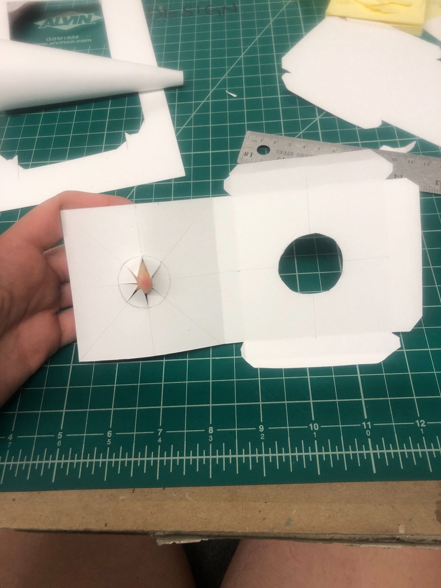
Research and Iterations

To make accurate representations of six different words with four squares I researched the words and used the elements and principles that we learned in class to create concept ideas. To see this research, click: research

Making squares using combinations of the elements and principles helped me to think of ways to manipulate those techniques to create certain moods and environments. To see these, click: elements and principles variations

From there forward, I began to sketch versions of these squares to see which deliveries of the concepts were most successful. To see these iterations, click: square iterations


Draft

Narrowing down the squares, I tried to pick the ones that resonated most with myself. One of the many things that I can take away from this assignment is to make sure to look at it from an outside perspective, which is something that I initially struggled with. With a lot of my designs, I used my own reasoning for the square placement and color instead of a more general interpretation. I now feel like, especially projects that have so much minimalism, it’s important to have a more problem-solving approach rather than a personal goal in mind.

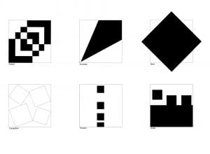
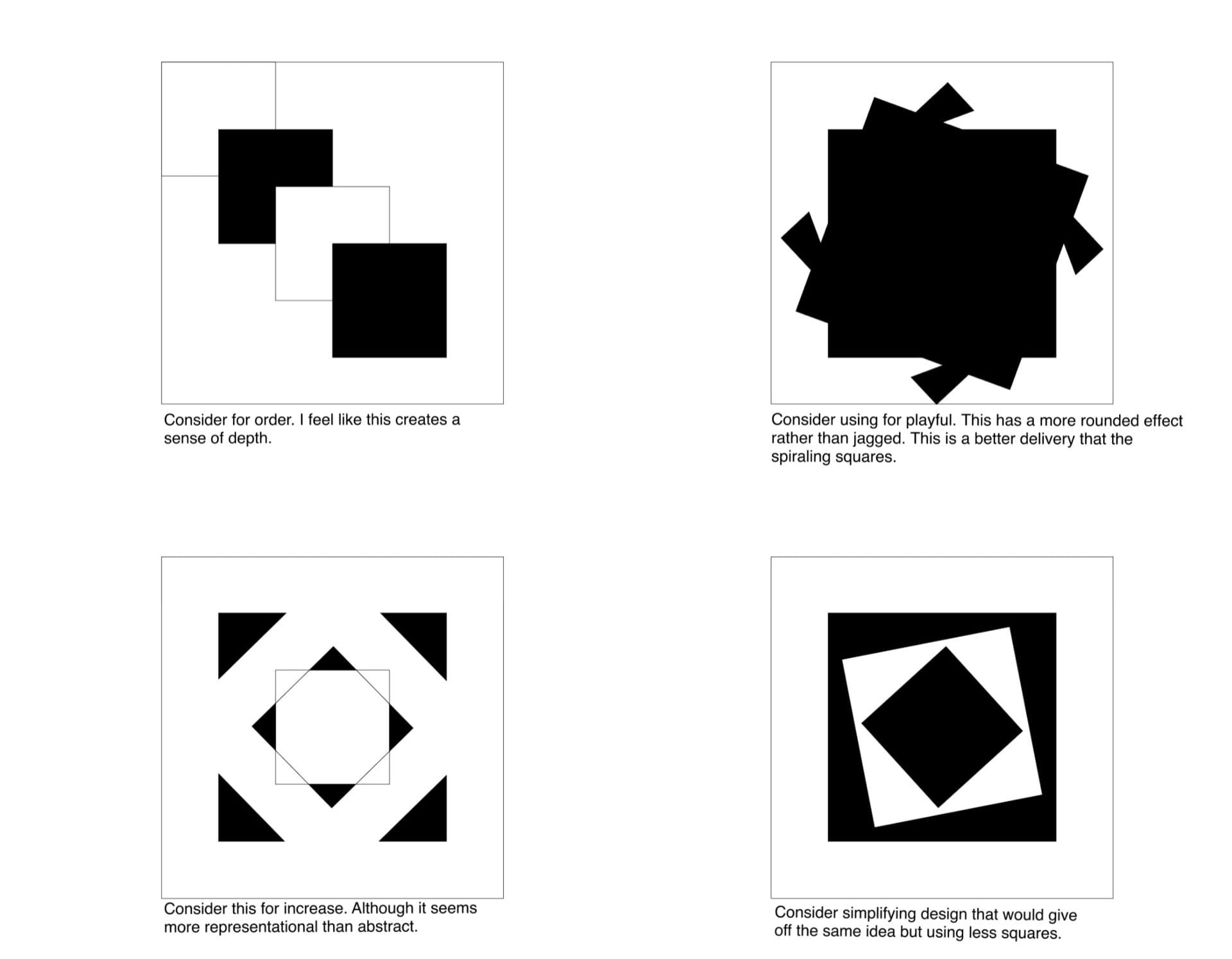
Top row from left to right:

1. For playful I originally used this design because it was the most vibrant one that I had. I tried to use movement by not allowing the viewer’s eye to be directed in any particular direction. Although I liked this design, and those in my critique group agreed, that it doesn’t necessarily fit into the word playful. I would say that this design was too abstract and rigid for the word ‘playful’, but I may keep it in my back pocket for later design inspiration.

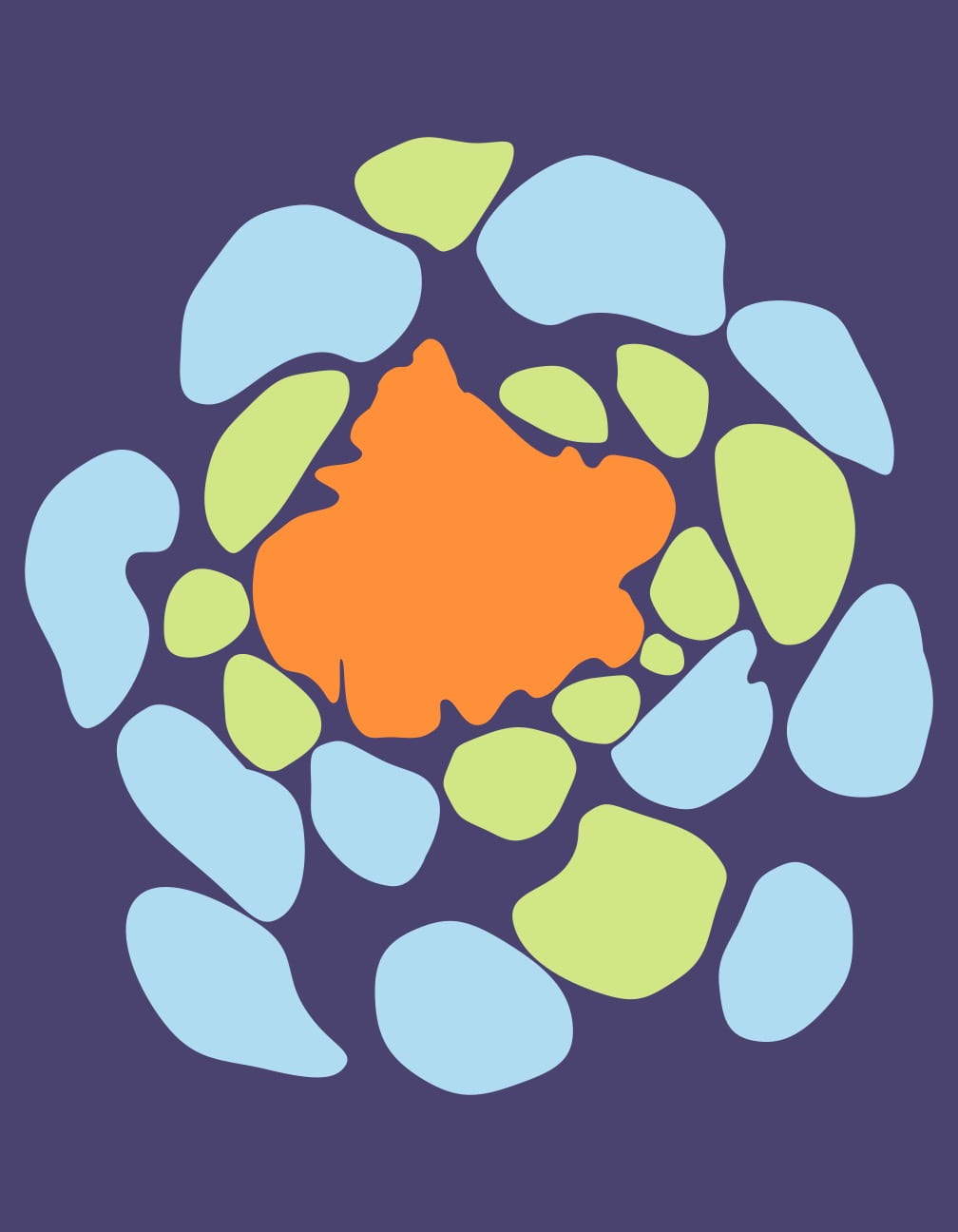
2. Increase proved to be the most successful for my draft critique. I feel as though the minimalism of this design makes it more effective by giving the viewer only one thing to look at. I attempted to use both scale and movement in this example. The extreme increase in size widens the scale moves te eye from smaller to larger.

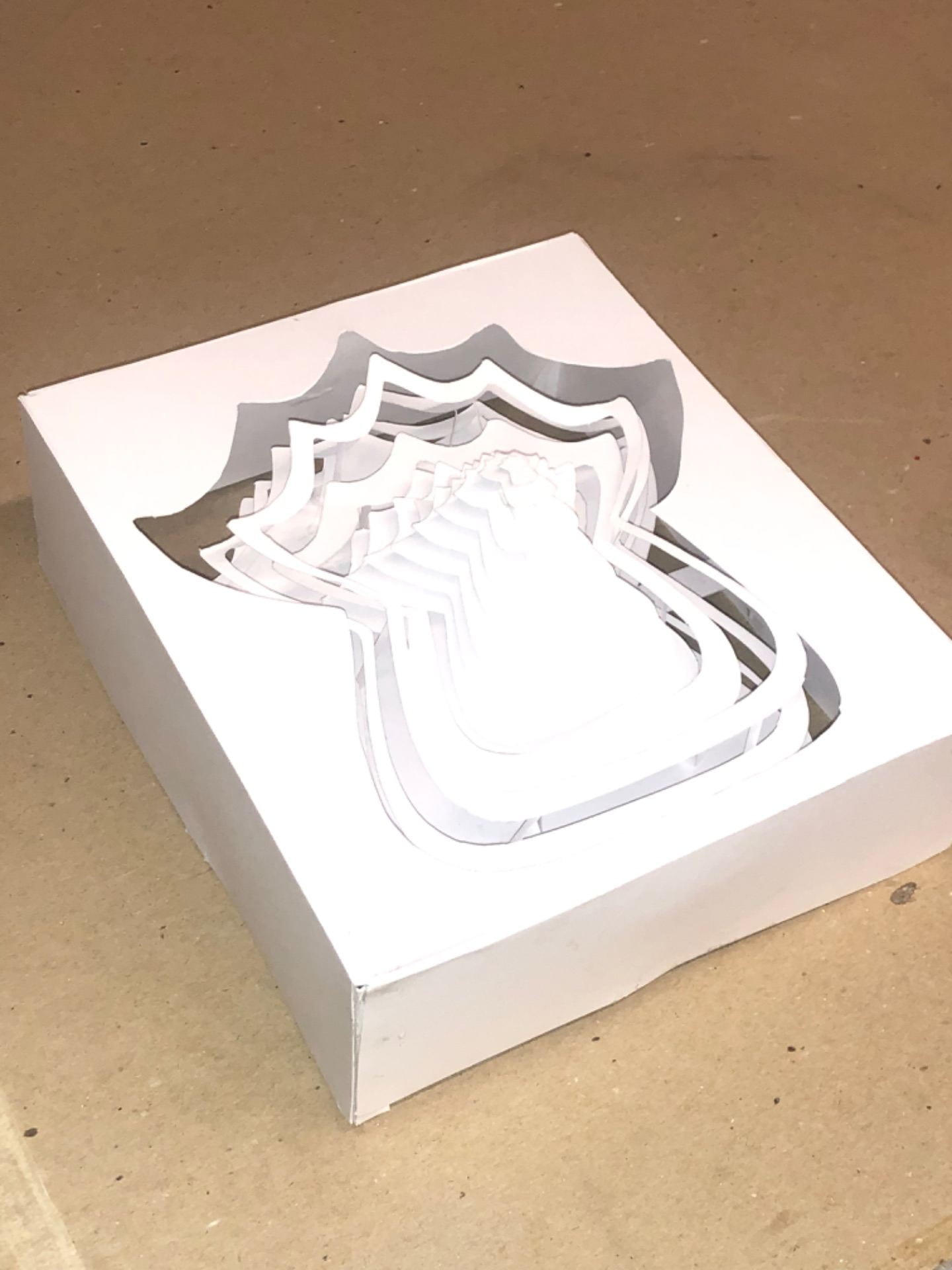
3. For bold, I used the same concept of minimalism as I did in increase. This is purposely the only image that goes outside the 3×3 square; I feel as if “breaking the mold” is a big part of bold’s meaning. I used contrast and going outside of the margins to create emphasis. I also used symmetry so there was no confusion on the eye.

Bottom row from left to right:

4. This design for congested was actually lightly criticized in the critique because the four squares got lost in the background. However, after playing with different colors and line widths, I think I’ll stick with it because I feel as if the lined squares give the eye more things to look at which makes the image feel congested. I used a lack of balance to create a more chaotic and unplanned image and lack of contrast to make the image feel stuck in one spot.

5. For tension, I used the idea of a build-up to express the word. Using unity, I placed squares closer and closer together to signify an increasing build-up of potential energy. It was suggested in the critique that I make the boxes slightly closer/tighter to lessen its bouncy effect.

6. Lastly, for order I attempted to use movement to show boxes going in order one after the other. I found that this idea was too representational and was not received as well as I had hoped.

Rethinking Playful and Order

So it was back to the drawing board for playful and order. I was almost excited about this setback because it gave me a chance to get better at knowing how to make a design decipherable to a first time viewer.

The first image was a redo of ‘order’ that was better received with my peers. I wanted an incomplete pattern because I felt as if the incomplete pattern made there a feeling of more possibly being added to it. The second image and the fourth image was a redo of ‘playful’. I liked the spiraling effect that they had, but I felt as if I could expand upon that more. To see that expansion of ‘playful’ designs, click: playful iterations


Final

Journey to a Treasure

Process

Drawing using Triangulation made me feel much more in control when doing observational drawings. It helped me to create the correct proportions a lot easier than I had before.

Walking the path given to me was the first task. Finding something new along an almost familiar path was the second task. Finding meaning along my way came almost naturally. There’s something for everyone on this campus.


My 5 Places

Drawing five meaningful stops along the way, I found inspiration in most pictures. Sitting and drawing something gives you a lot of time with that certain something, Maybe the reason I was drawn to so many buildings was because of all the possible stories they could hold. My lunch and the hot tub may seem mundane to others, but by giving an anecdote with them I hoped to involve the viewer in the drawing.

Triangulation is a new method of drawing for me, however not being perfect at it yet, I know it will help me exponentially and I am excited to involve it more in my process.