Color and Pattern

Introduction to Color

Our first introduction to color was a RadioLab podcast over color and how it affects us. Following we had questions about how colors affected us and how they affect the way we see the world around them. Following the podcast we had to make a color collage of the words “soft” and “energy”. This portion of the project made me look at color from a new perspective. I struggled when I would begin to put things on the collage that I was favoring for texture rather than color. I did end up using textured objects, but only after I originally picked them for their color.

On the left is “soft” and on the right is “energy”


Introduction to Pattern

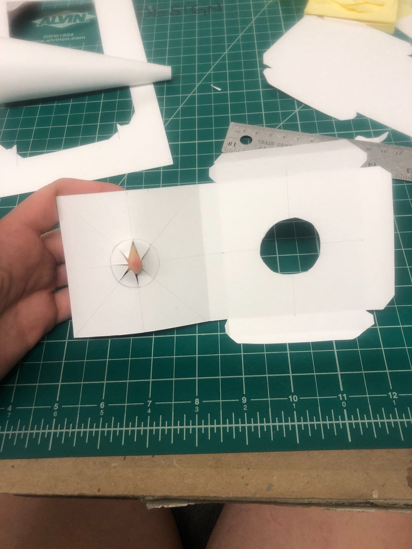
Taking natural forms, we trace the components, directional lines, values, and proportions, to begin observing organic and natural versions of pattern.

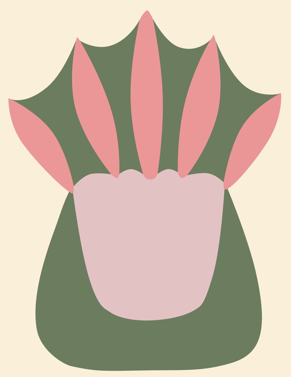
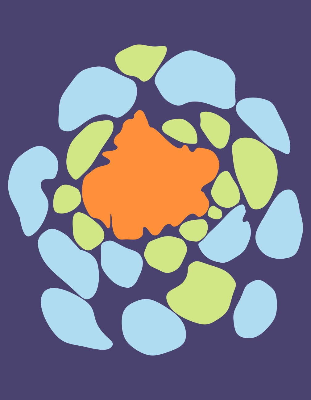
Above are the rough sketches I did to showcase these patterns. I wanted to pick objects from nature that had a cozy energy around them, or objects I favor. From this table, I initially chose the directional manatee photo and the baby platypus’ foot. Eventually I switched from the directional manatee to the proportional cauliflower because I felt the cauliflower had a more dynamic and asymmetric layout which achieved the feeling of “kooky and bubbly” which was intentional.

This was the very beginning stages of the directional manatee


Color Iterations

I knew I wanted one design to be bright and bold and the other I wanted to have more muted natural colors. For my iterations of both, I planned on giving the paw bright colors and the cauliflower muted colors. Although I later changed this mindset, you can view some of my original color schemes here: Color iterations

I decided agains those color schemes of the paw because I felt as if the static design felt better with a more muted color scheme. I ended up choosing the orange, blue, green color scheme for the cauliflower to keep the sense of “kooky and bubbly”.


This is my final symmetrical design. In the draft critique I had a white background and a yellow or green one was recommended. I feel like the yellowish/ ivory background makes the colors work together to form a harmonious balance.
This is my final design for an asymmetrical pattern. In the draft critique I had a white background and a yellow one was recommended. I felt that the comment was right to add a background, but yellow washed out the brighter colors and I wanted to stick with a color that kept the vibrancy.


Taking into account what I had learned from lessons and from classroom critiques, I was able to develop a final product which will be inserted below.

Interpreted Journey

Developing the Point of View

Originally I planned on doing the journey through the point of view of being chased; I decided to do the alien view because I felt it would be a different challenge.

See my iterations and notes here: interpreted journey iterations (there are three sets of being chased, one of flying, one of alien, and they all are read horizontally left to right)

Weening off the idea of being chased, I didn’t want to insert a lot of people because I wanted to focus on the landscape aspect. This is why my final doesn’t have the alien in the jacuzzi or him riding a bird scooter.

I used canted angles to signal confusion of the alien. I also made University Hall from a high perspective on with the bird sketches, but I decided to put a low angle of University Hall to make it seem overwhelming for the alien.


Choosing one Path

I was most excited for my alien path because I felt confident in portraying his confusion. My critique group did help me realize that my initial ideas were a little too imaginative and reminded me to continue to focus on the angles/ perspective. This helped me to stick with the views being from his perspective.


Final

For the final I used gray scale markers, which I really enjoyed. I outlined the drawings in black to make them have harder edges, but it may have made the drawings not as bold. I really wanted to focus on perspective and portraying the mood through only needed details. I have a bad habit of drawing too light and focusing too hard on details rather than the big picture; I felt that the markers really helped with that.

You can view my final here: interpreted journey

1.) My first drawing is the first thing the alien takes in on this new planet. He is looking at some unknown objects (acorns) in his hands that have a dizzying perspective. Hayes Halls is seen blurred in the background.

2.)My second image is a canted view of a tree and recycling bin somewhere on the sidewalk after Hayes Hall and before University Hall. The canted view gives a feeling of confusion as he’s worriedly exploring this odd place.

3.) My third drawing is a low angle view of University Hall. I meant for this to give an overwhelming feeling.

4.) My fourth drawing is a drawing of Thompson Library. I included it to show the contrast of modern architecture compared to the more traditional architecture of University Hall.

5.) I included this fifth drawing of a propped open door to show how the alien got into the RPAC. I inserted odd symbols and writing on the door to show that the alien is unaware of the language on the door.

6.) The final drawing is the destination of the alien. The jacuzzi has a longer stretched distortion to it and a semi-glowing effect to it. I included odd letters in the jacuzzi as well to continue to show that he doesn’t know the language.


2D to 3D Orthographic

The First Cube

I was determined to get a perfect cube on the first try (I didn’t), but the second time I was more conscious of my pressure on the blade, lining it up with the ruler to avoid cutting into the actual planes, and how much glue to use on the tabs. The second cube took me around two and a half hours but I ended with a product that I was proud of.


The First Orthographic Drawings

The orthographic drawings seemed easier when it was being taught to me but I learned quickly that it was a genuinely difficult practice to get used to. After the first worksheets with it though, I was definitely more confident with orthographic drawing. See this first worksheet here: orthographics


Iterate

I wanted to focus on building and make sure that my shapes gave me the opportunity to learn a solid foundation of building through Bristol paper. I struggled with making ideas that stood out in detail and pattern because I wanted that firm foundation. I now know that I will be extremely confident later when building for other projects. Below are images of my first rough sketches for ideas.


Orthographic Drawings

I felt more confident going into this second round of Orthographics, yet I still struggled to visualize where things belonged. The lines seemed to get confused in my head and I feel like I could visualize them more with breaking apart the drawings and simplifying them. You can view these orthographic drawings here: Scan Oct 8, 2019

Construction

Most shapes were smooth-sailing due to them being rectangular prisms. The first design, however, was the hardest despite its simplicity. I went through around 6 cone templates before I got it to work.

Above is my first attempt. To get a rounded cone, I thought scoring it with vertical lines would help make the curves more fluid. I was wrong and it gave it a bunch of little edges. My final attempt involved soaking the cone template with water which helped it to curve flawlessly.

To insert the cone into the rectangular prisms, I calculated the circumference of the cone for each side it would be entered into.


The rest of the templates were straight forward. They took the most time solely because they were simple and I wanted to perfect them.


Final

The final project is overall something that I am very proud of. I feel like this project looks simple to many people who are not in design, so it is easy to get discouraged when those around you are acting like it is easy. It is a hard, exact, and necessary process and skill to have that goes unseen by most people, and that is okay! This project also taught you how to be confident in your own abilities and time commitment. You can see my final project and aerial views of my final below.