Checkmate: Process

Concept Statement

For the “Checkmate” project, my partner and I chose the concept of the chess pieces to reflect the true beauty or ugliness hidden behind one’s facade. We left the front side of the chess pieces their standard shapes and kept them unpainted. This reflects that judging someone’s character based off their appearance is very deceiving. My side of the chess board emphasizes the good hidden within a person. They are painted in warm tones to make them strong and inviting, and the forms themselves are left unbroken. Contrast is heavily used between the front of the pieces and the back to reiterate that stark contrast within a person. Contrast is also used between my pieces and my partner’s pieces because hers display the ugliness within a person.

Narrative Story

In order to create a clear concept, we started out by formulating a story:

Once upon a time, there were two kingdoms ruled by two brothers. On the surface, the brothers looked merely identical. They moved, talked, and even acted to the public like mirrors. However, under the surface, the brothers could not have been more different. Where one was a man of high integrity and honor, the other was one of deceit and destruction. The first brother, with his kindness and wisdom brought great success to his kingdom. But, no matter how hard the second brother tried to hide his true self, his wickedness eventually led to the demise of his own. Now the brothers, still identical on the outside, are stuck with their fates, because looks are fleeting, but character is forever.

Research

In order to get a better understanding of the project, I looked up some of the rules and made some notes. From those rules, I brainstormed some possible ideas to accommodate them.

Chess Rules

My partner, Raneem, and I had a broad range of ideas for our concept. We loved the opportunity to use contrast, so we incorporated that into our ideas.

In terms of material research, we tested out both chipboard and paper. Due to the limited time at the laser cutter, we found that watercolor paper was a durable option.

I looked at a few examples in class for ideas on how to start assembly.

Slice-form examples

Exercises

We practiced the general assembly of slice-forms by making test pieces.

Iterations

Our first idea was to create pieces that reflected important aspects of each of our lives. I took those object/ideas and turned them into abstractions for potential piece shapes.

I Started to turn those abstractions into possible forms:

Basic chess forms

Link to reference photo

Chess Piece Reference

Another concept we thought of was the contrast within a person (appearance vs. personality). We thought of a few ways to represent that. I started by making a list of opposites that could potentially portray that concept.

We thought about using contrasting symbols like moths and butterflies or simply using pristine vs. destroyed pieces.

Production

I started by putting my pieces into Illustrator to make some test cuts.

Rook version 1
King
Knight
Queen
Rook

We tried chip board, then ultimately decided that watercolor paper would be the best option due to scheduling issues with the laser cutter.

Chipboard pieces

I then cut out the Illustrator file on the Cricut.

I used a series of slices of .02 inches to connect the circular pieces to the main forms.

Pawn Pieces
Finished Pawns

For the knight, I had to hand-cut a few of the pieces because it was an organic shape unlike the other pieces.

Side piece
Base connector

I then painted the back of each piece with warm-colored acrylic paint in contrast to my partner’s cool-toned pieces. The warm colors emphasize their integrity and strength.

Painted rook

Individual Piece Selections

Pawn: flag

Rook: Castle Tower

Knight: Horse

Bishop: Sword

Queen: Crown

King: Throne

My partner and I thought that keeping similar forms to the original would emphasize our theme more because it shows the sharp contrast in looks between the front and the back of the pieces.

Final Images

My side of pieces
Full chess set


View individual pieces at Individual Chess Pieces

Overall, this project was a great way to learn more about 3D forms. It was a challenge at first to learn how to assemble the forms, but I really enjoyed the process. However, I think my pieces could have benefited by leaving the front form completely flat to emphasize the theme of superficiality.

View final portfolio project at Checkmate

Dynamic Pages: Process

Concept Statement

This dynamic triptych was inspired by the musical elements of the lo-fi song, “Morning Moon,” by Kanisa, Wishes and Dreams. (Time 1:15-1:26). The composition is divided into three different parts representing the careful layering of instruments (piano, electronic strings, and saxophone) that unite to give the listener/viewer a sensation of peace and relaxation. The panel displayed here individually has an overall simplicity, because it represents the raw breakdown of the piano. The piano is represented through circular mechanisms to show its consistency throughout the piece. The circles increase in size as the mechanism is being pulled, which shows the escalation of the actual notes being played through rhythm and repetition. The pull-tab mechanism also utilizes elements like a leading line to guide the viewers eyes to the rest of the composition. The cohesive color palette of the panel and the entire composition consists of two cool-toned colors contrasting with one warm, which creates an overall harmony within the piece as well as its overall curve-linear shape. It also emphasizes the idea that all of the instrumental parts unite to create a complete sense of relaxation.

Research

This project was really exciting to me because I have a strong background in music. I was also placed in the group of three, which gave us a great opportunity to capitalize on the importance of individual instruments. For our research, we each looked up different styles of music we were interested in.

Links to the songs i found:

Fine Coffee Jazz

Jump Up-7” edit

When we got to class to share our ideas, we found that Tawny’s song she found called “Morning Moon,” was our best option. There were three clearly defined parts of the song, piano, electronic strings, and saxophone.

We also made a mind map to collect all of our thoughts to clarify them.


In class, we drew how we visualized a song. I often associated staccato, moving notes with a wave/escalating image, which late influenced my project.

Music to Visuals

We were really inspired by how abstract putting music to paper could be. It allowed us to express how we interpret sound in a much more physical way. Every time there were moving notes, I pictured forms in a flowing sequence, which is what I ended up focusing on in my final.

When we were formulating our concept, we used the same technique to visualize our chosen song.

“Morning Moon” visualized

Exercises

Exercise 1

For this project, researching paper mechanisms was one of the most important steps to complete it. I looked up video and picture tutorials to generate more ideas for my panel.

I found a few interesting pop-up tutorials to test out for my project. View tutorials at

Automatic Pull Strips

Simple Pop Up Card


This mechanism pops/folds up whenever the paper is opened.

I also tried a much simpler mechanism, which was a simple pop-up. I wanted to become more familiar with the basics before I started something more complicated.

Iterations

For the mechanism I planned on using, I created many different iterations of it. They were all inspired by the tutorial Waterfall Card Tutorial

I started by making the first one straight like the tutorial, but I began to experiment with what it could look like if it were curved. I tried a few different versions of that because it was difficult to get the scoring in the correct increments.


Iterations for overall composition

Production

I began my construction process by cutting out circles of multiple sizes with the Cricut. I used cardstock for this as well as the rest of my compositions.


I then hand-cut a strip of paper and scored it in even increments. After doing that, I attached the circles onto it in increasing size order.

Front View

I then created A pull tab to connect the strip to. I attached then attached the mechanism to a base. I kept the base shape very curve-linear to fit with the idea of relaxation.

Mechanism on base

I realized at this point that I would need a way to keep the pull tab steadier, so I added a slit into the base, so the strip would have a guided path.

Pull-tab with slit

On the end of the pull tab, I cut out a shape similar to those on my partners’ work. I then filed the edges of it and the base of the composition.

Cut-out shape with file

I wanted to add more stability, so I cut slits to create a channel for the tab to follow.

Added slits

I created a loop to go underneath the slits and connect to the top of the tab. This allowed the tab to move straight without wobbling.

Loop

I did not like the way the small, purple loop looked, so I made thicker loop and replaced it to give it a much cleaner appearance.

Final Images

Beginning position
End position
Side-View

I used the app “Gif-Maker: turn videos to gifs” to make a gif of my section. You can view it by clicking on the image below.


Starting position
Ending Position

To put our project into stop motion, I used the app “Stop-Motion.” I also added a short clip of our song to play behind the composition.

Reflection

Overall, I felt that this project gave me much needed experience working in a group setting. Being a group of three had its challenges, but we were able to come together and create a successful composition.

View final portfolio project at Dynamic Pages

Sketchbook: Process

Research

In the beginning of my research, I learned more about mind-mapping to generate ideas more efficiently.

I class, we practiced using the prompt of “Which Season is the best?”

We took an approach based on overall “feel” of the season, which led us to choose summer.

I also took up embroidery and learned new techniques so I could incorporate that into my sketchbook as well.

Embroidery Tutorial

Embroidered “O” with flowers

Aside from the internet and outside research, I asked myself what I wanted for my sketchbook. My criteria was:

1. Access to online research

2.  Small/Portable size

3. Informational pages

4. Organized

Exercises

1. Mini Sketchbook

I experimented with how the sketchbook opens. I made it so it can be opened like a normal book, then flipped up and expanded to have more space. Inside of the sketchbook, I practiced more mind-mapping with the concept of “How to live your  best life.” I found that the answer is balance.

Iterations

Then I started in Illustrator on the size and design of my book. I made mine on the smaller side to keep it easy to travel with. The dimensions are around 6.4in x 8 in. The line weight is .072.

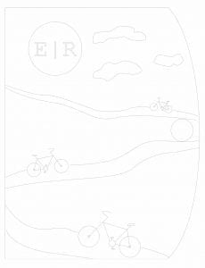
I wanted my cover to be something I enjoy looking at. We were asked in class to think about something that we really love. I thought about it, and even though it’s simple, riding my back is one of my favorite activities to do. I reworked my design to figure out a way to incorporate that image into it.

I kept the rounded edge because it gave the book a sleek finish. I also wanted to add something with a deeper meaning to my cover, so I added the Roman Numerals to my favorite Bible verse, Mathew 11:28. My faith is something very important to me, which makes my sketchbook even more personal.

Production

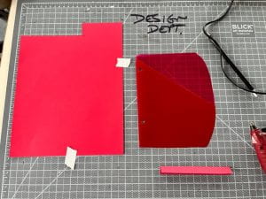
The first challenge of the sketchbook was figuring out the materials I wanted to use. I thought about chip-board or leather, but I wanted to use something I already had to create less waste. I took apart and old binder to get the cardboard underneath.

Binder with cardboard

I used the laser cutter to engrave my Illustrator design into my cover

Finished Cover

I began by looking at my lists of what I wanted in my sketchbook. One of the requirements was access to online notes, so as my “surprise element,” I made my own QR codes to download and put into my book. I used a printer and cut them out.

QR Codes

Order from right to left: Adobe Color, my portfolio, a linear perspective PowerPoint

The website I used:

QR Codes

The pages, I used the Cricut machine to cut out most of my pages. The materials I used were: gray cardstock (color-testing), sketchbook paper (notes and ideations), grid paper and tracing paper (precise drawing).

Vector page template

To save time, I moved to the laser cutter to finish the cutting process. I am much more familiar with the Cricut, so a few of my pages were slightly burned around the holes as I was adjusting the settings.

Laser-cut page

For a much needed storage element, I used old, unused tab dividers to hold and cut/sewed them to hold paper. I original was going to line the bottom with paper, but thread was a sturdier option and looked better aesthetically.

Construction of folder
Stitching
Pocket in book
Grid paper

When I came time to bind my book, I faced a few road bumps. I originally wanted to use spiral binding, but the measurements of my holes were slightly off, so I decided to use thread. If I were to do something differently, it would be to make the holes bigger, so the spiral could have worked because I wanted my book to lay flat.

I tried this first method of binding with thread, but found that it made the book difficult to close and the overall appearance was not as clean as I was wanting.

I thought about using Coptic, but I had so many holes on the side of my book, that it was not my best option in terms of efficiency.

I ended up following this video tutorial:

Binding Tutorial

Binding Detail

On my cover, I used a “French Knot” technique along with cutting the petals off of a fake flower to make the flowers in the basket.

Fake Flower
Cut flower petals
Flowers in basket

Final Product

Front


Back

I began a few note pages in my book to refresh my memories on important topics.

I used felt-tip markers to add some extra color.

Overall, this project pushed me way out of my comfort zone. Craft is very important to me and is something I am continuing to improve on, so the binding issues took up much of my time. From those issues however, I had to use design thinking to work out another solution, which was a great learning opportunity. In the future, I would love to experiment with new materials and push the boundaries even further.

View final portfolio project at Sketchbook

Mash Up: Process

Research

With this project, I had to familiarize myself with new softwares. I had never worked with Illustrator on the desktop so I had to watch a tutorial on the extrude and bevel tools.

Links for tutorial:

Illustrator Tutorial

I began combining words to create potential possibilities for my project.

I narrowed down my options to “Wintold,” (winter and cold) “Cozmas,” (cozy and Christmas) and “Snabin.” (snowy and cabin) I decided on “Snabin” because of how easily it rolls off the tongue and the many design possibilities.

Exercises

Exercise 1

We practiced using different softwares to create our initials in isometric. I used illustrator on my iPad to create mine.

I tried three different color options. In order to change the color, I had to redraw every piece of the letter using the pen tool and fill it in.

Iterations

Sprints

We did “sprints” to create ideas for our project. I put possible words into isometric and created possible post card designs for the word “Snabin.”

Other Iterations

I created one iteration for “Cozmas” then shifted my focus to “Snabin.” I tried both literal and poetic approaches. I included my post card iterations as well as a couple other ones I made in Sketchbook.


Production

I started in Adobe Illustrator for the desktop to easily put my word into isometric. I placed an isometric grid underneath the words for more accuracy.

I took a picture of the word and imported it to Sketchbook on my IPad. I began retracing and filling in the letters to create a clean look.

Filled in Letters

I kept the hues relatively dark to create an inviting and cozy feeling.

I began to add small details to all of the letters in Sketchbook. I used the technical pen for all of the solid colors and lines. For the pine needles, I used the feathery shape. In the window of the “A,” I used the glow airbrush tool. On the “S,” I used the rough charcoal tool to create a knit effect.

View all Letter Details at Snabin Details

After I added the details, I began to construct the snow globe.

The snow presented a challenge because I had to find the correct way to position it in isometric.

I added the base at an angle to make it seem like the globe was being shook.

For all of the shadows, I used the airbrush tool. I wanted the lighting to be dramatic, so I added a large shadow behind the globe and behind each letter.

For the snow, I used the speckled texture tool to create the individual flakes.

I used the Courier New font for my definition because it gave the poster a vintage and cozy look. It reads, “The coziest cabin retreat in the snowiest of winters.”

I then went back to add a plaque to the base of the globe. I wanted to add the plaque so “The Snabin” seemed like a real place people vacationed to.

Final Result

Overall, this project was a great way for me to work with new softwares and further my knowledge of isometric. In the future, I would love to experiment with a more complex font or different angle of the letters. I am looking forward to improving my digital skills in the upcoming semester.

View final portfolio project at Mash Up

Space and Time Walk: Process

Research

In class we looked at different styles of maps to expand our ideas of what a map could be.

View full map research at Map Research

As a class we went out and took pictures to work on our composition.

We also created a collage to get some inspiration for our final project. My theme for my map is the meshing of nature and man, so for my collage I decided to use strong contrast between the lush green and stark concrete.

I used jagged cutouts from magazines to represent the industrial part of campus.

I added 3D elements with softer edges to represent the natural part of campus.

Exercises

1. Written Descriptions

2. Visual Descriptions

Hayes Hall
Wexner Center of the Arts

View full pdf of visual descriptions at Compositions

Iterations

I did all of my planning on Sketchbook to get a clear idea of how I  wanted to layout my map. I experimented with words and how I wanted to portray the sounds I heard on my path.

Production

I began with the iterations on my iPad, forming new ideas digitally. I then transferred those ideas to paper.

I did a rough sketch of Hayes and started on the outlines of my buildings. I added 3D lettering to the buildings that followed my path.

I added more trees and details to my map including more dimension to my words.

I began to add color to my map using green felt pens. wanted to make my path stand out with contrast, so I used a different shade of green than the rest.

As a whole, this project was a very great learning experience. I learned that slow looking is an important skill to have, and using all of my senses will be crucial as a designer. I also enjoyed the amount of freedom we had to make our maps completely unique. In the future I want to push the boundaries more with my design and not be afraid to take risks.

View final portfolio project at Space and Time Walk

Perspective: Process

Research

I thought about multiple sizes that I wanted my studio to be. I decided on 13ft wide x 16 ft deep x 11 ft high. This gave me the opportunity to display more objects against the walls and a deeper space to work with. I had thought about doing a 15ft wide x 15ft long, but I thought that having a longer space added more dimension and interest to the whole composition.

I also used real pieces of furniture for reference. I had to make the dimensions a little bit different to fit my space, but overall they are very similar.

To view all furniture at Furniture research

I used these dimensions as a guide, but altered them slightly to fit a smaller space.

I also experimented with two-point perspective for some of my objects.

Piano in two-point perspective

Exercises

Line and Contour: Hole-punch

To practice contour, we chose one object to draw and transform it into a new composition. I chose a hole-punch and used repetition to create a sunflower-like object.

Triangulation Drawing: Derby Hall

For my triangulation drawing I focused on Derby Hall and its architectural details. I also wanted to capture the foliage surrounded the hall to create a more accurate depiction. I focused on shadows and contrast to help draw the structure.

Grid Space

In my practice grid space, I placed one vantage point near the center of the page and the other near the edge to create a more straight-on point of view.

Iterations

I kept the iterations relatively similar. I just adjusted the ceiling and wall decor/furniture placement. I had a pretty solid idea of what I wanted from the start.

To view all iterations view pdf:

Studio Iterations

Production

I began with my grid space of 13x16x11

Grid

I started with the furniture in the front and key architectural details to frame my space.

I used a window as a makeshift light table in order to trace my studio space onto my bristol.

After using pencil to draw my shape onto my bristol, I used a number 2 pen to trace over my lines.

Finally, after going over all of my pencil with pen, I went back to my drawing to add line weight to create depth and contrast.

My final project captures what I want in a studio. The high ceilings and the wall of windows give it an airy feel, whereas the large fireplace grounds and defines the space. Small details like the piano, bookshelves, and coffee cup, put more of my personality into the space.

Overall, this project presented me with new challenges regarding perspective and working with a grid space. I had to learn about new concepts like placing my vantage points or drawing structures like a piano or staircase. Through this project, I was able to learn new ways to draw in one and two-point perspective and gained a better understanding of how to visualize a space.

View final portfolio project at Perspective