Summary
The fundamental components of this project are color and pattern. Through the analysis of nature, one must explore how a pattern can be abstracted and developed with the addition of color. Color theory is a major consideration in color selection, as is saturation and value. The overall focus is derived from the use of design’s elements and principles: color, line, shape, rhythm/repetition, texture, and scale.
Reflection
My two designs are developed from an image of a frog’s eye and a rock formation. I abstracted the foundational shapes and simplified the overall image. I used a the application Vectornator to experiment with the different shapes and lines. When deciding which natural pattern I planned to use for my outline, I wanted to choose two very different references. I thought the concentric circles of the frog’s eye had interesting contrast with the pointy design in the eye. The rock pillars were my second choice for the pattern project because the horizontal movement of the rock layers intuitively contradicts its column form. I appreciate the variety of lines, both actual and implied within this form. My design was inspired by the the horizontal motion the layered earth suggests.
Eye Design
My initial interpretation the frog’s eye focused on its individual components. I decided to revise the triangular shapes within the eye, and place them in a more symmetric position. The triangles contrast the roundness of the concentric circles. As my ideas developed, I added more intricate triangles within the circle to create a fuller, more active design. When developing my tile that was to be repeated, I focused on using the maximum amount of space, as my design is simple and not overwhelming. In addition, by layering the circles, I demonstrate a slight depth. The center is still the negative space, so I transitioned the design into different shades and tints of the blue that outlines the other circles.

Rock Formation Design
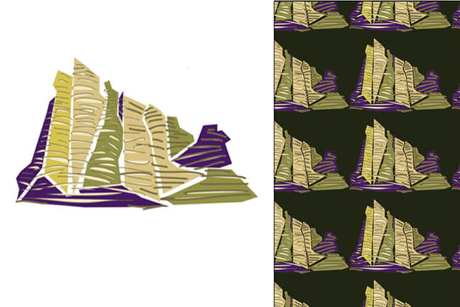
The design derived from the rocks is based on the direction projected by the layers of rock. The initial thought was to use line work to elicit movement; however, when adding color I experimented with adding filled shape. I found that by adding awkward shapes it created a more cohesive composition. Furthermore, the dynamics of the line contrasts nicely with the stability of the shapes. Color helped this composition join as abstract components. I used varied tints and shades of green and yellow. It created a feeling of earthiness I strived for. Additionally, the yellow is accented by the sparingly used purple. When evaluating my tile as a repeating pattern, I thought mostly about how the color of the negative space will influence the pattern. I chose to put each form close together in order to create a similar shape out of the negative space. In my final pattern I determined a dark green to be the right choice for the background. The darkness helps define each individual form, while not being overbearing. In addition, the shade of green present follows the color scheme as it is a deviation of the green already present.

For more about the process for Color and Pattern Project follow this link:
https://u.osu.edu/kimball.103/tag/color-and-pattern/

