Author: gladden.9@osu.edu
Including alt text on images with CK-Editor
The many benefits of inclusive design and good accessibility
Digital accessibility is not just about meeting the needs of the disabled or catering to edge cases. Good accessibility impacts everyone5. The benefits of good web accessibility go beyond ADA compliance and risk management. Using effective headings and document structuring can help improve your SEO and search engine placement which benefits your organization and all site visitors. Inclusive design seeks to use digital accessibility techniques to benefit all website visitors.
Specifying headings to structure your page
Making something, like a title, bold doesn’t make it an actual header, that’s a pseudo-heading. The CK-Editor toolbar in Drupal has an option to specify a proper heading (such as H1, H2, or H3). Screen-reader users have an easier time scanning page content that has been divided into headings and sub-headings. Special key commands allow them to jump between headings to scan the page. The Communication Services staff at the College of Arts and Sciences have put together some great video tutorials about using headings to promote good accessibility2. See the References at the bottom of this page.
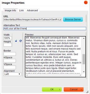
Specifying alternative text on images, hyperlinks, and links to documents
Specifying alternative text on images helps a screen reader user tell image means and it’s relation to nearby content. Making your online content friendly for screen-readers not only benefits the visually impaired but others who use text-to-speech apps5. In certain contexts, like while driving in a car, people may choose to listen to your content through a text-to-speech app rather than visually read it. Audio narration also helps people follow along with the narrative while they are reading. Many text-to-speech apps highlight what is being read.
Alternative text should also be added to hyperlinks. To add alt text to a link with CK-Editor click the ‘Advanced’ tab and add your alternative text under ‘Advisory Tile’ (becomes both a hover tool-tip and alt text for the link). It’s a good idea to include the word ‘website’ in your links to external sites to inform readers that they are going to a new site. Relative links are used to build internal links between pages. For example a path might look like: ‘/folder/sub-folder/name-of-page.html’. Absolute links send readers out to external sites. A URL path might look like: ‘http://www.someplace.com/folder/sub-folder/name-of-page.html’.
Instead of just linking to untagged PDF files it’s recommended to create webpages with the same content as the file then place a link to the PDF, if needed. This is because PDF files are generally not as accessible as HTML pages4. It takes more effort to make a PDF file more accessible than an HTML page. Many universities and schools of pharmacy are already creating student manual documents in HTML format. Some post important current student information in both HTML and PDF format. The ‘ASC CE Training Links to Files’ training video4 says its’ imperative that you indicate the file type in the link text such as including ‘[pdf]’ in brackets.
Making data tables accessible
It’s important for tables to be made accessible as possible to those using screen readers. The most common issue for Word documents with data tables in them is missing table row headers <th> (usually in the first row).
You will be able to see the <th> in the table structure in Acrobat Pro’s ‘Tags’ panel after you’ve exported to PDF. Missing table row headers can also be added in Drupal’s CK-Editor or another HTML editor app, like Dreamweaver or Kompzer.
References
1) ASC Communication Services. ASC CE Training – Accessibility. The Ohio State University College of Arts and Sciences. 2015.
2) ASC Communication Services. ASC CE Training Headers and Accessibility. The Ohio State University College of Arts and Sciences. 2015.
3) ASC Communication Services. ASC CE Training – Alternative Text. The Ohio State University College of Arts and Sciences. 2015.
4) ASC Communication Services. ASC CE Training Links to Files. The Ohio State University College of Arts and Sciences. 2015.
5) Paul Boag. Accessibility is not what you think. Boagworld. 2014.
6) Accessibility at Penn State [Internet]. Tables for Data in HTML. Pennsylvania State University, University Park, PA. [cited 13 Feb 2016]
Periodic Review of Website Content for Broken Links is Important
It’s a good practice for website owners stakeholders to review their online content for accuracy at least every three months in order to meet the informational needs of their website audiences. I noticed one department in a major university had some pages that hadn’t been updated for over ten years. Sometimes organizations are great and producing internal reports and self-studies but a disconnect develops with their online presence.
One important item to have on the content review checklist is checking for ‘broken’ links. Notes on what links to fix can be added to your content audit spreadsheet. In order to keep your web pages useful and relevant, it’s important for area stakeholders to review their web areas for broken links or out-of-date content at least once per quarter (three months). Neglecting to update links to external sites can give site visitors a bad impression of the organization when the links they try to follow don’t work.
The web is ever-changing. As external sites you link to are redesigned, over time their URL paths change causing links in your site to break. Sometimes responsible web developers will create redirects to new URLs. When you notice redirects happening in external sites that’s a sign that a link is in danger of breaking in the future. In the next redesign, the developer of that site may forget to add another redirect so it would be best to update your link to the new URL as a precaution. Some content management systems, like Drupal, have the ability to automatically create redirects whenever a page’s URL path changes. That is good for other sites linking to the CMS powered site and good for its SEO (search engine optimization).
Looking up HTML codes for Greek characters
Discovering text-to-speech apps
About the kanji in the title of this blog
幸福 (hiragana こうふく, rōmaji kōfuku) A noun meaning happiness or gladness.
See more info regarding 幸福 .
Better structure in MS Word documents to promote accessibility
Better structure in MS Word and PDF documents helps readers with visual disabilities and also has SEO benefits. HTML document structural concepts are now pervasive across many formats like Word & PDF so it’s important for content authors/contributors to be familiar with methods of doc structuring. It’s important for documents posted online to be as accessible as possible. Adjusting styles for headings and specifying heading tags can aid in better structuring MS Word documents to promote document accessibility. Headings are especially important for structuring and organizing pages with lengthy content.
Documents should be structured in a hierarchical manner, generally with one H1 (heading level 1) as the page title. Bolded text sections below that are H2s (heading level 2s) and those nested beneath are H3s (heading level 3s). Document authors should be careful not to skip heading levels, you can’t have an H4 without it being nested inside an H3. Organizing content in heading sections allows sighted users to scan lengthy pages and jump to sections they’re interested in. It’s like chunking information to be more understandable. Similarly, users with assistive technologies, such as screen-readers, can jump between headings in a lengthy page to more quickly get to the information they’re interested in. See WebAIM’s article, Using Headings for Content Structure, for more information about properly structuring a document.
To specify headings in MS Word:
Including alternative text on images in documents:
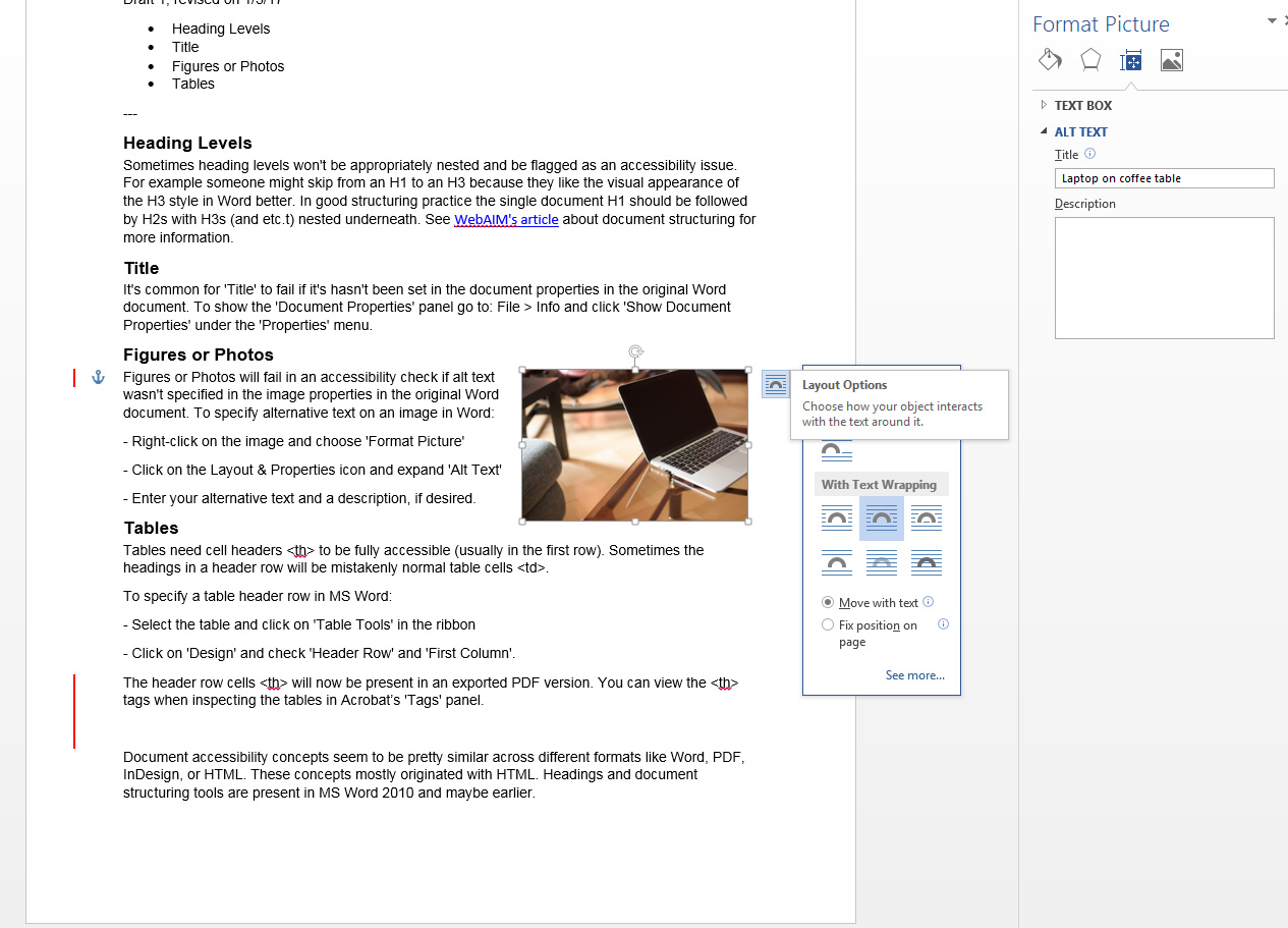
Adding Alt Text to Images in MS Word
To specify alternative text on an image in Word:
– Right-click on the image and choose ‘Format Picture’.
– Click on the ‘Layout & Properties’ icon and expand ‘Alt Text’.
– Enter your alternative text and a long description, if desired.
Running a document accessibility check in MS Word 2013
To run a document accessibility check in MS Word 2013:
- Go To: ‘File’ > ‘Check for Issue’ button > ‘Check Accessibility’
The Accessibility Checker Panel open to the right of your document and displays Errors and Warnings. - Click on an Error or Warning to get more information about the issue including ‘Why Fix’ and ‘How to Fix’.
Warnings are more subjective than Errors and are similar to Alerts in the WAVE tool from WebAIM. A Warning (MS Word) or an Alert (WAVE tool) may be more like a WCAG 2.0 Level AA concern. In the WCAG 2.0 standard Errors are about equivalent to Level A concerns. The most common type of error in a Word document is missing alt text on graphics, images, or tables. Attached is a screen of what the MS Word Accessibility Checker Panel looks like.
ord Accessibility Checker Panel looks like.
Academic Research Day site examples
Ohio State College of Dentistry Research Day
Ohio State College of Public Health Research News
Ohio State CPH Second Annual Research Day
University of Michigan College of Pharmacy Research
Michigan College of Pharmacy Science Day
Ohio State CCTS Pharmacy Reseach Day
Ohio State Pharmacy Research Day 2013
University of Florida College of Pharmacy Research Showcase
Wisconsin School Pharmacy Poster Contest
UIC College of Pharmacy Research Day
Using HTML tables in the correct way
Using HTML tables in the correct way will help make your sites more accessible to all viewers and user agents. Using tables for layout of webpages was a popular technique starting in the late 90s that had fell out of favor by 2006-2007 with the rise of web standards movement. Tables primary purpose is to display tabular data. If you are using tables of layout with empty cells, missing table headers <th>, or fixed widths you are using them in an incorrect way that introduces accessibility problems into your web site.
The preferred method late 2000s method for laying out pages was to wrap content in <divs> and use CSS (cascading style sheets) to place the <div> areas in columns or grids. HTML 5 introduced additional structural elements in HTML such as <article>, <nav>, and <aside> that could also be used with CSS layout techniques. A big problem with layout tables used in the late 90s was that they mixed presentational data in with content. CSS was created so the presentational markup could be separated from the ‘semantic’ HTML content. That way the same content could be more easily styled in a variety of ways by switching out style-sheets. It would be much more difficult to change the appearance of layout tables with inline fixed widths and other deprecated presentational markup that shouldn’t be in HTML.
Some key features of accessible tabular data tables as I understand them, are:
I’ll update this post as I learn more about best practices for using data tables in HTML. I’ll also share more insights in theming HTML 5 content as I discover new techniques.

