The CK-editor WYSIWYG editor, used in content management systems like WordPress 4 or Drupal 8, has all the tools you need to create an accessible data table. Some key things it remember are to keep your tables simple. Don’t create a more complex design with cells crossing into other columns. Also be sure to specify a header row. This is most commonly the first row. Below are some good settings to use with CK-editor in Drupal 8.
Suggested CK-editor settings for good accessibility
- Width: 100% —> yields: style=”width: 100%;”
- Cell Spacing: 0
- Cell Padding: 0
- Border size: 0
- Headers: First Row – it does wrap the < th > row with < thead >
- Alignment: not set
- Caption: include descriptive text, could be same as the title of the table.
- Summary: include descriptive text, could be same as the title of the table.
General accessible data table tips/guidelines:
- be sure to specify the First Row as the Header row (CK-editor will add the < th > and < thead > wrapper behind the scenes).
- To further enhance markup of the columns, add scope=”col” to the
. For example: <th scope=”col”>. If the table was turned on it’s side it would be scope=”row”. - keep table design basic, don’t span a cell into another row
- don’t embed tables inside tables
- include a descriptive Caption if the table doesn’t have a title/heading. The
can be visually hidden with CSS, but made available to screen-reader users. The value of including PDF and other types of download indicators on hyperlinks
When it comes to link text the W3C recommendations say: “clearly identify the target of each link” to aid users in deciding weather they want to follow a link or not. A well written article about Links and accessibility goes into more detail about giving all users the context to decide by including description text and download indicators.
Usability testing has shown that site visitors hate unexpected downloads. When there’s no text indication on whether a hyperlink goes to another webpage or downloads a file, visitors can end up downloading a huge file eating up their mobile data allowance and taking focus away from what they were doing. That Links and Accessibility article recommends that the type of download and size be indicated in parentheses after the hyperlink text to aid people on whether or not to follow the link. For example a descriptive link could look like:Disability Services Annual Report (PDF, 4.5 MB)Another technique is to add a PDF or Word icon instead of the text of a download link, but it’s important to make sure the icon has descriptive ALT text. Icons added via CSS or other automated techniques can be missed by people user screen readers.That Links and Accessibility article I reference in this post probably has the best description about why it’s important to let site visitors know what content a link goes to. It also describes why empty links are a bad practice, a link with no text at all gives no context to non-visual users on what the link is for or where it goes.At Ohio State, a former Arts & Science web CMS contributor trainer (Drupal trainer) from ACS Communications recommended adding PDF indicators on hyperlinks in her adding links accessibility training video on YouTube. Unfortunately the importance of adding ‘(PDF)’ on hyperlinks it’s well known and many significant web projects have over looked it. By researching and writing about this topic I’m attempting to educate others and perhaps make the web a little more usable.Here are some other accessibility resources from ACS Communications:References:Wild, Gian. Links and Accessibility. AccessibilityOz, 2014. Available at: https://www.accessibilityoz.com/2014/02/links-and-accessibility/Fixing empty links that find their way into websites
It’s easy to correct missing alt tags on images but some accessibility errors, like empty links, are more mysterious and ease to overlook. Sometime copying and pasting new code, such as code for social icons or links from a 3rd party, can unwittingly bring in empty links into a website.
I thought my website was mostly free from errors but I looked again (using the WAVE tool from WebAIM) and found that some new social icons that had been added actually were empty links. To fix these I added descriptive link text between the opening and close <a> tags and visually hid the text with a CSS class. That way my social icons still looked the visually the same but included actual text aiding non-visual users context to know what the links are about.
This Links & Accessibility article also says “do not have broken or empty links” because having an empty links give no context to allow a screen reader user to know what the link is about. Sometimes designers make an empty link visually to look like a button by adding a background image via CSS styles.I recently noticed that the website of a computing center at a major university had several empty links in their website header and footer. The university’s logo was an empty link because instead of the logo being an inline image, it was actually a background image, added through CSS, on a empty <a> tag. To fix this empty link error they could add “ACME University” link text and visually hide it for sighted users, if desired. Then a screen reader user could still have context to know what the link is for and the page could have the visual look desired by marketers.Steps to better structure an InDesign document to promote accessibility
Better structure in PDF documents helps readers with visual disabilities and also has SEO benefits. HTML document structural concepts are now pervasive across many formats like Word & PDF so it’s important for content authors/contributors to be familiar with methods of doc structuring. Adding paragraph styles for heading and specifying heading tags can aid in better structuring an InDesign document to promote document accessibility. Adding alternative text descriptions to all photos in a document is another important practice to enhance accessibility.Create Paragraph Styles:
Go to the ‘Window > Styles > Paragraph Styles’ panel to start setting up paragraph styles for your normal paragraphs and heading levels (such as H1, H2, and H3). There is typically just one heading level 1, H1, in a page as the page title. A normal paragraph is typically nested within one or more headings.To create a new paragraph style for a heading:– Add a text frame with the size and font style you want for that level of heading. Heading 1s typical have the largest font size.– In the ‘Paragraph Style’ panel choose ‘New Paragraph Style’ from the arrow menu.– Give it a name like ‘Heading 4 Style’. It takes on the font style characteristics of the text frame you had select.To give a normal paragraph text frame a heading style select that frame and click on one of the heading styles you created.Setup Structural Tags:
To setup structural tags in your InDesign document:– Go to ‘View > Utilities > Tags’ to open the Tags panel.– Choose ‘New Tag’ from the arrow menu.– Give the tag a name like ‘H4’.To tag a heading frame (frame with a heading paragraph style applied):– Select the heading text frame.– Click the heading tag (such as H4) you want it to be in the tags panel from the heading tags you created. You will be able to see which text frame have tags applied in the ‘View Structure’ panel.Other tag-related tips:– Go to ‘View > Structure > View Structure’ to view the document hierarchy structure branching off from the ‘Root’.– Go to ‘View > Structure > Show Tagged Frames’ to visually color-code your tagged frames. In my example document, H1s were red, H2s were green, and H3s were blue. Normal paragraphs, P, were just light gray.Adding Alt Text to Images in InDesign:
It’s important for all photos in a document to have alternative text descriptions. You can add alternative text to images, graphics, or photos by using the ‘Object Export Options’ panel.To add alternative text to an image in InDesign:– Select the object/photo that you want to add alternative text to.– Go to:’Object > Object Export Options’– Enter alternative text for the object/photo you selected in the ‘Alt Text’ tab. It’s possible to set custom alt text for an image or choose text from a structural tag previously applied.– Choose ‘Custom’ from the menu to enter custom alternative text for the photo.For more information about creating good accessibility in InDesign documents see Adobe’s documentation or watch the video, Preparing InDesign Files for Accessibility.
Document accessibility related panels in InDesign
Including alt text on images with CK-Editor
CK-Editor is a popular WYSIWYG editor powering rich text fields in Drupal site updating and WordPress blog post writing. It’s important for site builders/blog authors to know how to add alternative text to images uploaded with this editor to meet the accessibility needs of their audiences. Drupal 7 typically supports the 4.6.2 edition of CK-Editor.To specify alternative text on an image in Drupal 7’s CK-Editor:– Right click on the image you what to add text on and choose ‘Image Properties’.– Enter your alt text under the ‘Alternative Text’ field and hit ‘OK’Learn more about HTML and CK-Editor accessibility techniques in my other blog posts or ODEE’s resource center.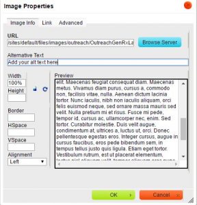
Adding alt text on an image in CK-Editor
It can also be beneficial to include a title and alt text on hyperlinks. To add alt text to a link with CK-Editor click the ‘Advanced’ tab and add your alternative text under ‘Advisory Tile’ (becomes both a hover tool-tip and alt text for the link). It’s a good idea to include the word ‘website’ in your links to external sites to inform readers that they are going to a new site.The many benefits of inclusive design and good accessibility
Digital accessibility is not just about meeting the needs of the disabled or catering to edge cases. Good accessibility impacts everyone5. The benefits of good web accessibility go beyond ADA compliance and risk management. Using effective headings and document structuring can help improve your SEO and search engine placement which benefits your organization and all site visitors. Inclusive design seeks to use digital accessibility techniques to benefit all website visitors.Specifying headings to structure your page
Making something, like a title, bold doesn’t make it an actual header, that’s a pseudo-heading. The CK-Editor toolbar in Drupal has an option to specify a proper heading (such as H1, H2, or H3). Screen-reader users have an easier time scanning page content that has been divided into headings and sub-headings. Special key commands allow them to jump between headings to scan the page. The Communication Services staff at the College of Arts and Sciences have put together some great video tutorials about using headings to promote good accessibility2. See the References at the bottom of this page.
Specifying alternative text on images, hyperlinks, and links to documents
Specifying alternative text on images helps a screen reader user tell image means and it’s relation to nearby content. Making your online content friendly for screen-readers not only benefits the visually impaired but others who use text-to-speech apps5. In certain contexts, like while driving in a car, people may choose to listen to your content through a text-to-speech app rather than visually read it. Audio narration also helps people follow along with the narrative while they are reading. Many text-to-speech apps highlight what is being read.
Alternative text should also be added to hyperlinks. To add alt text to a link with CK-Editor click the ‘Advanced’ tab and add your alternative text under ‘Advisory Tile’ (becomes both a hover tool-tip and alt text for the link). It’s a good idea to include the word ‘website’ in your links to external sites to inform readers that they are going to a new site. Relative links are used to build internal links between pages. For example a path might look like: ‘/folder/sub-folder/name-of-page.html’. Absolute links send readers out to external sites. A URL path might look like: ‘http://www.someplace.com/folder/sub-folder/name-of-page.html’.
Instead of just linking to untagged PDF files it’s recommended to create webpages with the same content as the file then place a link to the PDF, if needed. This is because PDF files are generally not as accessible as HTML pages4. It takes more effort to make a PDF file more accessible than an HTML page. Many universities and schools of pharmacy are already creating student manual documents in HTML format. Some post important current student information in both HTML and PDF format. The ‘ASC CE Training Links to Files’ training video4 says its’ imperative that you indicate the file type in the link text such as including ‘[pdf]’ in brackets.
Making data tables accessible
It’s important for tables to be made accessible as possible to those using screen readers. The most common issue for Word documents with data tables in them is missing table row headers <th> (usually in the first row).
To add a header row in MS Word 2013:– Right-click on the table and choose ‘Table Properties’.– Under the ‘Row’ tab check ‘Repeat as header row’ at the top of each page.You will be able to see the <th> in the table structure in Acrobat Pro’s ‘Tags’ panel after you’ve exported to PDF. Missing table row headers can also be added in Drupal’s CK-Editor or another HTML editor app, like Dreamweaver or Kompzer.
References
1) ASC Communication Services. ASC CE Training – Accessibility. The Ohio State University College of Arts and Sciences. 2015.
2) ASC Communication Services. ASC CE Training Headers and Accessibility. The Ohio State University College of Arts and Sciences. 2015.
3) ASC Communication Services. ASC CE Training – Alternative Text. The Ohio State University College of Arts and Sciences. 2015.
4) ASC Communication Services. ASC CE Training Links to Files. The Ohio State University College of Arts and Sciences. 2015.
5) Paul Boag. Accessibility is not what you think. Boagworld. 2014.
6) Accessibility at Penn State [Internet]. Tables for Data in HTML. Pennsylvania State University, University Park, PA. [cited 13 Feb 2016]Discovering text-to-speech apps
I was looking for an Android OS text-to-speech application to read aloud blog posts about web design and I came across the @ Voice Aloud Reader app. It’s powered by the Google TTS engine that’s installed for accessibility purposes on most newer Android phones. I was easily able to select ‘Share’ in my Chrome browser and have it speak a webpage. It can also speak aloud text from many other files such as PDF and Word. It’s a free app that has apps at the bottom but that doesn’t bother me. Find out more about this great app in the Google Play Store.Better structure in MS Word documents to promote accessibility
Better structure in MS Word and PDF documents helps readers with visual disabilities and also has SEO benefits. HTML document structural concepts are now pervasive across many formats like Word & PDF so it’s important for content authors/contributors to be familiar with methods of doc structuring. It’s important for documents posted online to be as accessible as possible. Adjusting styles for headings and specifying heading tags can aid in better structuring MS Word documents to promote document accessibility. Headings are especially important for structuring and organizing pages with lengthy content.
Documents should be structured in a hierarchical manner, generally with one H1 (heading level 1) as the page title. Bolded text sections below that are H2s (heading level 2s) and those nested beneath are H3s (heading level 3s). Document authors should be careful not to skip heading levels, you can’t have an H4 without it being nested inside an H3. Organizing content in heading sections allows sighted users to scan lengthy pages and jump to sections they’re interested in. It’s like chunking information to be more understandable. Similarly, users with assistive technologies, such as screen-readers, can jump between headings in a lengthy page to more quickly get to the information they’re interested in. See WebAIM’s article, Using Headings for Content Structure, for more information about properly structuring a document.
To specify headings in MS Word:
In Microsoft Word normal text may be changed to headings via the Heading styles in the ‘Home’ ribbon. To create a heading: select your text and click on one of the Heading styles (H1 – H4). See WebAIM’s article for more information about using headings in MS Word.To create a heading: select your text and click on one of the Heading styles (H1 – H4).See WebAIM’s article for more information about using headings in MS Word.Including alternative text on images in documents:
It’s important for all photos in a document to have alternative text descriptions to pass an accessibility check. This post highlights some resources and techniques to add alt text to images in MS Word documents.Adding Alt Text to Images in MS Word
To specify alternative text on an image in Word:
– Right-click on the image and choose ‘Format Picture’.
– Click on the ‘Layout & Properties’ icon and expand ‘Alt Text’.
– Enter your alternative text and a long description, if desired.
Adding alt text to an image in Microsoft Word
Running a document accessibility check in MS Word 2013
To run a document accessibility check in MS Word 2013:
- Go To: ‘File’ > ‘Check for Issue’ button > ‘Check Accessibility’
The Accessibility Checker Panel open to the right of your document and displays Errors and Warnings. - Click on an Error or Warning to get more information about the issue including ‘Why Fix’ and ‘How to Fix’.
Warnings are more subjective than Errors and are similar to Alerts in the WAVE tool from WebAIM. A Warning (MS Word) or an Alert (WAVE tool) may be more like a WCAG 2.0 Level AA concern. In the WCAG 2.0 standard Errors are about equivalent to Level A concerns. The most common type of error in a Word document is missing alt text on graphics, images, or tables. Attached is a screen of what the MS Word Accessibility Checker Panel looks like.
ord Accessibility Checker Panel looks like.
Using HTML tables in the correct way
Using HTML tables in the correct way will help make your sites more accessible to all viewers and user agents. Using tables for layout of webpages was a popular technique starting in the late 90s that had fell out of favor by 2006-2007 with the rise of web standards movement. Tables primary purpose is to display tabular data. If you are using tables of layout with empty cells, missing table headers <th>, or fixed widths you are using them in an incorrect way that introduces accessibility problems into your web site.
The preferred method late 2000s method for laying out pages was to wrap content in <divs> and use CSS (cascading style sheets) to place the <div> areas in columns or grids. HTML 5 introduced additional structural elements in HTML such as <article>, <nav>, and <aside> that could also be used with CSS layout techniques. A big problem with layout tables used in the late 90s was that they mixed presentational data in with content. CSS was created so the presentational markup could be separated from the ‘semantic’ HTML content. That way the same content could be more easily styled in a variety of ways by switching out style-sheets. It would be much more difficult to change the appearance of layout tables with inline fixed widths and other deprecated presentational markup that shouldn’t be in HTML.
Some key features of accessible tabular data tables as I understand them, are:
– They have a <caption> tag included at the top of the table. These can be hidden visually but be seen by screen readers or other tools that read text.– They have header cells, <th>, which help to label table columns or rows (depending on how the table is laid out). Site visitors using screen readers can jump between these headings.– They have a <thead> tag that’s used to wrap the header cells, <th>.– They have the have the same number of columns in every row and same number of rows in every column. Fancier layouts with cells spanning multiple columns can yield accessibility errors in validators and navigational problems in screen readers.– They are basic and straightforward in their layout. Nested tables within tables or cells spanning multiple rows will confuse accessibility validators and screen readers.I’ll update this post as I learn more about best practices for using data tables in HTML. I’ll also share more insights in theming HTML 5 content as I discover new techniques.

