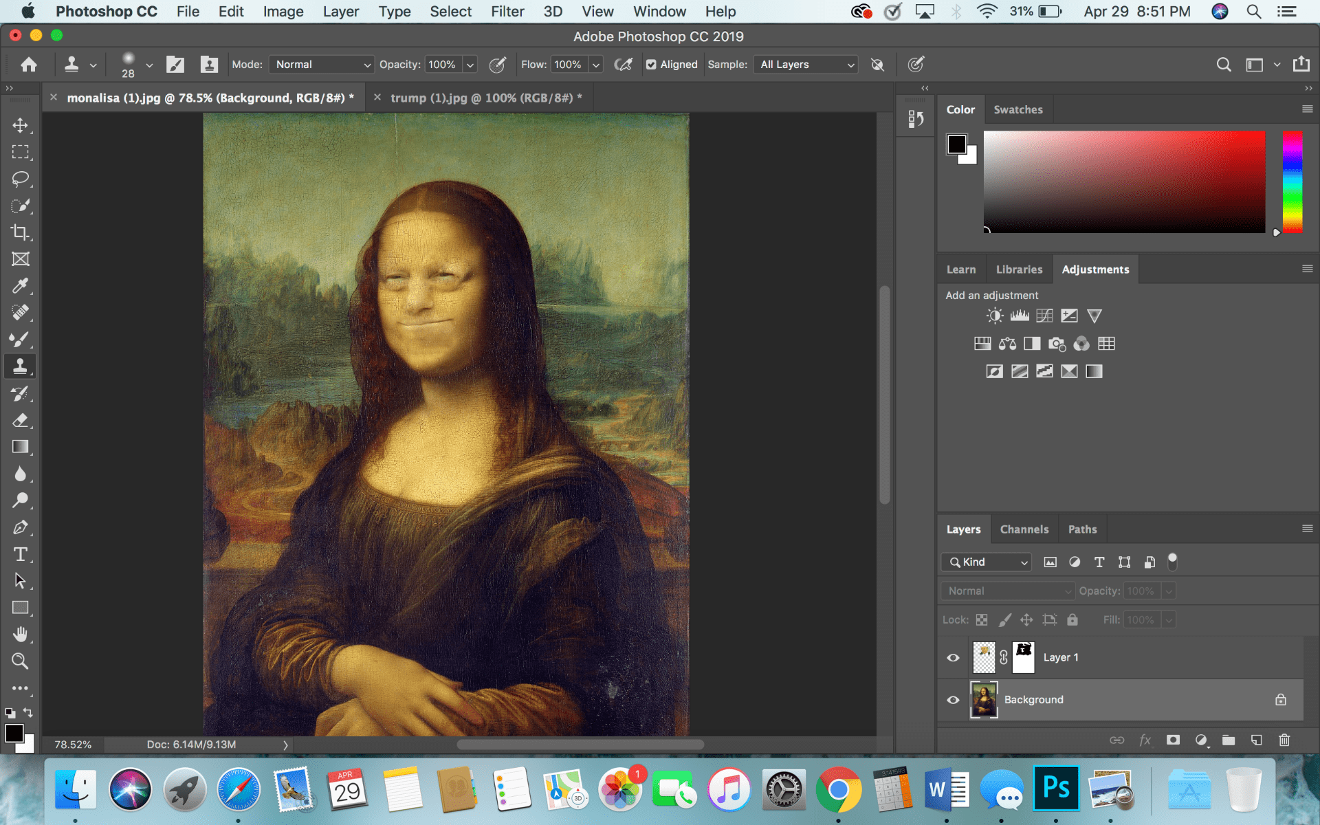
Weekly Assignment 4

Background layer:

Blend Layer:

Related image

Normal: Normal is the default blend mode and just applies opaque pixels over the pixels below them. To see the layer below, you can lower the opacity of the blend layer.


Dissolve: Like normal, to see the layer below you must lower the opacity. Dissolve shows the pixels in a type of grainy and noisy way. This blend mode looks like the fuzzy TV channel.

Darken Category: All the modes in this category turns the results darker. Any white parts in the blend layer are removed and do not show up in the result, any colors darker than white will be darkened.

-Darken: Darken does not blend the pixels, it compares the colors of the two images and chooses the darker of the two. 

-Multiply: Multiply uses the luminosity of the two images to make changes. It multiplies the luminosities of the background layer by the blend layer. The results of multiplying the luminosities will always make a darker color. 

-Color Burn: Color burn increases the contrast between the background and blend layers, which reduces the highlights.

-Linear Burn: Linear burn decreases the brightness of the background layer. This mode produces one of the darkest colors in this category.

-Darker Color: Darker color compares the background and blend layer and keeps the darkest color of each of them. Darker color uses the combination of all RGB colors.

Lighten Category: This category is the opposite of the darken category, anything that is black will not show up in the result.

-Lighten: Lighten looks at the color of the background and blend layers and picks the lightest of each. 

-Screen: Screen brightens the result based on the luminosities of the background and blend layers.

-Color Dodge: Color dodge decreases the contrast between the two layers, emphasizing the highlights.

-Linear Dodge: Linear dodge brightens the colors of the background layer and increases the brightness.less

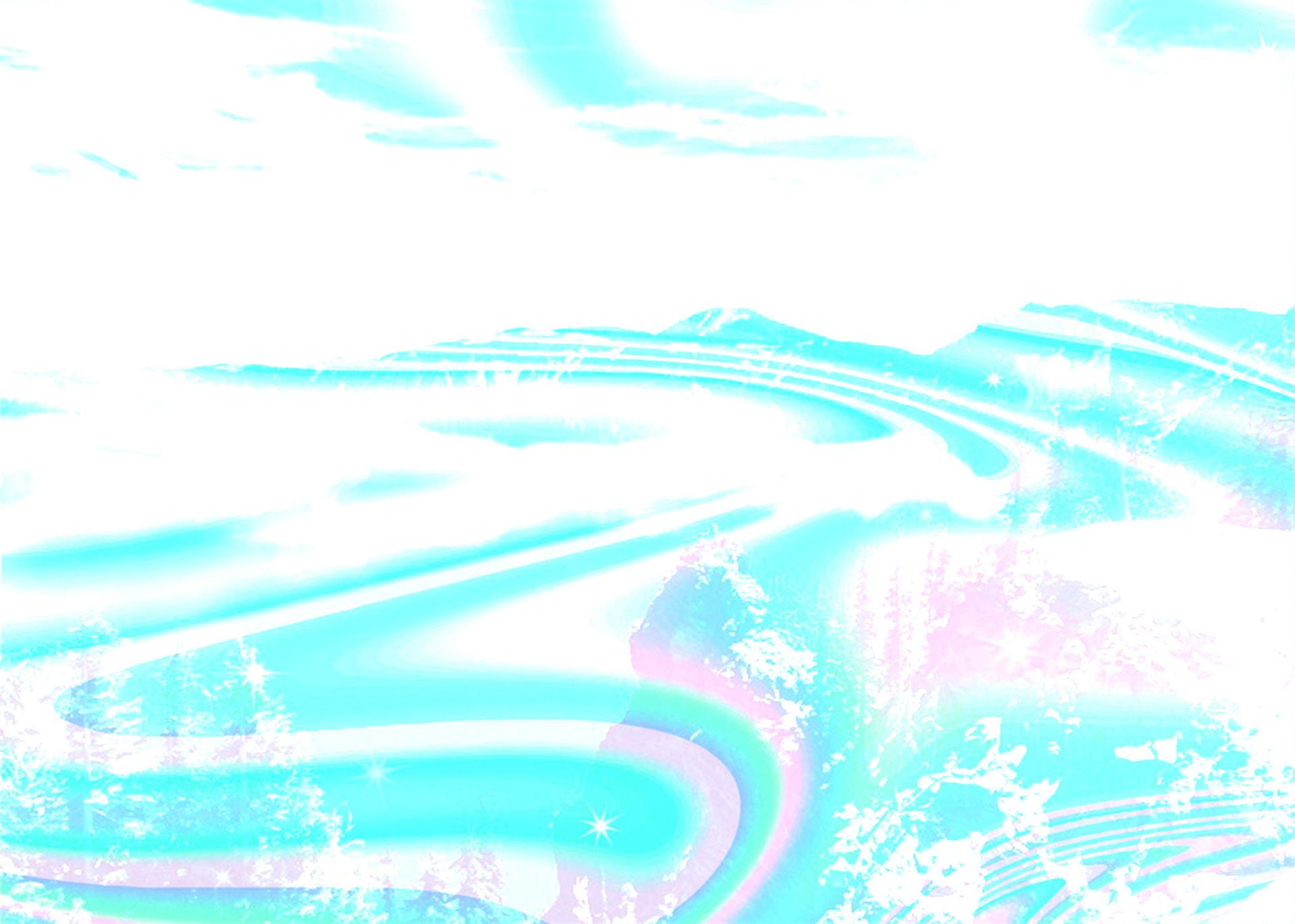
-Lighter Color: Lighter color uses the combination of the RGB colors to compare the background and blend layers and keeps the lighter color of the two. 

Contrast Category: If a color is less than 50% gray, a lightening effect is added. If a color is more than 50% gray, a darkening effect is added.

-Overlay: Overlay uses the screen blend mode on colors that are less than 50% gray and multiply on the colors that are over 50% gray. 

-Soft Light: Soft light is a softer version of overlay with a lot less contrast. It is based of the luminosities of the layers.

-Hard Light: Hard light uses the brightness of the blend layer to combine the multiply and screen layers. It is like overlay but more intense. 

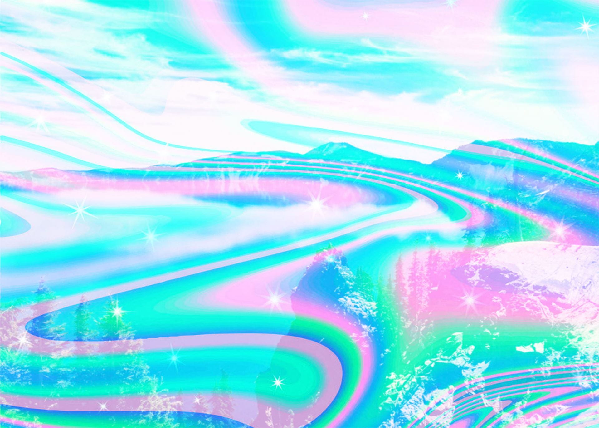
-Vivid Light: Vivid Light is like overlay and soft light where less than 50% gray is lightened, and more than is darkened. Vivid light is a lot more intense and vivid.

Inversion Category: Uses differences between the background and blend layers to make the results.

-Difference: Uses the difference between the background and blend layer pixels. White inverts the colors of the background layer. 

-Subtract: Subtracts the pixels from the background layer to subtract the brightness which makes the results darker.

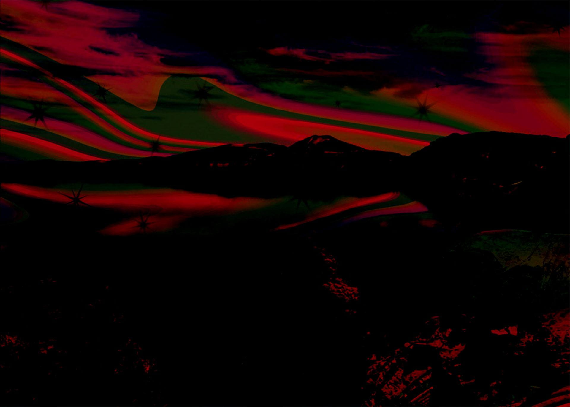
Component Category: This category relies on the differences between the primary color aspects to make the result.

Hue: Hue maintains the saturation and luminosity of the background layer and applies the hue from the blend layer. 

Saturation: Saturation maintains the hue and luminosity of the background layer but applies the saturation of the blend layer.

Extra Credit: PS Challenge

I changed the eyes to a blueish color and the hair to a lilac color. I just Googled how to change eye color and how to change hair color and used the first tutorial that came up. It was super easy to follow and actually combined all the stuff we learned in class, I just did not think of how to combine all the aspects. The hair color tutorial was about the same as the eye color tutorial, it was just on the hair instead.

Eye color: https://www.photoshopessentials.com/photo-editing/eye-color/

Hair color: https://www.photoshopessentials.com/photo-editing/hair-color/

For the eyes I used the quick selection tool to select the colored parts of the eyes (the iris and pupil). I first did the right eye then held down shift for the left eye, though I am not sure I had to do that because I used quick select instead of the lasso that was used in the tutorial. After I had the selection I needed for the eyes, I made a new hue/saturation adjustments layer by clicking the adjustments layer mask at the bottom of the layers panel. I messed with the hue and saturation until I found a color that looked somewhat realistic and that I liked. I selected colorize on the adjustments layer and set the blend mode to color. This definitely made the color pop more. On the adjustment layer mask I just a black brush to clean up around the iris so there was no color/adjustments made to the whites of the eyes. I also used the black brush on the black part of the eye so the pupil did not look blue too.

For the hair I used the same process, used quick select on the hair and made a hue/saturation adjustment mask. I did a light purple grayish color because I recently saw a color like that on Instagram and it looked cool. I also selected colorize and made the blend mode color but I lowered the opacity for a more subtle effect. I used the black brush on the adjustment layer to clean up the edges of the hair. The color looks kind of weird on the hair line on the forehead so I think I could have cleaned that up a little better. Overall I thought the process was pretty easy and encompassed a lot of the stuff we learned in class.

Week 7 Assignment

What item did you select to represent you? Why did you choose this item?

-I selected a little statue that is in my room of a hand gesturing rock on. I don’t know why but I love it and it is one of the favorite decorations in my room. It was a completely unnecessary purchase but for some reason I just had to have it and I really enjoy it. I think it is important because I really like home decor and decorating my spaces to represent me and make me feel relaxed and comfortable.

What was Andy Warhol’s “big idea” – what ideas was he exploring in his artwork? What was he trying to say? Do you think his ideas on popular culture have merit?

-Warhol often showed aspects of ordinary American culture, like the Campbell soup can. This soup can was recognizable to everyone, the rich and the poor. He often showed money and symbols of money because he grew up without it. His works also criticized advertising and its repetitive nature. I think his work did have a lot of merit and it still holds. Objects like Campbells soup and other things like toilet paper are similar among the rich and the poor even though all of the major differences between them.

What relationship does this item have to pop(ular) culture? Will other people connect to this item? Why or why not?

-I think this object relates to pop culture because it goes along with the idea of making things look perfect for others to see. I think a lot on social media like Instagram and Pinterest, people are always trying to set up their life and house to look perfect, cute, and trendy for everyone else to see. This reminds me of birthdays and those gold balloons everyone has to have with the perfect backdrop to make the perfect picture.

Warhol was interested in using machines in artmaking – he automated a great deal of his artmaking. Are you following this tradition as you work with PS? How has your access to this technology changed the way you create images and/or ideas?

-Photoshop has allowed for a lot easier manipulation of photos. I do not edit photos a lot or multiple times at once so I would not say that I necessarily automate the way I work. When I do use Photoshop, I’m usually not doing the same tasks but if I was I would be able to apply edits to multiple files or layers. Photoshop lets us edit pictures a lot faster and try out different effects or edits. It allows for more trial and error because you do not need a lot of time and resources to edit pictures anymore.


Week 6 Assignment

The elements of art are line, shape, color, value, form, texture, space. Lines are points of moving space, they can be straight or curved in any direction. Shape is the contour of a flat area or a geometric shape. Color is the chromatic quality, which consists of hue, value, and intensity. We manipulated the color for our Andy Warhol assignment. Value is the degree of lightness and darkness in the colors, like when you add more light and the color gets lighter. The difference between lightness and darkness in colors is contrast. Form is the 3D depth of a work. Texture is the tactile quality of a photo, in the tattoo revision assignment it was hard to retain the texture of the skin when trying to remove the tattoos. Space is the amount of space between objects and the objects internal/external areas.

Line, space, shape :

Texture:

Form:

Value and difference:

The principles of design are balance, contrast, emphasis, movement, pattern, rhythm, and unity. Balance is how objects are weighted, like if all the objects are on the left side. Contrast is difference between the objects or aspects. Emphasis shows a big importance or focus on one aspect. Movement can show a path or direction of an object. Pattern is repeated elements, like stripes. Proportion is the size of elements relative to one another. Alignment is where elements are spaced out relative to each other. Unity is how all the elements are related and if they go well together.

Pattern:

Alignment and balance:

Proportion:

Emphasis and contrast: