Gifting Design

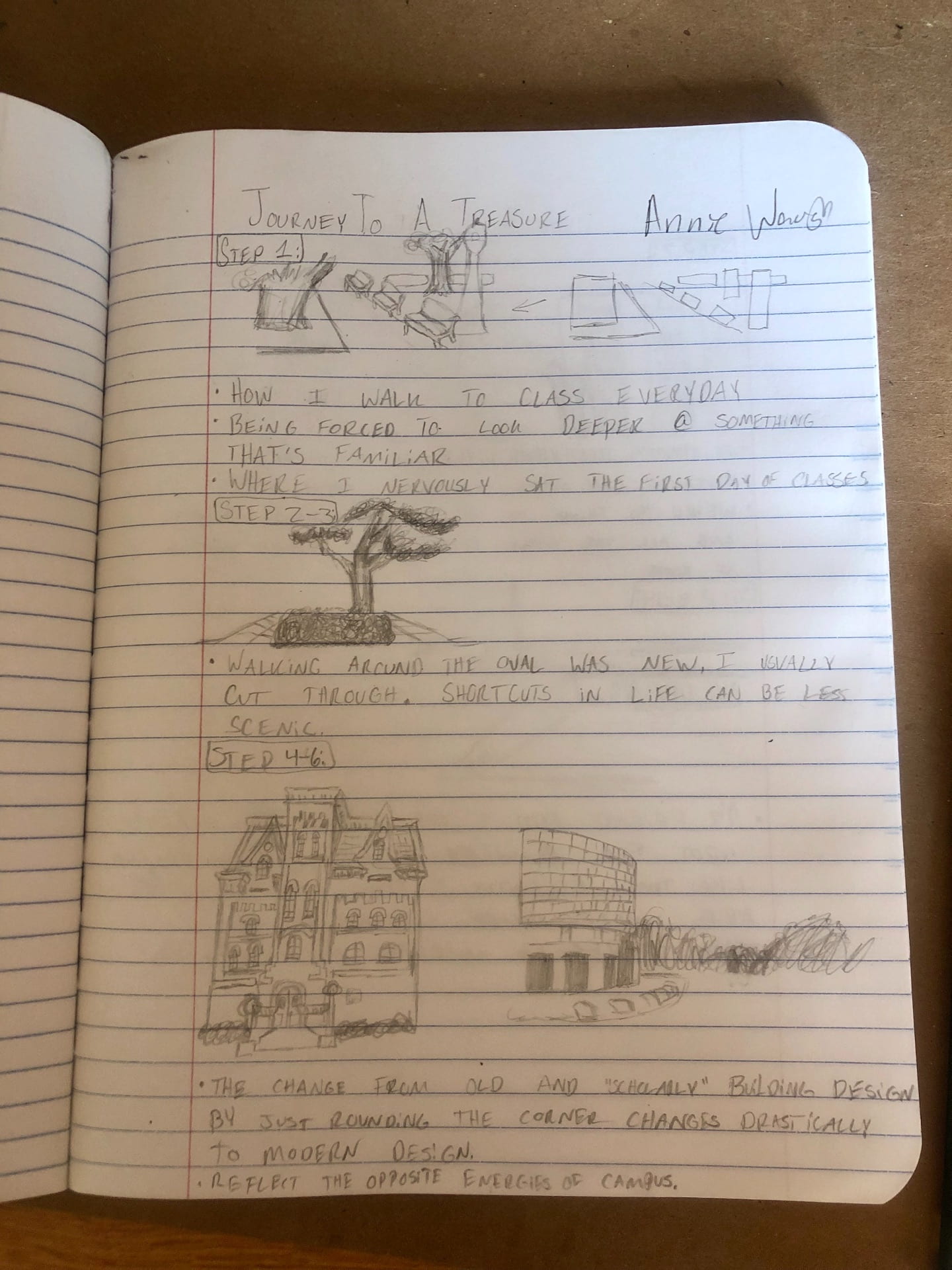
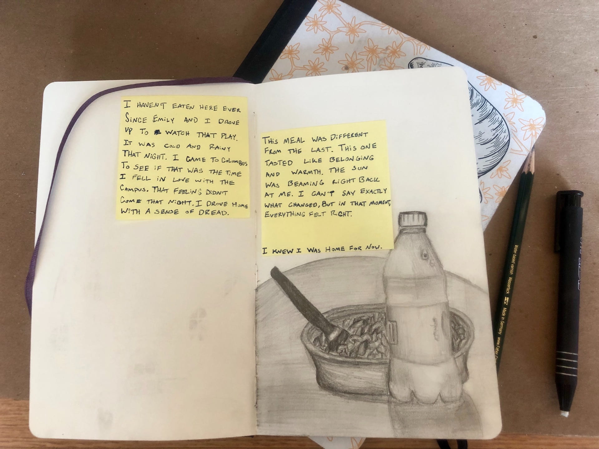
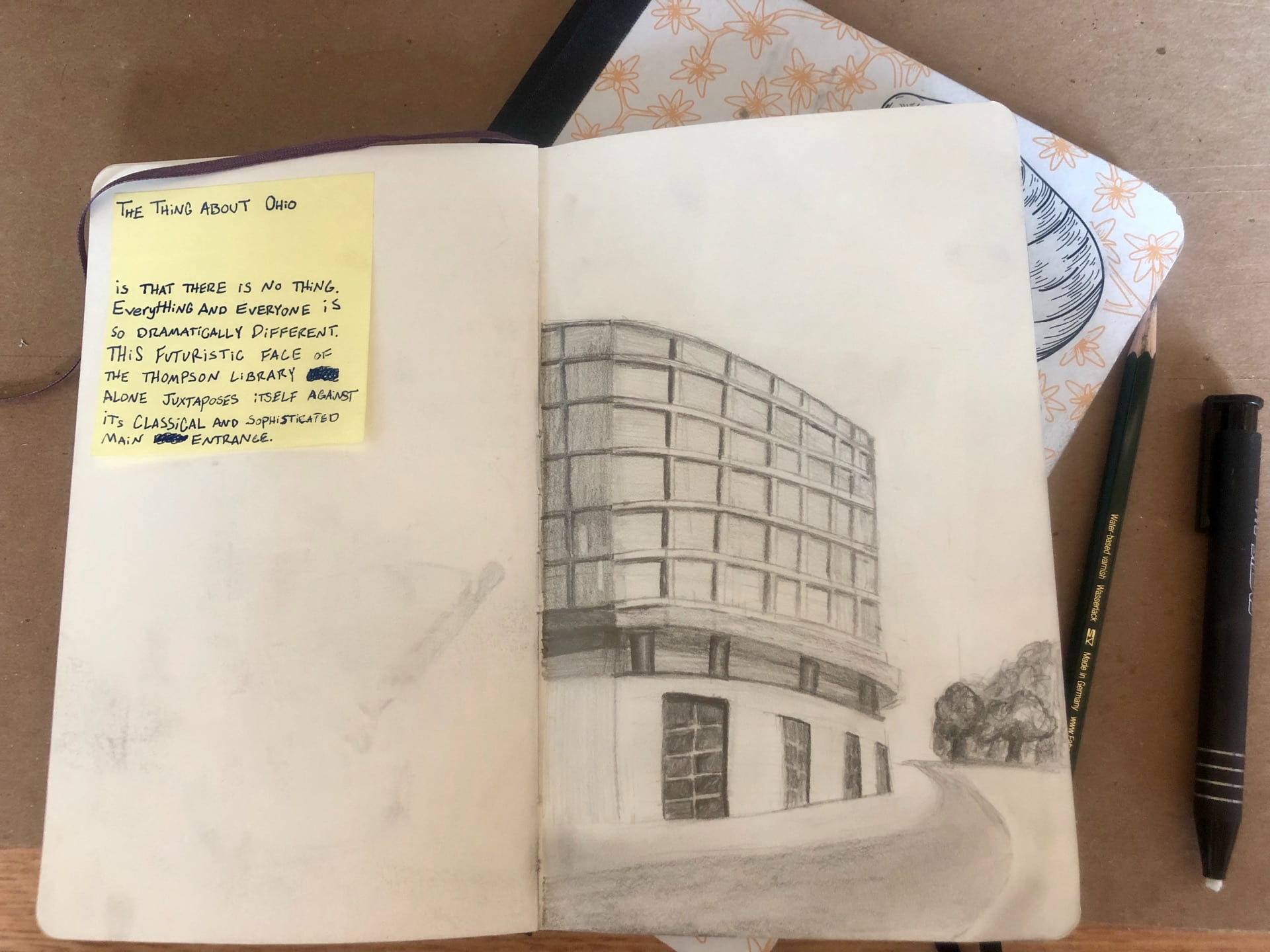
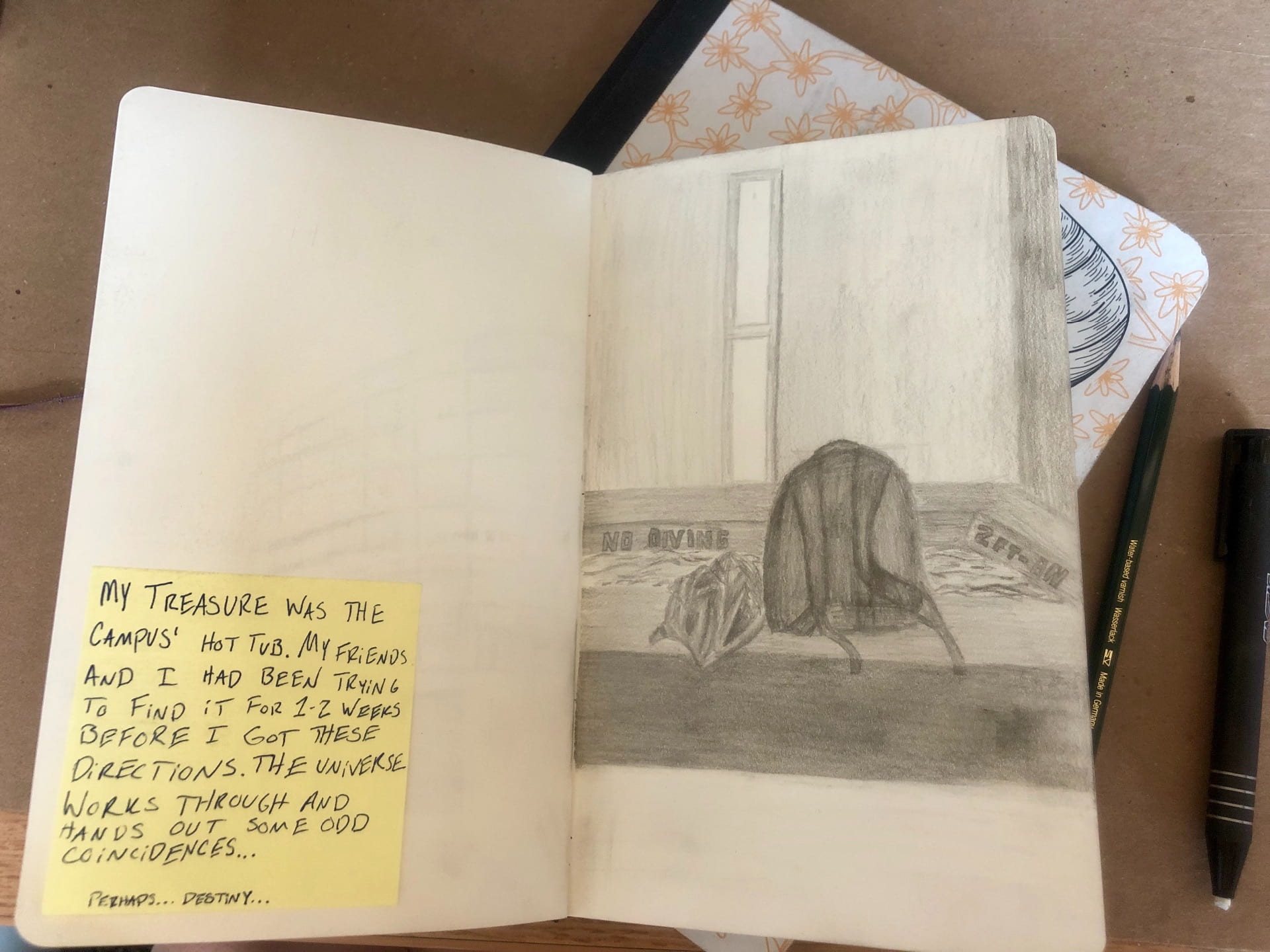
Defining the Meaning of a Gift

One of our exercises required us to think of one our favorite gifts that we’ve received. I wrote about a gift that my friend (who is also in design foundations) got me for Christmas. It was a small gift but meaningful to me because she payed attention months before when I slightly mentioned liking someone’s monkey keychain and she remembered. So I knew that I wanted to give my recipient something revolving around something important to them which eventually came to fruition through the bike.


Reaching out

Reaching out and getting to know the gift recipient was the first step of getting an idea of what to do.

From what I gathered from our conversation Liam seems like a very down to Earth guy who finds importance in the little things in life. I highlighted some things that I noted like his aesthetics, his heavy love for biking and WHY he loves biking, music interests, the fact that he’s a senior and is losing his last year, etc.


Human Experience Using Design to Compose a Song

The quote that I picked was: “The only important thing about design is how it relates to people” — Victor Papanek

I chose this quote because I wanted to challenge myself to focus on the purpose of design — human experience, and not only my recipient’s personal wants and interests, but making a final product that was designed in a non representational way. My goal was to represent his interests WHILE focusing my design on the ‘unseen’ aspect so it seemed natural. I used intervals and chord progressions to craft a song  that was inspired more by design than making a song.

I wanted the song to be warm and inviting

  • The VII-i-III-VII chord progression that I chose is a common progression for songs that sound hopeful yet serene and not too overly exciting and common in pop music like the chord progression I-V-vi-IV (similar to the chord progressions in the song ‘Riptide’ by Vance Joy)
  • The song is well balance with a higher pitched melody on bells/piano/electric piano and a low/ deep base chord structure. I added in a few elements to accent some moments in the song
  • As far as the intervals, a lot are scales that stepping up or down by major seconds. There are a fair share of major 3rd steps. Major seconds are very positive sounding (like the notes ru-dolph in ‘Rudolph the Red Nosed Reindeer’ and the beginning few notes in ‘Happy Birthday’) and as are major thirds (like the first two notes of ‘When the Saints’)
  • A few times (to create a more distinct melody) I would include a perfect 4th from C-F but then paired it with a minor 2nd to end that phrase. A perfect fourth is engraved within us as a hopeful interval (here comes the bride) While a minor second is typically a more evil sounding note interval (the duh-duh in Jaws), I find that sandwiching it between a perfect 4th and a minor 7th is an interesting way to create a melody that kind of represents ‘hope in the unknown’.
  • the bridge of the song has a sort of rumpy-march feel that reminded me of the rhythms they used to use in cartoons when someone snuck up on them. I felt like it made the mood more complex and added representation of curiosity and the unknown.

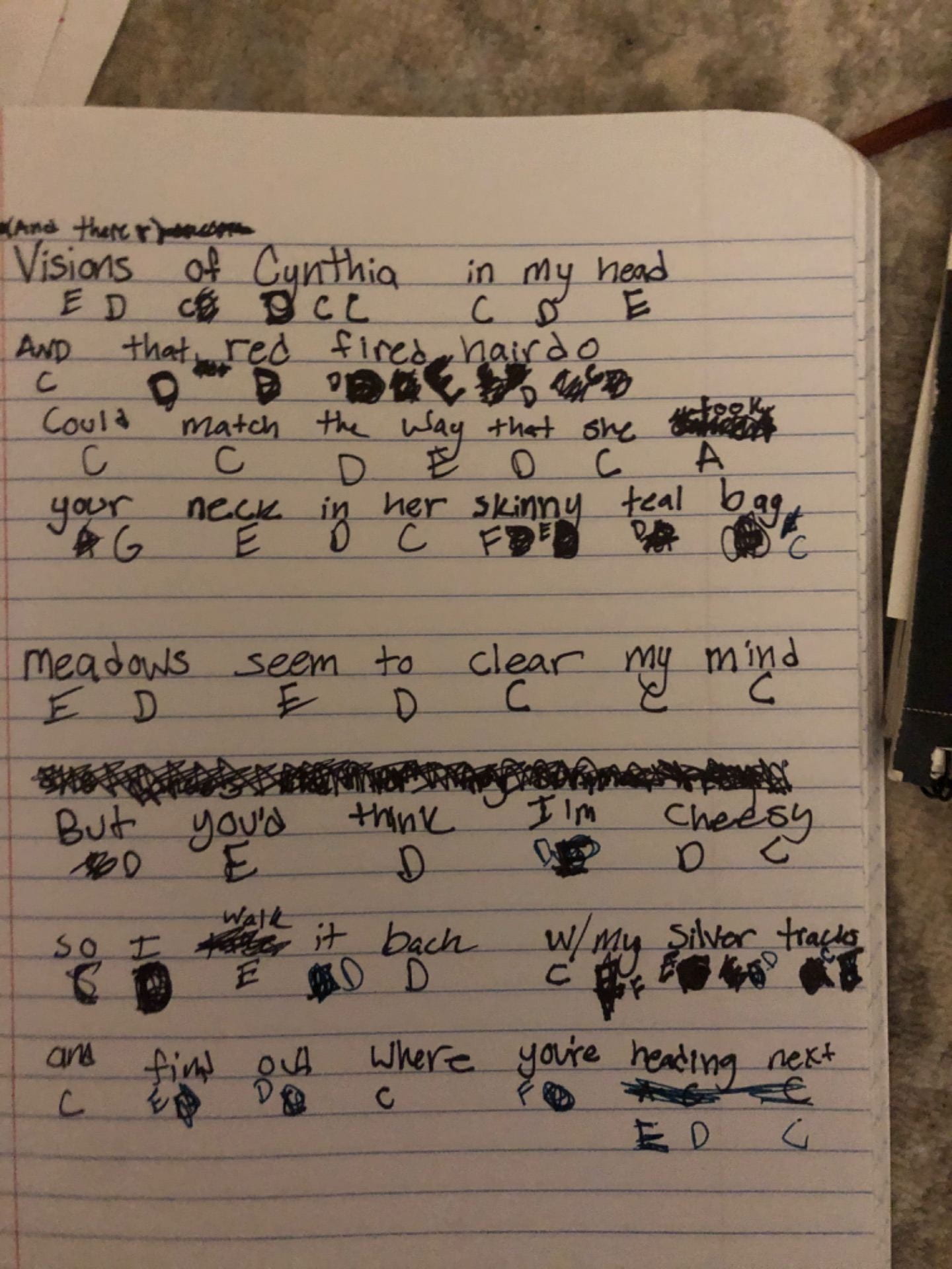
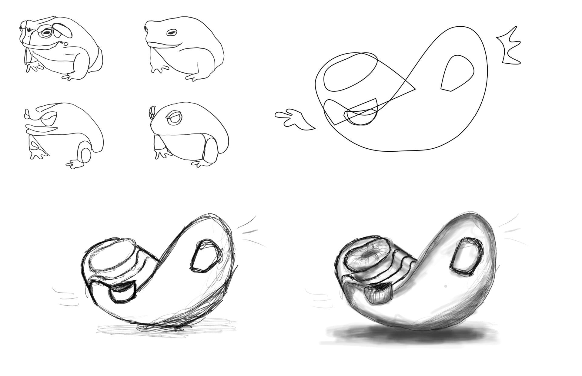
Above is my first draft of when I began to pluck the notes out for the melody. Both versions have lyrics technically, but that’s because when I read music or write it I find it easy to remember the rhythm and inflection that I want when I have something to attach the melody to like words. The words,however, are nonsense and don’t have anything to do with the project.

I want to say that above is my final draft. Although I am a little rusty on rhythmic composition, but it was helpful to put everything down on a staff, regardless of whether the measures were counted perfectly or not. Some things changed while editing and revising the audio version that I did not write onto sheet music.

First Audio Draft:

Above is the first audio draft that I made on GarageBand. I was not happy with this version of the track and the more that I messed with it, the worse it got. It did not have very good rhythm and I recorded a lot of the parts separately because I thought it was easier, but it ended up just taking away a lot from the rhythm and flow of the song. So I decided that design is supposed to be hard, so it can appear easy to it’s user; so I gave up on that version and began the journey of trying to record the melody perfectly within one take on the tiny GarageBand IPad piano/keyboard.

Final Audio:

I was finally satisfied with an audio that brought out all the aspects that I was intending like hope and peace.


Packaging

While the gift that I designed is the song above, I wanted to ‘package’ this song in a video that was simple yet interesting. I created a simple animation of the biker’s POV while on a peaceful stroll (on a warm sunny day, which my recipient mentioned in his ‘perfect day’). The animation has the same loop and every once in a while is interrupted by a passing flower or a bird. I kept these loops simple and didn’t add too many extra ones because I really wanted to focus on finding peace through observing the little things in life, which seemed to be important to Liam.

Animation Creation Time Lapse:

I also have a title page (which I won’t insert to save space, but it can be viewed in the final video form) that I kept as a still image with a moving title to further capture peace and serenity.


Final and Concept Statement

IMG_1573

“The only important thing about design is how it relates to people” — Victor Papanek


Using a muted color scheme with some simple animation creates a calming video to ‘wrap’ the gift which is the song. The meaning of the song and video draws attention to observing the little things in life; this is conveyed through a steady melody (with a few parts that stick out) and a video paired with it that has some small moments of objects passing by. Relating to the quote, the song uses chord progressions and patterns that are well known to catch the human ear’s attention. With hints of the obvious bike, the video shows a both literal representation of what the recipient enjoys, but also includes his reason for loving bike riding — finding peace through observation. 

Face Off

What is the Purpose of a Costume?

Masks and costumes have continually been used through history for plays, storytelling, representation, enjoyment, and so much more. The purpose of costumes are to add something to the natural human body to convey a thought or idea that isn’t naturally occurring on that specific human’s body.


What is OUR Purpose?

My partner Liz and I have been ideating things that fit within the realm of duality. In the beginning we focused on aspects that were visually or surface-level opposites. Some ideas that we had were:

  • sticky/flaky
  • messy/clean
  • spiky/fuzzy
  • inside/outside experience on a rainy day
  • blurry/clear vision
  • inhale/exhale (blobby vs. limp)
  • yell/whisper
  • shaky/stable
  • candle/ light bulb

After talking and doing a few mind maps, we decided to go with flaky/sticky.

You can view a PDF of some of our ideas here: Face Off Project

Better Defining our Ideas

After talking in class with Emily, we started to consider more of what the purpose and meaning of our costume was meant to be. We began to change from textures to types of traits in humans. The sticky changed to clingy (which changed to dependent) and flaky changed to aloof (which changed to independent). Then for our narrative, we focused on how these roles interact in a toxic relationship.

Our Narrative

“The time has now come to discuss the nature of toxic relationships. Often there is one partner that falls victim to the other. There is a manipulative individual who projects their negativity and toxic tendencies unfairly onto their partner. They want to taint them by trapping them in manifestations of doubt and insecurity. The objective becomes hooking them in to tear them down and siphon their energy. In an attempt to build their own damaged selves back up, they dangerously depend upon their partner to bend to their will. A developed sense of cunning is permitted to evolve the longer their partner is allowing the cycle to continue. So much pain has been endured through emotional damage, but this cycle will end–as all things must do. 

Never underestimate the moment when the victim begins to find their inner strength. Gradually, steps are taken toward emotional well-being through building their strength of mind. They are hardening against their partner’s persistent attacks. They are building a shield and preparing to strike back, now armed with self-awareness as their weapon. Welling inside them is their true defense, a suppressed version of themselves that is now ready to break out. When it does, a new energy, stronger than any that was taken from them before, emerges symbolizing a newfound resilience. The efforts of their former manipulator are rendered ineffective now and for the future.”

Independence (My focus of the Project)

WHO — this mask is to show the personal growth of independence and show that from independence grows self-love. This mask is for someone to realize their self worth and be firm in it

WHAT — this mask protects the wearer from being susceptible to the manipulations put in place by others who may want to suck their innocent and caring energy

WHEN — One uses this mask when it is finally time to concur its enemy in an attempt to escape to a happier and more fulfilling state

HOW — this mask cannot always be a choice to wear. Others may need to help the victim along the journey, yet very often in this process there becomes a decision made by the victim to split away from the tormentor

Visualizing Independence

You can view my entire Face-Off visualization process here: Face Off Process

What I learned

In this project I learned to work effectively with another mind. I experienced a collaborative design process (which was one of my firsts) and loved it! We were able to ideate very basic ideas and brainstorm lots of ideas from them. I am so glad that our project moved in the direction it did. I love the powerful message behind our narrative, and glad that we were able to represent it in a way that we were both proud of!


Hidden in Plain Sight

The Initial Exercises

1. Using fonts to represent several different words helped the initial steps of analyzing context and ‘space’ of something that otherwise seems normal. My group received the word group ‘pronouns’. We used: mine, you, oneself, y’all, and them. Applying those words to places were they ‘fit’ helped us to think about ways fonts and meanings could be applied to space.


2. I chose the letter ‘A’ from my name. The font I picked was a lower case version of a kindergarten-style font. The font, to me, showcases a mindset that I will never be perfect and peak (capital letter) because I try to go through life with the mindset that I am always learning and growing as a person. I filled the ‘a’ with an apple because my small town that I grew up in has a major theme of apples (apple water tower, apple festival, apple orchids, etc.) and think it is important to give tribute to your roots and foundations.


Choosing the Space

My three different places are below. A dirty corner in Hopkins, the light table in Hayes, and two windows that were across the way from each other. In the corner in Hopkins I thought I could play on the use of dirt and color of the tile. The light table I figured that I could use the ideas of shadows. With the windows I wanted to create some perspective change while moving on the stairs. Although I ultimately picked the windows, I still incorporated the idea of using dirt from the Hopkins corner.


Concept Draft

Initial concept draft before review:

Final Concept Draft:

Ideas for Implementation

Lenticular perspective art

Initially I wanted to try and do an accordion style lenticular perspective change. I soon realized that that wasn’t very possible with the given angle constraints that I wanted to stay in. I began to try and ideate a way where the words “and opens windows” could appear with just the slightest shift. To do this I wrote “and opens windows” with large white letter and then put a grate of a dark brown color in front of it. This contraption rests in between the stairs and the window across from the main window. I then took slivers of that same dark paper and then took a picture of where they would have to be for it to be seen on one step and not the other. This only allows every other shred of the word to be seen, but through the gestalt principles of closure and proximity, you are able to read the words.

The tape with stripes on it helped me to measure exactly where the shreds should be taped on the window so it lined up correctly.

Final

The final reads “Love unlocks doors that have gone unseen”. Yet when you step down a step the other window reveals the words “and opens windows” so the quote finishes “Love unlocks doors and open windows that have gone unseen”. This reveals a window that has gone unseen. In the main window I simply added my own dust (some water and chalk dust) and wrote “Love unlocks doors that have gone unseen” but the space in between ‘doors’ and ‘that’ is where “and opens windows” is seen. Someone has even walked by and underlined the word “that” which I was initially upset with, but I have decided that the fact that they underlined it just proved that it blended in to the space because they didn’t know it was a project.

Although the lens on my IPhone camera doesn’t represent it very well, until I get ahold of a better camera, here is my final:


Imagined Journey

Ideation

To reimagine the Journey, we had to come up with a short and reimagined experience. Below is an attached picture of mine

My concept for this project focuses on the final treasure, the RPAC jacuzzi, and begins to play with the idea of what strangers mean to others. Jacuzzis are a weird and uncomfortable public spaces and coming to OSU and being forced to interact and meet people seems to be represented by that well. I included Haikus from anonymous people about their feelings on strangers to capture a chaotic mind state. The final project is an abstracted version of that same jacuzzi with a hand reaching out towards the viewer.

View my ideation process here: Scan Dec 12, 2019


Process

For my process post, I recorded a vlog because I felt like it better documented my process and that you can view here: https://youtu.be/fOlV_uasnt8

In front of the jacuzzi I included a display of haikus that other people wrote about strangers pictured below. It is titled “Warmest Regards,”

Towards the end, it started to leak so I went to the store before hand and got paper wrap, ziploc bags, and condoms to try and water-proof it. None of those worked though! So I used a trash bag and a lot of duct tape. I also added tension by putting a rubber band around it and used towels to control the leaking.


Final

Below are images of the final. A video of the final is also included in the process vlog.

Here is a short video of the final


Abstracted Metamorphosis

Research and Abstraction

For my three forms I picked a toad, armadillo, and a lily flower. I wanted to choose natural forms that had a unique geometric feel to them, like the toad and armadillo. I selected a lily because they have been on my mind lately and felt like it was needed. You can view my original breakdown of these forms here: forms


Reconstruction

I made 15 iterations for each of the three forms. This helped me to think of ideas because I put all of my ideas on the page even if I thought they were bad. Below is the process of the reconstruction of the lily flower. This reconstruction was the biggest challenge for me and required the most drawing from imagination rather than drawing from another image. Below are the beginning reconstructions of all three forms, and then a more in depth reconstruction process for the lily.


The Armadillo Amphitheater

This theater I had in mind to belong to some sort of summer camp held somewhere in Arizona. The stage is perfect for end of camp talent shows or inviting the locals to a small acoustic set. I wanted the theater to feel small and homey for those who would visit.


Bed Side Hero

This rough and tough action star is the purfect protector against the monsters under your child’s bed and is especially good at scaring off the boogey man in their closet. This dynamic character is equipped with movable action joints, a soft plush body, and detachable armor. Sensational for fighting all things that go bump in the night, the Bed Side Hero really is no scaredy cat.


Full Music Immersion experience chair

The FMI chair is great for any child, teenager, or adult that has been on the hunt for that perfect place to listen to their new master playlist. Not only does this chair form perfect to each persons unique body, but it submerges you in the music experience of a lifetime. Find yourself humbled while you are swallowed in a cocoon of immersive sound.


Final

This project definitely challenged my ability to draw from imagination. Creating ideas based off of these abstracted forms did however seem really encouraging and exciting from an industrial design viewpoint. Talking with others in critique was actually one of my favorite parts of this project because everyone seemed so eager and excited to be creating these things purely from imagination!

Spatial Assembly

Learning the Technique

We began learning how cubes are shown through one-point and two-point perspective. You can see the beginning process of that here. Through this I learned how high/ low or to the right/left an object should be to get my desired perspective.  We furthered this by applying more complex shapes to the perspective techniques and adding shading, which you can also see here.


Designing the Room

It was time to apply the new uses of perspective and shading to a comprehensive room. We began with a practice room/ perspective grid and placed a simple cube within it, which you can see here. I knew I wanted my room to be simple and minimalist. To do that, I would have to find a way to add some complexity to the drawing somewhere, so I took another spin at practicing shading and the way that it can affect a space. I feel as if I could improve upon my shading skills or try new shading techniques like stippling or cross hatching. I also included a cat with my room; I would like to get more practice at drawing organic objects in perspective. I tried to be conscious of depth cues like darker objects being closer and closer objects having more details (I tried to do this especially with the leaves on the front porch).


Contents of the Room

I wanted a clean room that I could see myself actually working in. You can view the final project here.

-I added a hanging chair that has a track attached to the ceiling. This would allow me to easily move myself to different areas in the room without extra floor clutter.

– I added a large window that would let in tons of sunlight and would be a nice place to swing my chair towards if I needed a break (also an excellent place for the cat).

-The candles allow a soft and welcoming environment for when the ceiling light becomes too much.

-The desk is against the wall with minimal decorations to allow all focus to be on whatever project I am working on.

-In the back of the room is a tiny door. I’ve always wanted some sort of interesting passage (or even a secret passage) of my own.


Journey to a Treasure

Process

Drawing using Triangulation made me feel much more in control when doing observational drawings. It helped me to create the correct proportions a lot easier than I had before.

Walking the path given to me was the first task. Finding something new along an almost familiar path was the second task. Finding meaning along my way came almost naturally. There’s something for everyone on this campus.


My 5 Places

Drawing five meaningful stops along the way, I found inspiration in most pictures. Sitting and drawing something gives you a lot of time with that certain something, Maybe the reason I was drawn to so many buildings was because of all the possible stories they could hold. My lunch and the hot tub may seem mundane to others, but by giving an anecdote with them I hoped to involve the viewer in the drawing.

Triangulation is a new method of drawing for me, however not being perfect at it yet, I know it will help me exponentially and I am excited to involve it more in my process.