Color Correction vs Color Grading
 Working with color is an important aspect of video production that many people grow into, at least cursorily. As part of being a novice in post-production terminology frequently gets misused or interchanged. While color correction and color grading use some of the same tools and processes they serve different purposes and are done in different parts of the workflow.
Color correction is used to alter footage across a project so that its appearance is consistent, creating an accurate portrayal as it would be viewed by the human eye, making sure whites look white and blacks look black. Typically this is compensating for inaccurate camera settings, leveling color temperature, or adjusting contrast, brightness, and saturation. The human eye will view white under varying lighting as white. However, with cameras you have to tell the sensor what white is. If done improperly your image will have a red, blue, or yellow cast. In addition, if you are shooting outside over the course of an entire day the color of the light will change as we move from sunrise to mid-day to dusk. Even passing clouds will change the color.
Color grading (color timing in reference to film) is altering the image for aesthetic or communicative purposes to enhance the story, create a visual tone, convey a mood, express emotion, or carry a theme. Typically the alterations in color grading are more extreme than with color correction. Rarely color grading can even be used to salvage problematic footage that color correction is incapable of fixing. Usually at the end of editing the editor will begin color grading, give the project to a dedicated colorist, or when quicker turnaround is required the footage will be sent off to be graded while editing is being done.
Color is a powerful component and careful thought goes into crafting the look of a piece. Grading can be used subtly, to warm a scene by pushing the oranges and reds to give it the feel of late afternoon, or be used to make sweeping changes, creating striking visuals creating a surreal dream sequence.
 There any many common grades that you may not have overtly noticed. A desaturated look is used to indicate something from a long time ago, such as in HBO’s Band of Brothers. Sepia tone is also used for the same purpose, but more sparingly.
  O Brother Where Art Thou employed a variant using desaturation while exaggerating the yellows and orange hues in a monochromatic color palette. Desaturation can also be used when dealing with a bleak and dreary world like the one in AMC’s The Walking Dead.
Contrasting color grades can be used to differentiate locations, opposing forces or viewpoints, and acts within a picture. Steven Soderbergh’s Traffic used starkly contrasting color themes for Mexico’s corrupt underbelly and the United State’s political environment.  The Matrix movies are another iconic example of color being used to indicate changes in locale with heavy greens for the Matrix and more true to life colors for the real world.
Pitch Black uses color theme changes to show time lapse akin to Traffic’s use for locale. The warm, desaturated, blown-out highlights are used to stylize the ultra-bright daytime of multiple suns with dark, cold blues for the long, dangerous nights.
Faux nighttime can also be created in color grading when the footage was shot during the day. This is common practice since shooting in low light can be difficult and frequently imparts heavy grain in the image.
Production Tip: White balance off a manila envelope for easy in-camera day-for-night.
Thanks Jason Johns, Media Services’ man-of-awesome!
Along the same lines, almost all night vision shots are created with color grading, such as in this shot form Zero Dark Thirty.
Recently major Hollywood block busters have adopted a duo-tone color theme of warm midtones and cool shadows & highlights creating neutral backgrounds with almost-orange skin tones. This treatment can best be seen in the Transformers movies, which some argue is being overused.
Color grading can do more than just affect the image as a whole, though. With color grading you’re able to isolate colors for secondary color correction as well. For instance, a shot in the forest that’s drab straight from the camera can become a vibrant, lush landscape without affecting skin tones and other colors.

Adobe Speedgrade’s presets
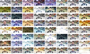
So, how is color grading done? Professionally color grading is done with dedicated software such as DaVinci Resolve, Red Giant Colorista II, or Adobe Speedgrade, but much less elaborate tools also exist in editing and compositing software like Premiere and After Effects for rudimentary control. Color grading softwares come with at least a handful of presets and add-on packages of nothing but presets, such as Magic Bullet Looks, are available for one click styling.

A sample of the presets included with Looks
However, if you inspire to do more than just slap a template look onto your video, an understanding of color theory is crucial for good color grading. A good overview of color theory is available at worqk.com and Adobe has a fantastic color theme creation tool. While one of the best ways to get good at color grading is to do it everyday day-in-day-out on a variety of content, the next best thing is to study deconstruction videos from professionals. These videos walk you step by step through how they created the look through layering grades and manipulating ranges of thresholds and tolerances within the color channels.
A blog of color grade breakdowns from professional colorist Charles-Etienne Pascal.
http://blog.iseehue.com/
A color grade breakdown article from PremiumBeat.com
http://www.premiumbeat.com/blog/impressive-color-grading-breakdowns/
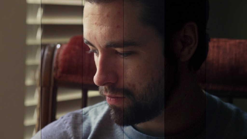
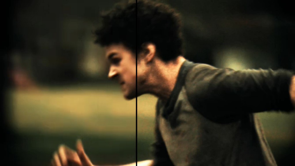
Checking out before and after examples is also a great way to see what’s possible.
Adam Myhill provides some before and after examples
of his color grades with some extra insight.
http://www.adammyhill.com/color-grading/
A great color analysis of the movie Black Hawk Down.
http://www.outside-hollywood.com/2009/03/color-theory-for-cinematographers/


