Posts

Photoshop Tutorial – Comic Effect

Photoshop Tutorial – Comic Effect

Do you like Marvel Comics, manga, or graphic novels? Have you ever imagined how it would be if you looks like one of them?

If you are interested, this tutorial will help you out.

Perfect Photoshop  tutorial for comic geeks!

1. Open up an image file that you want to make a comic effect on.
->file-open

2. Make a right click on the ‘Background’ layer, and press ‘Duplicate layer’

*Optional* Double click on the new layer’s name, and change it into ‘Line’

3. Click on the Filter tap, and go to the ‘Filter Gallery’

4. As you get into the Filter Gallery, Select ‘Poster Edges’ on the right tap, and adjust each set point

-> Edge Thickness : 10 / Edge Intensity : 10 / Posterization : 2

Press OK on the right top

5. Click on ‘Image’ tap, get to Adjustment->Threshold to make a black and white linear effect.

6. Adjust set point somewhere between 10~20 based on your image.

7. Press an eye emoticon located on the left part of your ‘Line’ Layer bar.

Duplicate the background image layer one more time

*Optional* Double click on the new layer’s name, and change it into ‘Color’

8. Get into the Filter Gallery (Filter-Filter Gallery), and adjust each set point.

-> Edge Thickness : 0 / Edge Intensity : 0 / Posterization : 2

Press OK on the right top

9. Go to ‘Level’ in the Image-Adjustment tap.

10. Set the output level into 50.

11. Go to ‘Hue/Saturation’ in the Image-Adjustment tap.

12. Set the Saturation into +35

13. Go to Oil Paint filter (Filter-Stylize-Oil Paint) and adjust each set point.

Stylization: 8 / Cleanliness: 5 / Scale: 0.1 / Bristle Detail: 0 / Angle: 0 / Shine: 0

Press OK

14. Click on the ‘Line’ Layer, and open up the eye emoticon on the layer bar.

15. Adjust the ‘Line’ layer setting into ‘Multiply’

16. Click on the Black and white Circle on the bottom of layer section, press level.

17. Move around the points of the Level section to make whole image blend altogether well.

Finish!


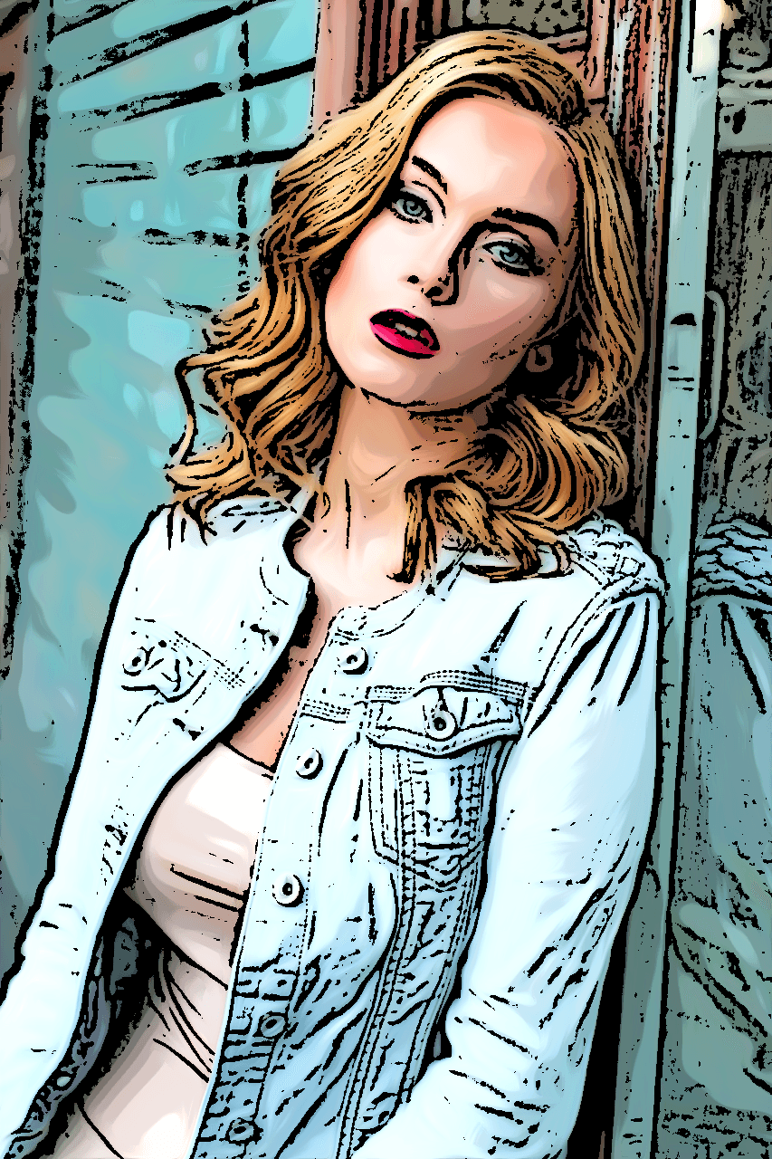
Drawing actual comics or graphic images by hand is hard for many people. So for those people who like comics and want to create their own image, I introduce this comic effect Photoshop tutorial. It can be made out of any photographs that have taken by anyone, and isn’t hard at all as we follow this tutorial step by step.

Working on this Project, I wanted people to see how their photographs can be such dramatic, graphic image. By changing photograph with deep volume and 3-dimensional color into much more flat, strong-bordered image, I hope people to enjoy how they can make an image that looks like comic strip so easily, and explore further possibilities of effects that Photoshop can make. By adjusting series of images, they might be able to create their own comic strips.

Face Swap


For this project, I chose Yayoi Cusama, a famous Japanese artist. I chose her because she is a well-known, refined Asian artist who has a high technique of making art. As myself who is a student studying art, Kusama’s overcome of own trauma by making art moved my mind. Also, her aspect of making various, eye-taking patterns is something I really like. So I tried to face swap with her. I chose the image of Kusama with a fierce, vivid color of  red, and I matched it with myself in a strong red makeup. As I went through the tutorial, those two matched really well, and I am really satisfied how it turned out. It was such a great way to make a spiritual connection with myself and this artist.

For the tutorials I have been using for this work, the first one with Mona Risa and Trump was helpful to me. I think it is because I am familiar with adjusting actual settings and colors with Photoshop, so It was more easy to place the face manually and make the color fit by myself. I was thinking that if I could make tutorial on top of this, I would add how to adjust the color balance, hue and saturation of the swapped face, and overall image. By telling people how to do that in step-by-step screenshots, It won’t be so hard, and this technique would make the image more actual and natural as we swap the face.

Identity Self-Portrait


Identity Worksheet


9/11

Maybe the most impressive and straight-forward way to describe oneself is by making self portrait. But because just “drawing” oneself can be stereo typed image, I tried to approach it by another way. So I am trying to make my self-expressing portrait by making a collage out of fabric textures and images. Based on my identity worksheet, I chose my occupational part as an subject to dig in, which is a student who is majoring textile art in Korea. Creating something out of diverse textiles, threads, and cloths is always interesting. So for this project, I am going to express myself by creatively making a digital image of myself by using various textures.


9/18

I am making my Self portrait by creating a collage out of fabric patterns. It emphasizes my major, fiber art. On top of last time’s work, now I am planning to add stitches, threads, and needle to make it more clear that this work is made out of sewing fabrics into collage. I am adding shades by dividing planes, and it makes my image more diverse.  I mixed shapes to create my image, and added lines on top of them to emphasize my subject matter. By using different textures and colors, I tried to make a form by shading the shapes. Also, I used warm and decent colors to express my cozy feelings with my own major.


9/19

for my final image, I emphasized my image by making a frame as an postcard. With diverse patterns, I tried to make the movement along the form on the curvy hair and stitched that I added on my image. I divided proportions on the background so that the image won’t look boring. By trimming the image and adding small details, I finished my identity portrait project with broad unity inside of its image.

Elements Of Art & Principles Of Designs

Elements of Art

1. Line

On my way to the class, I found out a combination of straight line, cracked line, and a curved line.

2. Shape

Wondering around for the shopping, there was paper bags with tremendous shapes on them. Each shape combines together to form various images.

3. Color

It was wonderful to find out so many kinds of green colors on one tree.

4. Value

Brutus statue, which is the famous one in our Ohio Union, showed me rich value made by light on the metal.

5. Form

3-D formed standing mannequin with cloth on reveals solid form.

6. Texture

Tree is surely a common thing we pass by everyday, but as I look closer, its texture was a lot more interesting that I thought.

7. Space

With a large hall on the canter and several floors, Ohio Union shows unique space formats.

Principles of Design

8. Balance

As I start concentrating on the elements and principles around me, I could find out symmetrical balance from the architecture.

9. Contrast

Peeking the door just a bit can make a dramatic contrast with the help of the light.

10. Emphasis

Exit sigh is everywhere, flashing bold red light to give an emphasis.

11. Movement

Escalator, which usually move our body to other floor, can also lead our eyes to make a movement.

12. Pattern

Pattern is everywhere, even on the hallway of my dorm that I walk over every day.

13. Proportion

Folders on the shelves could form geometrical image by taking proportion for each colors.

14. Repetition

I found out repeating zigzag lines, forming a decent design on the paper bag.

15. Unity

With the unity of nature and man-made things, it forms a good view of the High street.

Letter to Stephanie

Dear Stephanie.

Hello, This is Hannah Park. I am a junior student currently studying in OSU.

I am an exchange student from Ewha Womans University in Korea. Since I was a kid, I was always eager to make arts – not just paintings, but also designs, 3-d sculptures, and digital arts. With this eager, there was another huge experience that broaden my perspective toward art. After finishing my courses in the Kaywon Art High school, me and My family got to visit Virginia, USA. By studying abroad in Blackburg High school in Virginia, I got to change my view of dealing with artwork by experiencing AP Art class. Before, I was trapped in old-fashioned way of creating art because of the entrance test that I had to take in Korea. That made me stay in repeating old techniques. However, by learning in new country with whole new way of education, I learned how to see things in new perspectives and realized I can also do a lot better by trying fresh methods and techniques while creating arts – and digital art was the absolute option for that. It has really broad range of possibilities. Every media we use, experience, and feel can be the materials. It can be the the method to express myself toward the world, show what I am thinking, and make myself meaningful. Such experience will be so important for the students who are on their way to grow their mind and perspective, no matter how old their age is.

This course seemed to be great chance to share such experience. When I got to learn new things from teachers, other students, and instructor, It made me build up myself. As an grown up student, I want to share my knowledge as the way I got helped by tremendous of people while I was growing up. I want to make other students to feel how it is like to create their own piece of art, and how it can affect oneself in diverse ways. Also, I think affecting others is not just giving my knowledge. As I teach others, I myself also get taught and could progress by that experience. This is the thing I am expecting to gain by taking this course.

However, there is still concern in my mind. Although I love sharing my knowledge and make my time meaningful by working with younger students, I am worried that I might not get fully connected with them emotionally. As I have experienced studying abroad when I was young, I know having English as an second language makes hardship in communication in some way. But I think I will get to figure out the way, as I always did.

These are my thinking that I wanted to share with you. Thank you so much for hearing !

Yours sincerely

Hannah Park