Affinity Diagramming Process and Results
For this activity, we used the software tool Miro. Each team member initially brainstormed prior to the first meeting, writing down takeaways and trends that they have identified from the collective body of research gathered so far. Each group member used a different color sticky note to keep track of their posts as shown below.
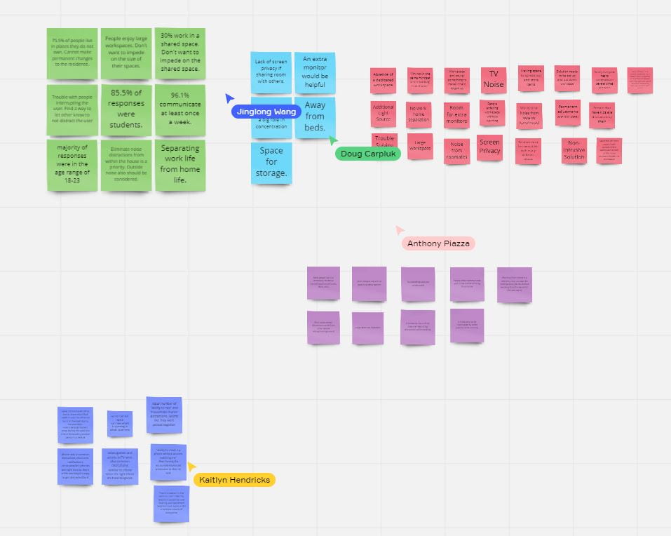
We then came together to discuss each note and start to formulate general categories/themes that were emerging. As we discussed, we dragged the notes that represented a common category into a certain spot on the board in order to organize the diagram.

Analyzing these categories even further, we decided to create a label name for each category, classifying what the grouping represented. Frames were used to enclose the notes in each category to make it easier to navigate the diagram.
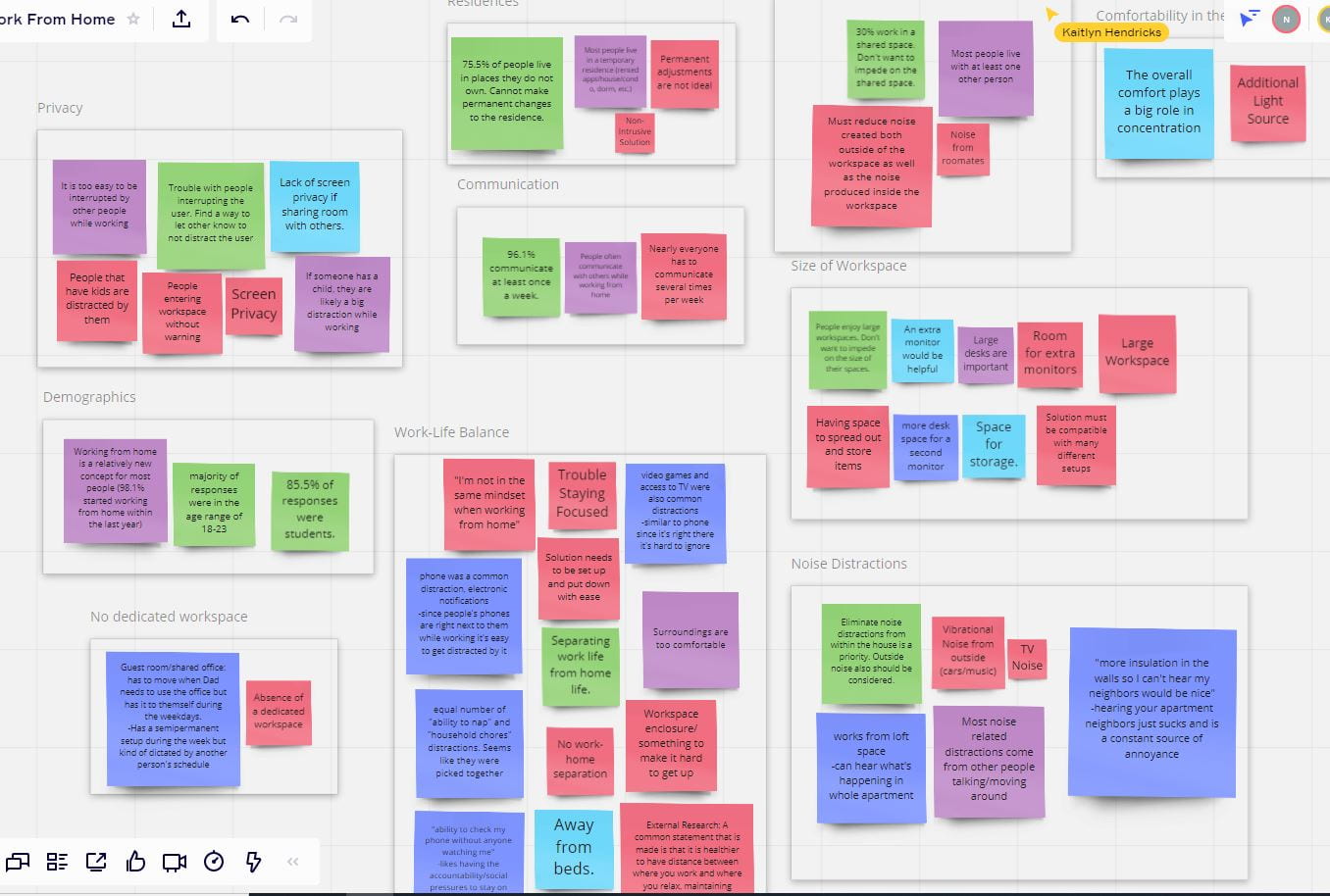
The next step of the process included us going through all of the photos collected using the survey to take note of common observations of workspaces. These notes were collected in a separate frame on the same diagram.

We decided after the photo analysis was completed to end our first meeting and return in a few days with a clear head and additional notes grounded in our individual survey responses and quotes that would add to the diagram.
In the next meeting, we placed the newly generated sticky-notes into their appropriate category. Several adjustments were made to the categories, as the “No dedicated workspace” was merged into the larger category of “Work-Life Balance”. Also, the sticky-notes from the “Photo Study” category were moved to different categories in which they belonged, most falling into a new “Workspace Setup/Configuration” grouping. With this, we had created a final Affinity Diagram that could be reflected on.
Final Diagram: (Here is the PDF version to more easily view individual notes)

Reflection:
What did you learn?
The affinity diagramming activity provided us with a lot of useful information. After going through the affinity diagramming process, we were able to confirm some of the data that we found in the preliminary research phase. One of the main findings in our early research was that various forms of noise were some of the most distracting parts about working from home, and the affinity diagram proved this. The group also gathered new information regarding the importance of a “work-life balance”, and found that many people find it too easy to do various everyday tasks while working from home. Also, by using the pictures that people provided in the teams’ survey, they found that extra shelf storage and ample desk space are important to most people.
Did it bring clarity?
A major dilemma remains an underlying stereotype of potential solutions, which could affect the judgment of our interpretation of data. The affinity diagram helped us in a way that members of the group, being open to others’ opinions and being objective to the survey data, could categorize the different areas to focus on and reduce the influence of our thoughts. For instance, some specific details about the working environment could be paradoxical yet coherent, from our survey, people want a comfortable environment but they also want to feel as if they are at school or office so that they won’t be bothered by beds, sofas, or maybe PlayStations. Prior to the affinity diagram, this level of understanding had not been established.
What did you find challenging?
Meaningfully grouping our notes and removing bias made this assignment challenging. First, it was difficult to extract the root intention of each note and pair it with others of similar intention. While grouping things, we weren’t sure if the categories we had identified were weighty enough; that is, did the categories we chose have merit? Could we pull a key idea from the category for use in subsequent steps? Furthermore, after we had worked through the first iteration, we found it challenging to recategorize things into a reasonable second draft. Secondly, we all found it challenging to let go of our preconceived solutions or the biggest problems of working from home. That is, we found ourselves asking questions like “what were the most common distractions people had?” instead of “did people tend to be distracted by things?” What we thought was a problem from our initial research, sometimes did not end up being as big an issue as we thought and we found it difficult to let go of those ideas.
Are there any lingering questions?
After completing the assignment there were still some questions that we had regarding the process moving forward. As we came up with our groupings in the affinity diagram we were able to see some of the trends that persisted through our initial research and survey. However, we are unsure what the next step is with this data. We were able to draw some conclusions from the data we had but as far as the next steps are concerned, we are still unsure. We believe that from this data we will be able to create need statements that will guide us through our design process moving forward. Moreover, we considered some changes we believe will need to be made. In the coming weeks, we plan to create need statements grounded in the information from our preliminary research and our affinity diagram. To do this, we will want to reorganize the small groupings into larger concepts. We believe this will help us visualize not only what we need to do moving forward but how we should tackle these issues as we run into them.
-

- Our Individual Notes
-

- Working Towards a Solution – 1
-

- Working Towards a Solution – 2
-

- Working Towards a Solution – 3
-

- Our Final Diagram