Public Health Informatics Portfolio – Data
Healthcare-Associated Infections (HAIs) can increase mortality, length of stay, and cost in hospitalized patients. Generally, they may be prevented. There are several types of healthcare-associated infections. For example, the Centers for Disease Control and Prevention (CDC) states that HAIs include central line-associated bloodstream infections, catheter-associated urinary tract infections, and ventilator associated pneumonia. Additionally, infections may occur at surgery sites. It is estimated by the CDC that “5-10% of patients inside hospitals acquire an HAI while studies showed that around 30-70% of HAIs can be prevented” (Hammound et al). According to the World Health Organization, of every 100 hospitalized patients at a given time, 7 in developed and 10 in developing countries will acquire at least one healthcare-associated infection. In addition, in high-income countries, approximately 30% of patients in intensive care units (ICU) are affected by at least one healthcare-associated infection.
Not only does a HAI negatively impact the patient and most importantly their health and safety, the presence of HAIs may also impact resource utilization and the facility financially. In addition, HAIs can prolong hospital stays and increase resistance to antibiotics. Involving the patient more in the care process could reduce the chance of obtaining a healthcare-associated infection. This can be completed through patient empowerment, or patient involvement. Patient empowerment refers to “permitting patients to achieve the information and build the needed skills to make decisions and contribute to their care process by educating and encouraging them to participate in all aspects” (Hammound et al). Since a vast majority of HAIs can be prevented, what measures may be implemented in order to reduce the amount of healthcare-associated infections at a facility in Ohio? If changes in protocols are implemented, how will that affect the HAI rate at that facility?
Hypothesis: If a facility is located in a rural area of Ohio, does that put that facility at a higher risk of being below the national benchmark in regards to hospital acquired infections (HAIs)?
In order to identify facilities that may need assistance in implementing new protocols, the Healthcare Associated Infection (HAI) Measures – Provider Data was used. This data was accessed from data.medicare.gov and measures are developed by the CDC and are collected through the National Healthcare Safety Network (NHSN). This dataset provides information on infections that occur while the patient is in the hospital. The dataset contains quantitative data – including the facility name, address, measure name, status compared to the national average, score, and the measure start and end date. The metadata was updated on July 29,2020. A limitation would be that only specific measures are collected, such as SSI – Colon Surgery and MRSA Bacteremia: Observed Cases. In addition, the measures are compared to the national benchmark, however this dataset does not account for variables such as funding to the facility and availability of resources.
To identify facilities that are below the national benchmark, Tableau was used. The most recent spreadsheet was imported into Tableau. One downfall of this process is that if you do not update the data source, you could not be analyzing the most current information. Alternatively, the site data.gov had a visualization tool in order to manipulate the data. This pulls the dataset from the website, so to ensure the data is always current, it would be beneficial to pursue this route. However, the visualization tool on the website has limitations and you can produce more in depth visualizations with Tableau.
Below are visualizations reflecting the facilities and their standing in comparison to the national benchmark.

This pie chart shows all of the facilities and the proportion that are better, worse and the same as the national benchmark. The larger section of the pie chart are facilities (105,840) that do not have data available. There are 53,964 facilities (31%) that are no different than the national benchmark and 13,986 (8%) facilities that are better than the national benchmark. Only 2,034 facilities are worse than the national benchmark. Below is a map of Ohio highlighting facilities that fall into these categories. Going from left to right, facilities that are better than the national benchmark are displayed followed by no difference and lastly worse than the national benchmark.


Results:
Below is a map of Ohio that separates the counties based on the URGEO data from the FY2019 IPPS Final Rule published by the Centers for Medicare and Medicaid services (CMS). This data set “contains the final FY 2019 readmissions payment adjustment factors under the Hospital Readmissions Reduction Program that will be applicable to discharges occurring on or after October 1, 2018. It also contains information on the number of cases for each of the applicable conditions and the base operating DRG payments used in the calculation of the readmission payment adjustment factors” (CMS.gov).
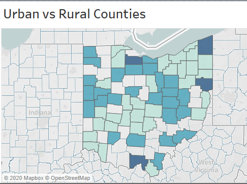
Urban counties are denoted by a score of 0, or the light green on the map and rural counties are denoted by a score of 2, or navy blue on the map.
It is apparent that the facilities that are better than the national benchmark are generally in higher populated areas of Ohio. The facilities that are below the national benchmark are located in both urban and rural classified counties. Since the facilities that do not differ are spread throughout the state, it would be beneficial to focus on those that are not in an urban area, as they are likely more at risk for dropping below the national benchmark – possibly due to lack of resources or funding.
Sources:
FY 2019 Final Rule and Correction Notice Data Files. (n.d.). Retrieved October 10, 2020, from https://www.cms.gov/Medicare/Medicare-Fee-for-Service-Payment/AcuteInpatientPPS/FY2019-IPPS-Final-Rule-Home-Page-Items/FY2019-IPPS-Final-Rule-Data-Files
Hammoud, S., Amer, F., Lohner, S., & Kocsis, B. (2020). Patient education on infection control: A systematic review. American journal of infection control, S0196-6553(20)30354-0. Advance online publication. https://doi.org/10.1016/j.ajic.2020.05.039
Healthcare-associated Infections (2016, March 4). Retrieved from https://www.cdc.gov/hai/index.html.
Healthcare-associated Infections Fact Sheet. Retrieved from https://www.who.int/gpsc/country_work/gpsc_ccisc_fact_sheet_en.pdf
Public Health Informatics Portfolio – Survey
The purpose of this survey is to evaluate how knowledgeable facilities are about hospital acquired infections and to see if during a patient’s healthcare stay, staff at the facilities are completing tasks – before, during and after procedures – to help reduce the chance of obtaining a hospital acquired infection. In addition, this survey will evaluate what safety measures are put in place to help reduce the chance of a patient acquiring a hospital acquired infection. Since our data is is evaluating if the location of the hospital – rural or urban – and the impacts of the rate of hospital acquired infections at the facility, the survey will ask participants to identify the zip code and county of the healthcare facility.
The target audience of this survey is clinical and non-clinical healthcare workers, ranging from nurses to hospital administrators in all departments of the facility. Having this range in responses is imperative, as it is good to consider opinions and feedback from those who create policies (hospital administrators) and those who deliver patient care (nurses and physicians). This survey will be administered electronically via a link to the respondents email with an identifier being the respondents occupation. A challenge that could be that the responses by the respondents could not be honest. For example, this survey is asking questions like “do you wash your hands every time you enter and exit a patient’s room”. If the respondent does not do what the question asks, they may not answer truthfully.
Link to Survey: https://osu.az1.qualtrics.com/jfe/form/SV_416l5LeRDExLVlz
Some challenges that came with developing the survey was making sure you can capture all of the necessary information for your study while making sure that the survey is not too long or repetitive. In addition, choosing the format of the survey was a challenge. You want to make sure you capture the information in a way that is easy to analyze. For example, a free-text section would allow respondents to adequately express their opinion about the subject, however it is hard to effectively analyze. If you were to have a free-text section, you would have to train those analyzing the survey to ensure the results are consistent.
Public Health Informatics Portfolio – News & Timeline
For this assignment, I looked at the article Location Data Says It All: Staying at Home During Coronavirus Is a Luxury by Jennifer Valentino-Devries, Denise Lu and Gabriel J.X. Dance. This article was published in the New York Times and it tracks movement in the 25 most populous metropolitan areas (such as San Francisco, Boston and Washington) based on aggregate cellphone location data. This data is provided by Cuebiz, which is a location analysis company that tracks roughly 15 million cellphone users nationwide daily.
The visuals included in this article showcase movement of individuals on metro systems beginning in February 2020. As seen on the graph, the movement dramatically decreases around March 16, 2020. This is the time that citizens were advised to stay at home to slow the spread of the virus. Furthermore, this graphic separates the movement by individuals in the wealthiest and poorest areas. In all of the major cities, similar trends were found. Data shows that wealthier individuals were able to avoid using public transit amidst the pandemic, suggesting that they have an advantage over poorer individuals – such as increased job security and benefits like the ability to work from home.
This article is a good example of a function of Geographic Information Systems (GIS) as it allows individuals to visualize and analyze data in order to make informed decisions about a particular issue. In this example, the graphic shows that people in higher income neighborhoods are able to stay home versus those in lower-income areas.
This data is beneficial to public health officials as they can evaluate how those individuals that live in low-income areas are impacted by the pandemic. This data can showcase the concerns and potentially can trigger an increase of resources sent to this area. If combined with other data, they can evaluate access to healthcare, distribution to PPE in the area, and guidelines mandates to stay home and mask requirements.
Public Policy Experts who have evaluated this data have also mentioned that there could be other factors accounting for this difference – such as access to information about COVID-19 and awareness of risks of the virus. In addition, as most of the individuals who are traveling via public transit/metro systems are from low-income areas this could be good data to support the fact that those in “essential” job roles, such as grocery workers and delivery drivers, need access to adequate PPE and testing resources.
A report that evaluates Public Transportation and COVID-19 transmissions was published in September 2020 by the American Public Transportation Association. This report offers a comprehensive review of COVID-19 transmission and Public Transportation in the United States including data analysis and input from public health experts. One notable quote is from Dr. Thomas Matte, a Senior Science advisor for Environmental Health at Vital Strategies (a global public health organization). He says “the public perceptions and press coverage of COVID-19 transmission risk in transit has created more fear than is warranted by the evidence.” As of August 2020, no outbreaks have been traced to public transit in the United States and it appears that rates of COVID-19 are independent of public transit ridership. There is a very weak correlation found between infection rates and transit usage. In addition, the New York Times conducted a survey of various transportation agencies and it was found that there has been no notable super spreader events linked to public transit. This can likely be attributed to to several factors: mask wearing, less crowding, increased hygiene efforts and a higher refresh rate of airflow on public transit vehicles. Some strategies to accomplish this are frequent disinfecting of highly touched surfaces, UV light disinfectant technology, PPE supplied to transit workers and Safety Ambassadors present at stations.
This data enforces the idea that proper education, distribution of materials and access to healthcare should be evaluated in low-income areas where COVID-19 cases are high, as the spike in cases should not be attributed to public transit usage.
Sources:
Schwartz, Sam. 2020, Public Transit and COVID-19 Pandemic: Global Research and Best Practices, www.apta.com/research-technical-resources/research-reports/public-transit-and-covid-19-pandemic-global-research-and-best-practices/.
Valentino-devries, Jennifer, et al. “Location Data Says It All: Staying at Home During Coronavirus Is a Luxury.” The New York Times, The New York Times, 3 Apr. 2020, www.nytimes.com/interactive/2020/04/03/us/coronavirus-stay-home-rich-poor.html.
History of GIS: