VLOOKUP Function
As an intermediate Excel user, you have probably used the VLOOKUP function in Excel to match data between two different tables. VLOOKUP is legitimately a great function with lots of uses. For example, you can match the budget information in one table with department information in another using the common department number. The formula itself is pretty straight forward:
![]()
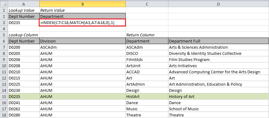
Lookup value: This is the cell number of the data you want to use to match. In the example below, this is the department number in cell A3.
Region with data: This is the range of the table with the data to be matched. The leftmost column must be the one you want to search for a matching value. In the example below, we start with A7 and go to D18.
Column index for return data: This is an index number for the column with the data you want returned. The first column in the region you selected is 1, the second column is 2, and so on. In our example, we want the value in the 3rd column to be returned.
Match type: This number tells Excel how you want to match. “0” means only return an exact match. You will almost always want to use 0.

Results

Note that if there is no match, the formula returns an error so you might want to enclose VLOOKUP in the IFERROR function:
![]()
Downsides of the VLOOKUP Function
As great and powerful as the VLOOKUP function is, it does have some downsides. It can only return a value that is to the right of the column that contains the lookup values. In our example, we can lookup up the Department name using the Department number, but we couldn’t do the reverse. Also, if your table is a work in progress (and they usually are), you might want to add a new column. When the new column is added, it can shift the index number you used to get your return value and presto your formula is broken.
INDEX & MATCH Function
There is a solution to these issues. Using the INDEX and MATCH formulas together is little more complicated that VLOOKUP, but not terribly so and it is a lot more versatile. Let’s break it down.
![]()
The MATCH function returns a relative position for data that matches the lookup value you give it. We want it to return the relative row number from the lookup column. We only want an exact match to be returned so the match type should be 0.
![]()
So far MATCH is a lot like VLOOKUP, the only difference is it will return only the relative position, not the value in the cell. Since we want the actual value in the cell, we wrap MATCH in a function called INDEX. INDEX returns the value in a cell when given its relative position.
![]()
For our purposes, there are three parts to the INDEX function: return column, relative row number, and relative column number. Return column is straight-forward, this is the same as with VLOOKUP. We just figured out the relative row number with our MATCH formula above. Since we are only giving INDEX one column, the relative column number will be 1. Voila we have the final formula!
This combination of INDEX and MATCH is a lot clearer about where the return data is located than VLOOKUP. Instead of a relative column number, you have the actual column written out. It also becomes easier to copy and paste this formula into more than one column if you want multiple values returned.

I recommend trying the INDEX MATCH combination wherever you would normally use VLOOKUP. It will save you time and errors in the long run.

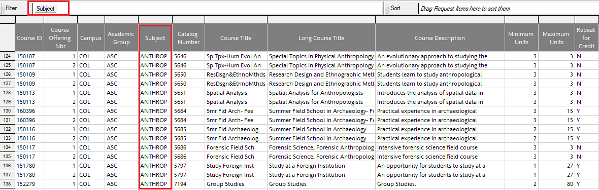
![Picture of the Schedule of Classes [Sections]](https://u.osu.edu/weedingthenumbers/files/2014/08/Blog4-03-1b8l11b.png)
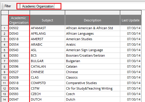
![Picture of The Schedule of Classes [Sections, Meeting] page](https://u.osu.edu/weedingthenumbers/files/2014/08/Blog4-04-2elqr1v.png)