Posts

Using VLOOKUP and INDEX MATCH Formulas

Picture of Ren Leaflight       Picture of Baby Using Computer to Symbolize Savvy Rating

VLOOKUP Function

As an intermediate Excel user, you have probably used the VLOOKUP function in Excel to match data between two different tables.  VLOOKUP is legitimately a great function with lots of uses.  For example, you can match the budget information in one table with department information in another using the common department number.  The formula itself is pretty straight forward:

VLookup general formula


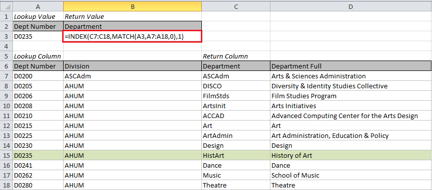
Lookup value:  This is the cell number of the data you want to use to match.  In the example below, this is the department number in cell A3.

Region with data:  This is the range of the table with the data to be matched.  The leftmost column must be the one you want to search for a matching value. In the example below, we start with A7 and go to D18.

Column index for return data: This is an index number for the column with the data you want returned.  The first column in the region you selected is 1, the second column is 2, and so on.  In our example, we want the value in the 3rd column to be returned.

Match type: This number tells Excel how you want to match.  “0” means only return an exact match.  You will almost always want to use 0.

Formula for VLOOKUP example


Results

Results from the VLookup formula


Note that if there is no match, the formula returns an error so you might want to enclose VLOOKUP in the IFERROR function:

Enclosing VLookup in IFERROR formula


Downsides of the VLOOKUP Function

As great and powerful as the VLOOKUP function is, it does have some downsides.  It can only return a value that is to the right of the column that contains the lookup values. In our example, we can lookup up the Department name using the Department number, but we couldn’t do the reverse.  Also, if your table is a work in progress (and they usually are), you might want to add a new column.  When the new column is added, it can shift the index number you used to get your return value and presto your formula is broken.

INDEX & MATCH Function

There is a solution to these issues.  Using the INDEX and MATCH formulas together is little more complicated that VLOOKUP, but not terribly so and it is a lot more versatile.  Let’s break it down.

General formula for Match


The MATCH function returns a relative position for data that matches the lookup value you give it.  We want it to return the relative row number from the lookup column.  We only want an exact match to be returned so the match type should be 0.

Specific Match formula for example


So far MATCH is a lot like VLOOKUP, the only difference is it will return only the relative position, not the value in the cell.  Since we want the actual value in the cell, we wrap MATCH in a function called INDEX.  INDEX returns the value in a cell when given its relative position.

General Index Formula


For our purposes, there are three parts to the INDEX function:  return column, relative row number, and relative column number.  Return column is straight-forward, this is the same as with VLOOKUP. We just figured out the relative row number with our MATCH formula above. Since we are only giving INDEX one column, the relative column number will be 1.  Voila we have the final formula!

Index Match Formula for Example


This combination of INDEX and MATCH is a lot clearer about where the return data is located than VLOOKUP.  Instead of a relative column number, you have the actual column written out.  It also becomes easier to copy and paste this formula into more than one column if you want multiple values returned.

Copying Index Match to other columns


I recommend trying the INDEX MATCH combination wherever you would normally use VLOOKUP.  It will save you time and errors in the long run.


eReports – SR Course Models

Ren_SmallSquare                               Picture of Earth to Symbolize Global Rating

An integral part of being data savvy here at OSU is using the Hyperion eReports system to pull your own data.  However, people who use these reports infrequently can find them a bit intimidating.  Starting with this blog, I will be discussing the most used eReports and the information you can pull with them in hopes of making these valuable reports a little friendlier.  Today’s topic is the SR Course Models series of reports.

SR Course Models is your main “go to” set of reports for anything to do with course enrollments. You can find out where and when a course is scheduled, the name of the instructor for the course and the current enrollment in the course.  These reports are commonly used to check on wait list and enrollment totals near the beginning of a new term.

To get to the main page of eReports first select the Student_Information_System folder, then the Student_Records folder.  SR Course Models is the fourth item on the menu.

Picture of the Student_Records page


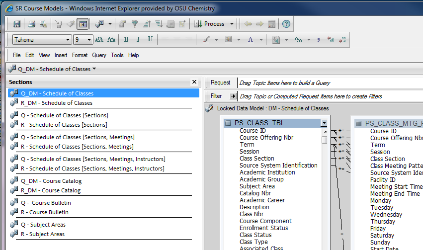
Once you have selected SR Course Models, you have a choice of seven reports.  Two of these, Schedule of Classes and Course Catalog are “blank slate” queries that you can use to build your own view of the data; we won’t discuss them here.

Picture of the SR Course Models page

Three of the reports – Schedule of Classes [Sections], Schedule of Classes [Sections, Meetings], and Schedule of Classes [Sections, Meetings, Instructors] – show increasing levels of detail for your courses.

You might use the top level – Schedule of Classes [Sections] to get a quick feel for which classes have wait lists of greater than 10.  Run the report selecting the upcoming term and the subject you are interested in. Then drag the Wait List Total column to the Filter line above the data.  When the selection box pops up, select greater than 10.  The data set will quickly be reduced to your courses with the highest wait lists.

Picture of the Schedule of Classes [Sections]

Once you have a list of each class with a long wait list, maybe you want to check out meeting times to see if there are other meetings for the same course that have no wait list.  You can use Schedule of Classes [Sections, Meeting] with a minor adjustment to get this information.  Before you run the query, first drag Enrollment Total, then Wait List Total to the Request line above the data.  Both of these fields can be found in the PS_CLASS_TBL.

Picture of The Schedule of Classes [Sections, Meeting] page


Run the query and select the Term, Campus, Subject and Catalog Number of the class or classes in question.  When the query finishes running, you may want to drag up the column Course Component to the Filter line and select LEC, LAB, REC, etc. depending on your needs.  The filter line can help you narrow down your view to pinpoint exactly the courses you want to view.

Perhaps now you want to know the instructors for the various sections of the course.  You can run Schedule of Classes [Sections, Meeting, Instructors] to get the instructor names for each of the meeting times.  Run the query the same way you did the last one selecting Term, Campus, Subject and Catalog Number.  This time you may want to drag Instructor Role to the Filter line and select PI to get only the primary instructors.  Additionally, dragging Print Instructor in Schedule to the Filter line will help you narrow the search down even more.

Picture of Schedule of Classes with Instructor Role


The other reports in SR Course Models are the Course Bulletin and Subject Areas.  Course Bulletin is a quick way to pull up course descriptions, credit hours, career, and CIP codes.  This report runs very quickly and it is easy to drag the Subject to the Filter line after it runs if you only want to see the courses for one department or subject.

Pciture of filtering by subject


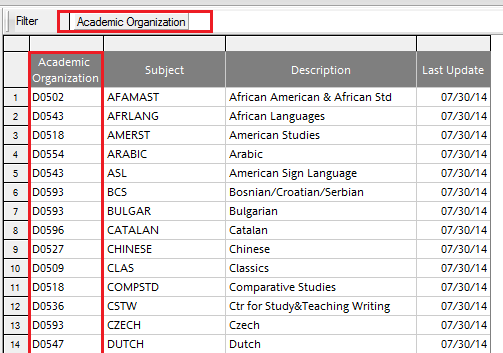
The Subject Areas report show the subjects that are owned by each Academic Organization (a.k.a. D Org).  It gives the standard abbreviation for the subject as well as a full description.  I find it helpful to filter this by the first few characters of the Academic Organizations. For example, I might choose to look at all the D Orgs beginning with D05 for Humanities or D07 for Social and Behavioral Sciences.  Whatever your filter, the report automatically gives you the most up to date view of subjects and owners.

Picture of filtering by Academic Organization


There is a lot you can do with the SR Courses Models reports, especially the Schedule of Classes reports.   I’m sure many of you may have your own favorite use for them.  I would be very interested to hear about your experiences and any tricks you have to make the most of them so please do chime in.


Insert a Table in Excel

Ren_SmallSquare                                                           Picture of Earth to Symbolize Global Rating

If you have never used Excel’s “Insert a Table” function, you may not realize how much easier it can make your life.  Here are some tips and tricks tables allow you to do.

How to Insert a Table

Select the data you want to turn into a table (remember the CTRL-SHIFT-END trick from my previous blog on Excel tricks and tips).  Under the Insert menu tab, click on the Table icon and then click OK on the Create Table box that pops up.

Picture of the Insert a Table Icon


Naming the Table and Quick Formatting Styles

Now you will see a new menu tab: Table Tools > Design.  On this tab, rename the table something more meaningful than Table1.  A meaningful name will be very helpful if you use the table as a basis for a chart or pivot table later on.

You can also select another design for your table.  I recommend the simpler designs to make reading your data easier on your users, but there is certainly a wide selection available.  If you want a specific look, you can create your own style from scratch or from a duplicate of one that is there.

Picture of the table styles available


Calculating Sums

One of the nicest features of the newly created table is the ability to calculate sums for filtered data.  In a regular data range, the grand total is always the total of all the rows, filtered or not.  But an Excel table will recalculate to show the total of visible rows only.

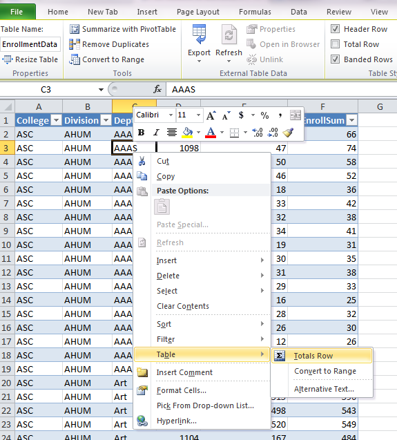
First create a totals row by right-clicking anywhere within your table. Select Table > Totals Row from the menu that appears.

Picture of Table Row drop down box


A total row will be created at the bottom of the table. You can add calculations at the bottom of each column selecting from a variety of options.

Picture of options available for total row


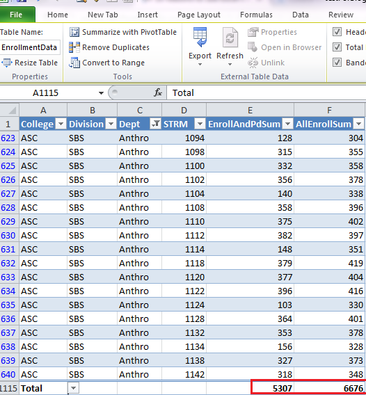
Once you create the total row, it will update every time you choose to filter your table.  The table below is filtered for a single department and the totals have updated to only include the data that is show for that department.

Picture of subtotal with filter on department

Sorting and Filtering the Data

When you convert the data to a table in Excel, it automatically adds the sort-and-filter arrows.  This makes filtering or sorting by one or more columns a breeze.  Click the down arrow and select the sort or filter you desire. Any column with a filter will show a filter icon instead of the down arrow.  This makes it easier to remove the filter when you are ready to look at the whole table again.

If you decide you don’t want any filters, they are easy to turn off.  Click anywhere in the table, then on the Data tab click Filter.  The down arrows disappear and none of the data is filtered anymore.  Click Filter again to get the sort-and-filter arrows back.

Picture of Data Filter icon

Formulas in a Table

Adding a column of formulas to a table is a breeze with Excel tables.  As with rows, adding a new column is as simple as adding any text or formula to a cell adjacent to the table.  If you type in a formula at the top of your table, Excel will not only format the new column, but also copy the formula down the entire table.

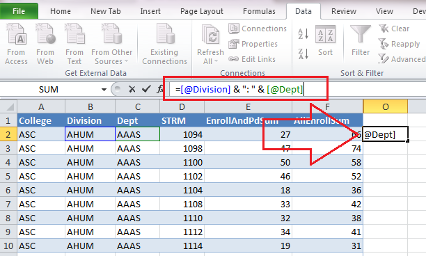
Here I have typed in the formula, but I haven’t clicked enter yet. Notice that Excel uses the column names instead of the usual cell reference number.  You create the formula the same way as you would in a normal range by clicking on the cells you want to include. Excel is smart enough to substitute the[@ColumnName] format for the cell reference.

Picture of formula added to a new column


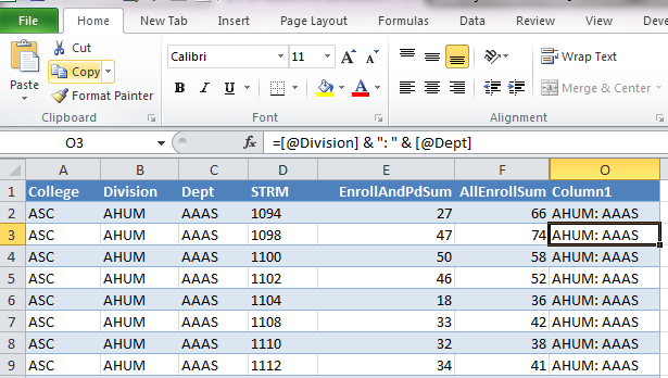
Here is the view after I hit the Enter key.

Picture of spreadsheet after automatic copy down


Now I can rename the column something more meaningful than Column 1.

The copy down functionality is terrific, but even better is what happens if you need to delete all the rows and paste or type new data into the table.  Excel remembers the formula and recalculates the column automatically.  You never need to retype the formula as long as you have the table.

Creating a Chart

Creating a chart from the new table makes the chart much more dynamic than if it were based on a range.  The chart will automatically include new rows of data.  It will also update based on the filter you apply which makes it great for investigating trends.  When you select the data range for your inserted chart, use the table name instead of highlighting the rows.  Since you gave your table a meaningful name, this should be much easier than choosing the range.

Picture of a graph from the table data


Reverting Back to Normal Range

If at some point you want the extra table features to go away, it is easy to revert back to a normal range. Click anywhere inside the table, then select Convert to Range from the Table Tools > Design menu tab and the nifty functionality of tables goes away.

5 Easy Tips for Excel

Ren_SmallSquare                                                           Picture of Earth to Symbolize Global Rating

 The following tips are fairly simple things you can do to make Excel less time consuming.  They are so simple you might wonder why no one has told you about them before!

Quick Sums and Averages

Suppose you are working on a spreadsheet in Excel, and you want to quickly check that the column of numbers you just entered matches the total you are expecting.  No need to click the Quick Sum button, just highlight the cells you want to total and look at the bottom of your screen.  Excel automatically creates an Average, Count and Sum calculation every time your highlight cells.

Excel Spreadsheet with Selection Showing Quick Sums, Averages and Counts

Shortcut Keys for Selecting

Excel has a lot of short cut keys that can really make your life easier if you have to do repetitive actions.  You can find a partial list at here.  For this post, I wanted to spotlight two ways of selecting large portions of a spreadsheet quickly.  When I’m working in Excel, I often want to select all or most of the spreadsheet.  A quick way to make this selection is to click on the top left cell in the block you want to select then use CTRL SHIFT  → ↓.

Spreadsheet with Selection Made with Ctrl Shift Arrows

However, using the CTRL SHIFT → ↓ is great only if you have a complete block with no missing rows or columns.  To make sure you get everything, use CTRL SHIFT END and the highlighting will extend all the way to the last used cell in the worksheet.

Picture of Excel Spreadsheet with Selection Made with Ctrl Shift End

Transpose a Table

Suppose you have a table in Excel and you want the columns to be rows and the rows to be columns.  There is a “quick and dirty” way to do it quickly.

1) Select the data you want to transpose. Copy.

Excel Data Selected for Transposing 

2)  Select a blank cell in your worksheet where you want the transposed table to appear; select the arrow for Paste from the Home tab.  The Transpose symbol is in the second row, third column of the Paste options.

Excel Spreadsheet Showing Paste Transpose Icon

Voila!  Your data has been transposed. The downside of the quick and dirty version is that the newly created table is not linked to the original table.  If you change something in the original table, it will not be updated in your transposed version.  There is a way to transpose while keeping that connection, but that will have to wait for a later post since it is a lot more complicated.

Display Formulas Instead of Values

Sometimes when you create a complex spreadsheet with a lot of calculations, it can be helpful to view all the calculations in the spreadsheet instead of the results of the calculations. This is particularly helpful when you are trying to track down an error.

Excel provides a shortcut to quickly do this:  CTRL `.

The ` grave accent key is located at the top left of your keyboard with the tilde.

Tilda Grave Key

Press once and the spreadsheet displays the formulas; press again and you get the results to appear again.

Excel Spreadsheet with Formulas Displayed

Getting the Most from the Quick Access Toolbar

If you use Excel a lot, you may find yourself using a specific command over and over again.  Paste Values is one I use a lot and I’ve frequently wished for a shortcut key to make my life easier.  An underused trick in Excel will allow you to create such a shortcut quickly and easily.

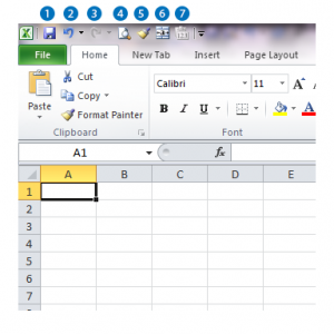
1) Click the down arrow at the right of the Quick Access Toolbar.

Quick Access -Toolbar

2) Click More Commands…

You can limit the number of commands you see by selecting “Commands Not in the Ribbon” from the “Choose commands from:” drop down box.

3) Select Paste Values (or your preferred command) and Click Add.

Quick Access -Add Paste Values

By default, Excel will add this to all your documents.  If you only want this shortcut to show up in the current document you can make that selection using the “Customize Quick Access Toolbar” drop down box (see the blue highlighted box above).

4) Click OK

Quick Access -Added To Toolbar

Now the fun begins.  Not only can you see this one click item all the time, but if you prefer to use keystrokes, you can access by holding down the Alt key and pressing the number corresponding to the position of the icon in the Quick Access Tool Bar.  In my case, I added Paste Value into the 7th position on the Toolbar so I can use Alt 7 to call on it at any time.

Quick Access - Hot Keys

Coming soon…

There are numerous tips and trick to Excel that can make your life easier.  I have only presented a few here, but there will be plenty more coming soon.  In the near future, we’ll take a look at the “Insert a Table” function and how this simple tool can be a truly powerful friend.  Later on, we’ll be looking at creating our own simple macros for personalized short cuts.  It’s easier than you think!

Welcome to Weeding the Numbers Garden!

Do you feel like your data is an overgrown garden?  Are you spending too much “quality time” with Excel?  If you want help harvesting insights quickly, you have come to the right place.

ren_leaflight-smallDr. Livingston, I Presume

Hi, Everyone!  I’m Ren Leaflight, the Business Intelligence Analyst for the College of Arts and Sciences at The Ohio State University.  Our college is quite large with 75+ majors and 100 minor degree programs.  All in all, we serve around 16,000 undergraduate and 2,500 graduate students.  Keeping track of all our students, faculty, departments and centers can be overwhelming.

It’s a (Big Data) Jungle Out ThereOrangutan in Jungle

Data everywhere is growing into a massive, tangled jungle – and OSU is no exception. When I was young, I loved imagining “Intrepid Explorer Ren” hacking through dense jungles and fighting off giant mosquitoes.  Nowadays, I prefer my data neatly organized – a data garden, if you will.  In this blog I will be covering some of the tips and tricks I use to tame the data jungle.

Weeding-the-Numbers-Garden Blog

This blog will explore tips and tricks to simplify your life with basic data exploration tools like MS Excel or MS Access.  Entries will range from general to advanced topics and each one will be clearly marked:

Picture of Earth to Symbolize Global Rating

Picture of Baby Using Computer to Symbolize Savvy Rating         Picture of Meditator in Front of Moon to Symbolize Guru Rating


We will also consider some of the newer data visualization tools on the market like Tableau and Datawatch.  MS SQL Server tips and tricks will be discussed in some of the “guru” positings.  We will discuss how to best answer your questions using our PeopleSoft query tools: eReports (Hyperion) and the soon to launch BuckIQ.  I will also explore some of the free tools available to download from the web that can help us tame with wildest data garden.

Guest Bloggers

Additionally, I will be inviting guest bloggers from around the university and from other higher education institutions to write about a topic where they are the experts.  They will help us discover new areas and gain a different perspective on the issues we all struggle to overcome.

Focus on You

Most of all, I would like to discover and explore the information and tools important to you.  I encourage you to chime in with your insight. Let me know what topics you would like me to cover. And if you have a topic you are burning to share, I invite you to be our next a guest blogger.

KittensRen's Three Kittens Lounging on Bed

And because data should be fun, here is a picture of my three kittens – Brigitte Lin, Jackie Chan, and Jet Li.