The Initial Exercises
1. Using fonts to represent several different words helped the initial steps of analyzing context and ‘space’ of something that otherwise seems normal. My group received the word group ‘pronouns’. We used: mine, you, oneself, y’all, and them. Applying those words to places were they ‘fit’ helped us to think about ways fonts and meanings could be applied to space.


2. I chose the letter ‘A’ from my name. The font I picked was a lower case version of a kindergarten-style font. The font, to me, showcases a mindset that I will never be perfect and peak (capital letter) because I try to go through life with the mindset that I am always learning and growing as a person. I filled the ‘a’ with an apple because my small town that I grew up in has a major theme of apples (apple water tower, apple festival, apple orchids, etc.) and think it is important to give tribute to your roots and foundations.

Choosing the Space
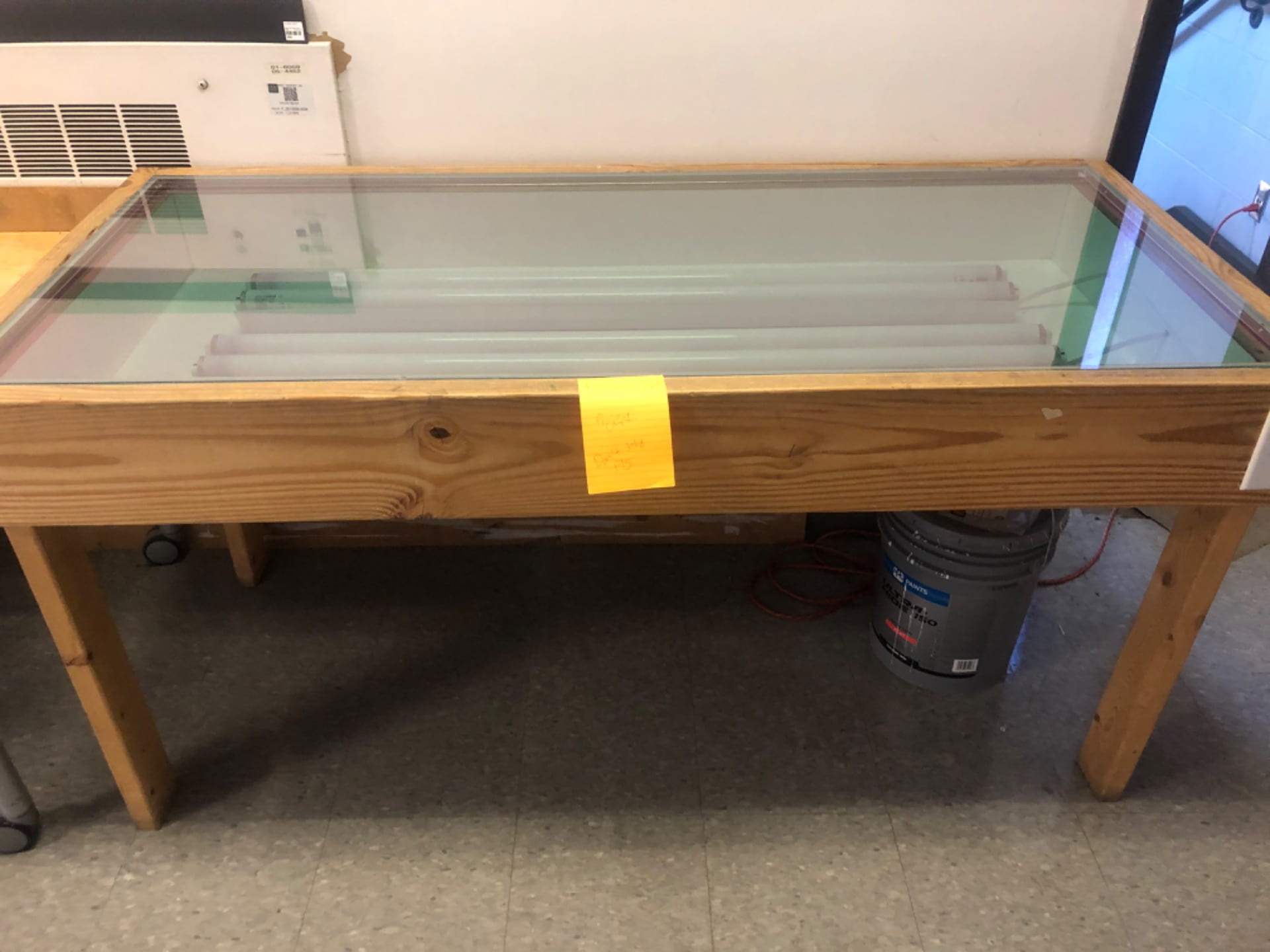
My three different places are below. A dirty corner in Hopkins, the light table in Hayes, and two windows that were across the way from each other. In the corner in Hopkins I thought I could play on the use of dirt and color of the tile. The light table I figured that I could use the ideas of shadows. With the windows I wanted to create some perspective change while moving on the stairs. Although I ultimately picked the windows, I still incorporated the idea of using dirt from the Hopkins corner.


Concept Draft
Initial concept draft before review:

Final Concept Draft:

Ideas for Implementation
Initially I wanted to try and do an accordion style lenticular perspective change. I soon realized that that wasn’t very possible with the given angle constraints that I wanted to stay in. I began to try and ideate a way where the words “and opens windows” could appear with just the slightest shift. To do this I wrote “and opens windows” with large white letter and then put a grate of a dark brown color in front of it. This contraption rests in between the stairs and the window across from the main window. I then took slivers of that same dark paper and then took a picture of where they would have to be for it to be seen on one step and not the other. This only allows every other shred of the word to be seen, but through the gestalt principles of closure and proximity, you are able to read the words.


The tape with stripes on it helped me to measure exactly where the shreds should be taped on the window so it lined up correctly.
Final
The final reads “Love unlocks doors that have gone unseen”. Yet when you step down a step the other window reveals the words “and opens windows” so the quote finishes “Love unlocks doors and open windows that have gone unseen”. This reveals a window that has gone unseen. In the main window I simply added my own dust (some water and chalk dust) and wrote “Love unlocks doors that have gone unseen” but the space in between ‘doors’ and ‘that’ is where “and opens windows” is seen. Someone has even walked by and underlined the word “that” which I was initially upset with, but I have decided that the fact that they underlined it just proved that it blended in to the space because they didn’t know it was a project.
Although the lens on my IPhone camera doesn’t represent it very well, until I get ahold of a better camera, here is my final:


