Spatial Assembly

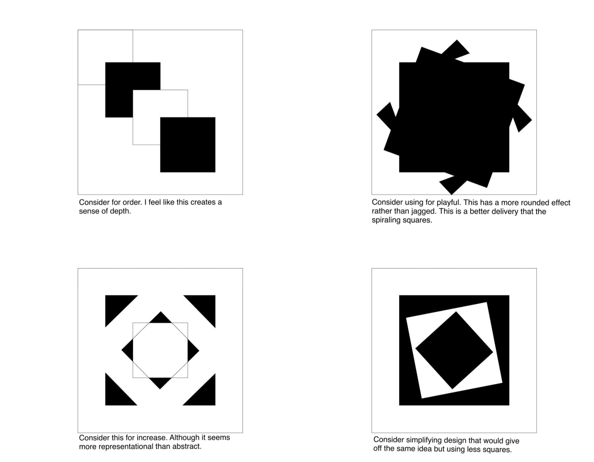
Learning the Technique

We began learning how cubes are shown through one-point and two-point perspective. You can see the beginning process of that here. Through this I learned how high/ low or to the right/left an object should be to get my desired perspective.  We furthered this by applying more complex shapes to the perspective techniques and adding shading, which you can also see here.


Designing the Room

It was time to apply the new uses of perspective and shading to a comprehensive room. We began with a practice room/ perspective grid and placed a simple cube within it, which you can see here. I knew I wanted my room to be simple and minimalist. To do that, I would have to find a way to add some complexity to the drawing somewhere, so I took another spin at practicing shading and the way that it can affect a space. I feel as if I could improve upon my shading skills or try new shading techniques like stippling or cross hatching. I also included a cat with my room; I would like to get more practice at drawing organic objects in perspective. I tried to be conscious of depth cues like darker objects being closer and closer objects having more details (I tried to do this especially with the leaves on the front porch).


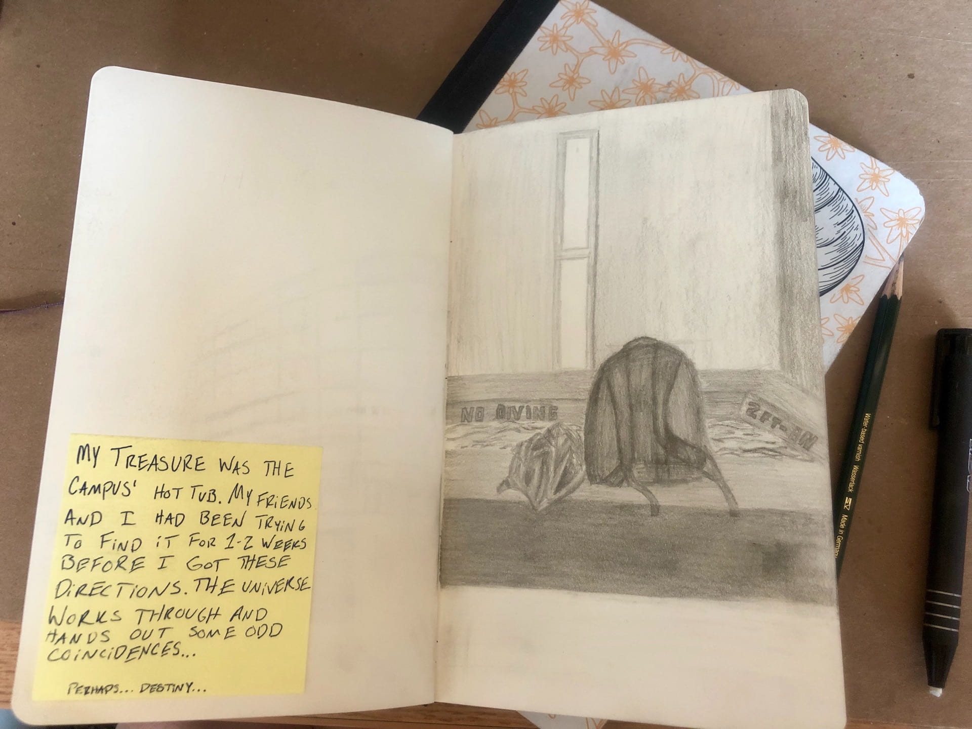
Contents of the Room

I wanted a clean room that I could see myself actually working in. You can view the final project here.

-I added a hanging chair that has a track attached to the ceiling. This would allow me to easily move myself to different areas in the room without extra floor clutter.

– I added a large window that would let in tons of sunlight and would be a nice place to swing my chair towards if I needed a break (also an excellent place for the cat).

-The candles allow a soft and welcoming environment for when the ceiling light becomes too much.

-The desk is against the wall with minimal decorations to allow all focus to be on whatever project I am working on.

-In the back of the room is a tiny door. I’ve always wanted some sort of interesting passage (or even a secret passage) of my own.


2D Principles and Squares

Research and Iterations

To make accurate representations of six different words with four squares I researched the words and used the elements and principles that we learned in class to create concept ideas. To see this research, click: research

Making squares using combinations of the elements and principles helped me to think of ways to manipulate those techniques to create certain moods and environments. To see these, click: elements and principles variations

From there forward, I began to sketch versions of these squares to see which deliveries of the concepts were most successful. To see these iterations, click: square iterations


Draft

Narrowing down the squares, I tried to pick the ones that resonated most with myself. One of the many things that I can take away from this assignment is to make sure to look at it from an outside perspective, which is something that I initially struggled with. With a lot of my designs, I used my own reasoning for the square placement and color instead of a more general interpretation. I now feel like, especially projects that have so much minimalism, it’s important to have a more problem-solving approach rather than a personal goal in mind.

Top row from left to right:

1. For playful I originally used this design because it was the most vibrant one that I had. I tried to use movement by not allowing the viewer’s eye to be directed in any particular direction. Although I liked this design, and those in my critique group agreed, that it doesn’t necessarily fit into the word playful. I would say that this design was too abstract and rigid for the word ‘playful’, but I may keep it in my back pocket for later design inspiration.

2. Increase proved to be the most successful for my draft critique. I feel as though the minimalism of this design makes it more effective by giving the viewer only one thing to look at. I attempted to use both scale and movement in this example. The extreme increase in size widens the scale moves te eye from smaller to larger.

3. For bold, I used the same concept of minimalism as I did in increase. This is purposely the only image that goes outside the 3×3 square; I feel as if “breaking the mold” is a big part of bold’s meaning. I used contrast and going outside of the margins to create emphasis. I also used symmetry so there was no confusion on the eye.

Bottom row from left to right:

4. This design for congested was actually lightly criticized in the critique because the four squares got lost in the background. However, after playing with different colors and line widths, I think I’ll stick with it because I feel as if the lined squares give the eye more things to look at which makes the image feel congested. I used a lack of balance to create a more chaotic and unplanned image and lack of contrast to make the image feel stuck in one spot.

5. For tension, I used the idea of a build-up to express the word. Using unity, I placed squares closer and closer together to signify an increasing build-up of potential energy. It was suggested in the critique that I make the boxes slightly closer/tighter to lessen its bouncy effect.

6. Lastly, for order I attempted to use movement to show boxes going in order one after the other. I found that this idea was too representational and was not received as well as I had hoped.

Rethinking Playful and Order

So it was back to the drawing board for playful and order. I was almost excited about this setback because it gave me a chance to get better at knowing how to make a design decipherable to a first time viewer.

The first image was a redo of ‘order’ that was better received with my peers. I wanted an incomplete pattern because I felt as if the incomplete pattern made there a feeling of more possibly being added to it. The second image and the fourth image was a redo of ‘playful’. I liked the spiraling effect that they had, but I felt as if I could expand upon that more. To see that expansion of ‘playful’ designs, click: playful iterations


Final

Journey to a Treasure

Process

Drawing using Triangulation made me feel much more in control when doing observational drawings. It helped me to create the correct proportions a lot easier than I had before.

Walking the path given to me was the first task. Finding something new along an almost familiar path was the second task. Finding meaning along my way came almost naturally. There’s something for everyone on this campus.


My 5 Places

Drawing five meaningful stops along the way, I found inspiration in most pictures. Sitting and drawing something gives you a lot of time with that certain something, Maybe the reason I was drawn to so many buildings was because of all the possible stories they could hold. My lunch and the hot tub may seem mundane to others, but by giving an anecdote with them I hoped to involve the viewer in the drawing.

Triangulation is a new method of drawing for me, however not being perfect at it yet, I know it will help me exponentially and I am excited to involve it more in my process.