Posts

Checkmate: Process

Research


To start my design processes for this project, I began researching the game of chess itself. I made myself familiar with different terms and action taken while playing the game. I also explored the characteristics of each individual chess piece. As a class we explored these characteristics and gave a person to what these pieces would be if at a college party, try to compare them to things in our everyday lives.

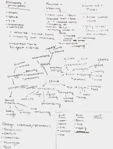
My partner and I mind mapped and explored possible thees that our entire chess set could take on. The one idea that we both were pretty set on was Starbucks vs. Dunkin. We knew we wanted to do something that was fun and recognizable to others. Once we found a theme that we would follow in that direction, I had the Dunkin Donuts side so I made a mood board inspired by the brand.

I did research on different products and aspects of the brand. In the start, I was very focused on making each piece a different drink; however, I realized pretty early in the process that it would be hard for news/players to identify and distinguish which piece is which. I began doing more research on the company and started to think back to the characteristics each original chess piece has. I started to brainstorm food items, packaging, workers, slogans, etc..

Iterations


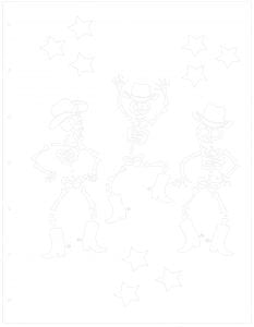
In my research stage of the design process, I explored many possibilities of what each individual piece could be. I had a good idea about what I wanted the pieces to be to I began drawling sketches of what I imagined the piece to be. Once I determined what each piece was, I had a very clear vision of how I wanted to display them and at first, drew those. Once I had the piece drawn up, I explored and directed each piece on how it could be built using slice form methods.

I began testing the structure of each piece, quickly and by hand, to just get an idea of how they would look. I was able to get a better understanding of how each piece would fit into one another.

I began drawing each image that I needed for all the piece in the Sketchbook app on my iPad, I focused on the continuous use of the same shades and bending logos. I knew when drawing the images, I was going to have to adjust the sizing once I had a better understanding of what scale I wanted each whole piece.

Once I had each piece drawn in the Sketchbook app, I uploaded the files to my computer. I was then able to upload each image into Adobe Illustrator and make the images vector based.

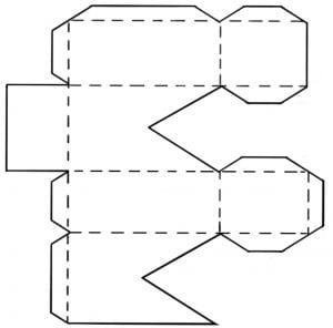
While in Illustrator, I created files and templates for each piece. I wanted to explore chipboard but also wanted a material that I knew was going to be sturdy and not easily breakable. I made the decision to use clear acrylic for the structure of each piece so I knew I would have to utilize the laser cuter. Because of this I created my piece silhouettes and structure in Illustrator.

As I finished creating my piece outlines in Illustrator, I uploaded and cut them out using the Cricut. Here I was able to get a physical look at how my pieces would look even though the material (cardstock) was different then what my final material was.

From the previous step, I was able to fix any major chances I saw with the structure and cuts of the pieces. I also had a better understanding of what size each image component would be, so I went back and adjusted those, while also adding the sliceform cuts.

Production

Once I had all my files completed in Illustrator, I used the laser cutter to create each piece out of acrylic.

I then started off by printing out my images (from Staples) on white cardstock.

I then cut out each individual image. I used my exacto knife to make any scoring cuts so that I could fold any piece I needed to such as the packaging.

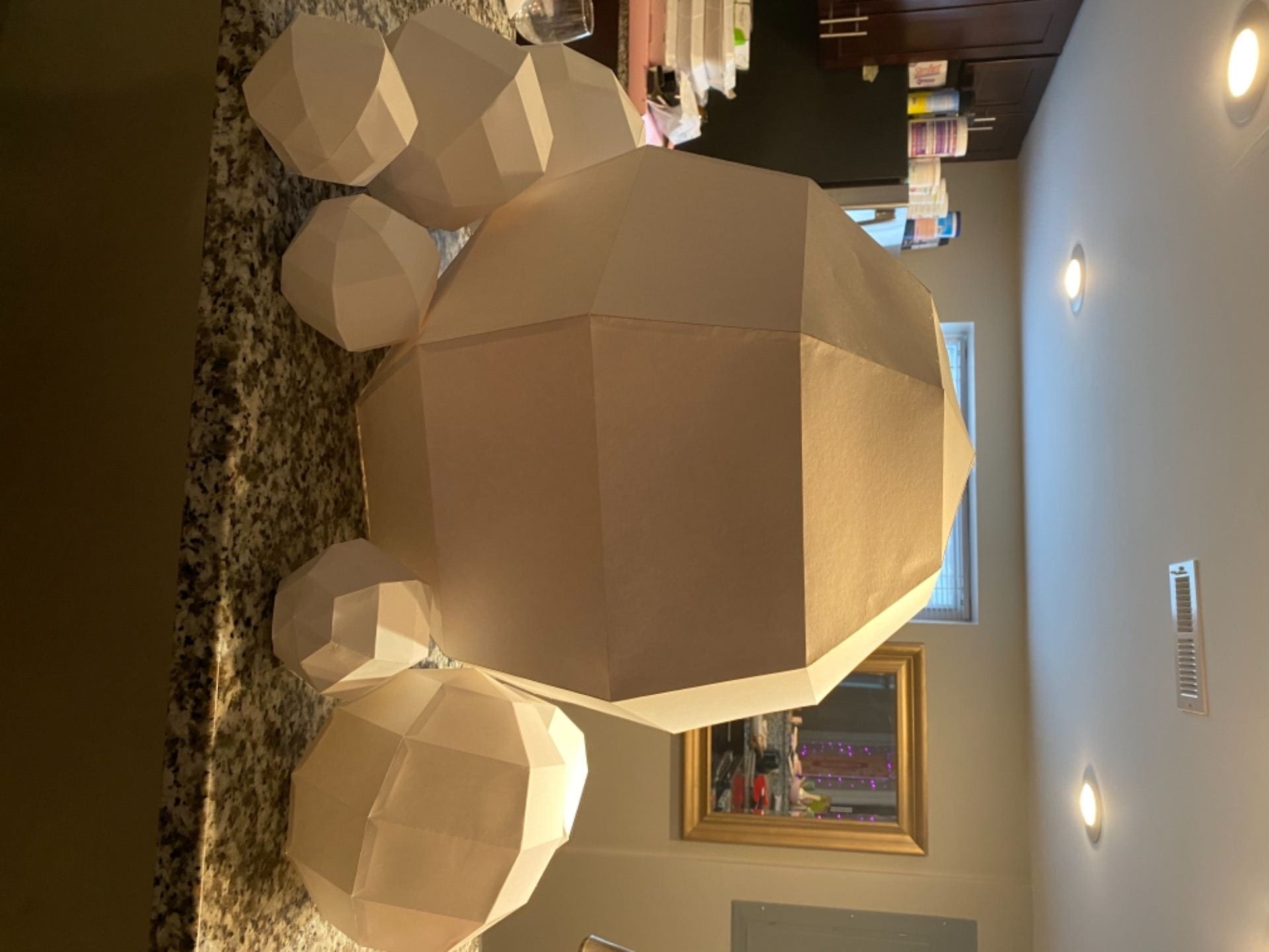
I used glue to coat each side of a piece and then placed to needed image onto the acrylic. For the pawns/donuts, I repeated this step 16 times, 1 per side of each 8 pieces, and then another 160 times, 2 per side pieces, 10 pieces per donut, 8 donuts.

As I was gluing the images to each piece, I used acrylic paint to paint the other pieces. I related both steps until all the pieces were complete.

Final composition


My set (Dunkin Donuts) and both sets ( Starbucks set by Claire Sukert).

Concept Statement

Starbucks vs. Dunkin, it is a worldwide controversy that everyone knows they have a strong opinion about. As much as one might say one company is better than the other, they share common products and qualities. In the game of chess each piece has their own characteristics. This chess set correlates each piece to each other and the individual nature of the set was to display the brand company of Dunkin Donuts. Each piece correlates to either a popular product or branding of the company. Through studying the characteristics from original chess pieces, Specific and statistically Dunkin Donut features were chosen that shared those traits. The Queen is represented by an Iced coffee because it is an extremely popular item and is viewed as superior just like the original queen chess piece. The king is the visual of a regular hot coffee, rich and strong as well as popular but it is just plain and boring, almost lazy just like chess piece king. The logo of America runs on Dunkin was created as the rook because a rook “is a solid piece representing the relative safety of the castle and home” which a logo for any given brand does. The bishop carries the trait of knowledge as if they know the board and is filled with all knowing; therefore, the Dunkin visor that all employees wear is the bishop to represent the workers who know the ways of the stores. The knights and pawns go hand in hand. The knights are visualized as a donut box and the pawns are donuts. Knights have the same qualities as a pawn but want to conceal the pawns to outshine them just like the box conceals the donut. This set brings a fun twist to the game of chess but each piece still holds the same characteristics.

Portfolio Project

View final project at Checkmate Project

Gifting Design: Process

Research

The first thing I did to start the design processes for this project was reaching out to my mentor, Rachel, and getting to know her. I asked her questions about herself and what she enjoys outside of design so I could get a better understand of her as a person. I then had to get to know her as a designer so I began gearing toward questions that would help be understand Rachel as a designer. I asked her questions about her favorite artists, how she approaches the design process, how she develops ideas, what design concepts intrigue her creativity, etc..

When finding a quote, Rachel mentioned the saying “just keep swimming”. I chose not to directly use this saying but to find a quote that relayed the same message and motivation. The quote that really resonated with me after conversations I had with Rachel was “This moment has purpose. The season of your life has a meaningful part in your story. The divine is adding beauty to your journey and restoring peace to your soul”.

After fining that quote, I quickly began to just iterate and do some research about first possible ideas of what the quote could be physical and visual represented.

Based on conversation with my mentor, I began to do research on visual design aspects that she enjoyed and drew inspiration from such as industrial design.

My mentors favorite designer is Eileen Gray so I did research and got to learn different signature design elements this artist incorporated into her work.

Image links/citations

Exercises


Exercise 1: Write about the best gift you’ve ever received. I talked about letters that my parents each wrote to me after I graduated and how the gift was very emotional.

Exercise 2: We were asked to create a container for an object out of our art supplies. I wanted to create an almost comical container for my lead. I made a large container for my small object because I always seem to lose it. Since the container is so big compared to the lead, I will now never lose the object.

Iterations


I chose an direction based on th quick, small sketches I did at the very beginning of the design process and began to elaborate an ego more in depth. I was able to disect what I my quote more and form a better understanding of what my intentions were in what I was going to create.

I did not want to stop my creative and iteration process too short so I reevaluated my quote one last time. I broke up each part of the quote and reworded it so that I knew exactly what it meant to me. I ultimately decided to just keep the first two lines of the quote because they were more meaningful to the outcome I wanted to produce. I continued to brainstorm ideas and different directions I could go based off this new understanding of what I want my intentions to be with this gift.

I began testing  ways I could create a gift that brought the quote to a physical sense such as through a puzzle.

I sketched different ways I could contain the gift. I wanted the gift to have a visual interest towards my mentor so that she could display not just the gist but the container a well. I brainstormed different elements that were influenced by industrial or her favorite designers work.

I final knew a the direction I wanted to take and a design that I wanted to create.

Production


I started the production process by creating an outline of each piece, measurements, materials and anything else essential to begin creating the design. I used this outline to create files through Illustrator that I could use to cut the acrylic. I decided to use acrylic to give the illusion of glass.

I used the laser cutter to cut each piece of the acrylic to form the box and the top. The files on my iPad when creating the boxes were the same 1/8 measurement; however, when imported to the laser cutter to cut, the bottom box joints were cut as 1/4 (the top box slayed 1/4). The top still was able to fit on the bottom box so I had to incorporate the new look into my design.

I then cut the gift portion of the design.

I used black vinyl and a Cricut Machine to create the illusion of black beams that can commonly be seen in industrial design. The stickiness of the vinyl also acted as a adhesive unit for the box. I used a credit card to apply the vinyl slowly so that there would be less bubbles caught under the material.

I then Used the Circuit machine to cut out the design I created to be placed on the under side of each puzzle piece. Since the adhesive side of the vinyl usually is applied onto of the surface it is being applied to, I wanted to apply the vinyl on the bottom of the acrylic so that the image could be seen. because of this I had to build the design from the top of the design to the bottom.

I cut each piece of the design out on the Cricut. I then keep the pice of vinyl on the original backing paper and cut the vinyl design piece outline with scissors. I then applied each piece smooth side down and then peeled the backing paper off the reveal the sticky adhesive side of the vinyl. Once I was done repeating this process for each element of the design, I was left with the full design, adhesive side up.

I then applied the image of vinyl to the back of the cut pieces of acrylic that I secured together with using masking tape. I used my blade knife to make little slits in the top layer of vinyl to release any air that was creating a huge bubble.

Once the image was applied to the acrylic, I removed the masking tape and used my blade knife to cut each piece using the edges of each piece of acrylic that was cut using the laser cutter.

All the vinyl was then applied to each piece of acrylic, I applied heat using a hairdryer to press the vinyl down more, removing as many bubbles and spacing between the two materials.

Then next step was to just make any final touches. I applied her name in final on the lid then took a cloth to remove any smudges or mistakes on the clear acrylic.

Final design.

Concept Statement

Life is filled with quotes that we designate to incorporate into our everyday lives. When it comes to designs, there are thousands of quotes that can be directed straight to the design process or quotes that have a deeper meaning and are more personal. “This moment has purpose, this season of your life has a meaningful part in your story,” this is the quote that I chose to inspire this gift.
As I got to know my mentor, she expressed how she struggles through the design processes sometimes. I chose the quote above to act as motivation and created a gift that took the recipient through the struggles of the design process and coming together at the end to make a whole piece. The elements of a puzzle encapsulated the perfect way to embrace the quote through an experience. Each piece of the puzzle is a certain moment in the design process. As you put the pieces together, no matter how difficult or time consuming it may be, you are creating a whole composition; adding to your design story.
Based on the recipient’s visual interests, the blue and green cater to her interest in color theory to create a visual that is inspired by her favorite designer, Elise Gray. The package design takes the feeling of industrial design inspiration. Overall, the gift and packaging create an experience that is emotional through bringing the chosen quote to a physical sense.

Portfolio Project

View final project at Gifting Design Project


Dynamic Pages: Process

Research


To start off this project, the first thing I did was mind map about different ideas that could possible be the center of the prompt. My partner and I, went through different instrumental songs and choice some that stood out to us. We eventually chose a song, Secrets(Violin Version), a very light continuous beat. We then threw out different idea of possible directions we could go based on how the song made us both feel; there was a common theme that revolved around a cycle.

Once we had a couple of main ideas of what the narrative could be, I did research on possible hand held mechanisms we could test.

We eventually choice our one strong narrative, the cycle of a tree and from there were able to decide on what might be the strongest mechanism to demonstrate that. An infinite flipper seemed to encapsulate the narrative in a physical and figuratively.

I then did some research on how a tree grows, different stages it goes through, and characteristics of the tree through stages of life. I tried to sketch more literal images to what different stages would be and how I could incorporate and make each image dynamic.

The most crucial part of my research was taking the idea of a tree evolving and changing and making it abstract. My partner took on the part of our narrative that described the tree going through the seasons. In my composition, I focused on showing the entire life of a tree from birth to death. I took notes and brainstormed different ways I could portray that. My partner and I decided to use shapes to represent different stages in an abstract sense. We tested different shapes and how they would transform into one another, the idea of transformation through a cycle led me to change directions and create a stop motion film.

Iterations


We rendered different shapes in Illustrator, cut them out using the laser cutter, and could physically have the pieces in front to manipulate them by hand.

I played around with different ways to show the narrative. I got to see how the shapes transformed into one another and how it would look.

I then went through with these draft shapes and took pictures to create a draft stop motion film.

I imported these photos into Adobe AfterEffect and was able to play around with the software. In the app, I created a draft stop motion, I got to see what I need to fix/change. Unfortunately, I ran into technological problems and with the software being new to me, was not able to save the draft video. I did however trouble shoot this and was able to learn what I should have done and apply that to my final.

Production


To create the final stop motion, I used the laser cutter to cut out new shapes using colored card stock. The colors used correlated to different stages of life. Once I had the shapes, I placed them one by one, taking photos of every change I made, on a black background. I then took all the images and upload them as a sequence into Adobe AfterEffect. I then uploaded my video to my computer and converted the file to an mp3. I upload the file into iMovie in order to add the music in the background of the video.


My video was then in my photos and through editing in the photos app on MacBook, I played around with contrast, black point, exposure, and vibrance to make the background a solid deep black and the color of each shape to pop.

Concept Statement

Cycles occur in everyday life and can even take a whole lifetime before they repeat. They can be a process, routine, method, or even a story. The song Secrets (violin loop) by Darioviolin is an instrumental music piece that encapsulates the feeling of a cycle through the repeating rhythm. The song has a relatively simple beat that repeats continuously, changing tones periodically. Through sound, the song causes listeners to feel as if they are stuck in a loop or cycle; my composition reflects the continuous feeling in a physical visual sense. Through a dynamic image stop motion composition, what is being shown is the infinite flow of life through the representation of a tree. This composition demonstrates the process of a tree’s life from beginning to end, covering an extended period, a lifetime. It visually shows the growth beginning at a tiny seed life shape evolving and morphing while becoming older. Through the use of abstract shapes; the frequent change can be seen. Circles represent the start, curvilinear shapes show the young playful years. The composition then changes into triangles and hexagons to display death. This abstract stop motion animation encapsulate the process of life through the representation of a tree as the music continues to repeat the evolving rhythm.

Portfolio Project

View final project at Dynamic Pages Project

Mask Up: Process

Research


When starting off my design process for this project, I brainstormed what comes to mind when I think of masks. My group members and I shared what we all thought about and the word emotion was a common idea we all shared. I mind mapped about emotion individual, sketching/jotting down the first idea that came to mind. After sharing and collaborating with my group, we decided to go in the direct of Covid 19 as our pandemic and emotions as our concept; a very broad start.

Exercises


For the first exercise we did to take the next steps after coming up with a narrative, was to sketch 10 or more ideas we had that supported our concept. We established a who, what, where, when, ad how for our narrative; based on that I was able to sketch different possibilities to show emotion during the time of the pandemic. After meeting several times, we decided we were going to express emotions and feels that we each felt the strongest at that time. Instead of the masks being so direct, we focused one chosing one feeling and representing the through our masks.

Iterations


When it came to approaching iterations and material tests, I created a design I wanted to test that embraced the feeling of being trapped. My intension with this design was to use wire to create a framework around the head, down the arm, and hand. This frame work would restrict the wearer from moving, causing them to feel trapped/stuck. I was then going to take cloth and weave that through the wire being more dense around areas that related to the five senses.

As I began to play around with this fabric, I noticed quickly it was not laying how I expected it too and it was tearing me in a direction where I lost sight of the requirement of having a planar design. I knew based off just this iteration that I wanted to explore more planar materials. What I did take away from this material study was that the way the fabric was colored and how I unintentionally placed it, the piece reminded me of a straitjacket. I made the connection with a feeling and a physical object which lead me to brainstorm about more objects that were related to being trapped.

Through my second material test I used paper mâché. I reiterated my concept design after making the connection of being trapped to the saying “stuck in your own bubble”. I focused on more circular spheres the create the illusion of a bubble. However, I was still not totally grasping the planar element it needed to portray.

In my next material studies, I continued with the bubble-like spheres but used paper to create them. With using paper such as Bristol and card-stock, I could create a sphere that had planar side which successful met that requirement. As I began doin different templates and measurements, I noticed how much more efficient this material study was for the magnitude of elements I needed.

After creating my first paper sphere template, I wanted a template that was more linear instead of triangular. I also made the design decision to remove the mask from restricting the hand and arm. The focus was to express the feeling of being trapped and stuck with yourself and those personal thoughts. There was no intent behind having the mask be anywhere but the head. I tested a second paper template that gave me what I intended visually. It was also more efficient so I was able to produce more elements.

Production


I first drew out what my vision for the final composition was going to look like

I then created a template that consisted of six pieces for one sphere. I created the template and layer sin illustrator and then uploaded it to the Circut app so I could use that as a resource to score and cut each piece. Once I had Enough pieces to make 2-3 spheres per a certain diameter, I used tacky glue to glue the 6 pieces together. I made a draft large 20inch diameter sphere for the main head piece to understand how I wanted to cut it so it could be wore.

I then created The final large 20inch diameter main head sphere out if a thinker poster board. In the first draft of this scale sphere I cut along each seam go the bottom layer as shown above in the second photo of the final piece. The edges were sharp making git hard to remove, so for the final piece I just rounded the pointed edges.

I used spray paint to make each sphere black. Then used masking tape to attach and reattach the smaller spheres to the large sphere to see where I wanted everything to lay.

I struggled with attaching the the smaller spheres for the final time. I used three different types of glue but ultimately use a velcro tape to inhere the pieces together.

Final composition.

Concept Statement

The devastating pandemic of Covid 19 has been lurking around in our lives for the past 3 years. As we travel back in time to the first few months, when we were all struggling to get through a quarantine stage while our brains were filled with so many emotions. As we sat in our homes, restricted from leaving and coming in contact with your once normal life filled with interactions; everyone around the world felt a certain way. No contact with others, face to face communication stripped away, stores closed; struggling thoughts were running through heads. We were all trapped in our own bubble-like state of living. The outside world was out of reach and we were all restricted from seeing other people and the wonders of the world. It felt as if we were stuck with only our own personal thoughts. While being trapped, we all started to lose a piece of ourselves through this unknown pandemic and “new normal”. This composition expresses a physical representation of this deep dark emotion. The black color of each individual piece and the composition as a whole, lends to this idea. The dimensional spheres bring the imagery of “trapped in a bubble” and the composition as whole is a physical representation of just one of the countless emotions felt by everyone through this pandemic.

Portfolio Project

View final project at Mask Up Project

Deep Space: Process

Research:


When approaching this project where we had to use the prompt of deep space and using layers to create a composition, I started off with mind mapping. I brainstormed off deep space and wrote a bunch of aspects that came to mind. This helped me narrow down what direction I wanted to go towards for my concept.
After I was mind mapping of deep space, the concept that was really catching my eye was the mind. I then mind mapped about the mind to see based of that, all the possibilities I could dive deeper into. I was fascinated with the concept of brains and love and the connection that happens between the two.


As I explored more into the concept of brains and love, I did research on brain mapping done by research. What I found was that two spots seem to light up in the brain, a spot in the back and a smaller spot in the front. I also was inspired by the line work and compositional elements of the above photo of the silhouette.

Exercises:


This exercise was designed to provide practice using vectors, exploring positive and negative shapes and introduce the laser cutting or vinyl cutting technologies. Using my initials, I picked a font that provides an opportunity to use the negative space to “hide” an image in its negative space that communicates something about yourself. I designed the form using vectors with the intention of cutting on the laser cutter. This exercise made me foe comfortable with the idea of negative and positive space. It also acted as a good introduction into the process it takes to use the laser cutter which was newly introduced as a resource. 

Iterations:


When it came to writing my first concept statement for this project I was a little lost at first. It took me several drafts and multiple changes to have a statement about my concept that was understandable and truly described my composition. After creating my first diagram of elements and principles, function and meaning, and material and tools along with my first statement draft; I knew it wasn’t 100% correct but I knew I was on the right path. I then went back and made a new diagram of the three aspects, using that to draft a new statement. Again, I was making progress but still missing the mark. I took a step back and really thought about about all the elements and principles I wanted to include in my final composition. Once I listed all those under the right column in a new diagram, I thought of why I wanted to include those and what it was bring to my composition. I really focused on each piece of my desired composition, why I was doing it, and if it was improving or making my concept stronger and more clear. After doing all that, I was finally able to make a final version of my concept statement.

As I started to create a visual of what was described in my concept statement. I chose two elements or principles and began to just sketch random images that related to my concept using those two things. This allowed me to narrow down to three visuals that I wanted to explore more. I started with the idea of having one individual; however in my concept its the love between two individuals. I used Bothe images and merged them into one. I finally got to single image that represented my concept clearly (last photo).

I took the image and sketched it out on paper. I like doing so because for me it is easier to tweak certain elements and visualize it more. I took it into illustrator so that I could explore more of the layering process and add clear gray scale values to different layers. This allowed me to manipulate each layer individually while still having the option to view all the layers as a whole.

I played around with different line weights of the connecting line and face lines so that when taken to the laser cutter or circuit, they would be easily visible. As I was playing with the curvilinear think top line one time, I made it in a way that almost looked as if the word ‘love’ was spelled out in cursive. I did not really intend for that to be so directly visible in my composition, but it was so subtle while still adding a whole new layer to the composition so I decided to keep the line as is.

Production:


To approach actually making my composition. I started off with a list of all my layers, the order in which they needed to be assembled, etc.. This acted as my ‘cheatsheet’ to how I needed to set my file up to have all my layers cut out and put together.

I decided to use the Circuit as my way to cut out each layer so I took my illustrator file and uploaded it into the Circuit app. In this app, I was able to separate all my layers into what was needed and as I had on my cheatsheet. Once I had all my layers separated, I made one last ‘cheatsheet’ to ensure all the layers were correct and that the Circuit cutting process would go by smoothly.

When all my layers were finally cut out on separate pieces of card stock, I went through the layers that I knew I wanted to have flat/flush with no spacers in between and glued those together.

I used cardboard to create space between certain layers, so I went through and glued cut out strips of cardboard on the back of those layers to give even more depth.

I proceeded to glue the layers together, starting with the bottom layer to the top.

Final:


Final composition- full overview and two detailed images.

Concept Statement

With research done by multiple professionals, brain scans have shown the waves and mapping that occurs when in love. No matter what one is in love with, when looking, thinking, or feeling it is what they love, the brain mappings are the same. Despite individual difference on the outside as well as there perspectives; love is within us all and gives us all an aspect in common. Love has an open mind; therefore, the lines that travel through the composition have a curvilinear movement that supports the idea that love flows through all of us. The two figures shown in this composition can be seen to have a connection through the organic line that connects each others love brain mapping. However, everyone lives their own lives and develops their own idea of love. This confinement and personal thoughts are represented with thick frames around the separated figures. Yet love still looks the same in both figure and finds away to connect the two.

Portfolio Project

View final project at Deep Space Project


Sketchbook: Process

Research:


To begin this project, I started off mind mapping about possible ideas and ways to approach my sketchbook. I brainstormed different possible concepts/themes, different materials, images, and tones. As I stepped backed and looked at all I had wrote, I was drawn to the idea to create something fun, full of color, and bright.

I knew fro the start I wanted to use acrylic as my front cover. I liked how the material looked and felt, I just had to duo research on how it would perform in the laser cutter.

I explored different possible materials I could use throughout the sketchbook.

My first go and idea for the cover was to create a collage of all my favorite things with some fun detailed elements as shown above. However, after exploring that I kept thinking abut how I could incorporate one of my favorite designs, shown below.


Exercises:


Exercise 1: Design and construct a mini sketchbook (or mini zine).
We had to use the mind mapping process to document a solution to a given problem. The question I answered was how to achieve word peace. This exercise allowed me to get a better grasp as to what mind mapping is and how I can incorporate it in my own person design process.

Iterations:


To start off my designing of the cover, I wanted to create an image of skeletons dancing, having fun, while dressed in a cowboy hat and boots. I drew each element separately in Sketchbook app. I traced over that once more on sketchbook before I took the image into illustrator. In illustrator, I then created a vector image of the design.

One part that I wanted to incorporate into my design was vellum paper. I wanted the translucent effect but wanted to add a pink tint to it so I tried using a dye. I used a red dye and dipped to vellum into the dye.

I let it dry over the span of  two days, the vellum picked up the color but the dye was still rubbing off. I then tried to seal it with Mod Podge. It worked and created a look I like; however, when folded or creased to seal would crack and peel right off.

I thought of other ways to save the vellum paper that was dyed. I took an old party Pom Pom decor piece and took that apart. I tried glueing that over top of vellum but the glue underneath would not dry. I ultimately came to the decision to find another material I could use in place of the vellum paper to act as a dividing agent in the sketchbook.

Production:


I used the Laser Cutter to cut out my designed image into a piece of neon pink acrylic.

For the back design, I painted a piece of 8.5×11 cardboard white. I selected a font in the Cricut app that I liked and rendered my text on my iPad. I then took a piece of vellum paper to trace over the text on my iPad with pencil. Taking the drawn on vellum I then rubbed the lead onto the back cover to transfer the text. Once transferred, I used a neon pink sharpie to outline and fill in the text. I also used the cut out acrylic stars from the front and glued them to the back to create a consecutive feel.

Instead of the dyed vellum, I used pink construction paper and glitter card stock to act as a dividing element. I cut all those pages to 8.5×11. Then used a hammered and nail to created to holes in order to bind it.

I used elastic plastic string and a coptic like stitch to bind the two covers and pages together.

Final Sketchbook:


Front and back cover.

Inside Sketchbook.

Portfolio Project

View final project at Sketchbook Project

MashUp: Process

Research


The first thing I did in starting and approaching this project was brainstorm words. I knew from the beginning I wanted my word to be about Christmas since it was soon approaching. I started by thinking and writing down every word that came to mind when I thought about Christmas. I then was able to look at which of the words I could see together and create a new word. From this, I combined Christmas and gifting to make chrifting.

I brainstormed of several ways I could display my word on my poster. These were my first thoughts of the directions I could go.

Exercises


Exercise 1: Isometric Type
– Select a font that you feel represents some aspect or quality of your personality. Write your name or initials using this font. Transfer this text to an isometric grid and create an extruded 3D isometric illustration of your name/initials. Test methods of drawing by using different tools in Illustrator. Use layers to upload an isometric grid. Additional layers: Test and experiment with line weight, value, color and fill variations.
– I used a sleek and clean font type. I also chose to make the color in pink hues because that is my favorite color.

Iterations


I first started off doing multiple versions of how I could display my word in the poster.

Based off my previous iterations, I realized that I needed to focus more on manipulating the word and then create a background scene that could support that. So I began testing the font and color I wanted to use for my base word.

I played around with different ways to manipulate each letter. For some letters, I tried just adding little details and then for others, I manipulated the letter completely. I explored how I could do a good balance between all the letters to express the meaning of the word.

Once I was content with the manipulations done to the word itself. I explored different ways I could change the background. I tested my original thought of placing the word under a tree to emphasis the gifting meaning of my word. Ultimately, I came to the decision that I wanted the detail in the word to be the main focus.

I then started doing iterations with the background color and while I was doing this I began to thing that it was too simple. So I played around with adding different isometric gifts to add to the background. I also played around with where I wanted to place each piece (the word, gift, and definition).

Production


To create the final poster, I started off with extruding the word in isometric right and applying my color.

I then redrew all my manipulations in the Sketchbook app on iPad to clearly show the detail. Once those were all drawn, I took each image into Adobe Illustrator, used the trace image tool in the app, and made all the image vector based so that I could add them to my word.

I then began placing all my image manipulations to the extrude isometric word, focusing on keeping everything in an isometric right view.

I added a colored background of a lighter green hue. Compliments the details in the word.

I placed the additional isometric images of the gift bottom and top to create the illusion that the word was in the box.

I did not want the definition to take away any attention of the word. I used the same font as the word and just a darker hue of the same green background color. This let the definition be apart of the composition but did not take the viewers eye away from the main focus (the word and gift).

The final isometric poster composition.

Chrifting (Christmas + Gifting)
verb /cr-if-ting/
– The act of giving one a present during the holiday season.

I created a clean yet still very detailed representation of the word, crifting. The details in each letter describes a sense of Christmas and gift giving which directly supported the meaning of the word I created.
This project allowed me to further my skills on creating isometric forms. My attention to detail has grown greatly with having to make sure everything was easily readable, recognizable, and in the same view. This project allowed me to be more open with my creative side and work on my craft.

Portfolio Project

View final project at Mashup Project

Mandala: Process

Research

When first presented with this project to create our own Mandala, I watched several videos to gather more information on the history of Mandalas and their meaning. One video is linked below.
https://www.google.com/urlsa=t&rct=j&q=&esrc=s&source=video&cd=&ved=2ahUKEwiYxKjM59f0AhVPWs0KHTI_CXcQtwJ6BAgEEAI&url=https%3A%2F%2F
www.youtube.com%2Fwatch%3Fv%3DWNCFi5ss7ZI&usg=AOvVaw1fs00brrtIo6kwK6JS5EK


To start we had to collect at least 10 images of natural forms. Collect a minimum of 10 humanmade mechanisms. Using line drawing techniques and digital applications, analyze each form using proportion/size, direction/line, component/shapes, value. The drawings will be abstractions of your original source images.

Exercises


The first exercise was to select 2 abstractions from your research collection one natural and one synthetic (humanmade). In a single 3”square, draw and combine your abstractions in Illustrator. Repeat this square for a total of 9 times to create 9”X9” patterned grid design. Experiment with rotation of grid squares to enhance and change pattern and movement. This design will be constructed with line and contours, black, white and grey shape/fill. Test and experiment with line weight, value and fill variations.

After playing around with different abstractions, I went with the natural form abstraction of a leaf and the man-made abstraction of the iPhone camera outline. Both abstractions had a organic feel to them. I placed them in my square to create a organic sense. I wanted to keep that feel while creating my larger composition so I focused on arranging the 3×3 squares in positions that created an organic movement.

After creating my pattern, I was able to chose 5 abstractions that I wanted to test in my Mandala.

Iterations


These were my first attempts at creating my Mandala grid. My main design principle was movement in an organic feel like I did in my pattern exercises. After reviewing these grids, I realized that they were too busy. They needed to simplified to just the overall outline grid. However; I took a lot of inspiration from the last iteration when it came to applying my iterations.

These were my second attempts at my Mandala Grid. I simplified my first ones and ended up going with the second grid because it would allow me to use the abstractions to be the focus and create the movement.


Once I had my grid I began to place my five abstractions into the grid by using one of my first attempts at the grid for inspiration.

Once I had a composition I enjoyed a began to add value. As I was adding value, I realized there were parts of my Mandala that would appear stronger if they were changed. I focused on changing the outer swirl abstraction to support the circular movement.

Once I fixed the outer swirls, the center waves seemed a bit cluttered. I wanted to keep the idea of using the leaves to add value in the waves but in a way that wasn’t distracting from the whole composition. I reduced the amount of leaves used and lightened up the line weight. It still gave the same effect but was less cluttered. Finally, I was able to apply value.


After I created a Mandala with value, it was time to add color. I started off my color exploration with making a variety of different color swatches. As I started I made several colored Mandalas, they all seemed to bright and bold for what my intensions were. My principle is movement and I wanted to keep that organic, natural, and light sense.


After the previous iterations, I made new color swatches that were more neutral and less bold but still supported the organic movement.

Production


My final Mandala grid and five iterations.

I then began to add my abstractions into my grid.


Final Value Mandala. Once I created the overall Mandala including the abstractions I added value.

Next I added color. I went with an analogous color scheme and a split complementary. Both supporting the principle of movement.

Final two Mandalas with color application

Portfolio Project

View final project at Mandala Project


Space and Time Walk: Process

Research


The first thing I had to determine was my destination and path. The first place I thought to be my destination was Mirror Lake. This location has become on of my more frequently visited place on campus. As I start to explore the different paths to travel to get to my destination, I decided to choose the path I take to get to the lake. I chose Mirror Lake because of the sense of peacefulness is gives you and the nature that surrounds you. I wanted that to carry into the path, so I chose a simple and calm way that as you got closer to the destination the more nature you were engulfed in.

Once my location and path were decided, I created a list of elements that I wanted to include in my map and brainstormed different ideas to approach certain aspects.

Practice that was done to explore different shading and value techniques that could be applied to map.

Exercises


Exercise 1: two different ways the write my chosen path. The first set of directions was written with specific steps being clear how to get to Mirror Lake. The second directions was written with a more descriptive approach. While writing this, I focused on the physical effects of nature and surroundings throughout that path.

Exercise 2: Use of pictures to document the path ( starting at Hayes Hall)

Collage: Making a map to the destination using different materials and techniques. This was my first go at creating a whole map and putting all my ideas into one concept. Doing this I was able to play with color and different textures that I could use to create value. After making this collage, I reflected back onto what I did and different elements that I liked or thought could be different.

Iterations


I tested different textures and styles of shading to see which technique I wanted to use to add value for the lake and pathway around it.

Explored different ways to represent trees, nature, surfaces, and buildings.

Production


Drew the basic outline and positioning of all the elements

Started a draft version so see what my “final” decisions would all look like together. While doing this I discovered the use of creating almost like a sticker for important elements that I want to exaggerate.

Created the final drawn images of the sticker like elements.

Final Composition: Put all elements together while adding line weight and hues of green.
My main focus of the map is to represent the sense of becoming engulfed in nature while still feeling a sense of peacefulness. I made the map simple and clean to portray those feelings while also adding the color of green to emphasize the nature. As you get closer to the final destination the hue of green darkens to further show the path and importances of the trees.

Portfolio Project

View final project at Space and Time Walk Project


2D to 3D Translation: Process

Research


To begin this project, we were asked to look at our previous project and identify a shape that we wanted to work with. This chosen shape was going to be the shape that we were going to create into a three dimensional form.

Exercises

The first exercise done was to extrude the two dimensional shape and create a template for that new three dimensional form.

Iterations


Once I had the new form, I went through the process of adding new forms to the existing form. The main focus was to keep the plan view the same but still changing the other surfaces. My first thought was to add a pyramid to the flat square part of the top. I tried to add more triangular shapes to the top and tried cutting into the sides; however, the simple and clean look of just the singular pyramid shape kept drawing my attention.

I then began to dissect the new form by going through and adding measurement and seeing how to unfold the form to create a template. Shown above is the iterations of my template. The first pencil layer is what I began with. As I began cutting the template out and building the form, I noticed changes that had to be made. Those corrections shown in blue.

With a successful template and being able to building the form perfectly, we were asked to chose an option to take the form further. I chose modularity where I then produced draft forms and looked at different ways I could put them together to create an even bigger form. Iterations shown above.

Productions


Final template.


Final 3D form

Final option form – modularity.
For my final 3D form, I wanted to create something that was simple and clean. A form that had uniform and symmetry just like my composition from the previous project. When it came to my option form, I wanted to maintain that idea throughout.

Portfolio Project

View final project at 2D to 3D Project