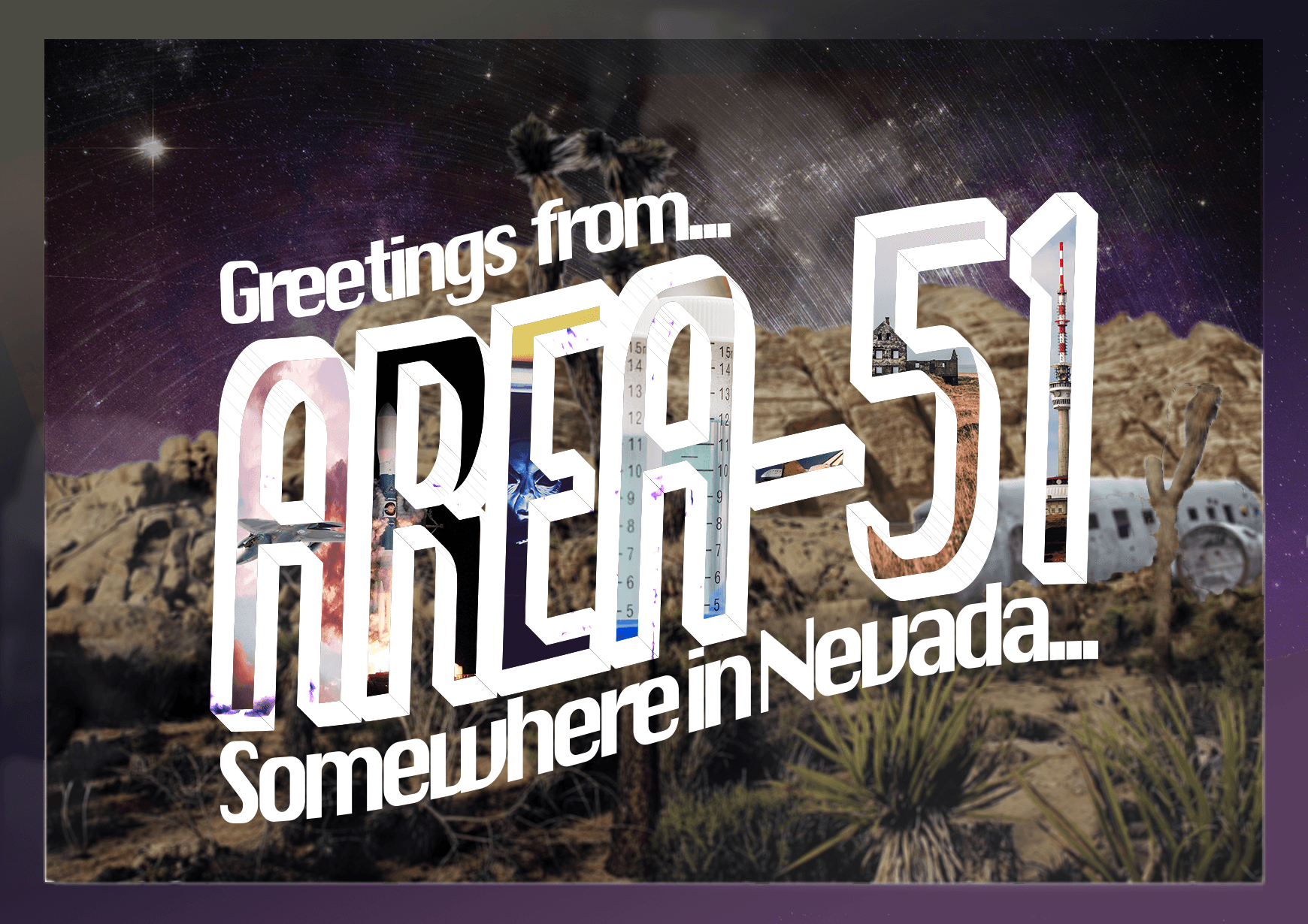
Vintage Style Postcard from Area-51
Frontside of Postcard
Backside of Postcard

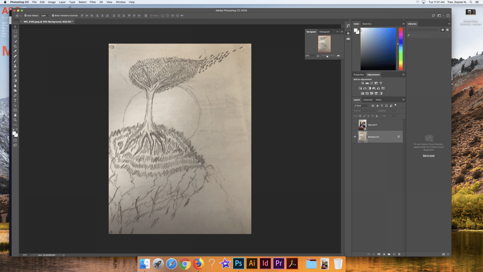
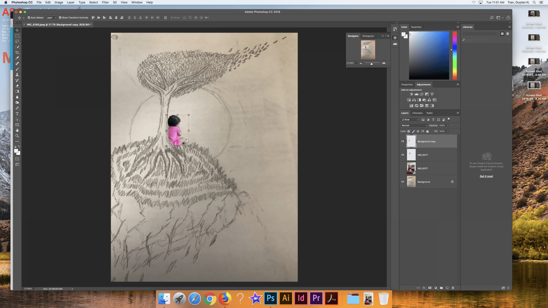
Frontside Workspace

Backside Workspace

Vintage Style Postcard from Area-51
Frontside of Postcard
Backside of Postcard
Frontside Workspace
Backside Workspace

The above image is a visualization of a dream I had about my niece inside one of my drawings.
In this dream I emerged from a deep slumber with clouded eyes, seeing before me nothing but fog. As my consciousness was gradually restored the fog dissipated with it, revealing a land lost in endless sea. On this small piece of land stood a single tree illuminated by a oversized moon, a scene in which I could faintly recognize. A small figure sat at the base of this tree, staring off into the endless sea. As I became more conscious as to where I was and who I saw sitting before me, I awoke.

Above Image: Original Photo of Niece
Above Image: Original Photo of Drawing

Above Image: Cutting Out Niece with Magnetic Lasso

Above Image: Resizing and Placement by Base of Tree
Above Image: Merging Subject Behind Tree

Above Image: Addition of Smokey Image (Retrieved from Pexels)

Image: Cutting Out Smokey Image through Lighten Blend Mode

Above Image: Cutting Out Smokey Image, Duplicating It, and Experimentation with Placement

Above Image: Cutting Away Background of Drawing with Magic Wand Selection
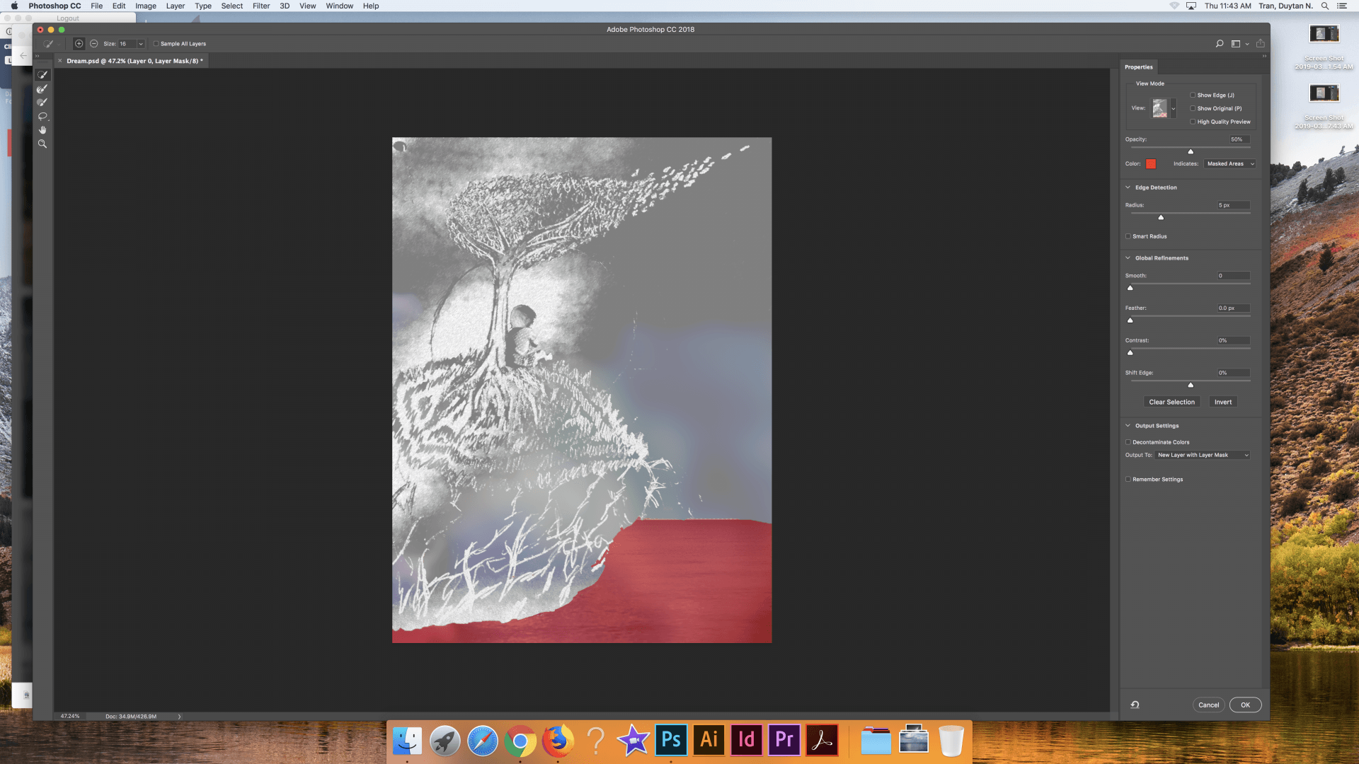
Above Image: Filtering Image and Cutting Away Bottom Half of through Mask

Above Image: Addition of Water (Also Filtered)

Above Image: Filtered the Colorful Smoke into Semitransparent Fog
Above Image: Final Product After A Few Minor Adjustments
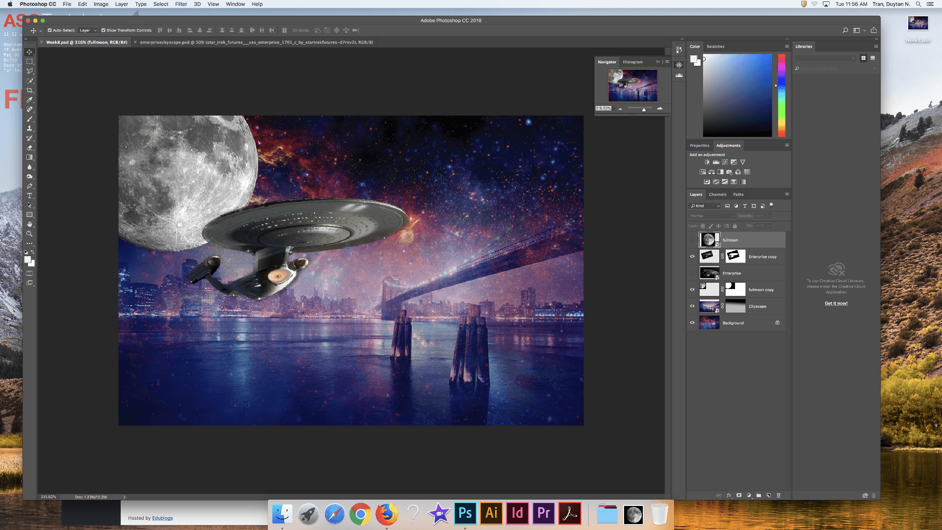
Image: Enterprise Cityscape
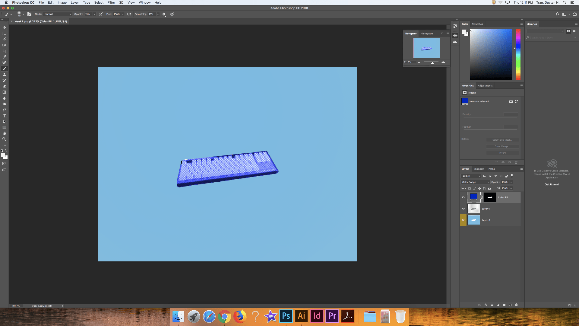
Image: Andy Warhol Inspired Keyboard
1. I picked a keyboard because it relates to a lot of the hobbies I have. I like playing games, making music, programming, 3D model, and drawing, all of which are done through a computer. So it was only naturally to have a keyboard to represent myself.
2. Andy Warhol took a interest in the common products that connect the rich and poor. He saw importance in the fact that the wealthiest of people were not so different from the poorest of people in terms of consumerism.
4. As society continues to progress and innovate computers have become highly important to everything. We are living in a digital age, so naturally many people will also connect with this item.
5. I discovered that photoshop has a lot of tools that automate the process so you, the users, can focus on the vision of their project rather than the mechanics. The access to this technology requires me to think in a system of layers, so when I think of a image, I think of it in terms of photoshop.
Elements of Art & Principles of Design
Image 1: Line
Definition: A visual element that is naturally traced by the viewer’s eye.
Image 2: Shape
Definition: A visually flat element that conveys geometric properties.

Image 3: Color
Definition: Visual sensations formed by the human brain and reflections of light.

Image 4: Value
Definition: The varying intensity of color.

Image 5: Form
Definition: Visual quality that enables the perception of depth.
Image 6: Texture
Definition: Visual element that conveys a sense of material.
Image 7: Space
Definition: A visual element that draws the viewer to other areas where it is not present.

Image 8: Balance
Definition: The positioning of visual elements to maximize or minimize a sense of equilibrium.

Image 9: Contrast
Definition: Two or more entities present for the purpose of comparison.

Image 10: Emphasis
Definition: The prominence of a visual element.

Image 11: Movement
Definition: The conveyance of motion.

Image 12: Pattern
Definition: The conveyance of repetition.

Image 13: Proportion
Definition: The natural comparison of size.

Image 14: Alignment
Definition: Arrangements that form an idea of linear distribution.

Image 15: Unity
Definition: The natural matching of visual elements.
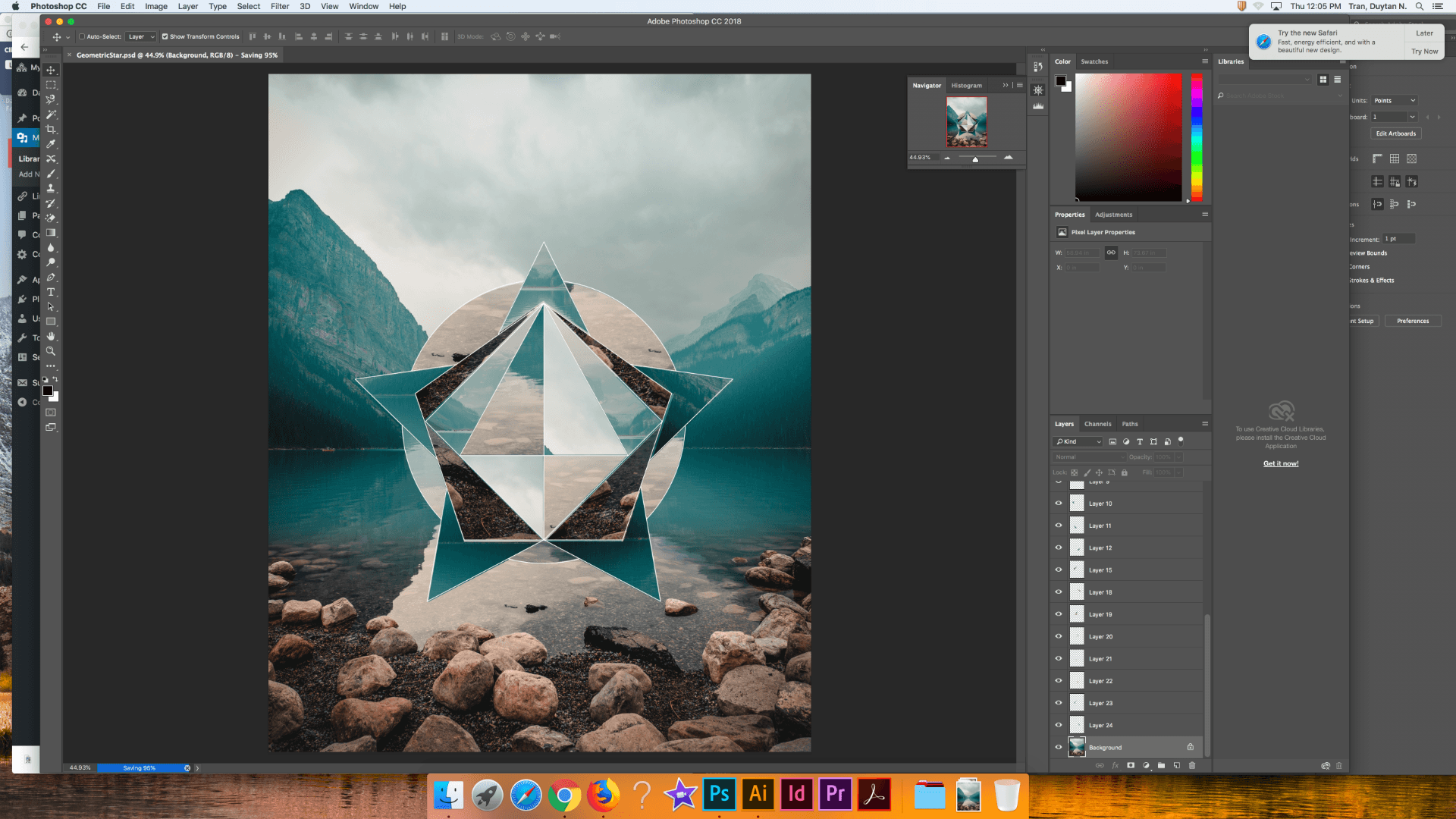
Image: Geometric Manipulation
The 6 Blend Mode Families
The blend modes of photoshop are used to quickly change the colors and transparencies of a image, heavily dependent on the algorithms set by the developers.
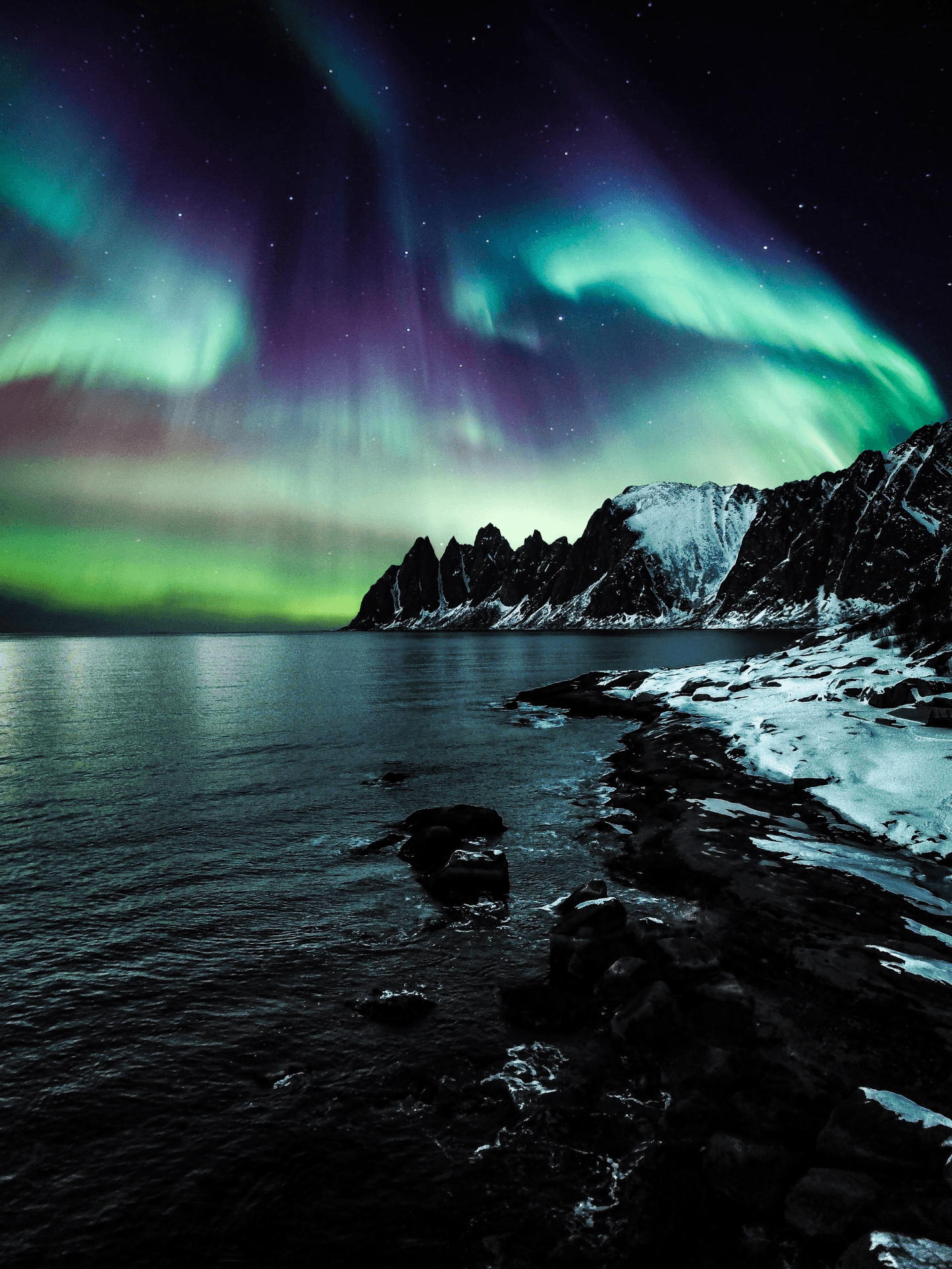 Image 1: Normal Blending Modes – Normal and Dissolve appear respectively.
Normal blend modes changes the opacity between layers instead of blending pixels like the other modes.
Image 2: Darken Blending Modes – (From top left to bottom right) Darken, Multiply, Color Burn, Linear Burn, and Darker Color appear respectively.
Darken blend modes turn the whites of a photo invisible while accentuating the darker portions.

Image 3: Lighten Blending Modes – (From top left to bottom right) Lighten, Screen, Color Dodge, Linear Dodge, and Lighter Color appear respectively.
Lighten blend modes accentuates the brightest colors in a photo.
Image 4: Contrast Blending Modes – (From top left to bottom right) Overlay, Soft Light, Hard Light, Vivid Light, Linear Light, and Hard Mix appear respectively.
Contrast blend modes combine light and dark blend modes by darkening dark colors and lightening lighter colors. It also turns colors exactly in between invisible.

Image 5: Inversion Blending Modes – (From top left to bottom right) Difference, Exclusion, Subtract, and Divide appear respectively.
Inversion blend modes accentuates variation between layers by reversing colors.

Image 6: Component Blending Modes – (From top left to bottom right) Luminosity, Color, Saturation, and Hue appear respectively.
Component blend modes takes into account the primary color components of hue, saturation, and brightness in order to create a variation of vibrancy.


Image 1: Workspace
Image 2: Tiny World
The location needs a open sky throughout the entire panorama to make a proper spherical shape. The space I chose captures the bleak, cold weather of Ohio. I reflect this environment by having a cold look to match it, conveying clear unhappiness about the harsh weather.
The creative process of this image’s backdrop required me to use polar coordination, patch tools, and healing tools. The work associated with placing myself in the center required the use of erase tools and lassos. One of the issues I had when making the final image was having some houses cut off in the middle, to fix this issue I patched some sky over the roofing and extended some trees upwards to make it look more natural.

Image: Freckles and Tattoos
I cut the subject out of her colorful background and seamlessly placed her in a dark hallway using the magnetic lasso and quick selection tools. I then carefully removed her tattoos and freckles using the spot healing brush, content aware move tool, patch tool, and healing brush. The biggest struggle in doing this was seamlessly cutting her out of the original background, due to the shades of her skin being similar.


Image 1: Modified Lava Fields
Image 2: Posterized Lava Fields
Image 3: Desaturated Lava Fields
The removal of background elements was done with the magnetic lasso and quick selection tools. I removed a round patch on the ground, the sky, and some clouds; replacing them with food, animals, boot, and ghosts. Posterizing and desaturating was done in seconds using the tools provided by photoshop.