
Reducing Nature’s Embrace to a Few Casual Comments, black and white ink on watercolor paper, 22″ x 30″
Detailed pieces like this reveal mysteries and meanings as the and drawing and composition unfold.
Reducing Nature’s Embrace to a Few Casual Comments, black and white ink on watercolor paper, 22″ x 30″
Detailed pieces like this reveal mysteries and meanings as the and drawing and composition unfold.
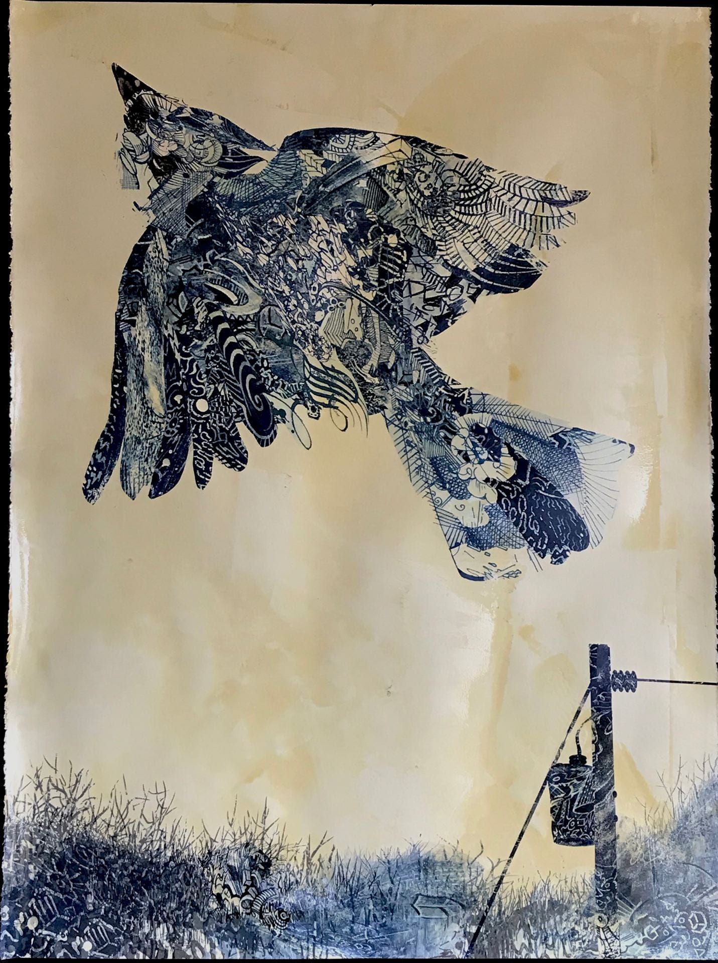
After Audubon; The American Jay, monoprint, (hand-altered inkjet print, size, ink and gouache on Stonehenge paper)
John James Audubon (1785-1851) spent a few years (1813-1820) in my hometown of Henderson, Kentucky. All of the lore surrounding those years spin a remarkable tale of a man driven by the desire to identify, illustrate and categorize the birds of America. There was a romantic aura about his persona-a multi-lingual backwoodsman who sought to marry the natural sciences and art…His quest was not without obstacles, however. Business failures punctuated his early career. At one point, two hundred of his drawings were destroyed by rats. He lost two children. His ventures in Henderson yielded little profit (he operated a mill and dabbled in mercantile exchange…ahem…including running whiskey) and at one point ended up in debtor’s prison. He did a few sketches in the seven years he lived in Henderson, but created his most famous works years after leaving. Audubon’s persistence is especially noteworthy. In addition to spearheading business ventures in order to support his ultimate goal (publishing a comprehensive illustrated ornithological guide), he taught drawing, dancing and fencing, and did steamboat murals and sign painting.* Worldwide recognition of his work is a source of pride for the people of Henderson. This piece recollects and reflects. Audubon’s story becomes a metaphor for the struggle to situate art in the wild ride of life…especially in a world so increasingly separated from the woodlands and river bottoms that captivated his lifelong passion.
*Blaugrund, A., Stebbins, T., (eds) (1993) John James Audubon, The Watercolors for The Birds of America, New York: Barnes and Noble Inc.

Before I Get Carried Away, Pen and black and white ink and size on Stonehenge paper, 22″ x 30″ (30″ x 40″ framed)
‘Sakes alive…this is 2020…no messing around…get out the quill pens and immerse in the meticulous…

Before I Get Carried Away, (detail)

Before I Get Carried Away, (detail)

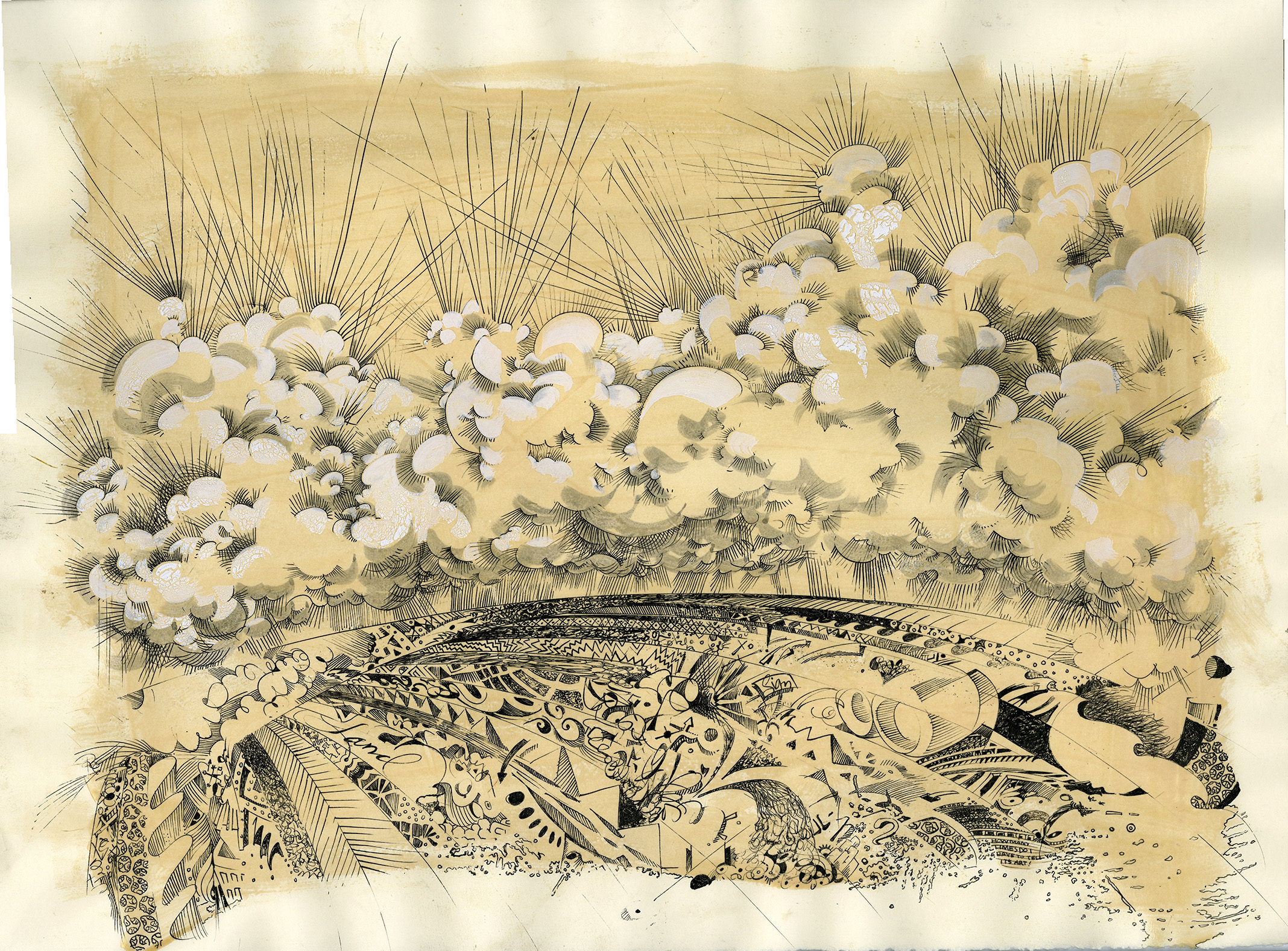
Pastoral Extravaganza, mono print (archival inkjet print, size, ink, and gouache) on Stonehenge paper, 22″ x 30″, framed 30″ x 40″
Completed in 2019, Pastoral Extravaganza is both a reflection and premonition as far as I’m concerned.

Retroactive Withdrawal, monoprint (archival inkjet print, size and India ink) on paper, 22″ x 30″
An entry is much overdue…thanks for patience. The new work involves an investigation of marks, separated from their original contexts and positioned as compositional elements. It’s a simple process of collage. Scan old drawings, use digital manipulation to isolate, then transform and arrange captures. More often than not, I retouch the inkjet prints after output. So, they originate as hand processed forms, manifest as digital images, and find closure in hand processing again.
Enough about technique.
Question: What is it about?
Specific Answer: This hand altered digital collage (monoprint) is titled Retroactive Withdrawal, an esoteric title which requires some explanation. The term is an academic one, established by universities to allow students who quit attending a class after the deadline for dropping has passed, to be withdrawn from the course without it appearing on their academic record. I have appropriated the term for the title, because extracting select visual information from completed drawings in order to re-purpose and re-image is a form of withdrawing my marks and gestural choices with retroactive intent.
General Answer: These works started as an attempt to address the natural confusion that results from seeing and responding to an endless stream of visual stimuli in ever-changing formats and environments. As I probed and sampled my old drawings, I began to understand the process as something involving memory, history, displacement and identity. I have made and studied art for a long time. My recollection of the past is built on my inclination to look, to analyze and to respond. Perhaps our world is over-saturated with images. Even so, humans will always be compelled to manipulate physical and digital realities, and create platforms for experience based on things we see.

Situation Requiring Wavering Attention, monoprint (archival inkjet print, size, India ink) on paper, 22″ x 30″
Linear marks collected from drawings for this piece span a 32 year period.
Referencing a personal history of mark-making, gestures and randomness collide and overlap, becoming a layered post-graphic barrage of images and information.


Click on the image to explore the drawing at intimate scale….
A Storm of Confusion Over a Field of Uncertainty, John Thrasher, pen and ink and hide glue on paper, 22″ x 30″
Rag paper requires size for pen and ink work. After the paper is sized with hide glue, patterns are drawn within the infrastructure of a landscape sketch. The drawings are all part of a series, consistently sized and formatted, that I began in 1998. The series builds on a range of stylistic approaches to drawing in order to address profound and absurd notions of aesthetic measure.

A Storm of Confusion Over a Field of Uncertainty (detail), John Thrasher, pen and ink and hide glue on paper, 22″ x 30″
Penmanship has always been one of my interests. My dad taught me to use quill pens when I was a teen, so I’ve been attracted to the delicacy and contrast of scripted ink marks for many years. With this drawing, I use the pen to “run amok” in a linear composition that unfolded rather haphazardly, hence the title. I completed the drawing before a live audience for Eye Spy, a fundraising art jam put on by my friends at the Mansfield Art Center. To my great pleasure, one of my prize students won the piece!

The King o’ Sumpn Sumpn, John Thrasher, digital print, gouache, color pencil and ink on paper, 22″ x 30″
For The King o’ Sumpn-sumpn, an array of digitally printed marks provide a foundation for a figurative drawing completed with gouache, color pencil and ink. Some of the marks are nearly 30 years old, scanned from drawings collected over time. Physically rendered graphics are digitally re-purposed, layered and arranged, then addressed again with plastic media.

The King o’ Sumpn Sumpn (detail), John Thrasher, digital print, gouache, color pencil and ink on paper, 22″ x 30″

Intersect, John Thrasher, pastel on paper with glazed earthenware, 30″ x 40″ x 4″
Intersect (30” x 40” x 4”, with frame), pastel on paper, glazed earthenware, 2013) addresses fractured surfaces through mark making, removal, and positioning. Neutral pastels provide a muted contrast to the glazed earthenware tile placed behind the geometric center. It had been a while since I had composed a symmetrical form that rigidly and intently responds to the format of the paper. In most of my previous drawings, measured elements were placed more randomly. The depth of the frames I use, (4 inches) invites numerous possibilities for creating strata that extend surface. The centricity of the rectangle disrupts an already disruptive, fragmented picture surface.
The piece is also a mingling of forms that rarely collocate in the same compositional framework. One of the challenges I enjoy is creating a dialogue between drawing and ceramic sculpture. The surface features of the recessed earthen tile in Intersect are elements of the drawing. The two-dimensional surface of the drawing is not a separate vehicle, or a means to a three-dimensional end. The integration of the two distinct visual qualities emphasizes the disparity of the materials, and imposes a curious balance of design.